Describe an item you were incredibly attached to as a youth. What became of it?
I really struggled with this question: I couldn’t think of anything that I was especially attached to as a kid.
Our kids have very strong attachments to a knitted blanket from her babyhood and to a stuffed toy elephant he’s slept with since he was very young, respectively.
Maybe it was just that I couldn’t think of anything; that the memory was lost to time and age.
So I did the obvious thing… and reached out to my mum.
“Muuuuum… where’s my… whatever I used to be attached to? Also… what was it?”
It turns out that apparently my recollection is correct: I really didn’t have any significant attachments to toys or anything like them. I didn’t ever have any kind of “special thing” I
slept with. I recall in my later childhood being surprised to learn that some people did have such things: like all children, I’d internalised my experience of
the world as being representative of the general state of things!
Why, I wonder, are some children different than others and get this kind of youthful attachment to something? Is it genetic?1 Is it memetic,
perhaps a behaviour we subconsciously reinforce in our children because we think it’s “normal”?
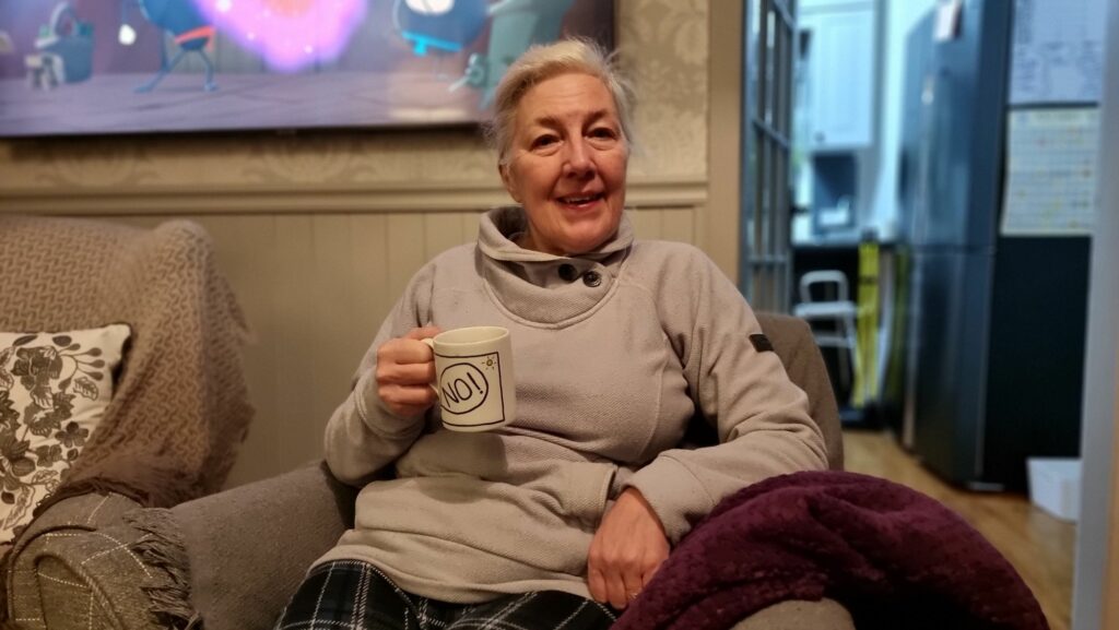
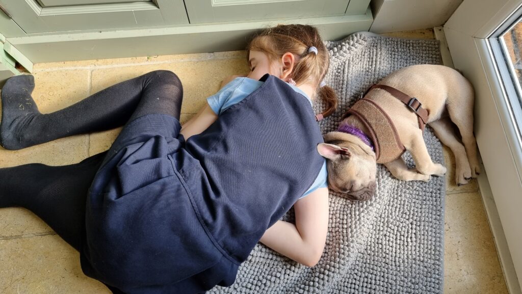
Being attached to napping with a dog doesn’t count, right? (‘cos I’ve definitely done that at least once, although for obvious reasons I’ve only managed to take photos of
others doing the same.)
I’ll bet that some clever psychologist has done some research into this already2, but that sounds like a
different day’s exploration.
But more seriously, my mission – if I have such a thing, is:
Today’s my first day back at work after an decent length break (if you exclude the Friday after Christmas, when I did a little, I’ve
been away from my day job for over a fortnight), and I’ve got a lot to catch up on even before I kick off running a training course I’ve never delivered before, so that’s all
you get for today. But so long as my Bloganuary streak (which now almost makes it onto my leaderboard!)
continues, I’m counting this as a win.
What are your thoughts on the concept of living a very long life?
Today’s my 43rd birthday. Based on the current best statistics available for my age and country, I might expect to live about the same amount of time again: I’m literally about half-way
through my anticipated life, today.1
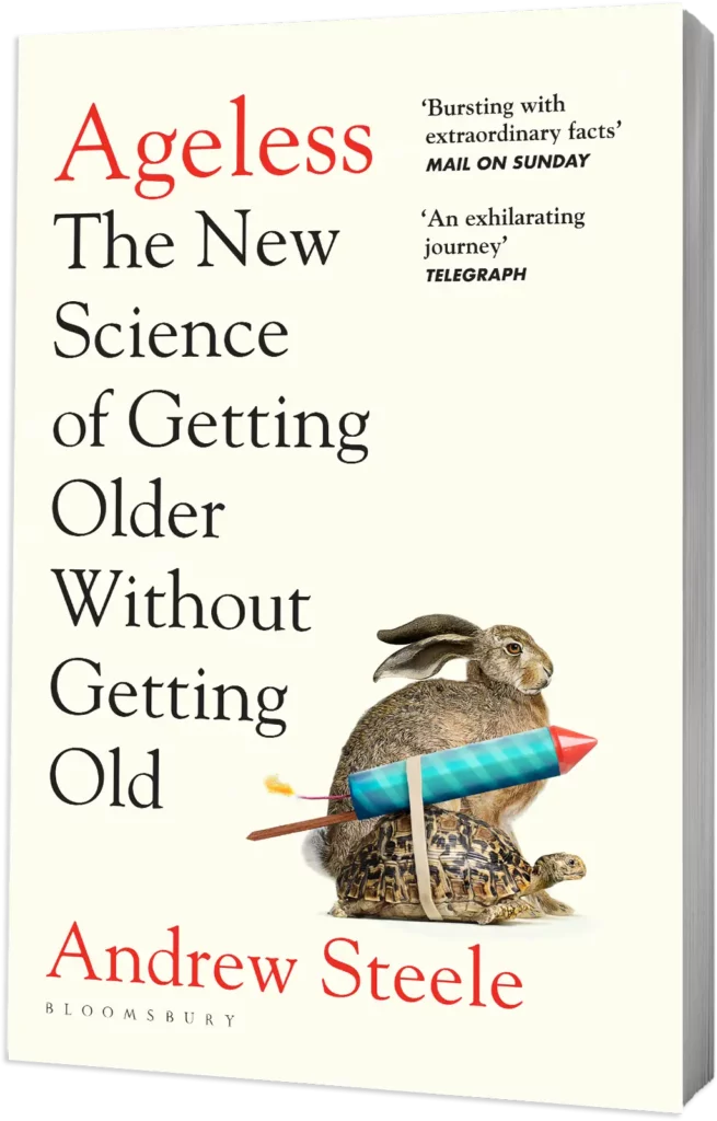
Naturally, that’s the kind of shocking revelation that can make a person wish for an extended lifespan. Especially if, y’know, you read Andrew’s book on the subject and figured that, excitingly, we’re on the cusp of some meaningful life extension technologies!
I’ll be leaning heavily on the only book I’ve read on the subject for this one.
My very first thought when I read Andrew’s thoughts on lifespan extension was exactly the kind of knee-jerk panic response he tries to assuage with his free bonus chapter. He spends a while
explaining how he’s not just talking about expending lifespan but healthspan, and so the need healthcare resources that are used to treat those in old-age wouldn’t increase
dramatically as a result of lifespan increase, but that’s not the bit that worries me. My concern is that lifespan extension technologies will be unevenly distributed, and the
(richer) societies that get them first are those same societies whose (richer) lifestyle has the greater negative impact on the Earth’s capacity to support human life.2
Andrew anticipates this concern and does some back-of-napkin maths to suggest that the increase in population doesn’t make too big an impact:
In this ‘worst’ case, the population in 2050 would be 11.3 billion—16% larger than had we not defeated ageing.
Is that a lot? I don’t think so—I’d happily work 16% harder to solve environmental problems if it meant no more suffering from old age.
This seems to me to be overly-optimistic:
The Earth doesn’t care whether or not you’re happy to work 16% harder to solve environmental problems if that extra effort isn’t possible (there’s necessarily an
upper limit to how much change we can actually effect).
16% extra population = 16% extra “work” to save them implies a linear relationship between the two that simply doesn’t exist.
And that you’re willing to give 16% more doesn’t matter a jot if most of the richest people on the planet don’t share that ideal.
Fortunately, I’m reassured by the fact that – as Andrew points out – change is unlikely to happen fast. That means that the existing existential threat of climate change
remains a bigger and more-significant issue than potential future overpopulation does!
In short: while I’m hoping I’ll live happily and healthily to say 120, I don’t think I’m ready for the rest of the world to all suddenly start doing so too! But I think there are bigger
worries in the meantime. I don’t fancy my chances of living long enough to find out.
Gosh, that’s a gloomy note for a birthday, isn’t it? I’d better get up and go do something cheerier to mark the day!
This post brought to you from my bed at the forest chalet I’ve spent the weekend in!
Footnotes
1 Assuming I don’t die of something before them, of course. Falling off a cliff isn’t a heritable condition, is it? ‘Cos there’s a family
history of it, and I’ve always found myself affected by the influence of gravity, which I believe might be a precursor to falling off things.
2 Fun fact: just last month I threw together a little JavaScript
simulator to illustrate how even with no population growth (a “replacement rate” of one child per adult) a population grows while its life expectancy grows, which some people find
unintuitive.
Well that sounds like a question lifted right off an Oblique
Strategies deck if ever I heard one!
I occasionally aspire to something-closer-to-veganism. Given that my vegetarianism (which
is nowadays a compromise position1 of “no meat on weekdays, no beef or lamb at all”) comes primarily from a place of environmental
concern: a Western meat-eating diet is vastly less-efficient in terms of energy conversion, water usage, and carbon footprint than a vegetarian or vegan diet.
In an ideal world, with more willpower, I’d be mostly-vegan. I’d eat free range eggs produced by my own chickens, because keeping your own chickens offsets the food miles by
enough to make them highly-sustainable. I’d eat honey, because honestly anything we can do to encourage more commercial beekeeping is a good thing as human civilisation depends on pollinators. But I’d drop all
dairy from my diet.
I suppose I’m not that far off, yet. Maybe this year I can try switching-in a little more vegan “cheese” into the rotation.
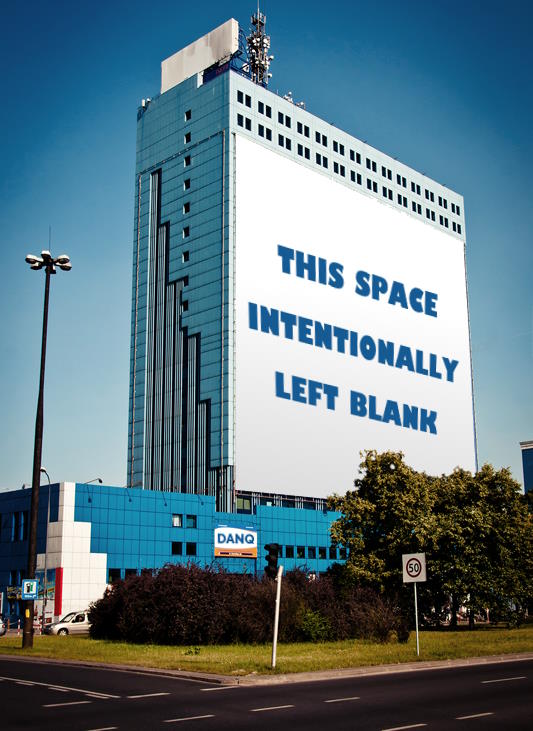
If you had a freeway billboard, what would it say?
I always loved it when a book or exam paper or similar contained a page whose only content was the words “this space intentionally left blank”. It tickles a particular part of me: the
part that wonders how “keep of the grass” signs get there without anybody treading on the grass, or laughs whenever somebody says something like “nobody drives in Oxford, there’s too
much traffic.”
This is not the famous painting, The Treachery of Images.
Would a nostalgic person reimplement this set-up but in a modern browser? Why yes, yes I would.
Thinking about the future
But I’m also keenly-focussed on the future. I apply a hacker mindset to every new toy that comes my way, asking not “what does it do?” but “what can it be made to do?”. I’ve
spent over a decade writing about the future of
(tele)working, which faces new challenges today
unlike any before. I’m much more-cautious than I was in my youth about jumping on every new tech bandwagon2, but I still try to keep abreast and
ahead of developments in my field.
But I also necessarily find myself thinking about the future of our world: the future that our children will grow up in. It’s a scary time, but I’m sure you don’t need me to spell that
out for you!
Either way: a real mixture of thinking about the past and the future. It’s possible that I neglect the present?
Footnotes
1 By the way: did you know that much of my blog is accessible over finger (finger
@danq.me), Gopher (gopher://danq.me), and Gemini (gemini://danq.me). Grab yourself a copy of Lagrange
or your favourite smolweb browser and see for yourself!
2 Exactly how many new JavaScript frameworks can you learn each week, anyway?
What topical timing, given that it’ll be my birthday in four days!
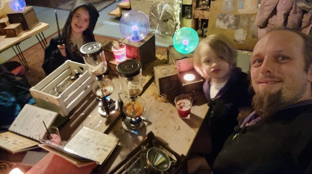
My birthday is slightly overshadowed by the proximity to it of our eldest child’s birthday, but we can still find enough overlap of interest to do some fun things. Here we are last
year, for example, at a magic-themed cocktail-making
workshop (with non-alcoholic recipes for the kids, of course).
Of the things I have least but treasure most, perhaps the biggest is time. Between work, volunteering, and childcare, I often find myself rushing to cram-in any of the diversity of “play” activities I engage in.1
I always feel particularly guilty if I step away to do “me things” that put me out of reach, because I know that while I’m off having fun, my absence necessarily means that
somebody else has to be the one to break up whatever child squabble is happening right now2. It feels particularly
extravagant to, for example, spend a weekend in pursuit of a distant geohash point or two3.
A fancy dinner in a hotel bar in the middle of a two-day geohashing expedition across the Midlands, as far from work and home responsibilities as I can manage? Yes please!
So one of the best gifts I ever received was for my birthday the year before last, when Ruth gave me “a weekend off”4, affording me the opportunity to do
exactly that. I picked some dates and she, JTA, and the kids vanished, leaving me free to spend a few days hacking my way
from Herefordshire to somewhere near Birmingham in what turned out to be the
worst floods of the year. It was delightful.5
Most people can’t give me “time”: it doesn’t grow on trees, and I haven’t found a place to order it online. It’s not even always practical to help me reclaim my own time by taking fixed
timesinks off my to-do list6. But for those
that can, it’s a great gift that I really appreciate.
It’s my birthday on Monday, if anybody wants to volunteer for childminding duties at any point. Just sayin’. 😅
2 Ours can be a particularly squabbly pair, and really know how to push one another’s
buttons to escalate a fight!
3 Unless I were to take the kids with me: then if feels fine, but then I’ve got a
different problem to deal with! The dog’s enough of a handful when you’re out traipsing through a bog in the rain!
5 I think that Ruth feels that her gift to me on my 41st birthday was tacky, perhaps
because for her it was a “fallback”: what she came up with after failing to buy a more-conventional gift. But seriously: a scheduled weekend to disconnect from everything
else in my life was an especially well-received gift.
6 Not least because I’m such a control freak that some of the biggest timesinks in my life
are things I would struggle to delegate or even accept help with!
I feel like this question might be a little US-centric? Or at least, not UK-friendly!
The question doesn’t translate well because of transatlantic differences in our higher education systems (even after I skimmed a guide to higher education across the pond).
Let’s try instead enumerating the education establishments I’ve attended post-school. There’ve been a few!
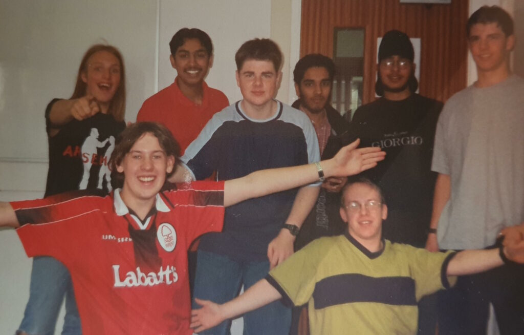
Preston College
I’m the leftmost of the unwashed nerdy louts in this collection of unwashed nerdy louts: Preston College’s Computing A-Level graduates of the 1997-1999 class.
Nowadays young adults are required to be enrolled in education or training until the age of 18, but that wasn’t the case when I finished secondary school at 16. Because my school didn’t yet offer a “sixth form” (education for 16-18
year olds), I registered with Preston College to study A-Levels in Computing, Maths, Psychology, and General Studies.
The first of these choices reflected my intention to go on to study Computer Science at University1.
Psychology was chosen out of personal interest, and General Studies was a filler to round-out my programme.
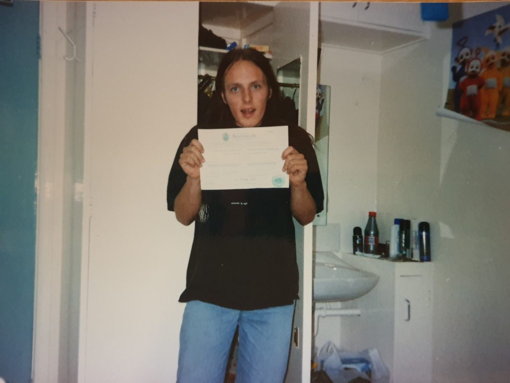
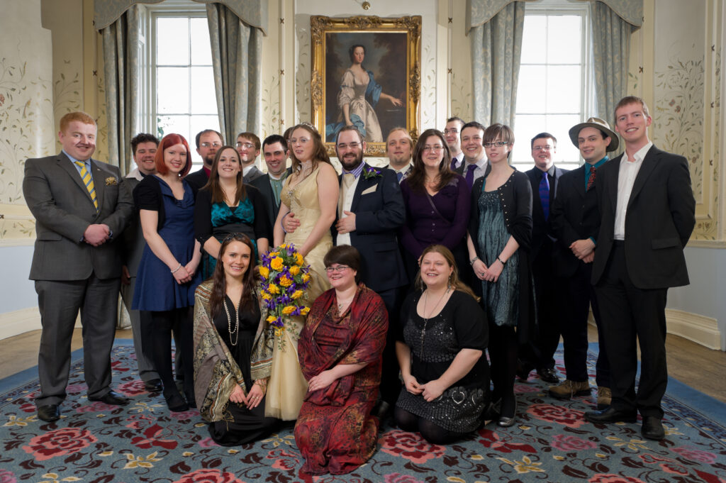
Then known as the University of Wales, Aberystwyth, this became my next academic destination as I pursued an undergraduate degree in Computer Science with Software Engineering.
This photo, showing off my admission certificate in my just-moved-into study bedroom, first appeared in a then-private post in October 1999 (after I’d had time to get the film developed and scan the
print!2).
Originally intending to spend five years doing a masters degree, I later dialled-back my plans and left with only a bachelors degree (although I still somehow spent five years
getting it). This was not-least because I was much more-interested in implementing Three Rings than in studying, although I at least
eventually managed to get away with writing
and handing in a dissertation based on my work on the
project3 and was awarded a degree and got to wear a silly hat and everything.
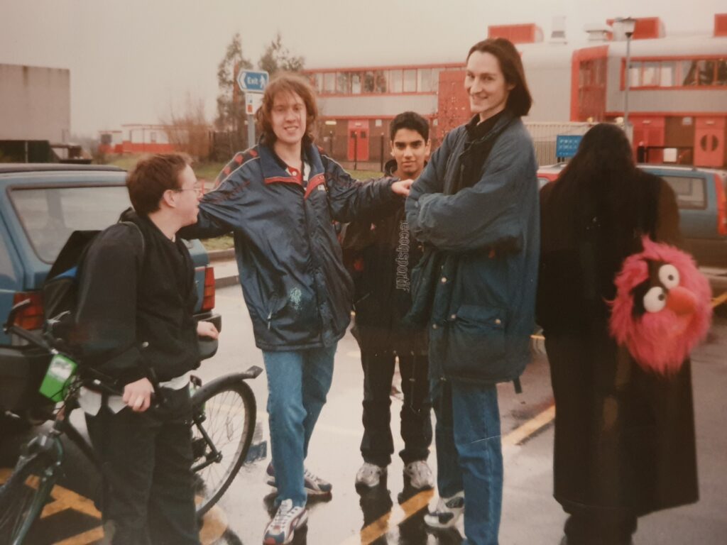
Of course, the real adventure at Aberystwyth was the friends I made along the way. Including this lot!
Since then, I’ve used my Software Engineering degree for… almost nothing. I started working at SmartData before I’d even completed it; the
Bodleian required that I had one but didn’t care what the subject was, and I’m not certain that Automattic even asked. But I still appreciate some of the theoretical grounding it gave me, which helps me when I learn new
concepts to this day4.
Aylesbury College
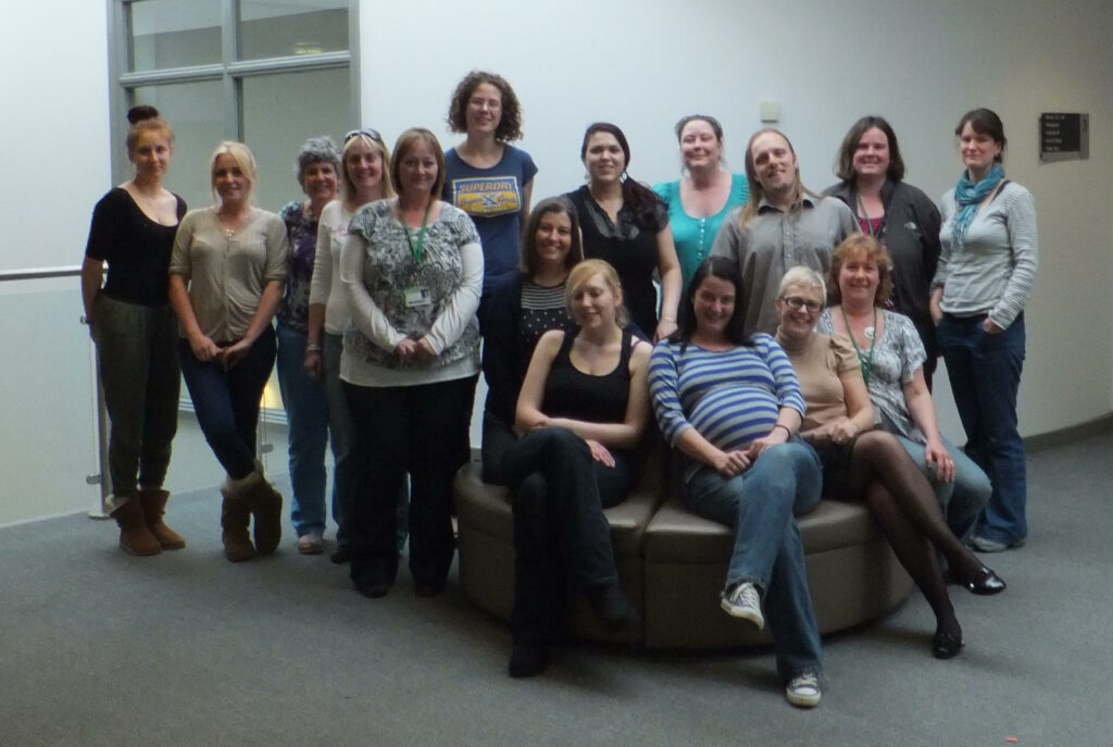
Almost a decade later, the academic bug bit me again and I decided
to study towards a foundation degree in Counselling & Psychotherapy! I figured that it I were going to have one degree that I never use, I might as well have two of them,
right?
Among this cheery group I stood out for a couple of reasons, but perhaps the most-interesting was that I was the only member of my class who didn’t intend to use their new
qualification in a practical capacity.
The academic parts5
of the work could be done remotely, but I needed to zip back and forth to Aylesbury on Monday evenings for several years for the
practical parts.
The Open University
Almost another decade passed then I decided it was time to break into academia a further time. This time, I decided to build on my existing knowledge from my first degree plus
the subsequent experience and qualifications I’d gained in ethical hacking and penetration testing, and decided to go for a masters degree in Information Security and Forensics!
I even managed to do some original research for my dissertation,
although it’s terribly uninteresting because all it possibly managed to prove was the null hypothesis.
Smug mode activated as I prepare to add another degree certificate to the wall.
Something I’d discovered having been a student in my teens, in my 20s, in my 30s, and in my 40s… is that it gets harder! Whereas in my 20s I could put in an overnight cram session and
ace an exam, in my 40s I absolutely needed to spend the time studying and revising over many weeks before information would become concrete in my mind!6 It almost feels
like it’s a physical effort to shunt things into my brain, where once it was near-effortlessly easy.
People have occasionally suggested that I might push my field(s) even further and do a doctorate someday. I don’t think that’s for me. A masters in a subdiscipline was plenty
narrow-enough a field for my interests: I’d far rather study something new.
Maybe there’s another degree in my sometime, someday, but it’s probably a bachelors!
Footnotes
1 I figured that an A-Level in Maths would be essential for admission to a Computer
Science degree, but it very definitely wasn’t, though it helped out in other ways.
2 The ubiquity of digital photography nowadays makes it easy to forget that snapping a
picture to share with friends used to be really hard work.
3 Little did I know that 20 years later Three Rings would still be going strong,
now supporting ~60,000 volunteers in half a dozen countries!
4 While I love and am defensive of self-taught programmers, and feel that
bootcamp-plus-experience is absolutely sufficient for many individuals to excel in my industry, there are certain topics – like compiler theory, data structures and algorithms, growth
rates of function complexity, etc. – that are just better to learn in an academic setting, and which in turn can help bootstrap you every time you need to learn a new
programming language or paradigm. Not to mention the benefit of “learning how to learn”, for which university can be great. It’s a bloody expensive way to get those skills, especially
nowadays, though!
Do you play in your daily life? What says “playtime” to you?
How do I play? Let me count the ways!
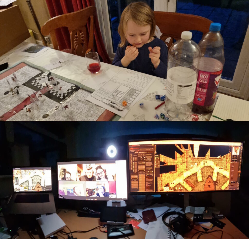
RPGs
I’m involved in no fewer than three different RPG campaigns (DMing the one for
The Levellers) right now, plus periodic one-shots. I love a good roleplaying game, especially one that puts character-building and storytelling
above rules-lawyering and munchkinery, specifically because that kind of collaborative, imaginative experience feels more like the kind of thing we call “play” when
done it’s done by children!
Family D&D and Abnib D&D might have a distinctly different tone, but they’re still both playtime activities.
Videogames
I don’t feel like I get remotely as much videogaming time as I used to, and in theory I’ve become more-selective about exactly what I spend my time on1.
Similarly, I don’t feel like I get as much time to grind through my oversized board games collection as I used to2,
but that’s improving as the kids get older and can be roped-into a wider diversity of games3.
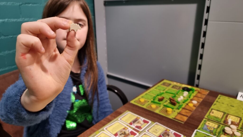
Our youngest wakes early on weekend mornings and asks to kick off his day with board games. Our eldest, pictured, has grown to the point where she’s working her way through all of the
animal-themed games at our local board games cafe.
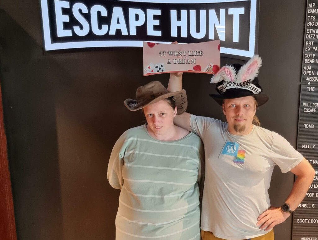
Escape Rooms
I love a good escape room, and I can’t wait until the kids are old enough for (more of) them too so I’ve an excuse to do more of them. When we’re not playing conventional escape rooms,
Ruth and I can sometimes be found playing board game-style boxed “kit” ones (which have very variable quality, in my experience) and we’ve
recently tried a little Escape Academy.
Ruth and I make a great duo when we remember to communicate early-and-often and to tag-team puzzles by swapping what we’re focussing on when we get stuck.
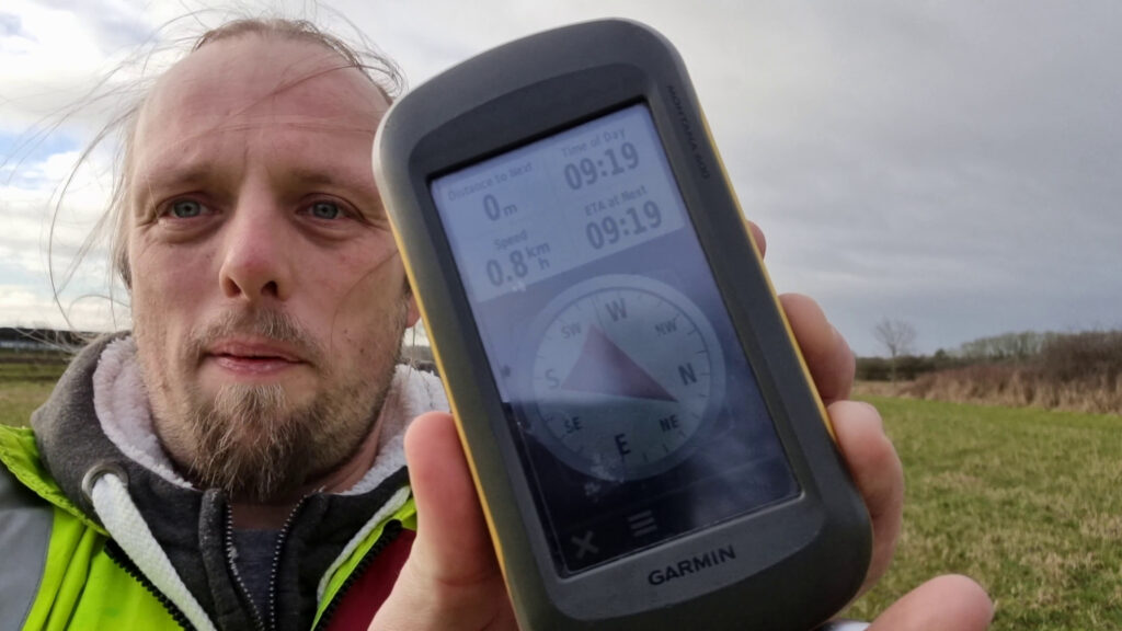
They’re not the only satnav-based activities I do at least partially “for fun” though! I contribute to OpenStreetMap, often through the
“gamified” experience of the StreetComplete app, and I’m very slowly creeping up the leader board at OpenBenches. Are these “play”? Sure, maybe.
And all of the above is merely the structured kinds of play I engage in. Playing “let’s pretend”-style games with the kids (even when they make it really, really weird) adds a whole extra
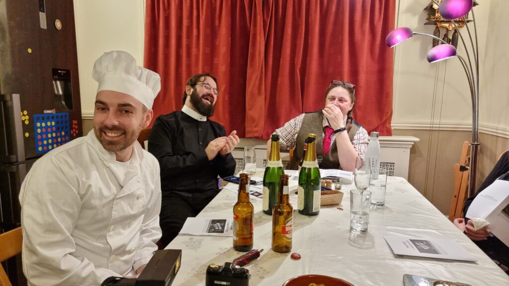
aspect. Also there’s the increasingly-rare murder mystery parties we sometimes hold: does that count as roleplaying, or some other kind of play?
A chef, a priest, and a librarian walk into a party… stop me if you’ve heard this one.
Suffice to say, there’s plenty of play in my life, it’s quite varied and diverse, and there is, if anything, not enough of it!
Footnotes
1 I say that, and yet somehow Steam tells me that one of my most-played games this year
was Starfield, which was… meh? Apparently compelling enough
that I’ve “ascended” twice, but in hindsight I wish I hadn’t bothered.
2 Someday my group and I will finish Pandemic Legacy: Season 2 so we can get
started on Season 0 which has sat
unplayed on my shelves since I got it… oooh… two or three years ago‽
3 This Christmas, I got each of them their first “legacy” game: Zombie Kids for the younger one, My City for the elder. They both seem pretty good.
4Geocaching is where you use military satellite networks to find lost tupperware. Geohashing uses the same technology but what you find is a whole lot of nothing. I don’t think I
can explain why I find the latter more-compelling.
I find winters are generally bad for my creativity
and motivation, usually until I bounce back in the Spring.
In an attempt to keep me writing daily, I’m giving Bloganuary a go this year. It’s sort-of like the NaNoWriMo of blogging1. And for me, Bloganuary’s very purpose is to overcome the challenge of getting disconnected
from blogging when the nights are long and inspiration’s hard to find2.
The Challenge of Staying On-Task
But outside of the winter, my biggest challenge is usually… staying on-task!
It’s easy to get my focus to wane and for me to drift into some other activity than whatever it is I should be spending my time on. It’s not even
procrastination3 so much as it’s a
fluctuating and changing field of interest. I’ll drift off of what I’m supposed to be working on and start on something that interests me more in that moment… and then potentially off
that too, in turn. The net result is that both my personal and professional lives are awash with half-finished projects4, all waiting their turn for me to find the
motivation to swing back around and pick them up on some subsequent orbit of my brain.
You know how sometimes a stock image says exactly what you need it to? This isn’t one of those times.
It’s the kind of productivity antipattern I’d bring up with my coach, except that I already
know exactly how she’d respond. First, she’d challenge the need to change; require that I justify it first. Second, she’d insist that before I can change, I need to accept and come to
terms with who I am, intrinsically: if this flitting-about is authentically “me”, who am I to change it?
Finally, after weeks or months of exercises to fulfil these two tasks, she’d point out that I’ve now reached a place where I’m still just as liable to change lanes in the middle of a
project as I was to begin with, but now I’m more comfortable with that fact. I won’t have externally changed, I’ll “just” have found some kind of happy-clappy inner peace. And she’ll
have been right that that’s what I’d actually needed all along.
Maybe it’s not such a challenge, after all.
Footnotes
1 Except that would be NaBloPoMo, of course. But it’s a similar thing.
2 Also, perhaps, to help me focus on writing more-often, on more-topics, than I might
otherwise in the course of my slow, verbose writing.
There are video games that I’ve spent
many years playing (sometimes on-and-off) before finally beating them for the first time. I spent three years playing Dune II before I finally beat it as every house. It took twice that to reach the end of Ultima Underworld II.
But today, I can add a new contender1 to that list.
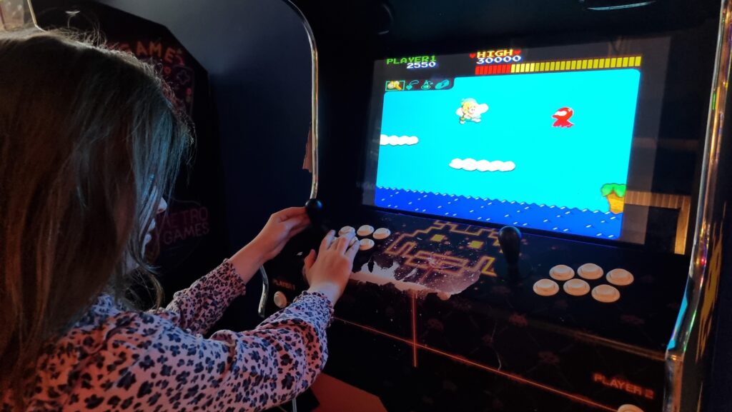
Today, over thirty-five years after I first played it, I finally completed Wonder Boy.
My first experience of the game, in the 1980s, was on a coin-op machine where I’d discovered I could get away with trading the 20p piece I’d been given by my parents to use as a deposit
on a locker that week for two games on the machine. I wasn’t very good at it, but something about the cutesy graphics and catchy chip-tune music grabbed my attention and it became my
favourite arcade game.
Of all the video games about skateboarding cavemen I’ve ever played, it’s my favourite.
I played it once or twice more when I found it in arcades, as an older child. I played various console ports of it and found them disappointing. I tried it a couple of times in MAME. But I didn’t really put any effort into it until a hotel we stayed at during a family holiday to Paris in October had a bank of free-to-play arcade machines
rigged with Pandora’s Box clones so they could be used to play a few thousand different arcade classics. Including Wonder Boy.
Our eldest was particularly taken with Wonder Boy, and by the time we set off for home at the end of our holiday she’d gotten further than I ever had at it (all
without spending a single tenpence).
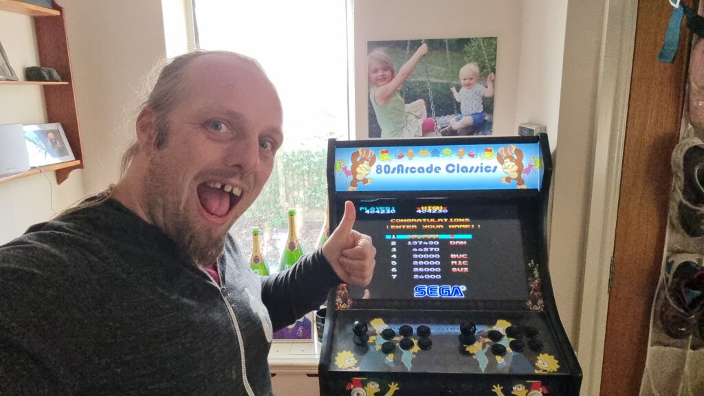
Off the back of all the fun the kids had, it’s perhaps no surprise that I arranged for a similar machine to be delivered to us as a gift “to the family”2
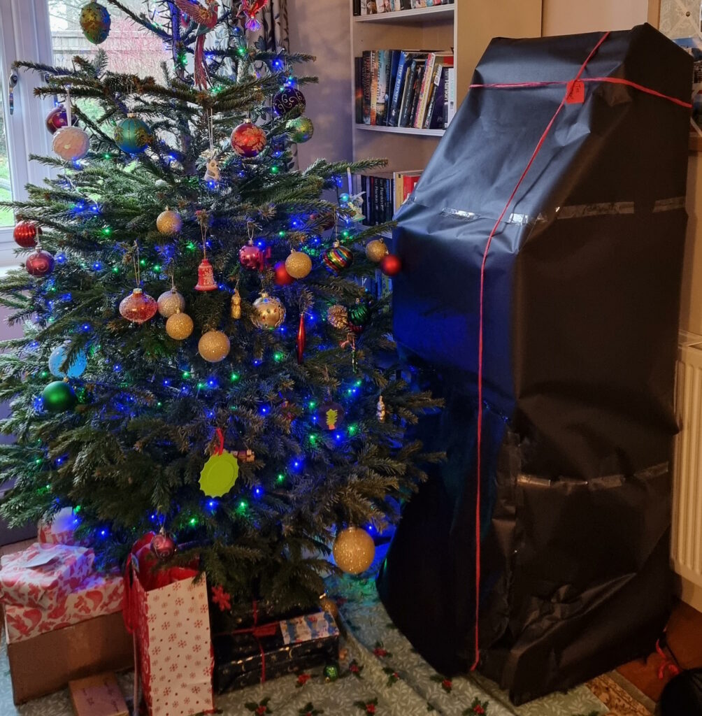
this Christmas.
If you look carefully, you can work out which present it it, despite the wrapping.
And so my interest in the game was awakened and I threw easily a hundred pounds worth of free-play games of Wonder Boy3 over the last few days. Until…
…today, I finally defeated the seventh ogre4,
saved Tina5, saved the kingdom, etc. It was a hell of a battle. I can’t count how many times I pressed the “insert coin” button on
that final section, how many little axes I’d throw into the beast’s head while dodging his fireballs, etc.
So yeah, that’s done, now. I guess I can get back to finishing Wonder Boy: The Dragon’s Trap, the 2017 remake of a 1989 game I
adored!6
It’s aged amazingly well!
Footnotes
1 This may be the final record for time spent playing a video game before beating it,
unless someday I ever achieve a (non-cheating) NetHack ascension.
2 The kids have had plenty of enjoyment out of it so far, but their time on the machine is
somewhat eclipsed by Owen playing Street Fighter II Turbo and Streets of Rage on it and, of course, by my rediscovered obsession with Wonder Boy.
3 The arcade cabinet still hasn’t quite paid for itself in tenpences-saved,
despite my grinding of Wonder Boy. Yet.
4 I took to calling the end-of-world bosses “ogres” when my friends and I swapped tips for
the game back in the late 80s, and I refuse to learn any different name for them.
5 Apparently the love interest has a name. Who knew?
6 I completed the original Wonder Boy III: The Dragon’s Trap on a Sega Master
System borrowed from my friend Daniel back in around 1990, so it’s not a contender for the list either.
Tracy Durnell’s post
about blogrolls really spoke to me. Like her, I used to think of a blogroll as a list of people you know personally (who happen to blog)1, but the number of bloggers among my immediate
in-person circle of friends has shrunk from several dozen to just a handful, and I dropped my blogroll in around 2008.
On the Internet, a blogger is only as alone as they choose to be.
But my connection to a wider circle has grown, and like Tracy I enjoy the “hardly strangers” connection I feel with the people I follow online. She writes:
While social media emphasizes the show-off stuff — the vacation in Puerto Vallarta, the full kitchen remodel, the night out on the town — on blogs it still seems that people are
sharing more than signalling. These small pleasures seem to be offered in a spirit of generosity — this is too beautiful not to share.
…
Although I may never interact with all the folks whose blogs I follow, reading the same blogger for a long time does build a (one-sided) connection. I may not know you, author,
but I am rooting for you. It’s a different modality of relationship than we may be used to in person, but it’s real: a parasocial relationship simmering with the potential for
deeper connection, but also satisfying as it exists.
At its core, blogging is a solitary activity with many (if not most) authors claiming that their blog is for them – myself included. Yet, the implication of audience cannot be
ignored. Indeed, the more an author embeds themself in the loose community of blogs, by reading and linking to others, the more that implication becomes reality even if not actively
pursued via comments or email.
To that end: I’ve started publishing my blogroll again! Follow that link and you’ll see an only-lightly-curated list of all the people (plus
some non-personal blogs, vlogs, and webcomics) I follow (that have updated their feeds within the last year2). Naturally, there’s an
OPML version too, and I’ve open-sourced the code I used to generate it (although I can’t imagine
anybody’s situation is enough like mine for it to be useful).
The page is a little flaky and there’s things I’d like to do to improve it, but I’d rather publish a basic version now and then come back to it with my gardening gloves on another time to improve it.
Maybe my blogroll has some folks on that you might recognise? Or else: maybe you’re only a single random-click away from somebody new you
never heard of before!
Footnotes
1 Possibly marked up with XFN to
indicate how you’re connected to one another, but I’ve always had a soft spot
for XFN.
During a conversation with a colleague last week, I claimed that while I blog more-frequently than I did 5-10 years ago, it’s still with a much lower frequency than say 15-20 years ago.
Only later did I stop to think: is that actually true? It’s time for a graph!
Generating a chart...
If this message doesn't go away, the JavaScript that makes this magic work probably isn't doing its job right: please tell Dan so he can fix it.
Generating a chart...
If this message doesn't go away, the JavaScript that makes this magic work probably isn't doing its job right: please tell Dan so he can fix it.
If you consider just articles (and optionally notes, which some older content might have been better classified-as, in
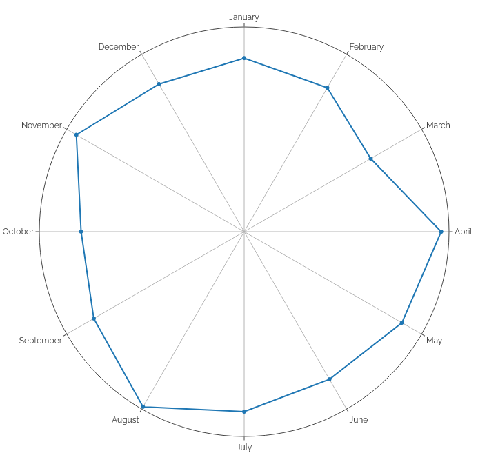
retrospect) it looks like I’m right. Long gone are months like February 2005 when I posted an average of three times every two days! November
2018 was a bit of an anomaly as a I live-tweeted Challenge Robin II: my recent output’s mostly been comparable to the “quiet period”
from 2008-20102.
Looking at number of posts by month of the year, it’s interesting to see a pronounced “dip” in all kinds of output roundabout March, less reposts in
Summer and Autumn, and – perhaps unsurprisingly – more checkins (which often represent geocaching/geohashing logs) in the warmer months.
Even on this scale, you can see the impact of the November “Challenge Robin spike” in the notes:
Generating a chart...
If this message doesn't go away, the JavaScript that makes this magic work probably isn't doing its job right: please tell Dan so he can fix it.
Anyway, now I’ve actually automated these kinds of stats its easier than ever for me to ask questions about how and when I write in my blog. I’ve put living copies of the
charts plus additional treats (want to know when my longest “daily streak” was?) on a special page dedicated to that purpose. It’ll be interesting to see how it
looks on this blog’s 25th anniversary, in a little under a year!
Footnotes
1 Try clicking on any of the post kinds in the legend to add/remove them, or
click-and-drag a range across the chart to zoom in.
2 In hindsight, I was clearly depressed in and around
2009 and this doubtless impacted my ability to engage in “creative” pursuits.
You can click an image and see a full-window popup dialog box containing a larger version of the image.
The larger version of the image isn’t loaded until it’s needed.
You can close the larger version with a close button. You can also use your browser’s back button.
You can click again to download the larger version/use your browser to zoom in further.
You can share/bookmark etc. the URL of a zoomed-in image and the recipient will see the same image (and return to the
image, in the right blog post, if they press the close button).
No HTTP round trip is required when opening/closing a lightbox: it’s functionally-instantaneous.2
No JavaScript is used at all.
Visitors can click on images to see a larger version, with a “close” button. No JavaScript needed.
Here’s how it works –
The Markup
<figureid="img3336"aria-describedby="caption-img3336"><ahref="#lightbox-img3336"role="button"><imgsrc="small-image.jpg"alt="Alt text is important."width="640"height="480"></a><figcaptionid="caption-img3336">
Here's the caption.
</figcaption></figure>
... (rest of blog post) ...
<dialogid="lightbox-img3336"class="lightbox"><ahref="large-image.jpg"><imgsrc="large-image.jpg"loading="lazy"alt="Alt text is important."></a><aclass="close"href="#img3336"title="Close image"role="button">×</a></dialog>
The HTML is pretty simple (and I automatically generate it, of course).
For each lightboxed image in a post, a <dialog> for that image is appended to the post. That dialog contains a larger copy of the image (set to
loading="lazy" so the browser have to download it until it’s needed), and a “close” button.
The image in the post contains an anchor link to the dialog; the close button in the dialog links back to the image in the post.3 I wrap the lightbox image itself in a link to the full version of the
image, which makes it easier for users to zoom in further using their browser’s own tools, if they like.
Even without CSS, this works (albeit with “scrolling” up and down to the larger image). But the clever bit’s yet to
come:
The Style
body:has(dialog:target) {
/* Prevent page scrolling when lightbox open (for browsers that support :has()) */position:fixed;
}
a[href^='#lightbox-'] {
/* Show 'zoom in' cursor over lightboxed images. */cursor: zoom-in;
}
.lightbox {
/* Lightboxes are hidden by-default, but occupy the full screen and top z-index layer when shown. */all:unset;
display:none;
position:fixed;
top:0;
left:0;
width:100%;
height:100%;
z-index:2;
background:#333;
}
.lightbox:target {
/* If the target of the URL points to the lightbox, it becomes visible. */display: flex;
}
.lightboximg {
/* Images fill the lightbox. */object-fit:contain;
height:100%;
width:100%;
}
/* ... extra CSS for styling the close button etc. ... */
Here’s where the magic happens.
Lightboxes are hidden by default (display: none), but configured to fill the window when shown.
They’re shown by the selector .lightbox:target, which is triggered by the id of the <dialog> being referenced by the anchor part of
the URL in your address bar!
Summary
It’s neither the most-elegant nor cleanest solution to the problem, but for me it hits a sweet spot between developer experience and user experience. I’m always disappointed when
somebody’s “lightbox” requires some heavyweight third-party JavaScript (often loaded from a CDN), because that seems to be the
epitome of the “take what the Web gives you for free, throw it away, and reimplement it badly in JavaScript” antipattern.
There’s things I’ve considered adding to my lightbox. Progressively-enhanced JavaScript that adds extra value and/or uses the Popover API where available, perhaps? View Transitions to animate the image “blowing up” to the larger size, while the full-size image loads in the
background? Optimistic preloading when hovering over the image4? “Previous/next” image links when lightboxing a gallery? There’s lots of potential to expand it
without breaking the core concept here.
I’d also like to take a deeper dive into the accessibility implications of this approach: I think it’s pretty good, but accessibility is a big topic and there’s always more to
learn.
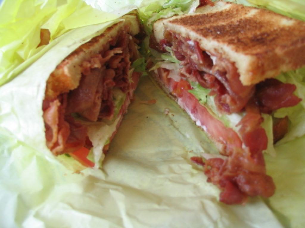
In the meantime, why not try out my lightbox by clicking on this picture of my dog (photographed here staring longingly at the bacon sandwich picture above, perhaps).
I hope the idea’s of use to somebody else looking to achieve this kind of thing, too.
Footnotes
1 Where JavaScript is absolutely necessary, I (a) host it on the same domain, for
performance and privacy-respecting reasons, and (b) try to provide a functional alternative that doesn’t require JavaScript, ideally seamlessly.
2 In practice, the lightbox images get lazy-loaded, so there can be a short round
trip to fetch the image the first time. But after that, it’s instantaneous.
3 The pair – post image and lightbox image – work basically the same way as footnotes,
like this one.
4 I already do this with links in general using the excellent instant.page.
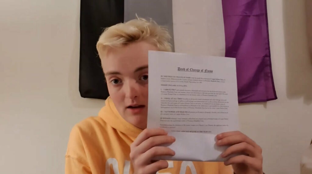
Naturally, I was delighted, not least because it gives me an excuse to use the “deed poll” and “music” tags simultaneously on a post for the first time.
Don’t ask me what my “real” name is,
I’ve already told you what it was,
And I’m planning on burning my birth certificate.
The song’s about discovering and asserting self-identity through an assumed, rather than given, name. Which is fucking awesome.
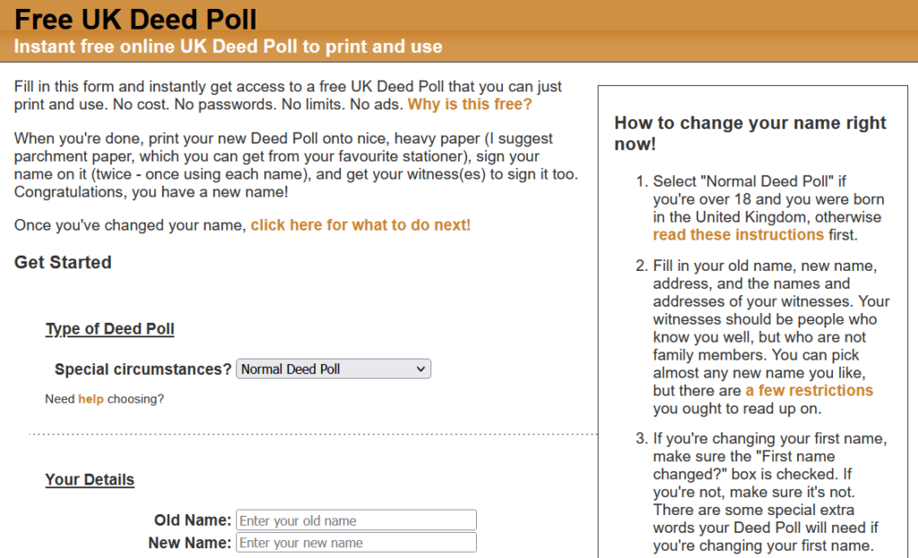
The website’s basically unchanged for most of a decade and a half, and… umm… it looks it. I really ought to get around to improving and enhancing it someday.
Like virtually all of my sites, including this one, freedeedpoll.org.uk deliberately retains minimal logs and has no analytics tools. As a result, I have very little concept of how
popular it is, how widely it’s used etc., except when people reach out to me.
People do: I get a few emails every month from people who’ve got questions1,
or who are having trouble
getting their homemade deed poll accepted by troublesome banks. I’m happy to help them, but without additional context, I can’t be sure whether these folks represent the entirety of the
site’s users, a tiny fraction, or somewhere in-between.
So it’s obviously going to be a special surprise for me to have my website featured in a song.
I’ve been having a challenging couple of weeks2,
and it was hugely uplifting for me to bump into these appreciative references to my work in the wider Internet.
Footnotes
1 Common questions I receive are about legal gender recognition, about changing the names
of children, about changing one’s name while still a minor without parental consent, or about citizenship requirements. I’ve learned a lot about some fascinating bits of law.