I was pretty ill yesterday. It’s probably a combination of post-flood stress and my shitty lungs’ ability to take a sore throat and turn it into something that leaves me lying in bed
and groaning.
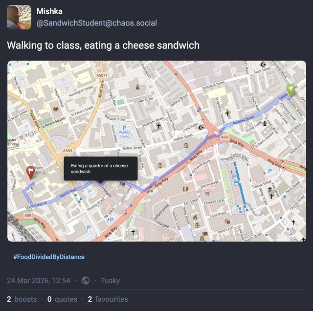
I spent most of the morning in and out of a fitful sleep, during which I dreamed up the most-bizarre application: a GPS tracker app that, after being told your destination and what you
were eating, reported your journey progress to social media by describing where you were going and how much of your food was left1.
The “eating progress” could either be updated to the status itself or overlaid onto a map of the route.
I should be clear that in the dream, I wasn’t the one that invented this concept; in fact, I didn’t even understand it at first (maybe I still don’t!). In the dream I was
at some kind of unconference event with a variety of “make art with the Web” types, and I missed a session by falling asleep2. I woke
(within the dream) right before the session ended and rushed in to see what was being presented, and only got the tail-end of the explanation of how a project – this
project – worked, after which I felt rushed to try to understand it before somebody inevitably tried to talk to me about it.
For times you’re disconnected or otherwise unable to self-track, tools like FlightRadar could step in.
I’m probably not going to implement this. It is, in the end, the kind of stupidity that could (should?) only appear in the dreams of somebody who’s got a bad head cold.
But if you manage to take this idea and turn it into something… actually good?… let me know!
Or if you’ve just got a cool, “Web 2.0-ey” idea for the name of an app that tracks both your journey progress and your meal consumption, I’d love to hear that too.
Footnotes
1 Under the assumption that its consumption would be evenly distributed throughout the
journey. Because everybody does that, right? Counting the number of steps they make before taking another equal-sized bite. Right?
2 Even in my dreams, I can dream of falling asleep. And, sometimes, of dreaming. A fever
probably helps.
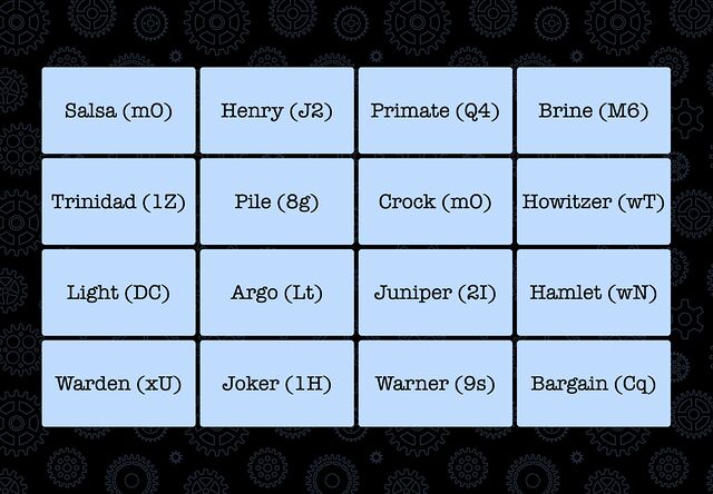
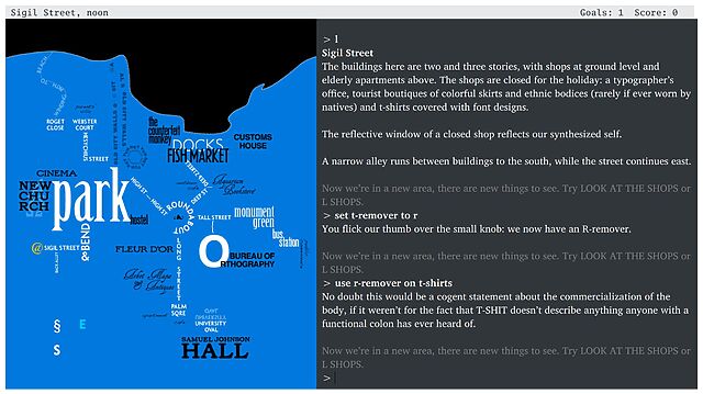
The other day I needed to solve a puzzle1. Here’s the essence of it: there was a grid of 16 words. They needed to be organised into four thematic “groups” of four words each;
then each group needed to be sorted alphabetically.
Each item in each group had a two-character code associated with it: these were to be concatenated together into a string and added to a pastebin.com/... URL. The correct
four URLs would each contain a quarter of the answer to the puzzle.
Apparently this puzzle format is called “Only Connect” and is based on a TV show?2
I’m sure I could have solved the puzzle. But I figured it’d be more satisfying to solve a different puzzle, with the same answer: how to write a program
that finds the correct URLs for me.
I’m confident that this approach was faster.3
Or rather: it would have been if it hadn’t been for the fact that I felt the need to subsequently write a blog post about it.
Here’s how it works:
It creates an array containing the 43,680 possible permutations of 4 from the 16 words.
If sorts the permutations and removes duplicates, reducing the set to just 1,820.
It removes the bit of each that isn’t the two digit code at the end and concatenates them into a URL.
It tries each URL, with short random gaps between them, listing each one that isn’t a 404 “Not found” response.4
I kicked off the program and got on with some work. Meanwhile, in the background, it permuted the puzzle for me. Within a few minutes, I had four working pastebin URLs, which
collectively gave me the geocache’s coordinates. Tada!
Was this cheating?
I still solved a puzzle. It probably took me, as a strong programmer, about as long as it would have taken me to solve the puzzle the conventional way were I a strong… “only
connect”-er5.
But I adapted the puzzle into a programming puzzle and solved it a completely different way, . Here’s the arguments, as I see them:
Yes, this was cheating. This wasn’t the way the puzzle author intended it to be solved. Inelegantly brute-forcing a problem isn’t “solving” it, it’s sidestepping
it. If everybody did this, there’d be no point in the author putting the time into the puzzle in the first place.
No, this wasn’t cheating. This solution still required solving a puzzle, just a different one. A bad human player making a lucky guess would be fine. It’s
a single-player game; play any way that satisfies you. Implementing software to assist is no worse than asking a friend for help, as others have done.
Click on a 😡 or a 🧠 to let me know whether you think I cheated or not, or drop me a comment if you’ve got a more-nuanced opinion.
2 Don’t try to solve this one; it’s randomly generated.
3 This version of the program is adapted to the fake gameboard I showed earlier. You won’t
get any meaningful results by running this program in its current state. But you could quickly adapt it to a puzzle of this format, I suppose.
4 It occurred to me that it could have been more-efficient to eliminate from the list any
possibilities that are ruled-out by any existing finds… but efficiency is a balancing act. For a program that you’ll only run once – and in the background, while you do other things,
to boot – there’s a tipping point at which it’s better to just get it running than it is to improve its performance.
5 There’s a clear parallel here to the various ways in which I’ve
solved jigsaw-puzzle-based geocaches, because I’m far more interested in (a) programming and (b) getting out into the world and finding geocaches in interesting places than I am
in doing a virtual jigsaw puzzle!
People being unwilling to discuss their wild claims later using the lack of discussion as evidence of widespread acceptance.
When people balance the new toilet roll one atop the old one’s tube.3
Come on! It would have been so easy!
Shellfish. Why would you eat that!?
People assuming my interest in computers and technology means I want to talk to them about cryptocurrencies.4
Websites that nag you to install their shitty app. (I know you have an app. I’m choosing to use your website. Stop with the banners!)
People who seem to only be able to drive at one speed.5
The assumption that the fact I’m “sharing” my partner is some kind of compromise on my part; a concession; something that I’d “wish away” if I could.
(It’s very much not.)
Brexit.
Wow, that was strangely cathartic.
Footnotes
1 I have a special pet hate for websites that require JavaScript to render their images.
Like… we’d had the<img>tag since 1993! Why are you throwing it away and replacing it with something objectively slower, more-brittle, and
less-accessible?
2 Or, worse yet, claiming
that my long, random password is insecure because it contains my surname. I get that composition-based password rules, while terrible (even when they’re correctly
implemented, which they’re often not), are a moderately useful model for people to whom you’d otherwise struggle to
explain password complexity. I get that a password composed entirely of personal information about the owner is a bad idea too. But there’s a correct way to do this, and it’s not “ban
passwords with forbidden words in them”. Here’s what you should do: first, strip any forbidden words from the password: you might need to make multiple passes. Second, validate the
resulting password against your composition rules. If it fails, then yes: the password isn’t good enough. If it passes, then it doesn’t matter that forbidden words
were in it: a properly-stored and used password is never made less-secure by the addition of extra information into it!
It’s F-Day plus 31 – a whole month (and a bit; thanks February) since our house filled with water and rendered us kinda-homeless.
We continue to live out of a series of AirBnB-like accommodations, flitting from place to place after a week or fortnight. I can’t overstate how much this feels like a hundred tiny
inconveniences, piling up in front of me all at once and making it hard to see “past” them.
Our current two-week stint is spent at a place that’s perfectly delightul… but it’s not home.
They’re all small potatoes compared to the bigger issue of, y’know… our house being uninhabitable. But they’re still frustrating.
I’m talking about things like discovering your spare toothbrush heads are at the “wrong” house. Or having to take extra care to plan who’s going to use which car to go to the office
because the kids and the dog need dropping off (because our lives were all optimised for our local walking and bus routes). It’s a level of cognitive load that, frankly, I could do
without.
I’m trying to look on the bright side. One particular highlight was JTA and I discovering the epic pizza restaurant inside the brewery that’s about four minutes walk from where we’re living, right now.
Meanwhile, any relief is slow to come. We’re still without a medium-term plan for somewhere to live, because even though the insurance company has pulled their finger out
and agreed to pay for say six months of rental of a place, we’re struggling to find a suitable property whose landlord is open to such a
short-term let.
When the house first flooded and friends told me that I’d be faced with manymonths of headaches, I figured this was hyperbole. Or that, somehow, with the epic
wrangling and project management skills of Ruth, JTA and I combined, that we’d be able to accelerate the process somewhat. Little did I know
that so many of the problems wouldn’t be issues of scale or complexity but of bureaucracy and other people’s timescales. Clearly,
we’re in it for the long haul.
It feels silly that we’re still in the first quarter of this 2026 and already I’m looking forward to next year and the point where we can look back and laugh, saying “ah,
remember 2026: the year of the flood?” Sigh.
My recent post How an RM Nimbus Taught Me a Hacker Mentality kickstarted several conversations, and I’ve enjoyed talking to people about the “hacker
mindset” (and about old school computers!) ever since.1
Thinking “like a hacker” involves a certain level of curiosity and creativity with technology. And there’s a huge overlap between that outlook and the attitude required to
be a security engineer.
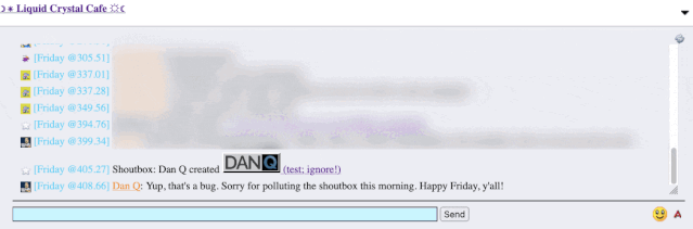
By way of example: I wrote a post for a Web forum2
recently. A feature of this particular forum is that (a) it has a chat room, and (b) new posts are “announced” to the chat room.
It’s a cute and useful feature that the chat room provides instant links to new topics.
The title of my latest post contained a HTML tag (because that’s what the post was talking about). But when the post got “announced” to the chat room… the HTML tag seemed to have
disappeared!
And this is where “hacker curiosity” causes a person to diverge from the norm. A normal person would probably just say to themselves “huh, I guess the chat room doesn’t show HTML
elements in the subjects of posts it announces” and get on with their lives. But somebody with a curiosity for the technical, like me, finds themselves wondering exactly
what went wrong.
It took only a couple of seconds with my browser’s debug tools to discover that my HTML tag… had actually been rendered to the page! That’s not good: it means that, potentially, the
combination of the post title and the shoutbox announcer might be a vector for an XSS attack. If I wrote a post with a title of, say, <script
src="//example.com/some-file.js"></script>Benign title, then the chat room would appear to announce that I’d written a post called “Benign title”, but anybody viewing it
in the chat room would execute my JavaScript payload3.
I reached out to an administrator to let them know. Later, I delivered a proof-of-concept: to keep it simple, I just injected an <img> tag into a post title and, sure
enough, the image appeared right there in the chat room.
Injecting an 88×31 seemed like a less-disruptive proof-of-concept than, y’know, alert('xss'); or something!
This didn’t start out with me doing penetration testing on the site. I wasn’t looking to find a security vulnerability. But I spotted something strange, asked
“what can I make it do?”, and exercised my curiosity.
Even when I’m doing something more-formally, and poking every edge of a system to try to find where its weak points are… the same curiosity still sometimes pays dividends.
And that’s why you need that mindset in your security engineers. Curiosity, imagination, and the willingness to ask “what can I make it do?”. Because if you don’t find the loopholes,
the bad guys will.
Footnotes
1 It even got as far as the school run, where I ended up chatting to another parent about
the post while our kids waited to be let into the classroom!
2 Remember forums? They’re still around, and – if you find one with the right group of
people – they’re still delightful. They represent the slower, smaller communities of a simpler Web: they’re not like Reddit or Facebook where the algorithm will always find something
more to “feed” you; instead they can be a place where you can make real human connections online, so long as you can deprogram yourself of your need to have an endless-scroll of
content and you’re willing to create as well as consume!
3 This, in turn, could “act as” them on the forum, e.g. attempting to steal their
credentials or to make them post messages they didn’t intend to, for example: or, if they were an administrator, taking more-significant actions!
Where could I possibly start this list if not with eccentric games-as-art proponent Pippin Barr. Created in 2016, It is as if you were
playing chess is an interactive experience that encourages you to mimic the physical movements of playing a digital chess game, without actually ever looking at a chessboard.
It’s a 67-second portrait video featuring four partially-dressed young men somewhere in what looks like Tyneside. Two of them kiss before one of the pair swigs from a spirits bottle and
takes a drag from a cigarette, throwing both onto the floor afterwards3.
Finally, the least-dressed young man (seemingly with the consent of all involved) repeatedly strikes the drinker/smoker with a folding chair.
It’s… quite something.
Unless you watch the video and then play the game, it’s hard to explain quite how faithful a recreation it is… and yet it also permits you to subvert the story, by
changing the order of events, how passionately the lads kiss, how much alcohol is consumed (or spilled), how long to drag on the cigarette, or the level of aggression in the chair
strikes. Also, there’s an easter egg if you manage to beat the victim enough…
In his blog post Hard Lads as an important failure, the game’s creator
Robert Yang describes it as “neorealist fumblecore”, and goes into wonderful detail about the artistic choices he made in creating it. The game is surreal, queer, and an absolute
masterpiece.
Let’s sidestep a moment out of video games and take a look at a book.
Top Ten Games You Can Play In Your Head By Yourself, edited by Sam Gorski (founder of Corridor Digital) and D. F. Lovett and based on an original series of gamebooks written pseudonymously by “J. Theophrastus Bartholomew”, initially looks like exactly what it
claims to be. That is, a selective reprint of a very-1980s-looking series of solo roleplaying game prompts.
Except that’s clearly a lie. There’s no evidence that J. Theophrastus Bartholomew exists as an author (even used as a pen name), nor do any of the fourteen books credited to him in the
foreword. The alleged author only as a framing device by the actual authors: the “editors”.
Seriously, what even is this book?
Superficially, the book presents a series of ten… “prompts”, I suppose. It’s like reading the rules of a Choose Your Own Adventure gamebook, or else the flavour and background in
an Advanced Dungeons & Dragons module.
Each prompt sets up a premise and describes it as if it would later integrate with a ruleset… but no ruleset is forthcoming. Instead, completing the story and also how
to go about completing the story is left entirely up to the reader.
It’s disarming, like if a recipe book consisted of a list of dishes and cuisines, a little about the history and culture of each… and no instructions on how to make it.
But what’s most-weird about the book (and there’s plenty more besides) are the cross-references between the chapters4.
Characters from one adventure turn up in another. Interstitial “Shadows and Treasures” chapters encourage you to reflect upon previous adventures and foreshadow those that follow.
There’s more on its RPGGeek page (whose existence surprised me!), along with a blog post by Lovett. They’re doing a horror-themed sequel, which I
don’t feel the need to purchase, but I’d got to say from what I’ve seen so far that they’ve once-again really nailed the aesthetic.
I have no idea who the book is “for”, but it’s proven surprisingly popular in some circles.
What is Mackerelmedia Fish? I’ve had a thorough and pretty complete experience of it, now, and I’m still not sure. It’s one or more (or
none) of these, for sure, maybe:
A point-and-click, text-based, or hypertext adventure?
A statement about the fragility of proprietary technologies on the Internet?
An ARG set in a parallel universe in which the 1990s never ended?
A series of surrealist art pieces connected by a loose narrative?
…
What I can tell you with confident is what playing feels like. And what it feels like is the moment when you’ve gotten bored waiting for page 20 of Argon Zark to finish appear so you decide to reread your already-downloaded copy of the 1997 a.r.k bestof book, and for a moment you think to yourself: “Whoah; this must be what living in the
future feels like!”
…
Mackerelmedia Fish is a mess of half-baked puns, retro graphics, outdated browsing paradigms and broken links. And that’s just part of what makes it great.
Historical fact: escaped fish was one of the primary reasons for websites failing in 1996.
Just because I wrote about it before doesn’t mean that you shouldn’t play it now, especially if you missed out on it during the insanity of Lockdown
1.0.
As an amateur beekeeper, semi-professional game designer, and generally pedantic person, I decided to play all the games I could find on the subject and rate them
according to their “realism”. The rating goes from one (⬢⬡⬡⬡⬡) to five (⬢⬢⬢⬢⬢) honeycomb cells.
I intentionally avoided all the games in which bees are completely anthropomorphized or function like a spaceship, and games in which bees play a secondary role. I did include short
and semi-abstract games when they referenced the bees actual behavior. Realism is not a matter of visual definition or sheer procedural complexity. In my view, even a tiny game can
capture something compelling about this fascinating insect.
Ha-bee-tat is one of only four games to which Paolo awards a full five honeycombs. And Paolo is picky, so that’s high praise indeed for the realism of this game,
which is – get this – also surprisingly educational on the subject of different species of bee! Neat!
This Twine-based adventure was released for my last Halloween at the Bodleian, based mostly upon the work of my then-colleague Brendon Connelly. We were aiming for something slightly unnerving, slightly Lovecraftian… and very Bodleian Libraries.
The Bodleian’s Comms team and I came up with all kinds of imaginative and unusual ways to engage with the wider world, of which this was just one.
Obviously I’ve written about it before, but if I can just take a moment to explain what we were going for, which didn’t come out in any of
the IFDB reviews or anything:
The story is cyclical: the protagonist keeps waking up, completely alone, in a seemingly abandoned world, having nodded off half way through The Shadow Out of Time in a Bodleian reading room. As they explore the eerie and empty world5, the protagonist catches vague
glimpses of another figure moving around the space as well, always just out of reach in the distance or beyond a window. There are even hints that this other person has been following
them: a book left open can be found closed again, or vice-versa, for example.
Eventually, exhausted, the character needs to rest, waking up again6 in order to continue their explorations, and it gradually becomes apparent that they are the ghost
that haunts the library. The shadows they’re witnessing are echoes of their past and future self, playing through the permutations of the game as they remain trapped in an endless and
futile chase with their own tail.
When I first wrote about this video, I remarked that it was sad that it was under-loved, attracting only a few hundred views on YouTube and only a
couple of dozen “thumbs up”. Six years on… I’m sad to say it’s not done much better for popularity, with low-thousands of views and, like, six-dozen “thumbs up”. Possibly
this (lack of) reaction is (part of the reason) why its creator Yaz Minsky has kind-of gone quiet online these last few years.
I always thought that this staircase looked like something out of an early Zelda game. Now it can sound like it too.
So what it is?
Well, you know how you’ve probably never seen Metropolis with a musical score quite like the one
composer Gottfried Huppertz intended? Well this… doesn’t solve that problem. Instead it re-scores the film with video game
soundtracks from the likes of Metroid, Castlevania, Zelda, Mega Man, Final Fantasy, Doom,Kirby, and
F-Zero, among others.
And it… works. It still deserves more love, so if you’ve got a spare couple of hours, put it on!
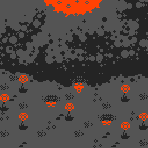
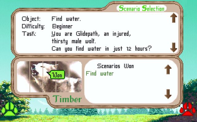
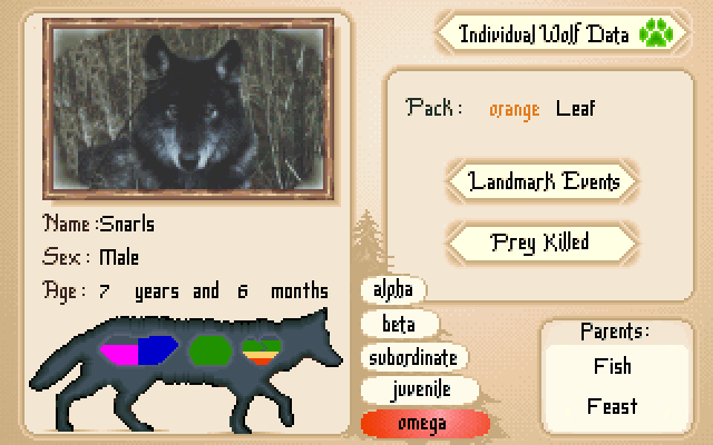
Like Ha-bee-tat, this is a realistic, pixelated, educational video game about nature. It came out in 1994 but I didn’t get around to playing it until twenty-five years
later in 2019, when I accidentally discovered it while downloading Wolfenstein to my DOSBox.
Like many games of its vintage, it’s not always easy. Imagine my delight when my wolf Glidepath, fighting his injury, managed to find water without getting shot by a human
(and it only took like five attempts).
What you’re seeing is a review of Wolf… but for wolves. I’m not aware of any other posts on that entire site that make the same gag, or
anything like it. That’s weird. And brilliant.
People have done similar thinigs in a variety of ways, but this was one of the most-ambitious:
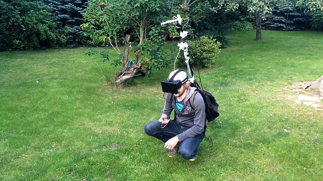
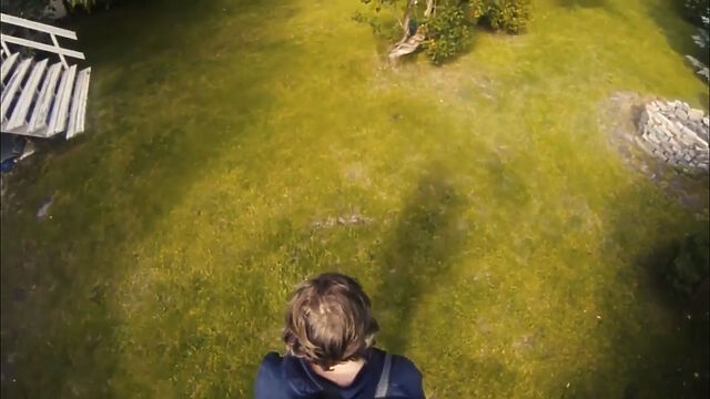
I’m sure the Steam Frame will make light work of this heavyweight rig, but that’s not the point.
As part of a two-day hack project, these folks put together a mechanism to mount some cameras up a pole, from a backpack containing a computer, connected to a VR headset. The idea was
that you’d be able to explore the world with the kind of “over-the-shoulder cam” that you might be used to in some varieties of videogame.
Theirs was just an experiment in proving what was possible within a “real world” game world. But ever since I saw this video, I’ve wondered about the potential to make what is
functionally an augmented reality game out of it. With good enough spatial tracking, there’d be nothing to stop the world as-shown-to-your-eyes containing objects
that aren’t present in the real world.
Like… what if you were playing Pokemon Go, but from a top down view of yourself as you go around and find creatures out and about in the real world. Not just limited to looking
through your phone as a lens, you’d be immersed in the game in a whole new way.
More “above the head” than “over the shoulder”, but the principle’s much the same.
I’m also really interested in what the experience of seeing yourself from the “wrong” perspective is like. Is it disassociating? Nauseating? Liberating? I’m sure we’ve all done one of
those experiments where, by means of mirrors or props, we experience the illusory sensation of our hand being touched when
it’s not actually our hand. What’s that like when you’re able to visually step completely out of your own body, and yet still move and feel
it perfectly?
There are so many questions that this set-up raises, and I’m yet to see anybody try to answer them.
Even folks who are familiar with the NetHack idiom The DevTeam Thinks Of Everything are still likely to be
impressed with the sheer diversity of objects and their interactions available in Counterfeit Monkey.
What makes it weird? The fact that there’s not really anything else quite like it. Within your first half hour or so of play you’ll probably have acquired your core toolkit – your
full-alphabet letter remover, restoration gel, and monocle – and you’ll begin to discover that you can do just about anything with anything.
Find some BRANDY (I’m don’t recall if there is any in the game; this is just an example) and you can turn it into a BRAND, then into some BRAN,
then into a BRA7. And while there might not exist any puzzles in the game for which you’ll need a bra, each of these items will have a
full description when you look at it. Can you begin to conceive of the amount of work involved in making a game like this?
It’s now over a decade old and continues to receive updates as a community-run project! It’s completely free8,
and if you haven’t played it yet, congratulations: you’re about to have an amazing time. Pay attention to the tutorial, and be sure to use an interpreter that supports the
UNDO command (or else be sure to SAVE frequently!).
I remain interested in things that push the boundaries of what a “game” is or otherwise make the space “fun and weird”. If you’ve seen something I should see, let me know!
Footnotes
1 The blog post got deleted but the Wayback Machine has a copy.
2 Note you don’t get to see a video of me playing It is as if you were making
love; you’re welcome.
3 Strangely – although it’s hard to say that anything in this video is more-strange than
any other part – one of the “hard lads” friends’ then picks up his fag end and takes a drag
4 This, in case it wasn’t obvious to you already, is likely to be a big clue that the
authors’ claim that each chapter was “found” from somewhere different can be pretty-well dismissed.
5 I wanted it to draw parallels to The Langoliers, a Stephen King short story about a group of people who get trapped alone in “yesterday”.
6 Until they opt to “stay asleep forever”, ending the game.
8Counterfeit Monkey is free, but it was almost charityware: if it turns
out you love it as much as I did then you might follow my lead and make a donation to
Emily’s suggested charity the Endangered Language Fund. Just sayin’.
She sent it to my “send me a postcard” PO box (even though she’s got my actual address), which I’m guessing was an indication that
it was being “sent” to me “as if” she were a stranger on the Internet.
Whatever the reason, it was an uplifting piece of mail to receive.
In other things-are-improving news, our insurance company (finally! – after lots of checks and paperwork at their end) accepted liability for paying for the repairs we’ll need and for
our temporary accommodation (including the places we’ve already been living for the last few weeks).
Last night I was chatting to my friend (and fellow Three Rings volunteer) Ollie about our respective
workplaces and their approach to AI-supported software engineering, and it echoed conversations I’ve had with other friends. Some workplaces, it seems, are leaning so-hard into
AI-supported software development that they’re berating developers who seem to be using the tools less than their colleagues!
That’s a problem for a few reasons, principal among them that AI does not
make you significantly faster but does make you learn less.1. I stand by the statement that AI isn’t useless, and I’ve experimented with it for years. But I certainly wouldn’t feel very comfortable
working somewhere that told me I was underperforming if, say, my code contributions were less-likely than the average to be identifiably “written by an AI”.
Even if you’re one of those folks who swears by your AI assistant, you’ve got to admit that they’re not always the best choice.
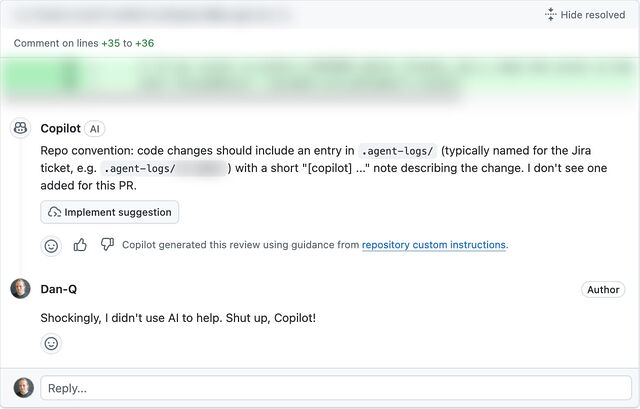
I ran into something a little like what Ollie described when an AI code reviewer told me off for not describing how my AI agent assisted me with the code change… when no AI had been
involved: I’d written the code myself.2
I spoke to another friend, E, whose employers are going in a similar direction. E joked that at current rates they’d have to start tagging their (human-made!) commits with fake
AI agent logs in order to persuade management that their level of engagement with AI was correct and appropriate.3
Supposing somebody like Ollie or E or anybody else I spoke to did feel the need to “fake” AI agent logs in order to prove that they were using AI “the right way”… that sounds
like an excuse for some automation!
I got to thinking: how hard could it be to add a git hook that added an AI agent’s “logging” to each commit, as if the work had been done by a
robot?4
Turns out: pretty easy…
To try out my idea, I made two changes to a branch. When I committed, imaginary AI agent ‘frantic’ took credit, writing its own change log. Also: asciinema + svg-term remains awesome.
Here’s how it works (with source code!). After you make a commit, the post-commit hook creates a file in
.agent-logs/, named for your current branch. Each commit results in a line being appended to that file to say something like [agent] first line of your commit
message, where agent is the name of the AI agent you’re pretending that you used (you can even configure it with an array of agent names and it’ll pick one at
random each time: my sample code uses the names agent, stardust, and frantic).
There’s one quirk in my code. Git hooks only get the commit message (the first line of which I use as the imaginary agent’s description of what it did) after the commit has
taken place. Were a robot really used to write the code, it’d have updated the file already by this point. So my hook has to do an --amend commit, to
retroactively fix what was already committed. And to do that without triggering itself and getting into an infinite loop, it needs to use a temporary environment variable.
Ignoring that, though, there’s nothing particularly special about this code. It’s certainly more-lightweight, faster-running, and more-accurate than a typical coding LLM.
Sure, my hook doesn’t attempt to write any of the code for you; it just makes it look like an AI did. But in this instance: that’s a feature, not a
bug!
Footnotes
1 That research comes from Anthropic. Y’know, the company who makes Claude, one of the
most-popular AIs used by programmers.
3 Using “proportion of PRs that used AI” as a metric for success seems to me to be just
slightly worse than using “number of lines of code produced”. And, as this blog post demonstrates, the
former can be “gamed” just as effectively as the latter (infamously) could.
4 Obviously – and I can’t believe I have to say this – lying to your employer isn’t a
sensible long-term strategy, and instead educating them on what AI is (if anything) and isn’t good for in your workflow is a better solution in the end. If you read this blog post and
actually think for a moment hey, I should use this technique, then perhaps there’s a bigger problem you ought to be addressing!
Samsung have been showing off pre-release versions of their new Galaxy S26 range. It’s all pretty same-old predictable
changes (and I’m still not really looking for anything to replace my now-five-year-old mobile anyway!), but one feature in particular – one that they’re not even mentioning in their
marketing copy – seemed interesting and innovative.
You know those polarising filters you can use to try to stop people shoulder-surfing? Samsung have come up with a software-controlled one.
Demos show the feature being used to black-out the screen at a 15°+ angle when entering a PIN or password, but also show how it can configured on an app-by-app basis to e.g. black out
notifications so that only the person right in front of the screen can see them.
I assume that this black magic is facilitated by an additional layer between the screen and the glass, performing per-pixel selective polarisation in the same way as a monochrome LCD
display might. But the fact that each pixel can now show two images – one to a user directly ahead, superimposed with another (monochrome) one to users with an offset
viewing angle, is what interests me: my long-cultivated “hacker mentality” wants to ask “what I can make that do?”
Does the API of this (of this or of any similar or future screens?) provide enough control to manipulate the new layer? And is its resolution identical to that of the underlying screen?
Could “spoilers”, instead of being folded-away behind a <details>/<summary> or ROT13-encoded, say “tilt to reveal” and provide
a physicality to the mechanism of exposure?
Could diagrams embed their own metadata annotations: look at a blueprint from the side to see descriptions, or tilt your phone to see the alt-text on an image?
Can the polarisation layer be expanded to provide a more-sophisticated privacy overlay, such as a fake notification in place of a real one, to act as a honeypot?
Is there sufficient control over the angle of differentiation that a future screen could use eye tracking to produce a virtual lenticular barrier, facilitating a novel kind of
autostereoscopic 3D display that works – like a hologram – from any viewing angle?
I doubt I’m buying one of these devices. But I’m very curious about all of these questions!
My regular home office of the last six years sits stripped-down, with no flooring, skirting boards, or power (with the exception of the specialised circuit powering an industrial
dehumidifier).
And man, a home insurance claim seems to be… slow. For instance, we originally couldn’t even get anybody out to visit us until F-day plus 10 (later improved to F-day plus
7). The insurance company can’t promise that they’ll confirm that they’ll “accept liability” (agree to start paying for anything) until possibly as late as F-day plus 17. Nobody will
check for structural damage until F-day plus 191.
Right now, though, we’re spending two weeks in this holiday let about half an hour’s drive from our house. It’s pretty nice, except that we have to commute over the ever-congested
single-lane Burford Bridge to get the kids to and from school every day2.
Some days it feels like being stuck in a nowhere-place… but simultaneously still having to make the regular everyday stuff keep ticking over. Visiting the house- currently stripped of
anything damp and full of drying equipment – feels like stepping onto another planet… or like one of those dreams where you’re somewhere familiar except it’s wrong somehow.
But spending time away from it, “as if” on holiday except-not, is weird too: like we’re accepting the ambiguity; leaning-in to limbo. Especially while we’re waiting for the insurance
company to do their initial things, it feels like life is both on hold, and not-allowed to be on hold.
The dog gets it. I had to take her to the house for a while on Monday3 and she spent the whole time leaning against my feet for reassurance.
And I worry that by the time they’re committed to paying for us to stay somewhere else for at least half a year, they lose any incentive they might have to contract for speed. There’s
no hurry any more. We’re expected to just press pause on our home, but carry on with our lives regardless, pretending that everything’s normal.
So yeah, it’s a weird time.
Footnotes
1 I’m totally committed to this way of counting the progress, which I started on F-day plus 3. I get the feeling like it might be a worthwhile way of
keeping track of how long all of this takes.
2 Normally, the younger and older child are able to get to school on foot or via a bus
that stops virtually outside our house, each day, so an hour-plus round-trip to their schools and back up to twice a day is a bit of a drag! We’re managing to make it work with a
little creativity, but I wouldn’t want to make it a long-term plan!
3 And do some work from there, amidst the jet engine-like noise of the dehumidifiers!
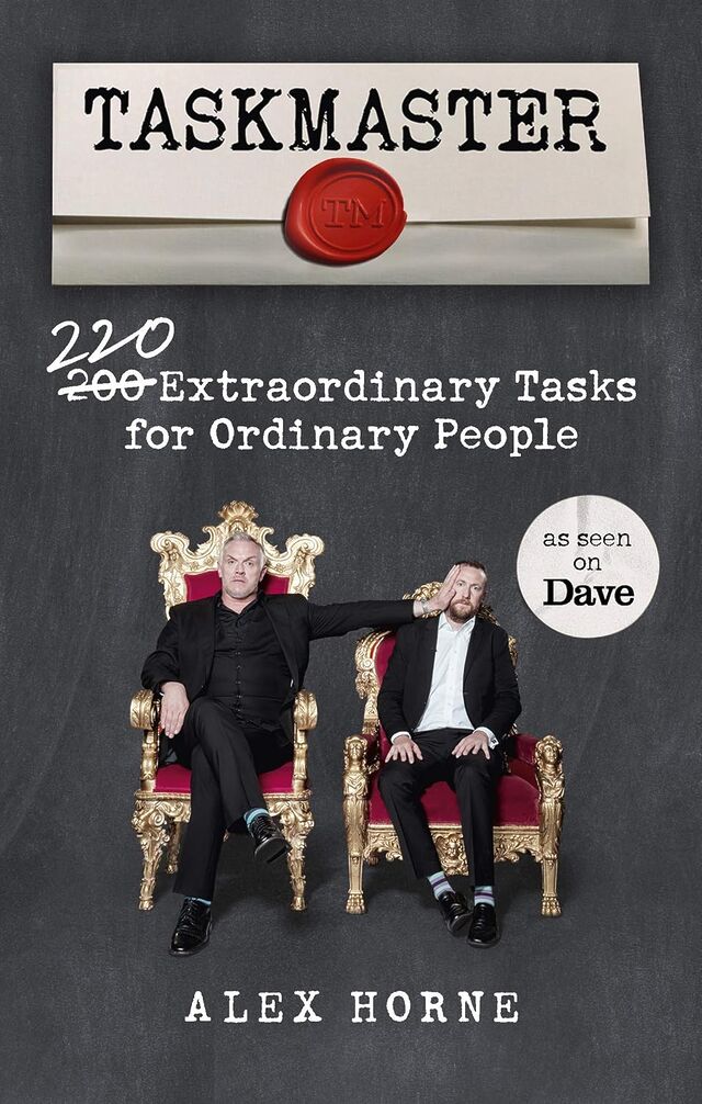
I recently read Taskmaster:
200 220 Extraordinary Tasks for Ordinary People by Alex Horne, and was… underwhelmed.
The meat of the book is a collection of Taskmaster-style tasks either for individuals, or groups, or teams. If you played human
jousting, or blindfold doughnut fishing, or leaky-guttering-water-transporter, or any of the other games Ruth and I hosted at Ruth &
JTA‘s Stag/Hen Party way back in the day… you’re thinking in the right kinds of ballpark. The activities presented are similar to
those shown on the Taskmaster TV show, but with fewer prop requirements.
Perhaps one in ten to one in five of the ideas are genuinely good, but if you want to run your own Taskmaster-like game with your friends… you’re probably best to just
adapt some of the games from the show, or sit down for an hour or two with a notepad, a pen, some funny friends, and a supply of whatever chemical stimulates your imagination!
One part of the book I did enjoy, though, was the accounts of parts of the TV show that didn’t make it into the final edit. I really love the TV show, and it was great to get the inside
scoop on what tasks worked and didn’t, what got cut and why, and so on. This bit of the book, hidden at the end and using a much smaller typeface as if it’s ashamed to be
there, was excellent and highly enjoyable.
Perhaps a future edition could have much more of that – there’ve been many more seasons since the book came out! – and drop some of the less-interesting tasks!
I saw a heron this morning, and it reminded me of a police officer.
If you plot a pair of axes for birds ‘looking really dorky, especially when flying’ and ‘actually being really cool’, the grey heron would sit at the sweet spot.
Right now, while my house is… not-so-inhabitable… I have a long drive to drop the kids off at school, and this morning it took us alongside the
many flooded fields between our temporary accommodation and the various kid drop-offs.
Stopped at traffic lights, I watched a heron land in what would be best-described as a large puddle, rather than in the lake on the other side of the road. The lake, it turns out… was
“guarded” by one of those fake heron things.
I didn’t get a photo of the fake heron, but I can tell you that it was one of those tacky plastic ones, not a fancy-looking metal one like this.1 Photograph copyright Christine Matthews, used under a Creative Commons license.
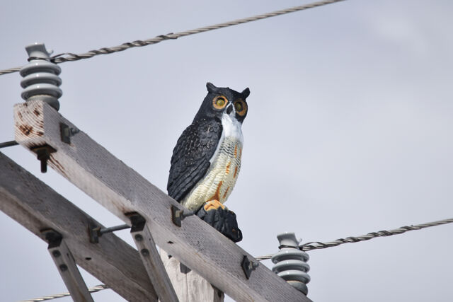
You’ve seen them, probably. People put them up to discourage territorial birds from visiting and eating all their fish.2 If you haven’t seen them, you might have
at least spotted the fake owls, whose purpose is slightly different because they scare off other birds.
Anyway: I found myself thinking… do birds actually fall for this? Like scarecrows, it feels like they shouldn’t (and indeed, scarecrows don’t always work,
and birds can quickly become accustomed to them). But clearly they work at least a little…?
If you don’t want birds, get a pretend bird. The same trick works for girlfriends.
Anyway, I found myself reminded of a geocaching expedition I went on outside Cambridge a couple of years ago. At
around 6am I was creeping around outside a shopping centre on a Saturday morning, looking for a tiny magnetic geocache hidden behind a sign. I’d anticipated not having to use much
“stealth” so early in the day… but nonetheless I kept getting the feeling that I was being watched.
It took me a few minutes until I worked out why: the local Home Bargains had put up a life-size standee of a police officer in just the right position that I kept catching him in the
corner of my eye and second-guessing how much my digging-through-the-bushes looked incredibly suspicious!
Rationally, I knew that this fella wasn’t real3,
but that didn’t stop him from making my brain go “wait, is that copper watching me hide behind a sign in the empty car park of a budget variety store, like he thinks I’m the world’s
loneliest drug dealer?”
I did a double-take the first time I spotted the officer, but soon realised he was fake. But the feeling of being watched persisted! There’s clearly something deeper in human
psychology, more-instinctive, that – as social animals – gives us that feeling of being watched and influences our behaviour.
There’s a wonderful and much-cited piece of research from 2010 that describes how cooperative behaviour
like proper use of an honesty box increases if you put a picture of some eyes above it: the mechanism’s not fully understood, but it’s speculated that it’s because it induces
the feeling of being watched.
I found this picture of a fake angler (this is a mannequin with a fishing pole!), which I guess is also an anti-heron measure.4
Photograph copyright Andy Beecroft, used under a Creative
Commons license.
I reckon it’s similar with birds. They’re not stupid (some of them, like corvids, are famously smart… and probably many predator birds exhibit significant intelligence too), but if
there’s something in your peripheral vision that puts you at unease… then of course you’re not going to be comfortable! And if there’s another option nearby5
that’ll work, that’s an easy win for a hungry bird.
You don’t need to actually believe that a scarecrow, a plastic bird, a poster of some eyes, or a picture of a bobby is real in order for it to have a
psychological impact. That’s why – I believe – a fake heron works. And that’s why, today, a heron reminded me of a police officer.
Footnotes
1 I guess actual herons can’t tell the difference?
2 Presumably the same technique doesn’t work with sociable birds, who would probably turn
up to try to befriend or woo the models.
3 I don’t know, but I do wonder, whether the picture is actually of a police
officer or of a model. If I were a police officer and I knew that my likeness was being used at supermarkets and the like, I’d be first to volunteer to any call-outs to anywhere
nearby them, so any suspect who ran from me would keep spotting me, following them, at every corner. You get few opportunities for pranks as a copper, I reckon, but this one would be
a blast.
4 I wonder if a fake angler is more- or less-effective than a fake heron. Somewhere, an
animal psychology PhD student is working out the experimental conditions to answer this question, I hope.
5 Remember: a bird can have a birds-eye view of feeding spots! If one option’s gonna make
them feel like they’re being watched by a predator or a competitor, and another nearby option looks almost-as-good, they’re gonna take the alternative!
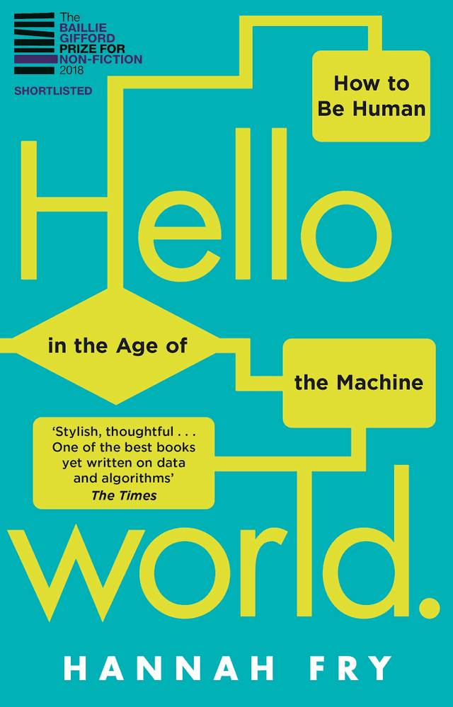
I’m not certain, but I think that I won my copy of Hello World: How to Be Human in the Age of the Machine at an Oxford Geek Nights event, after I was
first and fastest to correctly identify a photograph of Stanislav Petrov shown by the speaker.
Despite being written a few years before the popularisation of GenAI, the book’s remarkably prescient on the kinds of big data and opaque decision-making issues that are now hitting the
popular press. I suppose one might argue that these issues were always significant. (And by that point, one might observe that GenAI isn’t living up to its promises…)
Fry spins an engaging and well-articulated series of themed topics. If you didn’t already have a healthy concern about public money spending and policy planning being powered by the
output of proprietary algorithms, you’ll certainly finish the book that way.
One of my favourite of Fry’s (many) excellent observations is buried in a footnote in the conclusion, where she describes what she called the “magic test”:
There’s a trick you can use to spot the junk algorithms. I like to call it the Magic Test. Whenever you see a story about an algorithm, see if you can swap out any of the buzzwords,
like ‘machine learning’, ‘artificial intelligence’ and ‘neural network’, and swap in the word ‘magic’. Does everything still make grammatical sense? Is any of the meaning lost? If
not, I’d be worried that it’s all nonsense. Because I’m afraid – long into the foreseeable future – we’re not going to ‘solve world hunger with magic’ or ‘use magic to write the
perfect screenplay’ any more than we are with AI.
That’s a fantastic approach to spotting bullshit technical claims, and I’m totally going to be using it.
Anyway: this was a wonderful read and I only regret that it took me a few years to get around to it! But fortunately, it’s as relevant today as it was the day it was released.
The insurance loss adjusters came around this morning, accompanied by damage assessors and electricians and whatnot.
The process continues to feel painfully slow. We’re still one to two weeks from confirmation that the insurance company will accept liability and be ready to start paying for, y’know,
the immediate concerns like where we’re going to live.
“How long should we plan on renting another house to live in?” I asked, warily.
“Six to twelve months?” guessed the loss adjusters.
As I’ll demonstrate, it’s surprisingly easy to spin up your own VPN provider on a virtual machine hosted by your choice of the cloud providers. You pay for the hours you need
it2,
and then throw it away afterwards.
If you’d prefer to use GCP, AWS Azure, or whomever else you like: all you need is a Debian 13 VM with a public IP address (the cheapest one available is usually plenty!)
and this bash script.
If you prefer the command-line, Linode’s got an API. But we’re going for ‘easy’ today, so it’ll all be clicking buttons and things.
First, spin up a VM and run my script3.
If you’re using Linode, you can do this by going to my StackScript and clicking ‘Deploy New Linode’.
You might see more configuration options than this, but you can ignore them.
Choose any region you like (I’m putting this one in Paris!), select the cheapest “Shared CPU” option – Nanode 1GB – and enter a (strong!) root password, then click Create Linode.
It’ll take a few seconds to come up. Watch until it’s running.
Don’t like SCP? You can SSH in and ‘cat’ the configuration or whatever else you like.
My script automatically generates configuration for your local system. Once it’s up and running you can use the machine’s IP address to download wireguard.conf locally. For
example, if your machine has the IP address 172.239.9.151, you might type scp -o StrictHostKeyChecking=no root@172.239.9.151:wireguard.conf ./ – note that I
disable StrictHostKeyChecking so that my computer doesn’t cache the server’s SSH key (which feels a bit pointless for a “throwaway” VM that I’ll never connect to a second time!).
If you’re on Windows and don’t have SSH/SCP, install one. PuTTY remains a solid choice.
File doesn’t exist? Give it a minute and try again; maybe my script didn’t finish running yet! Still nothing? SSH into your new VM and inspect
stackscript.log for a complete log of all the output from my script to see what went wrong.
Not got WireGuard installed on your computer yet? Better fix that.
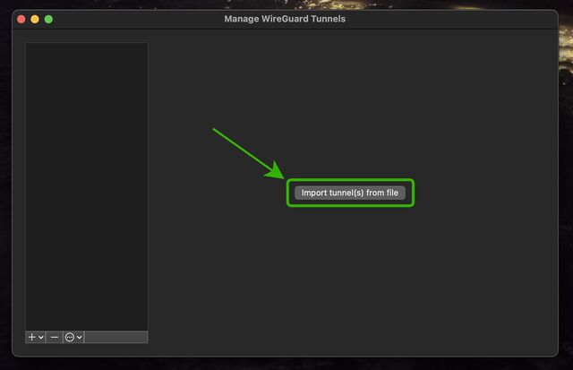
Open up WireGuard on your computer, click the “Import tunnel(s) from file” button, and give it the file you just downloaded.
You can optionally rename the new connection. Or just click “Activate” to connect to your VPN!
If you see the ‘data received’ and ‘data sent’ values changing, everything’s probably working properly!
You can test your Internet connection is being correctly routed by your VPN by going to e.g. icanhazip.com or ipleak.net: you should see the IP address of your new virtual machine and/or geolocation data that indicates that you’re in your selected region.
When you’re done with your VPN, just delete the virtual machine. Many providers use per-minute or even per-second fractional billing, so you can easily end up spending only a handful of
cents in order to use a VPN for a reasonable browsing session.
Again, you can script this from your command-line if you’re the kind of person who wants a dozen different locations/IPs in a single day. (I’m not going to ask why.)
When you’re done, just disconnect and – if you’re not going to use it again immediately – delete the virtual machine so you don’t have to pay for it for a minute longer than you
intend4.
I stopped actively paying for VPN subscriptions about a decade ago and, when I “need” the benefits of a VPN, I’ve just done things like what I’ve described above. Compared to a
commercial VPN subscription it’s cheap, (potentially even-more) private, doesn’t readily get “detected” as a VPN by the rare folks who try to detect such things, and I can enjoy my
choice of either reusable or throwaway IP addresses from wherever I like around the globe.
And if the government starts to try to age-gate commercial VPNs… well then that’s just one more thing going for my approach, isn’t it?
Footnotes
1 If you’re a heavy, “always-on” VPN user, you might still be best-served by one of the
big commercial providers, but if you’re “only” using a VPN for 18 hours a day or less then running your own on-demand is probably cheaper, and gives you some fascinating
benefits.
2 Many providers have coupons equivalent to hundreds of hours of free provision, so as
long as you’re willing to shuffle between cloud providers you can probably have a great and safe VPN completely for free; just sayin’.
3 Obviously, you shouldn’t just run code that strangers give you on the Internet unless
you understand it. I’ve tried to make my code self-explanatory and full of comments so you can understand what it does – or at least understand that it’s harmless! – but if you don’t
know and trust me personally, you should probably use this as an excuse to learn what you’re doing. In fact, you should do that anyway. Learning is fun.
4 Although even if you forget and it runs for an entire month before your billing cycle
comes up, you’re out, what… $5 USD? Plenty of commercial VPN providers would have charged you more than that!


