Debian + DKIM for Dummies

Earlier this year, for reasons of privacy/love of selfhosting, I moved the DanQ.me mailing list from Mailchimp to Listmonk (there’s a blog post about how I set it up), relaying outbound messages via an SMTP server provided by my domain registrar, Gandi.

Subscribe for email updates, or discover other ways to subscribe:

Email no more than
I assume that you knew that you can get an email, no more than once per day or once per week (your choice!) of what I get up to online, right? Email not your jam: there are plenty of other options too!

Unfortunately, Gandi recently announced that they’ll no longer be providing email services for free, so rather than fork out €4/month for an email address I won’t even read, I decided to inhouse it.

And because I learned a few things while doing so, I wrote this blog post so that next time I have to configure Postfix + DKIM, I’ll know where to find a guide. If it helps you in the meantime, that’s just a bonus.

Photograph of a French Bulldog on a wooden floor playing tug-of-war using a multicoloured plaited rope (the human holding the other end of the rope is behind the camera).
If the first rule of computing is “never roll your own crypto” (based on Schneier’s Law), the second rule might be “don’t run your own mailserver”. I don’t have a good picture to illustrate that, so here’s a photo of my dog playing tug-of-war.

Postfix

Running your own mailserver is a pain. I used to do it for all of my email, but – like many other nerds – when spam reached its peak and deliverability became an issue, I gave up and oursourced it1.

Screenshot of a Weekly Digest email from DanQ.me, showing in Mozilla Thunderbird.
Fun fact: when I’m at my desktop, I use a classic desktop email application for my personal email, like it’s the 90s or something2.
Luckily, I don’t need it to do much. I just need a mail transfer agent with an (unauthenticated, but local-only) SMTP endpoint: something that Listmonk can dump emails into, which will then reach out to the mailservers representing each of the recipients and relay them on. A default install of Postfix does all that out-of-the-box, so I ran sudo apt install postfix, accepted all the default options, and put the details into Listmonk.
Screenshot showing Listmonk's SMTP configuration screen. The host "192.168.2.12" and port "25" have been entered, TLS has been set to "STARTTLS", Skip TLS verification is enabled, and Auth Protocol is set to "None".
Listmonk makes adding an SMTP server very easy, and even includes a quick “test connection” link with which you can try out your settings.

Next, I tweaked my DNS configuration to add an SPF record, and tested it. This ought to have been enough to achieve approximate parity with what Gandi had been providing me with. Not bad.

$ dig +short -t TXT danq.link
"v=spf1 a mx a:fox.q-t-a.uk ip4:83.151.206.115 ~all"
You really can’t be doing without an SPF record as a minimum these days.

I sent a test email to a Gmail account, where I noticed two problems:

Screenshot from GMail showing a message with a red slashed padlock icon, which when clicked advises that "mail.danq.link did not encrypt this message".
It turns out that since the last time I ran a mailserver “for real”, the use of TLS for inter-server communication has become… basically mandatory. You don’t strictly have to do it, but if you don’t, some big email providers will put scary security warnings on your messages. This is a good thing.

The first problem was that Postfix on Debian isn’t configured by-default to use opportunistic TLS when talking to other mailservers. That’s a bit weird, but I’m sure there’s a good reason for it. The solution was to add smtp_tls_security_level = may to my /etc/postfix/main.cf.

The second problem was that without a valid DKIM signature on them, about half of my test emails were going straight to the spam folder. Again, it seems that since the last time I seriously ran a mailserver 20 years ago, this has become something that isn’t strictly required… but your emails aren’t going to get through if you don’t.

I’ve put it off this long, but I think it’s finally time for me to learn some practical DKIM.

Understanding DKIM

What’s DKIM, then?

Diagram illustrating the flow of email from sender to recipient. On the way it's signed by the sender's mailserver's private key, which publishes the public key via DNS. Further along, the recipient's mailserver retreives the public key and uses it to verify the signature.
I’ve already got an elementary understanding of how DKIM works, which I’ll summarise below.
  1. A server that wants to send email from a domain generates a cryptographic keypair.
  2. The public part of the key is published using DNS. The private part is kept securely on the server.
  3. When the server relays mail on behalf of a user, it uses the private key to sign the message body and a stated subset of the headers3, and attaches the signature as an email header.
  4. When a receiving server (or, I suppose, a client) receives mail, it can check the signature by acquiring the public key via DNS and validating the signature.

In this way, a recipient can be sure that an email received from a domain was sent with the authorisation of the owner of that domain. Properly-implemented, this is a strong mitigation against email spoofing.

OpenDKIM

To set up my new server to sign outgoing mail, I installed OpenDKIM and its keypair generator using sudo apt install opendkim opendkim-tools. It’s configuration file at /etc/opendkim.conf needed the following lines added to it:

# set up a socket for Postfix to connect to:
Socket inet:12301@localhost

# set up a file to specify which IPs/hosts can send through us without authentication and get their messages signed:
ExternalIgnoreList      refile:/etc/opendkim/TrustedHosts
InternalHosts           refile:/etc/opendkim/TrustedHosts

# set up a file to specify which selector/domain are used to each incoming email address:
SigningTable            refile:/etc/opendkim/SigningTable

# set up a file to specify which signing key to use for each selector/domain:
KeyTable                refile:/etc/opendkim/KeyTable

Into /etc/opendkim/TrustedHosts I put a list of local IPs/domains that would have their emails signed by this server. Mine looks like this (in this example I’m using example.com as my domain name, and default as the selector for it: the selector can be anything you like, it only matters if you’ve got multiple mailservers signing mail for the same domain). Note that 192.168.0.0/16 is the internal subnet on which my sending VM will run.

127.0.0.0.1
::1
192.168.0.0/16
*.example.com
example.com

/etc/opendkim/SigningTable maps email addresses (I’m using a wildcard) to the subdomain whose TXT record will hold the public key for the signature. This also goes on to inform the KeyTable which private key to use:

*@example.com default._domainkey.example.com

And then /etc/opendkim/KeyTable says where to find the private key for that:

default._domainkey.example.com example.com:default:/etc/opendkim/keys/example.com/default.private

Next, we need to create and secure that keypair. In /etc/opendkim/keys/example.com/, we run:

sudo opendkim-genkey -s default -d example.com
sudo chown opendkim:opendkim default.private

At last, we can configure Postfix to filter all mail through OpenDKIM by adding to our /etc/postfix/main.cf file:

milter_protocol = 2
milter_default_action = accept
smtpd_milters = inet:localhost:12301
non_smtpd_milters = inet:localhost:12301

DNS

The public key needs publishing via DNS. Conveniently, when you create a keypair using its tools, OpenDKIM provides a sample (in BIND-style) for you to copy-paste from or adapt: look in /etc/opendkim/keys/example.com/default.txt!

Screenshot from Gandi's Simple DNS management tools, showing danq.link with an SPF record as descibed earlier and a new TXT record on default._domainkey as just described.
Gandi’s DNS “Simple View” is great for one-off and quick operations, but I really appreciate that they have a BIND-style syntax “Advanced View” for when I’m making bigger and more-complex DNS configuration changes.

Once we’ve restarted both services (sudo service postfix restart; sudo service opendkim restart), we can test it!

Screenshot from GMail showing "DKIM: 'PASS' with domain danq.link".
Once the major email providers – who have the worst spam problem to deal with – say that your email signature looks good, you’re good.

So I learned something new today.

If you, too, love to spend your Saturday mornings learning something new, have a look at those subscription options to decide how you’d like to hear about whatever I get up to next.

Footnotes

1 I still outsource my personal email, and I sing the praises of the excellent folks behind ProtonMail.

2 My desktop email client also doubles as my newsreader, because, yes, of course you can still find me on USENET. Which, by the way, is undergoing a mini-revival

3 Why doesn’t DKIM sign all the headers in an email? Because intermediary servers and email clients will probably add their own headers, thereby invalidating the signature! DKIM gets used to sign the From: header, for obvious reasons, and ought to be used for other headers whose tampering could be significant such as the Date: and Subject:, but it’s really up to the signing server to choose a subset.

× × × × × × ×

Watch Together with WhatsApp on the side

A virtual party

This weekend, I threw a Virtual Free Fringe party for some friends. The party was under-attended, but it’s fine because I got to experiment with some tech that I’d been meaning to try.

Phootgraph of a wall-mounted television screen. On the screen, comedian Peter Buckley Hill sits with his guitar on his lap in front of an audience: the "PBH's Free Fringe" logo is on the curtain behind him. On the left of the screen a series of WhatsApp messages appear, including one showing a photo of Dan holding a can of Old Speckled Hen beer.
The Abnibbers and I have experimented with watching things together, but apart, before, but this is the first time we’ve watched stand-up comedy this way.

If you ever want to run something like this yourself1, here’s how I did it.

My goals were:

  • A web page at which any attendee could “watch together” a streaming video2,
  • A “chat” overlay, powered by a WhatsApp group3 (the friend group I was inviting were all using WhatsApp anyway, so this was an obvious choice), and
  • To do all the above cheaply or for free.
Selfie photograph of Dan, in a bar with a rooftop view of daylight out the windows in the background, looks concerned as he stares at the a frothy, bubbling flask of yellow liquid he's holding.
I’m a big fan of experiments. Contrary to this picture, though, they’re usually software experiments.

There were two parts to this project:

  1. Setting up a streaming server that everybody can connect to, and
  2. Decorating the stream with a WhatsApp channel

Setting up a streaming server

Linode offers a free trial of $100 of hosting credit over 60 days and has a ready-to-go recipe for installing Owncast, an open-source streaming server I’ve used before, so I used their recipe, opting for a 4GB dedicated server in their London datacentre: at $36/mo, there’d be no risk of running out of my free trial credit even if I failed to shut down and delete the virtual machine in good time. If you prefer the command-line, here’s the API call for that:

curl -H "Content-Type: application/json" \
-H "Authorization: Bearer $TOKEN" \
-X POST -d '{
    "authorized_users": [
        "[YOUR LINODE USERNAME]"
    ],
    "backups_enabled": false,
    "booted": true,
    "image": "linode/debian10",
    "label": "owncast-eu-west",
    "private_ip": false,
    "region": "eu-west",
    "root_pass": "[YOUR ROOT PASSWORD]",
    "stackscript_data": {
        "server_hostname": "[YOUR DOMAIN NAME]",
        "email_address": "[YOUR EMAIL ADDRESS]"
    },
    "stackscript_id": 804172,
    "tags": [],
    "type": "g6-dedicated-2"
}' https://api.linode.com/v4/linode/instances

The IP address got assigned before the machine finished booting, so I had time to copy that into my DNS configuration so the domain was already pointing to the machine before it was fully running. This enabled it to get its SSL certificate set up rightaway (if not, I’d have had to finish waiting for the DNS change to propogate and then reboot it).

Out of the box, Owncast is insecure-by-default, so I wanted to jump in and change some passwords. For some reason you’re initially only able to correct this over unencrypted HTTP! I opted to take the risk on this server (which would only be alive for a few hours) and just configure it with this limitation, logging in at http://mydomain:8080/admin with the default username and password (admin / abc123), changing the credentials to something more-secure. I also tweaked the configuration in general: setting the service name, URL, disabling chat features, and so on, and generating a new stream key to replace the default one.

Now I was ready to configure OBS Studio to stream video to my new Owncast server, which would distribute it to anybody who tuned-in.

Screenshot showing OBS Studio window with Start Streaming enabled. The layers "VLC", "Abnib Logo", "WhatsApp icon", WhatsApp prompt", and "WhatsApp" are visible. Elsewhere on the screen, a WhatsApp Web view is visible, with its CSS tweaked to give it a red background, among other changes.
Next up, we need to make WhatsApp appear on the stream with a little bit of CSS hackery.

Decorating the stream

I configured OBS Studio with a “Custom…” stream service with server rtmp://mydomain:1935/live and the stream key I chose when configuring Owncast and kicked off a test stream to ensure that I could access it via https://mydomain. I added a VLC source4 to OBS and fed it a playlist of videos, and added some branding.

With that all working, I now needed a way to display the WhatsApp chat superimposed over the video.For this, I added a Window Capture source and pointed it at a Firefox window that was showing a WhatsApp Web view of the relevant channel. I added a Crop/Pad filter to trim off the unnecessary chrome.

OBS Studio screenshot showing a WhatsApp Web (Window) source tied to a Firefox window and with Crop/Pad and Chroma Key filters applied.
The same technique, of course, could be used to superimpose any web page or whatever other content you like onto a stream.

Next, I used the Firefox debugger “Style Editor” to inject some extra CSS into WhatsApp Web. The class names vary frequently, so there’s no point we re-documenting all of them here, but the essence of the changes were:

  1. Changing the chat background to a solid bright color (I used red) that can then be removed/made transparent using OBS’s Chroma Key filter. Because you have a good solid color you can turn the Similarity and Smoothness way down.
  2. Making all messages appear the same (rather than making my messages appear different from everybody else’s). To do this, I added:
    • .message-in, .message-out { align-items: flex-start !important; } to align them all to the left
    • [aria-label="You:"]::after { content: "Dan Q"; height: 15px !important; display: block; color: #00f !important; padding: 8px 0 0 8px; } to force my name to appear even on my own messages
    • [aria-label^="Open chat details for "] { display: none; } to remove people’s avatars
    • [data-testid="msg-meta"] { display: none !important; } to remove message metadata
    • A hacky bit of CSS to make the backgrounds all white and to remove the speech bubble “tails”
  3. Removing all the sending/received/read etc. icons with [data-icon] { display: none; }

I aimed where possible to exploit selectors that probably won’t change frequently, like [aria-label]s; this improves the chance that I can use the same code next time. I also manually removed “old” messages from the channel that didn’t need to be displayed on the big screen. I wasn’t able to consistently remove “X new messages” notifications, but I’ll probably try again another time, perhaps with the help of an injected userscript.

A little bit of a shame that more people didn’t get to see the results of this experiment, but I’m sure I’ll use the techniques I’ve learned on another ocassion.

Footnotes

1 Or, let’s be honest, if you’re Future Dan and you’re trying to remember how you did it in last time.

2 We were to watch a show by one of my favourite comedians Peter Buckley Hill, the man behind the Free Fringe. I’ve written about him previously… here, there, also several times in 2012 when I also helped make an official digital map of Free Fringe venues. I was especially delighted to have my photo taken with him in 2006. I might be a bit of a fanboy.

3 This could probably be adapted for any other chat system that has a web interface, so if you prefer Telegram or Slack or whatever ever, that’s fine.

4 OBS’s VLC source is just amazing: not only can you give it files, but you can give it URLs, meaning that you can set up a playlist of YouTube videos, or RTSP security camera feeds, or pretty much anything else you feel like (and have the codecs for).

× × × ×

Are Geocache Logs Getting Shorter?

Background and hypothesis

When geocachers find a geocache, they typically “log” their find both in the cache’s paper logbook and on one of the online listing sites on which the cache’s coordinates can be found.1

Photograph showing a medium-sized geocache container with its contents laid-out around it: various pieces of swag for trade, plus a notebook.
A typical geocacher can find their cache container, logbook, swag, toothbrush, face flannel, soap, tin of biscuits, flask, compass, and most-importantly towel. Hang on, I’ve got my geekeries crossed again. Photo courtesy cachemania, used under a CC BY-SA license.

I’ve been finding and hiding geocaches for… a long while, so I’ve seen lots of log entries from people who’ve found my caches (and those of others). And it feels to me like the average length of a geocaching log entry is getting shorter.

Screenshot of a digital log entry from Geocaching.com, titled "MagicV77 found Grove Farm" on 22 August 2023. The entirety of the log entry itself is a thumbs-up emoji.
A single emoji is probably the shortest log entry I’ve ever seen. I’m not claiming that its cache deserves a longer log (it’s far from my best work!): just using it as an example of a wider trend towards shorter logs.

“It feels to me like…” isn’t very scientific, though. Let’s see if we can do better.

Getting the data

To test my hypothesis, I needed a decade or so of logs. I didn’t want to compare old caches to new caches (in case people are biased by the logs before them) so I used Geocaching.com’s own search to open the pages for the 500 caches closest to me that are each at least 10 years old.

Browser tab bar showing many hundreds of Geocaching.com tabs.
My browser hates me right now.

I hacked together a quick userscript to save all of the logs in a way that was easier than copy-pasting each of them but still didn’t involve hitting Geocaching.com’s API or automating bulk-scraping (which would violate their terms of service). Clicking each of several hundred tabs once every few minutes in the background while I got on with other things wasn’t as much of an ordeal as you might think… but it did take a while.

Needless to say I only had to go through the cycle a couple of times before I set up a keyboard shortcut.

I mashed that together into a CSV file and for the first time looked at the size of my sample data: ~134,000 log entries, spanning 20 years. I filtered out everything over 10 years old (because some of the caches might have no logs that old) and stripped out everything that wasn’t a “found it” or “didn’t find it” log.

That gave me a far more-reasonable ~80,000 records with which I could make Excel cry.2

Results

It looks like my hunch is right. The wordcount of “found” logs on traditional and multi-stage caches has generally decreased over time:

Graph showing word counts (log10) of geocache logs on different dates from August 2013 through August 2023, There's a slight downward trend.
“Found” logs are great for cache owner morale: a simple “TFTC” is a lot less-inspiring that hearing about your adventure to get to that point.

“Did not find” logs, which can be really helpful for cache owners to diagnose problems with their caches, have an even more-pronounced dip:

Graph showing word counts (log10) of geocache logs on different dates from August 2013 through August 2023, There's a pronounced downward trend.
Geocachers are just typing “Didn’t find it” and moving on. Without an indication of the conditions at the GZ, how long they spent looking, or an indication of whether the hint was followed, that doesn’t give a cache owner much to work with.

When I first saw that deep dip on the average length of “did not find” logs, my first thought was to wonder whether the sample might not be representative because the did-not-find rate itself might have fallen over time. But no: the opposite is true:

Graph showing how the "did not find" rate in my samples has climbed from an average of 4% to an average of 7.5% over the last decade.
A higher proportion than ever of geocachers are logging that they couldn’t find the cache, but they’re simultaneously saying less than ever about it.

Strangely, the only place that the trend is reversed is in “found” logs of virtual caches, which have seen a slight increase in verbosity.

Graph showing word counts (log10) of geocache logs on different dates from August 2013 through August 2023, There's a slight upward trend.
I initially assumed that this resulted from “virtual rewards” from 2017 onwards3 but this doesn’t make any sense because all of the caches in my study are 10+ years old: none of them can be “virtual rewards”.

Conclusion

Within the limitations of my research (80,000 logs from 500 caches each 10+ years old, near me), there are a handful of clear trends over the last decade:

  • Geocachers are leaving increasingly concise logs when they find geocaches.
  • That phenomenon is even more-pronounced when they don’t find them.
  • And they’re failing-to-find caches and giving up with significantly greater frequency.

Are these trends a sign of shortening attention spans? Increased use of mobile phones for logging? Use of emoji and acronyms to pack more detail into shorter messages? I don’t know.

I’d love to see some wider research, perhaps by somebody at Geocaching.com HQ (who has database access and is thus able to easily extract enough data for a wider analysis!). I’m also very interested in whether the identity of the cache finder has an impact on log length: is it impacted by how long ago they started ‘caching? Whether or not they have hidden caches of their own? How many caches they’ve found?

But personally, I’m just pleased to have been able to have a question in the back of my mind and – through a little bit of code and a little bit of data-mashing – have a pretty good go at answering it.

Footnotes

1 I have a dream that someday cache logging could be powered by Webmentions or ActivityPub or some similar decentralised-Web technology, so that cachers can log their finds on any site on which a cache is listed or even on their own site and have all the dots joined-up… but that’s pretty far-fetched I’m afraid. It’s not stopping some of us from experimenting with possible future standards, though…

2 Just for fun, try asking Excel to extrapolate a second-order polynomial trendline across 80,000 pairs of datapoints. Just don’t do it if you’re hoping to use your computer for anything in the next quarter hour.

3 With stricter guidelines on how a “virtual rewards” virtual caches should work than existed for original pre-2005 virtuals, these new virtuals are more-likely than their predecessor to encourage or require longer logs.

× × × × × × ×

RSS Zero isn’t the path to RSS Joy

Feed overload is real

The week before last, Katie shared with me that article from last month, Who killed Google Reader? I’d read it before so I didn’t bother clicking through again, but we did end up chatting about RSS a bit1.

Screenshot: Google Reader Notifier popup advises of "461 unread items".
I ditched Google Reader several years before its untimely demise, but I can confirm “461 unread items” was a believable message.

Katie “abandoned feeds a few years ago” because they were “regularly ending up with 200+ unread items that felt overwhelming”.

Conversely: I think that dropping your feed reader because there’s too much to read is… solving the wrong problem.

A white man with dark hair, wearing jeans and a t-shirt, moves to push over a stack of carboard boxes, each smaller than the one beneath it. From bottom to top, the boxes are labelled: stress, email client, mobile pings, doomscrolling, social media silos... and the very top, very smallest box, which glows with sunbeams emitted from it, reads "rss reader".
About half way through editing this image I completely forgot what message I was trying to convey, but I figured I’d keep it anyway and let you come up with your own interpretation.

Dave Rupert last week wrote about his feed reader’s “unread” count having grown to a mammoth 2,000+ items, and his plan to reduce that.

I think that he, like Katie, might be looking at his reader in a different way than I do mine.

FreshRSS sidebar, showing 567 unread items (of which 1 are comics, 2 are friends, 186 are communities, 1 are distractions, 278 are geeky, 1 is "me", 57 are youtube, 13 are strangers, 1 is software, 7 are rss club, 29 are podcasts, and 3 are polyamory. A further 107 are marked as favourites. The "friends" and "rss club" categories are showing warning triangles.
At time of writing, I’ve got 567 unread items. And that’s fine.

RSS is not email!

I’ve been in the position that Katie and David describe: of feeling overwhelmed by the sheer volume of unread items. And I know others have, too. So let me share something I’ve learned sooner:

There’s nothing special about reaching Inbox Zero in your feed reader.

It’s not noble nor enlightened to get to the bottom of your “unread” list.

Your 👏  feed 👏 reader 👏 is 👏 not 👏 an 👏 email 👏 client. 👏

The idea of Inbox Zero as applied to your email inbox is about productivity. Any message in your email might be something that requires urgent action, and you won’t know until you filter through and categorise .

But your RSS reader doesn’t (shouldn’t?) be there to add to your to-do list. Your RSS reader is a list of things you might like to read. In an ideal world, reaching “RSS Zero” would mean that you’ve seen everything on the Internet that you might enjoy. That’s not enlightened; that’s sad!

Google Reader's "Congratulations, you've reached the End of the Internet." Easter Egg screen, shown when all your feeds are empty.
Google Reader understood this, although the word “congratulations” was misplaced.

Use RSS for joy

My RSS reader is a place of joy, never of stress. I’ve tried to boil down the principles that makes it so, and here they are:

  1. Zero is not the target.
    The numbers are to inspire about how much there is “out there” for you, not to enumerate how much work need have to do.
  2. Group your feeds by importance.
    Your feed reader probably lets you group (folder, tag…) your feeds, so you can easily check-in on what you care about and leave other feeds for a rainy day.2 This is good.
  3. Don’t read every article.
    Your feed reader gives you the convenience of keeping content in one place, but you’re not obligated to read every single one. If something doesn’t interest you, mark it as read and move on. No judgement.
  4. Keep things for later.
    Something you want to read, but not now? Find a way to “save for later” to get it out of your main feed so you. Don’t have to scroll past it every day! Star it or tag it3 or push it to your link-saving or note-taking app. I use a link shortener which then feeds back into my feed reader into a “for later” group!
  5. Let topical content expire.
    Have topical/time-dependent feeds (general news media, some social media etc.)? Have reader “purge” unread articles after a time. I have my subscription to BBC News headlines expire after 5 days: if I’ve taken that long to read a headline, it might as well disappear.4
  6. Use your feed reader deliberately.
    You don’t need popup notifications (a new article’s probably already up to an hour stale by the time it hits your reader). We’re all already slaves to notifications! Visit your reader when it suits you. I start and end every day in mine; most days I hit it again a couple of other times. I don’t need a notification: there’s always new content. The reader keeps track of what I’ve not looked at.
  7. It’s not just about text.
    Don’t limit your feed reader to just text. Podcasts are nothing more than RSS feeds with attached audio files; you can keep track in your reader if you like. Most video platforms let you subscribe to a feed of new videos on a channel or playlist basis, so you can e.g. get notified about YouTube channel updates without having to fight with The Algorithm. Features like XPath Scraping in FreshRSS let you subscribe to services that don’t even have feeds: to watch the listings of dogs on local shelter websites when you’re looking to adopt, for example.
  8. Do your reading in your reader.
    Your reader respects your preferences: colour scheme, font size, article ordering, etc. It doesn’t nag you with newsletter signup popups, cookie notices, or ads. Make the most of that. Some RSS feeds try to disincentivise this by providing only summary content, but a good feed reader can work around this for you, fetching actual content in the background.5
  9. Use offline time to catch up on your reading.
    Some of the best readers support offline mode. I find this fantastic when I’m on an aeroplane, because I can catch up on all of the interesting articles I’d not had time to yet while grounded, and my reading will get synchronised when I touch down and disable flight mode.
  10. Make your reader work for you.
    A feed reader is a tool that works for you. If it’s causing you pain, switch to a different tool6, or reconfigure the one you’ve got. And if the way you find joy from RSS is different from me, that’s fine: this is a personal tool, and we don’t have to have the same answer.

And if you’d like to put those tips in your RSS reader to digest later or at your own pace, you can:  here’s an RSS feed containing (only) these RSS tips!

Footnotes

1 You’d  be forgiven for thinking that RSS was my favourite topic, given that so-far-this-year I’ve written about improving WordPress’s feeds, about mathematical quirks in FreshRSS, on using XPath scraping as an RSS alternative (twice), and the joy of getting notified when a vlog channel is ressurected (thanks to RSS). I swear I have other interests.

2 If your feed reader doesn’t support any kind of grouping, get a better reader.

3 If your feed reader doesn’t support any kind of marking/favouriting/tagging of articles, get a better reader.

4 If your feed reader doesn’t support customisable expiry times… well that’s not too unusual, but you might want to consider getting a better reader.

5 FreshRSS calls the feature that fetches actual post content from the resulting page “Article CSS selector on original website”, which is a bit of a mouthful, but you can see what it’s doing. If your feed reader doesn’t support fetching full content… well, it’s probably not that big a deal, but it’s a good nice-to-have if you’re shopping around for a reader, in my opinion.

6 There’s so much choice in feed readers, and migrating between them is (usually) very easy, so everybody can find the best choice for them. Feedly, Inoreader, and The Old Reader are popular, free, and easy-to-use if you’re looking to get started. I prefer a selfhosted tool so I use the amazing FreshRSS (having migrated from Tiny Tiny RSS). Here’s some more tips on getting started. You might prefer a desktop or mobile tool, or even something exotic: part of the beauty of RSS feeds is they’re open and interoperable, so if for example you love using Slack, you can use Slack to push feed updates to you and get almost all the features you need to do everything in my list, including grouping (using channels) and saving for later (using Slackbot/”remind me about this”). Slack’s a perfectly acceptable feed reader for some people!

× × × ×

Better WordPress RSS Feeds

I’ve made a handful of tweaks to my RSS feed which I feel improves upon WordPress’s default implementation, at least in my use-case.1 In case any of these improvements help you, too, here’s a list of them:

Post Kinds in Titles

Since 2020, I’ve decorated post titles by prefixing them with the “kind” of post they are (courtesy of the Post Kinds plugin). I’ve already written about how I do it, if you’re interested.

Screenshot showing a Weekly Digest email from DanQ.me, with two Notes and a Repost clearly-identified.
Identifying post kinds is particularly useful for people who subscribe by email (the emails are generated off the RSS feed either daily or weekly: subscriber’s choice), who might want to see articles and videos but not care about for example checkins and reposts.

RSS Only posts

A minority of my posts are – initially, at least – publicised only via my RSS feed (and places that are directly fed by it, like email subscribers). I use a tag to identify posts to be hidden in this way. I’ve written about my implementation before, but I’ve since made a couple of additional improvements:

  1. Suppressing the tag from tag clouds, to make it harder to accidentally discover these posts by tag-surfing,
  2. Tweaking the title of such posts when they appear in feeds (using the same technique as above), so that readers know when they’re seeing “exclusive” content, and
  3. Setting a X-Robots-Tag: noindex, nofollow HTTP header when viewing such tag or a post, to discourage search engines (code for this not shown below because it’s so very specific to my theme that it’s probably no use to anybody else!).
// 1. Suppress the "rss club" tag from tag clouds/the full tag list
function rss_club_suppress_tags_from_display( string $tag_list, string $before, string $sep, string $after, int $post_id ): string {
  foreach(['rss-club'] as $tag_to_suppress){
    $regex = sprintf( '/<li>[^<]*?<a [^>]*?href="[^"]*?\/%s\/"[^>]*?>.*?<\/a>[^<]*?<\/li>/', $tag_to_suppress );
    $tag_list = preg_replace( $regex, '', $tag_list );
  }
  return $tag_list;
}
add_filter( 'the_tags', 'rss_club_suppress_tags_from_display', 10, 5 );

// 2. In feeds, tweak title if it's an RSS exclusive
function rss_club_add_rss_only_to_rss_post_title( $title ){
  $post_tag_slugs = array_map(function($tag){ return $tag->slug; }, wp_get_post_tags( get_the_ID() ));
  if ( ! in_array( 'rss-club', $post_tag_slugs ) ) return $title; // if we don't have an rss-club tag, drop out here
  return trim( "{$title} [RSS Exclusive!]" );
  return $title;
}
add_filter( 'the_title_rss', 'rss_club_add_rss_only_to_rss_post_title', 6 );

Adding a stylesheet

Adding a stylesheet to your feeds can make them much friendlier to beginner users (which helps drive adoption) without making them much less-convenient for people who know how to use feeds already. Darek Kay and Terence Eden both wrote great articles about this just earlier this year, but I think my implementation goes a step further.

Screenshot of DanQ.me's RSS feed as viewed in Firefox, showing a "Q" logo and three recent posts.
I started with Matt Webb‘s pretty-feed-v3.xsl by Matt Webb (as popularised by AboutFeeds.com) and built from there.

In addition to adding some “Q” branding, I made tweaks to make it work seamlessly with both my RSS and Atom feeds by using two <xsl:for-each> blocks and exploiting the fact that the two standards don’t overlap in their root namespaces. Here’s my full XSLT; you need to override your feed template as Terence describes to use it, but mine can be applied to both RSS and Atom.2

I’ve still got more I’d like to do with this, for example to take advantage of the thumbnail images I attach to posts. On which note…

Thumbnail images

When I first started offering email subscription options I used Mailchimp’s RSS-to-email service, which was… okay, but not great, and I didn’t like the privacy implications that came along with it. Mailchimp support adding thumbnails to your email template from your feed, but WordPress themes don’t by-default provide the appropriate metadata to allow them to do that. So I installed Jordy Meow‘s RSS Featured Image plugin which did it for me.

<item>
        <title>[Checkin] Geohashing expedition 2023-07-27 51 -1</title>
        <link>https://danq.me/2023/07/27/geohashing-expedition-2023-07-27-51-1/</link>

        ...

        <media:content url="/_q23u/2023/07/20230727_141710-1024x576.jpg" medium="image" />
        <media:description>Dan, wearing a grey Three Rings hoodie, carrying French Bulldog Demmy, standing on a path with trees in the background.</media:description>
</item>
Media attachments for RSS feeds are perhaps most-popular for podcasts, but they’re also great for post thumbnail images.

During my little redesign earlier this year I decided to go two steps further: (1) ditching the plugin and implementing the functionality directly into my theme (it’s really not very much code!), and (2) adding not only a <media:content medium="image" url="..." /> element but also a <media:description> providing the default alt-text for that image. I don’t know if any feed readers (correctly) handle this accessibility-improving feature, but my stylesheet above will, some day!

Here’s how that’s done:

function rss_insert_namespace_for_featured_image() {
  echo "xmlns:media=\"http://search.yahoo.com/mrss/\"\n";
}

function rss_insert_featured_image( $comments ) {
  global $post;
  $image_id = get_post_thumbnail_id( $post->ID );
  if( ! $image_id ) return;
  $image = get_the_post_thumbnail_url( $post->ID, 'large' );
  $image_url = esc_url( $image );
  $image_alt = esc_html( get_post_meta( $image_id, '_wp_attachment_image_alt', true ) );
  $image_title = esc_html( get_the_title( $image_id ) );
  $image_description = empty( $image_alt ) ? $image_title : $image_alt;
  if ( !empty( $image ) ) {
    echo <<<EOF
      <media:content url="{$image_url}" medium="image" />
      <media:description>{$image_description}</media:description>
    EOF;
  }
}

add_action( 'rss2_ns', 'rss_insert_namespace_for_featured_image' );
add_action( 'rss2_item', 'rss_insert_featured_image' );

So there we have it: a little digital gardening, and four improvements to WordPress’s default feeds.

RSS may not be as hip as it once was, but little improvements can help new users find their way into this (enlightened?) way to consume the Web.

If you’re using RSS to follow my blog, great! If it’s not for you, perhaps pick your favourite alternative way to get updates, from options including email, Telegram, the Fediverse (e.g. Mastodon), and more…

Update 4 September 2023: More-recently, I’ve improved WordPress RSS feeds by preventing them from automatically converting emoji into images.

Footnotes

1 The changes apply to the Atom feed too, for anybody of such an inclination. Just assume that if I say RSS I’m including Atom, okay?

2 The experience of writing this transformation/stylesheet also gave me yet another opportunity to remember how much I hate working with XSLTs. This time around, in addition to the normal namespace issues and headscratching syntax, I had to deal with the fact that I initially tried to use a feature from XSLT version 2.0 (a 22-year-old version) only to discover that all major web browsers still only support version 1.0 (specified last millenium)!

× ×

Not the Isle of Man

This week, Ruth and I didn’t go the Isle of Man.

A laptop screen shows Automattic's "Work With Us" web page. Beyond it, in an airport departure lounge (with diners of Wagamama and The Breakfast Club in the background), Dan sits at another laptop, wearing a black "Accessibility Woke Platoon" t-shirt and grey Tumblr hoodie.
We’d intended to actually go to the Isle of Man, even turning up at Gatwick Airport six hours before our flight and working at Pret in order to optimally fit around our workdays.

It’s (approximately) our 0x10th anniversary1, and, struggling to find a mutually-convenient window in our complex work schedules, we’d opted to spend a few days exploring the Isle of Man. Everything was fine, until we were aboard the ‘plane.

Ruth, wearing a green top with white stripes, sits alongside Dan, wearing a black t-shirt and grey hoodie, by the wingside emergency exits in an aeroplane.
As the last few passengers were boarding, putting their bags into overhead lockers, and finding their seats, Ruth observed that out on the tarmac, bags were being removed from the aircraft.

Once everybody was seated and ready to take off, the captain stood up at the front of the ‘plane and announced that it had been cancelled2.

The Isle of Man closes, he told us (we assume he just meant the airport) and while they’d be able to get us there before it did, there wouldn’t be sufficient air traffic control crew to allow them to get back (to, presumably, the cabin crews’ homes in London).

Two passengers - a man and a woman - disembark from an EasyJet plane via wheeled stairs.
To add insult to injury: even though the crew clearly knew that the ‘plane would be cancelled before everybody boarded, they waited until we were all aboard to tell us then made us wait for the airport buses to come back to take us back to the terminal.

Back at the terminal we made our way through border control (showing my passport despite having not left the airport, never mind the country) and tried to arrange a rebooking, only to be told that they could only manage to get us onto a flight that’d be leaving 48 hours later, most of the way through our mini-break, so instead we opted for a refund and gave up.3

Ruth and Dan, looking tired and frustrated, sit at a pub table. Ruth is using her tablet computer.
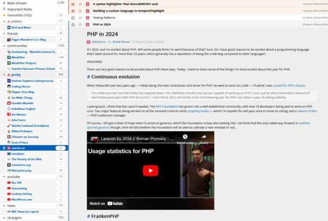
After dinner at the reliably-good Ye Old Six Bells in Horley, down the road from Gatwick Airport, we grumpily made our way back home.

We resolved to try to do the same kinds of things that we’d hoped to do on the Isle of Man, but closer to home: some sightseeing, some walks, some spending-time-together. You know the drill.

Panoramic photo showing a field containing the remains of a Roman villa in West Oxfordshire, under grey skies. The walls are barely visible in this wide shot.
There’s evidence on the Isle of Man of Roman occupation from about the 1st century BCE through the 5th century CE, so we found a local Roman villa and went for a look around.

A particular highlight of our trip to the North Leigh Roman Villa – one of those “on your doorstep so you never go” places – was when the audio tour advised us to beware of the snails when crossing what was once the villa’s central courtyard.

At first we thought this was an attempt at humour, but it turns out that the Romans brought with them to parts of Britain a variety of large edible snail – helix pomatia – which can still be found in concentration in parts of the country where they were widely farmed.4

Large cream-coloured snail in moderately-long grass, alongside a twenty-pence piece (for scale). The snail is around three times as long as the coin is.
Once you know you’re looking for them, these absolute unit gastropods are easy to spot.

There’s a nice little geocache near the ruin, too, which we were able to find on our way back.

Before you think that I didn’t get anything out of my pointless hours at the airport, though, it turns out I’d brought home a souvenier… a stinking cold! How about that for efficiency: I got all the airport-germs, but none of the actual air travel. By mid-afternoon on Tuesday I was feeling pretty rotten, and it only got worse from then on.

A box of tissues and a Nintendo Switch Pro Controller on the arm of a sofa.
I felt so awful on Wednesday that the most I was able to achieve was to lie on the sofa feeling sorry for myself, between sessions of The Legend of Zelda: Tears of the Kingdom.

I’m confident that Ruth didn’t mind too much that I spent Wednesday mostly curled up in a sad little ball, because it let her get on with applying to a couple of jobs she’s interested in. Because it turns out there was a third level of disaster to this week: in addition to our ‘plane being cancelled and me getting sick, this week saw Ruth made redundant as her employer sought to dig itself out of a financial hole. A hat trick of bad luck!

Dan, sitting in bed, holding a tissue and looking unwell.
Sniffle. Ugh.

As Ruth began to show symptoms (less-awful than mine, thankfully) of whatever plague had befallen me, we bundled up in bed and made not one but two abortive attempts at watching a film together:

  • Spin Me Round, which looked likely to be a simple comedy that wouldn’t require much effort by my mucus-filled brain, but turned out to be… I’ve no idea what it was supposed to be. It’s not funny. It’s not dramatic. The characters are, for the most part, profoundly uncompelling. There’s the beginnings of what looks like it was supposed to be a romantic angle but it mostly comes across as a creepy abuse of power. We watched about half and gave up.
  • Ant-Man and the Wasp: Quantumania, because we figured “how bad can a trashy MCU sequel be anyway; we know what to expect!” But we couldn’t connect to it at all. Characters behave in completely unrealistic ways and the whole thing feels like it was produced by somebody who wanted to be making one of the new Star Wars films, but with more CGI. We watched about half and gave up.

As Thursday drew on and the pain in my head and throat was replaced with an unrelenting cough, I decided I needed some fresh air.

Dan, looking slightly less-unwell, stands holding Demmy, a French Bulldog, in front of a hedge.
The dog needed a walk, too, which is always a viable excuse to get out and about.

So while Ruth collected the shopping, I found my way to the 2023-07-27 51 -1 geohashpoint. And came back wheezing and in need of a lie-down.

I find myself wondering if (despite three jabs and a previous infection) I’ve managed to contract covid again, but I haven’t found the inclination to take a test. What would I do differently if I do have it, now, anyway? I feel like we might be past that point in our lives.

All in all, probably the worst anniversary celebration we’ve ever had, and hopefully the worst we’ll ever have. But a fringe benefit of a willingness to change bases is that we can celebrate our 10th5 anniversary next year, too. Here’s to that.

Footnotes

1 Because we’re that kind of nerds, we count our anniversaries in base 16 (0x10 is 16), or – sometimes – in whatever base is mathematically-pleasing and gives us a nice round number. It could be our 20th anniversary, if you prefer octal.

2 I’ve been on some disastrous aeroplane journeys before, including one just earlier this year which was supposed to take me from Athens to Heathrow, got re-arranged to go to Gatwick, got delayed, ran low on fuel, then instead had to fly to Stansted, wait on the tarmac for a couple of hours, then return to Gatwick (from which I travelled – via Heathrow – home). But this attempt to get to the Isle of Man was somehow, perhaps, even worse.

3 Those who’ve noticed that we were flying EasyJet might rightly give a knowing nod at this point.

4 The warning to take care not to tread on them is sound legal advice: this particular variety of snail is protected under the Wildlife and Countryside Act 1981!

5 Next year will be our 10th anniversary… in base 17. Eww, what the hell is base 17 for and why does it both offend and intrigue me so?

× × × × × × × × ×

Short-Term Blogging

There’s a perception that a blog is a long-lived, ongoing thing. That it lives with and alongside its author.1

But that doesn’t have to be true, and I think a lot of people could benefit from “short-term” blogging. Consider:

  • Photoblogging your holiday, rather than posting snaps to social media
    You gain the ability to add context, crosslinking, and have permanent addresses (rather than losing eveything to the depths of a feed). You can crosspost/syndicate to your favourite socials if that’s your poison..
Photo showing a mobile phone, held in a hand, being used to take a photograph of a rugged coastline landscape.
Photoblog your holiday and I might follow it, and I’ll do so at my convenience. Put your snaps on Facebook and I almost certainly won’t bother. Photo courtesy ArtHouse Studio.
  • Blogging your studies, rather than keeping your notes to yourself
    Writing what you learn helps you remember it; writing what you learn in a public space helps others learn too and makes it easy to search for your discoveries later.2
  • Recording your roleplaying, rather than just summarising each session to your fellow players
    My D&D group does this at levellers.blog! That site won’t continue to be updated forever – the party will someday retire or, more-likely, come to a glorious but horrific end – but it’ll always live on as a reminder of what we achieved.

One of my favourite examples of such a blog was 52 Reflect3 (now integrated into its successor The Improbable Blog). For 52 consecutive weeks my partner‘s brother Robin blogged about adventures that took him out of his home in London and it was amazing. The project’s finished, but a blog was absolutely the right medium for it because now it’s got a “forever home” on the Web (imagine if he’d posted instead to Twitter, only for that platform to turn into a flaming turd).

I don’t often shill for my employer, but I genuinely believe that the free tier on WordPress.com is an excellent way to give a forever home to your short-term blog4. Did you know that you can type new.blog (or blog.new; both work!) into your browser to start one?

What are you going to write about?

Footnotes

1 This blog is, of course, an example of a long-term blog. It’s been going in some form or another for over half my life, and I don’t see that changing. But it’s not the only kind of blog.

2 Personally, I really love the serendipity of asking a web search engine for the solution to a problem and finding a result that turns out to be something that I myself wrote, long ago!

3 My previous posts about 52 Reflect: Challenge Robin, Twatt, Brixton to Brighton by Boris Bike, Ending on a High (and associated photo/note)

4 One of my favourite features of WordPress.com is the fact that it’s built atop the world’s most-popular blogging software and you can export all your data at any time, so there’s absolutely no lock-in: if you want to migrate to a competitor or even host your own blog, it’s really easy to do so!

×

Werewolves and Wanderer

This post is also available as a video. If you'd prefer to watch/listen to me talk about this topic, give it a look.

This blog post is also available as a video. Would you prefer to watch/listen to me tell you about the video game that had the biggest impact on my life?

Of all of the videogames I’ve ever played, perhaps the one that’s had the biggest impact on my life1 was: Werewolves and (the) Wanderer.2

This simple text-based adventure was originally written by Tim Hartnell for use in his 1983 book Creating Adventure Games on your Computer. At the time, it was common for computing books and magazines to come with printed copies of program source code which you’d need to re-type on your own computer, printing being significantly many orders of magnitude cheaper than computer media.3

Front cover of The Amazing Amstrad Omnibus, by Martin Fairbanks, with its bright yellow text on a red background.
Werewolves and Wanderer was adapted for the Amstrad CPC4 by Martin Fairbanks and published in The Amazing Amstrad Omnibus (1985), which is where I first discovered it.
When I first came across the source code to Werewolves, I’d already begun my journey into computer programming. This started alongside my mother and later – when her quantity of free time was not able to keep up with my level of enthusiasm – by myself.

I’d been working my way through the operating manual for our microcomputer, trying to understand it all.5

Scan of a ring-bound page from a technical manual. The page describes the use of the "INPUT" command, saying "This command is used to let the computer know that it is expecting something to be typed in, for example, the answer to a question". The page goes on to provide a code example of a program which requests the user's age and then says "you look younger than [age] years old.", substituting in their age. The page then explains how it was the use of a variable that allowed this transaction to occur.
The ring-bound 445-page A4 doorstep of a book quickly became adorned with my pencilled-in notes, the way a microcomputer manual ought to be. It’s strange to recall that there was a time that beginner programmers still needed to be reminded to press [ENTER] at the end of each line.
And even though I’d typed-in dozens of programs before, both larger and smaller, it was Werewolves that finally helped so many key concepts “click” for me.

In particular, I found myself comparing Werewolves to my first attempt at a text-based adventure. Using what little I’d grokked of programming so far, I’d put together a series of passages (blocks of PRINT statements6) with choices (INPUT statements) that sent the player elsewhere in the story (using, of course, the long-considered-harmful GOTO statement), Choose-Your-Own-Adventure style.

Werewolves was… better.

Photograph of Dan in his mid-teens, with shoulder-length bleached-blonde hair and wearing a t-shirt with a picture of a snarling wolf, sits in front of a running PC (with its beige case open) on which an external modem is precariously balanced.
By the time I was the model of a teenage hacker, I’d been writing software for years. Most of it terrible.

Werewolves and Wanderer was my first lesson in how to structure a program.

Let’s take a look at a couple of segments of code that help illustrate what I mean (here’s the full code, if you’re interested):

10 REM WEREWOLVES AND WANDERER

20 GOSUB 2600:REM INTIALISE
30 GOSUB 160
40 IF RO<>11 THEN 30

50 PEN 1:SOUND 5,100:PRINT:PRINT "YOU'VE DONE IT!!!":GOSUB 3520:SOUND 5,80:PRINT "THAT WAS THE EXIT FROM THE CASTLE!":SOUND 5,200
60 GOSUB 3520
70 PRINT:PRINT "YOU HAVE SUCCEEDED, ";N$;"!":SOUND 5,100
80 PRINT:PRINT "YOU MANAGED TO GET OUT OF THE CASTLE"
90 GOSUB 3520
100 PRINT:PRINT "WELL DONE!"
110 GOSUB 3520:SOUND 5,80
120 PRINT:PRINT "YOUR SCORE IS";
130 PRINT 3*TALLY+5*STRENGTH+2*WEALTH+FOOD+30*MK:FOR J=1 TO 10:SOUND 5,RND*100+10:NEXT J
140 PRINT:PRINT:PRINT:END

...

2600 REM INTIALISE
2610 MODE 1:BORDER 1:INK 0,1:INK 1,24:INK 2,26:INK 3,18:PAPER 0:PEN 2 
2620 RANDOMIZE TIME
2630 WEALTH=75:FOOD=0
2640 STRENGTH=100
2650 TALLY=0
2660 MK=0:REM NO. OF MONSTERS KILLED

...

3510 REM DELAY LOOP
3520 FOR T=1 TO 900:NEXT T
3530 RETURN
Locomotive BASIC had mandatory line numbering. The spacing and gaps (...) have been added for readability/your convenience.

What’s interesting about the code above? Well…

  • The code for “what to do when you win the game” is very near the top. “Winning” is the default state. The rest of the adventure exists to obstruct that. In a language with enforced line numbering and no screen editor7, it makes sense to put fixed-length code at the top… saving space for the adventure to grow below.
  • Two subroutines are called (the GOSUB statements):
    • The first sets up the game state: initialising the screen (2610), the RNG (2620), and player characteristics (26302660). This also makes it easy to call it again (e.g. if the player is given the option to “start over”). This subroutine goes on to set up the adventure map (more on that later).
    • The second starts on line 160: this is the “main game” logic. After it runs, each time, line 40 checks IF RO<>11 THEN 30. This tests whether the player’s location (RO) is room 11: if so, they’ve exited the castle and won the adventure. Otherwise, flow returns to line 30 and the “main game” subroutine happens again. This broken-out loop improving the readability and maintainability of the code.8
  • A common subroutine is the “delay loop” (line 3520). It just counts to 900! On a known (slow) processor of fixed speed, this is a simpler way to put a delay in than relying on a real-time clock.

The game setup gets more interesting still when it comes to setting up the adventure map. Here’s how it looks:

2680 REM SET UP CASTLE
2690 DIM A(19,7):CHECKSUM=0
2700 FOR B=1 TO 19
2710   FOR C=1 TO 7
2720     READ A(B,C):CHECKSUM=CHECKSUM+A(B,C)
2730   NEXT C:NEXT B
2740 IF CHECKSUM<>355 THEN PRINT "ERROR IN ROOM DATA":END

...

2840 REM ALLOT TREASURE
2850 FOR J=1 TO 7
2860   M=INT(RND*19)+1
2870   IF M=6 OR M=11 OR A(M,7)<>0 THEN 2860
2880   A(M,7)=INT(RND*100)+100
2890 NEXT J

2910 REM ALLOT MONSTERS
2920 FOR J=1 TO 6
2930   M=INT(RND*18)+1
2940   IF M=6 OR M=11 OR A(M,7)<>0 THEN 2930
2950   A(M,7)=-J
2960 NEXT J
2970 A(4,7)=100+INT(RND*100)
2980 A(16,7)=100+INT(RND*100)

...

3310 DATA   0,  2,  0,  0,  0,  0,  0
3320 DATA   1,  3,  3,  0,  0,  0,  0
3330 DATA   2,  0,  5,  2,  0,  0,  0
3340 DATA   0,  5,  0,  0,  0,  0,  0
3350 DATA   4,  0,  0,  3, 15, 13,  0
3360 DATA   0,  0,  1,  0,  0,  0,  0
3370 DATA   0,  8,  0,  0,  0,  0,  0
3380 DATA   7, 10,  0,  0,  0,  0,  0
3390 DATA   0, 19,  0,  8,  0,  8,  0
3400 DATA   8,  0, 11,  0,  0,  0,  0
3410 DATA   0,  0, 10,  0,  0,  0,  0
3420 DATA   0,  0,  0, 13,  0,  0,  0
3430 DATA   0,  0, 12,  0,  5,  0,  0
3440 DATA   0, 15, 17,  0,  0,  0,  0
3450 DATA  14,  0,  0,  0,  0,  5,  0
3460 DATA  17,  0, 19,  0,  0,  0,  0
3470 DATA  18, 16,  0, 14,  0,  0,  0
3480 DATA   0, 17,  0,  0,  0,  0,  0
3490 DATA   9,  0, 16,  0,  0,  0,  0
Again, I’ve tweaked this code to improve readability, including adding indention on the loops, “modern-style”, and spacing to make the DATA statements form a “table”.

What’s this code doing?

  • Line 2690 defines an array (DIM) with two dimensions9 (19 by 7). This will store room data, an approach that allows code to be shared between all rooms: much cleaner than my first attempt at an adventure with each room having its own INPUT handler.
  • The two-level loop on lines 2700 through 2730 populates the room data from the DATA blocks. Nowadays you’d probably put that data in a separate file (probably JSON!). Each “row” represents a room, 1 to 19. Each “column” represents the room you end up at if you travel in a given direction: North, South, East, West, Up, or Down. The seventh column – always zero – represents whether a monster (negative number) or treasure (positive number) is found in that room. This column perhaps needn’t have been included: I imagine it’s a holdover from some previous version in which the locations of some or all of the treasures or monsters were hard-coded.
  • The loop beginning on line 2850 selects seven rooms and adds a random amount of treasure to each. The loop beginning on line 2920 places each of six monsters (numbered -1 through -6) in randomly-selected rooms. In both cases, the start and finish rooms, and any room with a treasure or monster, is ineligible. When my 8-year-old self finally deciphered what was going on I was awestruck at this simple approach to making the game dynamic.
  • Rooms 4 and 16 always receive treasure (lines 29702980), replacing any treasure or monster already there: the Private Meeting Room (always worth a diversion!) and the Treasury, respectively.
  • Curiously, room 9 (the lift) defines three exits, even though it’s impossible to take an action in this location: the player teleports to room 10 on arrival! Again, I assume this is vestigal code from an earlier implementation.
  • The “checksum” that’s tested on line 2740 is cute, and a younger me appreciated deciphering it. I’m not convinced it’s necessary (it sums all of the values in the DATA statements and expects 355 to limit tampering) though, or even useful: it certainly makes it harder to modify the rooms, which may undermine the code’s value as a teaching aid!
Map showing the layout of the castle in video game "Werewolves and the Wanderer". Entering from outside the castle, to the West, the player must progress through the ground floor, up the stairwell in the Inner Hallway, into the Lift, and then East to the exit, but there are several opportunities to diverge from this path and e.g. explore the dungeons or various dead ends on the ground or first floors.
By the time I was 10, I knew this map so well that I could draw it perfectly from memory. I almost managed the same today, aged 42. That memory’s buried deep!

Something you might notice is missing is the room descriptions. Arrays in this language are strictly typed: this array can only contain integers and not strings. But there are other reasons: line length limitations would have required trimming some of the longer descriptions. Also, many rooms have dynamic content, usually based on random numbers, which would be challenging to implement in this way.

As a child, I did once try to refactor the code so that an eighth column of data specified the line number to which control should pass to display the room description. That’s a bit of a no-no from a “mixing data and logic” perspective, but a cool example of metaprogramming before I even knew it! This didn’t work, though: it turns out you can’t pass a variable to a Locomotive BASIC GOTO or GOSUB. Boo!10

An experimental program being run that attempts to GOSUB a variable, failing with a syntax error on the relevant line.
In hindsight, I could have tested the functionality before I refactored with a very simple program, but I was only around 10 or 11 and still had lots to learn!

Werewolves and Wanderer has many faults11. But I’m clearly not the only developer whose early skills were honed and improved by this game, or who hold a special place in their heart for it. Just while writing this post, I discovered:
A decade or so later, I’d be taking my first steps as a professional software engineer. A couple more decades later, I’m still doing it.

And perhaps that adventure -the one that’s occupied my entire adult life – was facilitated by this text-based one from the 1980s.

Footnotes

1 The game that had the biggest impact on my life, it might surprise you to hear, is not among the “top ten videogames that stole my life” that I wrote about almost exactly 16 years ago nor the follow-up list I published in its incomplete form three years later. Turns out that time and impact are not interchangable. Who knew?

2 The game is variously known as Werewolves and Wanderer, Werewolves and Wanderers, or Werewolves and the Wanderer. Or, on any system I’ve been on, WERE.BAS, WEREWOLF.BAS, or WEREWOLV.BAS, thanks to the CPC’s eight-point-three filename limit.

3 Additionally, it was thought that having to undertake the (painstakingly tiresome) process of manually re-entering the source code for a program might help teach you a little about the code and how it worked, although this depended very much on how readable the code and its comments were. Tragically, the more comprehensible some code is, the more long-winded the re-entry process.

4 The CPC’s got a fascinating history in its own right, but you can read that any time.

5 One of my favourite features of home microcomputers was that seconds after you turned them on, you could start programming. Your prompt was an interface to a programming language. That magic had begun to fade by the time DOS came to dominate (sure, you can program using batch files, but they’re neither as elegant nor sophisticated as any BASIC dialect) and was completely lost by the era of booting directly into graphical operating systems. One of my favourite features about the Web is that it gives you some of that magic back again: thanks to the debugger in a modern browser, you can “tinker” with other people’s code once more, right from the same tool you load up every time. (Unfortunately, mobile devices – which have fast become the dominant way for people to use the Internet – have reversed this trend again. Try to View Source on your mobile – if you don’t already know how, it’s not an easy job!)

6 In particular, one frustration I remember from my first text-based adventure was that I’d been unable to work around Locomotive BASIC’s lack of string escape sequences – not that I yet knew what such a thing would be called – in order to put quote marks inside a quoted string!

7 “Screen editors” is what we initially called what you’d nowadays call a “text editor”: an application that lets you see a page of text at the same time, move your cursor about the place, and insert text wherever you feel like. It may also provide features like copy/paste and optional overtyping. Screen editors require more resources (and aren’t suitable for use on a teleprinter) compared to line editors, which preceeded them. Line editors only let you view and edit a single line at a time, which is how most of my first 6 years of programming was done.

8 In a modern programming language, you might use while true or similar for a main game loop, but this requires pushing the “outside” position to the stack… and early BASIC dialects often had strict (and small, by modern standards) limits on stack height that would have made this a risk compared to simply calling a subroutine from one line and then jumping back to that line on the next.

9 A neat feature of Locomotive BASIC over many contemporary and older BASIC dialects was its support for multidimensional arrays. A common feature in modern programming languages, this language feature used to be pretty rare, and programmers had to do bits of division and modulus arithmetic to work around the limitation… which, I can promise you, becomes painful the first time you have to deal with an array of three or more dimensions!

10 In reality, this was rather unnecessary, because the ON x GOSUB command can – and does, in this program – accept multiple jump points and selects the one referenced by the variable x.

11 Aside from those mentioned already, other clear faults include: impenetrable controls unless you’ve been given instuctions (although that was the way at the time); the shopkeeper will penalise you for trying to spend money you don’t have, except on food, presumably as a result of programmer laziness; you can lose your flaming torch, but you can’t buy spares in advance (you can pay for more, and you lose the money, but you don’t get a spare); some of the line spacing is sometimes a little wonky; combat’s a bit of a drag; lack of feedback to acknowledge the command you enterted and that it was successful; WHAT’S WITH ALL THE CAPITALS; some rooms don’t adequately describe their exits; the map is a bit linear; etc.

× × × × ×

Solitary Nouns

The other night, Ruth and I were talking about collective nouns (y’know, like a herd of cows or a flock of sheep) and came up with the somewhat batty idea of solitary nouns. Like collective nouns, but for a singular subject (one cow, sheep, or whatever).

Then, we tried to derive what the words could be. Some of the results write themselves.1

Captioned photos showing "a HERD of COWS" and "a HER of COW".
Mooving right on…
Captioned photos showing "a PRIDE of LIONS" and "a PROUD of LION".
I’d be lion if I said I wasn’t proud of this one.
Captioned photos showing "a COLONY of BEES" and "a COLONIST of BEE".
I’m pollen out all the collective nouns now!

Some of them involve removing one or more letters from the collective noun to invent a shorter word to be the solitary noun.

Captioned photos showing "an ARMY of ANTS" and "an ARM of ANT". The latter picture shows an ant lifting a stick many times its size.
They stay healthy by working out and getting vaccinated, both of which give them tough anty bodies.
Captioned photos showing "a COVEN of WITCHES" and "an OVEN of WITCH" (the latter picture shows a scene from Handsel & Gretel in which the witch is pushed into the oven).
The sound of an oven is a cackling: “When shall I one meet again?”
Captioned photos showing "a MURMURATION of STARLINGS" and "a MURMUR of STARLING".
Eventually it grows up into a star, which are a lot louder.2
For others, we really had to stretch the concept by mutating words in ways that “felt right”, using phoenetic spellings, or even inventing collective nouns so that we could singularise them:
Captioned photos showing "a GAGGLE of GEESE" and "a GIGGLE of GOOSE".
For more goose-related wordplay, take a gander at this blog post from a few years back.
Captioned photos showing "a ROUND of DRINKS" and "a ROW of DRINK": the latter photo shows a man drinking in a bar while fighting another man.
Getting smashed doesn’t have to end with bumps and boozers.3
Captioned photos showing "an 1812 of CANNONS" and "a 1 of CANNON".
Blast but not least.

Did I miss any obvious ones?

Footnotes

1 Also consider “parliament of owls” ➔ “politician of owl”, “troop of monkeys” ➔ “soldier of monkey”, “band of gorillas” ➔ “musician of gorilla”. Hey… is that where that band‘s name come from?

2 Is “cluster of stars” ➔ “luster of star” anything?

3 Ruth enjoyed the singularised “a low of old bollock”, too.

× × × × × × × × ×

Local Expert

At school, our 9-year-old is currently studying the hsitory of human civilization from the late stone age through to the bronze age. The other week, the class was split into three groups, each of which was tasked with researching a different piece of megalithic architecture:

  • One group researched Stonehenge, because it’s a pretty obvious iconic choice
  • Another group researched the nearby Rollright Stones, which we’ve made a family tradition of visiting on New Year’s Day and have dragged other people along to sometimes
  • The final group took the least-famous monument, our very own local village henge The Devil’s Quoits
Dan, wearing a black t-shirt with the words "Let's make the web a better place" on, sits with his back to a standing stone. Four more standing stones can be seen stretching away into the bakground, atop a flowery meadow and beneath a slightly cloudy but bright sky.
Love me some ancient monuments, even those that are perhaps less authentically-ancient than others.

And so it was that one of our eldest’s classmates was searching on the Web for information about The Devil’s Quoits when they found… my vlog on the subject! One of them recognised me and said, “Hey, isn’t that your Uncle Dan?”1

On the school run later in the day, the teacher grabbed me and asked if I’d be willing to join their school trip to the henge, seeing as I was a “local expert”. Naturally, I said yes, went along, and told a bunch of kids what I knew!

A group of schoolchildren in a mixture of white and blue shirts, and with most wearing sunhats, sit on a pile of rocks alongside a ring ditch and listen intently to Dan.
I’ve presented to much-larger audiences before on a whole variety of subjects, but this one still might have been the most terrifying.

I was slightly intimidated because the class teacher, Miss Hutchins, is really good! Coupled with the fact that I don’t feel like a “local expert”2, this became a kick-off topic for my most-recent coaching session (I’ve mentioned how awesome my coach is before).

A young girl, her hair wild, sits at a kitchen table with a laptop and a homework book, writing.
I originally thought I might talk to the kids about the Bell Beaker culture people who are believed to have constructed the monument. But when I pitched the idea to our girl she turned out to know about as much about them as I did, so I changed tack.

I eventually talked to the class mostly about the human geography aspects of the site’s story. The area around the Devil’s Quoits has changed so much over the millenia, and it’s a fascinating storied history in which it’s been:

  • A prehistoric henge and a circle of 28 to 36 stones (plus at least one wooden building, at some point).
  • Medieval farms, from which most of the stones were taken (or broken up) and repurposed.
  • A brief (and, it turns out, incomplete) archeological survey on the remains of the henge and the handful of stones still-present.
  • A second world war airfield (a history I’ve also commemorated with a geocache).
  • Quarrying operations leaving a series of hollowed-out gravel pits.
  • More-thorough archeological excavation, backed by an understanding of the cropmarks visible from aircraft that indicate that many prehistoric people lived around this area.
  • Landfill use, filling in the former gravel pits (except for one, which is now a large lake).
  • Reconstruction of the site to a henge and stone circle again.3
Ultrawide panoramic picture showing a full circle of standing stones under a clear sky. The dry grass has been cut back, and the remains of a campfire can be seen.
It doesn’t matter to me that this henge is more a modern reconstruction than a preserved piece of prehistory. It’s still a great excuse to stop and learn about how our ancestors might have lived.

It turns out that to be a good enough to pass as a “local expert”, you merely have to know enough. Enough to be able to uplift and inspire others, and the humility to know when to say “I don’t know”.4

That’s a lesson I should take to heart. I (too) often step back from the opportunity to help others learn something new because I don’t feel like I’m that experienced at whatever the subject is myself. But even if you’re still learning something, you can share what you’ve learned so far and help those behind you to follow the same path. I’m forever learning new things, and I should try to be more-open to sharing “as I learn”. And to admit where I’ve still got a long way to go.

Footnotes

1 Of course, I only made the vlog because I was doing a videography course at the time and needed subject matter, and I’d recently been reading a lot about the Quoits because I was planning on “hiding” a virtual geocache at the site, and then I got carried away. Self-nerdsniped again!

2 What is a local expert? I don’t know, but what I feel like is just a guy who read a couple of books because he got distracted while hiding a geocache!

3 I’ve no idea what future archeologists will make of this place when they finda reconstructed stone circle and then, when they dig nearby, an enormous quantity of non-biodegradable waste. What was this strange stone circle for, they’ll ask themselves? Was it a shrine to their potato-based gods, to whom they left crisp packets as a sacrifice?

4 When we’re talking about people from the neolithic, saying “I don’t know” is pretty easy, because what we don’t know is quite a lot, it turns out!

× × × ×

How cool are Silo’s credits?

I’ve long been a fan of Hugh Howey‘s Wool series of books (especially the first and third; the second’s a bit weaker); in fact I’ve been enjoying re-reading them as a bedtime story for our eldest!1

Naturally, when I heard that it would become a TV series I was really excited! I’m enjoying the series so far, especially thanks to its epic casting. It diverges a lot from the books – sometimes in ways I love, sometimes in ways that confuse me – but that’s not what I wanted to talk about. I wanted to share how cool the opening credits sequence is!

Spoiler warning: even if you’re following the TV series there are likely to be major spoilers below based on my recollection of the books!

Sun shining through yellow clouds.

We open on the sun shining above a thick layer of all-obscuring clouds, tinted sickly yellow like poison gas, then descend into the darkness below. This hints at the uninhabitability of the world above, foreshadows Lukas stargazing through gaps in the clouds2, and foreshadows revelations about the argon gas used to flush the airlocks. The descent feels representative of humanity’s migration from the sunlit surface to the underground silos.

A star-shaped structure seen from above, through thick clouds.

Looking down, we see the silo from above in a desolate landscape, introducing the world and its setting. The area around it is shrouded and hostile, reflecting the residents’ view of the outside world as unsurvivable, but also masking our view of the other nearby silos that we might otherwise be able to see.

Dark circle on a yellow background with random radial spokes.

Descending “into” this representation of the silo, we get a view for only a split second that looks distinctly like the platter and spindle of a magnetic hard disk drive, broken-up as if to represent corruption. This reflects a number of major plot points in the first season relating to the destruction and recovery of secret information from ancient storage devices.

Sepia view "down" into a deep silo, with landings and skywalks visible.

Truly within the silo now, we see the spokes of landings radiating out from the great stairwell. The shape is reminiscient of a cog: a motif we’ll return to later. Humanoid shapes made of light, like you get in a long exposure, move around, giving both the idea of a surveillance state, and setting us up to think of all such “glowing spots” as people (relevant later in the credits).

Spiral, shaking, with illuminated gaseos shapes whipping around it.

A representation of the stairwell itself appears, with a lit gaseous substance whipping up and down it. Given that we’ve just been shown that this kind of “light” represents people, it’s easy to see this as showing us the traffic that grinds up and down the silo, but it also feels like looking at part of a great machine, pumping gas through a condenser: notice that there’s no landings any more: this is all about the never-ending traffic.

Skewed camera angle showing a dark bridge with ghostly gaseous figures crossing.

A landing appears, and the gaseous forms are now more-clearly humanoid, almost as if they’re ghosts (perhaps pointing to the number of generations who’ve lived before, in this place, or else a reference to Juliette’s investigation into the lives of those who lived before her).

A swirling mass of luminescent gas around a central pillar, with a fenced balcony visible.

More swirling gas-people, this time below an empty balconette: perhaps a nod to the source of Juliette’s uncommon name (in the books, it’s taken from Romeo & Juliet, a possibly-illicit copy of which is retained by the silo and performed prior to Juliette’s birth and for at least a short while afterwards: she writes mechanical notes on the back of a playscript), or perhaps a reference to George’s death after “falling” from a balcony.

Blue-white gas wirls around a pillar.

Seen from a different angle, the colour shifts, and the gas/ghosts become white like the argon spray of the airlock. The people are all part of a machine: a machine that sends people outside to clean and die. But more than that, the blue comes to represent a clean/perfect view of what a silo can be: a blueprint representation of the goals of its creators to shape the inhabitants into their vision of the future:

Partial X-ray of a human spine?

We refocus on the shape of the silo itself, but just for a split second the view looks more like an x-ray… of a human spine? As if to remind us that it’s people who upload the system of the silo, just as its concrtete uploads its physical structure. Also a reminder that the silo is treated (by those who manage it, both within and beyond it) as an organic thing that can be nurtured, grown, or if necessary killed.

Bridges seen semi-transparently.

This becomes the structure of the silo, but it almost looks architectural: a “clean” look, devoid of people or signs of life, like a blueprint, perhaps foreshadowing Donald’s role in designing the structures that will eventually become the silos. The “space” between the arms is emphasised, showing how the social system that this structure imposes serves to separate and segregate people: classism is a recurring theme in both the books and the TV series, and it eventually becomes apparent that the silos are specifically organised to reduce communication between interdependent groups.

Swirling spiral of gaseous light with a nautillus shell shape at its centre.

Returning to the “populated” silo – swirls of gas spiralling away down (or up: it’s no longer clear!), we catch a glimpse of a nautilus shell at the centre. The nautilus is a “living fossil”, a creature from a bygone era that continues to survive in our modern world, which is an excellent metaphor for the population of the dead world who go on living beneath its surface. The nautilus shell is a recurring image within the TV series: Gloria’s visions of the world that came before see her clutching one and tracing its shape, for example.

A seed in a yellow cloud.

We cut to what appears to be a seed, representing both the eventual conclusion of the story (Juliette, Charlotte and the Silo 18 survivors’ discovery of the cache of supplies that will allow them to begin rebuilding the world) and also the nature of the silo3. The seed we see initially appears to fail and degrade, becoming nothing at all, before eventually growing into the beginnings of a strong new plant. This could represent the eventual and inevitable collapse of silo 18, among others, but the eventual flourishing of those that survive, or on a broader scale the collapse of modern civilization to be replaced by the silos, or even of the silo system to be replaced with that which follows it after the conclusion of the story. Lots of options!

A seedling grows in harsh conditions.

It’s also possibly a reflection of the harsh and opaque eugenics/population control mechanism imposed by the “lottery”, which becomes a major plot point in the TV series much earlier than in the books.

Trees in a yellow fog.

We cut to trees, thriving despite a yellow fog. The sky can’t be seen, which is a reminder that all of humanity’s resources must now be produced underground (trees are especially rare and prized, leading to a shortage of paper4. It seems to be deliberately left unclear whether the trees we see are on the surface before the fall of humanity, on the surface after the fall, or grown underground.

Fruit falling from a tree.

A fruit falls from the tree, which links back to the seed we saw geminate earlier but also seems likely to be a representation of the concept of original sin. The grand idea of the silos was to create a better world on the other side of a man-made catastrophe, but this idea is inherently flawed because the systems that are constructed by the same people who are complicit in the destruction of the world that came before. The structure that’s put in place through the Pact carries the weight of the sins of its creators: even though the inhabitants of silo 1 ultimately intend to destroy themselves, they’re unable to create a new world that is both better than the one that came before and free from their influence: it’s an impossibility.

It’s also possibly a representation of the religious beliefs of some inhabitants that the creators of the silo should be revered as gods. This was a recurring plot point in the books but has been somewhat muted in the TV series so far.

Rotting fruit falls.

The metaphor continues when we see that this falling fruit is already beginning to rot, degrading as it tumbles towards the earth. We don’t see it strike the ground: it almost seems to hover in the air, uncertain and undecided, and reflective of the eventual end when the inhabitants of the silos break free from the shackles of the system that’s been constructed for them and can choose their own destiny. Or perhaps we don’t see the collision simply because the camera continues to fall down into the earth and below the surface again?

Heavy industrial machinery, smoke, and fumes.

This time, wer’e very deep: all the way down in the depths of Mechanical, at the bottom of the silo: home to our heroine and source of many aspects of the story. In the centre, a shaft descends, connecting us back to the “spine” of the silo – the great staircase – but it’s harder to see as a wealth of machinery appears to support it, occluding our view. From down here in Mechanical it appears that the machines keep the silo running, whereas further up it looked like humans pumped through it like blood, which reflects Juliette’s disagreements with many of those up-top about their priorities during her time as Sheriff and, later, as Mayor.

A cloud of steam, some of it with humanoid shapes.

We see a cloud of steam, like that used to drive the generator that brings life to the silo, and for a moment it’s impossible to differentiate it from the cloud of people we saw earlier, rushing up and down the stairs. Look closely at the steam, though, and you’ll see that it too contains the ghosts of people.

Many cogs whirl in a firey light.

Deeper still, the cog motif returns and we’re buried in an impossible number of interconnected gears. The machine that they support is impossible to comprehend from within: How big is it? What is it for? Who made it and why?

A cog crossfades into a top-down view of a spiral staircase.

The final cog mutates into the staircase again, winding away from us and hammering the point home.

A spiral staircase becomes encased in outlines of blue-white light.

The staircase changes again, first becoming an outline of itself (a callback to the “blueprint” design we saw earlier, reminding us that this thing was designed to be like this)…

A double-helix shape cast in light, being made from the alternating-steps of a staircase.

…but this becomes a double-helix, representing the chaos of life. Again, the metaphor is of a perfect idea constructed to achieve a goal, but the unpredictability of humans leads to a different outcome.

The ends of spiraling lights appear to spin around.

Seen from above, the staircase now looks like an enormous clock, a machine of cogs each turning slower than the one beneath, counting down until the end of the silo experiment in accordance with the whim of its creators. Except, of course, if something were to break this machine.

Cross-section of different-sized circular floors with ghostly people moving around.

Seen from the side, the silo is a hive of activity, but the shape the levels form in this depiction are exactly like the rotors of a steam turbine, and this is reflected by an image of steam, almost in the shape of a growing tree – passing behind it in the background. The generator and its rotor blades is a significant early plot point in both the books and the TV series, and the books in particular use engine metaphors to explain Juliette’s interpretation of different situations she finds herself in, even those which are distinctly interpersonal rather than mechanical.

Cog-like shape.

Looking back up the silo, towards the light, we can now see its shape and structure for what it is: just another cog – a part of an even bigger machine that is the whole Operation Fifty silo network. The people are the lifeblood of this machine, but they’re as replaceable and interchangable as any other part.

The word "SILO" in a stab-serif font, black on a yellow background.

Finally, we crossfade to the title, looking like a stencil. Each letter is more-degraded than the one before it, representing the impossibility of building a perfect system.

The credits sequence is less than 90 seconds long, but so much is packed into it. It’s just great.

Footnotes

1 We’re into the final act of Dust now and it’s been amazing to experience the characters – loveable and hateable – of the series.

2 Curiously, in the TV series Lukas is only ever seen stargazing on clear nights, which is one of those confusing choices I mentioned. I suspect it’s for aesthetic reasons and to help add some romance to Juliette and Lukas’s courtship.

3 A silo is, of course, a place to store something valuable through the hard times. This is exactly what the silos in this story are for.

4 The shortage of paper shows up many times in the books but is somewhat glossed-over in the TV series. I’m not sure how they’ll reconcile that with the impact of the discovery of the Legacy, later.

× × × × × × × × × × × × × × × × × × × × × × × × × ×

WCEU23 – Day 2

My second day of the main conference part of WordCamp Europe 2023 was hampered slightly by a late start on my part.

Dan, sweating, with an actively-used dancefloor in the background.
I can’t say for certain why I woke up mildly hungover and with sore knees, but I make an educated guess that it might be related to the Pride party I found myself at last night.

Still, I managed to get to all the things I’d earmarked for my attention, including:


Gutenberg collaborative editing experience

I’m sure I can’t be the only person who’s been asked “why can’t the (or ‘shouldn’t the’) WordPress post editor let multiple people edit post at the same time”. Often, people will compare it to e.g. Google Docs.

A man in a blue shirt stands on a large stage.
I can’t begin to speculate how often people must ask this supposedly-trivial question of Dawid Urbański, possibly the world’s expert on this very question.

Dawid summarised the challenging issues in any effort to implement this much-desired feature. Some of them are examples of those unsolved problems that keep rearing their heads in computer science, like the two generals’ problem, but even the solvable problems are difficult: How does one handle asynchronous (non-idempotent) commutative operations? How is the order of disparate actions determined? Which node is the source of truth? If a server is used, where is that server (with a nod to quite how awful the experience of implementing a Websockets server in PHP can be…)? And so on…

Slide showing a timeline in which two participants A and B send an update to one another, but neither can be sure whose update was made first.
Slides showing simplified timelines of parties communicating with one another in ambigous ways

I really appreciated Dawid’s reference to the various bits of academic literature that’s appeared over the last four decades (!) about how these problems might be solved. It’s a strong reminder that these things we take for granted in live-updating multi-user web applications are not trivial and every question you can answer raises more questions.

There’s some great early proof-of-concepts, so we’re “getting there”, and it’s an exciting time. Personally, I love the idea of the benefits this could provide for offline editing (perhaps just because I’m still a huge fan of a well-made PWA!).


The future of work is open

James Giroux’s goal: that we all become more curious about and more invested in our team’s experiences, from a humanistic standpoint. His experience of companies with organic growth of software companies is very, very familiar: you make a thing and give it away, then you need more people, then you’ve somehow got a company and it’s all because you just had an idea once. Sounds like Three Rings!

A man in a white t-shirt and dark jacket stands on a stage in front of a screen; the bottom line of the words on the screen can be seen to read "Work is Open".
Financial success is not team success, as Twitter shows, with their current unsustainable and unhappy developer culture, James reminds us.

James was particularly keen to share with us the results of his Team Experience Index research, and I agree that some of the result are especially exciting, in particularly the willingness of underrepresented groups, especially women, to enagage with the survey: this provides hugely valuable data about the health of teams working in the WordPress space.

A slide showing demographic details: 28% say that they represent a historically underrepresented group, 55% are in North America, 67% provided a gender that was not "male".
The statistician in me immediately wanted to know how the non-response rate to these (optional) questions varied relative to one another (if they’re very different, putting these pie charts alongside one another could be disingenuous!), but I’m tentatively excited by the diversity represented anyway.

“We have this project that we work with and contribute to, that we love,” says James, in an attempt to explain the highly-positive feedback that his survey respondents gave when asked questions about the authenticity of their purpose and satisfaction in their role.

A man on a stage stands in front of a slide listing strengths and opportunities resulting from the survey.
Again, my inner statistician wants to chirp up about the lack of a control group. The data from the survey may well help companies working within the WordPress ecosystem to identify things we’re doing well and opportunities for growth, but it’d also be cool to compare these metrics to those in companies outside of the WordPress world!

So, what do we do with these findings? How do WordPress-ey companies improve? James recommends that we:

  • Get better are showing what recognition, celebration, and career growth looks like,
  • Improve support and training for team leaders to provide them with the tools to succeed and inspire, and
  • Bridge the gap between leadership and team members with transparent, open dialogue.

Good tips, there.


The Big Photo

A WordCamp tradition is to try to squeeze every willing participant into a photo. Clearly with the size that these events are, nowadays, this requires some wrangling (and, in this case, the photographers standing atop the roof of a nearby building to get everybody into frame).

An enormous crowd shuffles tightly into a courtyard. A trio of blue-shirted photographers stands atop a building opposite them.
Like herding cats, trying to get several hundred people to line up where you want them for a photograph is an exercise in patience.

I’ll have to keep an eye out for the final picture and see if I can find myself in it.


What is new in CSS?

I always find that learning about bleeding edge CSS techniques makes me feel excited and optimistic, perhaps because CSS lends itself so well towards a progressive enhancement approach to development: often, you can start using a new technique today and it’ll only benefit, say, people using a beta version of a particular browser (and perhaps only if they opt-in to the applicable feature flag). But if you’ve designed your site right then the lack of this feature won’t impact anybody else, and eventually the feature will (hopefully) trickle-down into almost everybody’s Web experience.

Anyway, that’s what Fellyph Cintra says too, but he adds that possibly we’ve still not grown out of thinking that browsers take a long time between versions. 5 years passed between the release of Internet Explorer 6 and Internet Explorer 7, for example! But nowadays most browsers are evergreen with releases each month! (Assuming we quietly ignore that Apple don’t sent new versions of Safari to old verisons of MacOS, continuing to exacerbate a problem that we used to see with Internet Explorer on Windows, ahem.)

A man on a stage with his arm out in greeting to the crowd in front of him.
Fellyph told us about how he introduced <dialog> to his team and they responded with skepticism that they’d be able to use it within the next 5 years. But in fact it’s already stable in every major browser.

An important new development may come from Baseline, a project to establish a metric of what you can reliably use on the Web today. So a bit like Can I Use, I guess, but taken from the opposite direction: starting from the browsers and listing the features, rather than the other way around.

Anyway, Fellyph went on to share some exciting new ideas that we should be using, like:

  • object-fit and object-position, which can make the contents of any container “act like” a background
  • aspect-ratio, which I’m already using and I love, but I enjoyed how Fellyph suggested combining the two to crop images to a fluid container on the client side
  • scroll-behavior: smooth, which I’ve used before; it’s pretty good
  • clamp, which I use… but I’m still not sure I fully grok it: I always have to load some documentation with examples when I use it
  • @container queries, which can apply e.g. (max-width: ...) rules to things other than the viewport, which I’ve not found a need for yet but I can see the value of it
  • @layers, which grant an additional level of importance in the cascade: for example, you might load a framework into a layer (with @import url(...) layer(framework)) which is defined as a lower-priority than your override layer, meaning you won’t have to start slapping !important all over the shop
  • @media (400px <= width <= 600px)-style media queries, which are much easier to understand than min-width: if you’re used to thinking in a more-procedural programming language (I assume they work in container queries too!)
Fellyph Cintra stands in front of a large screen showing a slide that introduces himself to his audience: "Front-end Lead at Digitale Methode & Google Developer Expert @fellyph"

It’s also worth remembering:

  • @supports, which is badass and I love and use it already (it was especially useful as display: grid began to roll out and I wanted to start using it but needed to use a fallback method for browsers that didn’t support it yet
  • :has(), which I’ve long thought is game-changing: styling something based on what it contains is magical; not really suitable for mainstream use yet without Firefox support, though (it’s still behind a feature flag)! Fellyph sold me on the benefit of :not(:has(...)), though!
  • Nesting, which again doesn’t have Firefox support yet but provides SCSS-like nesting in CSS, which is awesome
  • Scroll-driven animations, which can e.g. do parallax effects without JavaScript (right now it’s Canary only, mind…), using e.g. animation-timeline: and animation-range: to specify that it’s the scroll position within the document that provides the timeline for the animation

And keeping an eye on upcoming things like text-balanced (which I’m already excited by), popover, selectmenu, view transitions (which I’ve been experimenting with because they’re cool), and scoped style.

Fellyph was at least as inspiring as I’d hoped.


Stop blocking my thread

For my second workshop, I joined Google’s Adam Silverstein to watch him dissect a few participants’ websites performance using Core Web Vitals as a metric. I think I already know the basics of Core Web Vitals, but when it comes to improving my score (especially on work-related sites with unpleasant reliance on heavyweight frameworks like React, in my experience).

A man stands at a podium.
In an early joke, Adam pointed out that you can reduce JavaScript thread blocking by removing JavaScript from your site. A lot of people laughed, but frankly I think it’s a great idea.

We talked a lot about render blocking (thanks to JS and CSS in the <head>), thread blocking (by scripts, especially those reacting to user input), TTFB (relating to actual network and server performance, or at least server-side processing), TBT (the time between FCP and TTI), and the upcoming change to measure INP rather than FID. That’s a lot of acronyms.

The short of it is that there are three pillars to Core Web Vitals: loading (how long until the page renders), interactivity (how long until the page responds to user interaction), and stability (how long it takes for the page to cease layout shifts as a result of post-load scripts and stylesheets). I was pleased that Adam acknowledged the major limitation of lab testing resulting from developers often using superior hardware and Internet connections to typical users, and how if you’re serious about performance metrics you’ll want to collect RUM data.

Adam explaining Render-Blocking CSS.
The fastest way to improve rendering performance is to put fewer obstacles in the way of rendering.

I came away with a few personalised tips, but they’re not much use for your site: I paid attention to the things that’ll be helpful for the sites I look after. But I’ll be taking note of his test pages so I can play with some of the tools he demonstrated later on.


Variations on a theme: 20 years of WordPress

I couldn’t liveblog this because I spent too much of the session applauding. A few highlights from memory:

  • Phase 2 (of 4) of Gutenberg is basically complete, which is cool. Some back-and-forth about the importance of phase 4 (bringing better multilingual support to WordPress) and how it feels like it’s a long way away.
  • Lots of plugging for Five for the Future, which I can get behind.
  • In the same vein as his 2016 statement that WordPress developers should “learn JavaScript deeply”, Matt leant somewhat into the idea that from today they should “watch AI carefully”; I’m not 100% convinced, but it’s not been stopping me from getting involved with a diversity of AI experiments (including some WordPress-related ones) anyway.
  • Musings about our community being a major part of why WordPress succeeded (and continues to thrive) unlike some other open source projects of its era. I agree that’s a factor, but I suspect that being in the right place at the right time was also important. Perhaps more on that another time.
  • Announcement of the next WordCamp Europe location.

Here’s looking forward to WordCamp Europe 2024 in Turin!

× × × × × × × × × × ×

WCEU23 – Day 1

The first “full” day of WordCamp Europe 2023 (which kicked-off at Contributor Day) was busy and intense, but I loved it.

This post is basically a live-blog of everything I got up to, and it’s mostly for my own benefit/notetaking. If you don’t read it, nobody will blame you.

Seen from behind, a very long queue runs through a conference centre.
Six minutes after workshop registration opened its queue snaked throughout an entire floor of the conference centre.

Here’s what I got up to:


10 things that all WordPress plugin developers should avoid

David Artiss took the courageous step of installing 36 popular plugins onto a fresh WordPress site and was, unsurprisingly, immediately bombarded by a billion banners on his dashboard. Some were merely unhelpful (“don’t forget to add your API key”), others were annoying (“thanks for installing our plugin”), and plenty more were commercial advertisements (“get the premium version”) despite the fact that WordPress.org guidelines recommend against this. It’s no surprise that this kind of “aggressive promotion” is the single biggest annoyance that people reported when David asked around on social media.

Similarly, plugins which attempt to break the standard WordPress look-and-feel by e.g. hoisting themselves to the top of the menu, showing admin popovers, putting settings sections in places other than the settings submenu, and so on are a huge annoyance to everybody. I get sufficiently frustrated by these common antifeatures of plugins I use that I actually maintain a plugin for my own use that “fixes” the ones that aggrivate me the most!

A man wearing glasses and a t-shirt with a WordPress logo stands on a stage.
David raised lots of other common gripes with WordPress plugins, too: data validation failures, leaving content behind after uninstallation (and “deactivation surveys”, ugh!), and a failure to account for accessibility.

David’s promised to put his slides online, plus to write articles about everything that came up in his Q&A.

I’m unconvinced that we can rely on plugin developers to independently fix the kinds of problems that come high on David’s list. I wonder if there’s mileage in WordPress Core reimplementing the way that the main navigation menu works such that all items in it can be (easily) re-arranged by users to their own preference? This would undermine the perceived value to plugin developers of “hoisting” their own to the top by allowing users to counteract it, and would provide a valuable feature to allow site admins to streamline their workflow: use WooCommerce but only in a way that’s secondary to your blog? Move “Products” below “Posts”! Etc.

Screenshot showing a WordPress admin interface writing this blog post, with the stage in the background.
Why yes, I’m liveblogging this. And yes, I’m not using Gutenberg yet (that’s a whole other story…)

Where did we come from?

Aaron Reimann from ClockworkWP gave us a tour of how WordPress has changed over the course of its 20-year history, starting even slightly before I started using WordPress; my blog (previously powered by some hacky PHP, previouslier powered by some hackier Perl, previousliest written in static HTML) switched to WordPress in 2004, when it hit version 1.2, so it was fun to get the opportunity to see some even older versions illustrated.

A WordPress site, circa 2004, simulated in a virtual machine.
A WordPress site from 2004 would, of course, still be perfectly usable today. How many JS-heavy/API-driven websites of today do you reckon will still function in 20 years time?

It was great to be reminded how far the Core code has come over that time. Early versions of WordPress – as was common among PHP applications at the time! – had very few files and each could reliably be expected to be a stack of SQL, wrapped in a stack of code, wrapped in what’s otherwise a HTML file: no modularity!

A man wearing a flat cap strides across a stage.
Aaron’s passion for this kind of digital archaeology really shows. I dig it.

There were very few surprises for me in this talk, as you might expect for such an “old hand”, but I really enjoyed the nostalgia of exploring WordPress history through his eyes.

I enjoyed putting him on the spot with a “spicy” question at the end of his talk, by asking him if, alongside everything we’ve gained over the years, whether there’s anything we lost along the way. He answered well, pointing out that the somewhat bloated stack of plugins that are commonplace on big sites nowadays and the ease with which admins can just “click and install” more of them. I agree with him, although personally I miss built-in XFN support…

Dan, smiling, wearing a purple t-shirt with a WordPress logo and a Pride flag, hugs a cut-out of a Wappu (itself hugging a "WP 20" balloon and wearing a party hat).
If you’d have told me in advance that hugging a Wapuu would have been a highlight of the day… yeah, that wouldn’t have been a surprise!

Networking And All That

There’s a lot of exhibitors with stands, but I tried to do a circuit or so and pay attention at least to those whose owners I’ve come into contact with in a professional capacity. Many developers who make extensions for WooCommerce, of course, sell those extensions through WooCommerce.com, which means they come into routine direct contact with my code (and it can mean that when their extension’s been initially rejected by our security scanners or linters, it’s me their developers first want to curse!).

A WordCamp Europe Athens 2023 lanyard and name badge for Dan Q, Attendee, onto which a "Woo" sticker has been affixed.
After a while, to spare some of that awkward exchange where somebody tries to sell me their product before I explain that I already sell their product for them, I slapped a “Woo” sticker on my lanyard.

It’s been great to connect with people using WordPress to power the Web in a whole variety of different contexts, but it somehow still feels strange to me that WordPress has such a commercial following! Even speaking as somebody who’s made their living at least partially out of WordPress for the last decade plus, it still feels to me like its greatest value comes from its use for personal publishing.

The feel of a WordCamp with its big shiny sponsors is enormously different from, say, the intimacy and individuality of a Homebrew Website Club meeting, and I think that’s something I still need to come to terms with. WordPress’s success story comes from many different causes, but perhaps chief among them is the fact that it’s versatile enough to power the website of a government, multinational, or household-name brand… but also to run the smallest personal indie blog. I struggle to comprehend that, even with my background.

(Side note, Sophie Koonin says that building a personal website is a radical act in 2023, and I absolutely agree.)

A "Woo" booth, staffed with a variety of people, with Dan at the centre.
My division of Automattic had a presence, of course.

I was proud of my colleagues for the “gimmick” they were using to attract people to the Woo stand: you could pick up a “credit card” and use it to make a purchase (of Greek olive oil) using a website, see your order appear on the app at the backend in real-time, and then receive your purchase as a giveaway. The “credit card” doubles as a business card from the stand, the olive oil is a real product from a real, local producer (who really uses WooCommerce to sell online!), and when you provide an email address at the checkout you can opt-in to being contacted by the team afterwards. That’s some good joined-up thinking by my buddies in marketing!


WordPress extended: build unique websites on top of WP

Petya Petkova observed that it’s commonplace to take the easy approach and make a website look like… well, every other website.  “Web deja-vu” is a real thing, and it’s fed not only by the ebbs and flows of trends in web design but by the proliferation of indistinct themes that people just install-and-use.

A woman with long hair, wearing a green t-shirt, stands before a screen on a stage.
How can we break free from web deja-vu, asks Petya. It almost makes me sad that her slides had been coalesced into the conference’s slidedeck design rather than being her own… although on second though maybe that just helps enhance the point!

Choice of colours and typography can be used to tell a story, to instil a feeling, to encourage engagement. Scrolling can be used as a metaphor for storytelling (“scrolly-telling”, Petya calls it). Animation flow can be used to direct a user’s attention and drive focus and encourage interaction.

A lot of the technical concepts she demonstrated – parts of a page that scroll at different speeds, typography that shifts or changes, videos used in a subtle way to accentuate other content, etc. – can be implemented in the frontend with WebGL, Three.js and the like. Petya observes that moving this kind of content interactivity into the frontend can produce an illusion of a performance improvement, which is an argument I’ve heard before, but personally I think it’s only valuable if it’s built as a progressive enhancement: otherwise, you’re always at risk that your site won’t look like you’d hope.

I note, for example, that Petya’s agency’s site shows only an “endless spinner” when viewed in my browser (which blocks the code.jQuery CDN by default, unless allowlisted for specific sites). All of the content is there, on the page, if you View Source, but it’s completely invisible if an external JavaScript fails to load. That doesn’t just happen when weirdos like me disable JavaScript in their browsers: it can happen if the browser interacts badly with the script, or if the user’s Internet connection is ropey, or a malware scanner misfires, or if government censorship blocks the CDN, or in any number of other conditions.

Screenshot from acceler8design.com, showing an "endless spinner" and no content.
While I agree with Petya about the value of animation and interactivity to make sites awesome, I don’t think it can take second-place to ensuring the most-widespread access and accessibility for your audience. Otherwise we’d still be making Flash sites, right?

So yeah: uniqueness and creativity are great, and I like what she’s proposing, but not the way she goes about it. The first person to ask a question wisely brought up accessibility, and Petya answered well that accessibility technologies can bridge the gap, but I’d counter that it’s preferable to build accessible in the first instance: if you have to use an aria- attribute it’s a good sign that you probably already did something wrong (not always, but it’s certainly a pointer that you ought to take a step back and check!).

Several other good questions and great answers followed: about how to showcase a preliminary design when they design is dependent upon animation and interactivity (which I’ve witnessed before!), on the value of server-side rendering of components, and about how to optimise for smaller screens. Petya clearly knows her stuff in all of these areas and had confident responses.


State of WordPress security – insights from 2022

Oliver Sild is the kind of self-taught hacker, security nerd, and community builder that I love, so I wasn’t going to miss his talk.

A man in a literal black hat stands in the centre of a large theatre stage.
The number of security vulnerability reports in the WordPress ecosystem is up +328%, Oliver opened. But the bugs being reported are increasingly old, so we’re not talking about new issues being created. And only 0.3% of bugs were in WordPress Core (and were patched before they were exploitable).

It’s good news in general in WordPress Security-land… but CSRF is on the up-and-up (overtaking XSS) in the plugin space. That, and all the broken access control we see in the admin area, are things I’ll be keeping in mind next time I’m arguing with a vendor about the importance of using nonces and security checks in their extension (I have this battle from time to time!).

But an interesting development is the growth of the supply chains in the WordPress plugin ecosystem. Nowadays a plugin might depend upon another plugin which might depend upon a library… and a patch applied to the latter of those might take time to be propagated through the chain, providing attackers with a growing window of opportunity.

Sankey chart showing 1160 submitted bugs being separated into pending, accepted, invalid, and (eventually) patched. 26% of critical bugs in 2022 received no timely patch.
I love a good Sankey chart. Even when it says scary things.

A worrying thought is that while plugin directory administrators will pull and remove plugins that have longstanding unactioned security issues. But that doesn’t help the sites that already have that plugin installed and are still using it! There’s a proposal to allow WordPress to notify admins if a plugin used on a site has been dropped for security reasons, but it was opened 9 years ago and hasn’t seen any real movement, soo…

I like that Oliver plugged for security researchers being acknowledged as equal contributors to developers on your software. But then, I would say that, as somebody who breaks into things once in a while and then tells the affected parties how to fix the problem that allowed me to do so! He also provided a whole wealth of tips for site owners and agencies to try to keep their sites safe, but little that I wasn’t aware of already.

A large audience of a few hundred people, seen from above, facing left.
Still, good to see this talk get as good an audience as it did, given the importance of the topic!

It was about this point in the day, glancing at my schedule and realising that at any given time there were up to four other sessions running simultaneously, that I really got a feel for the scale of this conference. Awesome. Meanwhile, Oliver was fielding the question that I’m sure everybody was thinking: with Gutenberg blocks powered by JavaScript that are often backed by a supply-chain of the usual billion-or-so files you find in your .node_modules directory, isn’t the risk of supply chain attacks increasing?

Spoiler: yes. Did you notice earlier in this post I mentioned that I don’t use Gutenberg on this site yet?

Animation showing Dan, wearing a pilot's hat, surrounded by cotton wool clouds, as the camera pans back and forth.
When the Jetpack team told me that they’ve been improving their cloud offering, this wasn’t what I expected.

Typographic readability in theme design & development

My first “workshop” was run by Giulia Laco, on the topic of readable content and design.

A title slide encourages designers to sit on the left (to the right of the speaker), developers to the right (on her left), and "no-coders" in the centre.
Designers to the left of me, coders to the right: here I am, stuck in the middle with you.

Giulia began by reminding us how short the attention span of Web readers is, and how important the right typographic choices are in ensuring that people actually read your content. I fully get this – I think that very few people will have the attention span to read this part of this very blog post, for example! – but I loved that she hammered the point home by presenting every slide of her presentation twice (or more), “improving” the typographic choices as she went along: an excellent and memorable quirk.

Our capacity to read and comprehend a text is affected by a combination of common (distance, lighting, environment, concentration, mood, etc.), personal (age, proficiency, motiviation, accessibility requirements, etc.), and typographic (face, style, size, line length and spacing, contrast, width, rhythm etc.) factors. To explore the impact of the typographic factors, the group dived into a pre-prepared Codepen and a shared Figma diagram. (I immediately had a TIL moment over the font-synthesis: CSS property!)

A presentation of the typography playground, in which the font is being changed.
I appreciated that Giulia stressed the importance of a fallback font. Just like the CDN issues I described above while talking about JavaScript dependencies, not specifying a fallback font puts your design at the mercy of the browser’s defaults. We don’t like to think about what happens when websites partially fail, but they do, and we should.

Things get interesting at the intersection of readability and accessibility. For example, WCAG accessibility requirements demand that you don’t use images of text (we used to do this a lot back before we could reliably use fonts on the web, and before we could easily have background images on e.g. buttons for navigation). But this accessibility requirement also aids screen readability when accounting for e.g. “retina” screens with virtual pixel ratios.

Slide showing a physical pixel and a "virtual pixel" representing a real pixel of a different size.
Do you remember when a pixel was the size of a pixel? Those days are long gone. True story.

Giulia provided a great explanation of why we may well think in pixels (as developers or digital designers) but we’re unlikely to use them everywhere: I’d internalised this lesson long ago but I appreciated a well-explained justification. The short of it is: screen zoom (that fancy zoom feature you use in your browser all the time, especially on mobile) and text zoom (the one you probably don’t use, or don’t use so much) are different things, and setting a pixel-based font size in the root node wrecks the latter, forcing some people with accessibility needs to use the former, which is likely to result in vertical scrolling. Boo!

I also enjoyed seeing this demo of how the different hyphenation-points in different languages (because of syllable stress) can impact on your wrapping points/line lengths when content is translated. This can affect any website, of course, because any website can be the target of automatic translation.

Plus, Giulia’s thoughts on the value of serifed fonts (even on digital displays) for improving typographic readability of the letters d, b, p and q which are often mirror- or rotationally-symmetric to one another in sans-serif fonts. It’s amazing to have something – in this case, a psychological letter transposition – pointed out that I’ve experienced but never pinned down the reason for, before. Neat!

It was a shame that this workshop took place late in the day, because many of the participants (including me) seemed to have flagging energy levels!


Altogether a great (but intense) day. Boggles my mind that there’s another one like it tomorrow.

× × × × × × × × × × × × × × × × ×

WCEU23 – Contributor Day

Among the many perks of working for a company with a history so tightly-intertwined with that of the open-source WordPress project is that license to attend WordCamps – the biggest WordPress conferences – is basically a given.

Dan, wearing an Automattic "Let's make the Web a better place" t-shirt, stands in front of a banner welcoming attendees to WordCamp Europe Athens 2023.
So yeah, right now I’m in Athens for WordCamp Europe 2023.

It’s frankly a wonder that this is, somehow, my first WordCamp. As well as using it1 and developing atop it2, of course, I’ve been contributing to WordPress since 2004 (albeit only in a tiny way, and not at all for most of the last decade!).

A table placeholder labelled "WP-CLI". It and s handful of Coke cans and disposable coffee cups are picked-out in colour on an otherwise monochrome and blurred picture.
If you already know what WP-CLI is… let’s be friends.

Today is Contributor Day, a pre-conference day in which folks new and old get together in person to hack on WordPress and WordPress-adjacent projects. So I met up with Cem, my Level 4 Dragonslayer friend, and we took an ultra-brief induction into WP-CLI3 before diving in to try to help write some code.

Dan takes a selfie from a round table covered in laptops, with people hacking at them.
Contributor Days are about many things, but perhaps their biggest value comes from lowering the barrier to becoming a new contributor to an open-source project by sitting you right next to somebody who already knows it well.

So today, as well as meeting some awesome folks, I got to write an overly-verbose justification for a bug report being invalid and implement my first PR for WP-CLI: a bugfix for a strange quirk in output formatting.

Screenshot showing a user running `wp plugin update --all --no-color` but the output putting the word "Success" in green.
The bug I fixed is slightly hard to describe (and even harder to explain why it matters), but here’s a summary: when you run a WP-CLI command that first displays a table and then the result, the result is likely to always appear in colour even if you specify --no-color.

I hope to be able to continue contributing to WP-CLI. I learned a lot about it today, and while I don’t use it as much as I used to in my multisite-management days, I still really respect its power as a tool.

MacBook showing an Automattic "Work For Us" web page, alongside a bottle of Corona Extra. A rooftop terrace garden and swimming pool can be seen in the background.
Did I mention lately how awesome my employers are? I promise my blog’s not always gonna be me shilling for them… but today it is.

Footnotes

1 Even with the monumental stack of custom code woven into DanQ.me, a keen eye will probably spot that it’s WordPress-powered.

2 Perhaps my proudest “built on WordPress” moment was my original implementation of OpenID for WordPress, back in 2005, which is completely obsolete now. But I’ve done plenty of other things, both useful (like the multisite installation used by the University of Oxford) and pointless (like making WordPress a CMS for Gemini, Gopher, and Finger) too over the last 20 years.

3 WP-CLI is… it’s like Drush but for WordPress, if that makes sense to you? If not: it’s a multifaceted command-line tool for installing, configuring, maintaining, and managing WordPress installations, and I’ve been in love with it for years.

× × × × ×

Have Fun with Missions, Visions, and Values

I just spent a lightweight week in Rome with fellow members of Automattic‘s Team Fire.

Among our goals for the week was an attempt to strengthen the definition of who are team are, what we work on, and how and why we do so. That’s basically a team-level identity, mission, vision, and values, right?

In front of the Colosseum in Rome, Dan - wearing a rainbow-striped bandana atop which his sunglasses are perched - takes a selfie. Behind him stand a man with dark hair and a closely-trimmed beard wearing a purple "woo" t-shirt, a woman with long brown hair wearing beads and a multicoloured dress, a man wearing spectacles and a dark t-shirt on which the number "23" can be made out, and a man in sunglasses with a ginger beard, wearing an open blue shirt.
We were missing two members of our team, but one was able to remote-in (the other’s on parental leave!).

Fellow Automattician Ben Dwyer recently wrote about his experience of using a deck of Dixit cards to help his team refine their values in a fun and engaging way. I own a Dixit set, so we decided to give it a go too.

A deck of Dixit cards, bound by a twisted elastic band, sits on a flight itinerary for the journey "LGW to FCO" taking place on May 21, 2023 and costing $367.60.
The cards sat on my ‘plane tickets for a fortnight because it was just about the only way I’d remember to pack them.

Normally when you play Dixit, you select a card from your hand – each shows a unique piece of artwork – and try to describe it in a way that’s precise enough that some of the other players will later be able to pick it out of a line-up, but ambiguous enough that not all the other players will. It’s a delicate balancing act. Even when our old Geek Night was in full swing we didn’t used to play it often because our well-established group’s cornucopia of  in-jokes and references  made it trivially easy to “target” your descriptions at specific players1, but it’s still a solid icebreaker activity.

A trio of Dixit cards within a grid of nine. From left to right, they show: a heart, on fire, beneath a glass jar; a cubbyhole containing childrens' toys; a fairy leaping from a book towards a small person atop a stack of books.
Can you see your team’s values symbolised in any Dixit cards?

Perhaps it was the fantasy artwork that inspired us or maybe it just says something about how my team sees themselves, but what we came up with had a certain… swords-and-sorcery… even Dungeons & Dragons… feel to it.

Partial screenshot from a document entitled "Team Fire". The visible part is titled "Who we are (identity)" and reads:We are a band of brave adventurers who bring light into the wild forests of Extend. We tame the monsters who lurk in the dungeons beneath the Castle of Vendor Experience. The beasts we keep at bay include: PBS, which helps ensure code quality and extension standards compliance; the Vendor Dashboard, haunt of third-party developers, as well as their documentation and analytics platforms; Integrations with Payments Admin, to ensure that treasure is shared, and other tools.
The projects my team are responsible for aren’t actually monsters, but they can be complex, multifaceted, and unintuitive. And have a high AC.

Ou team’s new identity isn’t finalised, but I love the fact that we’ve been able to inject a bit of fun and whimsy into it. At our last draft, my team looks to be defined as comprising:

  • Gareth, level 62 Pathfinder, leading the way through the wilds
  • Bero, Level 5 Battlesmith, currently lost in the void
  • Dan (me!), Level 5 Arcane Trickster, breaking locks and stealing treasure
  • Cem, Level 4 Dragonslayer, smashing doors and bugs alike
  • Lae, Level 7 Pirate, seabound rogue with eyes on the horizon
  • Kyle, Level 5 Apprentice Bard, master of words and magic
  • Simran, Level 6 Apprentice Code Witch, weaving spells from nature

I think that’s pretty awesome.

Footnotes

1 Also: I don’t own any of the expansion packs and playing with the same cards over and over again gets a bit samey.

2 The “levels” are simply the number of years each teammate has been an Automattician, plus one.

× × × ×