Inspired by The Frugal Gamer, who was in turn inspired by Ellane, I today used my silly plain text only blog to answer a questionnaire that’s going around:
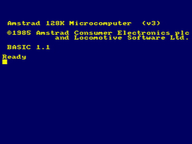
Questionnaire - Plain Text
==========================
The Frugal Gamer recently shared[1] her answers to the questions posed by plain-text advocate Ellane in her post "Answer These Eight Questions About Your Plain Text Files"[2], and this blog (being even more "plain text" than either of those!) seems like an obvious place to answer those questions on my own behalf, too. Let's give them a go!1. When did you start using plain text? ---------------------------------------Way back in the mid-1980s, on an Amstrad CPC microcomputer, I guess, when I started editing files of BASIC code (and, ocassionally, text-based data with CRLF delimiters). I'd later go on to extensively make use of plain text in various flavours of DOS on IBM-compatible PCs: for programming, of course, but also for general notetaking and personal documents.2. Why did you start using plain text? --------------------------------------At those earliest points, it was an exercise in necessity! With only 64Kb of RAM and a 4MHz CPU, the capabilities of my first microcomputer to do anything more gaphically-sophisticated than ASCII plain text (or a nearby derivative of it) would be a stretch! It was around this same time that I tested a basic word processing package called TASWord, but it was VERY bare-bones: just five font faces, able to hold up to three "pages" in memory at once, and some kind of mail merge tool... even though I had a (dot matrix!) printer capable of rendering those fonts, it didn't really justify the effort needed to load the software from the tape deck in the first place with a simpler, lighter editor would, for any real purpose, suffice!3. What do you use plain text for? ----------------------------------This blog, for a start!Aside from when I'm programming or taking basic notes, mostly I end up writing Markdown, these days. Obsidian's a wonderful notetaking app, but in practice all it REALLY is is a tool for collating text files and doing on-the-fly plain-text-to-markdown rendering. I don't really use any of its many cool plugins for anything more-sophisticated than that.And I'm also routinely found writing Markdown (or plain text!) for programming-adjacent jobs: commit logs, pull requests, test instructions, and the like.4. What keeps you using plain text? -----------------------------------My favourite thing about plain text is its longevity. I have notes (old emails, poems, logs from IRC and IM clients, personal notes, even letters) that I wrote in plain text formats 30+ years ago. Even though technology has moved on, I have absolutely no problem reading them today just as I would have when they were first written.5. Do you use any markup or formatting languages? If so, which ones and why? ----------------------------------------------------------------------------My most-used markup languages are Markdown and HTML (although neither on THIS blog, obviously). Both provide functionality that's absent from plain text while still retaining at least a part of the top feature of plain text: its universality and longevity. Markdown's perfectly human-readable even when you don't have an interpreter to hand already. HTML _can_ be very human-readable, too, if the author has taken the care to make it so... and even if it isn't, it can be transformed to plain text pretty trivially even if there isn't a Web browser to hand.6. What are your favourite plain text tools or applications? ------------------------------------------------------------My go-to text editor is Sublime Text (I'm using it right now). After over a decade of Emacs being my preferred text editor, Sublime Text was what dragged me kicking and screaming into 21st century text editing! I love that it's clean, and simple, and really fast (I tried Atom or VSCode or one of those other "heavyweight" editors, implemented in Electron, and found it it to be unbearably slow; perhaps faster processors have made them more-bearable, but doesn't that feel a little bit like treating the symptom rather than solving the problem?).Oh, and Obsidian, as previously noted. Sometimes I'll use Notepad++ on a Windows box, or Nano, Pico, or Emacs from a command-line.And just sometimes - more often than you might expect, I just daisychain an `echo` or a `printf` and a `>>` and just concatenate things into a file. Sometimes that's all you need!7. Is there one tool you can’t do without? ------------------------------------------Nope! I've spent long enough doing plain text things with enough different tools that - perhaps with a little mumbling and grumbling - I can adapt to whatever tools are available. Though you'll find me grumpy if you make me work on a system without `grep` available!8. Is there anything you can’t do with plain text? --------------------------------------------------I mean... ultimately, there has to be right? Sure, you can write general-purpose software using your plain text editor, but you'll still need a compiler or interpreter to run it, and how is ITS program code rendered? No matter what your stack is, eventually you'll find that you're running into machine code, and - even though it can be 1:1 mapped to assembly... that's a translation, not what it IS. So fundamentally, there's a limit to the power of plain text.But once you're balanced atop a well-made toolchain, there's a hell of a lot you can do! Data can be rendered as CSV, YAML, JSON or whatever. Markup can add value while retaining the human-readable joy of a simple, plain text file. It saddens me when I see somebody type out their shopping list in e.g. Microsoft Word or some other monster, when Notepad would have plenty sufficed (and be faster, with a smaller file size, and increased interoperability!).I've long loved the "Unix Philosophy" that plain text should be the default data format, rather than any binary format, between applications. That, in itself, is a reminder of plain text's versatility!It's the universal language of humans and machines. And it's here to stay.Links -----[1] https://www.thefrugalgamer.net/blog/2026/01/22/questionnaire-plain-text/ [2] https://ellanew.com/2025/01/19/ptpl-191-answer-8-questions-why-plain-text
D’ya know what? Back when I used to write lots of stuff on Usenet and BBSes, I got really good at manually wrapping at, say, 80 characters. Even doing full justification by tweaking word choices or by just manually injecting spaces in the places that that produce the fewest “rivers”.
I’ve sort-of lost the knack for it. But I think I did a pretty good job with this post!
![Stylish (for circa 2000) webpage for HoTMetaL Pro 6.0, advertising its 'unrivaled [sic] editing, site management and publishing tools'.](https://bcdn.danq.me/_q23u/2025/08/hotmetal-pro-6-640x396.jpg)
