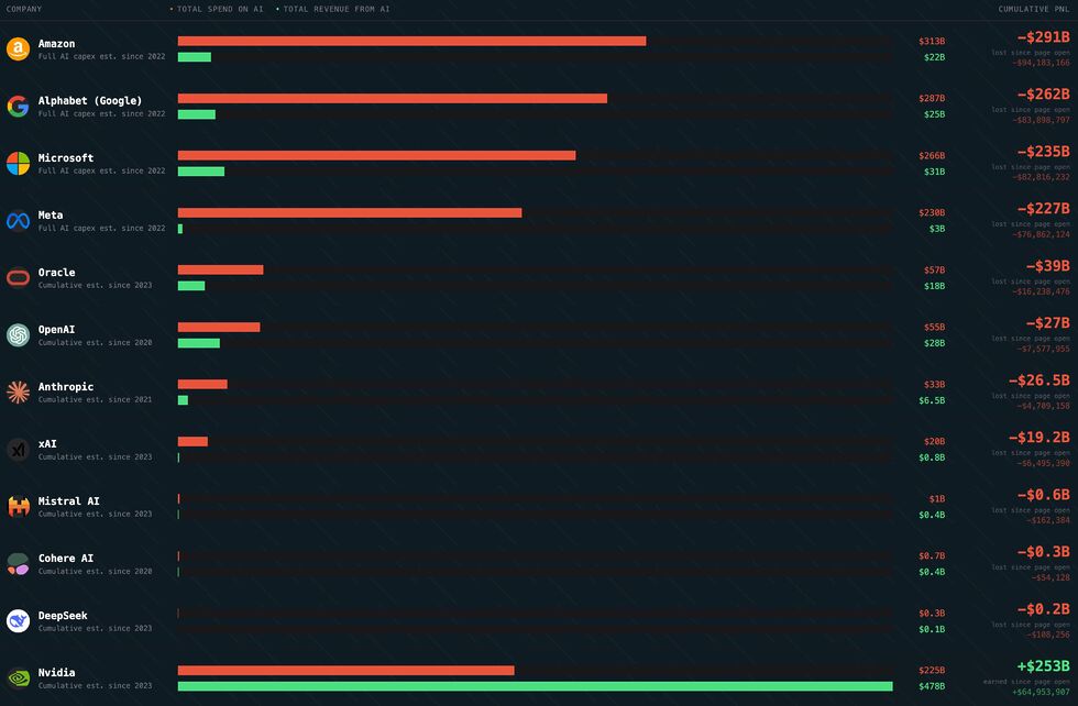
No surprises here, but it’s interesting/staggering to see quite how large the disparity between spending and profit is for some of these companies.
I enjoy the fact that there’s a real-time ticker on the site so you can watch Amazon (for example) burn five thousand dollars a second.
When I tell people that generative AI, as it’s currently used, is unsustainable, this is what I’m talking about. Unless there’s a quantum leap in AI efficiency (for which I’ve seen no
evidence of the feasibility) or a dramatic increase in the charged cost of LLM services (on the order of a tenfold increase assuming the increased cost does not drive any customers
away; more if it does), this whole thing looks like a house of cards.
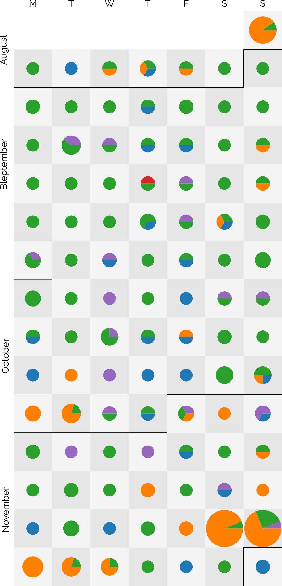
I was having trouble visualising the dice probabilities for some Forged in the Dark-based1
RPGs2, so I drew myself a
diagram. I don’t know who, if anybody, would be interested in such a thing other than me… but that’s why we put these things online, right?
1-3: Failure – depending on the circumstances you might be
able to try again (with greater risk) and/or suffer some kind of consequence (a “harm” or “complication”).
4-5: Limited success – you succeed, but with come kind of
consequence.
6: Success – you succeed!
Multiple 6s: Critical – you succeed, and it’s more-effective
than you’d hoped or you gain some other benefit4.
If you’re playing Blades in the Dark or another Forged in the Dark-based game and find it useful to visualise how likely you are to get screwed-over by the dice…
you’re welcome!
Footnotes
1Forged in the Dark is the name of the permissively-licensed SRD originally used
for fantasy RPG Blades in the Dark, but it’s been used in plenty of other places too where its relatively fast-and-loose mechanics are best-suited. Sharp-eyed readers might
have noticed this come up in a repost from last week, too…
2 I may or may not be considering Forged in the Dark as the engine for a
prototype RPG environment I’ve been half-heartedly constructing this winter…
3 A task for which you’ve prepared and have trained, in an area in which you’re skilled,
and for which you’re well-equipped (e.g. an accomplished thief takes the time to carefully pick a basic lock using fine tools) is likely to involve rolling more dice than a
less-fortunate individual.
I’ve had a few breakups, but I’ve only been made redundant once. There’s a surprising overlap between the two…
And with that, I’d better get back to it. Today’s mission is to finish checking-in on my list of “companies I’ve always admired and thought I should work for” and see if any of them are
actively looking for somebody like me!
(Incidentally: if you’re into open source, empowering the Web, and making the world a better place, my CV is over here. I’m a senior/principal full-stack
engineer with a tonne of experience in some radically diverse fields, and if you think we’d be a good match then I’d love to chat!)
Last week, I discovered Geneveive Raine‘s “The Continuum”, a super-compressed image comprised of
1-pixel-tall versions of her home page’s daily banners, stitched together1.
I thought it was a beautiful idea, so I stole adapted it to produce an illustration based on the featured images of my blog posts:
Only about 38% of my 5,445 blog posts have featured images suitable for use in this diagram. But here they are!
I generated a horizontal version too, but I’ve used the vertical version above because it’s
more-suitable for use with a HTML imagemap2.
Here’s the code I used to generate the images (and the imagemap), if you want to run it against your own
WordPress-ish blog.
Footnotes
1 Which was in-turn inspired by Movie
Iris, a tool that visualises the frames of a movie as a radial graphic.
2 What’s a HTML imagemap, you ask? You don’t need to ask: you shouldn’t be using it
anyway. Relying on it means you’re setting yourself up for an accessibility nightmare. Anyway: I used one above: you
can click on any “stripe” of the image to jump to the corresponding post. It needed some fighting-with because imagemaps can’t work with rescaled images, so I’ve forced the height of
the image even as it resizes horizontally. Not that you’re going to click on the stripes anyway: it’s just about the worst way imaginable to navigate a blog.
The dots are sized based on the number of posts and broken-down by post kind: articles are blue, notes are green, checkins are orange, reposts are purple, and replies are red3.
I didn’t set out with the aim of getting to a hundred4, as I might well
manage tomorrow, but after a while I began to think it a real possibility. In particular, when a few different factors came together:
Travel’s given me more opportunity for geocaching (and, this last week, geohashing), as reflected in my copious checkin logs for that period.
Earlier this year, inspired by Clayton Errington, I came up with a process to streamline my mobile blogging
“flow”5. I now use a custom
Progressive Web App to provide a better interface for quickly posting on-the-move to one or both of this blog and my personal Mastodon account,
which I tested heavily during Bleptember.
Previous long streaks have sometimes been aided by pre-writing posts in bulk and then scheduling them to come out one-a-day6.
I mostly don’t do that any more: when a post is “ready”, it gets published.
I didn’t want to make a “this is my 100th day of consecutive blogging” on the 100th day. That attaches too much weight to the nice round number. But I wanted to post to
acknowledge that I’m going to make it to 100 days of consecutive blogging… so long as I can think of something worth saying tomorrow. I guess we’ll all have to wait and see.
Footnotes
1 Given that I’ve been blogging for over 26 years, that I’m still finding noteworthy
blogging “firsts” is pretty cool, I think
2 My previous record “streak” was only 37 days, so there’s quite a leap there.
3 A massive 219 posts are represented over the last 99 days: that’s an average of over 2 a
day!
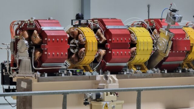
If you wanna bend a stream of electrons travelling at nearly the speed of light, you’re gonna need a lot of big magnets.
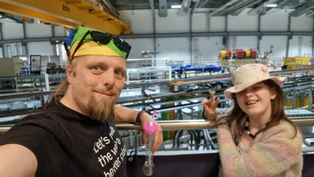
This started on Saturday with a trip to the Harwell Campus, whose first open day in eight years provided a rare opportunity for us to get up
close with cutting edge science (plus some very kid-friendly and accessible displays) as well as visit the synchrotron at Diamond Light Source.
It’s hard to convey the scale of the thing; turns out you need a big ol’ ring if you want to spin electrons fast enough to generate a meaningful amount of magnetobremsstrahlung
radiation.
The whole thing’s highly-recommended if you’re able to get to one of their open days in the future, give it a look. I was particularly pleased to see how enthused about science it made
the kids, and what clever questions they asked.
For example: the 7-year-old spent a long time cracking a variety of ciphers in the computing tent (and even spotted a flaw in one of the challenge questions that the exhibitors then had
to hand-correct on all their handouts!); the 10-year-old enjoyed quizzing a researcher who’d been using x-ray crystallography ofproteins.
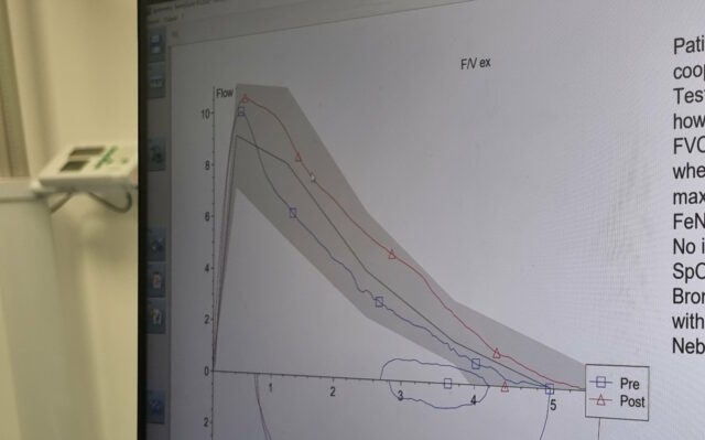
Medicine
And then on Sunday I finally got a long-overdue visit to my nearest spirometry specialist for a suite of experiments to try to work out what exactly is wrong with my lungs, which
continue to be a minor medical mystery.
“Once you’ve got your breath back, let’s fill you with drugs and do those experiments again…”
It was… surprisingly knackering. Though perhaps that’s mostly because once I was full of drugs I felt briefly superpowered and went running around the grounds of the wonderfully-named
Brill Hill Windmill with the dog until was panting in pretty much the way that I might normally have been,
absent an unusually-high dose of medication.
It’s got a graph; that makes it science, right? (I’m ignoring those party political histograms that outright lie about how narrow the margins are…)
For amusement purposes alone, I’d be more-likely to recommend the first day’s science activities than the second, but I can’t deny that it’s cool to collect a load of data about your
own body and how it works in a monitorable, replicable way. And maybe, just maybe, start to get to the bottom of why my breathing’s getting so much worse these last few years!
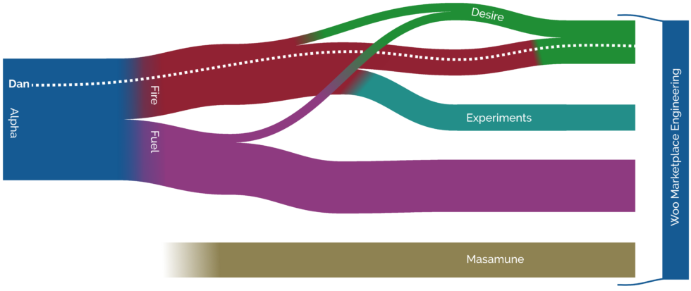
This winter, though, Fire became underpopulated. We lost a few folks to a newly-formed Experiments team, and several individual team members moved to other parts of the company. Once we
got small enough it wasn’t worthwhile being a team in our own right. Our focus areas got split between Desire and Masume, and those of us who were left got absorbed into Team Desire.
That’s where you’ll now find me.
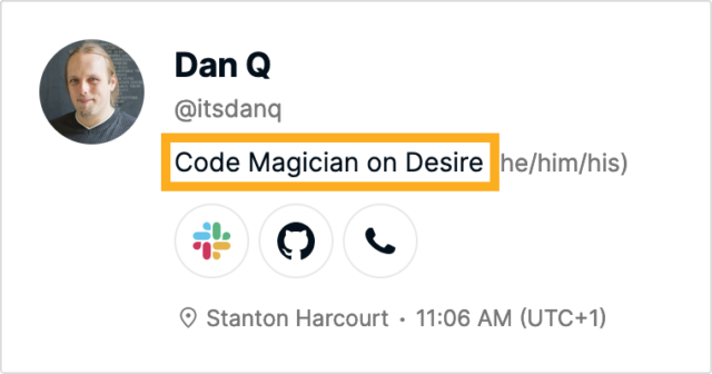
I miss being “on Fire”, because it sounded cool. Maybe I should suggest a patch for our intranet to allow teams to choose the preposition used when referring to their members, e.g.
from “on”, “in”, “of” etc. Then I could be the “Code Magician of Desire”, which is a cool job title once again.
I was initially a bit bummed about the dissolution of my old team3
and struggled to find my place in my new team. The work is similar and the codebases overlap, but even sibling teams can have different rituals and approaches to problems that provide a
learning barrier4.
I think I’ve begun to find my feet now, and next week I’m excited to meet many of my new team in-person for the first time at a Desire-wide meetup in Amsterdam5.
Footnotes
1 Strangely, this isn’t directly related to Automattic’s recent re-organisation, which I’ve written about previously, but is a
result of more-local changes within my division coupled with the natural flow of Automatticians around the company. But it does make it feel from my perspective like a lot of things
are getting jiggled about simultaneously!
2 When Alpha were first discussing the upcoming split, I suggested that we might like to
give our new teams a “pair” of names that linked to one another, and threw out a few ideas to get the ball rolling. One of those ideas was “Fuel and Fire”; I jokingly added that “it
was like the Metallica song, which also gave us ‘Desire’ as a possible third team name should the need arise”. This wasn’t
supposed to be taken seriously, but apparently it was taken seriously enough because my suggestion was the winner and I soon ended up “on Fire”.
3 Many of my old teammates and I did at least manage to get together for one final
(virtual) social event, culminating in a symbolic “extinguishing of fire” as a candle that had been left burning through the meeting was put out at the end.
4 A team’s rituals aren’t just about the way they hold their meetings or run their retros;
for example my new team are very disciplined about announcing their appearance on a morning with a friendly greeting in our social channel, which are for some reason generally
responded-to with a barrage of “waving Pikachu” slackmoji. I don’t know why Pikachu is the mascot of our mornings, but I’ve joined in because it’s a fun gesture of the team’s distinct
collective personality. Also it’s a cute GIF: it’s nice to get waved-at by Pikachu on a morning.
5 Doubly-awesome, the destination’s proximity means that I get to travel by Eurostar
rather than having to fly.
Well that was Bloganuary! It was pressuring, exhausting, and – mostly! – fun. Let’s
recap what I wrote about each day of January:
My Biggest Challenge, for which I pointed at motivation in the winter and how that was a major part of my
motivation for trying to participate in Bloganuary in the first place! I also touched on the difficulty of staying on-task.
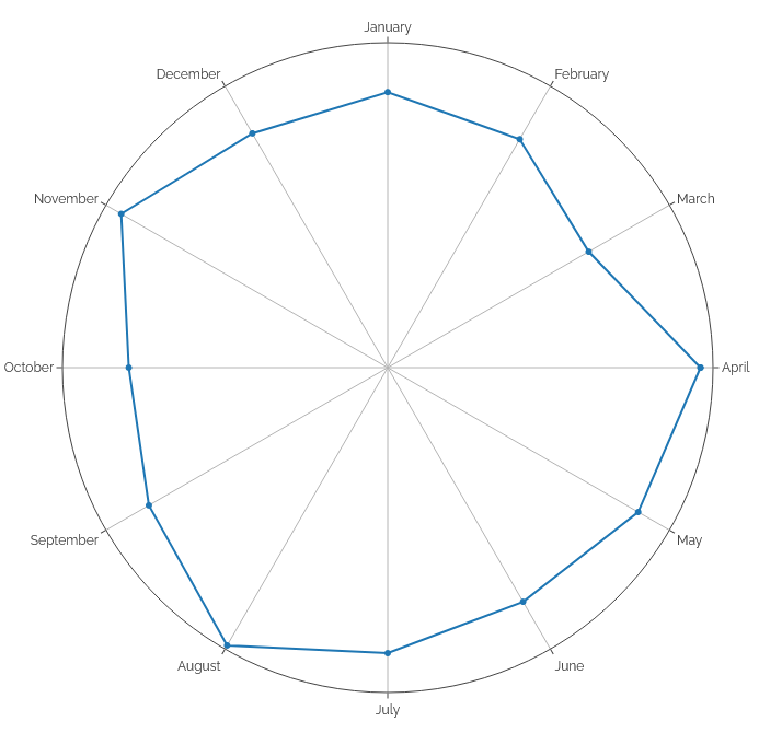
Early in January I shared this chart which indicates the severity of the “dip” I typically see in my blog output in the first few months of the year. Could I overcome this through
sheer determination, I wondered?
Playtime. I talked about some of the “play” activities I engage in, including roleplaying games, board games, videogames,
escape rooms, and GNSS games.
Alumnus: an exploration of the higher education establishments I’ve been part of.
The Gift of Time, when I talked about being time-poor and seemingly perpetually-busy and expressed my love of gifts that
help me reclaim that time.
Nostalgia vs Futurism. I spend comparable amounts of time thinking about the future as the past, I reckon.
Uninvention, in which I propose uninventing cryptocurrency.
Leadership: I revisited an
old post about the qualities I admire in leaders; it’s still true.
Dream Job – am I already doing my dream job? Maybe, though perhaps it isn’t the one that pays me!
What’s in a name? My name today is one I chose for myself, but it’s not the only name I’ve been known by. I revisit the
names I’ve been called and what they’ve meant.
New Tricks, about how convenient it’d be to be able to explain to our dog that the builders in our house are not here to
steal her toys.
Fun Five: five things I do for fun – code, magic, play, piano, learn. A bit of a parallel to “Playtime” from day 2.
Harcourt Manor, a local attraction I’ve never gotten to see inside.
Landslide, the spectacular song that inspired this post because I didn’t objected to the original prompt.
Traditions my family practices, some of which are pretty unique to us.
Reading List, about how mine is pretty long this time of year, but that doesn’t stop me thinking about what I might
re-read next.
Not The Lottery, a game I play that’s… well… not the lottery. And how if I played the actual lottery (and
somehow won), how I’d do my “dream job” from day 18.
Sportsball! I don’t really play or follow any sports, but that doesn’t stop me writing a diatribe of what’s wrong with
professional soccer.
Toilet Paper is typically mounted on a holder in one of two polarities. One of those orientations is an abomination.
The Fear of expressing vulnerability is real in this final Bloganuary entry.
So yeah: 31 posts in as many days! Actually, it was closer to 40, because on a couple of days I wrote non-Bloganuary posts too:
Generating a chart...
If this message doesn't go away, the JavaScript that makes this magic work probably isn't doing its job right: please tell Dan so he can fix it.
Of course, with the addition of this post, it’s now 32+ posts in 32 days. As I’ve noted before, this is my longest daily streak in over 25 years of blogging… and I’m genuinely a little curious how much longer I can keep it up. There
are lots of things I meant to write about last month but simply didn’t have time: if I dusted off a few of those ideas I could push on a few days longer. My longest
unstreak or “dry spell” – the longest number of consecutive days I’ve gone without making a post – is 42 days: could I beat that? That’d be a special level of
personal best.
Wait, is that “most pointless” in quality, or most “pointless posts” as in quantity?
I initially aimed to fuel and inspire my blogging at the start of this year in a more-interpersonal way, by making some pen pals and writing about the experience of that. Except I ran slightly late with my first (and haven’t written it up yet) and even
later with my second (on account of winter blues plus spending any spare “blogging” time doing Bloganuary) so that project’s already way off track. Still aiming to catch-up
though.
But I’m pleased to have been able to throw out 20,000 words of prompt-driven blog posts too, even if some of the prompts were weaker than others!
I find winters are generally bad for my creativity
and motivation, usually until I bounce back in the Spring.
In an attempt to keep me writing daily, I’m giving Bloganuary a go this year. It’s sort-of like the NaNoWriMo of blogging1. And for me, Bloganuary’s very purpose is to overcome the challenge of getting disconnected
from blogging when the nights are long and inspiration’s hard to find2.
The Challenge of Staying On-Task
But outside of the winter, my biggest challenge is usually… staying on-task!
It’s easy to get my focus to wane and for me to drift into some other activity than whatever it is I should be spending my time on. It’s not even
procrastination3 so much as it’s a
fluctuating and changing field of interest. I’ll drift off of what I’m supposed to be working on and start on something that interests me more in that moment… and then potentially off
that too, in turn. The net result is that both my personal and professional lives are awash with half-finished projects4, all waiting their turn for me to find the
motivation to swing back around and pick them up on some subsequent orbit of my brain.
You know how sometimes a stock image says exactly what you need it to? This isn’t one of those times.
It’s the kind of productivity antipattern I’d bring up with my coach, except that I already
know exactly how she’d respond. First, she’d challenge the need to change; require that I justify it first. Second, she’d insist that before I can change, I need to accept and come to
terms with who I am, intrinsically: if this flitting-about is authentically “me”, who am I to change it?
Finally, after weeks or months of exercises to fulfil these two tasks, she’d point out that I’ve now reached a place where I’m still just as liable to change lanes in the middle of a
project as I was to begin with, but now I’m more comfortable with that fact. I won’t have externally changed, I’ll “just” have found some kind of happy-clappy inner peace. And she’ll
have been right that that’s what I’d actually needed all along.
Maybe it’s not such a challenge, after all.
Footnotes
1 Except that would be NaBloPoMo, of course. But it’s a similar thing.
2 Also, perhaps, to help me focus on writing more-often, on more-topics, than I might
otherwise in the course of my slow, verbose writing.
During a conversation with a colleague last week, I claimed that while I blog more-frequently than I did 5-10 years ago, it’s still with a much lower frequency than say 15-20 years ago.
Only later did I stop to think: is that actually true? It’s time for a graph!
Generating a chart...
If this message doesn't go away, the JavaScript that makes this magic work probably isn't doing its job right: please tell Dan so he can fix it.
Generating a chart...
If this message doesn't go away, the JavaScript that makes this magic work probably isn't doing its job right: please tell Dan so he can fix it.
If you consider just articles (and optionally notes, which some older content might have been better classified-as, in
retrospect) it looks like I’m right. Long gone are months like February 2005 when I posted an average of three times every two days! November
2018 was a bit of an anomaly as a I live-tweeted Challenge Robin II: my recent output’s mostly been comparable to the “quiet period”
from 2008-20102.
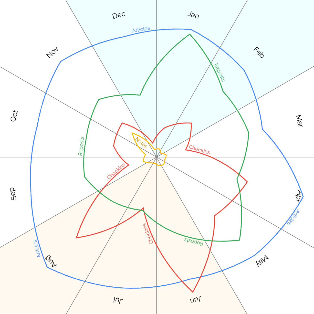
Looking at number of posts by month of the year, it’s interesting to see a pronounced “dip” in all kinds of output roundabout March, less reposts in
Summer and Autumn, and – perhaps unsurprisingly – more checkins (which often represent geocaching/geohashing logs) in the warmer months.
Even on this scale, you can see the impact of the November “Challenge Robin spike” in the notes:
Generating a chart...
If this message doesn't go away, the JavaScript that makes this magic work probably isn't doing its job right: please tell Dan so he can fix it.
Anyway, now I’ve actually automated these kinds of stats its easier than ever for me to ask questions about how and when I write in my blog. I’ve put living copies of the
charts plus additional treats (want to know when my longest “daily streak” was?) on a special page dedicated to that purpose. It’ll be interesting to see how it
looks on this blog’s 25th anniversary, in a little under a year!
Footnotes
1 Try clicking on any of the post kinds in the legend to add/remove them, or
click-and-drag a range across the chart to zoom in.
2 In hindsight, I was clearly depressed in and around
2009 and this doubtless impacted my ability to engage in “creative” pursuits.
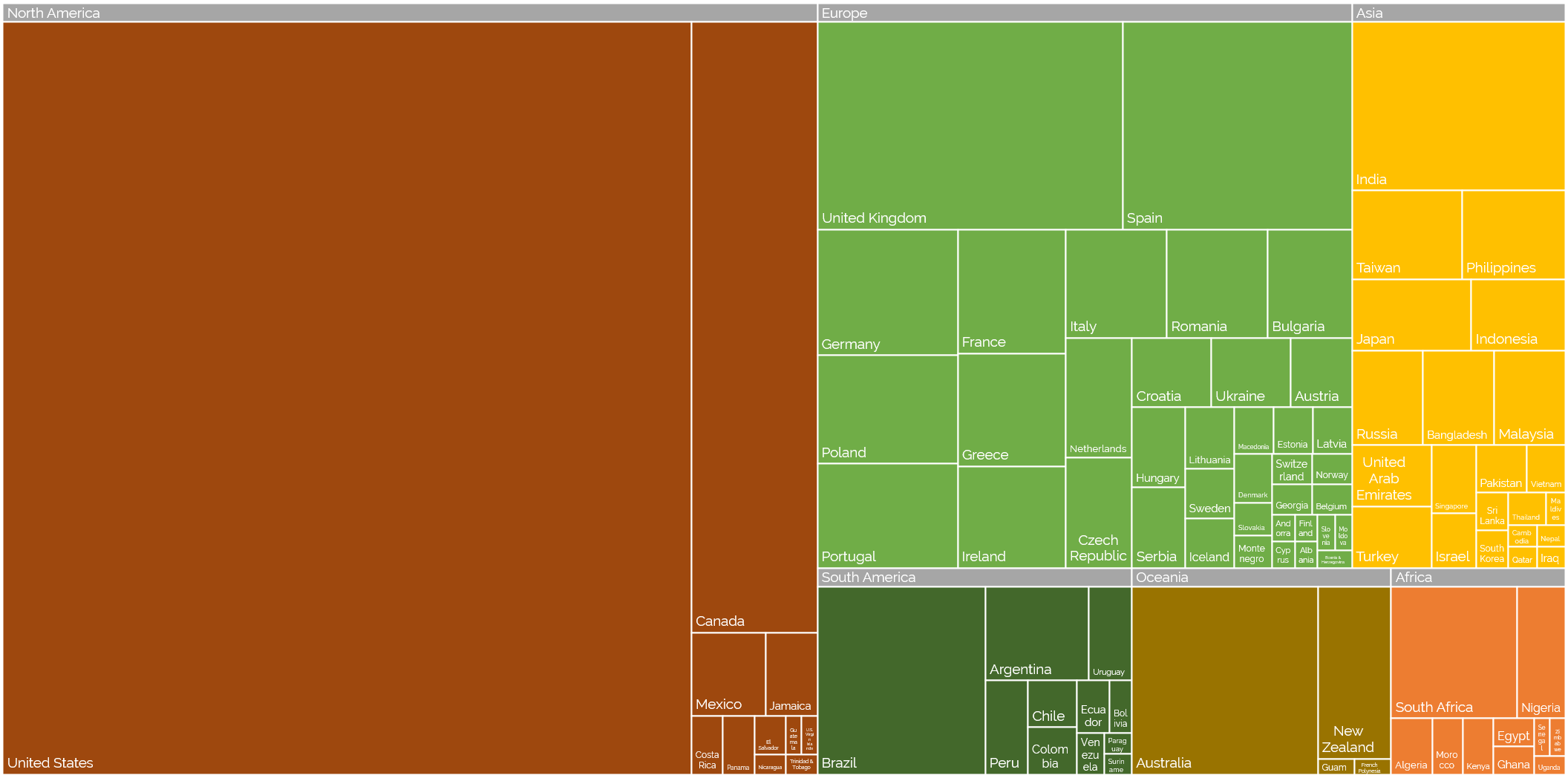
Off the back of my recent post about privileges I enjoy as a result of my location and first language, even at my highly-multinational employer, and inspired by my colleague Atanas‘ data-mining into where Automatticians are
located, I decided to do another treemap, this time about which countries Automatticians call home:
Where are the Automatticians?
If raw data’s your thing (or if you’re just struggling to make out the names of the countries with fewer Automatticians), here’s a CSV file for you.
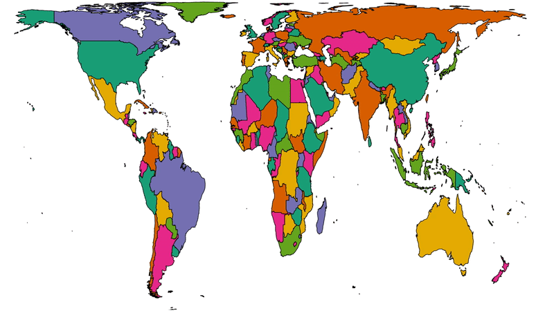
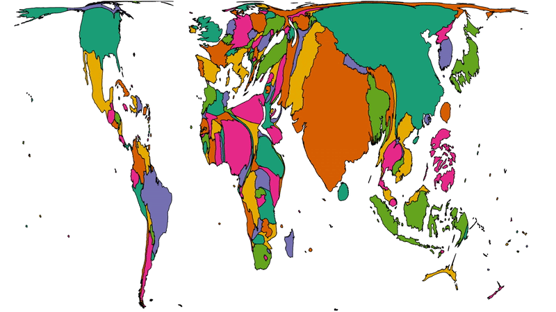
To get a better picture of that, let’s plot a couple of cartograms. This animation cycles between showing countries at (a) their
actual (landmass) size and (b) approximately proportional to the number of Automatticians based in each country:
This animation alternates between showing countries at “actual size” and proportional to the number of Automatticians based there. North America and Europe dominate the map, but there
are other quirks too: look at e.g. how South Africa, New Zealand and India balloon.
Another way to consider the data would be be comparing (a) the population of each country to (b) the number of Automatticians there. Let’s try that:
Here we see countries proportional to their relative population change shape to show number of Automatticians, as seen before. Notice how countries with larger populations like China
shrink away to nothing while those with comparatively lower population density like Australia blow up.
There’s definitely something to learn from these maps about the cultural impact of our employee diversity, but I can’t say more about that right now… primarily because I’m not smart
enough, but also at least in part because I’ve watched the map animations for too long and made myself seasick.
A note on methodology
A few quick notes on methodology, for the nerds out there who’ll want to argue with me:
Country data was extracted directly from Automattic’s internal staff directory today and is based on self-declaration by employees (this is relevant because we employ a relatively
high number of “digital nomads”, some of whom might not consider any one country their home).
Countries were mapped to continents using this dataset.
Maps are scaled using Robinson projection. Take your arguments about this over here.
The treemaps were made using Excel. The cartographs were produced based on work by Gastner MT, Seguy V, More P. [Fast flow-based algorithm for creating density-equalizing map
projections. Proc Natl Acad Sci USA 115(10):E2156–E2164 (2018)].
Some countries have multiple names or varied name spellings and I tried to detect these and line-up the data right but apologies if I made a mess of it and missed yours.
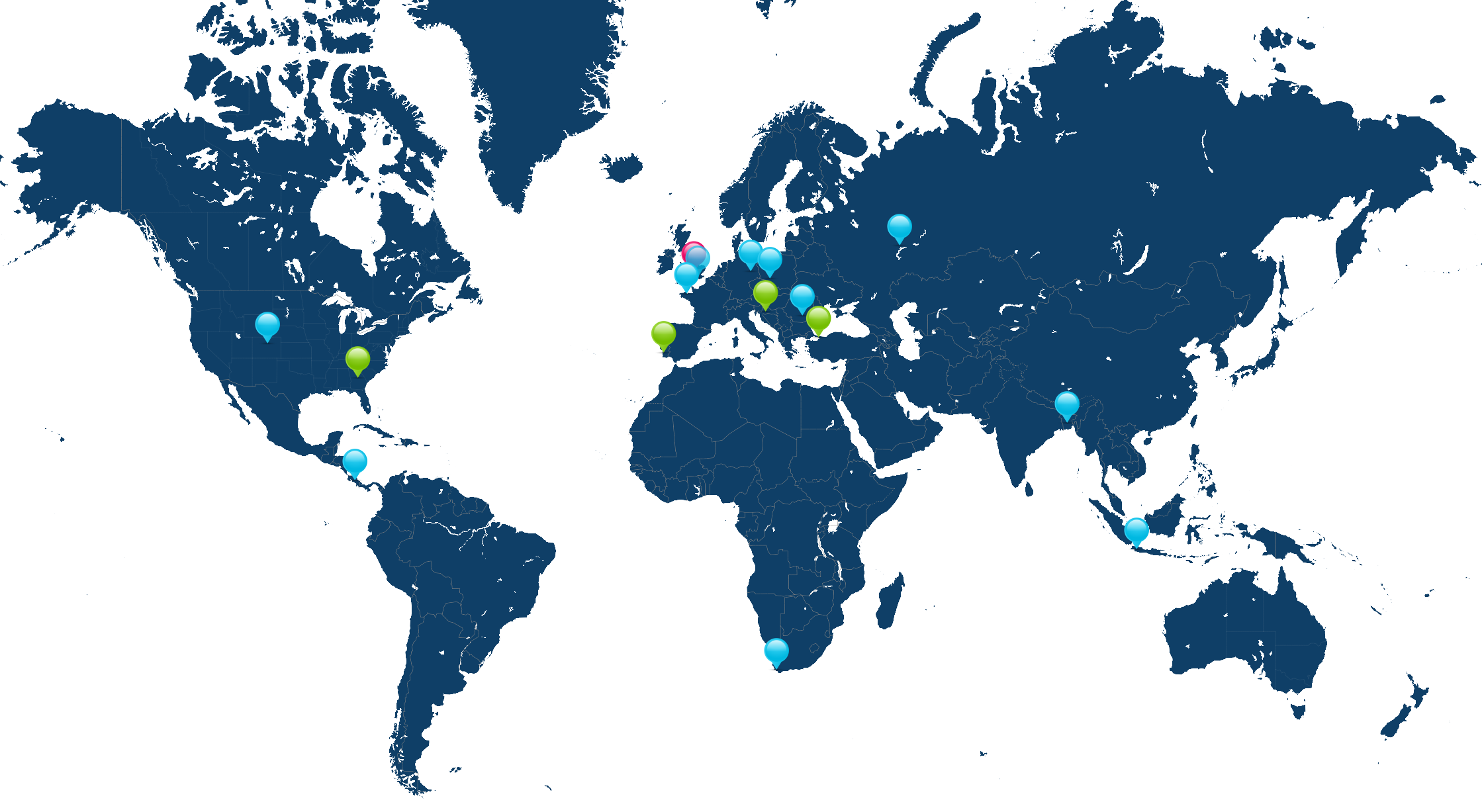
Take a look at the map below. I’m the pink pin here in Oxfordshire. The green pins are my immediate team – the people I work with on a
day-to-day basis – and the blue pins are people outside of my immediate team but in its parent team (Automattic’s org chart is a bit like a fractal).
I’m the pink pin; my immediate team are the green pins. People elsewhere in our parent team are the blue pins. Some pins represent multiple people.
Thinking about timezones, there are two big benefits to being where I am:
I’m in the median timezone, which makes times that are suitable-for-everybody pretty convenient for me (I have a lot of lunchtime/early-afternoon meetings where I get to
watch the sun rise and set, simultaneously, through my teammates’ windows).
I’m West of the mean timezone, which means that most of my immediate coworkers start their day before me so I’m unlikely to start my day blocked by anything I’m waiting on.
(Of course, this privilege is in itself a side-effect of living close to the meridian, whose arbitrary location owes a lot to British naval and political clout in the 19th century: had
France and Latin American countries gotten their way the prime median would have probably cut through the Atlantic or Pacific oceans.)
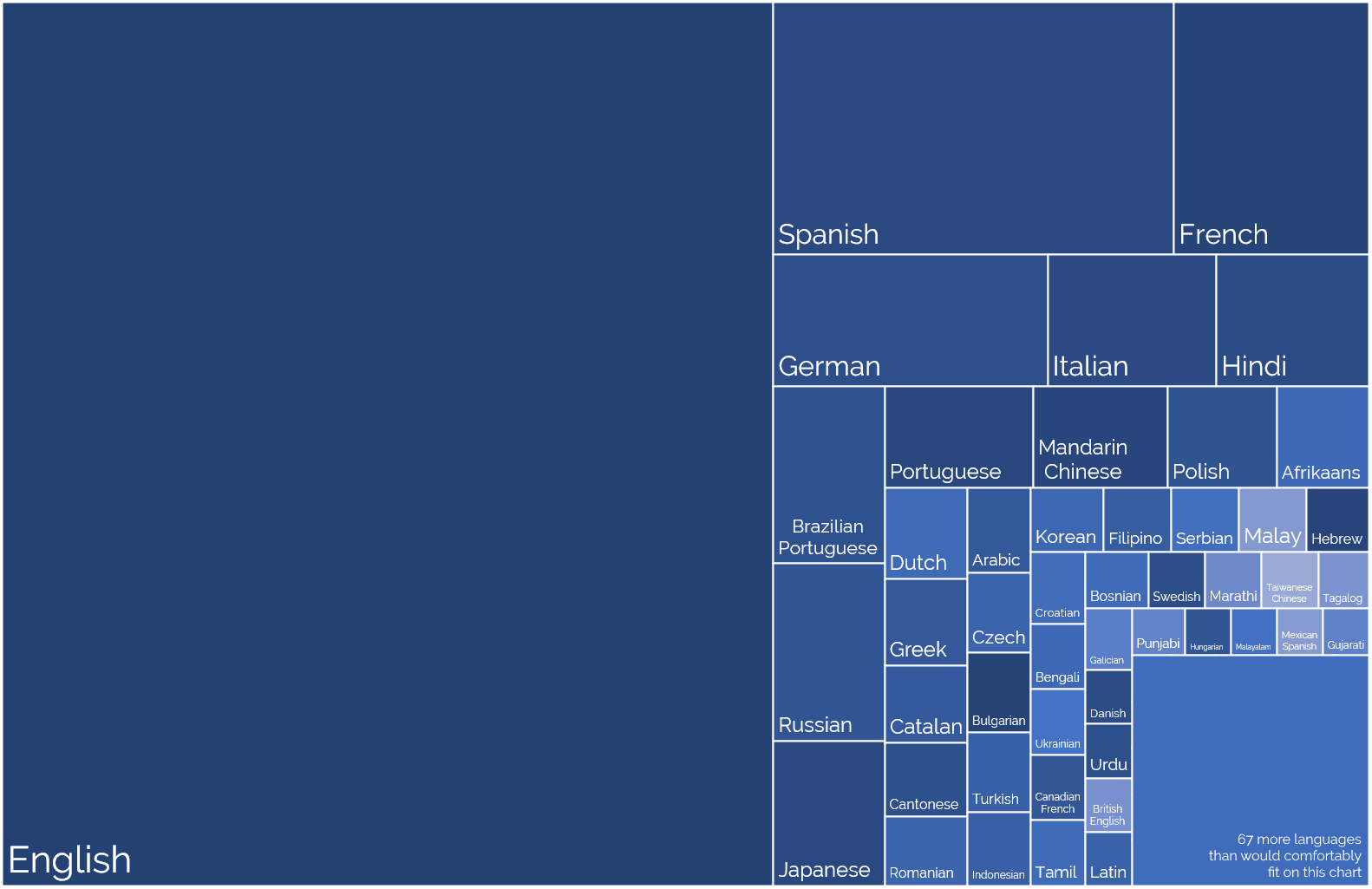
2. Language Privilege
English is Automattic’s first language (followed perhaps by PHP and Javascript!), not one of the 120 other languages spoken
by Automatticians. That’s somewhat a consequence of the first language of its founders and the language in which the keywords of most programming languages occur.
It’s also a side-effect of how widely English is spoken, which in comes from (a) British colonialism and (b) the USA using
Hollywood etc. to try to score a cultural victory.
Languages self-reportedly spoken by Automatticians, sized proportional to the number of speakers. No interpretation/filtering has been done, so you’ll see multiple dialects of the
same root language.
I’ve long been a fan of the concept of an international axillary language but I appreciate that’s an idealistic dream whose war
has probably already been lost.
For now, then, I benefit from being able to think, speak, and write in my first language all day, every day, and not have the experience of e.g. my two Indonesian colleagues who
routinely speak English to one another rather than their shared tongue, just for the benefit of the rest of us in the room!
3. Passport Privilege
Despite the efforts of my government these last few years to isolate us from the world stage, a British passport holds an incredible amount of power, ranking fifth or sixth in the world depending on whose passport index you
follow. Compared to many of my colleagues, I can enjoy visa-free and/or low-effort travel to a wider diversity of destinations.
Normally I might show you a map here, but everything’s a bit screwed by COVID-19, which still bars me from travelling to many
places around the globe, but as restrictions start to lift my team have begun talking about our next in-person meetup, something we haven’t done since I first started when I met up with my colleagues in Cape Town and got
assaulted by a penguin.
But even looking back to that trip, I recall the difficulties faced by colleagues who e.g. had to travel to a different country in order tom find an embassy just to apply for the visa
they’d eventually need to travel to the meetup destination. If you’re not a holder of a privileged passport, international travel can be a lot harder, and I’ve definitely taken that for
granted in the past.
I’m going to try to be more conscious of these privileges in my industry.
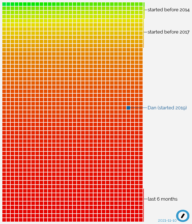
It just passed two years since I started working at Automattic, and I just made a startling
discovery: I’ve now been with the company for longer than 50% of the staff.
When you hear that from a 2-year employee at a tech company, it’s easy to assume that they have a high staff turnover, but Automattic’s churn rate is relatively low, especially for our
sector: 86% of developers stay longer than 5 years. So what’s happening? Let’s visualise it:
Everything in this graph, in which each current Automattician is a square, explains how I feel right now: still sometimes like a new fish, but in an increasingly big sea.
All that “red” at the bottom of the graph? That’s recent growth. Automattic’s expanding really rapidly right now, taking on new talent at a never-before-seen speed.
Since before I joined it’s been the case that our goals have demanded an influx of new engineers at a faster rate than we’ve been able to recruit, but it looks like things are
improving. Recent refinements to our recruitment process (of which I’ve written about my experience) have helped, but I wonder how much we’ve
also been aided by pandemic-related changes to working patterns? Many people, and especially in tech fields, have now discovered that working-from-home works for them, and a company
like Automattic that’s been built for the last decade and a half on a “distributed” model is an ideal place to see that approach work at it’s best.
We’re rolling out new induction programmes to support this growth. Because I care about our corporate culture, I’ve volunteered
myself as a Culture Buddy, so I’m going to spend some of this winter helping Newmatticians integrate into our (sometimes quirky, often chaotic) ways of working. I’m quite excited to be
at a point where I’m in the “older 50%” of the organisation and so have a responsibility for supporting the “younger 50%”, even though I’m surprised that it came around so quickly.
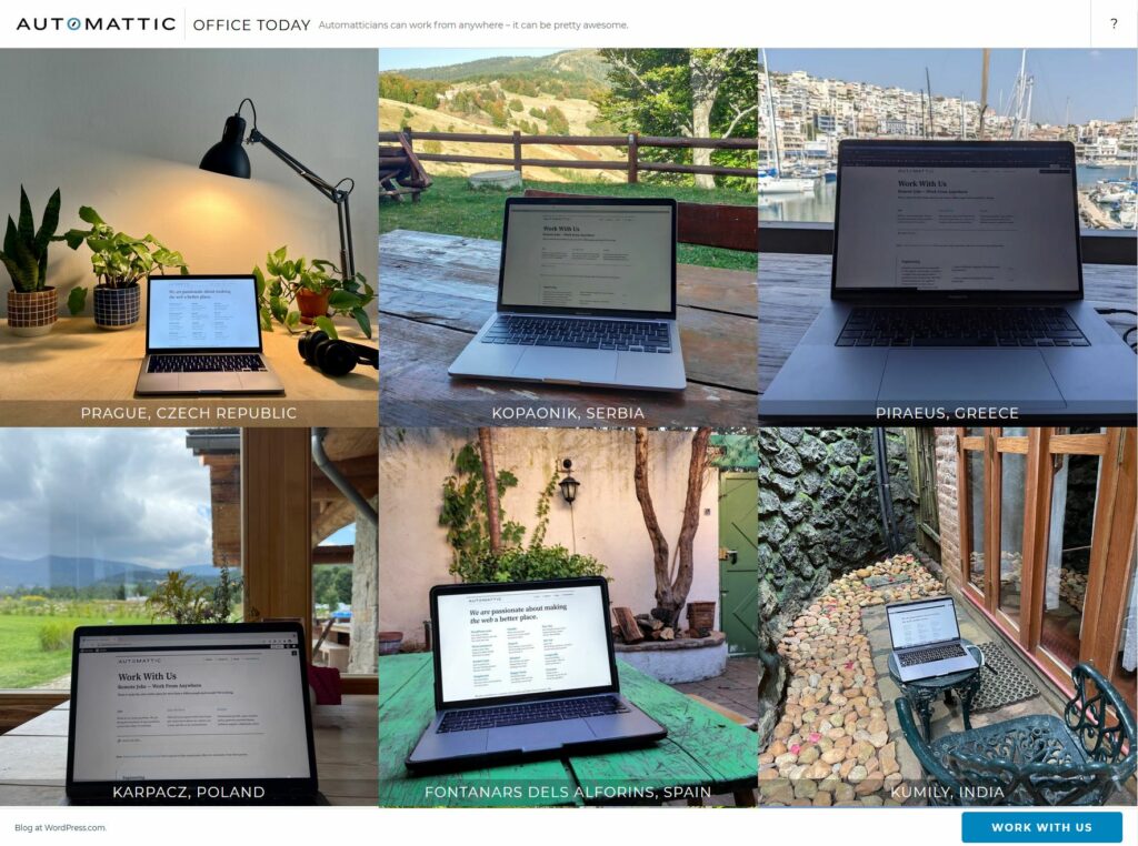
Automattic… culture? Can’t we just show them Office Today and be done with it?
I wonder how that graph will look in another two years.
Unsurprisingly my checkins, which represent #geocaching/#geohashing activity,
grow in the spring and peak in the summer when the weather’s better!
At first I assumed the notes peak in November might have been thrown off by a single conference, e.g. musetech, but it turns out I’ve
just done more note-friendly things in Novembers, like Challenge Robin II and my Cape Town
meetup, which are enough to throw the numbers off.


