(This is yet another post about Automattic. Seee more posts about my experience of working at Automattic.)
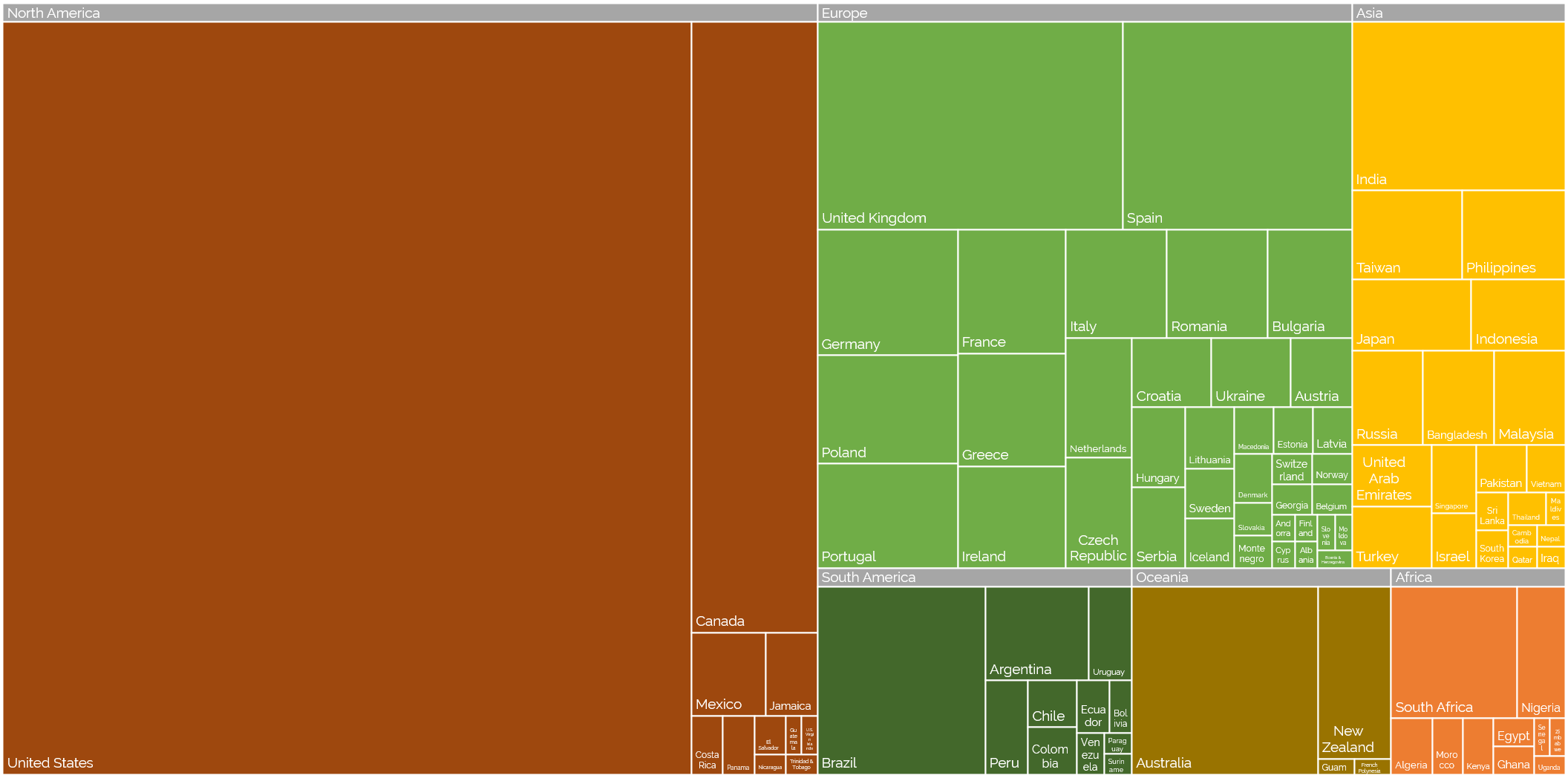
Off the back of my recent post about privileges I enjoy as a result of my location and first language, even at my highly-multinational employer, and inspired by my colleague Atanas‘ data-mining into where Automatticians are located, I decided to do another treemap, this time about which countries Automatticians call home:
Where are the Automatticians?
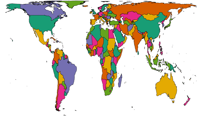
To get a better picture of that, let’s plot a couple of cartograms. This animation cycles between showing countries at (a) their actual (landmass) size and (b) approximately proportional to the number of Automatticians based in each country:
Another way to consider the data would be be comparing (a) the population of each country to (b) the number of Automatticians there. Let’s try that:
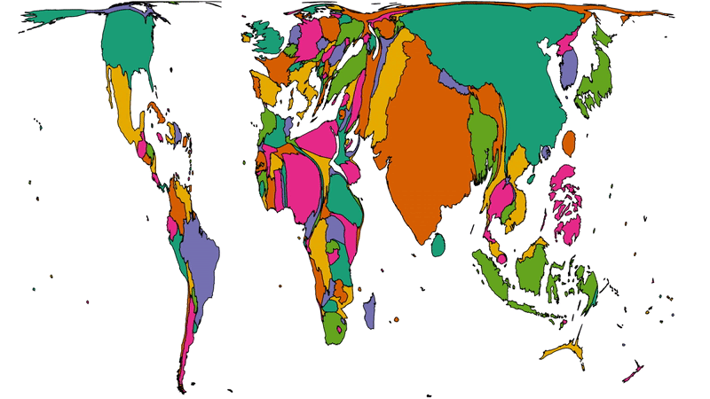
There’s definitely something to learn from these maps about the cultural impact of our employee diversity, but I can’t say more about that right now… primarily because I’m not smart enough, but also at least in part because I’ve watched the map animations for too long and made myself seasick.
A note on methodology
A few quick notes on methodology, for the nerds out there who’ll want to argue with me:
- Country data was extracted directly from Automattic’s internal staff directory today and is based on self-declaration by employees (this is relevant because we employ a relatively high number of “digital nomads”, some of whom might not consider any one country their home).
- Countries were mapped to continents using this dataset.
- Maps are scaled using Robinson projection. Take your arguments about this over here.
- The treemaps were made using Excel. The cartographs were produced based on work by Gastner MT, Seguy V, More P. [Fast flow-based algorithm for creating density-equalizing map projections. Proc Natl Acad Sci USA 115(10):E2156–E2164 (2018)].
- Some countries have multiple names or varied name spellings and I tried to detect these and line-up the data right but apologies if I made a mess of it and missed yours.
0 comments