Goodbye, Tulum! You were delightful, if very hot. It’s time for me to head back to the UK.

Goodbye, Tulum! You were delightful, if very hot. It’s time for me to head back to the UK.
This is a repost promoting content originally published elsewhere. See more things Dan's reposted.
A conversation about staying private and stripping EXIF tags on blogs lead to shdwcat asking the question “what would happen if you took a picture on the moon?”
…
However, I figured we could do better than “a point high above the Earth.” If you could state the coordinate system, you should be able to list an actual point on the moon.
…
It’s a fun question. Sure, you need to shoot down the naysayers who, like colin, rightly point out that you couldn’t reasonably expect to get a GPS/GNSS signal on the moon, but still.
GPS (and most other GNSS technologies) fundamentally work by the principle of trilateration. Here’s the skinny of what happens when your GPS receiver – whether that’s your phone, smartwatch, SatNav, or indeed digital camera – needs to work out where on Earth it is:
So yeah: that tiny computer on top of your camera or within your wristwatch? It’s differentiating to miniscule precision measurements of the speed of light, from spacecraft as far away as half the circumference of the planet, while compensating for not being a timekeeping device accurate enough to do so and working-around the time dilation resulting from the effect of general relativity on the satellites4.
Supposing you could pick out GPS signals from Earth orbit, from the surface of the moon (which – again – you probably can’t – especially if you were on the dark side of the moon where you wouldn’t get a view of the Earth). Could it work?
I can’t see why not. You’d want to recalibrate your GPS receiver to assume that the “time” satellite – the one with the earliest-apparent clock – was much further away (and therefore that the real time was later than it appears to be) than an Earth-based GPS receiver would: the difference in the order of 1.3 seconds, which is a long time in terms of GNSS calculation.
Again, once you had distance measurements from three spatial satellites you’d be able to pinpoint your location, to within some sphere of uncertainty, to one of two points. One would be on the moon (where you know that you are5), and one would be on the far side of the Earth by almost the same distance. That’s a good start. And additional satellites could help narrow it down even more.
You might even be able to get a slightline to more satellites than is typically possible on Earth, not being limited by Earth curvature, nor being surrounded by relatively-large Earth features like mountains, buildings, trees, and unusually-tall humans. It’s feasible.
If we wanted to go further – and some day, if we aim to place permanent human settlements on the moon, we might – then we might consider a Lunar Positioning System: a network of a dozen or so orbiters whizzing around the moon to facilitate accurate positioning on its surface. They’d want to be in low orbits to avoid the impact of tidal forces from the much-larger nearby Eath, and with no atmosphere to scrape against there’s little harm in that.
By the time you’re doing that, though, you might as well ditch trilateration and use the doppler effect, Transit-style. It works great in low orbits but its accuracy on Eath was always limited by the fact that you can’t make the satellites fly low enough without getting atmospheric drag. There’s no such limitation on the moon. Maybe that’s the way forward.
Maybe far-future mobile phones and cameras will support satellite positioning and navigation networks on both Earth and Luna. And maybe then we’ll start seeing EXIF metadata spanning both the WGS-84 datum and the LRO-ME datum.
1 That’s still only about a twentieth of the way to the moon, by the way. But there are other challenging factors, like our atmosphere and all of the obstructions both geographic and human-made that litter our globe.
2 Protip: it doesn’t.
3 Satnav voice: “After falling for forty thousand kilometres, you will reach your destination.”
4 The relativistic effects on GPS satellites cannot be understated. Without compensation, GPS accuracy would drift by up to 10km for every day that the satellites were in orbit, which I reckon would make them useless for anything more than telling you what hemisphere you were in within 5½ years!
5 If you’re on the moon and don’t know it, you have a whole different problem.
From safely outside of its predicted path, just around the Yucatan coast, Hurricane Milton seems like a forboding and distant monster. A growing threat whose path will thankfully take it away, not towards, me.
My heart goes out to the people on the other side of the Gulf of Mexico who find themselves along the route of this awakened beast.
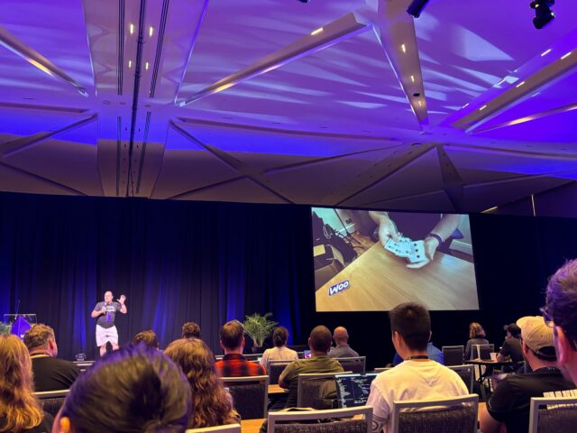
It’s a bit hard to perform close-up magic to an audience 40 metres deep, so I pre-recorded my favourite card trick! Then I talked over it, explaining to colleagues from my division why it’s my favourite bit of slight-of-hand, and what great magic tricks have in common with great code.
I feel like I’m likely to have to perform a lot more illusions at the bar later today!
It’s 05:30 local time on the third day of my work meetup in Tulum, on the Caribbean Coast of Mexico, and I was just woken by incredibly heavy rain. I got up and stepped out until it, and was surprised to discover that it’s almost as warm as the shower in my bathroom. In the distance, beyond the palm trees and over the hill, the booms of thunder are getting closer. Beautiful weather for a beautiful place.

Something I’ve long enjoyed about Automattic gatherings is the opportunity to meet some the most diverse characters you’ll ever find in one place.
But today was the first time I’ve ever been at a beachside disco that was attended by a foraging racoon.

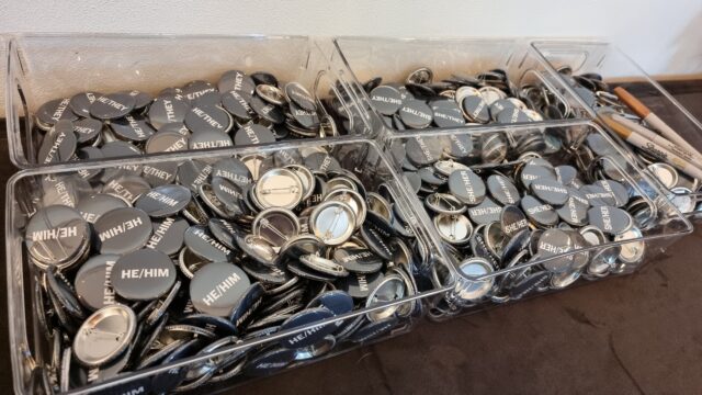
Max props to my employer for providing pronoun pins not just in a diversity of options but also offering blank ones for people not represented by any of the pre-printed options.
Well this is a sight to wake up to. 😍

It took almost twenty hours of travelling but I made it to Mexico!

Think I blew Ruth‘s mind this morning when I set off for a week in Mexico with only a medium-sized, underseat-suitable backpack.

But since working for Automattic five years ago I’ve totally been bitten by the travelling-light bug. Highly recommended!
This week has been a wild ride at Automattic. I’ve shared my take on our recent drama already1.
Off the back of all of this, our CEO Matt Mullenweg realised:
…
It became clear a good chunk of my Automattic colleagues disagreed with me and our actions.
So we decided to design the most generous buy-out package possible, we called it an Alignment Offer: if you resigned before 20:00 UTC on Thursday, October 3, 2024, you would receive $30,000 or six months of salary, whichever is higher.
…
HR added some extra details to sweeten the deal; we wanted to make it as enticing as possible.
I’ve been asking people to vote with their wallet a lot recently, and this is another example!
…
This was a really bold move, and gave many people I know pause for consideration. “Quit today, and we’ll pay you six months salary,” could be a pretty high-value deal for some people, and it was offered basically without further restriction2.
A 2008 Havard Business Review article (unpaywalled version) talked about a curious business strategy undertaken by shoe company Zappos:
…
Every so often, though, I spend time with a company that is so original in its strategy, so determined in its execution, and so transparent in its thinking, that it makes my head spin. Zappos is one of those companies
…
It’s a hard job, answering phones and talking to customers for hours at a time. So when Zappos hires new employees, it provides a four-week training period that immerses them in the company’s strategy, culture, and obsession with customers. People get paid their full salary during this period.
After a week or so in this immersive experience, though, it’s time for what Zappos calls “The Offer.” The fast-growing company, which works hard to recruit people to join, says to its newest employees: “If you quit today, we will pay you for the amount of time you’ve worked, plus we will offer you a $1,000 bonus.” Zappos actually bribes its new employees to quit!
…
I’m sure you can see the parallel. What Zappos do routinely and Automattic did this week have a similar outcome
By reducing – not quite removing – the financial incentive to remain, they aim to filter their employees down to only those whose reason for being there is that they believe in what the company does3. They’re trading money for idealism.
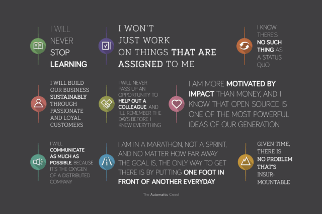
Buried about half way through the Creed is the line I am more motivated by impact than money, which seems quite fitting. Automattic has always been an idealistic company. This filtering effort helps validate that.
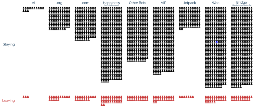
The effect of Automattic’s “if you don’t feel aligned with us, we’ll pay you to leave” offer has been significant: around 159 people – 8.4% of the company – resigned this week. At very short notice, dozens of people I know and have worked with… disappeared from my immediate radar. It’s been… a lot.
I chose to stay. I still believe in Automattic’s mission, and I love my work and the people I do it with. But man… it makes you second-guess yourself when people you know, and respect, and love, and agree with on so many things decide to take a deal like this and… quit4.
There’ve been some real heart-in-throat moments. A close colleague of mine started a message in a way that made me briefly panic that this was a goodbye, and it took until half way through that I realised it was the opposite and I was able to start breathing again.
But I’m hopeful and optimistic that we’ll find our feet, rally our teams, win our battles, and redouble our efforts to make the Web a better place, democratise publishing (and eCommerce!), and do it all with a commitment to open source. There’s tears today, but someday there’ll be happiness again.
1 For which the Internet quickly made me regret my choices, delivering a barrage of personal attacks and straw man arguments, but I was grateful for the people who engaged in meaningful discourse.
2 For example, you could even opt to take the deal if you were on a performance improvement plan, or if you were in your first week of work! If use these examples because I’m pretty confident that both of them occurred.
3 Of course, such a strategy can never be 100% effective, because people’s reasons for remaining with an employer are as diverse as people are.
4 Of course their reasons for leaving are as diverse and multifaceted as others’ reasons for staying might be! I’ve a colleague who spent some time mulling it over not because he isn’t happy working here but because he was close to retirement, for example.
Harry Segell’s 1938 play Heaven Can Wait went on to inspire such an extraordinarily long legacy of follow-ups.
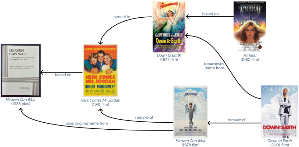
I’ve only seen the most-recent few and my experience is that the older iterations are better, so I probably ought to watch Here Comes Mr. Jordan, right?
This morning’s actual breakfast order from the 7-year-old: “A sesame seed bagel with honey, unless there aren’t any sesame seed bagels, in which case a plain bagel with honey on one half and jam on the other half, unless there aren’t any plain bagels, in which case a cinnamon and raisin bagel with JimJams on one half and Biscoff on the other half.”

Some day, this boy will make a great LISP programmer. 😂
This is a repost promoting content originally published elsewhere. See more things Dan's reposted.
…
Let’s play a little game. 😉
Look at the following list of words and try to find the intruder:
- wp-activate.php
- wp-admin
- wp-blog-header.php
- wp_commentmeta
- wp_comments
- wp-comments-post.php
- wp-config-sample.php
- wp-content
- wp-cron.php
- wp engine
- wp-includes
- wp_jetpack_sync_queue
- wp_links
- wp-links-opml.php
- wp-load.php
- wp-login.php
- wp-mail.php
- wp_options
- wp_postmeta
- wp_posts
- wp-settings.php
- wp-signup.php
- wp_term_relationships
- wp_term_taxonomy
- wp_termmeta
- wp_terms
- wp-trackback.php
- wp_usermeta
- wp_users
What are these words?
Well, all the ones that contain an underscore
_are names of the WordPress core database tables. All the ones that contain a dash-are WordPress core file or folder names. The one with a space is a company name……
A smart (if slightly tongue-in-cheek) observation by my colleague Paolo, there. The rest of his article’s cleverer and worth-reading if you’re following the WordPress Drama (but it’s pretty long!).
tl;dr: I’m tidying up and consolidating my personal hosting; I’ve made a little progress, but I’ve got a way to go – fortunately I’ve got a sabbatical coming up at work!
At the weekend, I kicked-off what will doubtless be a multi-week process of gradually tidying and consolidating some of the disparate digital things I run, around the Internet.
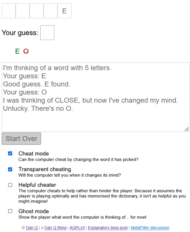
I’ve a long-standing habit of having an idea (e.g. gamebook-making tool Twinebook, lockpicking puzzle game Break Into Us, my Cheating Hangman game, and even FreeDeedPoll.org.uk!), deploying it to one of several servers I run, and then finding it a huge headache when I inevitably need to upgrade or move said server because there’s such an insane diversity of different things that need testing!
I can simplify, I figured. So I did.
And in doing so, I rediscovered several old projects I’d neglected or forgotten about. I wonder if anybody’s still using any of them?

It turns out GitHub pages is a fine place to host simple, static websites that were open-source already. I’ve been working on improving my understanding of GitHub Actions anyway as part of what I’ve been doing while wearing my work, volunteering, and personal hats, so switching some static build processes like DNDle’s to GitHub Actions was a useful exercise.
There’s still a few things I need to tidy up to bring my personal hosting situation under control:

This is the big one, because it’s not just a WordPress blog: it’s also a Gemini, Spartan, and Gopher server (thanks CapsulePress!), a Finger server, a general-purpose host to a stack of complex stuff only some of which is powered by Bloq (my WordPress/PHP integrations): e.g. code to generate the maps that appear on my geopositioned posts, code to integrate with the Fediverse, a whole stack of configuration to make my caching work the way I want, etc.
Right now this is a Ruby/Sinatra application, but I’ve got a (long-running) development branch that will make it run completely in the browser, which will further improve privacy, allow it to run entirely-offline (with a service worker), and provide a basis for new features I’d like to provide down the line. I’m hoping to get to finishing this during my Automattic sabbatical this winter.

A secondary benefit of it becoming browser-based, of course, is that it can be hosted as a static site, which will allow me to move it to GitHub Pages too.
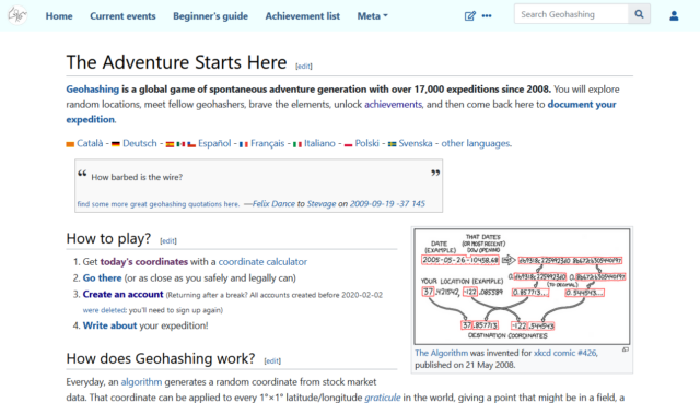
When I took over running the world’s geohashing hub from xkcd‘s Randall Munroe (and davean), I flung the site together on whatever hosting I had sitting around at the time, but that’s given me some headaches. The outbound email transfer agent is a pain, for example, and it’s a hard host on which to apply upgrades. So I want to get that moved somewhere better this winter too. It’s actually the last site left running on its current host, so it’ll save me a little money to get it moved, too!
Right now I run this on my NAS, but that turns out to be a pain sometimes because it means that if my home Internet goes down (e.g. thanks to a power cut, which we have from time to time), I lose access to the first and last place I go on the Internet! So I’d quite like to move that to somewhere on the open Internet. Haven’t worked out where yet.
It’s felt good so far to consolidate and tidy-up my personal web hosting (and to rediscover some old projects I’d forgotten about). There’s work still to do, but I’m expecting to spend a few months not-doing-my-day-job very soon, so I’m hoping to find the opportunity to finish it then!