
At the weekend, I became briefly obsessed with the cover of the manual for GoScript Plus, a 1990 software tool for converting PostScript output into a format that's compatible with a wider array of IBM-compatible printers.
I've never used this piece of software. I can't even remember how I found my way to archive.org's copy of its documentation. Just one of those mysteries.
Anyway: here's what it looks like:
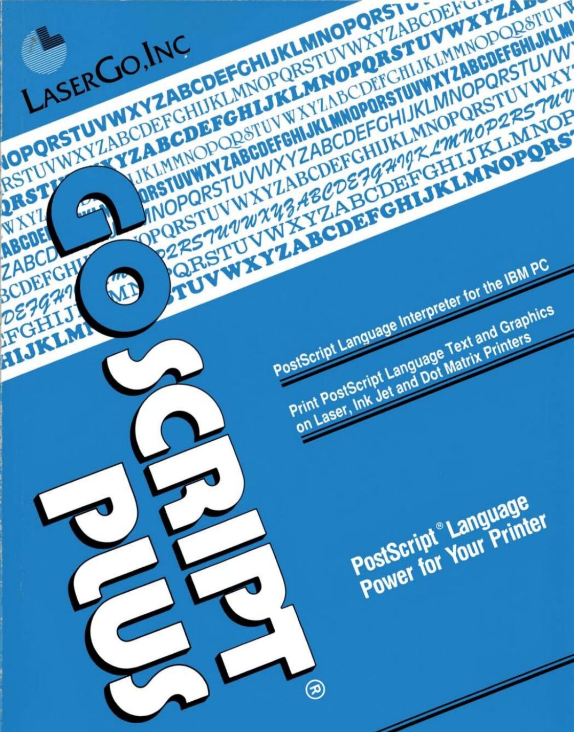
Alt
Computer manual cover printed in blue, black, and white. The title 'GoScript Plus' is askew at one angle, and everything else is askew at a right angle to that.
The design is very much a product of its era. That two-colour print, the strange angles, those smallcaps, the excessive use of title case, and the use of "ink jet" as two words rather than one.
Anyway: I decided I'd attempt to re-create the cover in pure HTML + CSS. No SVGs; no images. Here's what I came up with:
I'm not entirely happy with the fonts: in the short while I was working on this, I couldn't find anything that was quite "right" for the main title, with its stencil-style Rs and Ps, super-rounded Os and Cs, and narrow Ss. In the end I just used Ubuntu Sans almost everywhere.
The white "stripe" with font samples is all just system fonts from your computer! So that's not accurate either. But my aim was to capture the feel of the manual rather than necessarily make a 100% faithful recreation of it, so I guess it's okay.
I was quite pleased with the LaserGo logo in the top left. The main "striped circle with one corner a different color" was implemented like this:
/* The <address> element contains the text "LaserGo, Inc" */
address {
  /* Before AND after it are two virtual elements: */
  &:before,
  &:after {
    content: '';
    display: block;
    position: absolute;
    /* Both are offset to where I want the "circle" to be. */
    /* (note use of container query units for responsive sizing!) */
    top: -8cqw;
    left: 3cqw;
    width: 8cqw;
    height: 8cqw;
    /* Make it circular: */
    border-radius: 50%;
    /* The background is striped, with a color specified in --logo-color: */
    background: repeating-linear-gradient(var(--logo-color) 0cqw, transparent 0.2cqw, transparent 0.3cqw);
    /* Then that gets masked; two variables control which part is shown: */
    mask-image: conic-gradient(var(--logo-corner-mask) 0deg, var(--logo-corner-mask) 90deg, var(--logo-remainder-mask) 90deg, var(--logo-remainder-mask) 360deg);
  }

  &:before {
    /* The "before" circle uses white stripes: */
    --logo-color: var(--white);
    /* And masks so that three-quarters of the circle is shown: */
    --logo-corner-mask: transparent;
    --logo-remainder-mask: black;
  }

  &:after {
    /* The "after" circle uses black stripes: */
    --logo-color: var(--black);
    /* And masks so that one-quarter of the circle is shown: */
    --logo-corner-mask: black;
    --logo-remainder-mask: transparent;
  }
}
Anyway; there's probably nothing more to say about this, apart from a reminder than HTML + CSS is absolutely a an art medium. Take a look at the source code of my fake book cover, if you like (or inspect its DOM, if you prefer): it's all self-contained and should be reasonably readable.
You may have heard of this already but identifont is a great site for finding fonts based on a description of its character shapes. http://identifont.com/
Hey blackle. Good tip! I tried a different font identification tool and it wasn't much use. It's quite possible that the original book cover used something arcane, or was even drawn specifically for this cover.
I just tried identifont but I've got a bit of a shortage of letters to work with! It came up with 30 candidate fonts, but none of them were right. Thanks for sharing it, though: I'll definitely make use of it in other situations!
The main typeface used for the original cover is Pump Bold: https://fontsinuse.com/typefaces/1886/pump
The LaserGo logo is in Friz Quadrata: https://fontsinuse.com/typefaces/1768/friz-quadrata
Both are commercial releases.
Let me know if you want the names of the other fonts as well. (I do like your approach of capturing the feel rather than making a 100% faithful recreation.)
Amazing sleuthing! Thanks so much for showing how the combined hivemind of the Internet's geekery can outfox any problem.
Fantastic work. Is there any way to do the PT ligature in the title in css?
If I used the right font, and the file had the right features, it'd come free. Otherwise: probably not!