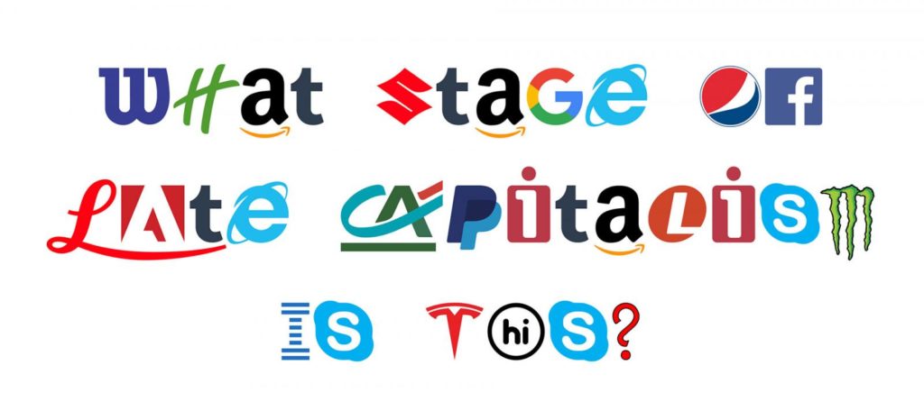
Chris Ferdinandi‘s daily tip
for yesterday addressed a common familiar to Web developers using custom fonts (i.e. basically all of them):
In many browsers, if a custom typeface is declared but hasn’t finished downloading and parsing yet, browsers will leave space for the text but not render it until the file is ready.
This is often called a Flash Of Invisible Text (or FOIT).
In a now slightly outdated article, Ilya Grigorik, a web performance engineer at Google, reports:
29% of page loads on Chrome for Android displayed blank text: the user agent knew the text it needed to paint, but was blocked from doing so due to the unavailable font resource. In
the median case the blank text time was ~350 ms, ~750 ms for the 75th percentile, and a scary ~2300 ms for the 95th.
To make matters worse, some mobile browsers never timeout a failed font file, and therefore never show text in a fallback typeface if the custom one fails to load. You get nothing at
all.
Let’s talk about how to fix that.
…
Chris is right…
He’s right that the FOIT is annoying, and he’s right that for most text (and especially body text) the best result would be if
a fallback system font was used immediately and swapped-out for the designer’s preferred font as soon as it becomes available: this maximises usability, especially on slower devices and
connections. His solution is this:
- Set the font to a fallback font initially.
- Set the font to the preferred font once a CSS class is applied to a root element.
- Use Javascript to set apply that CSS class either when
FontFaceSet.load() indicates that the font is available,
and (via a cookie) for as long as the font file is expected to appear in the browser cache.
This approach is not without its problems. It requires Javascript (users for whom Javascript fails for some reason won’t see the font at all, but may still have to download the font
file!), conflates cookie lifetime with cache lifetime (the two can be cleared independently, cookies can sometimes be synchronised across devices that don’t necessarily share caches,
etc.), and uses Javascript techniques that don’t work in some browsers (Edge and Internet Explorer are both capable of showing custom web fonts but both will use the fallback font
unless either (a) further Javascript is added (which Chris doesn’t supply) or (b) browser detection and/or conditional comments are used to trigger different behaviour in these
browsers (which is icky).
…but he’s also wrong…
If only there was a better way to prevent the FOIT. One which degrades gracefully in older browsers, doesn’t require
Javascript, doesn’t make assumptions about user cookie/cache configuration, and ideally involves a lot less code. It turns out, there is!
The font-display CSS directive exists to solve this exact issue [MDN]. Here’s what it looks like being used to solve the problem Chris presents (example taken from my
blog’s CSS!):
@font-face{
  font-family:"Raleway";
  font-style:normal;
  font-weight:400;
  src: local("Raleway"),
       local("Raleway-Regular"),
       url(/wp-content/themes/q18/fonts/raleway-v11-latin-regular.woff2) format("woff2"),
       url(/wp-content/themes/q18/fonts/raleway-v11-latin-regular.woff) format("woff");
  font-display:swap;
}
Setting font-display: swap in the @font-face block tells the browser to use fallback fonts in place of this font while it loads. That’s probably exactly what
you want for text fonts and especially body text; it means that the user sees the text as soon as possible and it’s swapped-out for the preferred font the moment it becomes available:
no Javascript necessary! Conversely, font-display: block is a better choice for icon fonts where you want to force the browser to wait as long as possible for the
font file to load (because any content rendered using it makes no sense otherwise).
font-display works out-of-the-box with Chrome, Firefox, and Safari and with the next version of Edge; older
versions of Edge and Internet Explorer will simply fall-back to their default behaviour (FOIT where-necessary) – this is a
progressive enhancement technique. But instead of a couple of dozen lines of Javascript, it’s a single line of CSS.
The only downside is that Google Web Fonts won’t add this directive, so you’ll need to
self-host your font files (which is really easy, by the way: there’s a tool that’ll show you how). You should consider
doing this anyway, of course: CDNs introduce a
number of problems and no longer provide the relative performance benefits they used to. So self-host
your fonts, add font-display: swap, and enjoy the most-lightweight and well-standardised approach possible to combatting the FOIT.

