Hot on the heels of my victory over Wonder Boy 35 years after I first played it, I can now finally claim to have beaten Golden Axe, 25 years after I first played it.
Couldn’t have done it without my magic-wielding 7-year-old co-op buddy.
Hot on the heels of my victory over Wonder Boy 35 years after I first played it, I can now finally claim to have beaten Golden Axe, 25 years after I first played it.
Couldn’t have done it without my magic-wielding 7-year-old co-op buddy.
I use a tool called Sonarr to, uhh1, keep track of when new episodes of television shows are released, regardless of what platform they’re on (Netflix, Prime, iPlayer, whatever) and notify me so I remember to watch it.
For several years, I’ve used IFTTT as the intermediary, receiving webhooks from Sonarr and translating them for Slack:

IFTTT‘s move to kill its Legacy Pro plan2 – which I was on – gave me reason to re-assess this configuration. It turns that the only Pro feature I was using was an IFTTT “filter” to convert the Sonarr webhooks to a Slack-friendly-format.
Given that I’m running an installation of Huginn on my home network anyway, I resolved to re-implement this flow in Huginn and cancel my IFTTT subscription.

This turned out to be so easy I wonder why I never did it before.
First, I created a Webhook Agent and gave the URL to Sonarr.
Then I connected that to a Slack Agent with the following configuration:
{
  "webhook_url": "https://hooks.slack.com/services/...",
  "channel": "#sonarr",
  "username": "Sonarr",
  "message": "*<https://thetvdb.com/?tab=series&id={{series.tvdbId}}|{{series.title}}>*\nNew episodes:{% for episode in episodes %}\n• S{{episode.seasonNumber}}E{{episode.episodeNumber}} {{episode.title}}{% endfor %}",
  "icon": ":tv:"
}
pluralize filter to
work so it’d say “episode” or “episodes” as appropriate before realising I didn’t care enough and gave up.
Then all I needed to do was re-emit some of the previous webhooks to test it:

:tv: icon and added the “Sonarr” username, as shown in my code sample.
Now I’ll continue to know when there’s new television to watch3!
I love the power and flexibility that Huginn provides to help automate your life. It does many of the things that I used to do with a handful of cron jobs and shell scripts, but all in one convenient place.
1 I’ve heard there are other uses for the tool. Your mileage may vary. Don’t forget to pay for your content, if possible.
2 Like many others, I originally signed up to the plan under the promise that the price would be honoured forever. Turns out “forever” means “three years”: who knew?
3 It’s especially useful when you’re between seasons or a show is on hiatus to be reminded that it’s back and I should go and watch it. Hey, there’s a thought: I wonder if I can extract the subtitles from shows and run them through a summarising LLM to give me a couple of paragraphs reminding me “what happened last series” if the show’s been on a long break?
During a family holiday last week to the Three Valleys region of the French Alps for some skiing1, I came to see that I enjoy a privilege I call the freedom of the mountain.

The freedom of the mountain is a privilege that comes from having the level of experience necessary to take on virtually any run a resort has to offer. It provides a handful of benefits denied to less-confident skiers:

The downside is that I’m less well-equipped to consider the needs of others! Out skiing with Ruth one morning I suggested a route back into town that “felt easy” based on my previous runs, only to have her tell me that – according to the map – it probably wasn’t!
The kids spent the week in lessons. It’s paying off: they’re both improving fast, and the eldest has got all the essentials down and it’s working on improving her parallel turns and on “reading the mountain”. It’s absolutely possible that the eldest, and perhaps both of them, will be a better skier than me someday2.
Maybe, as part of my effort to do what I’m bad at, I should have another go at learning to snowboard. I always found snowboarding frustrating because everything I needed to re-learn was something that I could already do much better and easier on skis. But perhaps if I can reframe that frustration through the lens of learning itself as the destination, I might be in a better place. One to consider for next time I hit the piste.
1 Also a little geocaching and some mountainside Where’s Wally?
2 Assuming snow is still a thing in ten years time.
This checkin to GCADXC6 Tour de France reflects a geocaching.com log entry. See more of Dan's cache logs.
My very first “ski-o-cache” was 9 years ago, down in La Tania: this was my second! Found the host easily at the coordinates and found the cache in the third hiding place I tried. It’s quite stiff and hard to extract right now! Needed to wait to return it while some other skiers took pictures of one another at the GZ, but got there in the end. Salutations d’Oxford, en Angleterre. MPLC!
This checkin to geohash 2024-02-10 51 -1 reflects a geohashing expedition. See more of Dan's hash logs.
Field between Cumnor and Appleton, West Oxfordshire
I haven’t hashed for long enough that my home graticule got marked as inactive. I’ve got a little free time this morning, so let’s fix that!
It took two attempts to reach this hashpoint.
The first attempt saw me set off around 09:40, with a plan to drive over the world’s stupidest toll bridge (paying 5p for the privilege), park up in Cumnor somewhere, then work down the Cumnor-Appleton footpath before dipping into the fields (which are likely to be fallow this time of year) to claim the hashpoint. I suggested to take the dog, and the 7-year-old child asked if he could join me too, so the three of us with our eight legs set off.
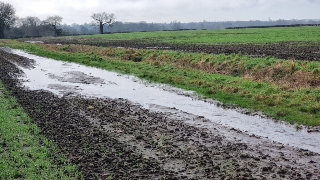
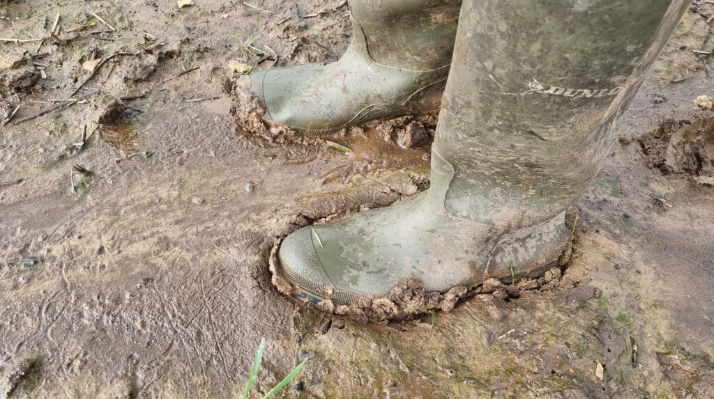
This winter’s seen heavy rain around these parts, and the stream that runs alongside the footpath had broken its banks and flooded the fields. The water had receded, but the ground remained extremely boggy. That kind of thick, wellie-sucking mud that means that if you stop walking for more than a couple of seconds, you might as well give up and say you live there now because your boot is never coming back.
The kid found the going especially-tough, especially after a particularly-deep puddle splashed over the edge of his wellies, and asked to turn back. The dog was finding it a bit challenging too! So we doubled-back and found a geocache a little way off the path. We’ve generally been disappointed by Cumnor’s geocaches and especially this series, finding them to be ill-maintained or completely absent, but it looks like the cache owner has been working on repairing and replacing them towards the tail end of last year and this one was soon found. I drove the dog and child home (back across the toll bridge), then came back out myself (paying the fivepence toll a third time). So began the second attempt:
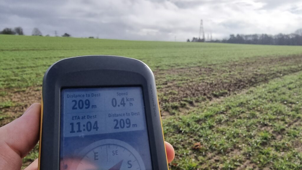
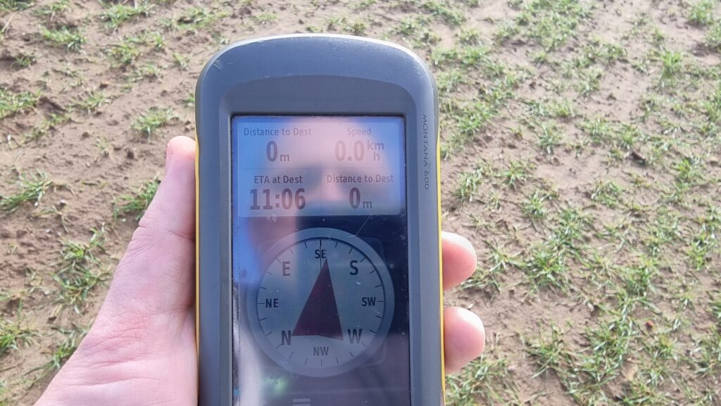
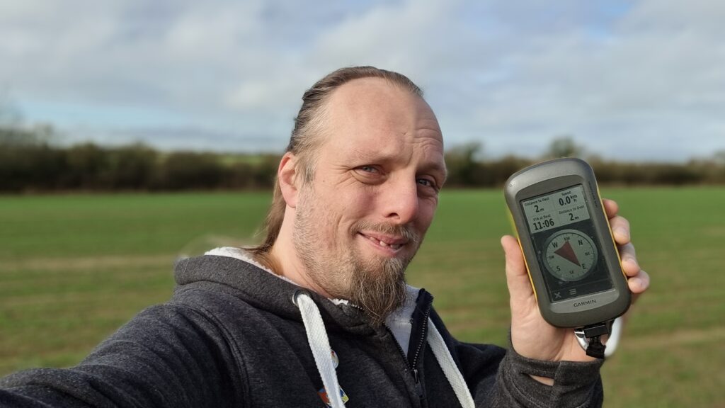
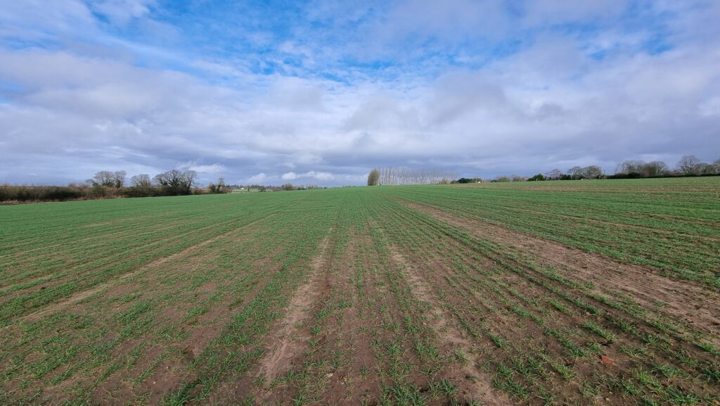
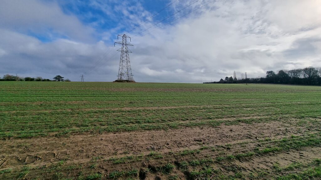
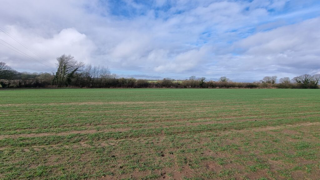
Unburdened by short-legged dogs and damp-footed kids, I made better progress. At points, the path was completely flooded-out, but this gave me an excuse to walk along the “tramlines” of the cultivator that must’ve been working in the field last year, which put me on a better course to reach the hashpoint. By 11:06 I was well within the circle of uncertainty and declared the mission a success.
Then I plodged back through the mud, changed my footwear, and drove over the toll bridge a fourth time. The attendant, clearly sick of seeing me driving back and forth, took pity on me and let me off without paying yet another 5p piece, so that was nice.

This checkin to GC82XT0 Cumnor Minions - Dr Nefario reflects a geocaching.com log entry. See more of Dan's cache logs.
Found after trying a few different hosts while out on an expedition to try and reach the 2024-02-10 51 -1 geohashpoint with the 7-year-old and the dog. The path to the hashpoint is really waterlogged and the little man said his wellies were leaking so we doubled back and retrieved this cache. Extracting the log was a bit of a challenge owing to tune container shape but we managed in the end. TFTC.
Progressive enhancement is a great philosophy for Web application development. Deliver all the essential basic functionality using the simplest standards available; use advanced technologies to add bonus value and convenience features for users whose platform supports them. Win.
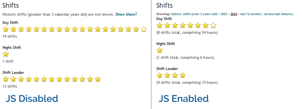
In Three Rings, for example, volunteers can see a “starchart” of the volunteering shifts they’ve done recently, at-a-glance, on their profile page1. In the most basic case, this is usable in its HTML-only form: even with no JavaScript, no CSS, no images even, it still functions. But if JavaScript is enabled, the volunteer can dynamically “filter” the year(s) of volunteering they’re viewing. Basic progressive enhancement.
If a feature requires JavaScript, my usual approach is to use JavaScript to add the relevant user interface to the page in the first place. Those starchart filters in Three Rings don’t appear at all if JavaScript is disabled. A downside to this approach is that the JavaScript necessarily modifies the DOM on page load, which introduces a delay to the page being interactive as well as potentially resulting in layout shift.
That’s not always the best approach. I was reminded of this today by the website of 7-year-old Shiro (produced with, one assumes, at least a little help from Saneef H. Ansari). Take a look at this progressively-enhanced theme switcher:
The HTML that’s delivered over-the-wire provides a disabled <select> element, which gains the CSS directive cursor: not-allowed;, to make it clear to the used that this dropdown doesn’t do anything. The whole thing’s wrapped
in a custom element.
When that custom element is defined by the JavaScript, it enhances the dropdown with an event listener that implements the theme changes, then enables the disabled
<select>.
<color-schemer>
  <form>
    <label>
      Theme
      <select disabled>
        <option value="">System</option>
        <option value="dark">Dark</option>
        <option value="light" selected>Light</option>
      </select>
    </label>
  </form>
</color-schemer>
<label>
probably should use a for="..." rather than wrapping the <select>, but otherwise this code is absolutely gorgeous.
It’s probably no inconvenience to the minority of JS-less users to see a theme switcher than, when they go to use it, turns out to be disabled. But it saves time for virtually everybody not to have to wait for JavaScript to manipulate the DOM, or else to risk shifting the layout by revealing a previously-hidden element.
Altogether, this is a really clever approach, and I was pleased today to be reminded – by a 7-year-old! – of the elegance of this approach. Nice one Shiro (and Saneef!).
1 Assuming that administrators at the organisation where they volunteer enable this feature for them, of course: Three Rings‘ permission model is robust and highly-customisable. Okay, that’s enough sales pitch.
This is a reply to a post published elsewhere. Its content might be duplicated as a traditional comment at the original source.
After a first attempt at mobile blogging, I found a process that works better for my work flow.
Throughout the day, I have ideas and need to write them down. This could be a coding process, a thought to remember, the start of a blog post, and more. I love a good notes app. I’ve gone through quite a few and use a few for different things. Lately it’s been Simplenote.
…
As I took part in Bloganuary and began what’ll hopefully become a fifth consecutive year of 100 Days To Offload, I started to hate my approach to mobile blogging and seek something better, too. My blog’s on WordPress, but it’s so highly-customised that I can’t meaningfully use any of the standard apps, and I find the mobile interface too slow and clunky to use over anything less than a great Internet connection… which – living out in the sticks – I don’t routinely have when I’m out and about. So my blogging almost-exclusively takes place at my desktop or laptop.
But your experience of using a notetaking app is reasonably inspiring. I’m almost never away from a “real” computer for more than a day, so there’s no reason I can’t simply write into such an app, let it sync, and copy-paste into a blog post (and make any tweaks) when I’m sitting at a proper keyboard! I’m using Obsidian for notetaking, and it Syncthing‘s to my other computers, so I should absolutely be leveraging that. I already have an Obsidian folder full of “blog post ideas”… why shouldn’t I just write blog posts there.
Thanks for the inspiration!
The ever-excellent Kev Quirk in 2020 came up with this challenge: write a blog post on each of 100 consecutive days. He called it #100DaysToOffload, in nominal reference to the “100 days of code” challenge. I was reflecting upon this as I reach this, my 36th consecutive day of blogging and my longest ever “daily streak” (itself a spin-off of my attempt at Bloganuary this year), and my 48th post of the year so far.

Might I meet that challenge? Maybe. But it turns out it’s easier than I thought because Kev revised the rules to require only 100 posts in a calendar year (or any other 365-day period, but I’m not going to start thinking about the maths of that).
That’s not only much more-achievable… I’ve probably already achieved it! Let’s knock out some SQL to check how many posts I made each year:
SELECT
  YEAR(wp_posts.post_date_gmt) yyyy,
  COUNT(wp_posts.ID) total
FROM
  wp_posts
WHERE
  wp_posts.post_status='publish'
  AND wp_posts.post_type='post'
GROUP BY yyyy
ORDER BY yyyy
A big question in some years is what counts as a post. Kev’s definition is quite liberal and includes basically-everything, but I wonder if mine shouldn’t perhaps be stricter. For example:
| Year | Posts | Success? | Notes |
|---|---|---|---|
| 1998 | 7 | ❌ No | Some posts are lost from 1998/1999. If they were recovered I might have made 100 posts in 1999, but probably not in 1998 as I only started blogging on 27 September 1998. |
| 1999 | 66 | ❌ No | |
| 2000 | 2 | ❌ No | |
| 2001 | 11 | ❌ No | |
| 2002 | 5 | ❌ No | |
| 2003 | 189 | 🏆 Yes | Achieved 1 September, with a post about an article on The Register about timewasting. Or, if we allow reposts, three days earlier with a repost about Claire's car being claimed by the sea. |
| 2004 | 374 | 🏆 Yes | An early win on 20 April, with a made-up Chez Geek card. Or if we allow reposts, two days earlier with thoughts on a confusing pro-life (???) website. |
| 2005 | 381 | 🏆 Yes | In a highly-productive year of blogging, achieved on 7 April with a post about enjoy curry and public information films with friends. If we allow bookmarks (I was highly-active on del.icio.us at the time!), achieved even earlier on 18 February with some links to curious websites. |
| 2006 | 206 | 🏆 Yes | On 21 July, I shared a personality test (which was actually my effort to repeat an experiment in using Barnum-Forer statements) - I didn't initially give away that I was the author of the "test". Non-pedants will agree I achieved the goal earlier, on 19 June, with my thoughts on a programming language for a hypothetical infinitely-fast computer. |
| 2007 | 166 | 🏆 Yes | Achieved on 2 July with thoughts on films I'd watched and board games I'd played recently. Or arguably 12 days earlier with Claire's birthday trip to Manchester. |
| 2008 | 86 | ❌ No | |
| 2009 | 79 | ❌ No | |
| 2010 |
159
(84 for pedants) |
✅ Yes* | A heartfelt post about saying goodbye to Aberystwyth as I moved to Oxford on 16 June was my 100th of the year. Pedants might argue that this year shouldn't count, but so long as you're willing to count checkins (and you should) then it would... and my qualifying post would have come only a couple of days later, with a post about the Headington Shark, which I had just moved-in near to. |
| 2011 | 177 | 🏆 Yes | Reached the goal on 28 October when I wrote about mild successes in my enquiries with the Office of National Statistics about ensuring that information about polyamorous households was accurately recorded. Or if we earlier on 9 June with a visual gag about REM lyrics if you accept all my geocache logs as posts too (and again: you should). |
| 2012 |
133
(91 for pedants) |
✅ Yes* | My 100th post of the year came on 28 August when I wrote about launching a bus named after my recently-deceased father. You have to be willing to accept both checkins and reposts as posts to allow this year to count. |
| 2013 |
151
(72 for pedants) |
😓 Probably not | I'm not convined this low-blogging year should count: a clear majority of the posts were geocaching logs, and they weren't always even that verbose (consider this candidate for 100th post of 2013, from 1 October). |
| 2014 |
335
(22 for pedants) |
🙁 Not really | Another geocache log heavy, conventional blogpost light year that I'm not convinced should count, even if the obvious candidate for 100th post would be 18 May's cool article about geocaching like Batman! |
| 2015 |
205
(18 for pedants) |
🙁 Not really | Still no, for the same reasons as above. |
| 2016 |
163
(37 for pedants) |
🙁 Not really | |
| 2017 |
301
(42 for pedants) |
🙁 Not really | |
| 2018 |
547
(87 for pedants) |
✅ Yes* | I maintain that checkins should count, even when they're PESOS'd from geocaching sites, so long as they don't make up a majority of the qualifying posts in a year. In which case this year should qualify, with the 100th post being my visit to this well-hidden London pub while on my way to a conference. |
| 2019 |
387
(86 for pedants) |
✅ Yes* | Similarly this year, when on 15 August I visited a GNSS calibration point in the San Francisco Bay Area... on the way to another conference! |
| 2020 |
221
(64 for pedants) |
✅ Yes* | Barely made it this year (ignoring reposts, of which I did lots), with my 21 December article about a little-known (and under-supported) way to inject CSS using HTTP headers, which I later used to make a web page for which View Souce showed nothing. |
| 2021 |
190
(57 for pedants) |
✅ Yes* | A cycle to a nearby geocache was the checkin that made the 100th post of this year, on 27 August. |
| 2022 |
168
(55 for pedants) |
✅ Yes* | My efforts to check up on one of my own geocaches on 7 September scored the qualifying spot. |
| 2023 |
165
(86 for pedants) |
✅ Yes* | My blogging ramped up again this year, and on 24 August I shared a motivational poster with a funny twist, plus a pun at the intersection between my sexuality and my preferred mode of transport. |
| 2024 | 436 | 🏆 Yes | Writing at full-tilt, my hundredth post came when I found a geocache near Regents Canal, but pedants who disregard reposts and checkins might instead count my excitement at the Ladybird Web browser as the record-breaker. This year also saw me write my 5,000th post on this blog! Wowza! |
| 2025 | 458 | 🏆 Yes | |
| 2026 |
164
(90 for pedants) |
✅ Yes* | |
| Total | 5,937 |
Total count of all the posts.
Doesn't add up? Not all posts feature in one of the years above! |
* Pedants might claim this year was not a success for the reasons described above. Make your own mind up.
In any case, I’d argue that I clearly achieved the revised version of the challenge on certainly six, probably fourteen, arguably (depending on how you count posts) as many as nineteen different years since I started blogging in 1998. My least-controversial claims would be:
Given all these unanswered questions, I’m not going to just go ahead and raise a PR against the Hall of Fame! Instead, I’ll leave it to Kev to decide whether I’m (a) eligible to claim a 14-time award, (b) merely eligible for a 4-time award for the years following the challenge starting, or (c) ineligible to claim success until I intentionally post 100 times in a year (in, at current rates, another two months…). Over to you, Kev…
Update: Kev’s agreed that I can claim the most-recent four of them, so I raised a PR.
This checkin to GC8X86T Crawley to Minster Loop - #5 Mirach reflects a geocaching.com log entry. See more of Dan's cache logs.
A second find this morning for the boy, the geopup and I this morning. The hound was no use; she had her nose right up against the cache at one point and gave no indication whatsoever. I’m beginning to think she doesn’t understand geocaching at all! Signed “DQ” to save space. TFTC.
This checkin to GC8X86E Crawley to Minster Loop - #4 Gacrux reflects a geocaching.com log entry. See more of Dan's cache logs.
Out for a dog walk with the younger child (and the dog, of course!). We’ve come to the nearby ruins many times before but never taken the time to do some caching here, until today. Needed the hint to guide us to the right host, after which it was an easy find, although the 7 y/o‘s little fingers had to work hard to extract the cache container from its (temporary?) hiding place! Log damp, but was able to sign “DQ”. TFTC.
Some younger/hipper friends tell me that there was a thing going around on Instagram this week where people post photos of themselves aged 21.
I might not have any photos of myself aged 21! I certainly can’t find any digital ones…
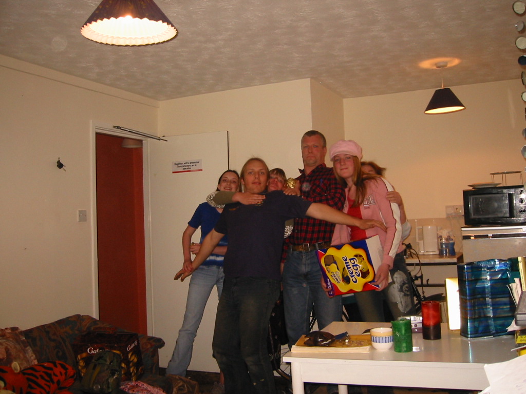
It must sound weird to young folks nowadays, but prior to digital photography going mainstream in the 2000s (thanks in big part to the explosion of popularity of mobile phones), taking a photo took effort:
I didn’t routinely take digital photos until after Claire and I got together in 2002 (she had a digital camera, with which the photo above was taken). My first cameraphone – I was a relatively early-adopter – was a Nokia 7650, bought late that same year.
It occurs to me that I take more photos in a typical week nowadays, than I took in a typical year circa 2000.

This got me thinking: what’s the oldest digital photo that exists, of me. So I went digging.
I might not have owned a digital camera in the 1990s, but my dad’s company owned one with which to collect pictures when working on-site. It was a Sony MVC-FD7, a camera most-famous for its quirky use of 3½” floppy disks as media (this was cheap and effective, but meant the camera was about the size and weight of a brick and took about 10 seconds to write each photo from RAM to the disk, during which it couldn’t do anything else).
In Spring 1998, almost 26 years ago, I borrowed it and took, among others, this photo:

I’m confident a picture of me was taken by a Connectix QuickCam (an early webcam) in around 1996, but I can’t imagine it still exists.
So unless you’re about to comment to tell me know you differently and have an older picture of me: that snap of me taking my own photo with a bathroom mirror is the oldest digital photo of me that exists.
I mentioned yesterday that during Bloganuary I’d put non-Bloganuary-prompt post ideas onto the backburner, and considered extending my daily streak by posting them in February. Here’s part of my attempt to do that:
Let’s take a trip into the Web of yesteryear, with thanks to our friends at the Internet Archive’s WayBack Machine.
The page we’re interested in used to live at http://www.netscape.com/comprod/columns/webstories/index.html, and promised to be a showcase for best practice in Web
development. Back in October 1996, it looked like this:
The page is a placeholder for Netscape Webstories (or Web Site Stories, in some places). It’s part of a digital magazine called Netscape Columns which published pieces written by Marc Andreeson, Jim Barksdale, and other bigwigs in the hugely-influential pre-AOL-acquisition Netscape Communications.
This new series would showcase best practice in designing and building Web sites1, giving a voice to the technical folks best-placed to speak on that topic. That sounds cool!
Those white boxes above and below the paragraph of text aren’t missing images, by the way: they’re horizontal rules, using the little-known size attribute to specify a
thickness of <hr size=4>!2
Certainly you’re excited by this new column and you’ll come back in November 1996, right?
Oh. The launch has been delayed, I guess. Now it’s coming in January.
The <hr>s look better now their size has been reduced, though, so clearly somebody’s paying attention to the page. But let’s take a moment and look at that page
title. If you grew up writing web pages in the modern web, you might anticipate that it’s coded something like this:
<h2 style="font-variant: small-caps; text-align: center;">Coming Soon</h2>
There’s plenty of other ways to get that same effect. Perhaps you prefer font-feature-settings: 'smcp' in your chosen font; that’s perfectly valid. Maybe you’d use
margin: 0 auto or something to centre it: I won’t judge.
But no, that’s not how this works. The actual code for that page title is:
<center>
  <h2>
    <font size="+3">C</font>OMING
    <font size="+3">S</font>OON
  </h2>
</center>
Back when this page was authored, we didn’t have CSS3. The only styling elements were woven right in amongst the semantic elements of a page4. It was simple to understand and easy to learn… but it was a total mess5.
Anyway, let’s come back in January 1997 and see what this feature looks like when it’s up-and-running.
Nope, now it’s pushed back to “the spring”.
Under Construction pages were all the rage back in the nineties. Everybody had one (or several), usually adorned with one or more of about a thousand different animated GIFs for that purpose.6
Building “in public” was an act of commitment, a statement of intent, and an act of acceptance of the incompleteness of a digital garden. They’re sort-of coming back into fashion in the interpersonal Web, with the “garden and stream” metaphor7 taking root. This isn’t anything new, of course – Mark Bernstein touched on the concepts in 1998 – but it’s not something that I can ever see returning to the “serious” modern corporate Web: but if you’ve seen a genuine, non-ironic “under construction” page published to a non-root page of a company’s website within the last decade, please let me know!
RSS doesn’t exist yet (although here’s a fun fact: the very first version of RSS came out of Netscape!). We’re just going to have to bookmark the page and check back later in the year, I guess…
Okay, so February clearly isn’t Spring, but they’ve updated the page… to add a search form.
It’s a genuine <form> tag, too, not one of those old-fashioned <isindex> tags you’d still sometimes find even as late as 1997. Interestingly, it specifies
enctype="application/x-www-form-urlencoded". Today’s developers probably don’t think about the enctype attribute except when they’re doing a form that handles
file uploads and they know they need to switch it to enctype="multipart/form-data", (or their framework does this automatically for them!).
But these aren’t the only options, and some older browsers at this time still defaulted to enctype="text/plain". So long as you’re using a POST
and not GET method, the distinction is mostly academic, but if your backend CGI program anticipates that special
characters will come-in encoded, back then you’d be wise to specify that you wanted URL-encoding or you might get a nasty surprise when somebody turns up using LMB or something
equally-exotic.
Anyway, let’s come back in June. The content must surely be up by now:
Oh come on! Now we’re waiting until August?
At least the page isn’t abandoned. Somebody’s coming back and editing it from time to time to let us know about the still-ongoing series of delays. And that’s not a trivial task: this
isn’t a CMS. They’re probably editing the .html file itself in their favourite text editor, then putting the
appropriate file:// address into their copy of Netscape Navigator (and maybe other browsers) to test it, then uploading the file – probably using FTP – to the webserver… all the while thanking their lucky stars that they’ve only got the one page they need to change.
We didn’t have scripting languages like PHP yet, you see8. We didn’t really have static site generators. Most servers didn’t implement server-side includes. So if you had to make a change to every page on a site, for example editing the main navigation menu, you’d probably have to open and edit dozens or even hundreds of pages. Little wonder that framesets caught on, despite their (many) faults, with their ability to render your navigation separately from your page content.
Okay, let’s come back in August I guess:
Now we’re told that we’re to come back… in the Spring again? That could mean Spring 1998, I suppose… or it could just be that somebody accidentally re-uploaded an old copy of the page.
Hey: the footer’s gone too? This is clearly a partial re-upload: somebody realised they were accidentally overwriting the page with the previous-but-one version, hit “cancel” in their FTP client (or yanked the cable out of the wall), and assumed that they’d successfully stopped the upload before any damage was done.
They had not.
I didn’t mention that top menu, did I? It looks like it’s a series of links, styled to look like flat buttons, right? But you know that’s not possible because you can’t rely on
having the right fonts available: plus you’d have to do some <table> trickery to lay it out, at which point you’d struggle to ensure that the menu was the same width
as the banner above it. So how did they do it?
The menu is what’s known as a client-side imagemap. Here’s what the code looks like:
<a href="/comprod/columns/images/nav.map">
  <img src="/comprod/columns/images/websitestories_ban.gif" width=468 height=32 border=0 usemap="#maintopmap" ismap>
</a><map name="mainmap">
  <area coords="0,1,92,24" href="/comprod/columns/mainthing/index.html">
  <area coords="94,1,187,24" href="/comprod/columns/techvision/index.html">
  <area coords="189,1,278,24" href="/comprod/columns/webstories/index.html">
  <area coords="280,1,373,24" href="/comprod/columns/intranet/index.html">
  <area coords="375,1,467,24" href="/comprod/columns/newsgroup/index.html">
</map>
The image (which specifies border=0 because back then the default behaviour for graphical browser was to put a thick border around images within hyperlinks) says
usemap="#maintopmap" to cross-reference the <map> below it, which defines rectangular areas on the image and where they link to, if you click them! This
ingenious and popular approach meant that you could transmit a single image – saving on HTTP round-trips, which were
relatively time-consuming before widespread adoption of HTTP/1.1‘s persistent connections – along with a little metadata
to indicate which pixels linked to which pages.
The ismap attribute is provided as a fallback for browsers that didn’t yet support client-side image maps but did support server-side image maps: there were a few!
When you put ismap on an image within a hyperlink, then when the image is clicked on the href has appended to it a query parameter of the form
?123,456, where those digits refer to the horizontal and vertical coordinates, from the top-left, of the pixel that was clicked on! These could then be decoded by the
webserver via a .map file or handled by a CGI program. Server-side image maps were sometimes used where client-side maps were undesirable, e.g. when you want to record the actual coordinates
picked in a spot-the-ball competition or where you don’t want to reveal in advance which hotspot leads to what destination, but mostly they were just used as a fallback.9
Both client-side and server-side image maps still function in every modern web browser, but I’ve not seen them used in the wild for a long time, not least because they’re hard (maybe impossible?) to make accessible and they can’t cope with images being resized, but also because nowadays if you really wanted to make an navigation “image” you’d probably cut it into a series of smaller images and make each its own link.
Anyway, let’s come back in October 1997 and see if they’ve fixed their now-incomplete page:
Oh, they have! From the look of things, they’ve re-written the page from scratch, replacing the version that got scrambled by that other employee. They’ve swapped out the banner and menu for a new design, replaced the footer, and now the content’s laid out in a pair of columns.
There’s still no reliable CSS, so you’re not looking at columns: (no implementations until 2014) nor at
display: flex (2010) here. What you’re looking at is… a fixed-width <table> with a single row and three columns! Yes: three – the middle column
is only 10 pixels wide and provides the “gap” between the two columns of text.10
This wasn’t Netscape’s only option, though. Did you ever hear of the <multicol> tag? It was the closest thing the early Web had to a semantically-sound,
progressively-enhanced multi-column layout! The author of this page could have written this:
<multicol cols=2 gutter=10 width=301>
  <p>
    Want to create the best possible web site? Join us as we explore the newest
    technologies, discover the coolest tricks, and learn the best secrets for
    designing, building, and maintaining successful web sites.
  </p>
  <p>
    Members of the Netscape web site team, recognized designers, and technical
    experts will share their insights and experiences in Web Site Stories.
  </p>
</multicol>
That would have given them the exact same effect, but with less code and it would have degraded gracefully. Browsers ignore tags they don’t understand, so a browser without
support for <multicol> would have simply rendered the two paragraphs one after the other. Genius!
So why didn’t they? Probably because <multicol> only ever worked in Netscape Navigator.
Introduced in 1996 for version 3.0, this feature was absolutely characteristic of the First Browser War. The two “superpowers”, Netscape and Microsoft, both engaged in unilateral changes to the HTML specification, adding new features and launching them without announcement in order to try to get the upper hand over the other. Both sides would often refuse to implement one-another’s new tags unless they were forced to by widespread adoption by page authors, instead promoting their own competing mechanisms11.
Between adding this new language feature to their browser and writing this page, Netscape’s market share had fallen from around 80% to around 55%, and most of their losses were picked
up by IE. Using <multicol> would have made their page look worse in Microsoft’s hot up-and-coming
browser, which wouldn’t have helped them persuade more people to download a copy of Navigator and certainly wouldn’t be a good image on a soon-to-launch (any day now!) page about
best-practice on the Web! So Netscape’s authors opted for the dominant, cross-platform solution on this page12.
Anyway, let’s fast-forward a bit and see this project finally leave its “under construction” phase and launch!
Oh. It’s gone.
Sometime between October 1997 and February 1998 the long promised “Web Site Stories” section of Netscape Columns quietly disappeared from the website. Presumably, it never published a single article, instead remaining a perpetual “Coming Soon” page right up until the day it was deleted.
I’m not sure if there’s a better metaphor for Netscape’s general demeanour in 1998 – the year in which they finally ceased to be the dominant market leader in web browsers – than the quiet deletion of a page about how Netscape customers are making the best of the Web. This page might not have been important, or significant, or even completed, but its disappearance may represent Netscape’s refocus on trying to stay relevant in the face of existential threat.
Of course, Microsoft won the First Browser War. They did so by pouring a fortune’s worth of developer effort into staying technologically one-step ahead, refusing to adopt standards proposed by their rival, and their unprecedented decision to give away their browser for free13.
1 Yes, we used to write “Web sites” as two words. We also used to consistently capitalise the words Web and Internet. Some of us still do so.
2 In case it’s not clear, this blog post is going to be as much about little-known and archaic Web design techniques as it is about Netscape’s website.
3 This is a white lie. CSS was first proposed almost at the same time as the Web! Microsoft Internet Explorer was first to deliver a partial implementation of the initial standard, late in 1996, but Netscape dragged their heels, perhaps in part because they’d originally backed a competing standard called JavaScript Style Sheets (JSSS). JSSS had a lot going for it: if it had enjoyed widespread adoption, for example, we’d have had the equivalent of CSS variables a full twenty years earlier! In any case, back in 1996 you definitely wouldn’t want to rely on CSS support.
4 Wondering where the text and link colours come from? <body bgcolor="#ffffff"
text="#000000" link="#0000ff" vlink="#ff0000" alink="#ff0000">. Yes really, that’s where we used to put our colours.
5 Personally, I really loved the aesthetic Netscape touted when using Times New Roman (or whatever serif font was available on your computer: webfonts weren’t a thing yet) with temporary tweaks to font sizes, and I copied it in some of my own sites. If you look back at my 2018 blog post celebrating two decades of blogging, where I’ve got a screenshot of my blog as it looked circa 1999, you’ll see that I used exactly this technique for the ordinal suffixes on my post dates! On the same post, you’ll see that I somewhat replicated the “feel” of it again in my 2011 design, this time using a stylesheet.
6 There’s a whole section of Cameron’s World dedicated to “under construction” banners, and that’s a beautiful thing!
7 The idea of “garden and stream” is that you publish early and often, refining as you go, in your garden, which can act as an extension of whatever notetaking system you use already, but publish mostly “finished” content to your (chronological) stream. I see an increasing number of IndieWeb bloggers going down this route, but I’m not convinced that it’s for me.
8 Another white lie. PHP was
released way back in 1995 and even the very first version supported something a lot like server-side includes, using the syntax <!--include /file/name.html-->. But it was a little computationally-intensive to run willy-nilly.
9 Server-side imagemaps are enjoying a bit of a renaissance on .onion services, whose visitors often keep JavaScript disabled, to make image-based CAPTCHAs. Simply show the visitor an image and describe the bit you want them to click on, e.g. “the blue pentagon with one side missing”, then compare the coordinates of the pixel they click on to the knowledge of the right answer. Highly-inaccessible, of course, but innovative from a purely-technical perspective.
10 Nowadays, use of tables for layout – or, indeed, for anything other than tabular
data – is very-much frowned upon: it’s often bad for accessibility and responsive design. But back before we had the features granted to us by the modern Web, it was literally
the only way to get content to appear side-by-side on a page, and designers got incredibly creative about how they misused tables to lay out content, especially as
browsers became more-sophisticated and began to support cells that spanned multiple rows or columns, tables “nested” within one another, and background images.
11 It was a horrible time to be a web developer: having to make hacky workarounds in order to make use of the latest features but still support the widest array of browsers. But I’d still take that over the horrors of rendering engine monoculture!
12 Or maybe they didn’t even think about it and just copy-pasted from somewhere else on their site. I’m speculating.
13 This turned out to be the master-stroke: not only did it partially-extricate Microsoft from their agreement with Spyglass Inc., who licensed their browser engine to Microsoft in exchange for a percentage of sales value, but once Microsoft started bundling Internet Explorer with Windows it meant that virtually every computer came with their browser factory-installed! This strategy kept Microsoft on top until Firefox and Google Chrome kicked-off the Second Browser War in the early 2010s. But that’s another story.
Well that was Bloganuary! It was pressuring, exhausting, and – mostly! – fun. Let’s recap what I wrote about each day of January:
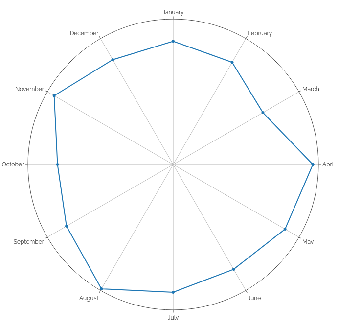

So yeah: 31 posts in as many days! Actually, it was closer to 40, because on a couple of days I wrote non-Bloganuary posts too:
Generating a chart...
If this message doesn't go away, the JavaScript that makes this magic work probably isn't doing its job right: please tell Dan so he can fix it.
Of course, with the addition of this post, it’s now 32+ posts in 32 days. As I’ve noted before, this is my longest daily streak in over 25 years of blogging… and I’m genuinely a little curious how much longer I can keep it up. There are lots of things I meant to write about last month but simply didn’t have time: if I dusted off a few of those ideas I could push on a few days longer. My longest unstreak or “dry spell” – the longest number of consecutive days I’ve gone without making a post – is 42 days: could I beat that? That’d be a special level of personal best.

I initially aimed to fuel and inspire my blogging at the start of this year in a more-interpersonal way, by making some pen pals and writing about the experience of that. Except I ran slightly late with my first (and haven’t written it up yet) and even later with my second (on account of winter blues plus spending any spare “blogging” time doing Bloganuary) so that project’s already way off track. Still aiming to catch-up though.
But I’m pleased to have been able to throw out 20,000 words of prompt-driven blog posts too, even if some of the prompts were weaker than others!