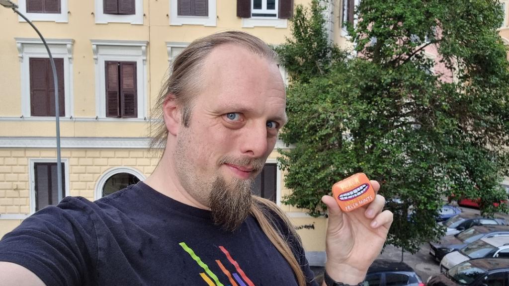
The first wayoint is right across the road from where some work colleagues and I are staying for an “away week”. I decided to dash out during a break in the weather to try and solve
this multi between meetings. But I was quickly confused because… this isn’t the way I was taught to do Roman numerals. I’d always been told that you should never have four of the same
letter in a row, e.g. you should say XIV, not XIIII. Once I’d worked out what I was doing wrong, though, I was okay!
The second and third waypoints had me braving some frankly scary roads. The drivers here just don’t seem to stop unless you’re super assertive when you step out!
Once I had the final numbers and ran it through geochecker I realised that the cache must be very close to where I’d had lunch earlier today! Once I got there it took me a while to get
to the right floor, after which the hint made things pretty obvious.
Great trail, really loved it. And just barely made it back before the rain really started hammering down. TFTC, FP awarded, and greetings from Oxford, UK!
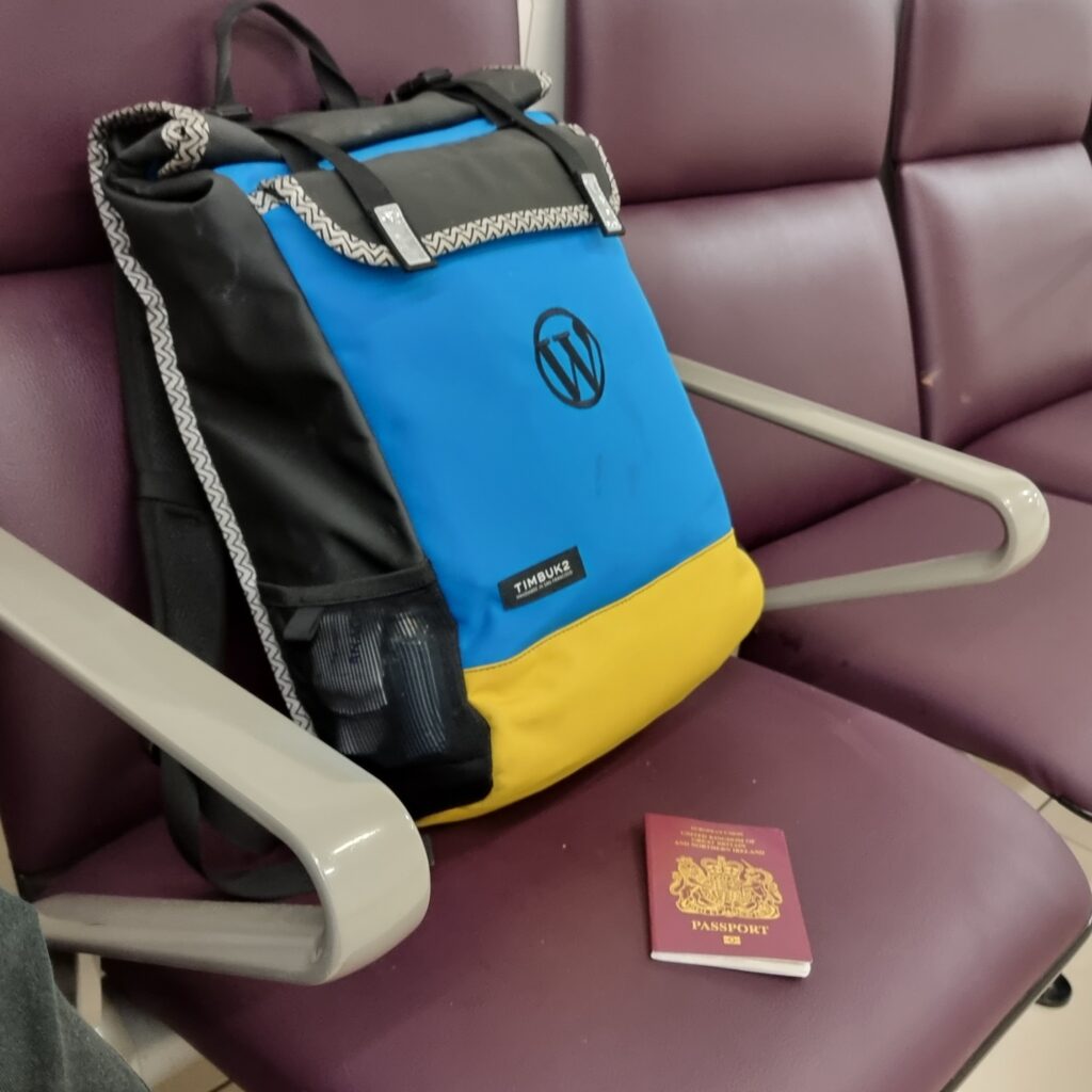
Now that travel for work is back on the menu, I’ve been trying to upgrade my “pack light” game.
I’ve been inspired in part by Beau, who I first met during my trip to South Africa in 2019 during my Automattic onboarding. Beau travelled from the US for a two week jaunt with nothing but hand luggage, and it blew my mind.
Gotta flight? Pack light, pack tight. That’s right! Corporate branding is just a bonus.
For my trip to Vienna earlier this year for a divisional meetup, I got by with just a backpack and a laptop bag. Right now, I’m waiting to fly to Rome for a week, and I’ve ditched the
laptop bag in favour of just a single carry-on backpack. About 7kg of luggage, and well within the overhead locker size limit.
I’m absolutely sold on this approach. I get to:
walk past the queues for luggage drop (having checked-in online),
keep the entirety of my luggage with me at all times (which ensures it goes where I do),
breeze through security1,
thanks to smart packing2
walk right out of the airport at the other end without having to wait for the flingers to finish smashing everybody’s luggage into the carousels.
I’ve been working on simplifying my everyday carry, too. My wallet is the Carbon Fibre Liquid Wallet, which is about the size of a deck of playing cards (something I also often carry!) and holds a handful
of cards, a bundle of cash, a bottle opener, and all my regular keys. The hook on the end is for attaching the pendrive with my password
safe for travel.
As somebody who’s travelled “heavy” for most of my life – and especially since the children came along – it’s liberating to migrate to a “pick up a bag and go” mindset. To begin with,
the nagging thought that I must’ve forgotten something essential was challenging, but I think I’ve gotten past that stage now.
Travelling light feels like carefree: like being a kid again, when all you needed was the back on your back and you were ready for an adventure. Once again, I’ve got a bag on my
back3 and I know that everything I need for an adventure
is right here with me4.
Footnotes
1 If you’ve travelled with me before, you might have noticed that I sometimes have trouble
at borders on account of my damn stupid name, as predicted by the Passport
Office. I’ve since learned all the requisite tricks to sidestep these problems, but that’s probably worthy of a post in its own right.
2 A little smart packing goes a long way. In the photo above, you might see my pre-prepared liquids bag in
a side pocket, my laptop slides right out for separate scanning, my wallet and phone just dump out of my pockets, and I’m done.
3 I don’t really have a bag on my back right now. I’m sat in a depature lounge at Gatwick
Airport. But you get the idea.
4 Do I really have everything I need? I’ve not brought a waterproof coat and,
looking at the weather forecast at my destination, this might have been a mistake. But worst case I can buy a cheap poncho at the other end. That’s the kind of freedom that being an
adult gets you, replacing the childlike freedom to get soaked and not care.
Automattic has acquired the ActivityPub plugin for WordPress from German developer Matthias Pfefferle, who will be joining the company to continue improving support for federated platforms. Pfefferle, who is also the
author of the Webmention plugin, said his new role is to see how Automattic’s products can benefit from open protocols like
ActivityPub.
…
This is so exciting I might burst. Want to know why?
Matt Mullenweg‘s commitment to ActivityPub makes me happy. WordPress made Pingback and Trackback take off, back
in the day, and I believe that – in the same way – Automattic can help make ActivityPub more accessible and mainstream too.
Matthias Pfefferle is both an IndieWeb and an ActivityPub star; I use (and I’ve extented upon) a lot of code he’s written every day and
I sponsor him on Github! The chance that we get to work directly together is pretty slim, but it’s a chance right?
Susan A. Kitchens expressed concern that this could increase the level of
ActivityPub spam out there (which right now is very low). I worry about that too. But I’m still optimistic that we can make something awesome off the back of this acquisition and keep
the interpersonal Web federated, the way it ought to be.
Nowadays if you’re on a railway station and hear an announcement, it’s usually a computer stitching together samples1. But back in the day, there used to be a human
with a Tannoy microphone sitting in the back office, telling you about the platform alternations and
destinations.
I had a friend who did it as a summer job, once. For years afterwards, he had a party trick that I always quite enjoyed: you’d say the name of a terminus station on a direct line from
Preston, e.g. Edinburgh Waverley, and he’d respond in his announcer-voice: “calling at Lancaster, Oxenholme the Lake District, Penrith, Carlisle, Lockerbie, Haymarket, and Edinburgh
Waverley”, listing all of the stops on that route. It was a quirky, beautiful, and unusual talent. Amazingly, when he came to re-apply for his job the next summer he didn’t get it,
which I always thought was a shame because he clearly deserved it: he could do the job blindfold!
There was a strange transitional period during which we had machines to do these announcements, but they weren’t that bright. Years later I found myself on Haymarket station waiting for
the next train after mine had been cancelled, when a robot voice came on to announce a platform alteration: the train to Glasgow would now be departing from platform 2, rather than
platform 1. A crowd of people stood up and shuffled their way over the footbridge to the opposite side of the tracks. A minute or so later, a human announcer apologised for the
inconvenience but explained that the train would be leaving from platform 1, and to disregard the previous announcement. Between then and the train’s arrival the computer tried twice
more to send everybody to the wrong platform, leading to a back-and-forth argument between the machine and the human somewhat reminiscient of the white zone/red zone scene from Airplane! It was funny perhaps only
because I wasn’t among the people whose train was in superposition.
Clearly even by then we’d reached the point where the machine was well-established and it was easier to openly argue with it than to dig out the manual and work out how to turn it off.
Nowadays it’s probably even moreso, but hopefully they’re less error-prone.
When people talk about how technological unemployment, they focus on the big changes, like how a tipping point with self-driving vehicles might one day revolutionise the haulage
industry… along with the social upheaval that comes along with forcing a career change on millions of drivers.
But in the real world, automation and technological change comes in salami slices. Horses and carts were seen alongside the automobile for decades. And you still find stations with
human announcers. Even the most radically-disruptive developments don’t revolutionise the world overnight. Change is inevitable, but with preparation, we can be ready for it.
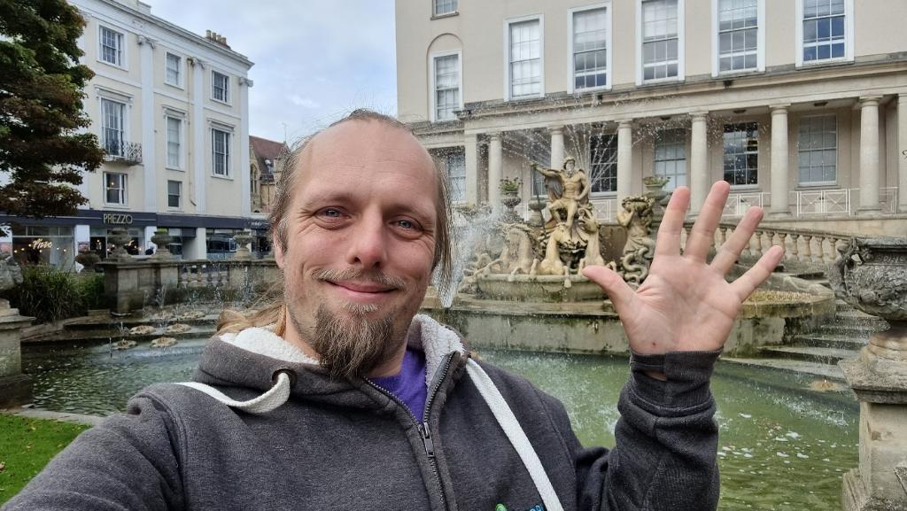
Super quick find on lunch break during a day coworking in Cheltenham. Love the hiding spot which seems pretty much made for a cache of this shape and size! TFTC!
Your product, service, or organisation almost certainly has a priority of constituencies, even if it’s not written down or otherwise formally-encoded. A famous example would be that expressed in the Web Platform Design Principles. It dictates how you decide between two competing
needs, all other things being equal.
At Three Rings, for example, our priority of constituencies might1 look
like this:
The needs of volunteers are more important than
The needs of voluntary organisations, which are more important than
Continuation of the Three Rings service, which is more important than
Adherance to technical standards and best practice, which is more important than
Development of new features
These are all things we care about, but we’re talking about where we might choose to rank them, relative to one another.
The priorities and constituencies portrayed in this illustration are ficticious. Any resemblence to real priorities and constituencies, whether living or dead, is entirely
coincidental.
The priorities of an organisation you’re involved with won’t be the same: perhaps it includes shareholders, regulatory compliance, different kinds of end-users, employees, profits,
different measures of social good, or various measurable outputs. That’s fine: every system is different.
But what I’d challenge you to do is find ways to bisect your priorities. Invent scenarios that pit each constituency against itself another and discuss how they should
be prioritised, all other things being equal.
Using the example above, I might ask “which is more important?” in each category:
The needs of the volunteers developing Three Rings, or the needs of the volunteers who use it?
The needs of organisations that currently use the system, or the needs of organisations that are considering using it?
Achieving a high level of uptime, or promptly installing system updates?
Compliance with standards as-written, or maximum compatibility with devices as-used?
Implementation of new features that are the most popular user requests, or those which provide the biggest impact-to-effort payoff?
These might not be your answers to the same questions. They’re not even necessarily mine, and they’re even less-likely to be representative of Three Rings CIC. It’s just illustrative.
The aim of the exercise isn’t to come up with a set of commandments for your company. If you come up with something you can codify, that’s great, but if you and your stakeholders just
use it as an exercise in understanding the relative importance of different goals, that’s great too. Finding where people disagree is more-important than having a unifying
creed2.
And of course this exercise applicable to more than just organisational priorities. Use it for projects or standards. Use it for systems where you’re the only participant, as a thought
exercise. A priority of constituencies can be a beautiful thing, but you can understand it better if you’re willing to take it apart once in a while. Bisect your priorities, and see
what you find.
Footnotes
1 Three Rings doesn’t have an explicit priority of constituencies: the example I give is
based on my own interpretation, but I’m only a small part of the organisation.
This post is also available as an article. So if you'd rather read a
conventional blog post of this content, you can!
This video accompanies a blog post of the same title. The content is basically the same – if you prefer videos, watch this video. If you prefer blog posts, go read
the blog post. If you’re a superfan, try both and spot the differences. You weirdo.
There are a great number of things that I’m bad at. One thing I’m bad at (but that I’m trying to get better at) is being more-accepting of the fact that there are things that I am bad
at.
I’ve also been thinking about how I’m bad at thinking about how I’m bad at thinking about how I’m bad at thinking about…
I’m also particularly bad at choosing suitable stock photos for use in blog posts.
Being Bad
As a young kid, I was a smart cookie. I benefited from being an only child and getting lots of attention from a pair of clever parents, but I was also pretty bright and a quick learner
with an interest in just about anything I tried. This made me appear naturally talented at a great many things, and – pushed-on by the praise of teachers, peers, and others – I
discovered that I could “coast” pretty easily.
But a flair for things will only carry you so far, and a problem with not having to work hard at your education means that you don’t learn how to learn. I got bitten
by this when I was in higher education, when I found that I actually had to work at getting new information to stick in my head (of course, being older makes learning harder
too, as became especially obvious to me during my most-recent qualification)!
Ignore the fact that you’ve now seen me trying to sledge uphill and just accept that I was a clever kid (except at
photography), okay?
A side-effect of these formative experiences is that I grew into an adult who strongly differentiated between two distinct classes of activities:
Things I was good at, either because of talent or because I’d thoroughly studied them already. I experienced people’s admiration and respect when I practised these
things, and it took little effort to stay “on top” of these fields, and
Things I was bad at, because I didn’t have a natural aptitude and hadn’t yet put the time in to learning them. We don’t often give adults external
reinforcement for “trying hard”, and I’d become somewhat addicted to being seen as awesome… so I shied away from things I was “bad at”.
The net result: I missed out on opportunities to learn new things, simply because I didn’t want to be seen as going through the “amateur” phase. In hindsight, that’s
really disappointing! And this “I’m bad at (new) things” attitude definitely fed into the imposter syndrome I felt when I first
started at Automattic.
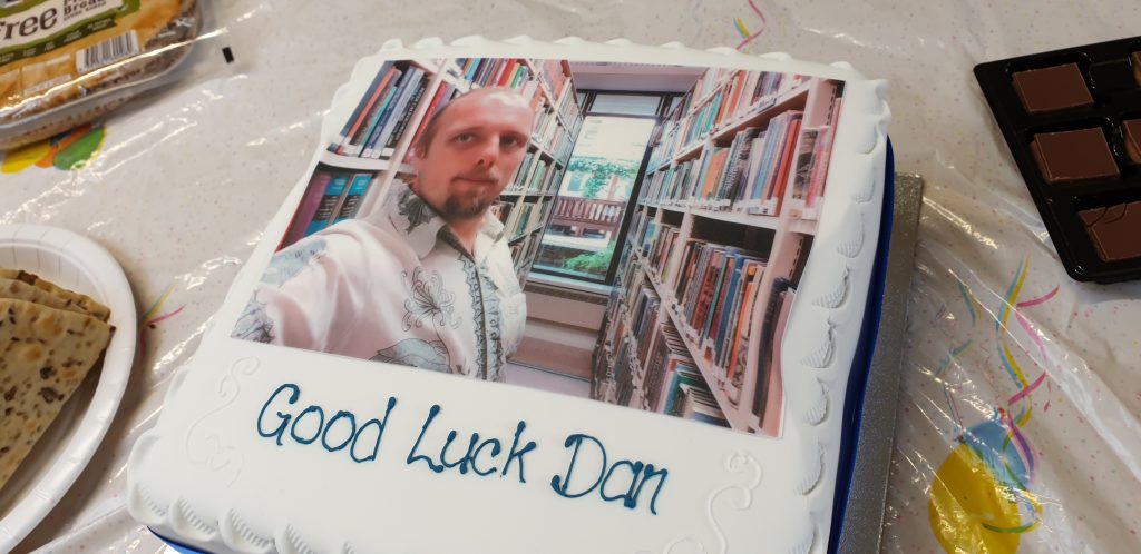
Being Better
Leaving the Bodleian after 8½ years might have helped stimulate a change in me. I’d carved out a role for myself defined by the fields I knew
best; advancing my career would require that I could learn new things. But beyond that, I benefited from my new employer whose “creed
culture” strongly promotes continuous learning (I’ve vlogged about this before), and from my coach who’s been great at encouraging me towards a growth mindset.
“Good Luck Dan”, my Bodleian buddies said. But perhaps they should’ve said “Keep Learning Dan”.
But perhaps the biggest stimulus to remind me to keep actively learning, even (especially?) when it’s hard, might have been the pandemic. Going slightly crazy with cabin fever during
the second lockdown, I decided to try and teach myself how to play the piano. Turns out I wasn’t alone, as I’ve mentioned before: the pandemic did strange things to us all.
I have no real experience of music; I didn’t even get to play recorder in primary school. And I’ve certainly got no talent for it (I can hear well enough to tell how awful my
singing is, but that’s more a curse than a blessing). Also, every single beginners’ book and video course I looked at starts from the assumption that you’re going to want to “feel” your
way into it, and that just didn’t sit well with the way my brain works.
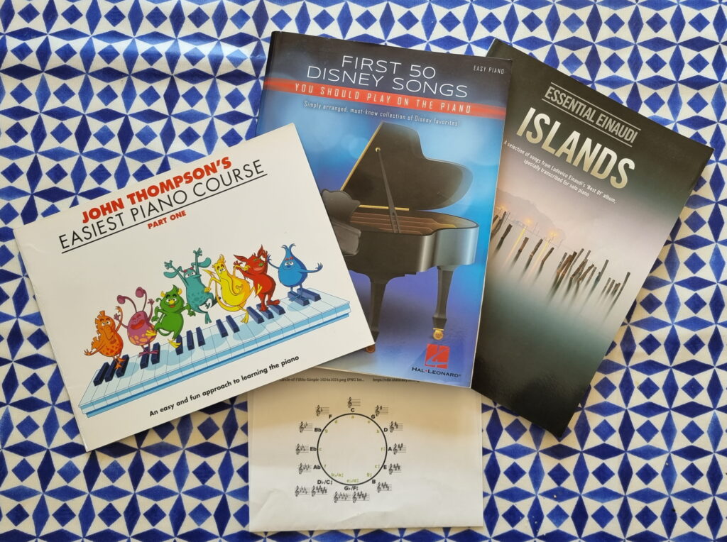
90% of what I do in front of a piano might be described as “Dan Mucks About (in B Minor)”, but that’s fine by me.
I wanted a theoretical background before I even sat down at a keyboard, so I took a free online course in music theory. Then I started working through a
“beginners’ piano” book we got for the kids. Then I graduated to “first 50 Disney songs”, because I know how virtually all of them sound well enough that I’d be able to hear where I was
going wrong. Since then, I’ve started gradually making my way through a transcription of Einaudi’s Islands. Feeling like I’d got a good handle on what I was supposed to be
doing, I then took inspiration from a book JTA gave me and started trying to improvise.
Most days, I get no more than about 10 minutes on the piano. But little by little, day by day, that’s enough to learn. Nowadays even my inner critic perfectionist can
tolerate hearing myself play. And while I know that I’ll probably never be as good as, say, the average 8-year-old on YouTube, I’m content in my limited capacity.
Let’s start at the very beginning. (A very good place to start.)
If I’m trying to cultivate my wonder syndrome, I need to stay alert for “things I’m bad at” that I could conceivably be better at if
I were just brave enough to try to learn. I’m now proudly an “embarrassingly amateur” pianist, which I’m at-long-last growing to see as better than a being non-pianist.
Off the back of that experience, I’m going to try to spend more time doing things that I’m bad at. And I’d encourage you to do the same.
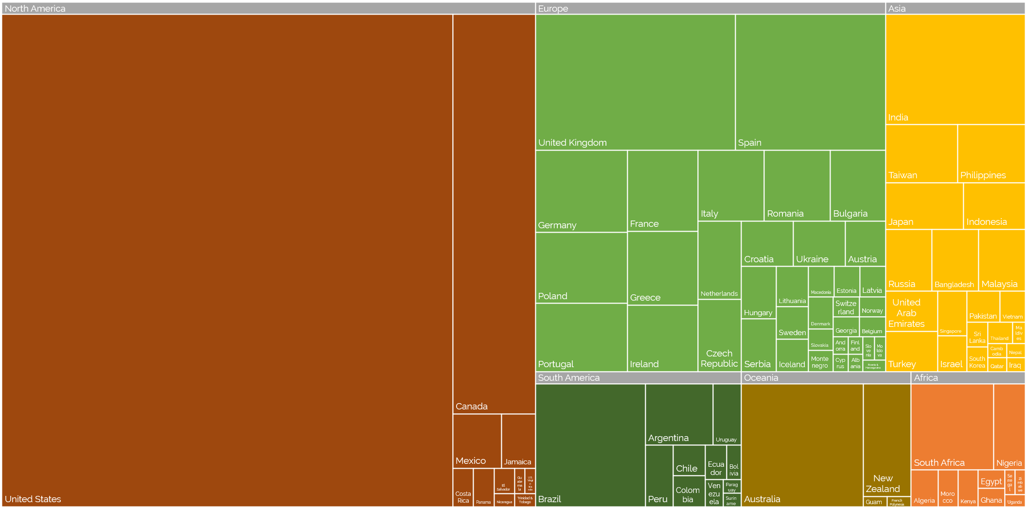
Off the back of my recent post about privileges I enjoy as a result of my location and first language, even at my highly-multinational employer, and inspired by my colleague Atanas‘ data-mining into where Automatticians are
located, I decided to do another treemap, this time about which countries Automatticians call home:
Where are the Automatticians?
If raw data’s your thing (or if you’re just struggling to make out the names of the countries with fewer Automatticians), here’s a CSV file for you.
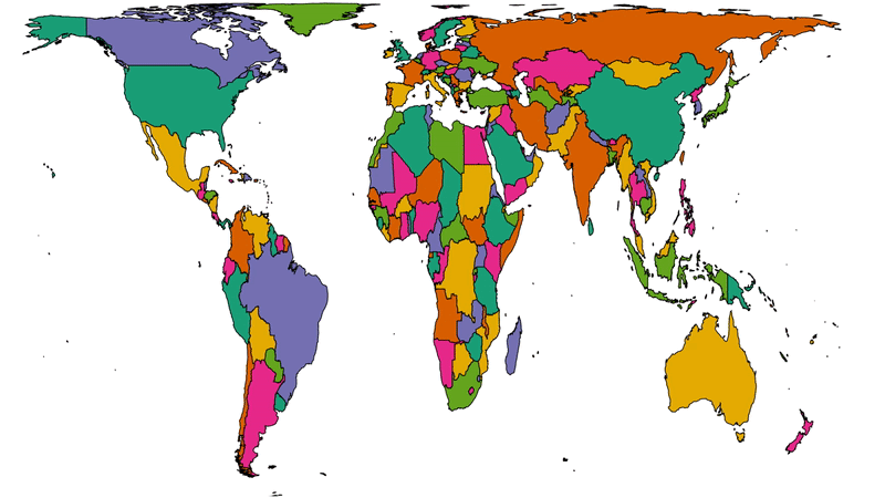
To get a better picture of that, let’s plot a couple of cartograms. This animation cycles between showing countries at (a) their
actual (landmass) size and (b) approximately proportional to the number of Automatticians based in each country:
This animation alternates between showing countries at “actual size” and proportional to the number of Automatticians based there. North America and Europe dominate the map, but there
are other quirks too: look at e.g. how South Africa, New Zealand and India balloon.
Another way to consider the data would be be comparing (a) the population of each country to (b) the number of Automatticians there. Let’s try that:
Here we see countries proportional to their relative population change shape to show number of Automatticians, as seen before. Notice how countries with larger populations like China
shrink away to nothing while those with comparatively lower population density like Australia blow up.
There’s definitely something to learn from these maps about the cultural impact of our employee diversity, but I can’t say more about that right now… primarily because I’m not smart
enough, but also at least in part because I’ve watched the map animations for too long and made myself seasick.
A note on methodology
A few quick notes on methodology, for the nerds out there who’ll want to argue with me:
Country data was extracted directly from Automattic’s internal staff directory today and is based on self-declaration by employees (this is relevant because we employ a relatively
high number of “digital nomads”, some of whom might not consider any one country their home).
Countries were mapped to continents using this dataset.
Maps are scaled using Robinson projection. Take your arguments about this over here.
The treemaps were made using Excel. The cartographs were produced based on work by Gastner MT, Seguy V, More P. [Fast flow-based algorithm for creating density-equalizing map
projections. Proc Natl Acad Sci USA 115(10):E2156–E2164 (2018)].
Some countries have multiple names or varied name spellings and I tried to detect these and line-up the data right but apologies if I made a mess of it and missed yours.
Take a look at the map below. I’m the pink pin here in Oxfordshire. The green pins are my immediate team – the people I work with on a
day-to-day basis – and the blue pins are people outside of my immediate team but in its parent team (Automattic’s org chart is a bit like a fractal).
I’m the pink pin; my immediate team are the green pins. People elsewhere in our parent team are the blue pins. Some pins represent multiple people.
Thinking about timezones, there are two big benefits to being where I am:
I’m in the median timezone, which makes times that are suitable-for-everybody pretty convenient for me (I have a lot of lunchtime/early-afternoon meetings where I get to
watch the sun rise and set, simultaneously, through my teammates’ windows).
I’m West of the mean timezone, which means that most of my immediate coworkers start their day before me so I’m unlikely to start my day blocked by anything I’m waiting on.
(Of course, this privilege is in itself a side-effect of living close to the meridian, whose arbitrary location owes a lot to British naval and political clout in the 19th century: had
France and Latin American countries gotten their way the prime median would have probably cut through the Atlantic or Pacific oceans.)
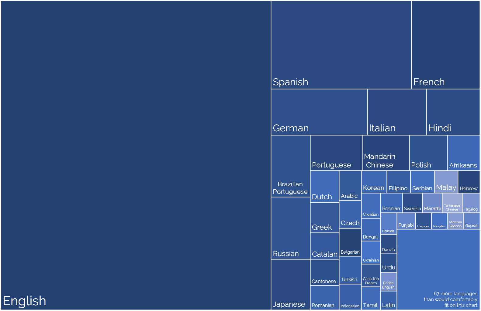
2. Language Privilege
English is Automattic’s first language (followed perhaps by PHP and Javascript!), not one of the 120 other languages spoken
by Automatticians. That’s somewhat a consequence of the first language of its founders and the language in which the keywords of most programming languages occur.
It’s also a side-effect of how widely English is spoken, which in comes from (a) British colonialism and (b) the USA using
Hollywood etc. to try to score a cultural victory.
Languages self-reportedly spoken by Automatticians, sized proportional to the number of speakers. No interpretation/filtering has been done, so you’ll see multiple dialects of the
same root language.
I’ve long been a fan of the concept of an international axillary language but I appreciate that’s an idealistic dream whose war
has probably already been lost.
For now, then, I benefit from being able to think, speak, and write in my first language all day, every day, and not have the experience of e.g. my two Indonesian colleagues who
routinely speak English to one another rather than their shared tongue, just for the benefit of the rest of us in the room!
3. Passport Privilege
Despite the efforts of my government these last few years to isolate us from the world stage, a British passport holds an incredible amount of power, ranking fifth or sixth in the world depending on whose passport index you
follow. Compared to many of my colleagues, I can enjoy visa-free and/or low-effort travel to a wider diversity of destinations.
Normally I might show you a map here, but everything’s a bit screwed by COVID-19, which still bars me from travelling to many
places around the globe, but as restrictions start to lift my team have begun talking about our next in-person meetup, something we haven’t done since I first started when I met up with my colleagues in Cape Town and got
assaulted by a penguin.
But even looking back to that trip, I recall the difficulties faced by colleagues who e.g. had to travel to a different country in order tom find an embassy just to apply for the visa
they’d eventually need to travel to the meetup destination. If you’re not a holder of a privileged passport, international travel can be a lot harder, and I’ve definitely taken that for
granted in the past.
I’m going to try to be more conscious of these privileges in my industry.
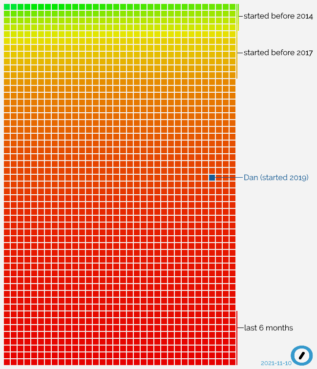
It just passed two years since I started working at Automattic, and I just made a startling
discovery: I’ve now been with the company for longer than 50% of the staff.
When you hear that from a 2-year employee at a tech company, it’s easy to assume that they have a high staff turnover, but Automattic’s churn rate is relatively low, especially for our
sector: 86% of developers stay longer than 5 years. So what’s happening? Let’s visualise it:
Everything in this graph, in which each current Automattician is a square, explains how I feel right now: still sometimes like a new fish, but in an increasingly big sea.
All that “red” at the bottom of the graph? That’s recent growth. Automattic’s expanding really rapidly right now, taking on new talent at a never-before-seen speed.
Since before I joined it’s been the case that our goals have demanded an influx of new engineers at a faster rate than we’ve been able to recruit, but it looks like things are
improving. Recent refinements to our recruitment process (of which I’ve written about my experience) have helped, but I wonder how much we’ve
also been aided by pandemic-related changes to working patterns? Many people, and especially in tech fields, have now discovered that working-from-home works for them, and a company
like Automattic that’s been built for the last decade and a half on a “distributed” model is an ideal place to see that approach work at it’s best.
We’re rolling out new induction programmes to support this growth. Because I care about our corporate culture, I’ve volunteered
myself as a Culture Buddy, so I’m going to spend some of this winter helping Newmatticians integrate into our (sometimes quirky, often chaotic) ways of working. I’m quite excited to be
at a point where I’m in the “older 50%” of the organisation and so have a responsibility for supporting the “younger 50%”, even though I’m surprised that it came around so quickly.
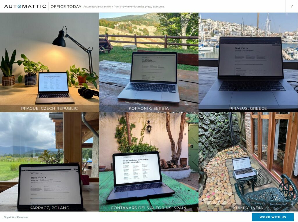
Automattic… culture? Can’t we just show them Office Today and be done with it?
I wonder how that graph will look in another two years.
Lots of companies have something like this, even if it falls short of a “creed”. It could be a “vision”, or a set of “values”, or something in that line.
Of course, sometimes that just means they’ve strung three clichéd words together because they think it looks good under their company logo, and they might as well have picked
any equally-meaningless words.
Company Name
respect
integrity
teamwork
Future logo and values of of Any Company, Anywhere.
But while most companies (and their staff) might pay lip service to their beliefs, Automattic’s one of few that seems to actually live it. And not in an awkward, shoehorned-in
way: people here actually believe this stuff.
By way of example:
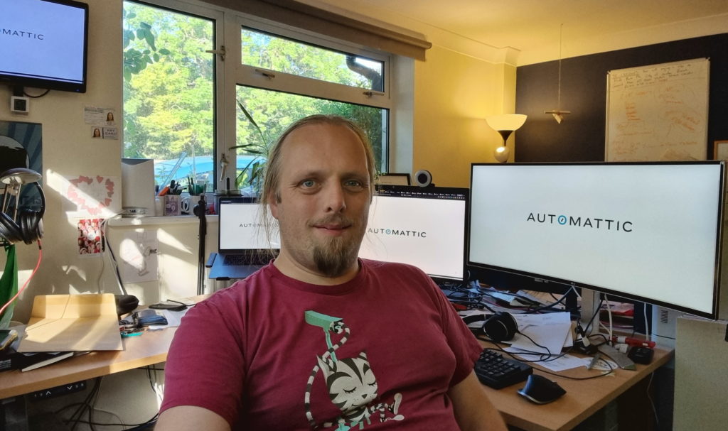
Coffee: check. Webcam: check. Let’s touch bases, random colleague!
We’ve got a bot that, among other things, pairs up people from across the company for virtual “watercooler chat”/”coffee dates”/etc. It’s cool: I
pair-up with random colleagues in my division, or the whole company, or fellow queermatticians… and collectively these provide me a half-hour hangout about once a week. It’s a great way
to experience the diversity of culture, background and interests of your colleagues, as well as being a useful way to foster idea-sharing and “watercooler effect” serendipity.
For the last six months or so, I’ve been bringing a particular question to almost every random-chat I’ve been paired into:
What part of the Automattic creed resonates most-strongly for you right now?
On a good day, I’m at least 90% certain I’m a senior software engineer and not a cult member.
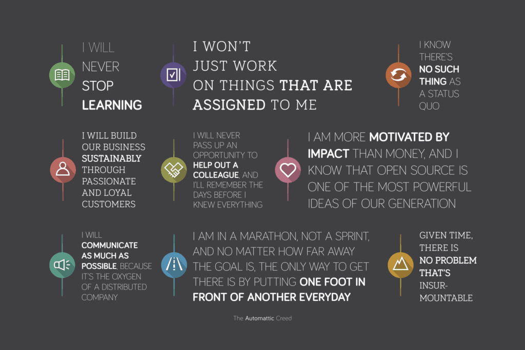
I volunteer my own answer first. It’s varied over time. Often I’m most-attached to “I will never stop learning.” Other times I connect best to “I will communicate as much as possible…”
or “I am in a marathon, not a sprint…”. Lately I’ve felt a particular engagement with “I will never pass up the opportunity to help a colleague…”.
It varies for other people too. But every single person I’ve asked this question has been able to answer it. And they’ve been able to answer it confidently and with
justifications for or examples of their choice.
Have you ever worked anywhere before where seemingly all your coworkers profess a genuine belief in the corporate creed? Like, enough that some of them get it tattooed onto their bodies. Unless you’ve been brainwashed by a cult, the answer is probably no.
If Automattic is a cult, then it might be too late for me.
Why are Automatticians like that?
For some folks, of course, the creed is descriptive rather than prescriptive. Regarding its initial creation, Matt
says that “as a hack to introduce new folks to our culture, we put a beta Automattic Creed, basically a statement of things important to us, written in the first person.”
But this alone isn’t an explanation, because back then there were only around a hundred people in the company: nowadays there are over 1,500. So how can the creed continue to be such a
pervasive influence? Or to put it another way: why are Automatticians… like that?
Do we simply attract like-minded individuals? The creed is highly visible and cross-referenced by our recruitment pages, so it wouldn’t be entirely surprising.
Maybe we filter for people who are ideologically-compatible with the creed? Insofar as the qualities it describes are essential to integrating into our corporate
culture, yes: our recruitment process does a great job of testing for those qualities.
Perhaps we converge on these values as a result of our experience as Automatticians? Once you’re in, you’re indoctrinated into the tenets of the creed and
internalise its ideas.
Or perhaps it’s a combination of the three, in some ratio or another. (What’s the ratio?)
I’ve been here 1⅔ years and don’t know the answer yet. But I’ll tell you this: it’s inspiring to be part of a team that really seem to believe in what they do.
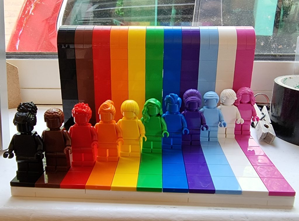
Ahead of schedule on work project. Invited to 2nd COVID jab next week. Spent half of day working on laptop in sunny garden. Parcel arrived from @LEGO_group with Everyone Is Awesome
model (pictured).


