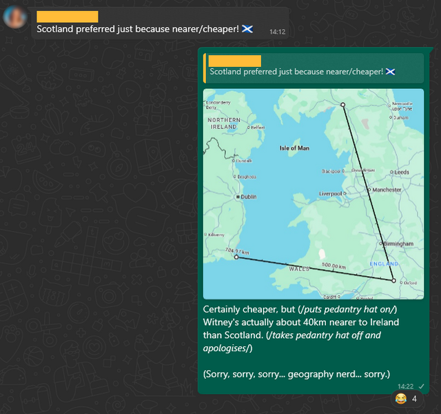
On our last day out at our current AirBnB, we searched for a takeaway.
Google Maps found me a Chinese takeaway, but it had an unexpected suggestion when I asked for an Indian:
On our last day out at our current AirBnB, we searched for a takeaway.
Google Maps found me a Chinese takeaway, but it had an unexpected suggestion when I asked for an Indian:
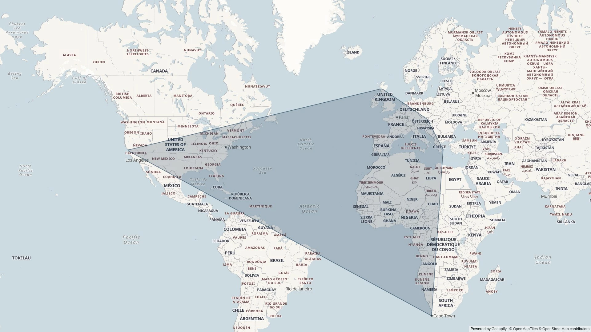
I nerdsniped myself today when, during a discussion on the potential location of a taekwondo tournament organised by our local martial arts school, somebody claimed that Scotland would be “nearer” than Ireland.
But the question got me thinking:
Could I plot a line across Great Britain, showing which parts are closer to Scotland and which parts are closer to Ireland?
If the England-facing Irish and Scottish borders were completely straight, one could simply extend the borders until they meet, bisect the angle, and we’d be done.
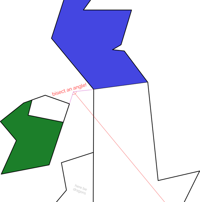
In reality, the border between England and Scotland is a winding mess, shaped by 700 years of wars and treaties1. Treating the borders as straight lines is hopelessly naive.
What I’m really looking for… is a Voronoi partition…

My Python skills are pretty shit, but it’s the best tool for the job for geohacking2. And so, through a combination of hacking, tweaking, and crying, I was able to throw together a script that produces a wonderful slightly-wiggly line up the country.
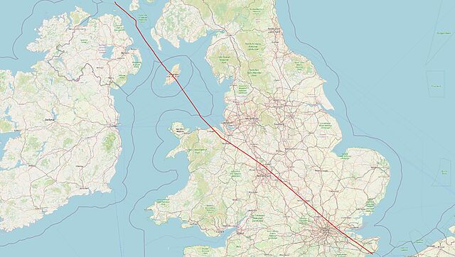
Once you’ve bisected England in this way – into parts that are “closer to Ireland” versus parts that are “closer to Scotland”, you start to spot all kinds of interesting things3.
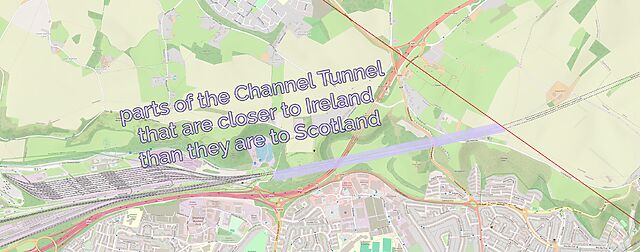
Like: did you know that the entire subterranean part of the Channel Tunnel is closer to Scotland than it is to Ireland… except for the ~2km closest to the UK exit.
A little further North: London’s six international airports are split evenly across the line, with Luton, Stansted and Southend closer to Scotland… and City, Heathrow and Gatwick closer to Ireland.
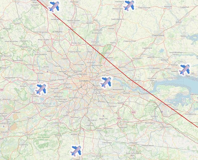
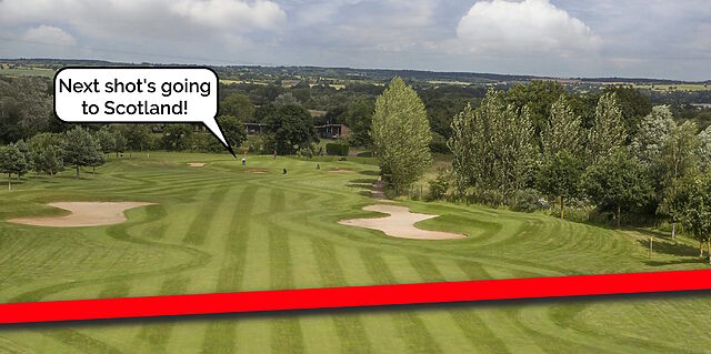
The line then pretty-much bisects Milton Keynes, leaving half its population closer to Scotland and half closer to Ireland, before doing the same to Daventry, before – near Sutton Coldfield – it drives right through the middle of the ninth hole of the golf course at the Lea Marston Hotel.
Players tee off closer to Ireland and – unless they really slice it – their ball lands closer to Scotland:
In Cannock, it bisects the cemetery, dividing the graves into those on the Scottish half and those in the Irish half:

The line crosses the Welsh border at the River Dee, East of Wrexham, leaving a narrow sliver of Wales that’s technically closer to Scotland than it is to Ireland, running up the coastline from Connah’s Quay to Prestatyn and going as far inland as Mold before – as is the case in most of Wales – you’re once again closer to Ireland:
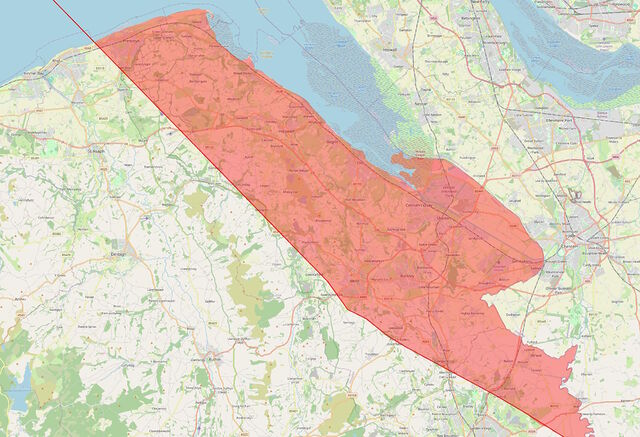
I’d never have guessed that there were any parts of Wales that were closer to Scotland than they were to Ireland, but the map doesn’t lie4
Anyway: that’s how I got distracted, today. And along the way I learned a lot about geodata encoding, a little about Python, and a couple of surprising things about geography5.
1 Not to mention the crazy history of places like Berwick-upon-Tweed, which has jumped the border several times, and Ba Green, ownership of which has traditionally been decided by game of football.
2 Or, at least: it’s the one that’s most-widely used and so I could find lots of helpful StackOverflow answers when I got stuck!
3 Interesting… if you’re specifically looking for some geographical trivia, that is!
4 Okay, the map lies a little. My program was only simple so it plotted everything on a flat plane, failing to accommodate for Earth’s curvature. The difference is probably marginal, but if you happen to live on or very close to the red line, you might need to do your own research!
5 Like: Chester and Rugby are closer to Scotland than they are to Ireland, and Harpenden and Towcester are closer to Ireland than they are to Scotland! Who knew?
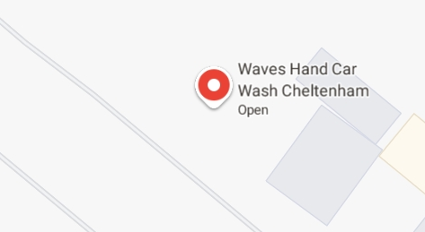
I know how I’m SUPPOSED to read it, but when I see this I can’t help but imagine a conversation like…
“What shall we call our car wash?”
/waves hand/ “I dunno.”
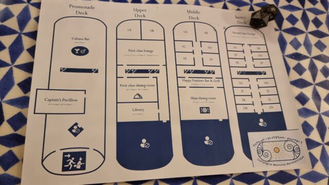
Y’all seemed to enjoy the “overworld” map I shared the other day, so here’s another “feelie” from my kids’ ongoing D&D campaign.
The party has just arranged for passage aboard a pioneering (and experimental) Elvish airship. Here’s a deck plan (only needs a “you are here” dot!) to help them get their bearings.
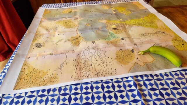
In preparation for Family D&D Night (and with thanks to my earlier guide to splicing maps together!), I’ve finally completed an expanded “overworld” map for our game world. So far, the kids have mostly hung around on the North coast of the Central Sea, but they’re picked up a hook that may take them all the way across to the other side… and beyond?
Banana for scale.
(If your GMing for kids, you probably already know this, but “feelies” go a long way. All the maps. All the scrolls. Maybe even some props. Go all in. They love it.)
You’ve probably come across GeoGuessr already: it’s an online game where you (and friends, if you’ve got them) get dropped into Google Street View and have two minutes to try to work out where in the world you are and drop a pin on it.
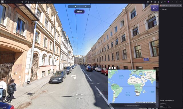
A great strategy is to “walk around” a little, looking for landmarks, phone numbers, advertisements, linguistic clues, cultural indicators, and so on, narrowing down the region of the world you think you’re looking at before committing to a country or even a city. You’re eventually scored by how close you are to the actual location.
I decided to see if ChatGPT can do better than me. Using only the free tier of both GeoGuessr and ChatGPT1, I pasted screenshots of what I was seeing right into ChatGPT:
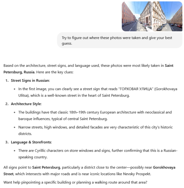
That’s pretty spooky, right?
The response came back plenty fast enough for me to copy-and-paste the suggested address into Google Maps, get the approximate location, and then drop a pin in the right place in GeoGuessr. It’s probably one of my most-accurate guesses ever.
This isn’t a one-off fluke. I tried again, this time using only a single photo, rather than one pointing in each direction on the street:
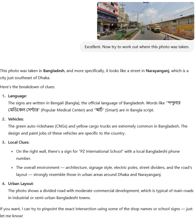
This time, it wasn’t quite right: the actual location of the photo was Chittagong, not Dhaka, about 200km away.
But that’s still reasonably spectacular from only a single vantage from a single point.
Obviously my approach here was crude, but it’d be relatively easy to, for example, implement a browser wrapper that cheated on-your-behalf: while playing GeoGuessr, you’d just click a “send to AI” button whenever you fancied and it’d start working in the background, improving precision with each subsequent screenshot (so you could still “walk around” and pass extra details to it).
And similarly, a little prompt manipulation could have the output include estimated GPS coordinates, allowing the code to place the pin for you while outputting its reasoning on the side2.
The short of what I’m saying is: if you’re playing GeoGuessr against somebody you don’t trust not to cheat… they might well be cheating. And thanks to the explanatory output, they can even justify their explanations for the places they dropped pins.
The other thought that comes to my mind is: could this be used to infer approximate geolocations from photos whose EXIF metadata has been stripped. Because if so, that’s the kind of thing that’s certain to get exploited by all kind of people who want to know where you are/were at a particular time. For example… law enforcement, stalkers, and other unsavoury types.
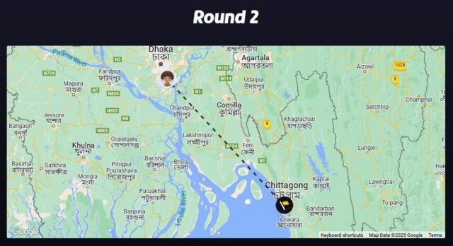
I wrote a prompt for gpt4o and put it to work:
The AI guessed:
Location: Port of Spain, Trinidad and Tobago
Explanation: The photograph shows a large ship docked at a port with a building that displays the text “WELCOME TO PORT OF SPAIN”. This text is in English, indicating an English-speaking country. The mention of “Port of Spain” directly specifies the port’s location in the capital city of Trinidad and Tobago. The design and style of the port facilities, as well as the presence of a ship named “Logos Hope”, which is known to visit many ports globally, further suggests a Caribbean port, aligning with Port of Spain’s known characteristics.
Coordinates: 10.6549, -61.5011
✅ That was pretty easy, to be fair.

The AI guessed:
Location: The Rollright Stones, England, United Kingdom
Explanation: The photograph depicts an area with several ancient standing stones arranged in a circle in a rural setting, characteristic of a stone circle. These are typically found in certain parts of the UK. The terrain is typical of the British countryside, with a grassy field and surrounding trees. The specific arrangement and size of the stones, along with the style of fencing and walking paths, are reminiscent of the Rollright Stones, one of Britain’s historic sites known for a circle of Neolithic or Bronze Age standing stones located in Oxfordshire, England.
Coordinates: 51.9743, -1.5731
✅ Again, spot on. If you’d never been to the Rollright Stones, you probably wouldn’t get that one, because while it’s a distinctive-looking stone circle… it’s not that distinctive-looking, right? Let’s be honest: it’s some rocks in a field.
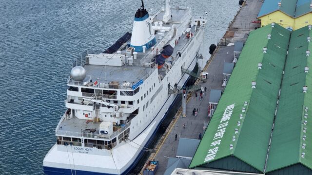
The AI guessed:
Location: Istanbul, Turkey
Explanation: The photograph prominently features the Galata Tower in the background, a well-known landmark in Istanbul, Turkey. Moreover, the presence of a ferry or similar boat and the architectural style of the surrounding buildings are indicative of Istanbul’s famous skyline. The signage in Turkish, as suggested by the word partially visible on the left, also supports this location as Turkey is a predominantly Turkish-speaking country. These elements combined make it highly likely that the photograph was taken in Istanbul.
Coordinates: 41.0082, 28.9784
✅ The coordinates aren’t exactly right – it’s placed us in the city rather than on a boat, which we clearly are – but it’s not done badly. Spotting the Galata Tower3 was a nice move.
The AI guessed:
Location: Cardiff Bay, Cardiff, Wales, United Kingdom
Explanation: The photograph features a marina with modern residential buildings, which is characteristic of the Cardiff Bay area in Cardiff, Wales. The architecture, clear blue skies, and marina setting are reminiscent of Cardiff’s waterfront development. Additionally, the presence of English signage on the boat (“FINBAR”) supports a location in an English-speaking country. Cardiff Bay is known for its redeveloped waterfront area with modern apartments and leisure facilities surrounding the marina. The style and design of the building are consistent with developments in Cardiff’s revitalized docklands.
Coordinates: 51.4626, -3.1678
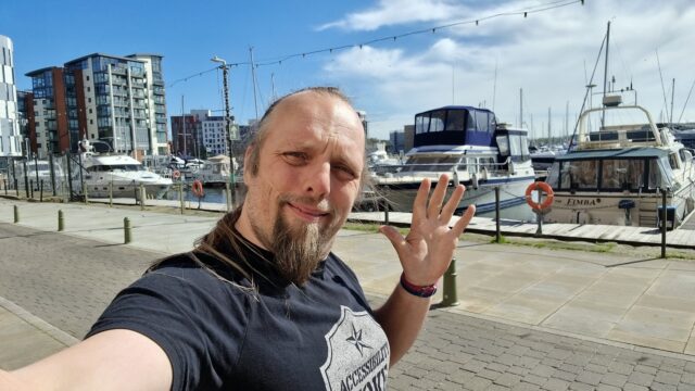
❌ Oops! Nope. I can see the thinking of what it’s claiming, there, but this was actually the Ipswich marina. I went for a walk to take a break from the code I’d been writing and took this somewhere in the vicinity of the blue plaque for Edward Ardizzone that I’d just spotted (I was recording a video for my kids, who’ve enjoyed several of his Tim… books).
So I don’t think this is necessarily a game-changer for Internet creeps yet. So long as you’re careful not to post photos in which you’re in front of any national monuments and strip your EXIF metadata as normal, you’re probably not going to give away where you are quite yet.
1 And in a single-player game only: I didn’t actually want to cheat anybody out of a legitimate victory!
2 I’m not going to implement GeoCheatr, as I’d probably name it. Unless somebody feels like paying me to do so: I’m open for freelance work right now, so if you want to try to guarantee the win at the GeoGuessr World Championships (which will involve the much-riskier act of cheating in person, so you’ll want a secret UI – I’m thinking a keyboard shortcut to send data to the AI, and an in-ear headphone so it can “talk” back to you?), look me up? (I’m mostly kidding, of course: just because something’s technically-possible doesn’t mean it’s something I want to do, even for your money!)
3 Having visited the Galata Tower I can confirm that it really is pretty distinctive.
4 3Camp is Three Rings‘ annual volunteer get-together, hackathon, and meetup. People come together for an intensive week of making-things-better for charities the world over.
Thanks to finding a couple of geocaches here in Istanbul, my geocaching “2D convex hull” (the smallest possible convex polygon that covers an area), which I wrote some code to draw last year, just expanded a little further to the East. 🎉
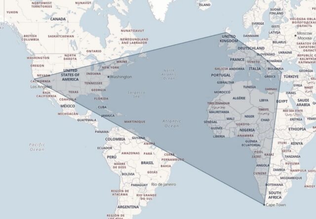
I’ve got a lot of the world left still to encircle, but I’m slowly extending my reach…
(previous map, for comparison: https://danq.me/_q23u/2024/04/dans-geoing-hull-2024-04-03.webp)
Especially outside of urban centres, and especially if you’re on foot, OpenStreetMap is way better than Google Maps, Bing Maps, Apple Maps, or what-have-you.
OpenStreetMap is especially good for walkers, with its more-comprehensive coverage of public footpaths as well as the ability to drill-down for accessibility information: whether a path ends in a gate or a stile matters a lot if you can’t climb the latter (or you’re walking with a small-but-muddy dog who’ll need lifting over).
Sure, you don’t get (as much) street view photography. But how often do you use that, anyway?1
I’ve heard it argued that OpenStreetMap, with its Wikipedia-like “anybody can edit it” model, cannot be relied upon. And sure, if you’re looking for an “official” level of accuracy and the alternative is an Ordinance Survey map, then that’s what you should go for.
But there’s nothing specific to, say, Google Maps that makes it fundamentally more “accurate” for most2 geographic features than OpenStreetMap. The vast of cartographic data on Google Maps is produced by humans, looking at satellite photos, and then tracing the features on them, probably with AI assistance. And the vast majority of cartographic data on OpenStreetMap is produced… exactly the same way, although without the AI “helping”.
Google Maps has mistakes, just like every map3. And it’s got trap streets, like most commercially-produced maps (including the Ordinance Survey). Google Maps’ mistakes tend to be made by somebody on the other side of the world from the feature, doing a bad job of tracing what they think might be a road… while OpenStreetMaps’ mistakes are for the most part omissions in areas that are under-explored by local contributors. And there are plenty of areas – like those near where I live, especially if you’re on foot – where the latter mistakes are much less-troublesome.
I fixed a couple of omissions on OpenStreetMap just earlier today. While I was out walking the dog, earlier, I added the names of two houses whose identities weren’t specifically marked on the map, and I added detail to the newly-constructed Deansfield estate. Google Maps shows there being only two houses on Deansfield Estate, among other inaccuracies, even though they’ve got up-to-date aerial and street photography.
Google Maps is fine if you want to drive to Sheffield, you need public transport connections to Plymouth4, or you’re looking for a restaurant nearby and you want the data about them to be accurate. But next time you’re walking somewhere, or when you’re looking for a specific address… I’d suggest you give OpenStreetMap a go. You might be pleasantly surprised.
1 I say that as somebody who uses street view and satellite photography a more than average amount, for geohashing purposes. But I can switch mapping software on-the-fly; nobody’s stopping me looking at “ostrich” photos when I need them.
2 The place that Google Maps really beats OpenStreetMap, in my mind, is in the integration of its business directory. If you search for a business in Google Maps, you’ll probably find it and get reasonably-accurate opening hours and contact details. But that’s a factor of two things: the Google My Business directory, and – more importantly – the popularity of the application and the fact that the mobile app “nudges” people to check on the places around them. By the way: if you want to contribute to making maps better in that way without becoming an unpaid researcher working to line Google’s pockets, StreetComplete is an app that helps fill-out business and related information on OpenStreetMap!
3 Google Maps used to show Vauxhall tube station on entirely the wrong side of the River Thames, for example.
4 Public transport’s another thing Google Maps does very well.

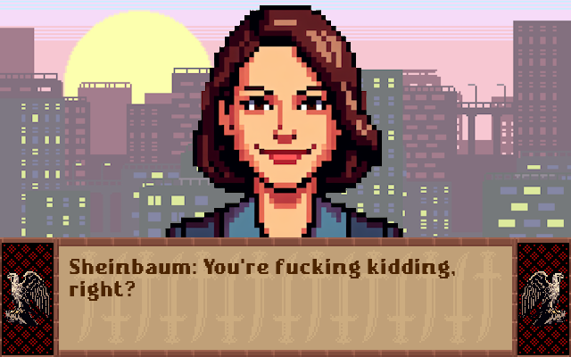
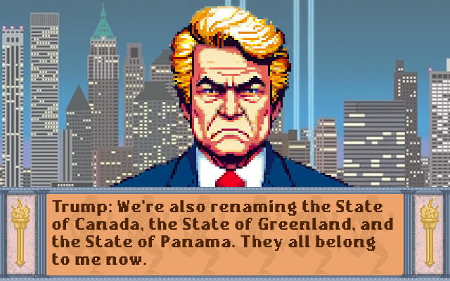
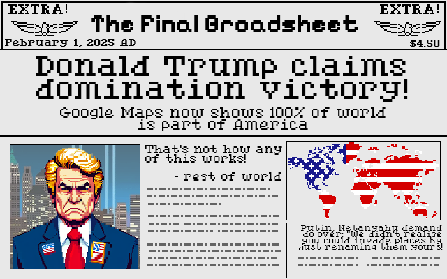
What do you reckon? Is he trying to go for a domination victory without ever saying “MY THREATS ARE BACKED BY NUCLEAR WEAPONS!”? His track record shows that he’s arrogant enough to think that the strategy of simply renaming things until they’re yours is actually viable!
After I saw Mexico’s response to Google following Trump’s lead in renaming the Gulf of Mexico, this stupid comic literally came to me in a dream.
Adapts screenshots from Sid Meier’s Civilization (1991 DOS version), public domain assets from
OpenGameArt.org, and AI-assisted images of world leaders on account of the fact that if I drew pixel-art world leaders without assistance then
you’d be even less-likely to be able to recognise them.
This is a repost promoting content originally published elsewhere. See more things Dan's reposted.
A conversation about staying private and stripping EXIF tags on blogs lead to shdwcat asking the question “what would happen if you took a picture on the moon?”
…
However, I figured we could do better than “a point high above the Earth.” If you could state the coordinate system, you should be able to list an actual point on the moon.
…
It’s a fun question. Sure, you need to shoot down the naysayers who, like colin, rightly point out that you couldn’t reasonably expect to get a GPS/GNSS signal on the moon, but still.
GPS (and most other GNSS technologies) fundamentally work by the principle of trilateration. Here’s the skinny of what happens when your GPS receiver – whether that’s your phone, smartwatch, SatNav, or indeed digital camera – needs to work out where on Earth it is:
So yeah: that tiny computer on top of your camera or within your wristwatch? It’s differentiating to miniscule precision measurements of the speed of light, from spacecraft as far away as half the circumference of the planet, while compensating for not being a timekeeping device accurate enough to do so and working-around the time dilation resulting from the effect of general relativity on the satellites4.
Supposing you could pick out GPS signals from Earth orbit, from the surface of the moon (which – again – you probably can’t – especially if you were on the dark side of the moon where you wouldn’t get a view of the Earth). Could it work?
I can’t see why not. You’d want to recalibrate your GPS receiver to assume that the “time” satellite – the one with the earliest-apparent clock – was much further away (and therefore that the real time was later than it appears to be) than an Earth-based GPS receiver would: the difference in the order of 1.3 seconds, which is a long time in terms of GNSS calculation.
Again, once you had distance measurements from three spatial satellites you’d be able to pinpoint your location, to within some sphere of uncertainty, to one of two points. One would be on the moon (where you know that you are5), and one would be on the far side of the Earth by almost the same distance. That’s a good start. And additional satellites could help narrow it down even more.
You might even be able to get a slightline to more satellites than is typically possible on Earth, not being limited by Earth curvature, nor being surrounded by relatively-large Earth features like mountains, buildings, trees, and unusually-tall humans. It’s feasible.
If we wanted to go further – and some day, if we aim to place permanent human settlements on the moon, we might – then we might consider a Lunar Positioning System: a network of a dozen or so orbiters whizzing around the moon to facilitate accurate positioning on its surface. They’d want to be in low orbits to avoid the impact of tidal forces from the much-larger nearby Eath, and with no atmosphere to scrape against there’s little harm in that.
By the time you’re doing that, though, you might as well ditch trilateration and use the doppler effect, Transit-style. It works great in low orbits but its accuracy on Eath was always limited by the fact that you can’t make the satellites fly low enough without getting atmospheric drag. There’s no such limitation on the moon. Maybe that’s the way forward.
Maybe far-future mobile phones and cameras will support satellite positioning and navigation networks on both Earth and Luna. And maybe then we’ll start seeing EXIF metadata spanning both the WGS-84 datum and the LRO-ME datum.
1 That’s still only about a twentieth of the way to the moon, by the way. But there are other challenging factors, like our atmosphere and all of the obstructions both geographic and human-made that litter our globe.
2 Protip: it doesn’t.
3 Satnav voice: “After falling for forty thousand kilometres, you will reach your destination.”
4 The relativistic effects on GPS satellites cannot be understated. Without compensation, GPS accuracy would drift by up to 10km for every day that the satellites were in orbit, which I reckon would make them useless for anything more than telling you what hemisphere you were in within 5½ years!
5 If you’re on the moon and don’t know it, you have a whole different problem.
FoundryVTT is a fantastic Web-based environment for tabletop roleplaying adventures1 and something I particularly enjoy is the freedom for virtually-unlimited scripting. Following a demonstration to a fellow DM at work last week I promised to throw together a quick tutorial into scripting simple multi-phase maps using Foundry.2
You might use a multi-phase map to:
I’ll use the map above to create a simple linear flow, powered by a macro in the hotbar. Obviously, more-complex scenarios are available, and combining this approach with a plugin like Monk’s Active Tile Triggers can even be used to make the map appear to dynamically change in response to the movement or actions of player characters!
Create a scene, using the final state of the map as the background. Then, in reverse-order, add the previous states as tiles above it.
Make a note of the X-position that your tiles are in when they’re where they supposed to be: we’ll “move” the tiles off to the side when they’re hidden, to prevent their ghostly half-hidden forms getting in your way as game master. We’ll also use this X-position to detect which tiles have already been moved/hidden.
Also make note of each tile’s ID, so your script can reference them. It’s easiest to do this as you go along. When you’re ready to write your macro, reverse the list, because we’ll be hiding each tile in the opposite order from the order you placed them.
Next, create a new script macro, e.g. by clicking an empty slot in the macro bar. When you activate this script, the map will move forward one phase (or, if it’s at the end, it’ll reset).
Here’s the code you’ll need – the 👈 emoji identifies the places you’ll need to modify the code, specifically:
const revealed_tiles_default_x = 250 should refer to the X-position of your tiles when they’re in the correct position.
const revealed_tiles_modified_x = 2825 should refer to the X-position they’ll appear at “off to the right” of your scene. To determine this, just move one tile right
until it’s sufficiently out of the way of the battlemap and then check what it’s X-position is! Or just take the default X-position, add the width of your map in pixels, and then add
a tiny bit more.
const revealed_tiles = [ ... ] is a list of the tile IDs of each tile what will be hidden, in turn. In my example there are five of them (the sixth and final image being
the scene background).
const revealed_tiles_default_x = 250;   // 👈 X-position of tiles when displayed
const revealed_tiles_modified_x = 2825; // 👈 X-position of tiles when not displayed
const revealed_tiles = [
  '2xG7S8Yqk4x1eAdr',                   // 👈 list of tile IDs in order that they should be hidden
  'SjNQDBImHvrjAHWX',                   //     (top to bottom)
  'tuYg4FvLgIla1l21',
  'auX4sj64PWmkAteR',
  'yAL4YP0I4Cv4Sevt',
].map(t=>canvas.tiles.get(t));

/*************************************************************************************************/

// Get the topmost tile that is still visible:
const next_revealed_tile_to_move = revealed_tiles.find(t=>
  t.position.x == revealed_tiles_default_x
);

// If there are NO still-visible tiles, we must need to reset the map:
if( ! next_revealed_tile_to_move ) {
  // To reset the map, we go through each tile and put it back where it belongs -
  for(tile of revealed_tiles){
    canvas.scene.updateEmbeddedDocuments("Tile", [ {
      _id: tile.id,
      x: revealed_tiles_default_x,
      hidden: false
    } ]);
  }
} else {
  // Otherwise, hide the topmost visible tile (and move it off to the side to help the GM) -
  canvas.scene.updateEmbeddedDocuments("Tile", [ {
    _id: next_revealed_tile_to_move.id,
    x: revealed_tiles_modified_x,
    hidden: true
  } ]);
}
I hope that the rest of the code is moderately self-explanatory for anybody with a little JavaScript experience, but if you’re just following this kind of simple, linear case then you don’t need to modify it anyway. But to summarise, what it does is:
I hope you have fun with scripting your own multi-phase maps. Just don’t get so caught-up in your awesome scenes that you fail to give the players any agency!
1 Also, it’s on sale at 20% off this week to celebrate its fourth anniversary. Just sayin’.
2 I can neither confirm nor deny that a multi-phase map might be in the near future of The Levellers‘ adventure…
3 AtraxianBear has a great series of maps inspired by the 1683 siege of Vienna by the Ottomans that could be a great starting point for a “gradually advancing siege” map.
4 If you’re using Dungeon Alchemist as part of your mapmaking process you can just export orthographic or perspective outputs with different times of day and your party’s regular inn can be appropriately lit for any time of day, even if the party decides to just “wait at this table until nightfall”.
5 Balatro made a stunning map with rising water as a key feature: there’s a preview available.
Back in 2019, the kids – so much younger back then! – and I helped undertake some crowdsourced citizen science for the Thames WaterBlitz. This year, we’re helping out again.
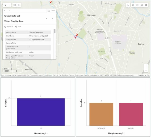
We’ve moved house since then, but we’re still within the Thames basin and can provide value by taking part in this weekend’s sampling activity. The data that gets collected on nitrate and phosphate levels in local water sources – among other observations – gets fed into an open dataset for the benefit of scientists and laypeople.
It’d have been tempting to be exceptionally lazy and measure the intermittent water course that runs through our garden! It’s an old, partially-culverted drainage ditch1, but it’s already reached the “dry” part of its year and taking a sample wouldn’t be possible right now.
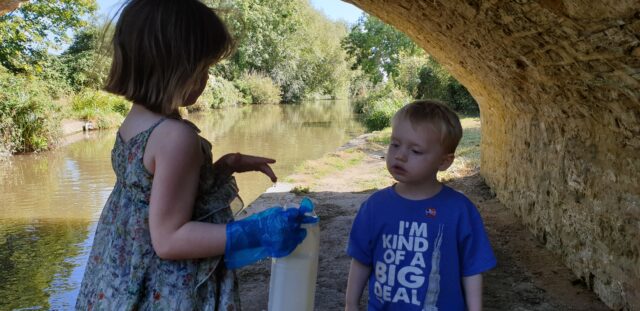
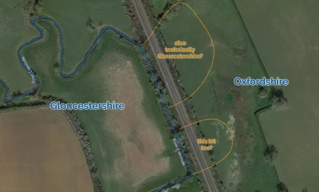
But more-importantly: the focus of this season’s study is the River Evenlode, and we’re not in its drainage basin! So we packed up a picnic and took an outing to the North Leigh Roman Villa, which I first visited last year when I was supposed to be on the Isle of Man with Ruth.
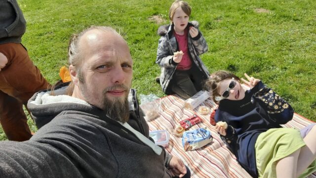
Our lunch consumed, we set off for the riverbank, and discovered that the field between us and the river was more than a little waterlogged. One of the two children had been savvy enough to put her wellies on when we suggested, but the other (who claims his wellies have holes in, or don’t fit, or some other moderately-implausible excuse for not wearing them) was in trainers and Ruth and I needed to do a careful balancing act, holding his hands, to get him across some of the tougher and boggier bits.
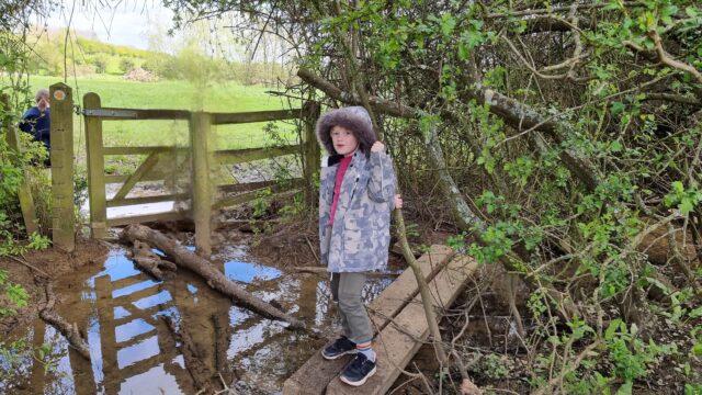
Eventually we reached the river, near where the Cotswold Line crosses it for the fifth time on its way out of Oxford. There, almost-underneath the viaduct, we sent the wellie-wearing eldest child into the river to draw us out a sample of water for testing.
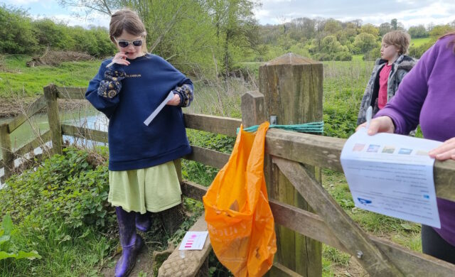
Looking into our bucket, we were pleased to discover that it was, relatively-speaking, teeming with life: small insects and a little fish-like thing wriggled around in our water sample2. This, along with the moorhen we disturbed3 as we tramped into the reeds, suggested that the river is at least in some level of good-health at this point in its course.

We were interested to observe that while the phosphate levels in the river were very high, the nitrate levels are much lower than they were recorded near this spot in a previous year. Previous years’ studies of the Evenlode have mostly taken place later in the year – around July – so we wondered if phosphate-containing agricultural runoff is a bigger problem later in the Spring. Hopefully our data will help researchers answer exactly that kind of question.
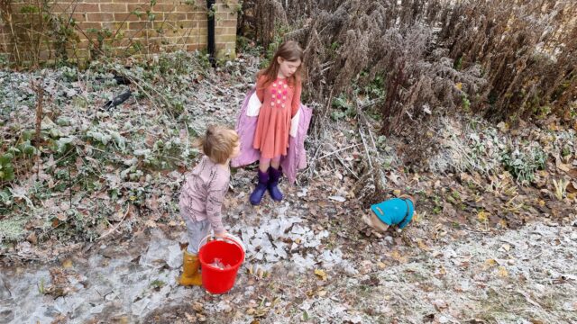
Regardless of the value of the data we collected, it was a delightful excuse for a walk, a picnic, and to learn a little about the health of a local river. On the way back to the car, I showed the kids how to identify wild garlic, which is fully in bloom in the woods nearby, and they spent the rest of the journey back chomping down on wild garlic leaves.
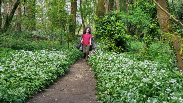
The car now smells of wild garlic. So I guess we get a smelly souvenir from this trip, too4!
1 Our garden ditch, long with a network of similar channels around our village, feeds into Limb Brook. After a meandering journey around the farms to the East this eventually merges with Chill Brook to become Wharf Stream. Wharf Stream passes through a delightful nature reserve before feeding into the Thames near Swinford Toll Bridge.
2 Needless to say, we were careful not to include these little animals in our chemical experiments but let them wait in the bucket for a few minutes and then be returned to their homes.
3 We didn’t catch the moorhen in a bucket, though, just to be clear.
4 Not counting the smelly souvenir that was our muddy boots after splodging our way through a waterlogged field, twice
I thought it might be fun to try to map the limits of my geocaching/geohashing. That is, to draw the smallest possible convex polygon that surrounds all of the geocaches I’ve found and geohashpoints I’ve successfully visited.
Mathematically, such a shape is a convex hull – the smallest polygon encircling a set of points without concavity. Here’s how I made it:
1. Extract all the longitude/latitude pairs for every successful geocaching find and geohashpoint expedition. I keep them in my blog database, so I was able to use some SQL to fetch them:
SELECT DISTINCT coord_lon.meta_value lon, coord_lat.meta_value lat
FROM wp_posts
LEFT JOIN wp_postmeta expedition_result ON wp_posts.ID = expedition_result.post_id AND expedition_result.meta_key = 'checkin_type'
LEFT JOIN wp_postmeta coord_lat ON wp_posts.ID = coord_lat.post_id AND coord_lat.meta_key = 'checkin_latitude'
LEFT JOIN wp_postmeta coord_lon ON wp_posts.ID = coord_lon.post_id AND coord_lon.meta_key = 'checkin_longitude'
LEFT JOIN wp_term_relationships ON wp_posts.ID = wp_term_relationships.object_id
LEFT JOIN wp_term_taxonomy ON wp_term_relationships.term_taxonomy_id = wp_term_taxonomy.term_taxonomy_id
LEFT JOIN wp_terms ON wp_term_taxonomy.term_id = wp_terms.term_id
WHERE wp_posts.post_type = 'post' AND wp_posts.post_status = 'publish'
AND wp_term_taxonomy.taxonomy = 'kind'
AND wp_terms.slug = 'checkin'
AND expedition_result.meta_value IN ('Found it', 'found', 'coordinates reached', 'Attended');
2. Next, I determine the convex hull of these points. There are an interesting variety of algorithms for this so I adapted the Monotone Chain approach (there are convenient implementations in many languages). The algorithm seems pretty efficient, although that doesn’t matter much to me because I’m caching the results for a fortnight.
3. Finally, I push the hull coordinates into Geoapify, who provide mapping services to me. My full source code is available.
An up-to-date (well, no-more than two weeks outdated) version of the map appears on my geo* stats page. I don’t often get to go caching/hashing outside the bounds already-depicted, but I’m excited to try to find opportunities to push the boundaries outwards as I continue to explore the world!
(I could, I suppose, try to draw a second larger area of places I’ve visited: the difference between the smaller and larger areas would represent all of the opportunities I’d missed to find a hashpoint!)
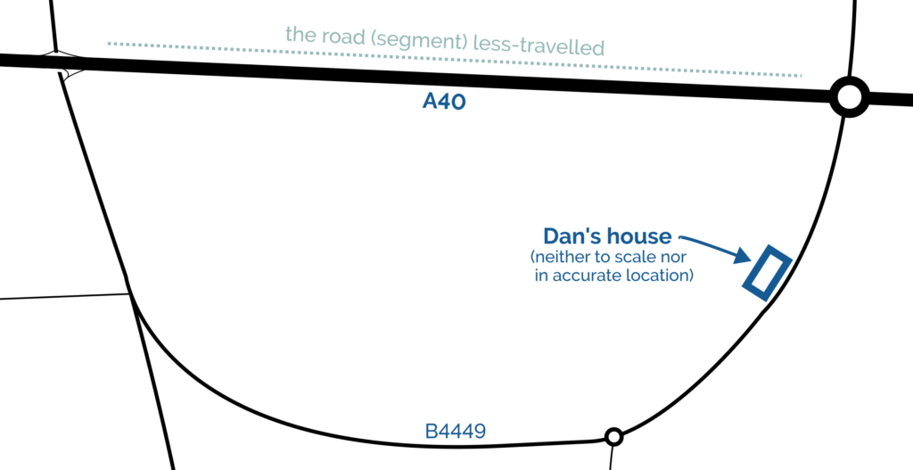
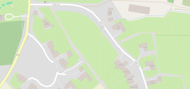
There are two junctions at which I can join the A40 trunk road from my house. When I drive East, I use the Easternmost of the two; when I drive West, I use the Westernmost; but I almost never drive the stretch of road between them!
A few years ago I generated heatmaps of my movements based on my long-running personal location log and, indeed, it shows a “cool spot” along this section of road too:
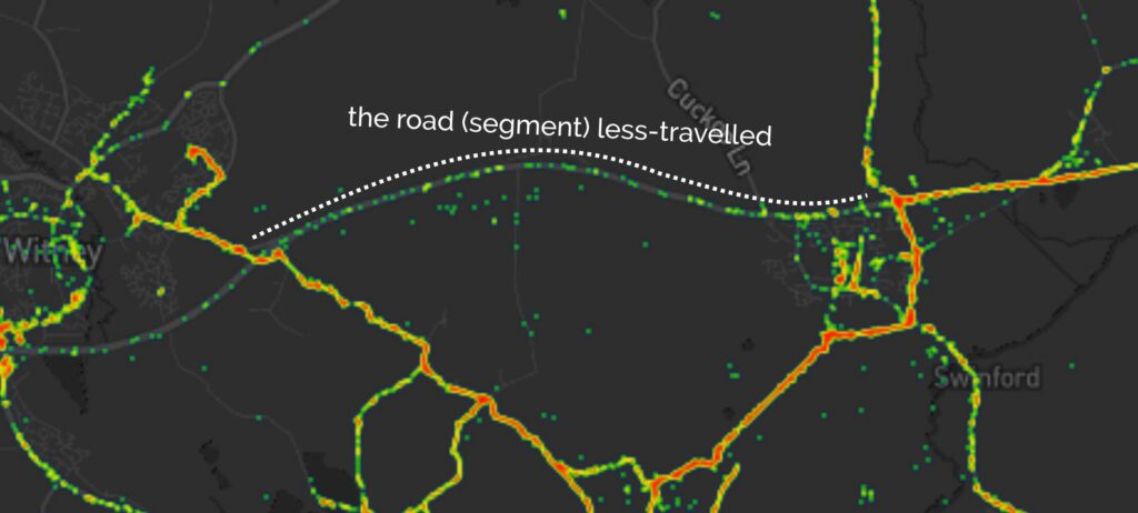
It’s inevitable I suppose that there should exist a “road (segment) less-travelled” right on my doorstep, but it still feels strange. Like when you live near a tourist attraction that you never get around to visiting. Except instead of a tourist attraction, I live near a major highway I rarely use.
Maybe I’m missing out on something great. Probably the commuters who use that road to get into and out of Oxford don’t think so.
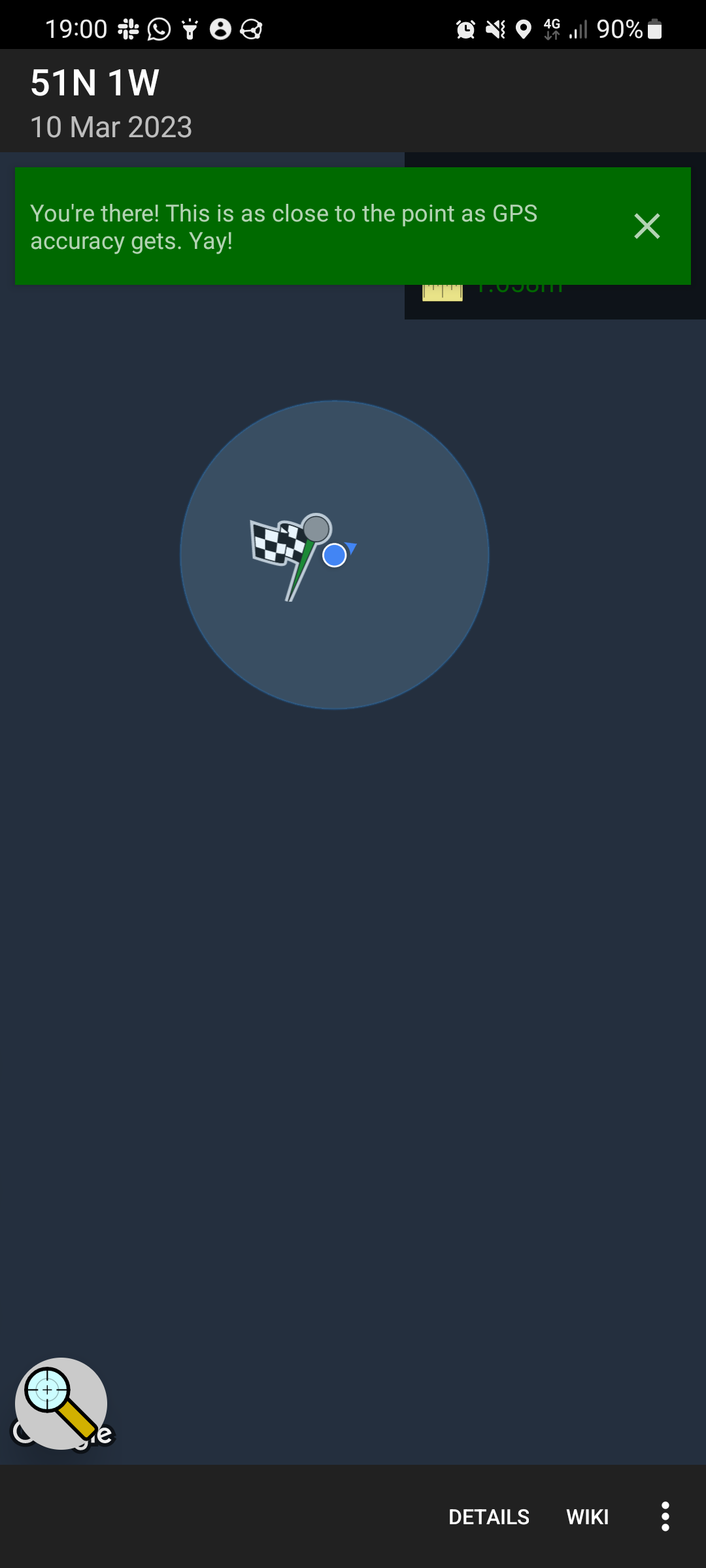
This checkin to geohash 2023-03-10 51 -1 reflects a geohashing expedition. See more of Dan's hash logs.
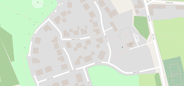
North Leigh Common, West Oxfordshire.
My evening just freed up, so – weather-permitting – I might brave the sleet and cold and cycle out to this hashpoint this evening.
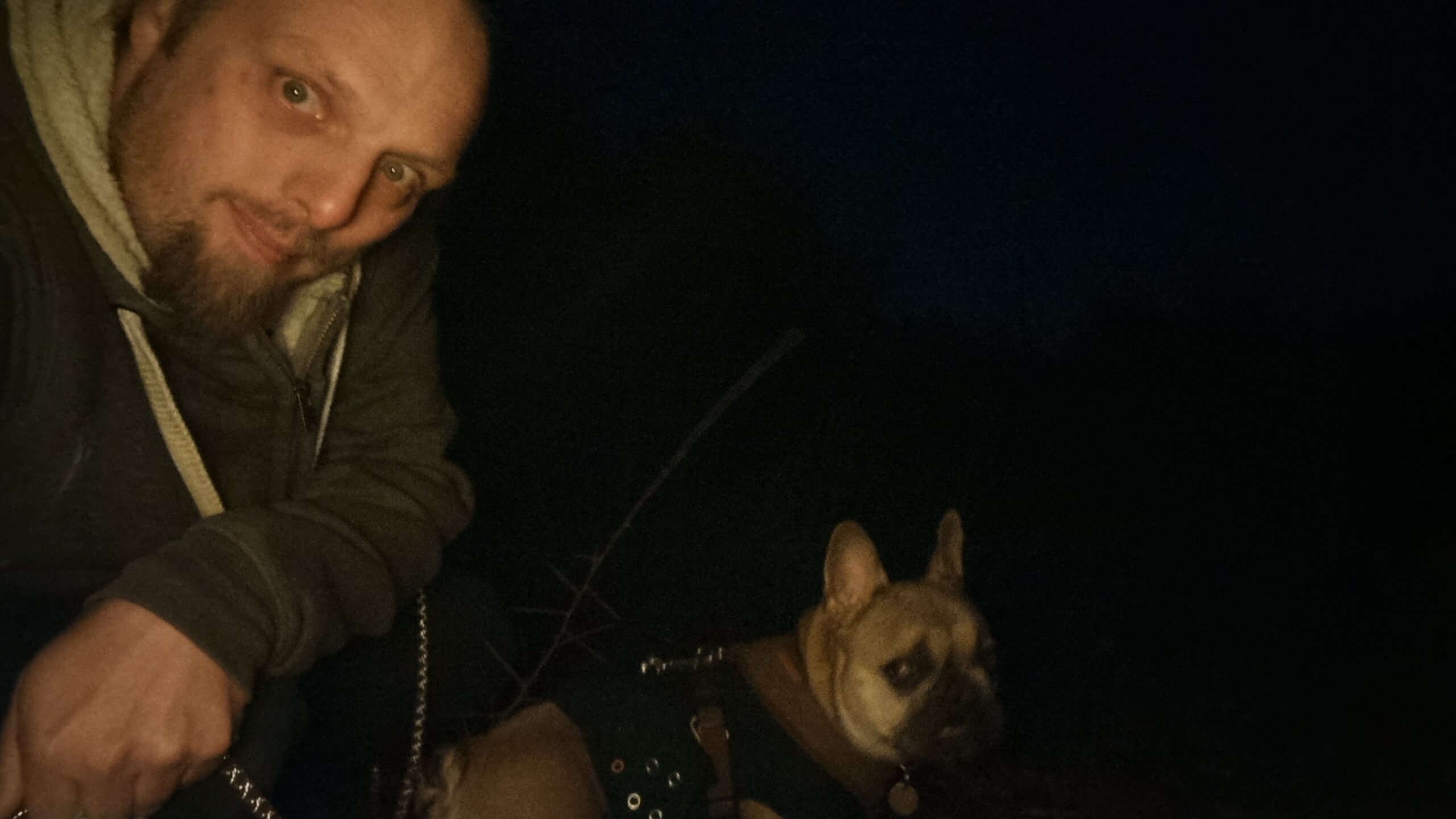
Our dog had surgery at the start of the week and has now recovered enough to want a short walk, so I changed my plan to cycle for one to drive (with the dog) out to somewhere near the hashpoint and take her for a walk to and around it. Amazingly, I might have been faster to cycle: a crash on the A40 had lead to lots of traffic being re-routed along the exact same back roads that was to be my most-direct route, and on the local rat run through South Leigh I got trapped behind a line of folks who weren’t familiar with this particular unlit and twisty road and took the entire derestricted section at an average of 25mph. Ah well.
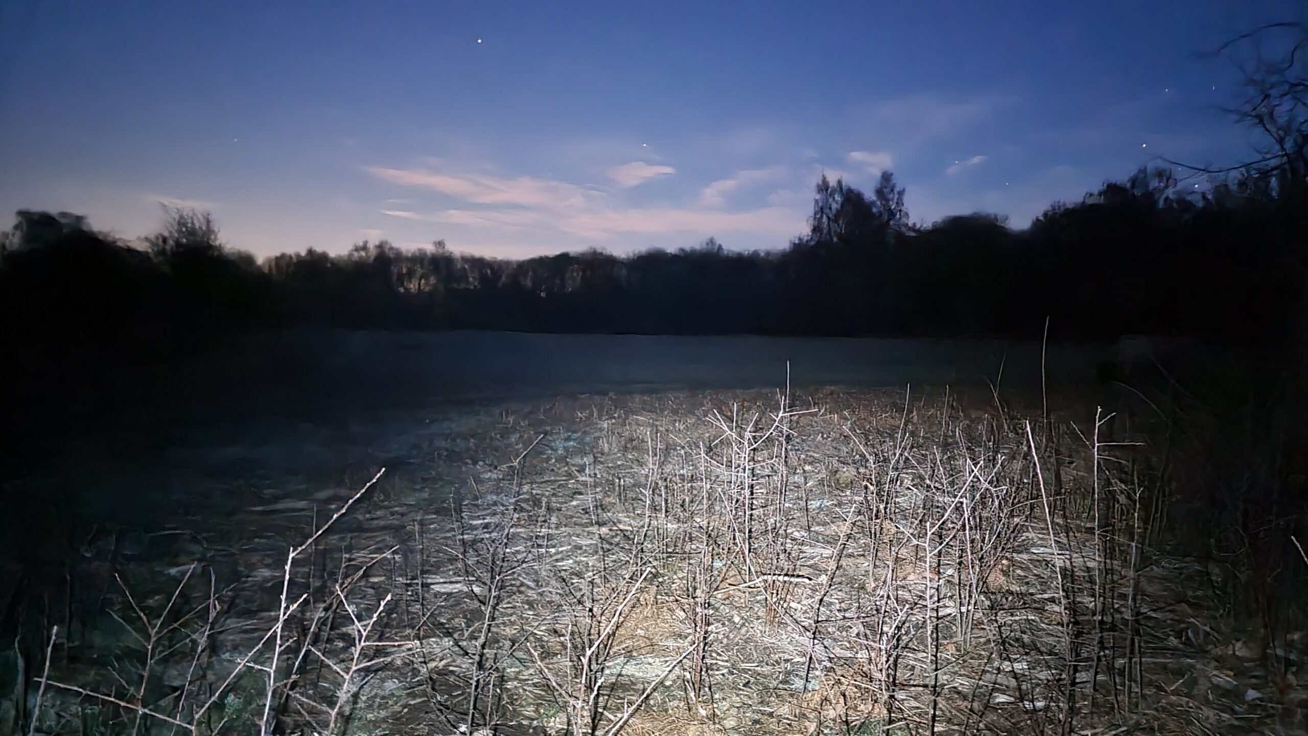
Out of laziness, I didn’t bring my GPSr or make a tracklog; I just used the Geohashdroid app and took a screenshot when I got there. South Leigh Common is pleasant, but it was dark, and my photos are all a little bit hard to make out! But the stars were beautiful tonight, and the dog loved one of her first outings since her surgery and enjoying running around in the long wet grass and sticking her head into rabbit holes. At 19:00 precisely I got within about a metre and a half of the hashpoint – well within the circle of uncertainty – and turned to head home.
I also took the time while there to update OpenStreetMap by drawing in the boundaries of the common, replacing the nondescript “point” that had marked it before.