As I’ve previously mentioned (sadly), Microsoft Edge is to drop its own rendering engine EdgeHTML and replace it with Blink, Google’s one (more
of my and others related sadness here, here, here, and here). Earlier this month, Microsoft made available the first prerelease versions of the browser, and I gave it a go.
At a glance, it looks exactly like you’d expect a Microsoft reskin of Chrome to look, right down to the harmonised version numbers.
All of the Chrome-like features you’d expect are there, including support for Chrome plugins, but Microsoft have also clearly worked to try to integrate as much as possible of the
important features that they felt were distinct to Edge in there, too. For example, Edge Blink supports SmartScreen filtering and uses Microsoft accounts for sync, and Incognito is of
course rebranded InPrivate.
But what really interested me was the approach that Edge Dev has taken with Progressive Web Apps.
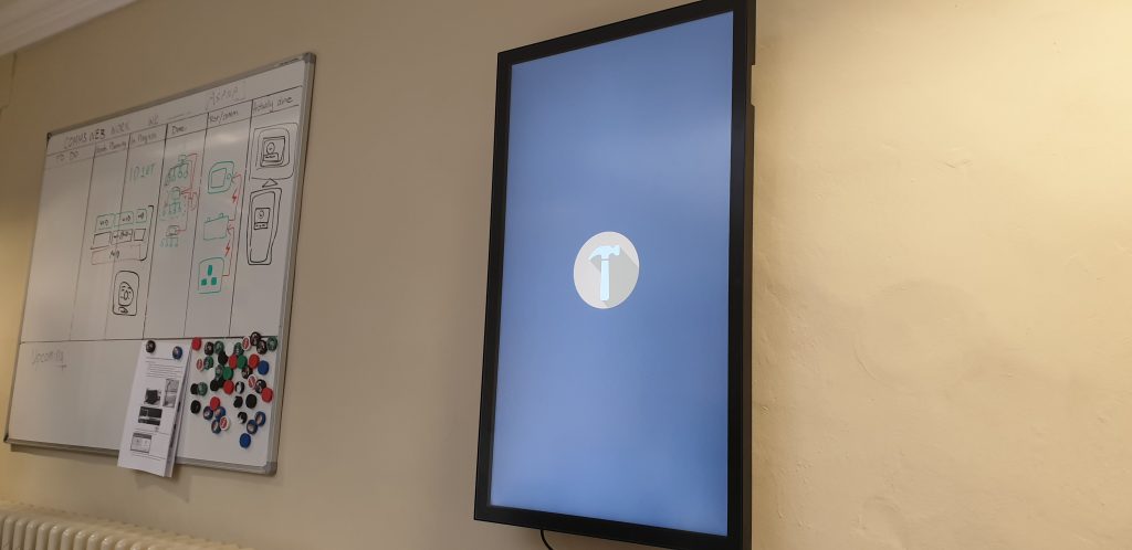
NonStopHammerTi.me might not be the best PWA in the world, but it’s the best one linked from this blog post.
Edge Dev may go further than any other mainstream browser in its efforts to make Progressive Web Apps visible to the user, putting a plus sign (and sometimes an extended
install prompt) right in the address bar, rather than burying it deep in a menu. Once installed, Edge PWAs “just work” in
exactly the way that PWAs ought to, providing a simple and powerful user experience. Unlike some browsers, which
make installing PWAs on mobile devices far easier than on desktops, presumably in a misguided belief in the importance of
mobile “app culture”, it doesn’t discriminate against desktop users. It’s a slick and simple user experience all over.
Once installed, Edge immediately runs your new app (closing the tab it formerly occupied) and adds shortcut icons.
Feature support is stronger than it is for Progressive Web Apps delivered as standalone apps via the Windows Store, too, with the engine not falling over at the first sign of a modal
dialog for example. Hopefully (as I support one of these hybrid apps!) these too will begin to be handled properly when Edge Dev eventually achieves mainstream availability.
If you’ve got the “app” version installed, Edge provides a menu option to switch to that from any page on the conventional site (and cookies/state is retained across both).
But perhaps most-impressive is Edge Dev’s respect for the importance of URLs. If, having installed the progressive “app”
version of a site you subsequently revisit any address within its scope, you can switch to the app version via a link in the menu. I’d rather have seen a nudge in the address bar, where
the user might expect to see such things (based on that being where the original install icon was), but this is still a great feature… especially given that cookies and other
state maintainers are shared between the browser, meaning that performing such a switch in a properly-made application will result in the user carrying on from almost exactly where they
left off.
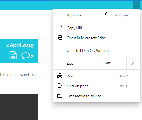
Unlike virtually every other PWA engine, Edge Dev’s provides a “Copy URL” feature even to apps without address bars, which is a killer feature for sharability.
Similarly, and also uncommonly forward-thinking, Progressive Web Apps installed as standalone applications from Edge Dev enjoy a “copy URL” option in their menu, even if the app runs without an address bar (e.g. as a result of a "display": "standalone" directive
in the manifest.json). This is a huge boost to sharability and is enormously (and unusually) respectful of the fact that addresses are the
Web’s killer feature! Furthermore, it respects the users’ choice to operate their “apps” in whatever way suits them best: in a browser (even a competing browser!), on their
mobile device, or wherever. Well done, Microsoft!
I’m still very sad overall that Edge is becoming part of the Chromium family of browsers. But if the silver lining is that we get a pioneering and powerful new Progressive Web App
engine then it can’t be all bad, can it?
You’ve probably seen the news about people taking a technological look at the issue of consent, lately. One thing that’s been
getting a lot of attention is the Tulipán Placer Consentido, an Argentinian condom which comes in a packet that requires the cooperation of two pairs of hands to open it.
Move your fingers just a bit lower. No… up a bit. Yes! Right there! That’s the spot!
One fundamental flaw with the concept that nobody seems to have pointed out (unless perhaps in Spanish), is that – even assuming the clever packaging works perfectly – all that you can
actually consent to with such a device is the use of a condom. Given that rape can be and often is committed coercively rather than physically – e.g. through fear, blackmail,
or obligation rather than by force – consent to use of a condom by one of the parties shouldn’t be conflated with consent to a sexual act: it may just be preferable to it
without, if that seems to be the alternative.
Indeed, all of these technical “solutions” to rape seem to focus on the wrong part of the process. Making sure that an agreement is established isn’t a hard problem,
algorithmically-speaking (digital signatures with split-key cryptography has given us perhaps the strongest possible solution to the problem for forty years now)! The hard problem here
is in getting people to think about what rape is and to act appropriately to one another. Y’know: it’s a people problem, not a technology problem! (Unshocker.)
“If it’s not a yes, it’s a no.” If you ignore the product, the ad itself is on-message.
But even though they’re perhaps functionally-useless, I’m still glad that people are making these product prototypes. As the news coverage kicked off by the #MeToo movement wanes, its valuable to keep that wave of news going: the issues faced by the victims of sexual assault and rape
haven’t gone away! Products like these may well be pointless in the real world, but they’re a vehicle to
keep talking about consent and its importance. Keeping the issue in the limelight is helpful, because it forces people to continually re-evaluate their position on sex and
consent, which makes for a healthy and progressive society.
So I’m looking forward to whatever stupid thing we come up with next. Bring it on, innovators! Just don’t take your invention too seriously: you’re not going to “fix” rape with
it, but at least you can keep us talking about it.
I’m not sure that I process death in the same way that “normal” people do. I blame my family.
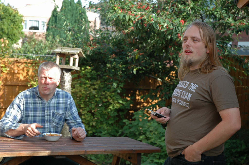
My sisters and I have wished one another a “Happy Dead Dad Day” every 19 February since his death.
When my grandmother died in 2006 I was just in the process of packing up the car with Claire to
try to get up to visit her before the inevitable happened. I received the phone call to advise me that she’d passed, and – ten emotional
minutes later – Claire told me that she’d “never seen anybody go through the five stages of grief as fast as that
before”. Apparently I was a textbook example of the Kübler-Ross model, only at speed. Perhaps I should volunteer to stand in front of introductory psychology classes and feel things, or
something.
I guess there isn’t actually a market for Happy Dead Dad Day greetings cards?
Since my dad’s death seven years ago, I’ve marked Dead Dad Day every 19 February a way that’s definitely “mine”: with a pint or three of Guinness
(which my dad enjoyed… except if there were a cheaper Irish stout on draught because he never quite shook off his working-class roots) and some outdoors and ideally a hill, although
Oxfordshire makes the latter a little difficult. On the second anniversary of my dad’s death, I commemorated his love of setting out and checking the map later by making
my first geohashing expedition: it seemed appropriate that even without him, I could make a journey without either of us
being sure of either the route… or the destination.
Eating cornflakes together in the garden was a tradition of my dad and I’s since at least 23 years before this photo was taken.
As I implied at his funeral, I’ve always been far more-interested in celebrating life than
mourning death (that might be why I’m not always the best at supporting those in grief). I’m not saying that it isn’t sad
that he went before his time: it is. What’s worst, I think, is when I remember how close-but-not-quite he came to getting to meet his grandchildren… who’d have doubtless called him
“Grandpeter”.
We all get to live, and we’re all going to die, and I’d honestly be delighted if I thought that people might remember me with the same kind of smile (and just occasionally tear) that
finds my face every Dead Dad Day.
I’m a big believer in the idea that the hardware I lay my hands on all day, every day, needs to be the best for its purpose. On my primary desktop, I type on a Das Keyboard 4 Professional (with Cherry MX brown switches) because it looks, feels, and sounds spectacular. I use
the Mac edition of the keyboard because it, coupled with a few tweaks, gives me the best combination of features and compatibility across all of the Windows, MacOS, and Linux (and
occasionally other operating systems) I control with it. These things matter.
I don’t know what you think these buttons do, but if you’re using my keyboard, you’re probably wrong. Also, they need a clean. I swear they don’t look this grimy
when I’m not doing macro-photography.
I also care about the mouse I use. Mice are, for the most part, for the Web and for gaming and not for use in most other applications (that’s what keyboard shortcuts are for!) but
nonetheless I spend plenty of time holding one and so I want the tool that feels right to me. That’s why I was delighted when, in replacing my four year-old Logitech MX1000 in 2010 with my first Logitech Performance MX, I felt
able to declare it the best mouse in the world. My Performance MX lived for about four years, too – that seems to be how long a mouse can stand the kind of use that I give it –
before it started to fail and I opted to replace it with an identical make and model. I’d found “my” mouse, and I was sticking with it. It’s a great shape (if you’ve got larger hands),
is full of features including highly-configurable buttons, vertical and horizontal scrolling (or whatever you want to map them to), and a cool “flywheel” mouse wheel that can
be locked to regular operation or unlocked for controlled high-speed scrolling at the touch of a button: with practice, you can even use it as a speed control by gently depressing the
switch like it was a brake pedal. Couple all of that with incredible accuracy on virtually any surface, long battery life, and charging “while you use” and you’ve a recipe for success,
in my mind.
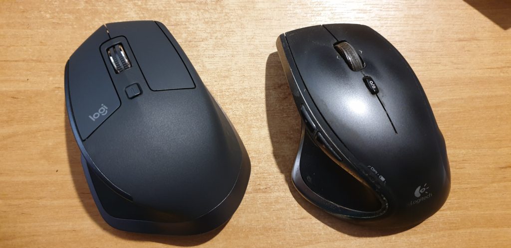
My second Performance MX stopped properly charging its battery this week, and it turns out that they don’t make them any more, so I bought its successor, the Logitech MX Master 2S.
On the left, the (new) Logitech MX Master 2S. On the right, my (old) Logitech Performance MX.
The MX Master 2S is… different… from its predecessor. Mostly in good ways, sometimes less-good. Here’s the important differences:
Matte coating: only the buttons are made of smooth plastic; the body of the mouse is now a slightly coarser plastic: you’ll see in the photo above how much less light
it reflects. It feels like it would dissipate heat less-well.
Horizontal wheel replaces rocker wheel: instead of the Performance MX’s “rocker” scroll wheel that can be pushed sideways for horizontal scroll, the MX Master 2S adds
a dedicated horizontal scroll (or whatever you reconfigure it to) wheel in the thumb well. This is a welcome change: the rocker wheel in both my Performance MXes became less-effective
over time and in older mice could even “jam on”, blocking the middle-click function. This seems like a far more-logical design.
New back/forward button shape: to accommodate the horizontal wheel, the “back” and “forward” buttons in the thumb well have been made smaller and pushed closer
together. This is the single biggest failing of the MX Master 2S: it’s clearly a mouse designed for larger hands, and yet these new buttons are slightly, but noticeably, harder to
accurately trigger with a large thumb! It’s tolerable, but slightly annoying.
Bluetooth support: one of my biggest gripes about the Performance MX was its dependence on Unifying, Logitech’s proprietary wireless protocol. The MX Master 2S
supports Unifying but also supports Bluetooth, giving you the best of both worlds.
Digital flywheel: the most-noticable change when using the mouse is the new flywheel and braking mechanism, which is comparable to the change in contemporary cars
from a mechanical to a digital handbrake. The flywheel “lock” switch is now digital, turning on or off the brake in a single stroke and so depriving you of the satisfaction of using
it to gradually “slow down” a long spin-scroll through an enormous log or source code file. But in exchange comes an awesome feature called SmartShift, which dynamically
turns on or off the brake (y’know, like an automatic handbrake!) depending on the speed with which you throw the wheel. That’s clever and intuitive and “just works” far better than
I’d have imagined: I can choose to scroll slowly or quickly, with or without the traditional ratchet “clicks” of a wheel mouse, with nothing more than the way I flick my finger (and
all fully-configurable, of course). And I’ve still got the button to manually “toggle” the brake if I need it. It took some getting used to, but this change is actually really cool!
(I’m yet to get used to the sound of the digital brake kicking in automatically, but that’s true of my car too).
Basic KVM/multi-computing capability: with a button on the underside to toggle between different paired Unifying/Bluetooth transceivers and software support for
seamless edge-of-desktop multi-computer operation, Logitech are clearly trying to target folks who, like me, routinely run multiple computers simultaneously from a single keyboard and
mouse. But it’s a pointless addition in my case because I’ve been quite happy using Synergy to do this for
the last 7+ years, which does it better. Still, it’s a harmless “bonus” feature and it might be of value to others, I suppose.
All in all, the MX Master 2S isn’t such an innovative leap forward over the Performance MX as the Performance MX was over the MX1000, but it’s still great that this spectacular series
of heavyweight workhouse feature-rich mice continues to innovate and, for the most part, improve upon the formula. This mouse isn’t cheap, and it isn’t for everybody, but if you’re a
big-handed power user with a need to fine-tune all your hands-on hardware to get it just right, it’s definitely worth a look.
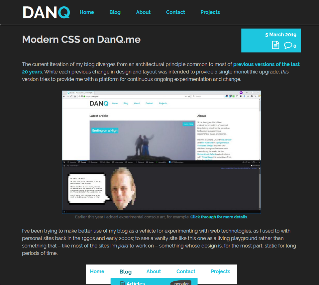
The current iteration of my blog diverges from an architectural principle common to most of previous versions of the last 20 years. While
each previous change in design and layout was intended to provide a single monolithic upgrade, this version tries to provide me with a platform for continuous ongoing
experimentation and change.
I’ve been trying to make better use of my blog as a vehicle for experimenting with web technologies, as I used to with personal sites back in the 1990s and early 2000s; to see a vanity
site like this one as a living playground rather than something that – like most of the sites I’m paid to work on – something whose design is, for the most part, static for
long periods of time.
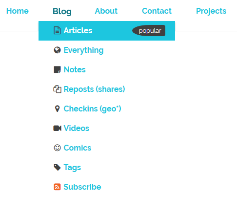
The “popular” flag and associated background colour in the “Blog” top-level menu became permanent after a period of A/B testing. Thanks, unwitting testers!
I’m not entirely happy with the design of these boxes, but that’s a job for another day.
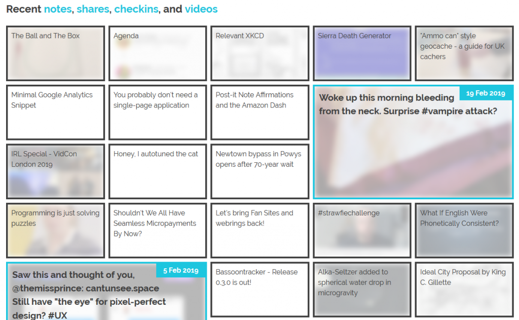
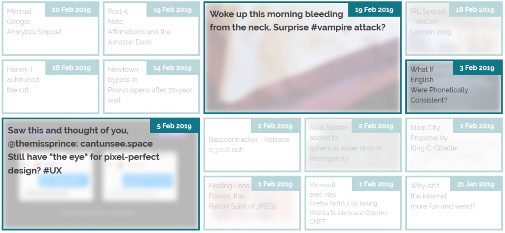
The grid of recent notes, shares, checkins and videos on my
homepage is powered by the display: grid; CSS directive. The number of columns varies by screen width from six
on the widest screens down to three or just one on increasingly small screens. Crucially, grid-auto-flow: dense; is used to ensure an even left-to-right filling of the
available space even if one of the “larger” blocks (with grid-column: span 2; grid-row: span 2;) is forced for space reasons to run onto the next line. This means that
content might occasionally be displayed in a different order from that in which it is written in the HTML (which is reverse
order of publication), but in exchange the items are flush with both sides.
The large “5 Feb” item in this illustration should, reverse-chronologically, appear before the “3 Feb” item, but there isn’t room for it on the previous line. grid-auto-flow:
dense; means that the “3 Feb” item is allowed to bubble-up and fill the gap, appearing out-of-order but flush with the edge.
Not all web browsers support display: grid; and while that’s often only one of design and not of readability because these browsers will fall back to usually-very-safe
default display modes like block and inline, as appropriate, sometimes there are bigger problems. In Internet Explorer 11, for example, I found (with thanks to
@_ignatg) a problem with my directives specifying the size of these cells (which are actually <li> elements because, well,
semantics matter). Because it understood the directives that ought to impact the sizing of the list items but not
the one that redeclared its display type, IE made… a bit of a mess of things…
Thanks, Internet Explorer. That’s totally what I was looking for.
Do websites need to look the same in every browser? No. But the content should be readable
regardless, and here my CSS was rendering my content unreadable. Given that Internet Explorer users represent a little
under 0.1% of visitors to my site I don’t feel the need to hack it to have the same look-and-feel: I just need it to have the same content readability. CSS Feature Queries to the rescue!
CSS Feature Queries – the @supports selector – make it possible to apply parts of your stylesheet if and only if
the browser supports specific CSS features, for example grids. Better yet, using it in a positive manner (i.e. “apply these
rules only if the browser supports this feature”) is progressive enhancement, because browsers that don’t understand the @supports selector act in
the same way as those that understand it but don’t support the specified feature. Fencing off the relevant parts of my stylesheet in a @supports (display: grid) { ... }
block instructed IE to fall back to displaying that content as a boring old list: exactly what I needed.
It isn’t pretty, but it’s pretty usable!
Reduced-motion support
I like to put a few “fun” features into each design for my blog, and while it’s nowhere near as quirky as having my head play peek-a-boo when you
hover your cursor over it, the current header’s animations are in the same ballpark: hover over or click on some of the items in the header menu to see for yourself..
I’m most-pleased with the playful “bounce” of the letter Q when you hover over my name.
These kinds of animations are fun, but they can also be problematic. People with inner ear disorders (as well as people who’re just trying to maximise the battery life on their portable
devices!) might prefer not to see them, and web designers ought to respect that choice where possible. Luckily, there’s an emerging standard to acknowledge that: prefers-reduced-motion. Alongside its cousins inverted-colors, prefers-reduced-transparency, prefers-contrast and
prefers-color-scheme (see below for that last one!), these new CSS tools allow developers to optimise based on the accessibility
features activated by the user within their operating system.
In Windows you turn off animations while in MacOS you turn on not-having animations, but the principle’s the same.
If you’ve tweaked your accessibility settings to reduce the amount of animation your operating system shows you, this website will respect that choice as well by not animating the
contents of the title, menu, or the homepage “tiles” any more than is absolutely necessary… so long as you’re using a supported browser, which right now means Safari or Firefox (or the
“next” version of Chrome). Making the change itself is pretty simple: I just added a @media screen and (prefers-reduced-motion: reduce) { ... } block to disable or
otherwise cut-down on the relevant animations.
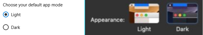
Dark-mode support
…
Similarly, operating systems are beginning to
support “dark mode”, designed for people trying to avoid eyestrain when using their computer at night. It’s possible for your browser to respect this and try to “fix” web pages for
you, of course, but it’s better still if the developer of those pages has anticipated your need and designed them to acknowledge your choice for you. It’s only supported in Firefox and
Safari so far and only on recent versions of Windows and MacOS, but it’s a start and a helpful touch for those nocturnal websurfers out there.
Come to the dark side, Luke. Or just get f.lux, I suppose.
It’s pretty simple to implement. In my case, I just stacked some overrides into a @media (prefers-color-scheme: dark) { ... } block, inverting the background and primary
foreground colours, softening the contrast, removing a few “bright” borders, and darkening rather than lightening background images used on homepage tiles. And again, it’s an example of
progressive enhancement: the (majority!) of users whose operating systems and/or browsers don’t yet support this feature won’t be impacted by its inclusion in my stylesheet, but those
who can make use of it can appreciate its benefits.
This isn’t the end of the story of CSS experimentation on my blog, but it’s a part of the it that I hope you’ve enjoyed.
Apparently the NCSF (US) are typing to make 28 February into Metamour Day: a
celebration of one’s lover’s lovers. While I’m not convinced that’ll ever get Hallmark’s interest, I thought it provided a good opportunity to sing the praises of my metamour, JTA.
This is a man who knows how to use Greek myths and legends to add magic to his daughter’s museum visit.
I first met JTA 15 years ago at Troma Night XX, when his girlfriend Ruth – an attendee of Troma Night since its earliest days the previous year – brought him along and we all mocked his three-letter initialism.
Contrary to our previous experience, thanks to Liz, of people bringing boyfriends once but never again (we always assumed that we
scared them off), JTA became a regular, even getting to relive some of the early nights that he’d missed in our nostalgic 50th event. Before long, I felt glad to count him among my friends.
Almost 13 years ago I described JTA thusly, and I stand by it:
You have a fantastic temper which you keep carefully bottled away and of which you draw out only a little at a time and only where it is genuinely justly deserved. Conversely, your
devotion to the things you love and care about is equally inspiring.
We’d be friends anyway, but having a partner-in-common has given us the opportunity for a closer relationship still. I love you, man: y’know, in the Greek way. Happy metamour
appreciation day.
People were quick to point this out and assume that it was something to do with the modernity of MetaFilter:
honestly, the disheartening thing is that many metafilter pages don’t seem to work. Oh, the modern web.
Some even went so far as to speculate that the reason related to MetaFilter’s use of CSS and JS:
CSS and JS. They do things. Important things.
This is, of course, complete baloney, and it’s easy to prove to oneself. Firstly, simply using the View Source tool in your browser on a MetaFilter page reveals source code that’s quite
comprehensible, even human-readable, without going anywhere near any CSS or JavaScript.
As late as the early 2000s I’d occasionally use Lynx for serious browsing, but any time I’ve used it since it’s been by necessity.
Secondly, it’s pretty simple to try browsing MetaFilter without CSS or JavaScript enabled! I tried in two ways: first,
by using Lynx, a text-based browser that’s never supported either of those technologies. I also tried by using
Firefox but with them disabled (honestly, I slightly miss when the Web used to look like this):
It only took me three clicks to disable stylesheets and JavaScript in my copy of Firefox… but I’ll be the first to admit that I don’t keep my browser configured like “normal people”
probably do.
And thirdly: the error code being returned by the simulated WorldWideWeb browser is a HTTP code 500. Even if you don’t
know your HTTP codes (I mean, what kind of weirdo would take the time to memorise them all anyway <ahem>),
it’s worth learning this: the first digit of a HTTP response code tells you what happened:
1xx means “everything’s fine, keep going”;
2xx means “everything’s fine and we’re done”;
3xx means “try over there”;
4xx means “you did something wrong” (the infamous 404, for example, means you asked for a page that doesn’t exist);
5xx means “the server did something wrong”.
Simple! The fact that the error code begins with a 5 strongly implies that the problem isn’t in the (client-side) reimplementation of WorldWideWeb: if this had have been a
CSS/JS problem, I’d expect to see a blank page, scrambled content, “filler”
content, or incomplete content.
So I found myself wondering what the real problem was. This is, of course, where my geek flag becomes most-visible: what we’re talking about, let’s not forget, is a fringe
problem in an incomplete simulation of an ancient computer program that nobody uses. Odds are incredibly good that nobody on Earth cares about this except, right now, for me.
I searched for a “Geek Flag” and didn’t like anything I saw, so I came up with this one based on… well, if you recognise what it’s based on, good for you, you’re certainly allowed to
fly it. If not… well, you can too: there’s no geek-gatekeeping here.
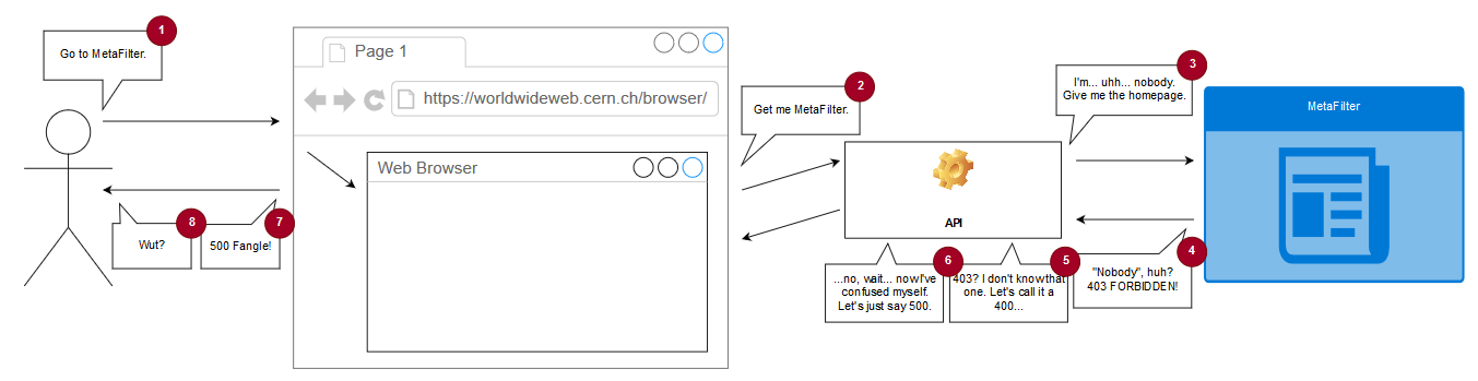
The (simulated) copy of WorldWideWeb is asked to open a document by reference, e.g. “https://www.metafilter.com/”.
To work around same-origin policy restrictions, the request is sent to an API which acts as a proxy server.
The API makes a request using the Node package “request” with this line of code: request(url, (error, response, body) =>
{ ... }). When the first parameter to request is a (string) URL, the module uses its default settings for all of
the other options, which means that it doesn’t set the User-Agent header (an optional part of a Web request where the computer making the request identifies the software
that’s asking).
MetaFilter, for some reason, blocks requests whose User-Agent isn’t set. This is weird! And nonstandard: while web browsers should – in RFC2119 terms – set their User-Agent: header, web servers shouldn’t require
that they do so. MetaFilter returns a 403 and a message to say “Forbidden”; usually a message you only see if you’re trying to access a resource that requires session authentication and
you haven’t logged-in yet.
The API is programmed to handle response codes 200 (okay!) and 404 (not found), but if it gets anything else back
it’s supposed to throw a 400 (bad request). Except there’s a bug: when trying to throw a 400, it requires that an error message has been set by the request module and if there
hasn’t… it instead throws a 500 with the message “Internal Server Fangle” and no clue what actually went wrong. So MetaFilter’s 403 gets translated by the proxy into a 400 which
it fails to render because a 403 doesn’t actually produce an error message and so it gets translated again into the 500 that you eventually see. What a knock-on effect!
If you’re having difficulty visualising the process, this diagram might help you to continue your struggle with that visualisation.
This then sets a User-Agent header and makes servers that require one, such as MetaFilter, respond appropriately. I don’t know whether WorldWideWeb originally set a User-Agent header
(CERN’s source file archive seems to be missing the relevant C sources so I can’t check) but I
suspect that it did, so this change actually improves the fidelity of the emulation as a bonus. A better fix would also add support for and appropriate handling of other HTTP response
codes, but that’s a story for another day, I guess.
I know the hackathon’s over, but I wonder if they’re taking pull requests…
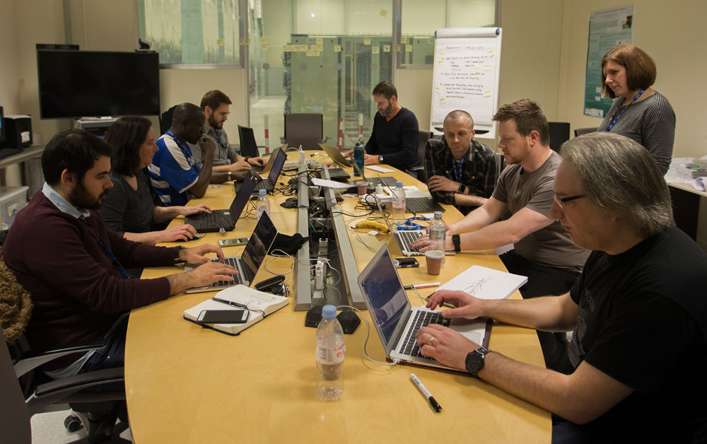
This month, a collection of some of my favourite geeks got invited to CERN in Geneva to
participate in a week-long hackathon with the aim of reimplementing WorldWideWeb –
the first web browser, circa 1990-1994 – as a web application. I’m super jealous, but I’m also really pleased with what they managed
to produce.
This represents a huge leap forward from their last similar project, which aimed to recreate the line mode browser: the first web browser that
didn’t require a NeXT computer to run it and so a leap forward in mainstream appeal. In some ways, you might expect
reimplementing WorldWideWeb to be easier, because its functionality is more-similar that of a modern browser, but there were doubtless some challenges too: this early browser predated the concept of the DOM and so there are distinct
processing differences that must be considered to get a truly authentic experience.
It’s just like any other hackathon, if you ignore the enormous particle collider underneath it.
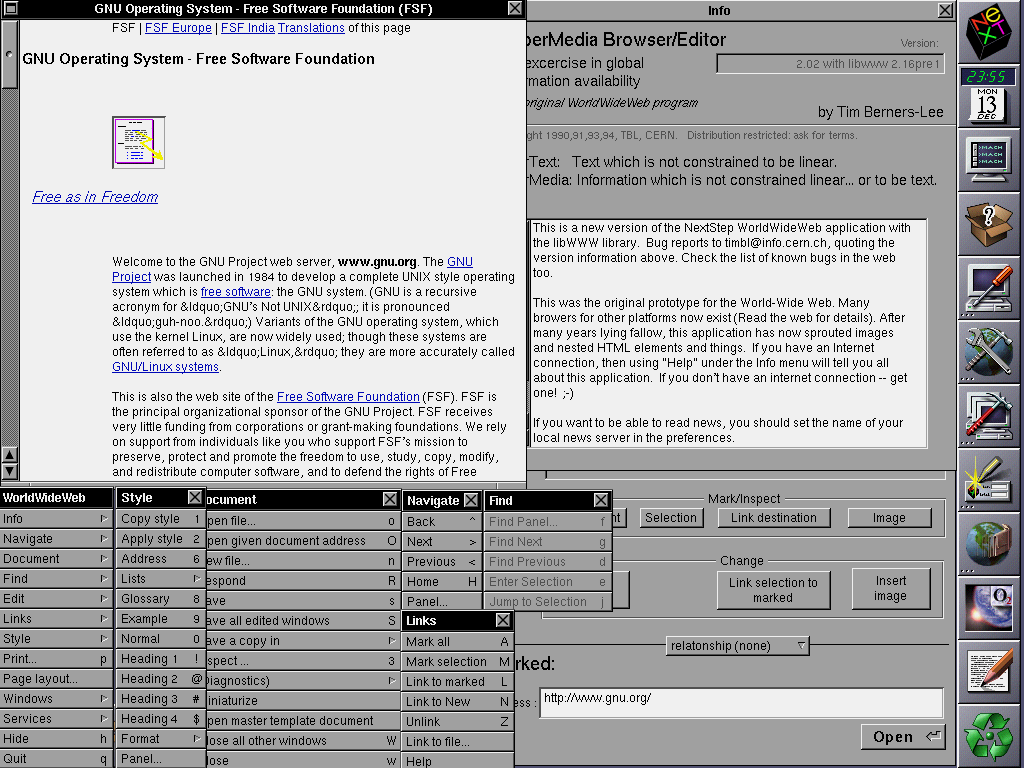
Among their outputs, the team also produced a cool timeline of the Web, which – thanks to some careful authorship – is as legible in WorldWideWeb as it is in a modern browser (if, admittedly, a little less pretty).
When Sir Tim took this screenshot, he could never have predicted the way the Web would change, technically, over the next
25-30 years. But I’m almost more-interested in how it’s stayed the same.
In an age of increasing Single Page Applications and API-driven sites and “apps”, it’s nice to be reminded that if you develop right for the Web, your content will be visible
(sort-of; I’m aware that there are some liberties taken here in memory and processing limitations, protocols and negotiation) on machines 30 years old, and that gives me hope that
adherence to the same solid standards gives us a chance of writing pages today that look just as good in 30 years to come. Compare that to a proprietary technology like Flash whose heyday 15 years ago is overshadowed by its imminent death (not to
mention Java applets or ActiveX <shudders>), iOS apps which stopped working when the operating system went 64-bit, and websites which only work
in specific browsers (traditionally Internet Explorer, though as I’ve complained before we’re getting more and more Chrome-only sites).
The Web is a success story in open standards, natural and by-design progressive enhancement, and the future-proof archivability of human-readable code. Long live the Web.
tl;dr: TRRTL.COM is my reimplementation of a Logo on-screen turtle as a CoffeeScript-backed web application
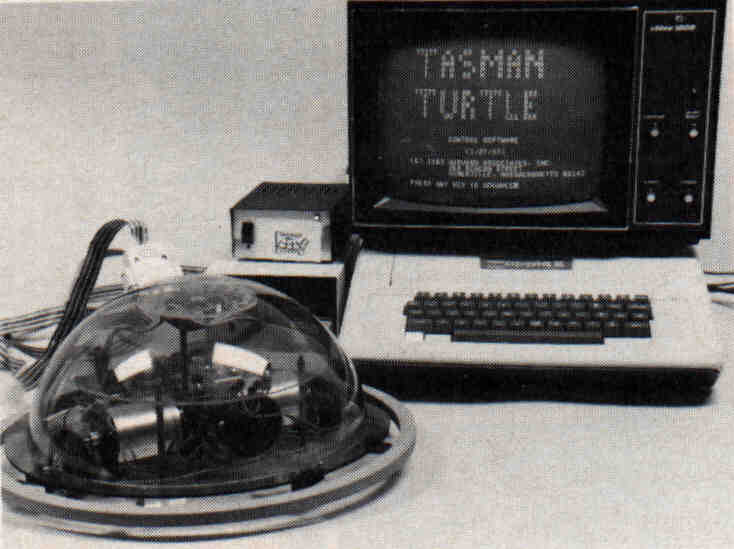
For many children growing up in the 1970s and 1980s, their first exposure to computer programming may have come in the form of Logo, a general-purpose educational programming language best-known for its “turtle graphics” capabilities. By issuing
commands to an on-screen – or, if they were really lucky, robotic – cursor known as a turtle, the student could draw lines and curves all over the screen (or in the case of
robotic turtles: a large sheet of paper on the floor).
Back in the day, screens were monochrome and turtles were wired. What a way to live.
While our eldest and I were experimenting with programming (because, well…) a small robotic toy of hers, inspired by a book, it occurred to me that this was an experience that she might miss out on. That’s fine, of course: she doesn’t have to find the same joy
in playing with Logo on an Amstrad CPC or a BBC Micro that I did… but I’d like her to be able to have the option. In fact, I figured, there’s probably a whole generation of folks who
played with Logo in their childhood but haven’t really had the opportunity to use something as an adult that gives the same kind of satisfaction. And that’s the kind of thing I can fix.
Don’t interrupt a programmer when she’s “in the flow”.
TRRTL.COM is my attempt to produce a modern, web-based (progressive,
offline-first) re-imagining of Logo. It uses CoffeeScript as its base language because it provides all of the power of JavaScript but supports a
syntax that’s more-similar to that of traditional Logo implementations (with e.g. optional semicolons and unparenthesised parameters).
Turtles can be surprisingly fast. Snails, less-so.
If you’ve not used Logo before, give it a go. Try typing simple commands like forward 100 (steps), right 90 (degrees), and so
on and you’ll find it’s a bit like an etch-a-sketch. Click the “help” icon in the corner for more commands (and shorter forms of them) as well as instructions on writing longer programs
and sharing your work with the world.
Users can share their creations with the world, and then optionally expand upon them. Click the image to carry on where I left off, here.
And of course the whole thing is open source in the most permissive way imaginable, so if you’re of an
inclination to do your own experiments with <canvas>, Progressive Web Apps, and the like, you’re welcome to borrow from me. Or if anybody wants to tag-team on making
a version that uses the Web Bluetooth API to talk to a robotic turtle or to use WebRTC to make LAN “multiplayer” turtle art, I’m totally game for that.
My volunteering and academic workload for the rest of this year is likely to reduce the amount of random/weird stuff I put online, so it might get boring here for a while. Hope this
tides you over in the meantime.
Hello, friendly insurance salesman I spoke to earlier today! I’ve been expecting you. Also: sorry.
Here are the people you just sold car insurance to.
I’ve been expecting you because you seemed so keen to finish your shift and search for me and, with my name, I’m pretty easy to find. I knew that you planned to search for me because
after I caused so much trouble for your computer systems then, well, I probably deserved it.
I’m sorry that what should have been a click-click-done exercise came down to a live chat session and then a phone call. I don’t mean to be more work for people.
“Which car are we insuring, little fella’?” // “THE RED ONE!”
But thank you for being friendly. And useful. And generally awesome. I expected a painful process, perhaps because that’s what I’d had from my last insurer. You, on the other hand (and
your Live Chat colleague who I spoke to beforehand) were fantastic. Somehow you were more-pleasant, more-competent, and represent better value than the insurer we’re coming
from, so thank you. And that’s the real reason that I hope you’ll follow through on the suggestion that you search for me by name: because you deserve a pat on the back.
Have you noticed how the titles printed on the spines of your books are all, for the most part, oriented the same way? That’s not a coincidence.
If you can’t see the spines of your books at all, perhaps you’re in a library and it’s the 17th century. Wait: how are you on the Internet?
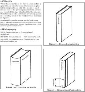
ISO 6357 defines the standard positioning of titles on the spines of printed books (it’s also
codified as British Standard BS6738). If you assume that your book is stood “upright”, the question is one of which way you tilt your head to read the title printed on the spine. If you
tilt your head to the right, that’s a descending title (as you read left-to-right, your gaze moves down, towards the surface on which the book stands). If you tilt your head to
the left, that’s an ascending title. If you don’t need to tilt your head in either direction, that’s a transverse title.
Not every page in ISO 6357:1985 is as exciting as this one.
The standard goes on to dictate that descending titles are to be favoured: this places the title in a readable orientation when the book lays flat on a surface with the cover
face-up. Grab the nearest book to you right now and you’ll probably find that it has a descending title.
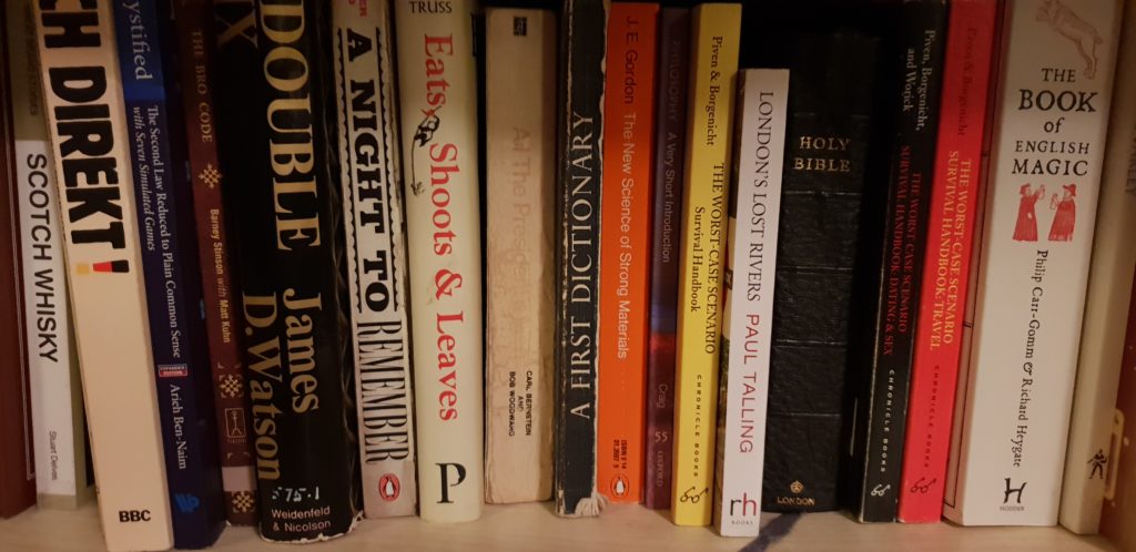
This eclectic shelf includes a transverse title (the Holy Bible), a semi-transverse title (The Book of English Magic) and a rare ascending title (A First
Dictionary) among a multitude of descending titles.
But if the book is lying on a surface, I can usually read the cover of the book. Only if a book is in a stack am I unable to do so, and stacks are usually relatively short and
so it’s easy enough to lift one or more books from the top to see what lies beneath. What really matters when considering the orientation of a spine title is, in my mind, how it appears
when it’s shelved.
It feels to me like this standard’s got things backwards. If a shelf of anglophone books is organised into any kind of order (e.g. alphabetically) then it’ll usually be from left to
right. If I’m reading the titles from left to right, and the spines are printed descending, then – from the perspective of my eyes – I’m reading from bottom to top:
i.e. backwards!
It’s possible that this is one of those things that I overthink.
If you’re reading this post via my blog and using a desktop computer, try opening your browser’s debug console (don’t worry; I’ll wait). If you don’t know how, here’s instructions for Firefox and instructions for Chrome. Other browsers may vary. You ought to see something like this in your
debugger:
The debug console is designed to be used by web developers so that they can write Javascript code right in their browser as well as to investigate any problems with the code run by a
web page. The web page itself can also output to the console, which is usually used for what I call “hello-based debugging”: printing out messages throughout a process so that the flow
and progress can be monitored by the developer without having to do “proper” debugging. And it gets used by some web pages to deliver secret messages to any of the site users who open
their debugger.
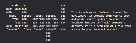
Facebook writes to the console a “stop” message, advising against using the console unless you know what you’re doing in an attempt to stop people making themselves victims of
console-based social engineering attacks.
Principally, though, the console is designed for textual content and nothing else. That said, both Firefox and Chrome’s consoles permit the use of CSS to style blocks of debug output by using the %c escape sequence. For example, I could style some of a message with italic text:
>> console.log('I have some %citalic %ctext', 'font-style:
italic;', ''); I have someitalictext
Using CSS directives like background, then, it’s easy
to see how one could embed an image into the console, and that’s been done before. Instead, though, I wanted to use
the lessons I’d learned developing PicInHTML 8¾ years ago to use text and CSS
(only) to render a colour picture to the console. First, I created my template image – a hackergotchi of me and an accompanying
speech bubble, shrunk to a tiny size and posterised to reduce the number of colours used and saved as a PNG.
The image appears “squashed” to compensate for console monospace letters not being “square”.
Next, I wrote a quick Ruby program, consolepic.rb, to do the hard work. It analyses each pixel of the image
and for each distinct colour assigns to a variable the CSS code used to set the background colour to that colour. It looks for
“strings” of like pixels and combines them into one, and then outputs the Javascript necessary to write out all of the above. Finally, I made a few hand-tweaks to insert the text into
the speech bubble.
The resulting output weighs in at 31.6kB – about a quarter of the size of the custom Javascript on the frontend of my
site and so quite a bit larger than I’d have liked and significantly less-efficient than the image itself, even base64-encoded for embedding directly into the code, but that
really wasn’t the point of the exercise, was it? (I’m pretty sure there’s significant room for improvement from a performance perspective…)
What it achieved was an interesting experiment into what can be achieved with Javascript, CSS, the browser console, and a little
imagination. An experiment that can live here on my site, for anybody who looks in the direction of their debugger, for the foreseeable future (or until I get bored of it). Anybody with
any more-exotic/silly ideas about what this technique could be used for is welcome to let me know!
Update: 17 April 2019 – fun though this was, it wasn’t worth continuing to deliver an additional 25% Javascript payload to every
visitor just for this, so I’ve stopped it for now. You can still read the source code (and even manually run it in the
console) if you like. And I have other ideas for fun things to do with the console, so keep an eye out for that…
Somehow in the intervening years I’ve gotten way out of practice and even more out of shape because our expedition was hard. Partly that was our fault for choosing to climb on
one of the shortest days of the year, requiring that we maintain a better-than-par pace throughout to allow us to get up and down before the sun set (which we actually managed with
further time in-hand), but mostly it’s the fact that I’ve neglected my climbing: just about the only routine exercise I get these days is cycling, and with changes in my work/life
balance I’m now only doing that for about 40 miles in a typical week.
For the longest time my primary mountaineering-buddy was my dad, who was – prior to his death during a hillwalking accident – a bigger climber and
hiker than I’ll ever be. Indeed, I’ve been “pushed on” by trying to keep up with my father enough times that fighting to keep up with Robin at the weekend was second nature. If I want
to get back to the point where I’m fit enough for ice climbing again I probably need to start by finding the excuse for getting up a hill once in a while more-often than I do, first,
too. Perhaps I can lay some of the blame for my being out of practice in the flat, gentle plains of Oxfordshire?
I’d have loved to have gotten a shot of me actually managing to get some use out of my crampons, but by that point visibility wasn’t great and we were rather cold and wet to be
stopping in a wind to take photographs. So this rocky stretch will have to do.
In any case, it was a worthwhile and enjoyable treat to be able to be part of Robin’s final reflection as well as to end the year somewhat-literally “on a high” by seeing off 2018 in
the Scottish Highlands. If you’ve not read his blog about his adventures of the last 52 weekends, you should: whether taking a Boris Bike from Brixton to Brighton (within the rental window) or hitching a ride on an aeroplane, he’s provided a year’s worth of fantastic stories accompanied by some great photography.
Noticing that our bagel supply was running low and with two kids who’d happily fight to the death for the last one if it came down to it, I decided this weekend to dust off an old
recipe and restock using the ingredients in our cupboard. For a festive spin, I opted to make cranberry and cinnamon bagels, and served a few at my family’s regular Sunday brunch.
Little did I know that they would turn out to be such a hit that not one from the resupply would survive to the end of the day, and I’ve been pressed into making them again in time for
breakfast on Christmas Day (or, as Ruth suggested as she and Robin fought for the last one in a manner
more-childish than the children ever would, I could “make them any time I feel like it; every week maybe?”).
Even the slightly-charred one turned out to be flipping delicious.
If you’d like to make your own, and you totally should, the recipe’s below. I prefer volumetric measurements to weight for bread-making: if you’re not used to doing so, be sure to give
your dry ingredients a stir/shake to help them settle when measuring.
Festive Cranberry & Cinnamon Bagels
Yield: 8 bagels
Duration:
When my dough is unevenly shaped I call it “rustic”. These are rustic bagels, ready to go into the oven.
Eyes on the prize: this is what you’re ultimately aiming for. You might even make a less-“rustic” one.
Directions
Whisk the yeast into the water and set aside for a few minutes to activate.
Combine the flour, one quarter of the sugar, and salt.
Make a well, and gradually introduce the water/yeast, mixing thoroughly to integrate all the flour into a sticky wet dough.
Add the vanilla extract and mix through.
Knead thoroughly: I used a mixer with a dough hook, but you could do it by hand if you prefer. After 5-10 minutes, when the dough becomes stretchy, introduce the dried fruit and
continue to knead until well integrated. The dough will be very wet.
Mix the cinnamon into the remaining sugar and scatter over a clean surface. Using well-floured fingers, form the dough into a ball and press into the sugar/cinnamon mixture. Fold
and knead against the mixture until it’s all picked-up by the dough: this approach forms attractive pockets and rivulets of cinnamon throughout the dough.
Rub a large bowl with oil. Ball the dough and put it into the bowl, cover tightly, and leave at room temperature for up to two hours until doubled in size.
When it’s ready, fill a large pan about 6cm deep with water, add the honey, and bring to a simmer. Pre-heat a hot oven (gas mark 7, 220°)
On a lightly-floured surface and with well-floured fingertips, extract the ball of dough and divide into eight (halve, halve, halve again). Shape each ball into a bagel by
pushing-through the middle with your thumb and stretching out the hole as you rotate it.
Submerge each bagel into the hot water for about a minute on each side, then transfer to baking sheet lined with greaseproof paper.
Thin the egg white with a few drops of water, stir, then brush each bagel with the egg mix.
Bake for about 25 minutes until golden brown. Cool on a wire rack.
Most bagel recipes I’ve seen claim that they freeze well. I can make no such claim, because ours barely cool before they’re eaten.
Mostly this recipe’s here for my own reference, but if you make some then let me know how they turn out for you. (Oh, and for those of you who prefer when my blog posts are technical,
this page is marked up in h-recipe.)