“Solved” all the puzzles some time ago, then came out to find this cache as a drive-by (on the minor, not the major, nearby road, of course!)
while in-between other errands nearby. Was looking for something smaller when I laid my hands on the cache container, which I thought looked “out of place”, but the weight balance of
the thing I’d picked up felt wrong… like something was loose inside? That’s when I realised I was holding the cache! Signed log and returned it to its spot. TFTC.
Unsurprisingly my checkins, which represent #geocaching/#geohashing activity,
grow in the spring and peak in the summer when the weather’s better!
At first I assumed the notes peak in November might have been thrown off by a single conference, e.g. musetech, but it turns out I’ve
just done more note-friendly things in Novembers, like Challenge Robin II and my Cape Town
meetup, which are enough to throw the numbers off.
But sometimes, they disappear slowly, like this kind of web address:
http://username:password@example.com/somewhere
If you’ve not seen a URL like that before, that’s fine, because the answer to the question “Can I still use HTTP Basic Auth in URLs?” is, I’m afraid: no, you probably can’t.
But by way of a history lesson, let’s go back and look at what these URLs were, why they died out, and how web
browsers handle them today. Thanks to Ruth who asked the original question that inspired this post.
Basic authentication
The early Web wasn’t built for authentication. A resource on the Web was theoretically accessible to all of humankind: if you didn’t want it in the public eye, you didn’t put
it on the Web! A reliable method wouldn’t become available until the concept of state was provided by Netscape’s invention of HTTP
cookies in 1994, and even that wouldn’t see widespread for several years, not least because implementing a CGI (or
similar) program to perform authentication was a complex and computationally-expensive option for all but the biggest websites.
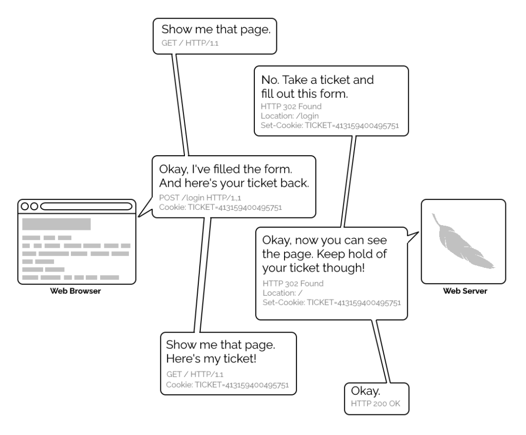
A simplified view of the form-and-cookie based authentication system used by virtually every website today, but which was too computationally-expensive for many sites in the 1990s.
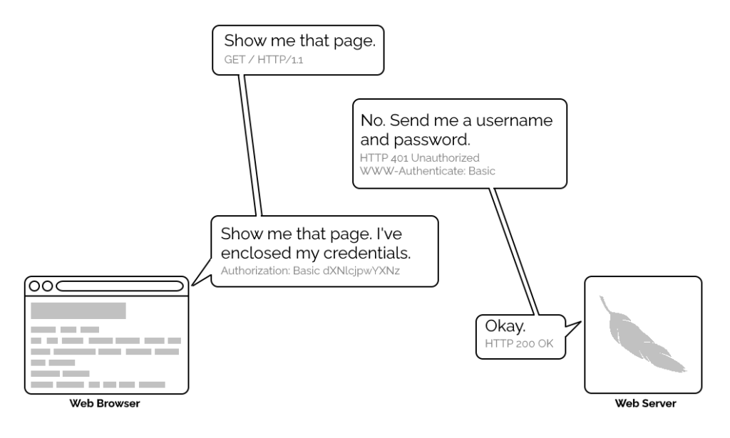
1996’s HTTP/1.0 specification tried to simplify things, though, with the introduction of the WWW-Authenticate header. The idea was that when a browser tried to access something that required
authentication, the server would send a 401 Unauthorized response along with a WWW-Authenticate header explaining how the browser could authenticate
itself. Then, the browser would send a fresh request, this time with an Authorization: header attached providing the required credentials. Initially, only “basic
authentication” was available, which basically involved sending a username and password in-the-clear unless SSL (HTTPS) was in use, but later, digest authentication and a host of others would appear.
For all its faults, HTTP Basic Authentication (and its near cousins) are certainly elegant.
Webserver software quickly added support for this new feature and as a result web authors who lacked the technical know-how (or permission from the server administrator) to implement
more-sophisticated authentication systems could quickly implement HTTP Basic Authentication, often simply by adding a .htaccessfile to the relevant directory.
.htaccess files would later go on to serve many other purposes, but their original and perhaps best-known purpose – and the one that gives them their name – was access
control.
Credentials in the URL
A separate specification, not specific to the Web (but one of Tim Berners-Lee’s most important contributions to it), described the general structure of URLs as follows:
At the time that specification was written, the Web didn’t have a mechanism for passing usernames and passwords: this general case was intended only to apply to protocols that
did have these credentials. An example is given in the specification, and clarified with “An optional user name. Some schemes (e.g., ftp) allow the specification of a user
name.”
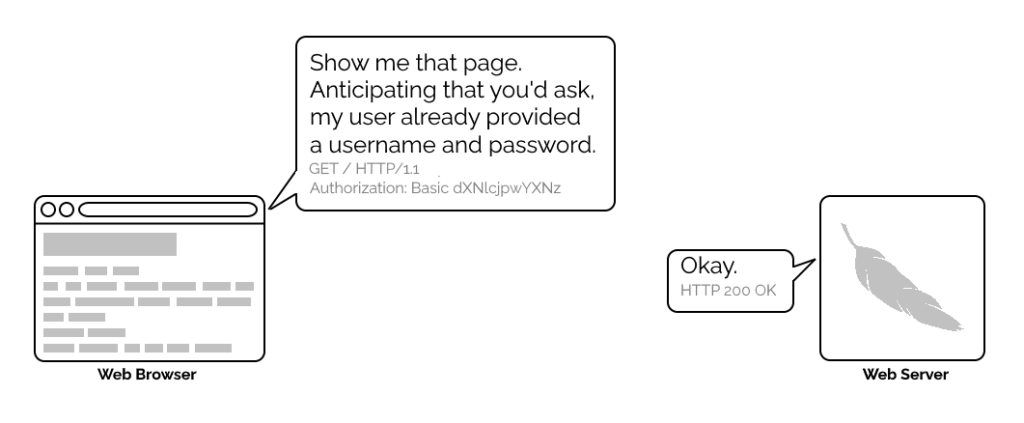
But once web browsers had WWW-Authenticate, virtually all of them added support for including the username and password in the web address too. This allowed for
e.g. hyperlinks with credentials embedded in them, which made for very convenient bookmarks, or partial credentials (e.g. just the username) to be included in a link, with the
user being prompted for the password on arrival at the destination. So far, so good.
Encoding authentication into the URL provided an incredible shortcut at a time when Web round-trip times were much longer owing to higher latencies and no keep-alives.
This is why we can’t have nice things
The technique fell out of favour as soon as it started being used for nefarious purposes. It didn’t take long for scammers to realise that they could create links like this:
https://YourBank.com@HackersSite.com/
Everything we were teaching users about checking for “https://” followed by the domain name of their bank… was undermined by this user interface choice. The poor victim would
actually be connecting to e.g. HackersSite.com, but a quick glance at their address bar would leave them convinced that they were talking to YourBank.com!
Theoretically: widespread adoption of EV certificates coupled with sensible user interface choices (that were never made) could
have solved this problem, but a far simpler solution was just to not show usernames in the address bar. Web developers were by now far more excited about forms and
cookies for authentication anyway, so browsers started curtailing the “credentials in addresses” feature.
Users trained to look for “https://” followed by the site they wanted would often fall for scams like this one: the real domain name is after the @-sign. (This attacker is
also using dword notation to obfuscate their IP address; this
dated technique wasn’t often employed alongside this kind of scam, but it’s another historical oddity I enjoy so I’m shoehorning it in.)
(There are other reasons this particular implementation of HTTP Basic Authentication was less-than-ideal, but this reason is the big one that explains why things had to change.)
One by one, browsers made the change. But here’s the interesting bit: the browsers didn’t always make the change in the same way.
How different browsers handle basic authentication in URLs
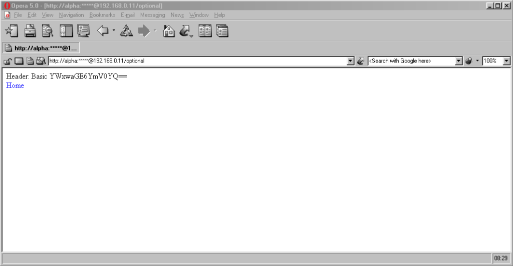
Let’s examine some popular browsers. To run these tests I threw together a tiny web application that outputs
the Authorization: header passed to it, if present, and can optionally send a 401 Unauthorized response along with a WWW-Authenticate: Basic realm="Test Site" header in order to trigger basic authentication. Why both? So that I can test not only how browsers handle URLs containing credentials when an authentication request is received, but how they handle them when one is not. This is relevant because
some addresses – often API endpoints – have optional HTTP authentication, and it’s sometimes important for a user agent (albeit typically a library or command-line one) to pass credentials without
first being prompted.
In each case, I tried each of the following tests in a fresh browser instance:
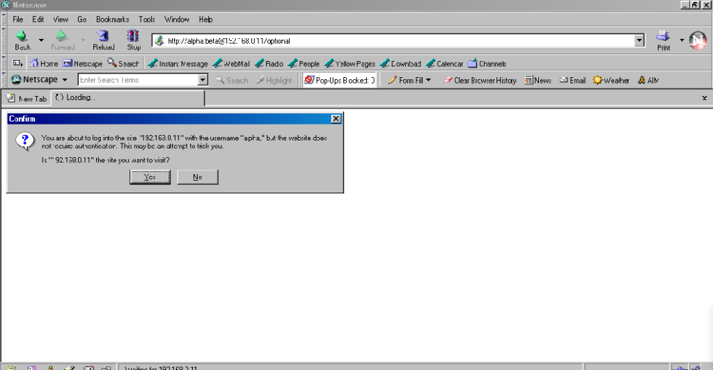
Go to http://<username>:<password>@<domain>/optional (authentication is optional).
Go to http://<username>:<password>@<domain>/mandatory (authentication is mandatory).
Experiment 1, then f0llow relative hyperlinks (which should correctly retain the credentials) to /mandatory.
Experiment 2, then follow relative hyperlinks to the /optional.
I’m only testing over the http scheme, because I’ve no reason to believe that any of the browsers under test treat the https scheme differently.
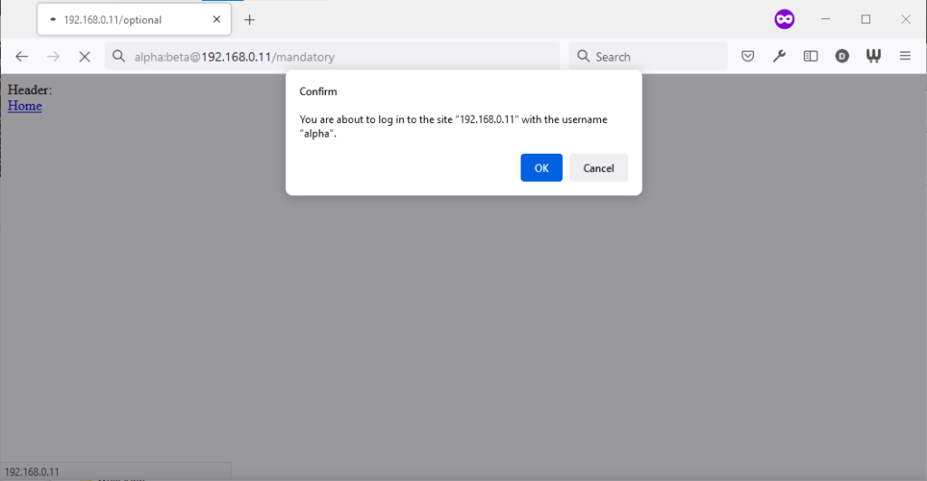
Chromium desktop family
Chrome 93 and Edge 93 both immediately suppressed the username and password from the address bar, along with the “http://” as we’ve come to expect of them. Like the “http://”, though,
the plaintext username and password are still there. You can retrieve them by copy-pasting the entire address.
Opera 78 similarly suppressed the username, password, and scheme, but didn’t retain the username and password in a way that could be copy-pasted out.
Authentication was passed only when landing on a “mandatory” page; never when landing on an “optional” page. Refreshing the page or re-entering the address with its credentials did not
change this.
Navigating from the “optional” page to the “mandatory” page using only relative links retained the username and password and submitted it to the server when it became mandatory,
even Opera which didn’t initially appear to retain the credentials at all.
Navigating from the “mandatory” to the “optional” page using only relative links, or even entering the “optional” page address with credentials after visiting the “mandatory” page, does
not result in authentication being passed to the “optional” page. However, it’s interesting to note that once authentication has occurred on a mandatory page, pressing enter at
the end of the address bar on the optional page, with credentials in the address bar (whether visible or hidden from the user) does result in the credentials being passed to
the optional page! They continue to be passed on each subsequent load of the “optional” page until the browsing session is ended.
Firefox desktop
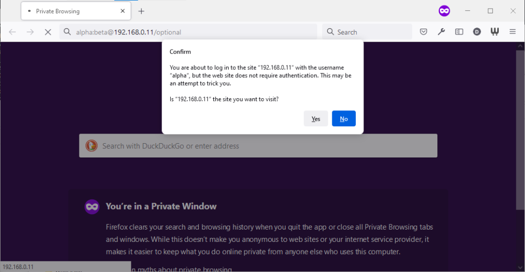
Firefox 91 does a clever thing very much in-line with
its image as a browser that puts decision-making authority into the hands of its user. When going to the “optional” page first it presents a dialog, warning the user that they’re going
to a site that does not specifically request a username, but they’re providing one anyway. If the user says that no, navigation ceases (the GET request for the page takes place the same
either way; this happens before the dialog appears). Strangely: regardless of whether the user selects yes or no, the credentials are not passed on the “optional” page. The credentials
(although not the “http://”) appear in the address bar while the user makes their decision.
Similar to Opera, the credentials do not appear in the address bar thereafter, but they’re clearly still being stored: if the refresh button is pressed the dialog appears again. It does
not appear if the user selects the address bar and presses enter.
Similarly, going to the “mandatory” page in Firefox results in an informative dialog warning the user
that credentials are being passed. I like this approach: not only does it help protect the user from the use of authentication as a tracking technique (an old technique that I’ve not
seen used in well over a decade, mind), it also helps the user be sure that they’re logging in using the account they mean to, when following a link for that purpose. Again, clicking
cancel stops navigation, although the initial request (with no credentials) and the 401 response has already occurred.
Visiting any page within the scope of the realm of the authentication after visiting the “mandatory” page results in credentials being sent, whether or not they’re included in the
address. This is probably the most-true implementation to the expectations of the standard that I’ve found in a modern graphical browser.
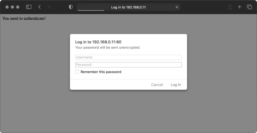
Safari desktop
Safari 14 never displays or uses credentials provided via the web address, whether or not
authentication is mandatory. Mandatory authentication is always met by a pop-up dialog, even if credentials were provided in the address bar. Boo!
Once passed, credentials are later provided automatically to other addresses within the same realm (i.e. optional pages).
Older browsers
Let’s try some older browsers.
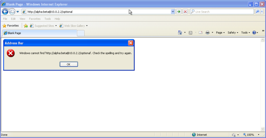
From version 7 onwards – right up to the final version 11 – Internet Explorer fails to even recognise
addresses with authentication credentials in as legitimate web addresses, regardless of whether or not authentication is requested by the server. It’s easy to assume that this is yet
another missing feature in the browser we all love to hate, but it’s interesting to note that credentials-in-addresses is permitted for ftp:// URLs…
…and if you go back a little way, Internet Explorer 6 and below supported credentials in the address bar pretty
much as you’d expect based on the standard. The error message seen in IE7 and above is a deliberate design
decision, albeit a somewhat knee-jerk reaction to the security issues posed by the feature (compare to the more-careful approach of other browsers).
These older versions of IE even (correctly) retain the credentials through relative hyperlinks, allowing them to be passed when
they become mandatory. They’re not passed on optional pages unless a mandatory page within the same realm has already been encountered.
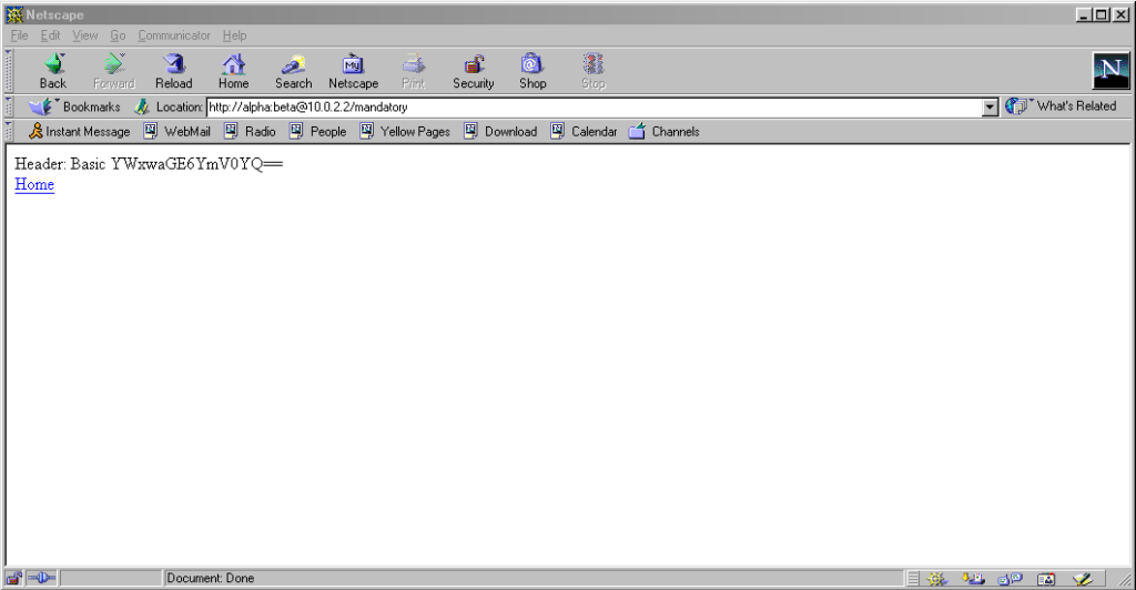
Pre-Mozilla Netscape behaved the same way. Truly this was the de facto standard for a long period on the Web, and the varied approaches we see today are the
anomaly. That’s a strange observation to make, considering how much the Web of the 1990s was dominated by incompatible implementations of different Web features (I’ve written about the <blink> and <marquee> tags before, which was perhaps the most-visible division between
the Microsoft and Netscape camps, but there were many, many more).
Interestingly: by Netscape 7.2 the browser’s behaviour had evolved
to be the same as modern Firefox’s, except that it still displayed the credentials in the address bar for all to see.
Now here’s a real gem: pre-Chromium Opera. It would send credentials to “mandatory” pages and remember them for the
duration of the browsing session, which is great. But it would also send credentials when passed in a web address to “optional” pages. However, it wouldn’t remember
them on optional pages unless they remained in the address bar: this feels to me like an optimum balance of features for power users. Plus, it’s one of very few browsers that
permitted you to change credentials mid-session: just by changing them in the address bar! Most other browsers, even to this day, ignore changes to HTTP Authentication credentials, which was sometimes be a source of frustration back in the day.
Finally, classic Opera was the only browser I’ve seen to mask the password in the address bar, turning it into a series of asterisks. This ensures the user knows that a
password was used, but does not leak any sensitive information to shoulder-surfers (the length of the “masked” password was always the same length, too, so it didn’t even leak the
length of the password). Altogether a spectacular design and a great example of why classic Opera was way ahead of its time.
The Command-Line
Most people using web addresses with credentials embedded within them nowadays are probably working with code, APIs,
or the command line, so it’s unsurprising to see that this is where the most “traditional” standards-compliance is found.
I was unsurprised to discover that giving curl a username and password in the URL meant that
username and password was sent to the server (using Basic authentication, of course, if no authentication was requested):
However, wgetdid catch me out. Hitting the same addresses with wget didn’t result in the credentials being sent
except where it was mandatory (i.e. where a HTTP 401 response and a WWW-Authenticate: header was received on the initial attempt). To force wget to
send credentials when they haven’t been asked-for requires the use of the --http-user and --http-password switches:
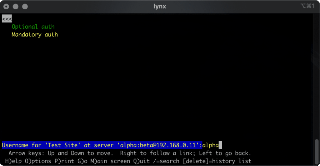
lynx does a cute and clever thing. Like most modern browsers, it does not submit credentials unless specifically requested, but if
they’re in the address bar when they become mandatory (e.g. because of following relative hyperlinks or hyperlinks containing credentials) it prompts for the username and password,
but pre-fills the form with the details from the URL. Nice.
What’s the status of HTTP (Basic) Authentication?
HTTP Basic Authentication and its close cousin Digest Authentication (which overcomes some of the security limitations of running Basic Authentication over an
unencrypted connection) is very much alive, but its use in hyperlinks can’t be relied upon: some browsers (e.g. IE, Safari)
completely munge such links while others don’t behave as you might expect. Other mechanisms like Bearer see widespread use in APIs, but nowhere else.
The WWW-Authenticate: and Authorization: headers are, in some ways, an example of the best possible way to implement authentication on the Web: as an
underlying standard independent of support for forms (and, increasingly, Javascript), cookies, and complex multi-part conversations. It’s easy to imagine an alternative
timeline where these standards continued to be collaboratively developed and maintained and their shortfalls – e.g. not being able to easily log out when using most graphical browsers!
– were overcome. A timeline in which one might write a login form like this, knowing that your e.g. “authenticate” attributes would instruct the browser to send credentials using an
Authorization: header:
In such a world, more-complex authentication strategies (e.g. multi-factor authentication) could involve encoding forms as JSON. And single-sign-on systems would simply involve the browser collecting a token from the authentication provider and passing it on to the
third-party service, directly through browser headers, with no need for backwards-and-forwards redirects with stacks of information in GET parameters as is the case today.
Client-side certificates – long a powerful but neglected authentication mechanism in their own right – could act as first class citizens directly alongside such a system, providing
transparent second-factor authentication wherever it was required. You wouldn’t have to accept a tracking cookie from a site in order to log in (or stay logged in), and if your
browser-integrated password safe supported it you could log on and off from any site simply by toggling that account’s “switch”, without even visiting the site: all you’d be changing is
whether or not your credentials would be sent when the time came.
The Web has long been on a constant push for the next new shiny thing, and that’s sometimes meant that established standards have been neglected prematurely or have failed to evolve for
longer than we’d have liked. Consider how long it took us to get the <video> and <audio> elements because the “new shiny” Flash came to dominate,
how the Web Payments API is only just beginning to mature despite over 25 years of ecommerce on the Web, or how we still can’t
use Link: headers for all the things we can use <link> elements for despite them being semantically-equivalent!
The new model for Web features seems to be that new features first come from a popular JavaScript implementation, and then eventually it evolves into a native browser feature: for
example HTML form validations, which for the longest time could only be done client-side using scripting languages. I’d love
to see somebody re-think HTTP Authentication in this way, but sadly we’ll never get a 100% solution in JavaScript alone: (distributed SSO is almost certainly off the table, for example, owing to cross-domain limitations).
Or maybe it’s just a problem that’s waiting for somebody cleverer than I to come and solve it. Want to give it a go?
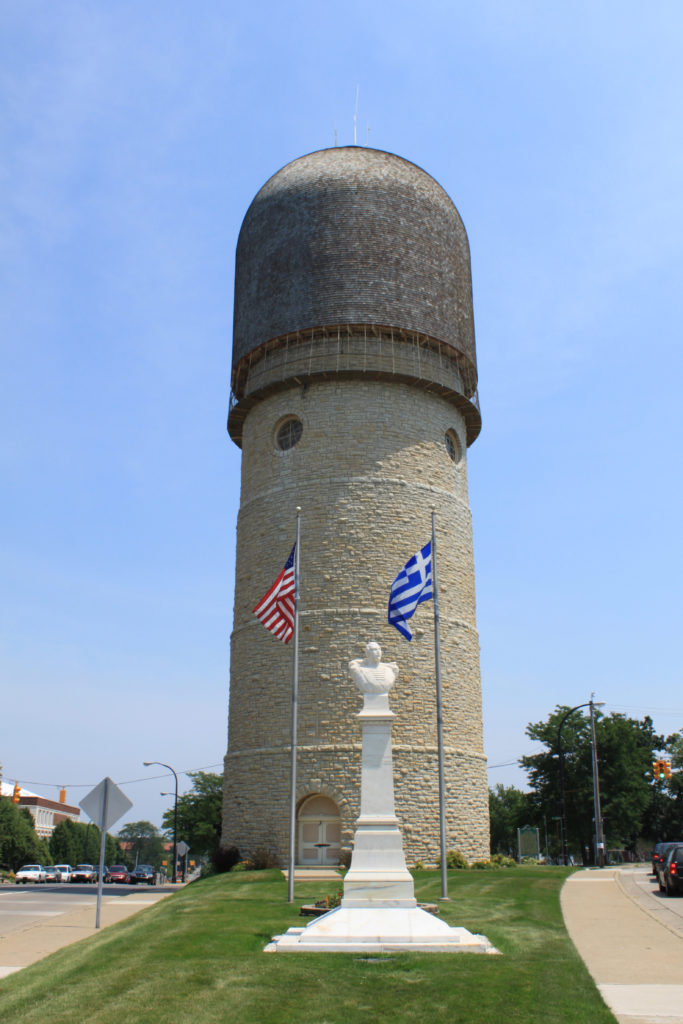
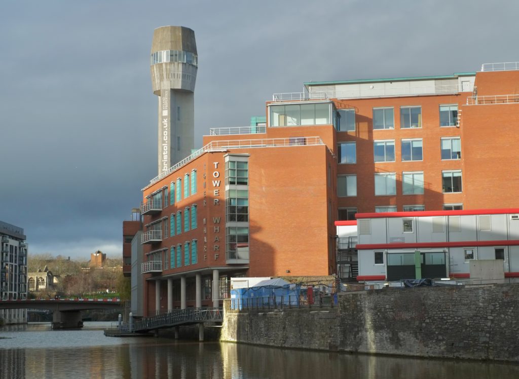
There was a discussion this week in the Abnib WhatsApp group about whether a particular illustration of a farm was full of phallic imagery (it was).
This left me wondering if anybody had ever tried to identify the most-priapic buildings in the world. Of course towers often look at least a little bit like their architects
were compensating for something, but some – like the Ypsilanti Water Tower in Michigan pictured above – go further than
others.
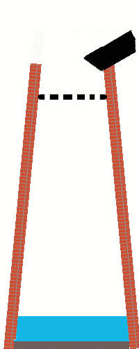
Anyway: a shot tower in Bristol – a part of the UK with a long history of leadworking – was among the latecomer entrants to the competition, and seeing this curious building reminded me about something I’d read, once, about the
manufacture of lead shot. The idea (invented in Bristol by a plumber called William Watts) is that you pour molten lead
through a sieve at the top of a tower, let surface tension pull it into spherical drops as it falls, and eventually catch it in a cold water bath to finish solidifying it. I’d seen an
animation of the process, but I’d never seen a video of it, so I went about finding one.
The animation I saw might have been this one, or perhaps one that wasn’t so obviously-made-in-MS-Paint.
British Pathé‘s YouTube Channel provided me with this 1950 film, and if you follow only one hyperlink from this article, let it be this one! It’s a well-shot (pun intended, but there’s
a worse pun in the video!), and while I needed to translate all of the references to “hundredweights” and “Fahrenheit” to measurements that I can actually understand, it’s thoroughly
informative.
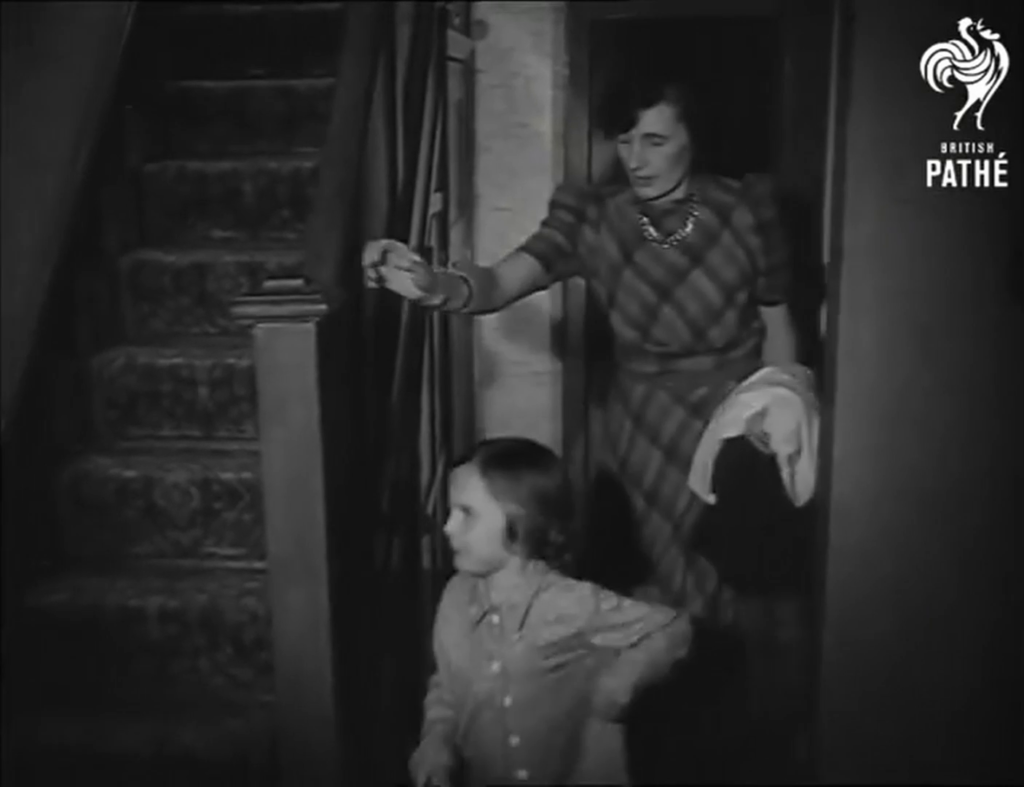
But there’s a problem with that video: it’s been badly cut from whatever reel it was originally found on, and from about 1 minute and 38 seconds in it switches to what is clearly a very
different film! A mother is seen shepherding her young daughter off to bed, and a voiceover says:
Bedtime has a habit of coming round regularly every night. But for all good parents responsibility doesn’t end there. It’s just the beginning of an evening vigil, ears attuned to cries
and moans and things that go bump in the night. But there’s no reason why those ears shouldn’t be your neighbours ears, on occasion.
“Off to bed, you little monster. And no watching TikTok when you should be trying to sleep!”
Now my interest’s piqued. What was this short film going to be about, and where could I find it? There’s no obvious link; YouTube doesn’t even make it easy to find the video
uploaded “next” by a given channel. I manipulated some search filters on British Pathé’s site until I eventually hit upon the right combination of magic words and found a clip called
Radio Baby Sitter. It starts off exactly where the misplaced prior clip cut out, and tells the story of “Mr.
and Mrs. David Hurst, Green Lane, Coventry”, who put a microphone by their daughter’s bed and ran a wire through the wall to their neighbours’ radio’s speaker so they can babysit
without coming over for the whole evening.
It’s a baby monitor, although not strictly a radio one as the title implies (it uses a signal wire!), nor is it groundbreakingly innovative: the first baby monitor predates it by over a decade, and it actually did use
radiowaves! Still, it’s a fun watch, complete with its contemporary fashion, technology, and social structures. Here’s the full thing, re-merged for your convenience:
Wait, what was I trying to do when I started, again? What was I even talking about…
It’s harder than it used to be
It used to be easier than this to get lost on the Web, and sometimes I miss that.
Obviously if you go back far enough this is true. Back when search engines were much weaker and Internet content was much less homogeneous and more distributed, we used to engage in
this kind of meandering walk all the time: we called it “surfing” the Web. Second-generation
Web browsers even had names, pretty often, evocative of this kind of experience: Mosaic, WebExplorer, Navigator, Internet Explorer, IBrowse. As people started to engage in the
noble pursuit of creating content for the Web they cross-linked their sources, their friends, their affiliations (remember webrings? here’s a reminder; they’re not quite as dead as you think!), your favourite sites etc. You’d follow links to other pages, then follow their links to others
still, and so on in that fashion. If you went round the circles enough times you’d start seeing all those invariably-blue hyperlinks turn purple and know you’d found your way home.
Some parts of the Web are perhaps best forgotten, though?
But even after that era, as search engines started to become a reliable and powerful way to navigate the wealth of content on the growing Web, links still dominated our exploration.
Following a link from a resource that was linked to by somebody you know carried the weight of a “web of trust”, and you’d quickly come to learn whose links were consistently valuable
and on what subjects. They also provided a sense of community and interconnectivity that paralleled the organic, chaotic networks of acquaintances people form out in the real world.
In recent times, that interpersonal connectivity has, for many, been filled by social networks (let’s ignore their failings in this regard for now). But linking to resources “outside” of the big
social media silos is hard. These advertisement-funded services work hard to discourage or monetise activity
that takes you off their platform, even at the expense of their users. Instagram limits the number of external links by profile; many social networks push
for resharing of summaries of content or embedding content from other sources, discouraging engagement with the wider Web, Facebook and Twitter both run external links
through a linkwrapper (which sometimes breaks); most large social networks make linking to the profiles of other users
of the same social network much easier than to users anywhere else; and so on.
The net result is that Internet users use fewer different websites today than they did 20 years ago,
and spend most of their “Web” time in app versions of
websites (which often provide a better experience only because site owners strategically make it so to increase their lock-in and data harvesting potential). Truly exploring the Web now
requires extra effort, like exercising an underused muscle. And if you begin and end your Web experience on just one to three services,
that just feels kind of… sad, to me. Wasted potential.
I suppose nowadays we don’t get lost as often outside of the Internet, either. Photo by Leah Kelly.
It sounds like I’m being nostalgic for a less-sophisticated time on the Web (that would certainly be in character!). A time before we’d
fully-refined the technology that would come to connect us in an instant to the answers we wanted. But that’s not exactly what I’m pining for. Instead, what I miss is something
we lost along the way, on that journey: a Web that was more fun-and-weird, more interpersonal, more diverse. More Geocities, less Facebook; there’s a surprising thing to find myself saying.
Somewhere along the way, we ended up with the Web we asked for, but it wasn’t the Web we wanted.
A quick and easy find in spite of the growing dark, significantly helped by my having correctly interpreted the name of the cache and knew exactly at I was looking for TFTC.
This cache’s siblings might have to wait until another day, when I have the light on my side, though!
Third time was the charm for me with this elusive cache! On this and my last visit the coords kept pointing me to the centre of the road, giving me a pretty big search radius.
Eventually found it – with the help of properly interpreting the hint – at N 51 46.314, W 001 25.758. Hope this helps anybody else with the same problem! TFTC, and once again for an excellent series.
Attached image is from my second visit, when I was trying to look unsuspicious and like I had a different reason to be hanging around here!
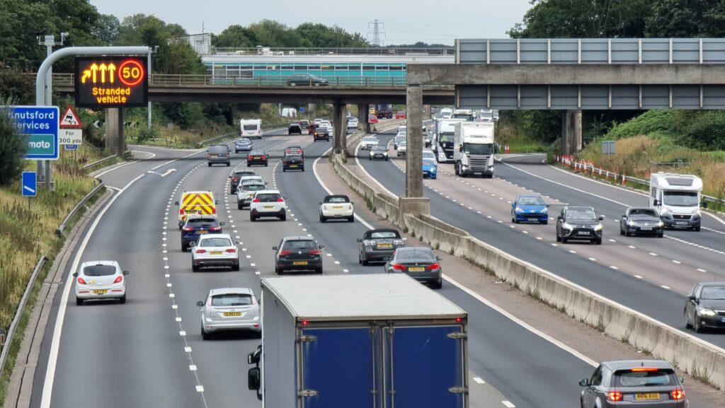
I was heading South on the M6 when my phone beeped to warn me that the road was blocked, ahead. Turns out there had been some sort of crash, and traffic was being directed into
Knutsford Services. Naturally, I used the break as an excuse to park up and hike out to this and another local cache.
As I came over this bridge, it looked like traffic was flowing again, albeit slowly and with a lane closed, so I’m going to complete my loop and get back on the road. Thanks for the
distraction while I was stranded!
The M6 Southbound got blocked by a crash this afternoon so I diverted to Knutsford Services and took a walk out to the local caches while I waited for it to clear. I had a feeling what
kind of thing I’d be looking for when I got here and I turned out the be right, making this a much quicker search than the 20 minutes or so it took me to walk up here! I possibly wasn’t
helped by my choice of route, though: thanks to a badly signed footpath through the lower part of Tabley Hill Farm I ended up off-course and found myself in the cattle yard at N 53º
18.345′ W 002º 24.147’… right as the cows were heading to the milking parlour! Got there in the end, though. TFTC!
I was in the vicinity of this cache while taking a rest break on a long journey South down the M6. Coordinates seemed off by about 8m but the hint quickly set me straight and after that
it was an easy find. SL, TFTC!
Came as a mini layover during a long drive South down the M6; specifically picked this cache because it fulfils a Wonder collection for me. ;-) A quick and easy find, once I got past
the cache’s spooky guardian! TFTC!
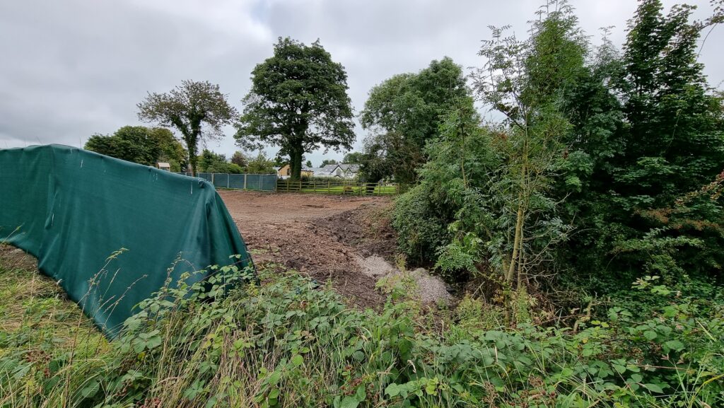
After failing to find GC2AJVT Cow Hill earlier we were really hoping to find this, but alas no. The entire area
seems to have been torn up for building works and the footpath moved, so we couldn’t get within 20m of GZ. Strongly suspect this one’s a
goner.
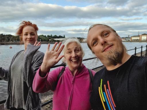
What an excellent cache container! I immediately spotted it but then disregarded it when I couldn’t see an obvious ingress. My sister Sarah, though, whom I’m visiting in Preston, tried
touching it a different way and soon discovered how to get at the cache. Log almost full – space only for one or two more entries.
Found with my mother and sister while visiting Preston on my way back to Oxfordshire after helping my partner’s brother move to Cumbria. Spotted part of the retrieval mechanism right
away and soon the cache was in hand. TFTC!


