After 8 or 10 (depending on how you count them) films and hundreds of hours of TV, finally we have reached the end of the whole Star Wars saga. Hooray,…
Exactly my thoughts on the latest Star Wars films, concisely expressed.
This is a repost promoting content originally published elsewhere. See more things Dan's reposted.
After 8 or 10 (depending on how you count them) films and hundreds of hours of TV, finally we have reached the end of the whole Star Wars saga. Hooray,…
Exactly my thoughts on the latest Star Wars films, concisely expressed.
This checkin to GC2VT9P Giants Graves reflects a geocaching.com log entry. See more of Dan's cache logs.
Walked over from Pendragon Castle in spite of the muddy conditions, although our party was reduced from 7 to just 3 by the time we got to the GZ as the kids gave up and turned back. Not a typical geocache hiding place, and it took us a good while to find the container beneath the detritus that had been washed atop it.
This checkin to GC1YHN9 Lady Anne’s Highway: Pendragon reflects a geocaching.com log entry. See more of Dan's cache logs.
First find of 2020. Came out for a New Year’s Day walk with extended family whom we’re visiting and decided to visit the ruin. Checked for nearby caches and spotted this one. Took some finding as it had gathered some natural camouflage and I eventually found the cache when I kicked it out of its hiding place while hunting somewhere else! TNLN, SL, TFTC.

Why can’t she get this right? WHY!!!
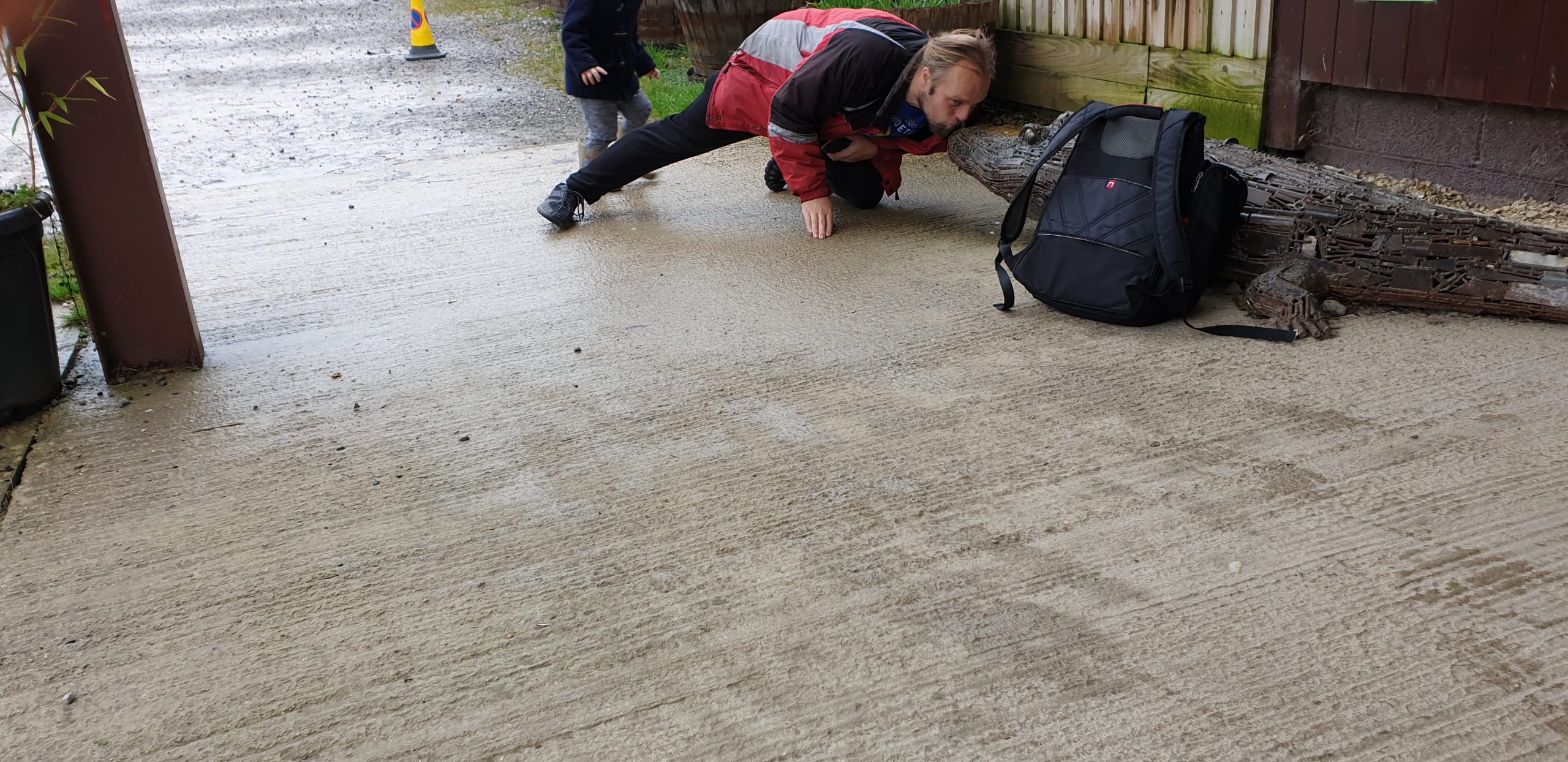
This checkin to TC4W8P Love a Cotswold Croc reflects a terracaching.com log entry. See more of Dan's cache logs.
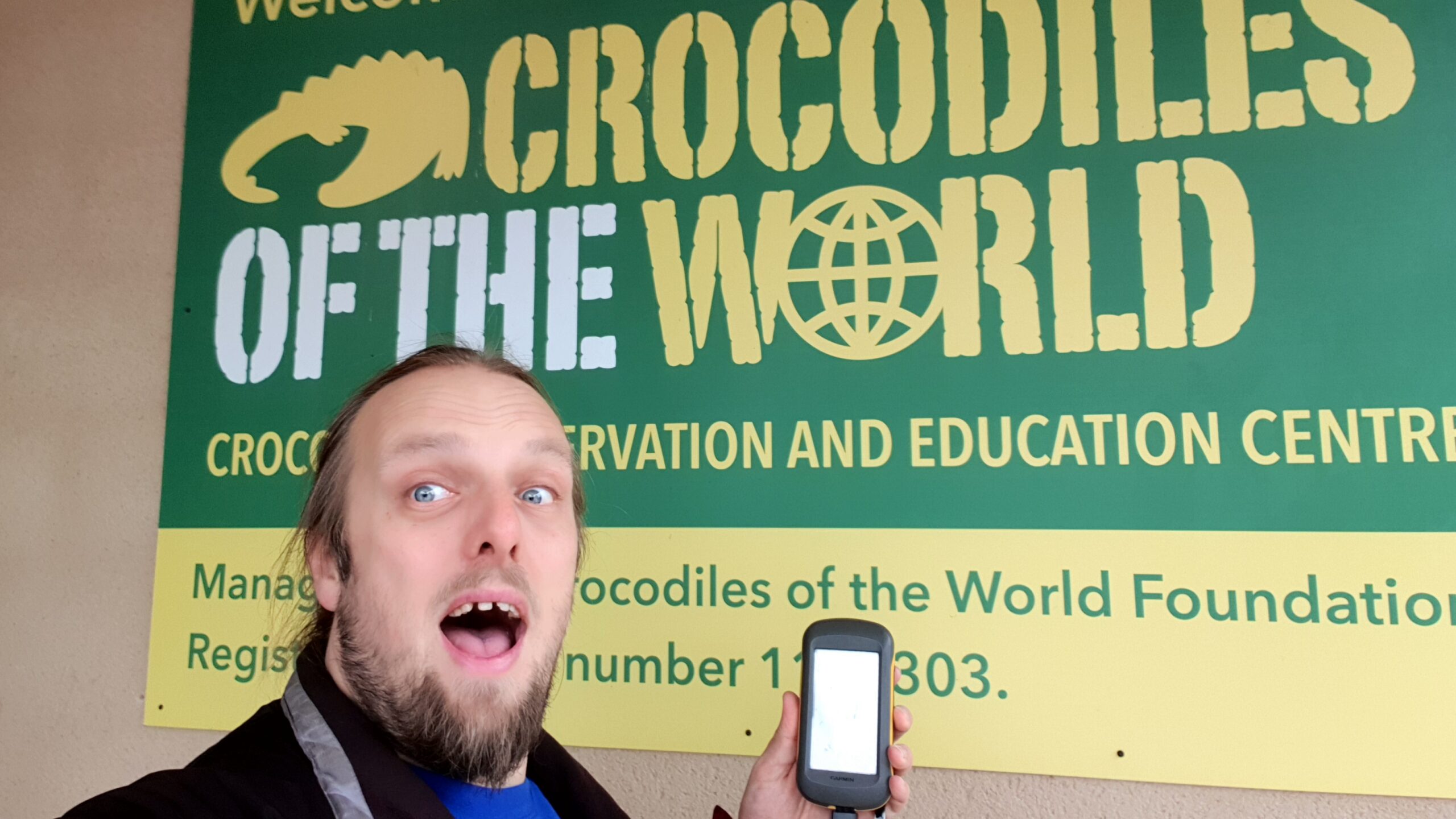
I’ve been to Crocodiles of the World many times before – both my 5-year-old and my 3-year-old are big fans – but I’d so-far always neglected to bring my GPSr with me on expeditions to this curious and specialised zoo. Not so today: this morning the kids and I came out to meet the reptiles as usual and take a quick break on the way in to snap a picture or two (with apologies for the terrible framing of the one taken by one of the kids!) to log the find. TFTC.
This is a repost promoting content originally published elsewhere. See more things Dan's reposted.
My mother has long argued that a large category of popular music, second only to those on the subjects of sex and drugs, are about food. This so-called corpus of food songs is, I’m pretty confident, mostly based on mishearing lyrics, but I think she’d have a friend in the fabulous Bec Hill who’s this month made a follow-up to her video When You Listen to the Radio When You’re Hungry. And it’s even better (and to my delight, paella still manages to make a cameo appearance).
Unfortunately Warner Music Group don’t seem to have a sense of humour and you might find that you can’t watch her new video on YouTube. But thankfully that’s not how the Internet works (somebody should tell them!) and if proxying isn’t the best solution for you then you can just watch her new video on the BBC’s Facebook page instead.
This is a repost promoting content originally published elsewhere. See more things Dan's reposted.
“Why make the web more boring? Because boring is fast, resilient, fault tolerant, and accessible. Boring is the essence of unobtrusive designs that facilitate interactions rather than hinder them.” says Jeremy.
He’s right. I’ve become increasingly concerned in recent years in the trend towards overuse of heavyweight frameworks. These frameworks impose limitations on device/network capabilities, browser features, caching, accessibility, stability, and more. It’s possible to work around many of those limitations, but doing so often takes additional work, and so most developers, especially junior developers raised on a heavyweight framework who haven’t yet been exposed to the benefits of working around them. Plus, such mitigations tend to make already-bloated web applications – full of unnecessary cruft – larger still; the network demands of the application grow ever larger.
What are these frameworks for? They often provide valuable components and polyfills, certainly, but they also have a tendency to reimplement what the browser already gives you: e.g. routing and caching come free with HTTP, buttons and links from HTML, design from CSS, (progressive) interactivity from JS. Every developer should feel free to use a framework if it suits them and the project they’re working on… but adoption of a framework should only come after consideration and understanding of what it provides, and at what cost.
This is part of a series of posts on computer terminology whose popular meaning – determined by surveying my friends – has significantly diverged from its original/technical one. Read more evolving words…
Few words have seen such mutation of meaning over their lifetimes as the word “silly”. The earliest references, found in Old English, Proto-Germanic, and Old Norse and presumably having an original root even earlier, meant “happy”. By the end of the 12th century it meant “pious”; by the end of the 13th, “pitiable” or “weak”; only by the late 16th coming to mean “foolish”; its evolution continues in the present day.

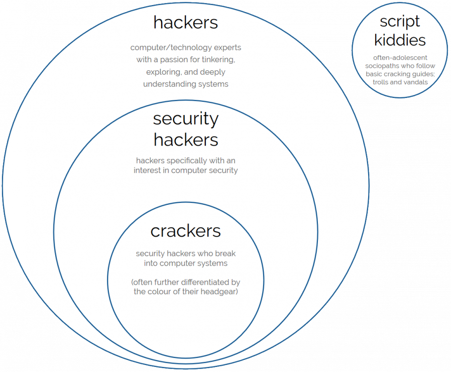
But there’s little so silly as the media-driven evolution of the word “hacker” into something that’s at least a little offensive those of us who probably would be described as hackers. Let’s take a look.
Computer criminal with access to either knowledge or tools which are (or should be) illegal.
Expert, creative computer programmer; often politically inclined towards information transparency, egalitarianism, anti-authoritarianism, anarchy, and/or decentralisation of power.
The earliest recorded uses of the word “hack” had a meaning that is unchanged to this day: to chop or cut, as you might describe hacking down an unruly bramble. There are clear links between this and the contemporary definition, “to plod away at a repetitive task”. However, it’s less certain how the word came to be associated with the meaning it would come to take on in the computer labs of 1960s university campuses (the earliest references seem to come from around April 1955).
There, the word hacker came to describe computer experts who were developing a culture of:
It is absolutely possible for hacking, then, to involve no lawbreaking whatsoever. Plenty of hacking involves writing (and sharing) code, reverse-engineering technology and systems you own or to which you have legitimate access, and pushing the boundaries of what’s possible in terms of software, art, and human-computer interaction. Even among hackers with a specific interest in computer security, there’s plenty of scope for the legal pursuit of their interests: penetration testing, security research, defensive security, auditing, vulnerability assessment, developer education… (I didn’t say cyberwarfare because 90% of its application is of questionable legality, but it is of course a big growth area.)

So what changed? Hackers got famous, and not for the best reasons. A big tipping point came in the early 1980s when hacking group The 414s broke into a number of high-profile computer systems, mostly by using the default password which had never been changed. The six teenagers responsible were arrested by the FBI but few were charged, and those that were were charged only with minor offences. This was at least in part because there weren’t yet solid laws under which to prosecute them but also because they were cooperative, apologetic, and for the most part hadn’t caused any real harm. Mostly they’d just been curious about what they could get access to, and were interested in exploring the systems to which they’d logged-in, and seeing how long they could remain there undetected. These remain common motivations for many hackers to this day.
News media though – after being excited by “hacker” ideas introduced by WarGames – rightly realised that a hacker with the same elementary resources as these teens but with malicious intent could cause significant real-world damage. Bruce Schneier argued last year that the danger of this may be higher today than ever before. The press ran news stories strongly associating the word “hacker” specifically with the focus on the illegal activities in which some hackers engage. The release of Neuromancer the following year, coupled with an increasing awareness of and organisation by hacker groups and a number of arrests on both sides of the Atlantic only fuelled things further. By the end of the decade it was essentially impossible for a layperson to see the word “hacker” in anything other than a negative light. Counter-arguments like The Conscience of a Hacker (Hacker’s Manifesto) didn’t reach remotely the same audiences: and even if they had, the points they made remain hard to sympathise with for those outside of hacker communities.

A lack of understanding about what hackers did and what motivated them made them seem mysterious and otherworldly. People came to make the same assumptions about hackers that they do about magicians – that their abilities are the result of being privy to tightly-guarded knowledge rather than years of practice – and this elevated them to a mythical level of threat. By the time that Kevin Mitnick was jailed in the mid-1990s, prosecutors were able to successfully persuade a judge that this “most dangerous hacker in the world” must be kept in solitary confinement and with no access to telephones to ensure that he couldn’t, for example, “start a nuclear war by whistling into a pay phone”. Yes, really.

Every decade’s hackers have debated whether or not the next decade’s have correctly interpreted their idea of “hacker ethics”. For me, Steven Levy’s tenets encompass them best:
- Access to computers – and anything which might teach you something about the way the world works – should be unlimited and total.
- All information should be free.
- Mistrust authority – promote decentralization.
- Hackers should be judged by their hacking, not bogus criteria such as degrees, age, race, or position.
- You can create art and beauty on a computer.
- Computers can change your life for the better.
Given these concepts as representative of hacker ethics, I’m convinced that hacking remains alive and well today. Hackers continue to be responsible for many of the coolest and most-important innovations in computing, and are likely to continue to do so. Unlike many other sciences, where progress over the ages has gradually pushed innovators away from backrooms and garages and into labs to take advantage of increasingly-precise generations of equipment, the tools of computer science are increasingly available to individuals. More than ever before, bedroom-based hackers are able to get started on their journey with nothing more than a basic laptop or desktop computer and a stack of freely-available open-source software and documentation. That progress may be threatened by the growth in popularity of easy-to-use (but highly locked-down) tablets and smartphones, but the barrier to entry is still low enough that most people can pass it, and the new generation of ultra-lightweight computers like the Raspberry Pi are doing their part to inspire the next generation of hackers, too.
That said, and as much as I personally love and identify with the term “hacker”, the hacker community has never been less in-need of this overarching label. The diverse variety of types of technologist nowadays coupled with the infiltration of pop culture by geek culture has inevitably diluted only to be replaced with a multitude of others each describing a narrow but understandable part of the hacker mindset. You can describe yourself today as a coder, gamer, maker, biohacker, upcycler, cracker, blogger, reverse-engineer, social engineer, unconferencer, or one of dozens of other terms that more-specifically ties you to your community. You’ll be understood and you’ll be elegantly sidestepping the implications of criminality associated with the word “hacker”.
The original meaning of “hacker” has also been soiled from within its community: its biggest and perhaps most-famous advocate‘s insistence upon linguistic prescriptivism came under fire just this year after he pushed for a dogmatic interpretation of the term “sexual assault” in spite of a victim’s experience. This seems to be absolutely representative of his general attitudes towards sex, consent, women, and appropriate professional relationships. Perhaps distancing ourselves from the old definition of the word “hacker” can go hand-in-hand with distancing ourselves from some of the toxicity in the field of computer science?
(I’m aware that I linked at the top of this blog post to the venerable but also-problematic Eric S. Raymond; if anybody can suggest an equivalent resource by another author I’d love to swap out the link.)
Verdict: The word “hacker” has become so broad in scope that we’ll never be able to rein it back in. It’s tainted by its associations with both criminality, on one side, and unpleasant individuals on the other, and it’s time to accept that the popular contemporary meaning has won. Let’s find new words to define ourselves, instead.

This is a repost promoting content originally published elsewhere. See more things Dan's reposted.
And on a way, way lighter note to my last repost, Parry Gripp’s latest song and video is the catchiest song about tacos or robots that you’ll ever hear.
This is a repost promoting content originally published elsewhere. See more things Dan's reposted.
I discovered Philosophy Tube earlier this year but because I’ve mostly been working my way through the back catalogue it took until very recently before I got around to watching the video Men. Abuse. Trauma. And about 95% of everything he says in it so-closely parallels my own experience of an abusive relationship that I was periodically alarmed by his specificity. I’ve written before about the long tail an abusive relationship can have and that this video triggered in me such a strong reaction of recognition (and minor distress) is a testament to that.
I escaped from my abusive relationship seventeen years ago this month. It took me around seven years to acknowledge that the relationship had been abusive and to see the full picture of the damage it had done me. It took at least another four or five before I reached a point that I suspect I’m “recovered”: by which I mean “as recovered as I think is feasible.” And the fact that this video – on the first two viewings, anyway – was still able to give me a moment of panic (albeit one well-short of flashbacks) is a reminder that no, I’m not yet 100% okay.
Regardless – I’ve wanted to plug the channel for a while now, and this was the vehicle I had to hand. Go watch.
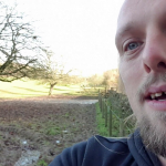
This checkin to geohash 2019-11-29 51 -1 reflects a geohashing expedition. See more of Dan's hash logs.
Footpath connecting Ditchley, Fulwell and Cleveley, North-East of Charlbury.
The XKCD Geohashing Wiki has been down ever since the forums hosted on the same server were hacked almost three months ago. But the algorithm is functionally open-source and there’s nothing to stop an enterprising Geohasher from undertaking adventures even when the biggest silo is offline (I’m trying to negotiate a solution to that problem, too, but that’s another story).
So I planned to take a slightly extended lunch break for what looked like an easy expedition: drive up to Fullwell where it looked like I’d be able to park the car and then explore the footpath from its Western end.
Everything went well until I’d parked the car and gotten out. We’ve had some pretty wet weather lately and I quickly discovered that my footwear was less than ideal for the conditions. Clinging to the barbed wire fence to avoid slipping over, I made my way along a footpath saturated with ankle-deep slippery mud. Up ahead, things looked better, so I pressed on…
…but what I’d initially surveyed to be a drier, smoother part of the field up ahead quickly turned out to be a thin dried crust on top of a pool of knee-to-waist-deep ooze. Letting out a smelling like a mixture of stagnant water and animal waste runoff, the surface cracked and I was sucked deep into the pit. I was glad that my boots were tied tightly or I might have lost them to the deep: it was all I could do to turn around and drag my heavy, sticky legs back to the car.
This is my first failed hashpoint expedition that wasn’t cancelled-before-it-started. It’s a little disappointing, but I’m glad I turned around when I did – when I spoke to somebody near where I’d parked, they told me that it got even worse in the next field and a farmer’s tractor had gotten briefly stuck there recently!
My GPSr keeps a tracklog:
Having realised my imminent failure, I vlogged the experience:
You can also watch it at:

This checkin to GC64QG0 Post Post SN4 309 (Alex Park) reflects a geocaching.com log entry. See more of Dan's cache logs.
After a quick pre-breakfast expedition to the (very good, but under-visited) nearby cache GC18GJB, I decided to take a minor diversion on my way back to Alexandra House via this little cache. An easy find, although I did for a moment think I might have been being watched… only to discover that the creature watching me was a deer. Does a deer count as a muggle? TFTC.
This checkin to GC18GJB Twelve O'Clock High reflects a geocaching.com log entry. See more of Dan's cache logs.
An abundance of leaf mulch made it more–challenging than I’d anticipated both to reach the GZ, on account of slipperiness, and to find the container, on account of camouflage. My geosense took me directly to the right spot but after an initially fruitless search I expanded my radius. Then, still having had no luck, I checked the hint and returned to the site of my initial hunch for a more-thorough search. Soon, the cache was in my hand. SL, TNLN.
Like many previous finders I’m staying in the nearby Alexandra House. My fellow volunteers and I at a nonprofit we run were getting together for our AGM and a Christmas meal (I know it’s early in the year for such things, but among our activities was signing Christmas cards to the hundreds of charities we support, and we have to catch the last international posting dates!).
As has become my tradition at our get-togethers, I got up for a quick hike/geocaching expedition before breakfast. I’m glad I did! This under-hunted cache represents much of what’s best about the activity: a decent sized container, maintained for many years, in a location that justifies a nice walk. FP awarded.
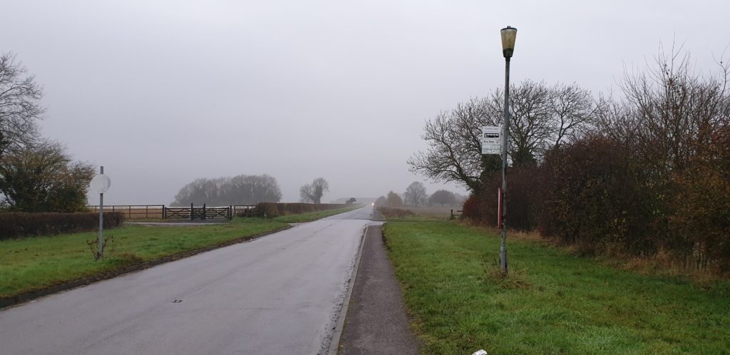
Side note: there’s a bus stop (pictured) at the North end of this footpath. Who’s it for??? In the middle of nowhere with a two-hourly bus five days a week, it doesn’t seem to be serving anybody! Maybe a geocacher will disembark there, someday.
TFTC.
This checkin to GC7Q96B Oxford's Long-Lost Zoo reflects a geocaching.com log entry. See more of Dan's cache logs.
Dropped by to give this cache a checkup before the winter really sets in. It’s well and healthy, only a tiny bit damp. Getting a little lost in fallen leaves but its size and colour mean that it still stands out!