Spencer’s filter
Last month I implemented an alternative mode to view this website “like it’s 1999”, complete with with cursor trails, 88×31 buttons, tables for layout1, tiled backgrounds, and even a (fake) hit counter.
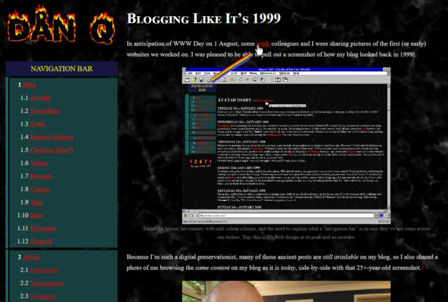
One thing I’d have liked to do for 1999 Mode but didn’t get around to would have been to make the images look like it was the 90s, too.
Back then, many Web users only had graphics hardware capable of displaying 256 distinct colours. Across different platforms and operating systems, they weren’t even necessarily the same 256 colours2! But the early Web agreed on a 216-colour palette that all those 8-bit systems could at least approximate pretty well.
I had an idea that I could make my images look “216-colour”-ish by using CSS to apply an SVG filter, but didn’t implement it.
But Spencer, a long-running source of excellent blog comments, stepped up and wrote an SVG filter for me! I’ve tweaked 1999 Mode already to use it… and I’ve just got to say it’s excellent: huge thanks, Spencer!
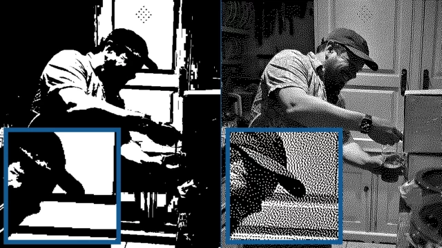
The filter coerces colours to their nearest colour in the “Web safe” palette, resulting in things like this:
Plenty of pictures genuinely looked like that on the Web of the 1990s, especially if you happened to be using a computer only capable of 8-bit colour to view a page built by somebody who hadn’t realised that not everybody would experience 24-bit colour like they did3.
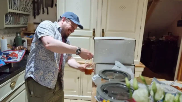
Dithering
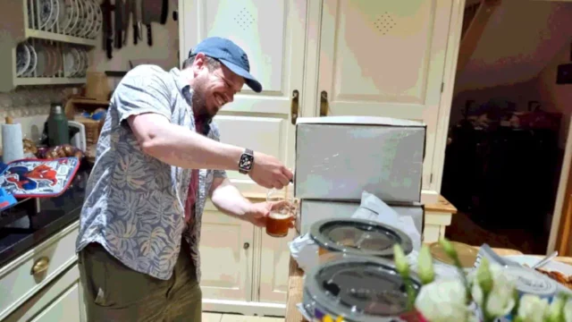
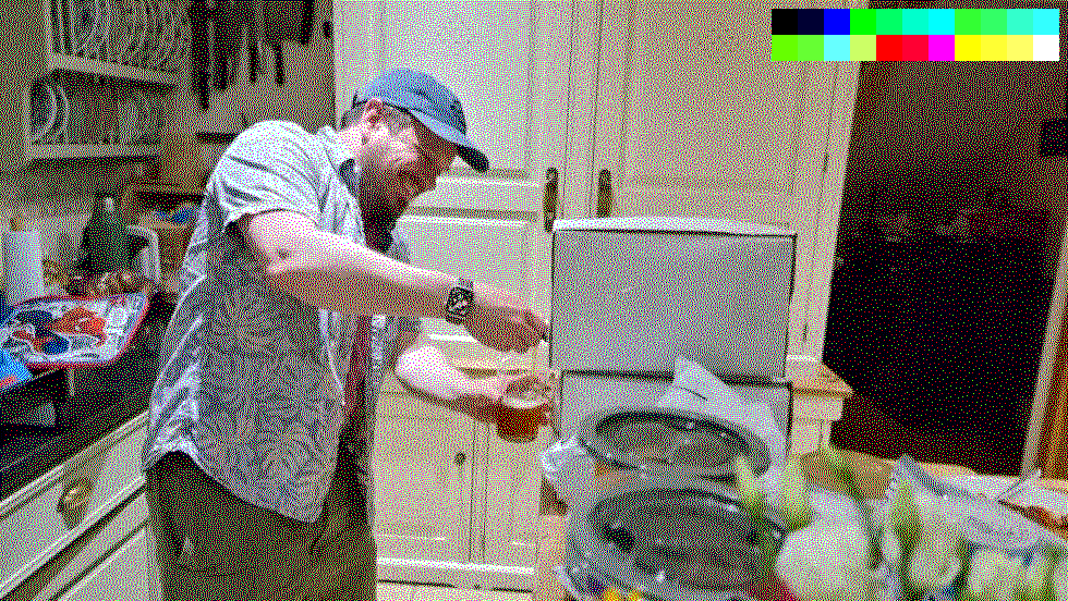
But not all images in the “Web safe” palette looked like this, because savvy web developers knew to dither their images when converting them to a limited palette. Let’s have another go:

Dithering introduces random noise to media4 in order to reduce the likelihood that a “block” will all be rounded to the same value. Instead; in our picture, a block of what would otherwise be the same colour ends up being rounded to maybe half a dozen different colours, clustered together such that the ratio in a given part of the picture is, on average, a better approximation of the correct colour.
The result is analogous to how halftone printing – the aesthetic of old comics and newspapers, with different-sized dots made from few colours of ink – produces the illusion of a continuous gradient of colour so long as you look at it from far-enough away.
The other year I read a spectacular article by Surma that explained in a very-approachable way how and why different dithering algorithms produce the results they do. If you’ve any interest whatsoever in a deep dive or just want to know what blue noise is and why you should care, I’d highly recommend it.
You used to see digital dithering everywhere, but nowadays it’s so rare that it leaps out as a revolutionary aesthetic when, for example, it gets used in a video game.
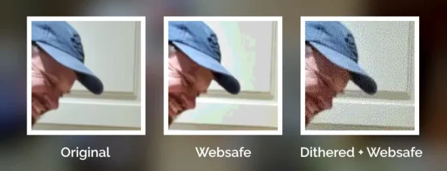
All of which is to say that: I really appreciate Spencer’s work to make my “1999 Mode” impose a 216-colour palette on images. But while it’s closer to the truth, it still doesn’t quite reflect what my website would’ve looked like in the 1990s because I made extensive use of dithering when I saved my images in Web safe palettes5.
Why did I take the time to dither my images, back in the day? Because doing the hard work once, as a creator of graphical Web pages, saves time and computation (and can look better!), compared to making every single Web visitor’s browser do it every single time.
Which, now I think about it, is a lesson that’s still true today (I’m talking to you, developers who send a tonne of JavaScript and ask my browser to generate the HTML for you rather than just sending me the HTML in the first place!).
Footnotes
1 Actually, my “1999 mode” doesn’t use tables for layout; it pretty much only applies a CSS overlay, but it’s deliberately designed to look a lot like my blog did in 1999, which did use tables for layout. For those too young to remember: back before CSS gave us the ability to lay out content in diverse ways, it was commonplace to use a table – often with the borders and cell-padding reduced to zero – to achieve things that today would be simple, like putting a menu down the edge of a page or an image alongside some text content. Using tables for non-tabular data causes problems, though: not only is it hard to make a usable responsive website with them, it also reduces the control you have over the order of the content, which upsets some kinds of accessibility technologies. Oh, and it’s semantically-invalid, of course, to describe something as a table if it’s not.
2 Perhaps as few as 22 colours were defined the same across all widespread colour-capable Web systems. At first that sounds bad. Then you remember that 4-bit (16 colour) palettes used to look look perfectly fine in 90s videogames. But then you realise that the specific 22 “very safe” colours are pretty shit and useless for rendering anything that isn’t composed of black, white, bright red, and maybe one of a few greeny-yellows. Ugh. For your amusement, here’s a copy of the image rendered using only the “very safe” 22 colours.
3 Spencer’s SVG filter does pretty-much the same thing as a computer might if asked to render a 24-bit colour image using only 8-bit colour. Simply “rounding” each pixel’s colour to the nearest available colour is a fast operation, even on older hardware and with larger images.
4 Note that I didn’t say “images”: dithering is also used to produce the same “more natural” feel for audio, too, when reducing its bitrate (i.e. reducing the number of finite states into which the waveform can be quantised for digitisation), for example.
5 I’m aware that my footnotes are capable of nerdsniping Spencer, so by writing this there’s a risk that he’ll, y’know, find a way to express a dithering algorithm as an SVG filter too. Which I suspect isn’t possible, but who knows! 😅
1. Man I had actually forgotten that that’s how images used to look and it’s only now that I realise something is wrong with them rather than just “how digital images look”.
2. This might be the most nerd-ass thing I’ve seen today and I accidentally spent my lunch break watching a 20 minute video on the modular design and options of the Leyland National bus, by a guy who specifically prefers the Mark 1.
So well done 😂
Next, “progressive” JPEG loading…
Man, I love progressive JPEGs. Right now most of my images are served as WebP, but I could probably write some JS that simulated progressive JPEG loading by using a stepped gradually decreasing Gaussian blur…
I feel like I’m owed royalties here :D
My talented model.
I’m glad I was able to help making your beautiful blog look worse!