I love Firefox, as I’ve doubtless said before. In 2005 it reached the point at which (with the right combination of add-ons) it could replace Opera as my default browser. Going mobile, I used it on my N900 (still an underrated device) back in 2010, and later I’d use it on my Android devices. I love the power, productivity, performance, and privacy Firefox helps to give me.
Enter the latest iteration of the Android version, Firefox Daylight, which came out last week.
First, the good: this latest version of Firefox for Android is fast. Blazingly fast. The privacy controls are clearer and easier to access. Having picture-in-picture mode on mobile is a nice touch, as is the new generation of tracking prevention features.
But Firefox Daylight still makes me frown. And it’s a trio of smaller things that really niggle:
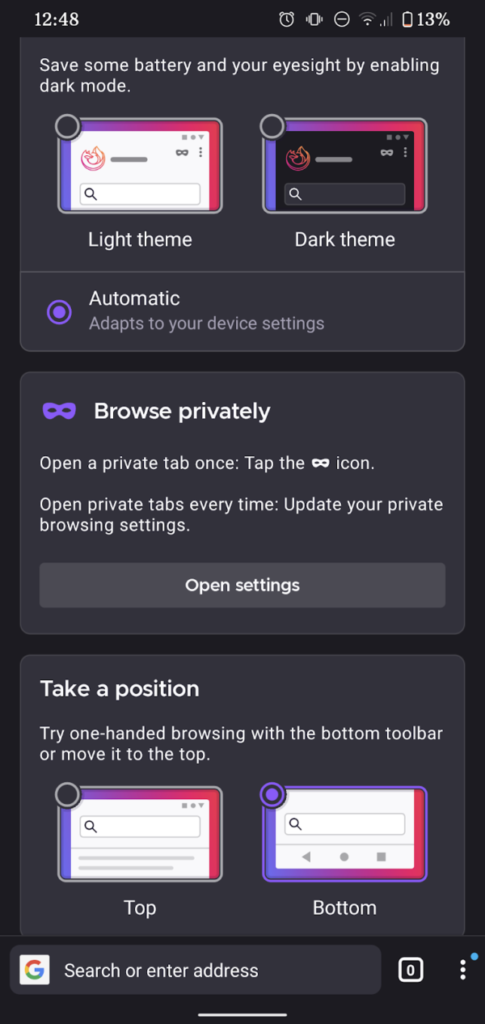
1. Top or bottom toolbar… but top is a second-class citizen.
In theory, I like the idea of having the address bar and its friends at the bottom of the screen where it’s more-accessible to your thumb. I’ve even tried it, independently. in years past. But it’s too much of a mental leap for me nowadays, plus it doesn’t cleanly fit into the “scroll down and the address bar disappears” user experience that’s become commonplace.
Making bottom toolbar the default was perhaps a little radical, then, but at least Mozilla provided an option to put it back at the top. But… it’s not quite right:
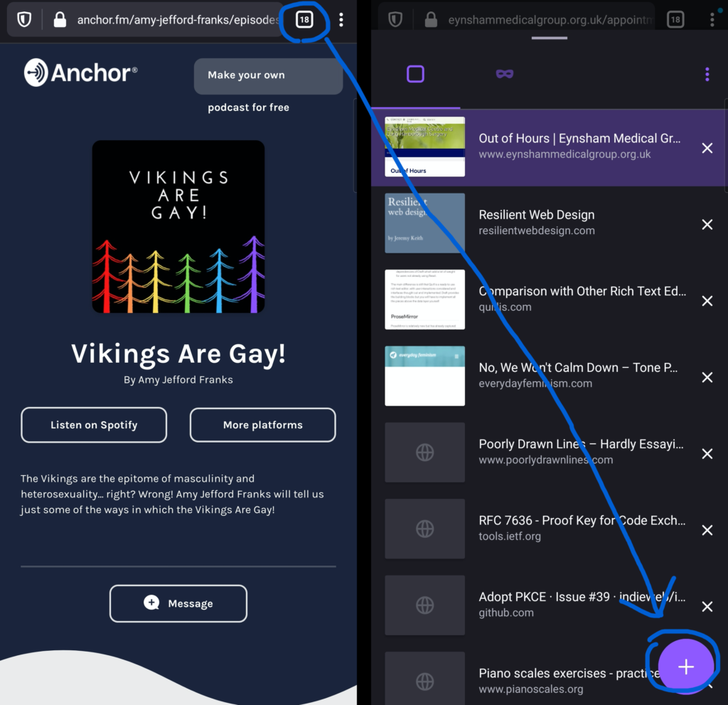
Even with the toolbar moved back to the top, some controls associated with it stay at the bottom. Want to open a new tab? You have to press the “tabs” button at the top of the screen, then the “plus” button at the bottom of the screen, then – probably – the address bar back at the top of the screen again! You’ve just covered two complete lengths of the screen to do something that used to require none. Not a satisfactory experience.
2. Tab previews were more space-efficient before
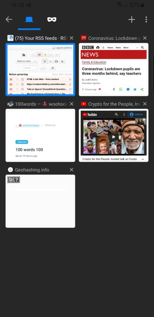
You’ve probably already spotted the other change to the “current tabs” view. Previously, open tabs were shown as mini previews with their titles above. Now they’re shown as tiny (sometimes absent) icon-sized previews with their titles alongside. This allows the domain name to be shown, which is nice, but not nice enough to justify reducing the instant visual recognition the previous interface provided.
It’s not even like you can fit more tabs onto a screen. The capacity is basically the same. You’re just making smaller hit targets with less recognisable graphics. Plus: previously the most-recent tabs were at the bottom (close to where your thumb is, which was the justification for making the address bar default to the bottom); now they’re at the top, further adding to the distance travelled.
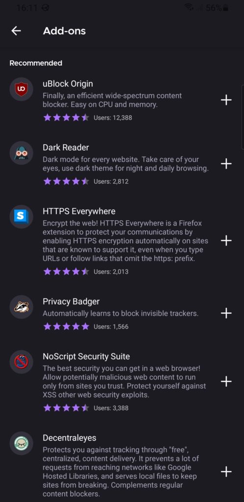
3. Plugin support is terrible
I know first hand that implementing backwards-compatibility is hard, but breaking most plugins and then providing a list of nine or so popular/recommended ones that still works isn’t a great experience.
Feels a bit like this was released before it was ready.
For the time being, I’m using Fennec F-Droid as my primary mobile browser. It picks up exactly where Firefox for Android left off, and it doesn’t break my workflow. I hope to switch back to regular Firefox for Android someday, but Daylight needs “finishing” first.
Mozilla is probably not happy about point 3 either:
> In order to get the new browser to users as soon as possible—which was necessary to iterate quickly on user feedback and limit resources needed to maintain two different Firefox for Android applications—we made some tough decisions about our minimum criteria for launch.
https://blog.mozilla.org/addons/2020/09/02/update-on-extension-support-in-the-new-firefox-for-android/
Someone should tell them bad decisions aren’t the same as tough decisions. In the world of cell phone apps, user experience is king and cannot be throw under the rug for any reason.