I’ve been GMing/DMing/facilitating1 roleplaying games for nearby 30 years, but I only recently began to feel like I was getting to be good at it.
The secret skill that was hardest for me to learn? A willingness to surrender control to the players.
Karma, Drama, Fortune
I could write a lot about the way I interpret the K/D/F model, but for today here’s a quick primer:
The K/D/F model describes the relationship between three forces: Karma (player choices), Drama (story needs) and Fortune (luck, e.g. dice rolls). For example,
- When the lich king comes to the region to provide a villainous plot hook, that’s Drama. Nobody had to do anything and no dice were rolled. The story demanded a “big bad” and so – within the limitations of the setting – one turned up.
- When his lucky critical hit kills an ally of the adventurers, that’s Fortune. That battle could have gone a different way, but the dice were on the villain’s side and he was able to harm the players. When we don’t know which way something will go, and it matters, we hit the dice.
- When one of the heroes comes up with a clever way to use a magical artefact from a previous quest to defeat him, that’s Karma. It was a clever plan, and the players were rewarded for their smart choices by being able to vanquish the evil thing.
- And elsewhere on their quest they probably saw many other resolutions. Each of those may have leaned more-heavily on one or another of the three pillars, or balanced between them equally.
Disbalancing drama
For most of my many years of gamemastering, I saw my role as being the sole provider the “drama” part of the K/D/F model. The story comes from me, the choices and dice rolls come from the players, right?
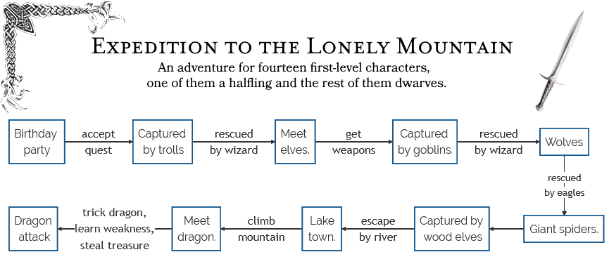
Nope, I was wrong. That approach creates an inevitable trend, whether large or small, towards railroading: “forcing” players down a particular path.
A gamemaster with an inflexible and excessively concrete idea of the direction that a story must go will find that they become unable to see the narrative through any other lens. In extreme examples, the players are deprotagonised and the adventure just becomes a series of set pieces, connected by the gamemaster’s idea of how things should play out. I’ve seen this happen. I’ve even caused it to happen, sometimes.2
A catalogue of failures
I’ve railroaded players to some degree or another on an embarrassing number of occasions.
In the spirit of learning from my mistakes, here are three examples of me being a Bad GM.
Quantum Ogre
Scenario: In a short-lived high fantasy GURPS campaign, I wanted the party to meet a band of gypsies and have their fortune told, in order to foreshadow other parts of the story yet to come.
What I did: I pulled a quantum ogre (magician’s choice) on them: whether they travelled by road, or water, or hacked their way through the forest, they were always going to meet the gypsies: their choice of route didn’t really matter.
Why that was wrong: I’d elevated the value of the encounter I’d planned higher than the importance of player agency. The more effort it took to write something, the more I felt the need to ensure it happened!
Two things I could’ve done: Reassessed the importance of the encounter. Found other ways to foreshadow the plot that didn’t undermine player choices, and been more-flexible about my set pieces.
Fudging
Scenario: In a Spirit of the Century one-shot an antagonist needed to kidnap a NPC from aboard an oceanbound ship. To my surprise – with some very lucky rolls – the players foiled the plot!
What I did: I used a fudge – an exploit based on the fact that in most games the gamemaster controls both the plot and the hidden variables of the game mechanics – to facilitate the antagonist kidnapping a different NPC, and adapted the story to this new reality.
Why that was wrong: It made the players feel like their choices didn’t matter. I justified it to myself by it being a one-shot, but that undermines the lesson: I could’ve done better.
Two things I could’ve done: Used the failed attack as a precursor to a later renewed offensive by a villain who’s now got a personal interest in seeing the party fail. Moved towards a different story, perhaps to a different element of the antagonist’s plan.
Ex Machina
Scenario: In a long-running Warhammer Fantasy Roleplay (1st edition!) campaign, a series of bad choices and terrible luck left the party trapped and unable to survive the onslaught of a literal army of bloodthirsty orcs.
What I did: I whipped out a deus spiritus ex machina, having a friendly ghost NPC
basically solve for them a useful puzzle they’d been struggling with, allowing them to escape alive (albeit with the quest truly failed).
Why that was wrong: It deprotagonised the adventurers, making them unimportant in their own stories. At the time, I felt that by saving the party I was “saving” the game, but instead I was undermining its value.
Two things I could’ve done: TPK: sometimes it’s the right thing to allow everybody to die! Pivot the plot to facilitate their capture (e.g. the arch-nemesis can’t solve the puzzle either and wants to coerce them into helping), leading to new challenges and interesting moral choices.
Those examples are perhaps extreme, but I’m pretty sure I’ve set up my fair share of lesser sins too. Like chokepoints that strongly encourage a particular direction: do that enough and you train your players to wait until they identify the chokepoint before they take action! Or being less invested in players’ plans if those plans deviate from what I anticipated, and having a convenient in-party NPC prompting players with what they ought to do next. Ugh.3
The good news is, of course, that we’ve all always got the opportunity for growth and self-improvement.
The self-improvement path
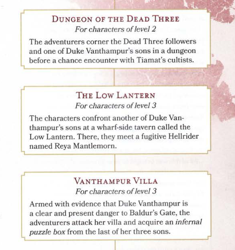
I’ve gotten better at this in general over the years, but when I took over from Simon at DMing for The Levellers in July, I decided that I was going to try to push myself harder than ever to avoid railroading. Simon was always especially good at promoting player freedom and autonomy, and I wanted to use this inspiration as a vehicle to improve my own gamemastering.
What does that look like within the framework of an established campaign?
Well: I ensure there are clues (usually three of them!) to point the players in the “right” direction. And I’ll be on hand to give “nudges” if they’re truly stuck for what to do next, typically by providing a “recap” of the things they’ve previously identified as hooks that are worth following-up (including both the primary plotline and any other avenues they’ve openly discussed investigating).
But that’s the limit to how I allow Drama to control the direction of the story. Almost everything else lies in the hands of Karma and Fortune.
Needless to say, opening up the possibility space for my players makes gamemastering harder4! But… not by as much as I expected. Extra prep-work was necessary, especially at the outset, in order to make sure that the world I was inheriting/building upon was believable and internally-consistent (while ensuring that if a player decided to “just keep walking East” they wouldn’t fall off the edge of the world). But mostly, the work did itself.
Because here’s the thing I learned: so long as you’re willing to take what your players come up with and run with it, they’ll help make the story more compelling. Possibly without even realising it.5
The Levellers are a pretty special group. No matter what the situation, they can always be relied upon to come up with a plan that wasn’t anywhere on their DM‘s radar. When they needed to cross a chasm over their choice of one of two bridges, each guarded by a different variety of enemy, I anticipated a few of the obvious options on each (fighting, magic, persuasion and intimidation, bribery…) but a moment later they were talking about having their druid wildshape into something easy-to-carry while everybody else did a group-spider climb expedition down the chasm edge and along the underside of a bridge. That’s thinking outside the box!
But the real magic has come when the party, through their explorations, have unlocked entirely new elements of the story.
Player-driven content
In our campaign, virtually all of the inhabitants of a city have inadvertently sold their immortal souls to a Archduchess of Hell by allowing, over generations, their declaration of loyalty to their city to become twisted away from their gods and towards their mortal leader, who sold them on in exchange for a sweet afterlife deal. The knights of the city were especially-impacted, as the oath they swore upon promised their unending loyalty in this life as well. When the fiendish pact was made, these knights were immediately possessed by evil forces, transforming into horrendous creatures (who served to harass the party for some time).
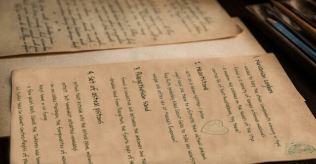
I didn’t have answers to these questions to begin with, but the players were moving towards investigating, so I provided some. This also opened up an entire new possible “soft” quest hook related to the reason for the discrepancy. So just like that, a plothole is discovered and investigated by a player, and that results in further opportunities for adventure.
As it happens, the party didn’t even go down that route at all and instead pushed-on in their existing primary direction, but the option remains. All thanks to player curiosity, there’s a possible small quest that’s never been written down or published, and is unique to our group and the party’s interests. And that’s awesome.
In Conclusion
I’m not the best GM in the world. I’m not even the best GM I know. But I’m getting better all the time; learning lessons like how to release the reins a little bit and see where my players can take our adventures.
And for those lessons, I’m grateful to those same players.
Footnotes
1 I’m using the terms GM, DM, and facilitator interchangeably, and damned if I’m writing them all out every single time.
2 A gamemaster giving all of the narrative power to any one of the three elements of K/D/F breaks the game, but in different ways. 100% karma and what you’ve got is a storytelling game, not a roleplaying game: which is fine if that’s what everybody at the table thinks they’re playing: otherwise not. 100% drama gives you a recital, not a jam session: the gamemaster might as well just be writing a book. 100% fortune leads to unrealistic chaos: with no rules to the world (either from the plot or from the consequences of actions) you’re just imagining all possible outcomes in your universe and picking one at random. There’s a balance, and where it sits might vary from group to group, but 100% commitment to a single element almost always breaks things.
3 A the “lesser sins” I mention show, the edges of what construes railroading and what’s merely “a linear quest” is a grey area, and where the line should be drawn varies from group to group. When I’m running a roleplaying session for my primary-school-aged kids, for example, I’m much more-tolerant of giving heavy-handed nudges at a high-level to help them stay focussed on what their next major objective was… but I try harder than ever to encourage diverse and flexible problem-solving ideas within individual scenes, where childish imagination can really make for memorable moments. One time, a tabaxi warrior, on fire, was falling down the outside of a tower… but his player insisted that he could shout a warning through the windows he passed before landing in flawless catlike fashion (albeit mildly singed). My adult players would be rolling athletics checks to avoid injury, but my kids? They can get away with adding details like that by fiat. Different audience, see?
4 A recent session took place after a hiatus, and I wasn’t confident that – with the benefit of a few months’ thinking-time – the party would continue with the plan they were executing before the break. And they didn’t! I’d tried to prep for a few other eventualities in the anticipation of what they might do and… I guessed wrong. So, for the first time in recorded history, our session ended early. Is that the end of the world? Nope.
5 Want a really radical approach to player-driven plot development? Take a look at this video by Zee Bashew, which I’m totally borrowing from next time I start running a new campaign.
6 You know what I miss? Feelies. That’s probably why I try to provide so many “props”, whether physical or digital, in my adventures.
7 The plothole isn’t even my fault, for once: it’s functionally broken as-delivered in the source book, although that matters little because we’ve gone so-far outside the original source material now we’re on a whole different adventure, possibly to reconvene later on.
