tl;dr?
I recreated a 16-year old interactive ad. Experience it here. Get the source code here. Or keep reading for the full story.
What?
Back in 2005 I reblogged a Flash-based interactive advert I’d discovered via del.icio,us. And if that sentence wasn’t early-naughties enough for you, buckle up…
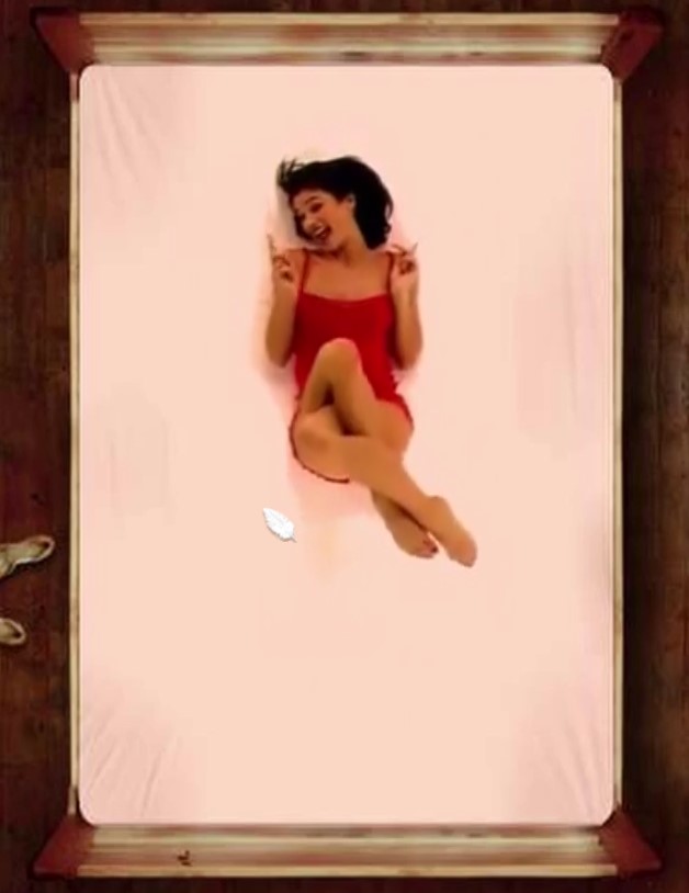
At the end of 2004, Unilever brand Axe (Lynx here in the UK) continued their strategy of marketing their deodorant as magically transforming young men into hyper-attractive sex gods. This is, of course, an endless battle, pitting increasingly sexually-charged advertisements against the fundamental experience of their product, which smells distinctly like locker rooms and school discos. To launch 2005’s new fragrance Feather, they teamed up with London-based design agency Dare Digital to create a game at domain AxeFeather.com (long since occupied by domain squatters).
In the game, the player’s mouse pointer becomes a feather which they can use to tickle an attractive young woman lying on a bed. The woman’s movements – which vary based on where she’s tickled – have been captured in digital video. This was aggressively compressed using the then-new H.263-ish Sorensen Spark codec to make a download just-about small enough to be tolerable for people still on dial-up Internet access (which was still almost as popular as broadband). The ad became a viral hit. I can’t tell you whether it paid for itself in sales, but it must have paid for itself in brand awareness: on Valentines Day 2005 it felt like it was all the Internet wanted to talk about.

I suspect its success also did wonders for the career of its creative consultant Olivier Rabenschlag, who left Dare a few years later, hopped around Silicon Valley for a bit, then landed himself a job as Head of Creative (now Chief Creative Officer) with Google. Kudos.
Why?
I told you about the site 16 years ago: why am I telling you again? Because this site, which made headlines at the time, is gone.
And not just a little bit gone, like a television ad no longer broadcast but which might still exist on YouTube somewhere (and here it is – you’re welcome for the earworm). The website went down in 2009, and because it was implemented in Flash the content was locked away in a compiled, proprietary format, which has ceased to be meaningfully usable on the modern web.

The ad was pioneering. Flash had only recently gained video support (this would be used the following year for the first version of YouTube), and it had so far been used mostly for non-interactive linear video. This ad was groundbreaking… but now it’s disappeared like so much other Flash work. And for all that Flash might have been bad for the web, it’s an important part of our digital history [recommended reading].
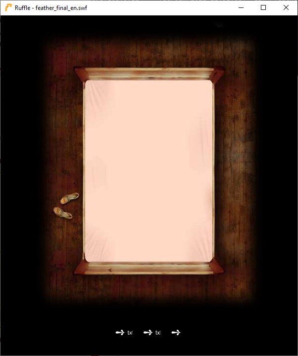
So on a whim… I decided to see if I could recreate the ad.
Call it lockdown fever if you like, because it’s certainly not the work of a sane mind to attempt to resurrect a 16-year-old Internet advertisement. But that’s what I did.
How?
My plan: to reverse-engineer the digital assets (video, audio, cursor etc.) out of the original Flash file, and use them to construct a moderately-faithful recreation of the ad, suitable for use on the modern web. My version must:
- Work in any modern browser, without Flash of course.
- Work on mobile devices/with touchscreens, with all of the original functionality available without a keyboard (the original had secret content hidden behind keyboard keypresses). Nowadays, Rabenschlag
knows to put mobile-first, but I think we can forgive him for not doing that twelve months before Flash Lite
2.0 would bring
.flvsupport to mobile devices… - Indicate how much of the video content you’d seen, because we live in an era of completionists who want to know they’ve seen it all.
- Depend on no third-party frameworks/libraries: just vanilla HTML, CSS, and JavaScript.
Let’s get started.
Reverse-engineering
I grabbed the compiled .swf file from archive.org and ran it through
SWFExtract and an online decompiler: neither was individually able to extract
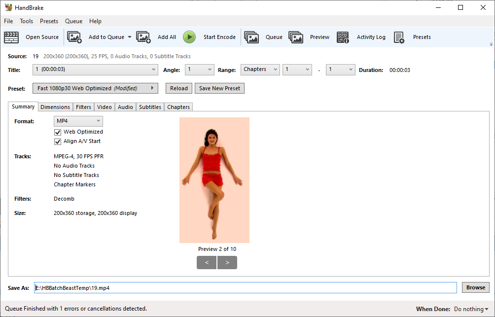
all of the assets, but together they gave me a full set. I ran the .flv files through Handbrake to get myself a set of
.mp4 files instead.
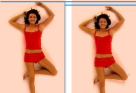
Seeing that the extracted video files were clearly designed to be carefully-positioned on a static background, and not all in the exact same position, I decided to make my job easier by combining them all together, and including the background layer (the picture of the bed) as a single video. Integrating the background with the subject meant that I was able to use video editing software to tweak the position, which I imagined would be much easier than doing so in code. Combining all of the video clips into a single file provides compression benefits as well as making it easier to encourage a browser to precache the entire video to begin with.

The longest clip was a little over 6 seconds long, so I split my timeline into blocks of 7 seconds, padding each clip with a freeze-frame of its final image to make each exactly 7 seconds long. This meant that calculating the position in the finished video to which I wanted to jump was as simply as multiplying the (0-indexed) clip number by 7 and seeking to that position. The additional “frozen” frames acted as a safety buffer in case my JavaScript code was delayed by a few milliseconds in jumping to the “next” block.

An additional challenge was that in the original binary, the audio files were stored separately from the video clips… and slightly longer than them! A little experimentation revealed that the ends of each clip lined up, presumably something to do with how Flash preloads and synchronises media streams. Luckily for me, the audio clips were numbered such that they mostly mapped to the order in which the videos appeared.
Once I had a video file suitable for use on the web (you can watch the entire clip here, if you really want to), it was time to write some code.

Regular old engineering
The theory was simple: web page, video, loop the first seven seconds until you click on it, then animate the cursor (a feather) and jump to another seven-second block before jumping back or, in some cases, on to a completely new seven second block. Simple!
Of course, any serious web development is always a little more complex than you first anticipate.

.swf 34 distinct animated clips, which I numbered 0 through 33. 6 and 30 appeared to be duplicates of others. 0 and 33 are each two “idling” states
from which interaction can lead to other states. Note that my interpretation of the order and relationship of animation sequences differs from the original.
For example: nowadays, putting a video on a web page is as easy as a <video> tag. But, in an effort to prevent background web pages from annoying you with unexpected
audio, modern browsers won’t let a video play sound unless user interaction is the reason that the video starts playing (or unmutes, if it was playing-but-muted to
begin with). Broadly-speaking, that means that a definitive user action like a “click” event has to be in the call stack when your code makes the video play/unmute.
But changing the .currentTime of a video to force it into a loop: that’s fine! So I set the video to autoplay muted on page load, with a script to make it loop
within its first seven-second block. The actress doesn’t make any sound in block 0 (position A) anyway; so I can unmute the video when the user interacts with a hotspot.
For best performance, I used window.requestAnimationFrame to synchronise my non-interactive events (video loops, virtual cursor repositioning). This posed a slight problem
in that animationframes wouldn’t be triggered if the tab was moved to the background: the video would play through each seven-second block and into the next! Fortunately the
visibilitychange event came to the rescue and I was able to pause the video when it wasn’t being actively watched.
I originally hoped to use the cursor: CSS directive to make the “feather” cursor, but there’d be no nice way to
animate it. Comet Cursor may have been able to use animated GIFs
as cursors back in 1997 (when it wasn’t busy selling all your personal information to advertisers, back when that kind of thing used to attract widespread controversy), but modern
browsers don’t… presumably because it would be super annoying. They also don’t all respect cursor: none, so I used the old trick of using cursor: url(null.png),
none (where null.png is an almost-entirely transparent 1×1 pixel image) to hide the original cursor, then position an image dynamically. I
usegetBoundingClientRect() to allow the video to resize dynamically in CSS and convert coordinates on it represented
as percentages into actual pixel values and vice-versa: this allows it to react responsively to any screen size without breakpoints or excessive code.
Once I’d gone that far I was able to drop the GIF idea entirely and used a CSS animation for the “tickling” motion.
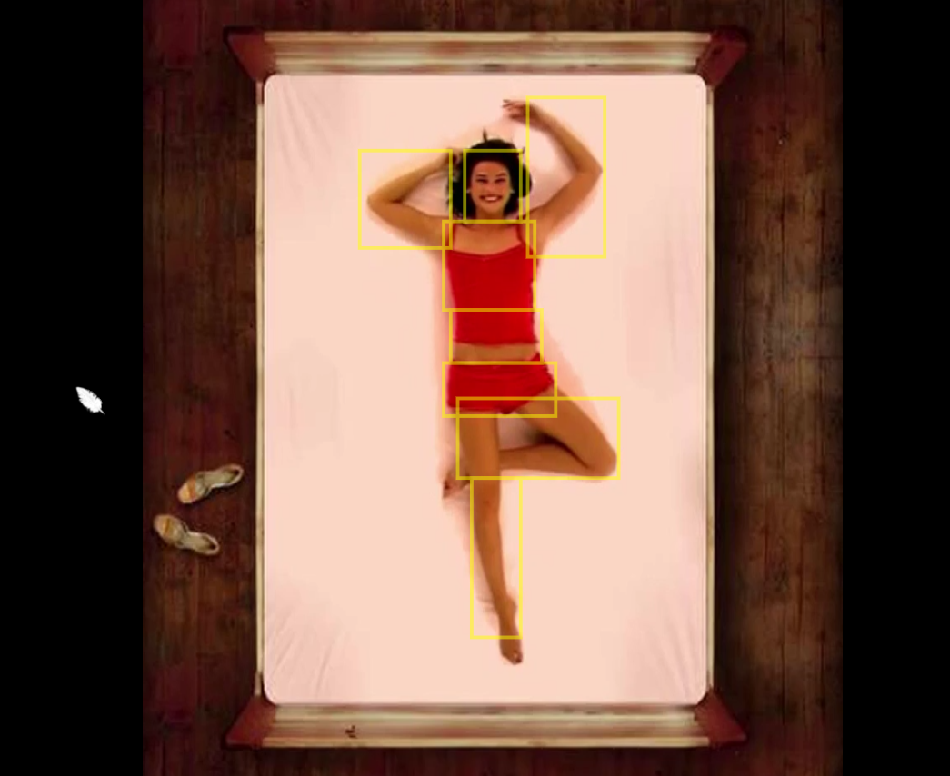
I added a transparent <canvas> element on top of the <video> on which the hit areas are dynamically drawn to help me test the “hotspots” and tweak
their position. I briefly considered implementing a visual tool to help me draw the hotspots, but figured it wasn’t quite worth the time it would take.
As I implemented more and more of the game, I remembered one feature from the original that I’d missed: the “blowaway”. If you trigger block 31 – a result of tickling the woman’s nose – she’ll blow your cursor off the screen. It’s particularly fun because it subverts the player’s expectations of their user interface: once you’ve got past the surprise of your cursor being a feather, you quickly settle in to it moving like a regular cursor… but then control’s stolen from you and the cursor vanishes! (Well I thought it was cool… 16 years ago.)

So yeah: that was my project this weekend.
I can’t even begin to explain why anybody would do this. But I did it. If you haven’t already: go have a play. And if you’re interested in how it works, the source code’s free for you to explore.
A million thank yous.
I’m an ‘ancient’ and I had totally forgotten that flash.
You’re definitely doing important work keeping our history alive.
Thanks for sharing.
I used to code but now I write poetry (rickthepoetwarrior)
Actually they’re the same thing
Nice poem buddy
rick
Hi Dan Q,
Bro, you are a genius!
I definitely do not think where the game came from and who made it when I first met it when I was about 8, I guess?
While it becomes quite annoying when I find none of the flash simulators can play this swf.
Thank you for the background of this flash and your effort in recreating it! You make my day!
Cheer,
Zor
by the way who is this girl ? name please ?
I’ve never been able to find out. If you manage to, let me know!
Hello Dan Q,
This is such a blast from the past. Thank you so much.
Here in Thailand, there was an Axe Click promotional campaign that also had a flash game about a detective that solve several murder cases of men getting “their happiest moment of their lives” before they meet the creator. In every case, there was a can of axe spray within the crime scenes. This, I believe was the international version of the flash game.
And also I believe there was also another version exclusively made for Thailand which had the player played as a guy with a clicker or an Axe Click spray who flirts around a couple of Thai models and actresses.
My memories are a little bit fuzzy, because I secretly play this game in my school computer lab during grade 12.
Anyway, just want to share something for the people who might remember this kind of stuff.
Thank you again for the flash game!
It’s 2025 and this game randomly popped into my head