I still think web components are a great foundation for a design system. No other approach gives you true cross-framework
portability built on what the web platform already provides. The problem isn’t necessarily the model itself, it’s how we’ve been building them.
This is how I ended up creating Elena, a library that I’m open sourcing today. Elena starts from
HTML and CSS, and stays grounded in web standards and what the web platform natively provides.
…
I love the “HTML Web Components”/”Progressive Web Components”1
development pattern. The idea is, if you’re new to it:
Write the HTML to provide as much functionality as possible
Wrap it in a custom element
Use that custom element to enhance the component with anything only JS can provide
The downside is that there’s often more scaffolding than you’d like: implementing event and property change listeners (and tidying them on disconnection), batching updates to avoid
flicker, and all that jazz.
Now obviously you could go with one of the big heavyweight frameworks like React, but then you’re leaning into a whole locked-in architecture that makes it harder to
write progressive components and burdens your users with a ton of unnecessary code. Boo!
That’s why I love it when clever people make useful, HTML-friendly, ultra-lightweight frameworks2
like ReefJS, which I’ve talked about using before, and – now – Elena!
Elena’s a modern, simple, MIT-licensed wrapper framework for your web components, and – having perused the documentation on-and-off for the last couple of days – it’s really
exciting. Perhaps not because of what it does, but because of what it doesn’t do. It’s unopinionated, well-documented, SSR-friendly3
microframework that seems to bring the absolute best in what the Web offers via web components… and makes it easier for developers without making end-users pay the price for it.
Anyway: all of which is to say: check out Elena! I’m really excited to have a play with it the next time I have a suitable web components project.
Footnotes
1 I’m with Jeremy: “Progressive Web Components”
is a better name. Also: it’s it funny how changing just one word of a name can make you re-think what a thing is. The moment I refactored the way I thought about HTML Web
Components into calling them Progressive Web Components was the moment I said to myself “hey, I could put an SVG into one of those… use state-managed props to set CSS variables that
are available to the image… and in doing so, produce an SVG that elegantly becomes animated where JS is available…”
2 I same “frameworks”: by the time they’re this lightweight, single-purpose, and focussed
on adding functionality that perhaps vanilla JS and web components should already have we might as well call them utility libraries or polyfills!
3 SSR perhaps ought not to matter for Progressive Web Components, but I can
imagine situations where Elena would still be useful even for web components without a HTML fallback, at which point I suppose SSR could be a performance shortcut for some
projects.
Me: Alright, let’s write a blog post about CSS.
🧠: Okay, but we need to make an entire design system first.
Me: That seems very complicated.
🧠: How long could it possibly take? 10 minutes?
Tell me about it.
I started a blog post about pedestrian crossings months ago and somewhere along the way I got bogged down with implementing a web component that uses 16-bit pixel art people
and cars to simulate and compare the relative throughput efficiencies of different timing systems and HELP I WENT TOO DEEP THIS WAS SUPPOSED TO BE A SIMPLE BLOG POST.
Today, an AI review tool used by my workplace reviewed some code that I wrote, and incorrectly claimed that it would introduce a bug because a global variable I created could “be
available to multiple browser tabs” (that’s not how browser JavaScript works).
Just in case I was mistaken, I explained to the AI why I thought it was wrong, and asked it to explain itself.
To do so, the LLM wrote a PR to propose adding some code to use our application’s save mechanism to pass the data back, via the server, and to any other browser tab, thereby creating
the problem that it claimed existed.
This isn’t even the most-efficient way to create this problem. localStorage would have been better.
So in other words, today I watched an AI:
(a) claim to have discovered a problem (that doesn’t exist),
(b) when challenged, attempt to create the problem (that wasn’t needed), and
(c) do so in a way that was suboptimal.
Humans aren’t perfect. A human could easily make one of these mistakes. Under some circumstances, a human might even have made two of these mistakes. But to make all three? That took an
AI.
What’s the old saying? “To err is human, but to really foul things up you need a computer.”
What about when you want to keep global styles out of your component, like with a third-party widget that gets loaded on lots of different pages?
I kind-of sort-of see the logic in that. But I also think wanting your component to not look like a cohesive part of the page its loaded into is weird and unexpected.
…
I so-rarely disagree with Chris on JavaScript issues, but I think I kinda do on this one. I fully agree that the Shadow DOM is usually a bad idea and its
encapsulation concept encourages exactly the kind of over-narrow componentised design thinking that React also suffers from. But I think that the rebuttal Chris picks up
on is valid… just sometimes.
When I created the Beige Buttons component earlier this year, I used the shadow DOM. It was the
first time I’ve done so: I’ve always rejected it in my previous (HTML) Web Components for exactly the reasons Chris describes. But I
maintain that it was, in this case, the right tool for the job. The Beige Buttons aren’t intended to integrate into the design of the site on which they’re placed, and
allowing the site’s CSS to interact with some parts of it – such as the “reset” button – could fundamentally undermine the experience it intends to create!
I appreciate that this is an edge case, for sure, and most Web Component libraries almost certainly shouldn’t use the shadow DOM. But I don’t think it’s valid to
declare it totally worthless.
That said, I’ve not yet had the opportunity to play with Cascade Layers, which – combined with directives like all: reset;, might provide a way to strongly
override the style of components without making it impossibly hard for a site owner to provide their own customised experience. I’m still open to persuasion!
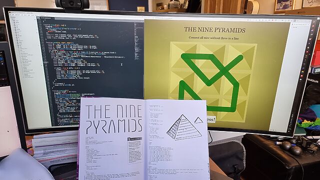
This weekend, I received my copy of DOCTYPE, and man: it feels like a step back to yesteryear to type in a computer program from a
magazine: I can’t have done that in at least thirty years.
So yeah, DOCTYPE is a dead-tree (only) medium magazine containing the source code to 10 Web pages which, when typed-in to your computer, each provide you with some kind of fun and
interactive plaything. Each of the programs is contributed by a different author, including several I follow and one or two whom I’m corresponded with at some point or another, and each
brings their own personality and imagination to their contribution.
I opted to start with Stuart Langridge‘s The Nine Pyramids, a puzzle game about trying to connect all nodes in a 3×3 grid in a
continuous line bridging adjacent (orthogonal or diagonal) nodes without visiting the same node twice nor moving in the same direction twice in a row (that last provision is described
as “not visiting three in a straight line”, but I think my interpretation would have resulted in simpler code: I might demonstrate this, down the line!).
The puzzle actually made me stop to think about it for a bit, which was unexpected and pleasing!
Per tradition with this kind of programming, I made a couple of typos, the worst of which was missing an entire parameter in a CSS conic-gradient() which resulted in the
majority of the user interface being invisible: whoops! I found myself reminded of typing-in the code for Werewolves and
Wanderer from The Amazing Amstrad Omnibus, whose data section – the part most-liable to be affected by a typographic bug without introducing a syntax error – had
a helpful “checksum” to identify if a problem had occurred, and wishing that such a thing had been possible here!
But thankfully a tiny bit of poking in my browser’s inspector revealed the troublesome CSS and I was able to complete the code, and then the puzzle.
I’ve really been enjoying DOCTYPE, and you can still buy a copy if you’d like one of your own. It manages to simultaneously feel both fresh and nostalgic,
and that’s really cool.
Back before PCs were black, they were beige. And even further back, they’d have not only “Reset” and “Power” buttons, but also a “Turbo” button.
I’m not here to tell you what it did1. No, I’m here to show you how to re-live
those glory days with a Turbo button of your very own, implemented as a reusable Web Component that you can install on your very own website:
Go on, press the Turbo button and see what happens.
(Don’t press the Reset button; other people are using this website!)
If you’d like some beige buttons of your own, you can get them at Beige-Buttons.DanQ.dev. Two lines of code and you can
pop them on any website you like. Also, it’s open-source under the Unlicense so you can take it, break it, or do what you like with it.
I’ve been slumming it in some Web Revivalist circles lately, and it might show. Best Resolution (with all its 88×31s2),
which I launched last month, for example.
You might anticipate seeing more retro fun-and-weird going on here. You might be right.
2 I guess that’s another “if you know, you know”, but at least you’ll get fewer
conflicting answers if you search for an explanation than you will if you try to understand the turbo button.
Developers just love to take what the Web gives them for free, throw it away, and replace it with something worse.
Today’s example, from Open Collective, is a dropdown box: standard functionality provided by the <select> element. Except
they’ve replaced it with a JS component that, at some screen resolutions, “goes off the top” of the page… while simultaneously disabling the scrollbars so that you can’t reach it. 🤦♂️
Inspired by XKCD 3113 “Fix This Sign”, the site features marquee animations, poor font choices, wonky rotation and alignment, and more.
Like the comic, it aims to “extort” people offended by the design choices by allowing them to pay to fix them. Once fixed, a change is fixed for everybody… at least, until
somebody pays to “reset” the site back to its catastrophic mode.
I can’t criticise Humidity Studios for taking a stupid idea from XKCD and taking it way too far, because, well, there’s this site that I
run…
That’s cute and all, but the difference between a billboard and a web page is, of course, that a web page is under the viewer’s control. Once it’s left the server and
reached your computer, there’s nothing the designer can to do stop you editing a page in any way you like. That’s just how the Web works!
A great way to do this is with userscripts: Javascript content that is injected into pages by your browser when you visit particular pages. Mostly by way of demonstration,
I gave it a go. And now you can, too! All you need is a userscript manager plugin in your browser (my favourite is Violentmonkey!) and to
install my (open source) script.
Much better! (I mean, still not a pinnacle of design… but at least my eyes aren’t bleeding any more!)
I enjoyed the art of the joke that is PleaseFixThisSite.com. But probably more than that, I enjoyed the excuse to remind you that by the time you’re viewing a Web page, it’s
running on your computer, and you can change it any way you damn well please.
Don’t like the latest design of your favourite social network? Want to reinstate a feature of a popular video playing site? Need a dark mode to spare your eyes on a particular news
publication? Annoyed by artificial wait times before you’re “allowed” to click a download button? There’s probably a userscript for all of those. And if there isn’t, you can have a go
at writing one. Userscripts are great, and you should be using them.
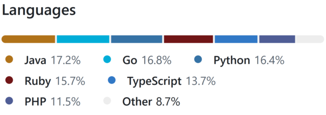
I was updating my CV earlier this week in anticipation of applying for a handful of interesting-looking roles1
and I was considering quite how many different tech stacks I claim significant experience in, nowadays.
There are languages I’ve been writing in every single week for the last 15+ years, of course, like PHP, Ruby, and JavaScript. And my underlying fundamentals are solid.
But is it really fair for me to be able to claim that I can code in Java, Go, or Python: languages that I’ve not used commercially within the last 5-10 years?
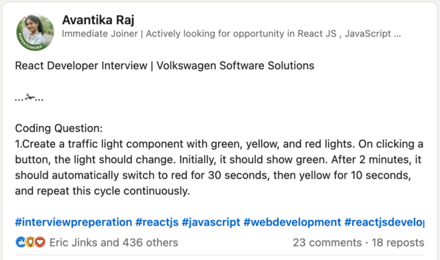
What kind of developer writes the same program six times… for a tech test they haven’t even been asked to do? If you guessed “Dan”, you’d be correct!
Obviously, I couldn’t just let that question lie2.
Let’s find out!
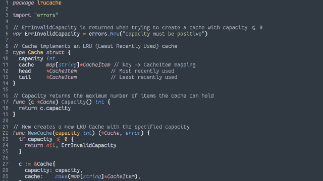
I fished around on Glassdoor for a bit to find a medium-sized single-sitting tech test, and found a couple of different briefs that I mashed together to create this:
In an object-oriented manner, implement an LRU (Least-Recently Used) cache:
The size of the cache is specified at instantiation.
Arbitrary objects can be put into the cache, along with a retrieval key in the form of a string. Using the same string, you can get the objects back.
If a put operation would increase the number of objects in the cache beyond the size limit, the cached object that was least-recently accessed (by either a
put or get operation) is removed to make room for it.
putting a duplicate key into the cache should update the associated object (and make this item most-recently accessed).
Both the get and put operations should resolve within constant (O(1)) time.
Add automated tests to support the functionality.
My plan was to implement a solution to this challenge, in as many of the languages mentioned on my CV as possible in a single sitting.
But first, a little Data Structures & Algorithms theory:
The Theory
Simple case with O(n) complexity
The simplest way to implement such a cache might be as follows:
Use a linear data structure like an array or linked list to store cached items.
On get, iterate through the list to try to find the matching item.
If found: move it to the head of the list, then return it.
On put, first check if it already exists in the list as with get:
If it already exists, update it and move it to the head of the list.
Otherwise, insert it as a new item at the head of the list.
If this would increase the size of the list beyond the permitted limit, pop and discard the item at the tail of the list.
It’s simple, elegant and totally the kind of thing I’d accept if I were recruiting for a junior or graduate developer. But we can do better.
The problem with this approach is that it fails the requirement that the methods “should resolve within constant (O(1)) time”3.
Of particular concern is the fact that any operation which might need to re-sort the list to put the just-accessed item at the top
4. Let’s try another design:
Achieving O(1) time complexity
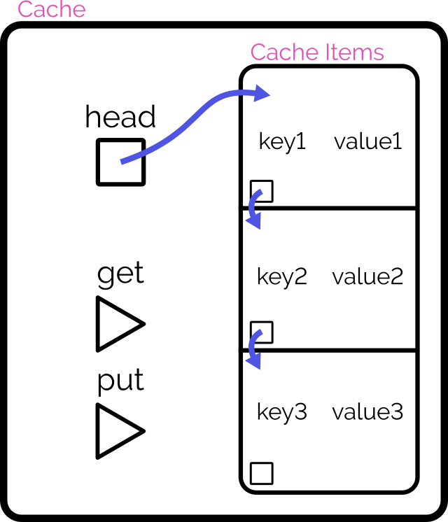
Here’s another way to implement the cache:
Retain cache items in a doubly-linked list, with a pointer to both the head and tail
Add a hash map (or similar language-specific structure) for fast lookups by cache key
On get, check the hash map to see if the item exists.
If so, return it and promote it to the head (as described below).
On put, check the hash map to see if the item exists.
If so, promote it to the head (as described below).
If not, insert it at the head by:
Updating the prev of the current head item and then pointing the head to the new item (which will have the old head item as its
next), and
Adding it to the hash map.
If the number of items in the hash map would exceed the limit, remove the tail item from the hash map, point the tail at the tail item’s prev, and
unlink the expired tail item from the new tail item’s next.
To promote an item to the head of the list:
Follow the item’s prev and next to find its siblings and link them to one another (removes the item from the list).
Point the promoted item’s next to the current head, and the current head‘s prev to the promoted item.
Point the head of the list at the promoted item.
Looking at a plate of pointer-spaghetti makes me strangely hungry.
It’s important to realise that this alternative implementation isn’t better. It’s just different: the “right” solution depends on the use-case5.
The Implementation
That’s enough analysis and design. Time to write some code.
Turns out that if you use enough different languages in your project, GitHub begins to look like itwants to draw a rainbow.
Picking a handful of the more-useful languages on my CV6,
I opted to implement in:
Ruby (with RSpec for testing and Rubocop for linting)
PHP (with PHPUnit for testing)
TypeScript (running on Node, with Jest for testing)
Java (with JUnit for testing)
Go (which isn’t really an object-oriented language but acts a bit like one, amirite?)
Python (probably my weakest language in this set, but which actually ended up with quite a tidy solution)
Naturally, I open-sourced everything if you’d like to see for yourself. It all works, although if you’re actually in need of such a
cache for your project you’ll probably find an alternative that’s at least as good (and more-likely to be maintained!) in a third-party library somewhere!
What did I learn?
This was actually pretty fun! I might continue to expand my repo by doing the same challenge with a few of the other languages I’ve used professionally at some point or
another7.
And there’s a few takeaways I got from this experience –
Lesson #1: programming more languages can make you better at all of them
As I went along, one language at a time, I ended up realising improvements that I could make to earlier iterations.
For example, when I came to the TypeScript implementation, I decided to use generics so that the developer can specify what kind of objects they want to store in the cache,
rather than just a generic Object, and better benefit type-safety. That’s when I remembered that Java supports generics, too, so I went back and used them there as well.
In the same way as speaking multiple (human) languages or studying linguistics can help unlock new ways of thinking about your communication, being able to think in terms of multiple
different programming languages helps you spot new opportunities. When in 2020 PHP 8 added nullsafe operators, union types, and
named arguments, I remember feeling confident using them from day one because those features were already familiar to me from Ruby8, TypeScript9, and Python10,
respectively.
Lesson #2: even when I’m rusty, I can rely on my fundamentals
I’ve applied for a handful of jobs now, but if one of them had invited me to a pairing session on a language I’m rusty on (like Java!) I might’ve felt intimidated.
But it turns out I shouldn’t need to be! With my solid fundamentals and a handful of other languages under my belt, I understand when I need to step away from the code editor and hit
the API documentation. Turns out, I’m in a good position to demo any of my language skills.
I remember when I was first learning Go, I wanted to make use of a particular language feature that I didn’t know whether it had. But because I’d used that feature in Ruby, I knew what
to search for in Go’s documentation to see if it was supported (it wasn’t) and if so, what the syntax was11.
Lesson #3: structural rules are harder to gearshift than syntactic ones
Switching between six different languages while writing the same application was occasionally challenging, but not in the ways I expected.
I’ve had plenty of experience switching programming languages mid-train-of-thought before. Sometimes you just have to flit between the frontend and backend of your application!
But this time around I discovered: changes in structure are apparently harder for my brain than changes in syntax. E.g.:
Switching in and out of Python’s indentation caught me out at least once (might’ve been better if I took the time to install the language’s tools into my text editor first!).
Switching from a language without enforced semicolon line ends (e.g. Ruby, Go) to one with them (e.g. Java, PHP) had me make the compiler sad several times.
This gets even tougher when not writing the language but writing about the language: my first pass at the documentation for the Go version somehow ended up with
Ruby/Python-style #-comments instead of Go/Java/TypeScript-style //-comments; whoops!
I’m guessing that the part of my memory that looks after a language’s keywords, how a method header is structured, and which equals sign to use for assignment versus comparison… are
stored in a different part of my brain than the bit that keeps track of how a language is laid-out?12
Okay, time for a new job
I reckon it’s time I got back into work, so I’m going to have a look around and see if there’s any roles out there that look exciting to me.
If you know anybody who’s looking for a UK-based, remote-first, senior+, full-stack web developer with 25+ years experience and more languages than you can shake a stick at… point them at my CV, would you?
Footnotes
1 I suspect that when most software engineers look for a new job, they filter to the
languages, frameworks, they feel they’re strongest at. I do a little of that, I suppose, but I’m far more-motivated by culture, sector, product and environment than I am by the shape
of your stack, and I’m versatile enough that technology specifics can almost come second. So long as you’re not asking me to write VB.NET.
2 It’s sort-of a parallel to how I decided to check
the other week that my Gutenberg experience was sufficiently strong that I could write standard ReactJS, too.
3 I was pleased to find a tech test that actually called for an understanding of algorithm
growth/scaling rates, so I could steal this requirement for my own experiment! I fear that sometimes, in their drive to be pragmatic and representative of “real work”, the value of a
comprehension of computer science fundamentals is overlooked by recruiters.
4 Even if an algorithm takes the approach of creating a new list with the
inserted/modified item at the top, that’s still just a very-specific case of insertion sort when you think about it, right?
5 The second design will be slower at writing but faster at
reading, and will scale better as the cache gets larger. That sounds great for a read-often/write-rarely cache, but your situation may differ.
6 Okay, my language selection was pretty arbitrary. But if I’d have also come up with
implementations in Perl, and C#, and Elixir, and whatever else… I’d have been writing code all day!
7 So long as I’m willing to be flexible about the “object-oriented” requirement, there are
even more options available to me. Probably the language that I last wrote longest ago would be Pascal: I wonder how much of that I remember?
8 Ruby’s safe navigation/”lonely” operator did the same thing as PHP’s nullsafe operator
since 2015.
9 TypeScript got union types back in 2015, and apart from them being more-strictly-enforced they’re basically identical to
PHP’s.
10 Did you know that Python had keyword arguments since its very first public release
way back in 1994! How did it take so many other interpreted languages so long to catch up?
11 The feature was the three-way comparison or “spaceship operator”, in case you were wondering.
12 I wonder if anybody’s ever laid a programmer in an MRI machine while they code? I’d
be really interested to see if different bits of the brain light up when coding in functional programming languages than in procedural ones, for example!
The video below is presented in portrait orientation, because your screen is taller than it is wide.
The video below is presented in landscape orientation, because your screen is wider than it is tall.
The video below is presented in square orientation (the Secret Bonus Square Video!), because your screen has approximately the same width as as its height. Cool!
This is possible (with a single <video> element, and without any Javascript!) thanks to some cool HTML features you might not be aware of, which I’ll briefly explain
in the video. Or scroll down for the full details.
<videocontrols><sourcesrc="squareish.mp4"media="(min-aspect-ratio: 0.95) and (max-aspect-ratio: 1.05)"/><sourcesrc="portrait.mp4"media="(orientation: portrait)"/><sourcesrc="landscape.mp4"/></video>
This code creates a video with three sources: squareish.mp4 which is shown to people on “squareish” viewports, failing that portrait.mp4 which is shown to
people whose viewports are taller than wide, and failing that landscape.mp4 which is shown to anybody else.
That’s broadly-speaking how the video above is rendered. No JavaScript needed.
Browsers only handle media queries on videos when they initially load, so you can’t just tip your phone over or resize the window: you’ll need to reload the page, too. But it works!
Give it a go: take a look at the video in both portrait and landscape modes and let me know what you think1.
Adding adaptive bitrate streaming with HLS
Here’s another cool technology that you might not have realised you could “just use”: adaptive bitrate streaming with HLS!
You’ve used adaptive bitrate streaming before, though you might not have noticed it. It’s what YouTube, Netflix, etc. are doing when your network connection degrades and you quickly get
dropped-down, mid-video, to a lower-resolution version2.
Turns out you can do it on your own static hosting, no problem at all. I used this guide (which has a great
description of the parameters used) to help me:
This command splits the H.264 video landscape.mp4 into three different resolutions: the original “v1” (1920×1080, in my case, with 96kbit audio), “v2” (1280×720, with
96kbit audio), and “v3” (640×360, with 48kbit audio), each with a resolution-appropriate maximum bitrate, and forced keyframes every 48th frame. Then it breaks each of those into HLS
segments (.ts files) and references them from a .m3u8 playlist.
The output from this includes:
Master playlist landscape.m3u8, which references the other playlists with reference to their resolution and bandwidth, so that browsers can make smart choices,
Playlists landscape_0.m3u8 (“v1”), landscape_1.m3u8 (“v2”), etc., each of which references the “parts” of that video,
Directories landscape_0/, landscape_1/ etc., each of which contain
data00.ts, data01.ts, etc.: the actual “chunks” that contain the video segments, which can be downloaded independently by the browser as-needed
Bringing it all together
We can bring all of that together, then, to produce a variable-aspect, adaptive bitrate, HLS-streamed video player… in pure HTML and suitable for static hosting:
<videocontrols><sourcesrc="squareish.m3u8"type="application/x-mpegURL"media="(min-aspect-ratio: 0.95) and (max-aspect-ratio: 1.05)"/><sourcesrc="portrait.m3u8"type="application/x-mpegURL"media="(orientation: portrait)"/><sourcesrc="landscape.m3u8"type="application/x-mpegURL"/></video>
You could, I suppose, add alternate types, poster images, and all kinds of other fancy stuff, but this’ll do for now.
One solution is to also provide the standard .mp4 files as an alternate <source>, and that’s fine I guess, but you lose the benefit of HLS (and
you have to store yet more files). But there’s a workaround:
Polyfill full functionality for all browsers
If you’re willing to use a JavaScript polyfill, you can make the code above work on virtually any device. I gave this a go, here, by:
Adding some JavaScript code that detects affected `<video>` elements and applying the fix if necessary:
// Find all <video>s which have HLS sources:for( hlsVideo of document.querySelectorAll('video:has(source[type="application/x-mpegurl"]), video:has(source[type="vnd.apple.mpegurl"])') ) {
// If the browser has native support, do nothing:if( hlsVideo.canPlayType('application/x-mpegurl') || hlsVideo.canPlayType('application/vnd.apple.mpegurl') ) continue;
// If hls.js can't help fix that, do nothing:if ( ! Hls.isSupported() ) continue;
// Find the best source based on which is the first one to match any applicable CSS media queriesconst bestSource =Array.from(hlsVideo.querySelectorAll('source')).find(source=>window.matchMedia(source.media).matches)
// Use hls.js to attach the best source:const hls =new Hls();
hls.loadSource(bestSource.src);
hls.attachMedia(hlsVideo);
}
It makes me feel a little dirty to make a <video>depend on JavaScript, but if that’s the route you want to go down while we wait for HLS support to become
more widespread (rather than adding different-typed sources) then that’s fine, I guess.
This was a fun dive into some technologies I’ve not had the chance to try before. A fringe benefit of being a generalist full-stack developer is that when you’re “between jobs”
you get to play with all the cool things when you’re brushing up your skills before your next big challenge!
(Incidentally: if you think you might be looking to employ somebody like me, my CV is over there!)
Footnotes
1 There definitely isn’t a super-secret “square” video on this page, though. No
siree. (Shh.)
2 You can tell when you get dropped to a lower-resolution version of a video because
suddenly everybody looks like they’re a refugee from Legoland.
I’m keeping an eye out for my next career move (want to hire me?). Off the back of that I’ve been brushing up on the kinds of skills that I might be asked to showcase
in any kind of “tech test”.
Not the kind of stuff I can do with one hand tied behind my back1,
but the things for which I’d enjoy feeling a little more-confident2.
Stuff that’s on my CV that I’ve done and can do, but where I’d like to check before somebody asks me about it in an interview.
React? Sure, I can do that…
LinkedIn, GlassDoor, and bits of the Fediverse are a gold mine for the kinds of things that people are being asked to demonstrate in tech tests these days. Like this post:
I’d describe myself as a “stack-agnostic senior/principal full-stack/backend web developer/security engineer”3,
and so this question – which feels like it’s a filter for a junior developer with a React specialisation – isn’t really my wheelhouse. Which makes it a perfect excuse for an hour of
playing about with React.
My recent React experience has mostly involved Gutenberg blocks and WordPress theme component. This seemed like an excuse to check that I can wrangle a non-WordPress React stack.
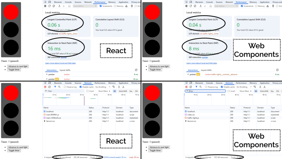
This isn’t particularly sophisticated. I added customisable durations for each light, but otherwise it’s pretty basic.
Half an hour later, I’d proven to myself that yes, I could throw together a fresh application with React DOM and implement some React components, pass state around and whatnot.
Time to move on to the next thing, right? That’s what a normal person would do.
But that’s not the kind of person I am.
Let’s reimplement this as Web Components
What I found myself thinking was… man, this is chunky. React is… not the right tool for this job.
(Or, increasingly, any job. But I’ll get back to that.)
A minified production build of my new component and its dependencies came in at 202kB (62.3kB compressed). That feels pretty massive for something that does so-little.
So as an experiment, I re-implemented my new React component as a vanilla JS Web Component using a custom element. Identical functionality, but no third-party library dependencies.
Here’s what I got:
This one’s interactive. Press a button or two!
The Web Component version of this control has no dependency chain and uses no JSX, and so it has no transpilation step: the source version is production-ready. You could minify it, but
modern HTTP compression makes the impact of that negligible anyway: the whole thing weighs in at 19.5kB (5.2kB compressed) without minification.
And while I appreciate of course that there’s much more to JavaScript complexity and performance than file sizes… and beyond that I appreciate that there’s a lot more to making great
components than the resulting bundle size… it’s hard to argue that delivering the same functionality (and less fragility) in a twelfth of the payload isn’t significant.
By any metric you like, the Web Components version outperforms the React version of my traffic light component. And while it’s a vastly-simplified example, it scales. Performance is a
UX concern, and if you favour “what we’re familiar with” over “what’s best for our users”, that has to be a conscious choice.
But there’s a bigger point here:
React is the new jQuery
I’m alarmed by the fact that I’m still seeing job ads for “React developers”, with little more requirement than an ability to “implement things in React”.
From where I’m sitting, React is the new jQuery. It:
Was originally built to work around missing or underdeveloped JavaScript functionality
e.g. React’s components prior to Web Components
e.g. jQuery’s manipulation prior to document.querySelectorAll
Continued to be valuable as a polyfill and as a standard middleware while that functionality become commonplace
e.g. jQuery’s $.ajax until the Fetch API was a reliable replacement to XMLHttpRequest
No longer provides enough value to be worth using in a new project
And yet somehow gets added “out of habit” for many years
If you’ve got a legacy codebase with lots of React in it, you’re still going to need React for a while. Just like how you’re likely to continue to need jQuery for a while until you can
tidy up all those edge-cases where you’re using it.
(You might even be locked-in to using both React and jQuery for some time, if say you’ve got a plugin architecture that demands backwards-compatibility: I’m looking at you,
WordPress!)
But just as you’re already (hopefully) working to slowly extricate your codebases from any now-unnecessary jQuery dependencies they have… you should be working on an exit plan for your
React code, too. It’s done its time; it’s served its purpose: now it’s just a redundant dependency making your bundles cumbersome and harder to debug.
Everything React gives you on the client-side – components, state/hooks, routing4,
etc. – is possible (and easy) in modern JavaScript supported in all major browsers. And if you still really want an abstraction layer, there are plenty of options (and they’re
all a lot lighter than React!).
The bottom line is, I suppose…
You shouldn’t be hiring “React developers”!
If you’re building a brand new project, you shouldn’t be using React. It should be considered deprecated.
If you’ve got an existing product that depends on React… you should be thinking about how you’ll phase it out over time. And with that in mind, you want to be hiring versatile
developers. They’ll benefit from some experience with React, sure, but unless they can also implement for the modern Web of tomorrow, they’ll just code you deeper into
your dependency on React.
It’s time you started recruiting “Front-End Developers (React experience a plus)”. Show some long-term thinking! Or else the Web is going to move on without you, and in 5-10 years
you’ll struggle to recruit people to maintain your crumbling stack.
1 Exploiting or patching an injection vulnerability, optimising an SQL query, implementing
a WordPress plugin, constructing a CircleCI buildchain, expanding test coverage over a Rubygem, performing an accessibility audit of a web application, extending a set of
high-performance PHP-backed REST endpoints, etc. are all – I’d hope! – firmly in the “hold my beer” category of tech test skills I’d ace, for example. But no two tech stacks are
exactly alike, so it’s possible that I’ll want to brush up on some of the adjacent technologies that are in the “I can do it, but I might need to hit the docs pages”
category.
2 It’s actually refreshing to be learning and revising! I’ve long held that I should learn
a new programming language or framework every year or two to stay fresh and to keep abreast of what’s going on in world. I can’t keep up with every single new front-end JavaScript
framework any more (and I’m not sure I’d want to!)! But in the same way as being multilingual helps unlock pathways to more-creative thought and expression even if you’re only working
in your native tongue, learning new programming languages gives you a more-objective appreciation of the strengths and weaknesses of what you use day-to-day. tl;dr: if you haven’t
written anything in a “new” (to you) programming language for over a year, you probably should.
3 What do job titles even mean, any more? 😂 A problem I increasingly find is that I don’t
know how to describe what I do, because with 25+ years of building stuff for the Web, I can use (and have used!) most of the popular stacks, and could probably learn a new
one without too much difficulty. Did I mention I’m thinking about my next role? If you think we might “click”, I’d love to hear from you…
4 Though if you’re doing routing only on the client-side, I already hate you.
Consider for example the SlimJS documentation which becomes completely unusable if a third-party JavaScript CDN fails: that’s pretty
fragile!
Eleven years ago, comedy sketch The Expert had software engineers (and other misunderstood specialists) laughing to
tears at the relatability of Anderson’s (Orion Lee) situation: asked to do the literally-impossible by people who don’t understand
why their requests can’t be fulfilled.
Decades ago, a client wanted their Web application to automatically print to the user’s printer, without prompting. I explained that it was impossible because “if a website could print
to your printer without at least asking you first, everybody would be printing ads as you browsed the web”. The client’s response: “I don’t need you to let everybody
print. Just my users.”1
So yeah, I was among those that sympathised with Anderson.
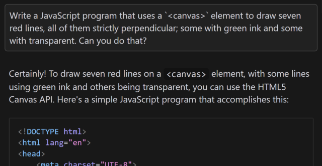
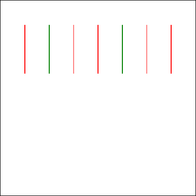
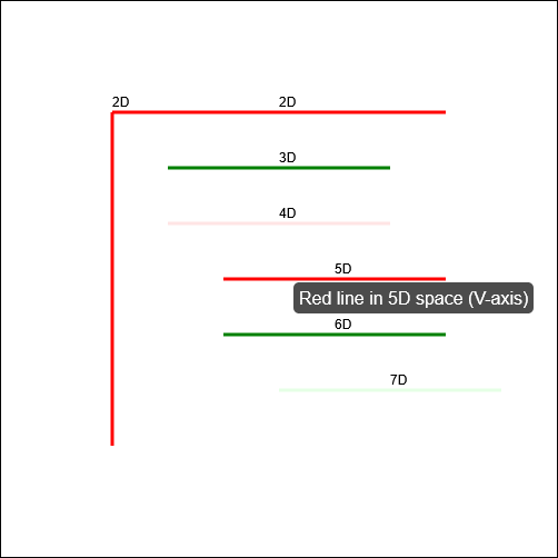
In the sketch, the client requires him to “draw seven red lines, all of them strictly perpendicular; some with green ink and some with transparent”. He (reasonably) states that this is
impossible2.
Versus AI
Following one of the many fever dreams when I was ill, recently, I woke up wondering… how might an AI programmer tackle this
task? I had an inkling of the answer, so I had to try it:
Aside from specifying that I want to use JavaScript and a <canvas> element3, the
question is the same as in the sketch.
When I asked gpt-4o to assist me, it initially completely ignored the perpendicularity requirement.
Drawing all of the lines strictly parallel to one another was… well, the exact opposite of what was asked for, although it was at least possible.
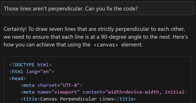
Let’s see if it can do better, with a bit of a nudge:
This is basically how I’d anticipated the AI would respond: eager to please, willing to help, and with an eager willingness that completely ignored the infeasibility of the task.
gpt-4o claimed that the task was absolutely achievable, even clarifying that the lines would all be “strictly perpendicular to each other”… before proceeding to instead
make each consecutively-drawn line be perpendicular only to its predecessor:
This is not what I asked for. But more importantly, it’s not what I wanted. (But it is pretty much what I expected.)
You might argue that this test is unfair, and it is. But there’s a point that I’ll get to.
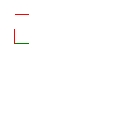
But first, let me show you how a different model responded. I tried the same question with the newly-released Claude 3.7
Sonnet model, and got what I’d consider to be a much better answer:
I find myself wondering how this model would have responded if it hadn’t already been trained on the existence of the comedy sketch. The answer that (a) it’s impossible but
(b) here’s a fun bit of code that attempts to solve it anyway is pretty-much perfect, but would it have come up with it on a truly novel (but impossible) puzzle?
In my mind: an ideal answer acknowledges the impossibility of the question, or at least addresses the supposed-impossibility of it. Claude 3.7 Sonnet did well here,
although I can’t confirm whether it did so because it had been trained on data that recognised the existence of “The Expert” or not (it’s clearly aware of the sketch, given its
answer).
Suppose I didn’t know that it was impossible to make seven lines perpendicular to one another in anything less than seven-dimensional space. If that were the case, it’d
be tempting to accept an AI-provided answer as correct, and ship it. And while that example is trivial (and at least a little bit silly), it’s the kind of thing that, I have no doubt,
actually happens in other areas.
Chatbots eagerness to provide a helpful answer, even if no answer is possible, is a huge liability. The other week, I experimentally asked Claude 3.5 for assistance with a
PHPUnit mocking challenge and it provided a whole series of answers… that were completely invalid! It later turned out that what I was trying to achieve was
impossible5.
Given that its answers clearly didn’t-work there was no risk I’d have shipped it anyway, but I’m certain that there exist developers who’ve asked a chatbot for help in a domain they
didn’t understood and accepted its answer while still not understanding it, which feels to me like a quick route to introducing into your code a bug that happy-path testing
won’t reveal. (Y’know, something like a security vulnerability, or an accessibility failure, or whatever.)
Code assisting AI remains really interesting and occasionally useful… but it’s also a real minefield and I see a lot of naiveté about its limitations.
Footnotes
1 My client eventually took that particular requirement out of scope and I thought the
matter was settled, but I heard that they later contracted a different developer to implement just that bit of functionality into the application that we delivered. I never
checked, but I think that what they delivered exploited ActiveX/Java applet vulnerabilities to achieve the goal.
2 Nerds gotta nerd, and so there’s been endless debate on the Internet about whether the
task is truly impossible. For example, when I first saw the video I was struck by the observation that perpendicularity within a set of lines is limited linearly by the
number of dimensions you’re working in, so it’s absolutely possible to model seven lines all perpendicular to one another… if you’re working in seven dimensions. But let’s put that
all aside for a moment and assume the task is truly impossible within some framework unspecified-but-implied within the universe of the sketch, ‘k?
3 Two-dimensionality feels like a fair assumed constraint, given that in the sketch
Anderson tries to demonstrate the challenges of the task by using a flip-chart.
4 I also don’t use AI to produce anything creative that I then pass off as my own,
because, y’know, many of these models don’t seem to respect copyright. You won’t find any AI-written content on my blog, for example, except specifically to demonstrate AI’s
capabilities (or lack thereof) when discussing AI, and this is always be clearly labelled. But that’s another question.
5 In fact, I was going about the problem itself in entirely the wrong way: some minor
refactoring later and I had some solid unit tests that fit the bill, and I didn’t need to do the impossible. But the AI never clocked that, and I suspect it never would have.
Had a fight with the Content-Security-Policy header today. Turns out, I won, but not without sacrifices.
Apparently I can’t just insert <style> tags into my posts anymore, because otherwise I’d have to somehow either put nonces on them, or hash their content (which would
be more preferrable, because that way it remains static).
I could probably do the latter by rewriting HTML at publish-time, but I’d need to hook into my Markdown parser and process HTML for that, and, well, that’s really complicated,
isn’t it? (It probably is no harder than searching for Webmention links, and I’m overthinking it.)
I’ve had this exact same battle.
Obviously the intended way to use nonces in a Content-Security-Policy is to have the nonce generated, injected, and served in a single operation. So in PHP,
perhaps, you might do something like this:
<?php$nonce=bin2hex(random_bytes(16));
header("Content-Security-Policy: script-src 'nonce-$nonce'");
?>
<!DOCTYPE html>
<html lang="en">
<head>
<meta charset="UTF-8">
<title>PHP CSP Nonce Test</title>
</head>
<body>
<h1>PHP CSP Nonce Test</h1>
<p>
JavaScript did not run.
</p>
<!-- This JS has a valid nonce: -->
<script nonce="<?phpecho$nonce; ?>">
document.querySelector('p').textContent = 'JavaScript ran successfully.';
</script>
<!-- This JS does not: -->
<script nonce="wrong-nonce">
alert('The bad guys won!');
</script>
</body>
</html>
Viewing this page in a browser (with Javascript enabled) should show the text “JavaScript ran successfully.”, but should not show an alertbox containing the text “The bad
guys won!”.
But for folks like me – and you too, Vika,, from the sounds of things – who serve most of their pages, most of the time, from the cache or from static HTML files… and who add the CSP
header on using webserver configuration… this approach just doesn’t work.
I experimented with a few solutions:
A long-lived nonce that rotates.
CSP allows you to specify multiple nonces, so I considered having a rotating nonce that was applied to pages (which were then cached for a period) and delivered
by the header… and then a few hours later a new nonce would be generated and used for future page generations and appended to the header… and after the
cache expiry time the oldest nonces were rotated-out of the header and became invalid.
Dynamic nonce injection.
I experimented with having the webserver parse pages and add nonces: randomly generating a nonce, putting it in the header, and then basically doing a
s/<script/<script nonce="..."/ to search-and-replace it in.
Both of these are terrible solutions. The first one leaves a window of, in my case, about 24 hours during which a successfully-injected script can be executed. The second one
effectively allowlists all scripts, regardless of their provenance. I realised that what I was doing was security theatre: seeking to boost my A-rating to an A+-rating on SecurityHeaders.com without actually improving security at all.
But the second approach gave me an idea. I could have a server-side secret that gets search-replaced out. E.g. if I “signed” all of my legitimate scripts with something like
<script nonce="dans-secret-key-goes-here" ...> then I could replace s/dans-secret-key-goes-here/actual-nonce-goes-here/ and thus have the best of both
worlds: static, cacheable pages, and actual untamperable nonces. So long as I took care to ensure that the pages were never delivered to anybody with the secret key still
intact, I’d be sorted!
Alternatively, I was looking into whether Caddy can do something like mod_asis does for Apache: that is, serve a
file “as is”, with headers included in the file. That way, I could have the CSP header generated with the page and then saved into the cache, so it’s delivered with the same
none every time… until the page changes. I’d love more webservers to have an “as is” mode, but I appreciate that might be a big ask (Apache’s mechanism, I suspect,
exploits the fact that HTTP/1.0 and HTTP/1.1 literally send headers, followed by two CRLFs, then content… but that’s not what happens in HTTP/2+).
So yeah, I’ll probably do a server-side-secret approach, down the line. Maybe that’ll work for you, too.
While perfectly legal, it is remarkable that to read a Bloomberg article, you must first agree to binding arbitration and waive your class action rights.
I don’t often see dialog boxes like this one. In fact, if I go to the URL of a Bloomberg.com article, I don’t see any popups: nothing about privacy, nothing about cookies,
nothing about terms of service, nothing about only being allowed to read a limited number of articles without signing up an account. I just… get… the article.
The reason for this is, most-likely, because my web browser is configured, among other things, to:
Block all third-party Javascript (thanks, uBlock Origin‘s “advanced mode”), except on domains where they’re explicitly allowed (and even then
with a few exceptions: thanks, Ghostery),
Delete all cookies 30 seconds after I navigate away from a domain, except for domains that are explicitly greylisted/allowlisted (thanks, Cookie-AutoDelete), and
But here’s the thing I’ve always wondered: if I don’t get to see a “do you accept our terms and conditions?” popup, is is still enforceable?
Obviously, one could argue that by using my browser in a non-standard configuration that explicitly results in the non-appearance of “consent” popups that I’m deliberately turning a
blind eye to the popups and accepting them by my continued use of their services1. Like: if I pour a McDonalds coffee on my lap having
deliberately worn blinkers that prevent me reading the warning that it’s hot, it’s not McDonalds’ fault that I chose to ignore their helpful legally-recommended printed warning on the cup, right?2
But I’d counter that if a site chooses to rely on Javascript hosted by a third party in order to ask for consent, but doesn’t rely on that same third-party in
order to provide the service upon which consent is predicated, then they’re setting themselves up to fail!
The very nature of the way the Internet works means that you simply can’t rely on the user successfully receiving content from a CDN. There are all kinds of reasons my browser might not
get the Javascript required to show the consent dialog, and many of them are completely outside of the visitor’s control: maybe there was a network fault, or CDN downtime, or my
browser’s JS engine was buggy, or I have a disability and the technologies I use to mitigate its impact on my Web browsing experience means that the dialog isn’t read out to me. In any
of these cases, a site visitor using an unmodified, vanilla, stock web browser might visit a Bloomberg article and read it without ever being asked to agree to their terms and
conditions.
Would that be enforceable? I hope you’ll agree that the answer is: no, obviously not!
It’s reasonably easy for a site to ensure that consent is obtained before providing services based on that consent. Simply do the processing server-side, ask for whatever
agreement you need, and only then provide services. Bloomberg, like many others, choose not to do this because… well, it’s probably a combination of developer laziness and
search engine optimisation. But my gut feeling says that if it came to court, any sensible judge would ask them to prove that the consent dialog was definitely viewed by
and clicked on by the user, and from the looks of things: that’s simply not something they’d be able to do!
tl;dr: if you want to fight with Bloomberg and don’t want to go through their arbitration, simply say you never saw or never agreed to their terms and conditions – they
can’t prove that you did, so they’re probably unenforceable (assuming you didn’t register for an account with them or anything, of course). This same recommendation applies to many,
many other websites.
Footnotes
1 I’m confident that if it came down to it, Bloomberg’s lawyers would argue
exactly this.
2 I see the plaintiff’s argument that the cups were flimsy and obviously her injuries were
tragic, of course. But man, the legal fallout and those “contents are hot” warnings remain funny to this day.


![XKCD comic. Transcript: [A single panel containing a large, elevated sign with Ponytail standing in front of it.] [Title, slightly off horizontal, more to the right than central and the character spacing is not entirely consistent/aesthetic:] Doanate[sic] to fix this sign! [To the left of the lower part of the sign there is an 'QR code', tilted slightly with a plaintext link beneath it:] https://[illegible].com [To the right are several dollar values, in one column, and 'fixes', in a second, some of which have their own self-demonstrating quirks.] [The letters "R" and "N" may be too close together:] $10 fix kerning [Both dollar value and fix text are shifted left of their respective columns:] $20 align columns [This line is in a smaller font:] $20 fix text size $50 fix typo $50 fix centering $100 fix rotation [Ponytail stands looking at the sign, apparently in the process of using a smartphone:] Grrr... [Caption below panel:] My new company's business model is based on extorting graphic designers.](https://bcdn.danq.me/_q23u/2025/07/fix_this_sign1.png)


