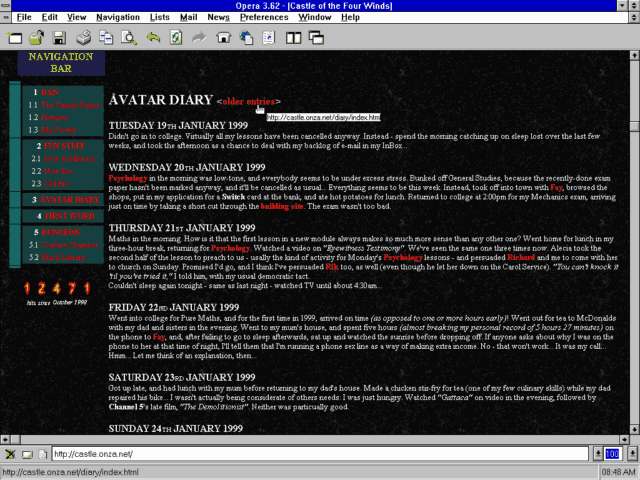
In anticipation of WWW Day on 1 August, some work colleagues and I were sharing pictures of the first (or early) websites we worked on. I was pleased to be able to pull out a screenshot of how my blog looked back in 1999!
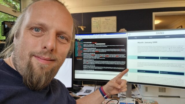
Because I’m such a digital preservationist, many of those ancient posts are still available on my blog, so I also shared a photo of me browsing the same content on my blog as it is today, side-by-side with that 25+-year-old screenshot.1
Update: This photo eventually appeared on a LinkedIn post on Automattic’s profile.
This inspired me to make a toggleable “alternate theme” for my blog: 1999 Mode.
Switch to it, and you’ll see a modern reinterpretation of my late-1990s blog theme, featuring:
- A “table-like” layout.2
- White text on a black marbled “seamless texture” background, just like you’d expect on any GeoCities page.
- Pre-rendered fire text3, including – of course – animated GIFs.4
- A (fake) hit counter.
- A stack of 88×31 micro-banners, as was all the rage at the time. (And seem to be making a comeback in IndieWeb circles…)
- Cursor trails (with thanks to Tim Holman)!
- I’ve even applied
img { image-rendering: crisp-edges; }to try to compensate for modern browsers’ capability for subpixel rendering when rescaling images: let them eat pixels!5
I’ve added 1999 Mode to my April Fools gags so, like this year, if you happen to visit my site on or around 1 April, there’s a change you’ll see it in 1999 mode anyway. What fun!
I think there’s a possible future blog post about Web design challenges of the 1990s. Things like: what it the user agent doesn’t support images? What if it supports GIFs, but not animated ones (some browsers would just show the first frame, so you’d want to choose your first frame appropriately)? How do I ensure that people see the right content if they skip my frameset? Which browser-specific features can I safely use, and where do I need a fallback6? Will this work well on all resolutions down to 640×480 (minus browser chrome)? And so on.
Any interest in that particular rabbit hole of digital history?
Footnotes
1 Some of the addresses have changed, but from Summer 2003 onwards I’ve had a solid chain of redirects in place to try to keep content available via whatever address it was at. Because Cool URIs Don’t Change. This occasionally turns out to be useful!
2 Actually, the entire theme is just a CSS change, so no tables are added. But I’ve tried to make it look like I’m using tables for layout, because that (and spacer GIFs) were all we had back in the day.
3 Obviously the title saying “Dan Q” is modern, because that wasn’t even my name back then, but this is more a reimagining of how my site would have looked if I were transported back to 1999 and made to do it all again.
4 I was slightly obsessed for a couple of years in the late 90s with flaming text on black marble backgrounds. The hit counter in my screenshot above – with numbers on fire – was one I made, not a third-party one; and because mine was the only one of my friends’ hosts that would let me run CGIs, my Perl script powered the hit counters for most of my friends’ sites too.
5 I considered, but couldn’t be bothered, implementing an SVG CSS filter: to posterize my images down to 8-bit colour, for that real
“I’m on an old graphics card” feel! If anybody’s already implemented such a thing under a license that I can use, let me know and I’ll integrate it!
6 And what about those times where using a fallback might make things worse, like
how Netscape 7 made the <blink><marquee> combination unbearable!
I love this 😄
I’ve been nerd sniped by your footnote! Here’s an SVG filter to reduce all your images to safe safe 4-bit depth. Beautiful!
Demo
(And we won’t mention how long it took me to figure out
color-interpolation-filters="sRGB", without which the colors get interpolated in a fancy linear-light colorspace that looks way too natural for 1999.)(Oops, I guess markdown doesn’t work. Maybe HTML? If this makes the comment even less legible just use the link.)
<filter id="ultrasafe" x="0" y="0" width="100%" height="100%" color-interpolation-filters="sRGB">


                    <feComponentTransfer>


                    <feFuncR type="discrete" tableValues="0 1"></feFuncR>


                    <feFuncG type="discrete" tableValues="0 1"></feFuncG>


                    <feFuncB type="discrete" tableValues="0 1"></feFuncB>


                    </feComponentTransfer>


                    </filter>
This. Is. Excellent.
I’ve integrated your filter into 1999 Mode, and I’ve blogged about doing so (along with an explanation of why many 90s Web images didn’t look quite like that… as a vehicle for talking about the importance of dithering when trying to make photographs look “natural” despite a limited colour palette).
Huge thanks!