Tidying WordPress’s HTML

Terence Eden, who’s apparently inspiring several posts this week, recently shared a way to attach a hook to WordPress’s get_the_post_thumbnail() function in order to remove the extraneous “closing mark” from the (self-closing in HTML) <img> element.

By default, WordPress outputs e.g. <img src="..." />, where <img src="..."> would suffice.

It’s an inconsequential difference for most purposes, but apparently it bugs him, so he fixed it… although he went on to observe that he hadn’t managed to successfully tackle all the instances in which WordPress was outputting redundant closing marks.

This is a problem that I’ve already solved here on my blog. My solution’s slightly hacky… but it works!

Source code for a post on DanQ.me, being searched for unnecessary HTML closing tags. No results are found.
There are many things you could say about the HTML produced to make the page you’re reading now. But “it needs fewer />s” isn’t among them.

My Solution: Runing HTMLTidy over WordPress

Tidy is an excellent tool for tiding up HTML! I used to use its predecessor back in the day for all kind of things, but it languished for a few years and struggled with support for modern HTML features. But in 2015 it made a comeback and it’s gone from strength to strength ever since.

I run it on virtually all pages produced by DanQ.me (go on, click “View Source” and see for yourself!), to:

  • Standardise the style of the HTML code and make it easier for humans to read1.
  • Bring old-style emphasis tags like <i>, in my older posts, into a more-modern interpretation, like <em>.
  • Hoist any inline <style> blocks to the <head>, and detect any repeated inline style="..."s to convert to classes.
  • Repair any invalid HTML (browsers do this for you, of course, but doing it server-side makes parsing easier for the browser, which might matter on more-lightweight hardware).

WordPress isn’t really designed to have Tidy bolted onto it, so anything it likely to be a bit of a hack, but here’s my approach:

  1. Install libtidy-dev and build the PHP bindings to it.
    Note that if you don’t do this the code might appear to work, but it won’t actually tidy anything2.
  2. Add a new output buffer to my theme’s header.php3, with a callback function: ob_start('tidy_entire_page').
    Without an corresponding ob_flush or similar, this buffer will close and the function will be called when PHP finishes generating the page.
  3. Define the function tidy_entire_page($buffer)
    Have it instantiate Tidy ($tidy = new tidy) and use $tidy->parseString (with your buffer and Tidy preferences) to tidy the code, then return $tidy.
  4. Ensure that you’re caching the results!
    You don’t want to run this every page load for anonymous users! WP Super Cache on “Expert” mode (with the requisite webserver configuration) might help.

I’ve open-sourced a demonstration that implements a child theme to TwentyTwentyOne to do this: there’s a richer set of instructions in the repo’s readme. If you want, you can run my example in Docker and see for yourself how it works before you commit to trying to integrate it into your own WordPress installation!

Footnotes

1 I miss the days when most websites were handwritten and View Source typically looked nice. It was great to learn from, too, especially in an age before we had DOM debuggers. Today: I can’t justify dropping my use of a CMS, but I can make my code readable.

2 For a few of its extensions, some PHP developer made the interesting choice to fail silently if the required extension is missing. For example: if you don’t have the zip extension enabled you can still use PHP to make ZIP files, but they won’t be compressed. This can cause a great deal of confusion for developers! A similar issue exists with tidy: if it isn’t installed, you can still call all of the methods on it… they just don’t do anything. I can see why this decision might have been made – to make the language as portable as possible in production – but I’d prefer if this were an optional feature, e.g. you had to set try_to_make_do_if_you_are_missing_an_extension=yes in your php.ini to enable it, or if it at least logged that it had done so.

3 My approach probably isn’t suitable for FSE (“block”) themes, sorry.

×

Shared Email Addresses

Email Antipatterns

There are two particular varieties of email address that I don’t often see, but I’ve been known to ridicule when I have:

  1. Geographically-based personal email addresses, e.g. OurHouseName@example.com. These always seemed to me to undermine one of the single-best things about an email address compared to postal mail – that they don’t change when you move house!1
  2. Shared/couple email addresses, e.g. MrAndMrsSmith@example.net. These make me want to scream “You know email addresses are basically free, right? You don’t have to share one!” Even back when most people got their email address directly from their dial-up provider, most ISPs offered some number of addresses (e.g. five).

If you’ve come across either of the above before, there’s… perhaps a reasonable chance that it was in the possession of somebody born before 1960 (and the older, the more-likely)2.

In Community Season 4, Episode 8 (Herstory of Dance), Pierce Hawthorne (Chevy Chase), wearing an Inspector Spacetime t-shirt, sits in a computer lab, saying "Seriously, I need to get to my email: the Post Office is about to close!"
In Pierce’s defence, “my email is on that computer” did genuinely used to be a thing, before the widespread adoption of IMAP and webmail.

You’ll never catch me doing that!

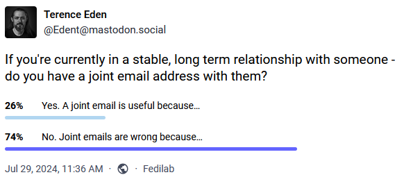
I found myself thinking about this as I clicked the “No” button on a poll by Terence Eden that asked whether I used a “shared” email address when in a stable long-term relationship.

Terence Eden (@Edent@mastodon.social) on Mastodon asks: "If you're currently in a stable, long term relationship with someone - do you have a joint email address with them?"
Of course I don’t! Why would I? Oh… wait…

It wasn’t until after I clicked “No” that I realised that, in actual fact, I have had multiple email addresses that I’ve share with significant other(s). And more than that, sometimes they’ve been geographically-based! What’s going on?

I’ve routinely had domains or subdomains that I’ve used to represent a place that I live. They’re convenient for when you want to give somebody a short web address which’ll take them to a page with directions to you and links to your location in a variety of different services and formats.

And by that point, you might as well have an email alias, e.g. all@myhouse.example.org, that forwards on email to, well, all the adults at the house. What I’ve described there is, after a fashion, a shared email address tied to a geographical location. But we don’t ever send anything from it. Nor do we use it for any kind of personal communication with anybody outside the house.

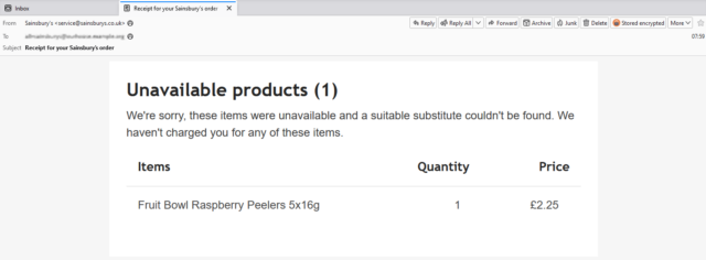
Email receipt from Sainsburys, advising that they're unable to deliver "Fruit Bowl Raspberry Peelers 5x16g".
Sainsbury’s aren’t going to bring us any Raspberry Peelers. I’m not sure who ordered them, but I’m confident that it’s the kids who’re gonna complain about it.

We don’t give out these all@ addresses (or their aliases: every company gets their own) to people willy-nilly. But they’re useful for shared services that send automated emails to us all. For example:

  • Giving a forwarding alias to the supermarket means that receipts (listing any unavailable products) g0 to all of us, and whoever’s meal plan’s been scuppered by an awkward substitution will know what’s up.
  • Using a forwarding alias with the household Netflix account means anybody can use the “send me a sign-in link” feature to connect a new device.
  • When confirming that you’ve sent money to a service provider, CC’ing one of these nice, short aliases provides a quick way to let the others know that a bill’s been paid (this one’s especially useful where, like me, you live in a 3+ adult household and otherwise you’d be having to add multiple people to the CC field).

Sure, the need for most of these solutions would evaporate instantly if more services supported multi-user or delegated access3. But outside of that fantasy world, shared aliases seem to be pretty useful!

Footnotes

1 The most ill-conceived example of geographically-based email addresses I’ve ever seen came from a a 2003 proposal by then-MP Derek Wyatt, who proposed that the domain name part of every single email address should contain not only the country of the owner (e.g. .uk) but also their complete postcode. He was under the delusion that this would somehow prevent spam. Even ignoring the immense technical challenges of his proposal and the impossibility of policing it across the borders of every country that uses email… it probably wouldn’t even be effective at his stated goal. I’ll let The Register take it from here.

2 No ageism intended: I suspect that the phenomenon actually stems from the fact that as email took off in the noughties this demographic who were significantly more-likely than younger folks to have (a) a very long-term home that they didn’t anticipate moving out of any time soon, and (b) an existing anticipation that people and companies wrote to them as a couple, not individually.

3 I’d love it if the grocery delivery sites would let multiple “accounts”, by mutual consent, share a delivery slot, destination, and payment method. It’d be cool to know that we could e.g. have a houseguest and give them temporary access to a specific order that was scheduled for during their stay. But that’s probably a lot of work for very little payoff if you’re busy running a supermarket.

× × ×

Blogging Like It’s 1999

In anticipation of WWW Day on 1 August, some work colleagues and I were sharing pictures of the first (or early) websites we worked on. I was pleased to be able to pull out a screenshot of how my blog looked back in 1999!

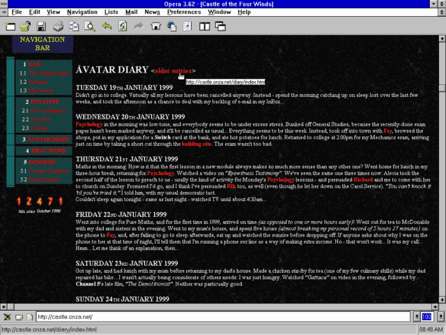
Opera 3.62 on Windows 3.11 viewing the 1999 version of Dan's blog.
Tables for layout, hit counter, web-safe colour scheme, and the need to explain what a “navigation bar” is in case they’ve not come across one before. Yup, this is 90s web design at its peak and no mistake.

Because I’m such a digital preservationist, many of those ancient posts are still available on my blog, so I also shared a photo of me browsing the same content on my blog as it is today, side-by-side with that 25+-year-old screenshot.1

Dan poses in front of circa 1999 and present-day copies of his blog, both showing posts from January 1999.
The posts are in reverse-chronological order now, rather than chronological order, but the content’s all the same (even though the design is now very different and, of course, responsive!).

Update: This photo eventually appeared on a LinkedIn post on Automattic’s profile.

This inspired me to make a toggleable “alternate theme” for my blog: 1999 Mode.

Switch to it, and you’ll see a modern reinterpretation of my late-1990s blog theme, featuring:

  • A “table-like” layout.2
  • White text on a black marbled “seamless texture” background, just like you’d expect on any GeoCities page.
  • Pre-rendered fire text3, including – of course – animated GIFs.4
  • A (fake) hit counter.
  • A stack of 88×31 micro-banners, as was all the rage at the time. (And seem to be making a comeback in IndieWeb circles…)
  • Cursor trails (with thanks to Tim Holman)!
  • I’ve even applied img { image-rendering: crisp-edges; } to try to compensate for modern browsers’ capability for subpixel rendering when rescaling images: let them eat pixels!5
This blog post, viewed using 1999 Mode.
Or if you can’t be bothered to switch to 1999 Mode, you can just look at this screenshot to get an idea of how it looks.

I’ve added 1999 Mode to my April Fools gags so, like this year, if you happen to visit my site on or around 1 April, there’s a change you’ll see it in 1999 mode anyway. What fun!

I think there’s a possible future blog post about Web design challenges of the 1990s. Things like: what it the user agent doesn’t support images? What if it supports GIFs, but not animated ones (some browsers would just show the first frame, so you’d want to choose your first frame appropriately)? How do I ensure that people see the right content if they skip my frameset? Which browser-specific features can I safely use, and where do I need a fallback6? Will this work well on all resolutions down to 640×480 (minus browser chrome)? And so on.

Any interest in that particular rabbit hole of digital history?

Footnotes

1 Some of the addresses have changed, but from Summer 2003 onwards I’ve had a solid chain of redirects in place to try to keep content available via whatever address it was at. Because Cool URIs Don’t Change. This occasionally turns out to be useful!

2 Actually, the entire theme is just a CSS change, so no tables are added. But I’ve tried to make it look like I’m using tables for layout, because that (and spacer GIFs) were all we had back in the day.

3 Obviously the title saying “Dan Q” is modern, because that wasn’t even my name back then, but this is more a reimagining of how my site would have looked if I were transported back to 1999 and made to do it all again.

4 I was slightly obsessed for a couple of years in the late 90s with flaming text on black marble backgrounds. The hit counter in my screenshot above – with numbers on fire – was one I made, not a third-party one; and because mine was the only one of my friends’ hosts that would let me run CGIs, my Perl script powered the hit counters for most of my friends’ sites too.

5 I considered, but couldn’t be bothered, implementing an SVG CSS filter: to posterize my images down to 8-bit colour, for that real “I’m on an old graphics card” feel! If anybody’s already implemented such a thing under a license that I can use, let me know and I’ll integrate it!

6 And what about those times where using a fallback might make things worse, like how Netscape 7 made the <blink><marquee> combination unbearable!

× × ×

Where Should Visual Programming Go?

This is a repost promoting content originally published elsewhere. See more things Dan's reposted.

Level 3: Diagrams are code

This is what the endgame should be IMO. Some things are better represented as text. Some are best understood visually. We should mix and match what works best on a case-by-case basis. Don’t try to visualize simple code. Don’t try to write code where a diagram is better.

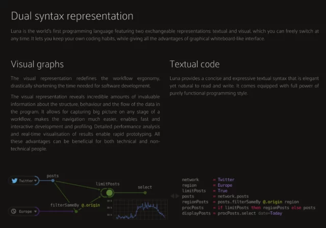
One of the attempts was Luna. They tried dual representation: everything is code and diagram at the same time, and you can switch between the two:

But this way, you are not only getting benefits of both ways, you are also constrained by both text and visual media at the same time. You can’t do stuff that’s hard to visualize (loops, recursions, abstractions) AND you can’t do stuff that’s hard to code.

Interesting thoughts from Niki (and from Sebastian Bensusan) on how diagrams and code might someday be intertwined as first class citizens (but not in the gross ways you might have come across in the past when people have tried to sell you on “visual programming”).

As Niki wrote about what he calls levels 2 and 3 of the concept – in which diagrams and code are intrinsically linked I found myself thinking about Twine, a programming language (or framework? or tool?… not sure how best to describe or define it!) intended for making interactive “choose your own adventure”-style hypertext fiction.

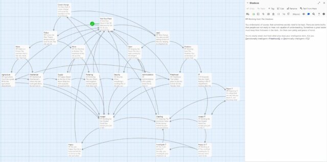
Screenshot showing the Twine 2 IDE, with a story map alongside a scene description.

Twine’s sort-of a level 2 implementation of visual programming: the code (scene descriptions) is mostly what’s responsible for feeding the diagram. But that’s not entirely true: it’s possible to create new nodes in your story graph in a completely visual way, and then dip into them to edit their contents and imply how they link to others.

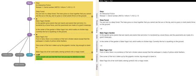
It’s possible that the IF engine community – who are working to lower the barriers to programming in order to improve accessibility to people who are fiction authors first, developers second – are ahead of the curve in the area of visual programming. Consider for example how Inform’s automated test framework graphs the permutations you (or your human testers) try, and allow you to “bless” (turn into assertions) the results so that regression testing becomes visually automated affair:

Inform 7's IDE, showing regression testing using the visual tree of the sample game Onyx.

× × ×

The Elegance of the ASCII Table

Duration

Podcast Version

This post is also available as a podcast. Listen here, download for later, or subscribe wherever you consume podcasts.

If you’ve been a programmer or programming-adjacent nerd1 for a while, you’ll have doubtless come across an ASCII table.

An ASCII table is useful. But did you know it’s also beautiful and elegant.

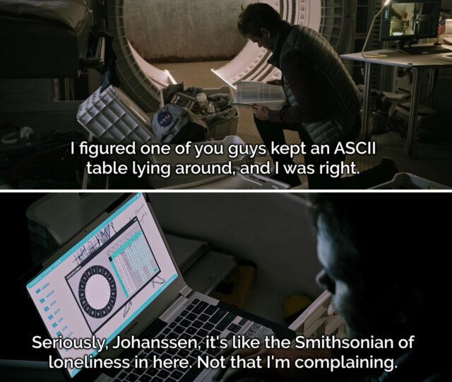
Frames from the scene in The Martian where Mark Watney discovers Beth Johanssen's ASCII table.
Even non-programmer-adjacent nerds may have a cultural awareness of ASCII thanks to books and films like The Martian2.
ASCII‘s still very-much around; even if you’re transmitting modern Unicode3 the most-popular encoding format UTF-8 is specifically-designed to be backwards-compatible with ASCII! If you decoded this page as ASCII you’d get the gist of it… so long as you ignored the garbage characters at the end of this sentence! 😁

History

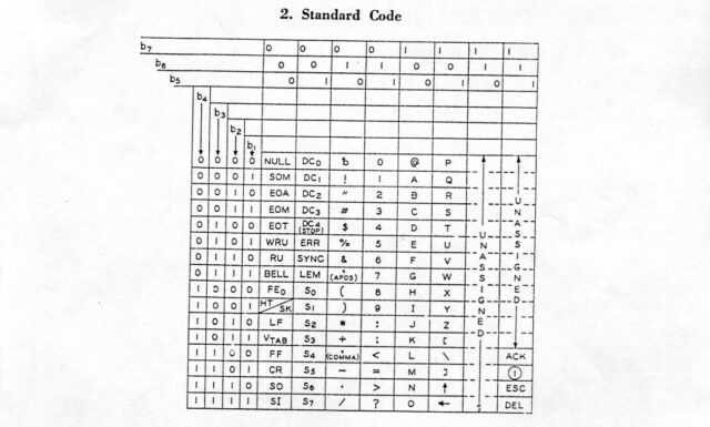
ASCII was initially standardised in X3.4-1963 (which just rolls off the tongue, doesn’t it?) which assigned meanings to 100 of the potential 128 codepoints presented by a 7-bit4 binary representation: that is, binary values 0000000 through 1111111:

Scan of a X3.4-1963 ASCII table.
Notably absent characters in this first implementation include… the entire lowercase alphabet! There’s also a few quirks that modern ASCII fans might spot, like the curious “up” and “left” arrows at the bottom of column 101____ and the ACK and ESC control codes in column 111____.

If you’ve already guessed where I’m going with this, you might be interested to look at the X3.4-1963 table and see that yes, many of the same elegant design choices I’ll be talking about later already existed back in 1963. That’s really cool!

Table

In case you’re not yet intimately familiar with it, let’s take a look at an ASCII table. I’ve colour-coded some of the bits I think are most-beautiful:

ASCII table with Decimal, Hex, and Character columns.That table only shows decimal and hexadecimal values for each character, but we’re going to need some binary too, to really appreciate some of the things that make ASCII sublime and clever.

Control codes

The first 32 “characters” (and, arguably, the final one) aren’t things that you can see, but commands sent between machines to provide additional instructions. You might be familiar with carriage return (0D) and line feed (0A) which mean “go back to the beginning of this line” and “advance to the next line”, respectively5. Many of the others don’t see widespread use any more – they were designed for very different kinds of computer systems than we routinely use today – but they’re all still there.

32 is a power of two, which means that you’d rightly expect these control codes to mathematically share a particular “pattern” in their binary representation with one another, distinct from the rest of the table. And they do! All of the control codes follow the pattern 00_____: that is, they begin with two zeroes. So when you’re reading 7-bit ASCII6, if it starts with 00, it’s a non-printing character. Otherwise it’s a printing character.

Not only does this pattern make it easy for humans to read (and, with it, makes the code less-arbitrary and more-beautiful); it also helps if you’re an ancient slow computer system comparing one bit of information at a time. In this case, you can use a decision tree to make shortcuts.

Two rolls of punched paper tape.
That there’s one exception in the control codes: DEL is the last character in the table, represented by the binary number 1111111. This is a historical throwback to paper tape, where the keyboard would punch some permutation of seven holes to represent the ones and zeros of each character. You can’t delete holes once they’ve been punched, so the only way to mark a character as invalid was to rewind the tape and punch out all the holes in that position: i.e. all 1s.

Space

The first printing character is space; it’s an invisible character, but it’s still one that has meaning to humans, so it’s not a control character (this sounds obvious today, but it was actually the source of some semantic argument when the ASCII standard was first being discussed).

Putting it numerically before any other printing character was a very carefully-considered and deliberate choice. The reason: sorting. For a computer to sort a list (of files, strings, or whatever) it’s easiest if it can do so numerically, using the same character conversion table as it uses for all other purposes7. The space character must naturally come before other characters, or else John Smith won’t appear before Johnny Five in a computer-sorted list as you’d expect him to.

Being the first printing character, space also enjoys a beautiful and memorable binary representation that a human can easily recognise: 0100000.

Numbers

The position of the Arabic numbers 0-9 is no coincidence, either. Their position means that they start with zero at the nice round binary value 0110000 (and similarly round hex value 30) and continue sequentially, giving:

Binary Hex Decimal digit (character)
011 0000 30 0
011 0001 31 1
011 0010 32 2
011 0011 33 3
011 0100 34 4
011 0101 35 5
011 0110 36 6
011 0111 37 7
011 1000 38 8
011 1001 39 9

The last four digits of the binary are a representation of the value of the decimal digit depicted. And the last digit of the hexadecimal representation is the decimal digit. That’s just brilliant!

If you’re using this post as a way to teach yourself to “read” binary-formatted ASCII in your head, the rule to take away here is: if it begins 011, treat the remainder as a binary representation of an actual number. You’ll probably be right: if the number you get is above 9, it’s probably some kind of punctuation instead.

Shifted Numbers

Subtract 0010000 from each of the numbers and you get the shifted numbers. The first one’s occupied by the space character already, which is a shame, but for the rest of them, the characters are what you get if you press the shift key and that number key at the same time.

“No it’s not!” I hear you cry. Okay, you’re probably right. I’m using a 105-key ISO/UK QWERTY keyboard and… only four of the nine digits 1-9 have their shifted variants properly represented in ASCII.

That, I’m afraid, is because ASCII was based not on modern computer keyboards but on the shifted positions of a Remington No. 2 mechanical typewriter – whose shifted layout was the closest compromise we could find as a standard at the time, I imagine. But hey, you got to learn something about typewriters today, if that’s any consolation.

A Remington Portable No. 3 typewriter.
Bonus fun fact: early mechanical typewriters omitted a number 1: it was expected that you’d use the letter I. That’s fine for printed work, but not much help for computer-readable data.

Letters

Like the numbers, the letters get a pattern. After the @-symbol at 1000000, the uppercase letters all begin 10, followed by the binary representation of their position in the alphabet. 1 = A = 1000001, 2 = B = 1000010, and so on up to 26 = Z = 1011010. If you can learn the numbers of the positions of the letters in the alphabet, and you can count in binary, you now know enough to be able to read any ASCII uppercase letter that’s been encoded as binary8.

And once you know the uppercase letters, the lowercase ones are easy too. Their position in the table means that they’re all exactly 0100000 higher than the uppercase variants; i.e. all the lowercase letters begin 11! 1 = a = 1100001, 2 = b = 1100010, and 26 = z = 1111010.

If you’re wondering why the uppercase letters come first, the answer again is sorting: also the fact that the first implementation of ASCII, which we saw above, was put together before it was certain that computer systems would need separate character codes for upper and lowercase letters (you could conceive of an alternative implementation that instead sent control codes to instruct the recipient to switch case, for example). Given the ways in which the technology is now used, I’m glad they eventually made the decision they did.

Beauty

There’s a strange and subtle charm to ASCII. Given that we all use it (or things derived from it) literally all the time in our modern lives and our everyday devices, it’s easy to think of it as just some arbitrary encoding.

But the choices made in deciding what streams of ones and zeroes would represent which characters expose a refined logic. It’s aesthetically pleasing, and littered with historical artefacts that teach us a hidden history of computing. And it’s built atop patterns that are sufficiently sophisticated to facilitate powerful processing while being coherent enough for a human to memorise, learn, and understand.

Footnotes

1 Programming-adjacent? Yeah. For example, geocachers who’ve ever had to decode a puzzle-geocache where the coordinates were presented in binary (by which I mean: a binary representation of ASCII) are “programming-adjacent nerds” for the purposes of this discussion.

2 In both the book and the film, Mark Watney divides a circle around the recovered Pathfinder lander into segments corresponding to hexadecimal digits 0 through F to allow the rotation of its camera (by operators on Earth) to transmit pairs of 4-bit words. Two 4-bit words makes an 8-bit byte that he can decode as ASCII, thereby effecting a means to re-establish communication with Earth.

3 Y’know, so that you can type all those emoji you love so much.

4 ASCII is often thought of as an 8-bit code, but it’s not: it’s 7-bit. That’s why virtually every ASCII message you see starts every octet with a zero. 8-bits is a convenient number for transmission purposes (thanks mostly to being a power of two), but early 8-bit systems would be far more-likely to use the 8th bit as a parity check, to help detect transmission errors. Of course, there’s also nothing to say you can’t just transmit a stream of 7-bit characters back to back!

5 Back when data was sent to teletype printers these two characters had a distinct different meaning, and sometimes they were so slow at returning their heads to the left-hand-side of the paper that you’d also need to send a few null bytes e.g. 0D 0A 00 00 00 00 to make sure that the print head had gotten settled into the right place before you sent more data: printers didn’t have memory buffers at this point! For compatibility with teletypes, early minicomputers followed the same carriage return plus line feed convention, even when outputting text to screens. Then to maintain backwards compatibility with those systems, the next generation of computers would also use both a carriage return and a line feed character to mean “next line”. And so, in the modern day, many computer systems (including Windows most of the time, and many Internet protocols) still continue to use the combination of a carriage return and a line feed character every time they want to say “next line”; a redundancy build for a chain of backwards-compatibility that ceased to be relevant decades ago but which remains with us forever as part of our digital heritage.

6 Got 8 binary digits in front of you? The first digit is probably zero. Drop it. Now you’ve got 7-bit ASCII. Sorted.

7 I’m hugely grateful to section 13.8 of Coded Character Sets, History and Development by Charles E. Mackenzie (1980), the entire text of which is available freely online, for helping me to understand the importance of the position of the space character within the ASCII character set. While most of what I’ve written in this blog post were things I already knew, I’d never fully grasped its significance of the space character’s location until today!

8 I’m sure you know this already, but in case you’re one of today’s lucky 10,000 to discover that the reason we call the majuscule and minuscule letters “uppercase” and “lowercase”, respectively, dates to 19th century printing, when moveable type would be stored in a box (a “type case”) corresponding to its character type. The “upper” case was where the capital letters would typically be stored.

× × × × ×

Good Food, Bad Authorisation

I was browsing (BBC) Good Food today when I noticed something I’d not seen before: a “premium” recipe, available on their “app only”:

Screenshot showing recipes, one of which is labelled "App only" and "Premium".

I clicked on the “premium” recipe and… it looked just like any other recipe. I guess it’s not actually restricted after all?

Just out of curiosity, I fired up a more-vanilla web browser and tried to visit the same page. Now I saw an overlay and modal attempting1 to restrict access to the content:

Overlay attempting to block content to the page beneath, saying "Try 1 year for just £9.99 and save 81%".

It turns out their entire effort to restrict access to their premium content… is implemented in client-side JavaScript. Even when I did see the overlay and not get access to the recipe, all I needed to do was open my browser’s debugger and run document.body.classList.remove('tp-modal-open'); for(el of document.querySelectorAll('.tp-modal, .tp-backdrop')) el.remove(); and all the restrictions were lifted.

What a complete joke.

Why didn’t I even have to write my JavaScript two-liner to get past the restriction in my primary browser? Because I’m running privacy-protector Ghostery, and one of the services Ghostery blocks by-default is one called Piano. Good Food uses Piano to segment their audience in your browser, but they haven’t backed that by any, y’know, actual security so all of their content, “premium” or not, is available to anybody.

I’m guessing that Immediate Media (who bought the BBC Good Food brand a while back and have only just gotten around to stripping “BBC” out of the name) have decided that an ad-supported model isn’t working and have decided to monetise the site a little differently2. Unfortunately, their attempt to differentiate premium from regular content was sufficiently half-hearted that I barely noticed that, too, gliding through the paywall without even noticing were it not for the fact that I wondered why there was a “premium” badge on some of their recipes.

Screenshot from OpenSourceFood.com, circa 2007.
You know what website I miss? OpenSourceFood.com. It went downhill and then died around 2016, but for a while it was excellent.

Recipes probably aren’t considered a high-value target, of course. But I can tell you from experience that sometimes companies make basically this same mistake with much more-sensitive systems. The other year, for example, I discovered (and ethically disclosed) a fault in the implementation of the login forms of a major UK mobile network that meant that two-factor authentication could be bypassed entirely from the client-side.

These kinds of security mistakes are increasingly common on the Web as we train developers to think about the front-end first (and sometimes, exclusively). We need to do better.

Footnotes

1 The fact that I could literally see the original content behind the modal was a bit of a giveaway that they’d only hidden it, not actually protected it in any way.

2 I can see why they’d think that: personally, I didn’t even know there were ads on the site until I did the experiment above: turns out I was already blocking them, too, along with any anti-ad-blocking scripts that might have been running alongside.

× × ×

Derpy McBlepsleep

Sleeping champagne-coloured French Bulldog, her tongue laying out on the cushion of her bed.

Derpy McBlepsleep, diligently guarding the front door just in case somebody comes by with treats.

×

Write Websites

This is a repost promoting content originally published elsewhere. See more things Dan's reposted.

Enbies and gentlefolk of the class of ‘24:

Write websites.

If I could offer you only one tip for the future, coding would be it. The long term benefits of coding websites remains unproved by scientists, however the rest of my advice has a basis in the joy of the indie web community’s experiences. I will dispense this advice now:

Enjoy the power and beauty of PHP; or never mind. You will not understand the power and beauty of PHP until your stack is completely jammed. But trust me, in 20 years you’ll look back at your old sites and recall in a way you can’t grasp now, how much possibility lay before you and how simple and fast they were. JS is not as blazingly fast as you imagine.

Don’t worry about the scaling; or worry, but know that premature scalability is as useful as chewing bubble gum if your project starts cosy and small. The real troubles on the web are apt to be things that never crossed your worried mind; if your project grows, scale it up on some idle Tuesday.

Code one thing every day that amuses you.

Well that’s made my day.

I can’t say I loved Baz Luhrmann’s Everybody’s Free To Wear Sunscreen. I’m not sure it’s possible for anybody who lived through it being played to death in the late 1990s; a period of history when a popular song was basically inescapable. Also, it got parodied a lot. I must’ve seen a couple of dozen different parodies of varying quality in the early 2000s.

But it’s been long enough that I was, I guess, ready for one. And I couldn’t conceive of a better topic.

Y’see: the very message of the value of personal websites is, like Sunscreen, a nostalgic one. When I try to sell people on the benefits of a personal digital garden or blog, I tend to begin by pointing out that the best time to set up your own website is… like 20+ years ago.

But… the second-best time to start a personal website is right now. With cheap and free static hosting all over the place (and more-dynamic options not much-more expensive) and domain names still as variably-priced as they ever were, the biggest impediment is the learning curve… which is also the fun part! Siloed social media is either eating its own tail or else fighting to adapt to once again be part of a more-open Web, and there’s nothing that says “I’m part of the open Web” like owning your own online identity, carving out your own space, and expressing yourself there however you damn well like.

As always, this is a drum I’ll probably beat until I die, so feel free to get in touch if you want some help getting set up on the Web.

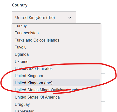
United Kingdom (the)

Remind me, do I live in “United Kingdom” or “United Kingdom (the)”? 😂

Dropdown select box for Country with options including "United Kingdom" and "United Kingdom (the)".

×

Vmail via FreshRSS

It’s time for… Dan Shares Yet Another FreshRSS XPath Scraping Recipe!

Vmail

I’m a huge fan of the XPath scraping feature of FreshRSS, my favourite feed reader (and one of the most important applications in my digital ecosystem). I’ve previously demonstrated how to use the feature to subscribe to Forward, reruns of The Far Side, and new The Far Side content, despite none of those sites having “official” feeds.

Signup form for VMail from Vole.WTF
Sure, I could have used my selfhosted OpenTrashMail server to convert email into RSS, but I figured XPath scraping would be more-elegant…

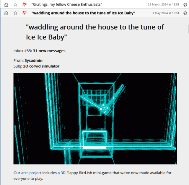
Vmail is cool. It’s vole.wtf’s (of ARCC etc. fame) community newsletter, and it’s as batshit crazy as you’d expect if you were to get the kinds of people who enjoy that site and asked them all to chip in on a newsletter.

Totes bonkers.

But email’s not how I like to consume this kind of media. So obviously, I scraped it.

Screenshot showing VMail subscription in FreshRSS
I’m not a monster: I want Vmail’s stats to be accurate. So I signed up with an unmonitored OpenTrashMail account as well. I just don’t read it (except for the confirmation link email). It actually took me a few attempts because there seems to be some kind of arbitrary maximum length validation on the signup form. But I got there in the end.

Recipe

Want to subscribe to Vmail using your own copy of FreshRSS? Here’s the settings you’re looking for –

  • Type of feed source: HTML + XPath (Web scraping)
  • XPath for finding news items: //table/tbody/tr
    It’s just a table with each row being a newsletter; simple!
  • XPath for item title: descendant::a
  • XPath for item content: .
  • XPath for item link (URL): descendant::a/@href
  • XPath for item date: descendant::td[1]
  • Custom date/time format: d M *y
    The dates are in a format that’s like 01 May ’24 – two-digit days with leading zeros, three-letter months, and a two-digit year preceded by a curly quote, separated by spaces. That curl quote screws up PHP’s date parser, so we have to give it a hint.
  • XPath for unique item ID: descendant::th
    Optional, but each issue’s got its own unique ID already anyway; we might as well use it!
  • Article CSS selector on original website: #vmail
    Optional, but recommended: this option lets you read the entire content of each newsletter without leaving FreshRSS.

So yeah, FreshRSS continues to be amazing. And lately it’s helped me keep on top of the amazing/crazy of vole.wtf too.

× ×

The Eyebrow Painter

This is a repost promoting content originally published elsewhere. See more things Dan's reposted.

There are a whole bunch of things that could be the source for the name, e.g. where we found most of their work (The Dipylon Master) or the potter with whom they worked (the Amasis Painter), a favourite theme (The Athena Painter), the Museum that ended up with the most famous thing they did (The Berlin Painter) or a notable aspect of their style. Like, say, The Eyebrow Painter.

Guess what kind of pottery the Eyebrow Painter made?

Collage of three Hellenic plates decorated with fish. The fish all have strange-looking eyebrows!

AristotelianComplacency

Just excellent.

A frowning fish, painted onto a plate, surely makes for the best funerary offering.

×

A Pressure Cooker for Tea

Duration

Podcast Version

This post is also available as a podcast. Listen here, download for later, or subscribe wherever you consume podcasts.

I’m not a tea-drinker1. But while making a cuppa for Ruth this morning, a thought occurred to me and I can’t for a moment believe that I’m the first person to think of it:

What about a pressure-cooker, but for tea?2

Hear me out.

A pressure cooker whose digital display reads 'tea'.
Modern digital pressure cookers have a lot of different settings and modes, but ‘tea’ is somehow absent?

It’s been stressed how important it is that the water used to brew the tea is 100℃, or close to it possible. That’s the boiling point of water at sea level, so you can’t really boil your kettle hotter than that or else the water runs away to pursue a new life as a cloud.

That temperature is needed to extract the flavours, apparently3. And that’s why you can’t get a good cup of tea at high altitudes, I’m told: by the time you’re 3000 metres above sea level, water boils at around 90℃ and most British people wilt at their inability to make a decent cuppa4.

It’s a question of pressure, right? Increase the pressure, and you increase the boiling point, allowing water to reach a higher temperature before it stops being a liquid and starts being a gas. Sooo… let’s invent something!

Illustration showing key components of a pressure-tea maker.

I’m thinking a container about the size of a medium-sized Thermos flask or a large keep-cup – you need thick walls to hold pressure, obviously – with a safety valve and a heating element, like a tiny version of a modern pressure cooker. The top half acts as the lid, and contains a compartment into which you put your teabag or loose leaves (optionally in an infuser). After being configured from the front panel, the water gets heated to a specified temperature – which can be above the ambient boiling point of water owing to the pressurisation – at which point the tea is released from the upper half. The temperature is maintained for a specified amount of time and then the user is notified so they can release the pressure, open the top, lift out the inner cup, remove the teabag, and enjoy their beverage.

This isn’t just about filling the niche market of “dissatisfied high-altitude tea drinkers”. Such a device would also be suitable for other folks who want a controlled tea experience. You could have it run on a timer and make you tea at a particular time, like a teasmade. You can set the temperature lower for a controlled brew of e.g. green tea at 70℃. But there’s one other question that a device like this might have the capacity to answer:

What is the ideal temperature for making black tea?

We’re told that it’s 100℃, but that’s probably an assumption based on the fact that that’s as hot as your kettle can get water to go, on account of physics. But if tea is bad when it’s brewed at 90℃ and good when it’s brewed at 100℃… maybe it’s even better when it’s brewed at 110℃!

A modern pressure cooker can easily maintain a liquid water temperature of 120℃, enabling excellent extraction of flavour into water (this is why a pressure cooker makes such excellent stock).

A mug of tea held by the handle.
It’s possible that the perfect cup of tea hasn’t been invented yet, owing to limitations in the boiling point of water.

I’m not the person to answer this question, because, as I said: I’m not a tea drinker. But surely somebody’s tried this5? It shouldn’t be too hard to retrofit a pressure cooker lid with a sealed compartment that releases, even if it’s just on a timer, to deposit some tea into some superheated water?

Because maybe, just maybe, superheated water makes better tea. And if so, there’s a possible market for my proposed device.

Footnotes

1 I probably ought to be careful confessing to that or they’ll strip my British citizenship.

2 Don’t worry, I know better than to suggest air-frying a cup of ta. What kind of nutter would do that?

3 Again, please not that I’m not a tea-drinker so I’m not really qualified to comment on the flavour of tea at all, let alone tea that’s been brewed at too-low a temperature.

4 Some high-altitude tea drinkers swear by switching from black tea to green tea, white tea, or oolong, which apparently release their aromatics at lower temperatures. But it feels like science, not compromise, ought to be the solution to this problem.

5 I can’t find the person who’s already tried this, if they exist, but maybe they’re out there somewhere?

× × ×