If you’re a web developer and you haven’t come across the Google AMP project yet… then what
stone have you been living under? But just in case you have been living under such a stone – or you’re not a web developer – I’ll fill you in. If you believe Google’s elevator
pitch, AMP is “…an open-source initiative aiming to make the web better for all… consistently fast, beautiful and high-performing across devices and distribution platforms.”
I believe that AMP is fucking poisonous and that the people who’ve come out against it by saying it’s “controversial” so far don’t go remotely
far enough. Let me tell you about why.
When you configure your website for AMP – like the BBC, The Guardian, Reddit, and Medium already have – you deliver copies of your pages written using AMP HTML and AMP JS rather than
the HTML and Javascript that you’re normally would. This provides a subset of the functionality you’re used to, but it’s quite a rich subset and gives you a lot of power with minimal
effort, whether you’re trying to make carousels, video players, social sharing features, or whatever. Then when your site is found via Google Search on a mobile device, then instead of
delivering the user to your AMP HTML page or its regular-HTML alternative… Google delivers your site for you via an ultra-fast precached copy via their own network. So far, a mixed bag, right? Wrong.
Google’s stated plan to favour pages that use AMP creates a publisher’s arms race in which
content creators are incentivised to produce content in the (open-source but) Google-controlled AMP format to rank higher in the search results, or at least regain parity, versus their
competitors. Ultimately, if everybody supported AMP then – ignoring the speed benefits for mobile users (more on that in a moment) – the only winner is Google. Google, who would then
have a walled garden of Facebook-beating proportions around the web. Once Google delivers all of your content, there’s no such thing as a free and open Internet any more.
So what about those speed increases? Yes, the mobile web is slower than we’d like and AMP improves
that. But with the exception of the precaching – which is something that could be achieved by other means – everything that AMP provides can be done using existing technologies. AMP
makes it easy for lazy developers to make their pages faster, quickly, but if speed on mobile devices is the metric for your success: let’s
just start making more mobile-friendly pages! We can make the mobile web better and still let it be our Web: we don’t need to give control of it to Google in order to shave a few milliseconds off the load time.
We need to reject AMP, and we need to reject it hard. Right now, it
might be sufficient to stand up to your boss and say “no, implementing AMP on our sites is a bad idea.” But one day, it might mean avoiding the use of AMP entirely (there’ll be browser
plugins to help you, don’t worry). And if it means putting up with a slightly-slower mobile web while web developers remain lazy, so be it: that’s a sacrifice I’m willing to make to
help keep our web free and open. And I hope you will be, too.
Like others, I’m just hoping that Sir Tim will feel the
urge to say something about this development soon.
Maybe it’s because I was at Render Conf at the end of last month or perhaps it’s because Three
Rings DevCamp – which always gets me inspired – was earlier this month, but I’ve been particularly excited lately to get the chance to play
with some of the more “cutting edge” (or at least, relatively-new) web technologies that are appearing on the horizon. It feels like the Web is having a bit of a renaissance of
development, spearheaded by the fact that it’s no longer Microsoft that are holding development back (but increasingly Apple) and, perhaps for the first time, the fact that the W3C are
churning out standards “ahead” of where the browser vendors are managing to implement technical features, rather than simply reflecting what’s already happening in the world.
Ben Foxall at Render Conf 2017 discusses the accompanying JSOxford Hackathon. Hey, who’s that near the top-right?
It seems to me that HTML5 may well be the final version of HTML. Rather than making grand new releases to the core technology, we’re now – at last! – in a position where it’s possible
to iteratively add new techniques in a resilient, progressive manner. We don’t need “HTML6” to deliver us any particular new feature, because the modern web is more-modular and
is capable of having additional features bolted on. We’re in a world where browser detection has been replaced
with feature detection, to the extent that you can even do non-hacky feature detection in pure CSS, now, and
this (thanks to the nature of the Web as a loosely-coupled, resilient platform) means that it’s genuinely possible to progressively-enhance
content and get on board with each hot new technology that comes along, if you want, while still delivering content to users on older browsers.
And that’s the dream! A web of progressive-enhancement stays true to Sir Tim’s dream of universal interoperability while still moving forward technologically. I’ve no doubt
that there’ll always be people who want to break the Web – even Google do it, sometimes – with single-page Javascript-only web apps, “app
shell” websites, mobile-only or desktop-only experiences and “apps” that really ought to have been websites (and perhaps PWAs) to begin with… but the fact that the tools to make a genuinely “progressively-enhanced” web, and those tools are
mainstream, is a big deal. If you don’t think we’re at that point yet, I invite you to watch Rachel Andrews‘ fantastic presentation,
“Start Using CSS Grid Layout Today”.
Three Rings’ developers hard at work at this year’s DevCamp.
Some of the things I’ve been playing with recently include:
Intersection Observers
Only really supported in Chrome, but there’s a great polyfill, the Intersection Observer API is one of those technologies that make you say “why didn’t we have that
already?” It’s very simple: all an Intersection Observer does is to provide event hooks for target objects entering or leaving the viewport, without resorting to polling or
hacky code on scroll event captures.
What’s it for? Well the single most-obvious use case is lazy-loading images, a-la Medium or Google
Image Search: delivering users a placeholder image or a low-resolution copy until they scroll far enough for the image to come into view (or almost into view) and then
downloading the full-resolution version and dynamically replacing it. My first foray into Intersection Observers was to take Medium’s approach and then improve it with a Service Worker in order to make it behave nicely even if the user’s Internet connection was unreliable, but
I’ve since applied it to my Reddit browser plugin MegaMegaMonitor: rather than hammering the browser with Javascript the plugin now waits
until relevant content enters the viewport before performing resource-intensive tasks.
Web Workers
I’d briefly played with Service Workers before and indeed we’re adding a Service Worker to the next
version of Three Rings, which, in conjunction with a manifest.json and the service’s
(ongoing) delivery over HTTPS (over H2, where available, since last year), technically makes it a Progressive Web App… and I’ve been
looking for opportunities to make use of Service Workers elsewhere in my work, too… but my first dive in to Web Workers was in introducing one to the next upcoming version of MegaMegaMonitor.
MegaMegaMonitor’s processor-intensive “Lists” feature sees the most benefit from Web Workers
Web Workers add true multithreading to Javascript, and in the case of MegaMegaMonitor this means the possibility of pushing the more-intensive work that the plugin has to do out of the
main thread and into the background, allowing the user to enjoy an uninterrupted browsing experience while the heavy-lifting goes on in the background. Because I don’t control the
domain on which this Web Worker runs (it’s reddit.com, of course!), I’ve also had the opportunity to play with Blobs,
which provided a convenient way for me to inject Worker code onto somebody else’s website from within a userscript. This has also lead me to the discovery that it ought to be possible
to implement userscripts that inject Service Workers onto websites, which could be used to mashup additional functionality into websites far in advance of that which is typically
possible with a userscript… more on that if I get around to implementing such a thing.
Fetch
The final of the new technologies I’ve been playing with this month is the Fetch API. I’m not pulling any punches
when I say that the Fetch API is exactly what XMLHttpRequests should have been from the very beginning. Understanding them properly has finally given me the confidence to stop
using jQuery for the one thing for which I always seemed to have had to depend on it for – that is, simplifying Ajax requests! I mean, look at
this elegant code:
Whether or not you’re a fan of Javascript, you’ve got to admit that that’s infinitely more readable than XMLHttpRequest hackery (at least, without the help of a heavyweight library like
jQuery).
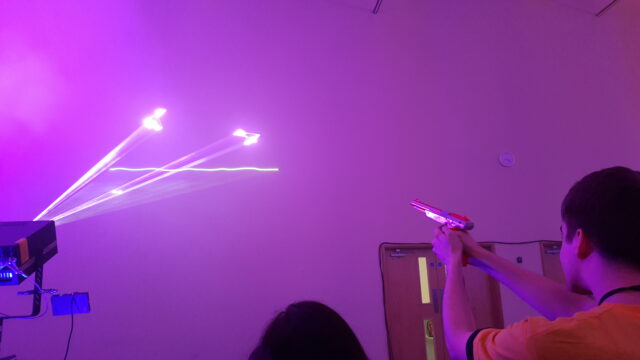
Other things I’ve been up to include Laser Duck Hunt, but that’s another story.
So that’s some of the stuff I’ve been playing with lately: Intersection Observers, Web Workers, Blobs, and the Fetch API. And I feel all full of optimism on behalf of the Web.
I have a vivid, recurring dream. I climb the stairs in my parents’ house to see my old bedroom. In the back corner, I hear a faint humming.
It’s my old computer, still running my 1990s-era bulletin board system (BBS, for short), “The Cave.” I thought I had shut it down ages ago, but it’s been chugging away this whole time
without me realizing it—people continued calling my BBS to play games, post messages, and upload files. To my astonishment, it never shut down after all…
I am the original author of GNU grep.  I am also a FreeBSD user,
although I live on -stable (and older) and rarely pay attention
to -current.

However, while searching the -current mailing list for an unrelated
reason, I stumbled across some flamage regarding BSD grep vs GNU grep
performance.  You may have noticed that discussion too...
In the beginning there was NCSA Mosaic, and Mosaic called itself NCSA_Mosaic/2.0 (Windows 3.1), and Mosaic displayed pictures along with text, and there was much rejoicing…
Have you ever wondered why every major web browser identifies itself as “Mozilla”? Wonder no longer…
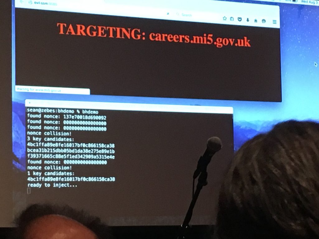
The coolest talk of this year’s Blackhat must have been the one of Sean Devlin and Hanno Böck. The talk summarized this early year’s paper, in a very cool way: Sean walked on stage
and announced that he didn’t have his slides. He then said that it didn’t matter because he had a good idea on how to retrieve them…
Here is an example scenario… You receive an email requesting a payment. It could be for rent, it could be fees for a course or any other legitimate reason. Typically, the payment is a
significant sum. The email contains the banking details you need to make the payment. Then shortly after the 1st email arrives…
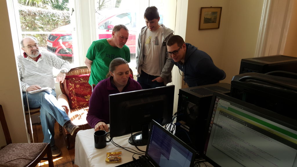
An annual tradition at Three Rings is DevCamp, an event that borrows from the “hackathon” concept and expands it to a week-long code-producing factory for the
volunteers of the Three Rings development team. Motivating volunteers is a very different game to motivating paid employees: you can’t offer to pay them more for working harder nor
threaten to stop paying them if they don’t work hard enough, so it’s necessary to tap in to whatever it is that drives them to be a volunteer, and help them get more of that out of
their volunteering.
This photo, from DevCamp 2011, is probably the only instance where I’ve had fewer monitors out than another developer.
At least part of what appeals to all of our developers is a sense of achievement – of producing something that has practical value – as well as of learning new things, applying
what they’ve learned, and having a degree of control over the parts of the project they contribute most-directly to. Incidentally, these are the same things that motivate paid
developers, too, if a Google search for studies on the subject is to believed. It’s just that employers are rarely able to willing to offer all of those things (and even if they can,
you can’t use them to pay your mortgage), so they have to put money on the table too. With my team at Three Rings, I don’t have money to give them, so I have to make up for it with a
surplus of those things that developers actually want.
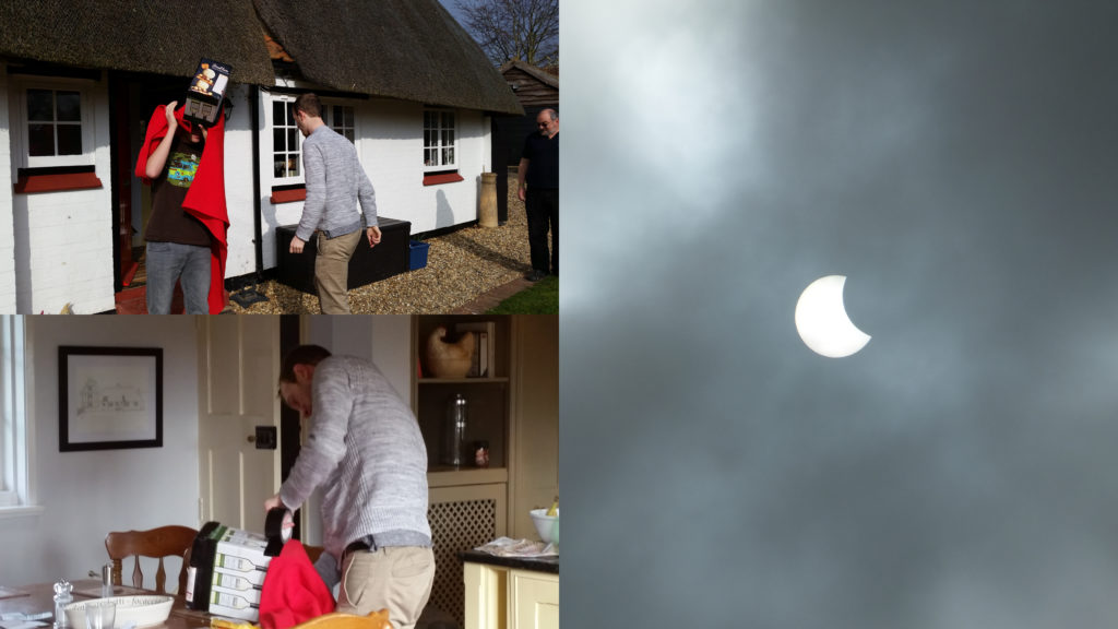
At the 2015 DevCamp, developers used the solar eclipse as an excuse for an impromptu teambuilding activity: making a camera obscura out of stuff we had lying about.
It seems strange to me in hindsight that for the last seven years I’ve spent a week of my year taking leave from my day job in order to work longer, harder, and unpaid for a
voluntary project… but that I haven’t yet blogged about it. Over the same timescale I’ve spent about twice as long at DevCamp than I have, for example, skiing, yet I’ve managed
to knock out several blog posts on that subject. Part of that might be borne out of the secretive nature of Three Rings, especially in its early days (when
involvement with Three Rings pretty-much fingered you as being a Nightline volunteer, which was frowned upon), but nowadays we’ve got a couple of
dozen volunteers with backgrounds in a variety of organisations: and many of those of us that ever were Nightliner volunteers have long since graduated and moved-on to other
volunteering work besides.
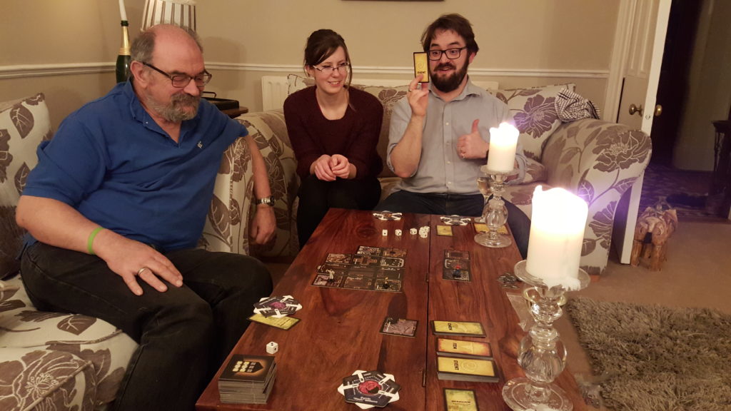
Semi-cooperative horror-themed board games by candlelight are a motivator for everybody, right?
Part of the motivation – one of the perks of being a Three Rings developer – for me at least, is DevCamp itself. Because it’s an opportunity to drop all of my “day job” stuff
for a week, go to some beatiful far-flung corner of the country, and (between early-morning geocaching/hiking expeditions and late night drinking tomfoolery) get to spend long days
contributing to something awesome. And hanging out with like-minded people while I do so. I like I good hackathon of any variety, but I love me some Three Rings DevCamp!
The geocaches near DevCamp 2016 were particularly fabulous, though. Like this one – GC4EE6C – part of an Alice In Wonderland-themed series.
So yeah: DevCamp is awesome. It’s more than a little different than those days back in 2003 when I wrote all the code and Kit worked hard
at distracting me with facts about the laws of Hawaii – for the majority of DevCamp 2016 we had half a dozen developers plus two documentation writers
in attendance! – but it’s still fundamentally about the same thing: producing a piece of software that helps about 25,000 volunteers do amazing things and make the world a better place.
We’ve collectively given tens, maybe hundreds of thousands of hours of time in developing and supporting it, but that in turn has helped to streamline the organisation of about 16
million person-hours of other volunteering.
So that’s nice.
An end-of-day “Show & Tell” session at DevCamp 2016.
Oh, and I was delighted that one of my contributions this DevCamp was that I’ve finally gotten around to expanding the functionality of the “gender” property so that there are now more
than three options. That’s almost more-exciting than the geocaches. Almost.
Edit: added a missing word in the sentence about how much time our volunteers had given, making it both more-believable and more-impressive.
This is the (long-overdue) last in a three-part blog post about telling stories using virtual reality. Read all of the
parts here.
For the first time in two decades, I’ve been playing with virtual reality. This time around, I’ve been using new and upcoming technologies like Google Cardboard and the Oculus Rift. I’m particularly interested in how these new experiences can be
used as a storytelling medium by content creators, and the lessons we’ll learn about immersive storytelling by experimenting with them.
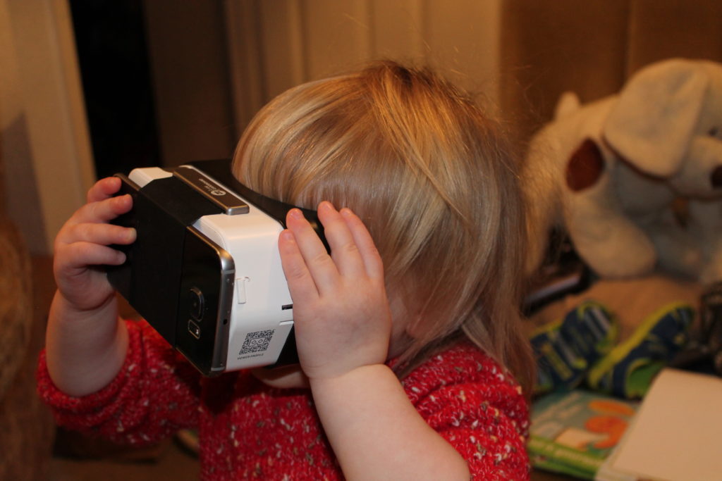
There are few user interfaces as simple as moving your own head. Even our kid – who struggles with the idea that some screens aren’t touchscreens – manages.
It seems to me that the biggest questions that VR content creators will need to start thinking about as we collectively begin to explore this new (or newly-accessible) medium are:
How do we make intuitive user interfaces?
This question mostly relates to creators making “interactive” experiences. Superficially, VR gives user experience designers a running start because there’s little that’s as intuitive
as “turning your head to look around” (and, in fact, trying the technology out on a toddler convinced me that it’s adults – who already have an anticipation of what a computer interface
ought to be – who are the only ones who’ll find this challenging). On the other hand, most interactive experiences demand more user interaction than simply looking around, and
therein lies the challenge. Using a keyboard while you’re wearing a headset is close to impossible (trust me, I’ve tried), although the augmented-reality approach of the Hololens and potentially even the front-facing webcam that’s been added to the HTC Vive PRE
might be used to mitigate this. A gamepad is workable, but it’s slightly immersion-breaking in some experiences to hold your hands in a conventional “gamer pose”, as I discovered while
playing my Gone Home hackalong: this was the major reason I switched to using a Wiimote.
All of the major VR manufacturers are working on single-handed controllers with spatial awareness and accessible buttons. Some also support haptic feedback so that you can “feel” UI
components.
So far, I’ve seen a few attempts that don’t seem to work, though. The (otherwise) excellent educational solar system exploration tool Titans of Space makes players stare at on-screen buttons for a few seconds to “press” them, which is clunky and unintuitive: in the
real world, we don’t press buttons with our eyes! I understand why they’ve done this: they’re ensuring that their software has the absolute minimum interface requirement that’s shared
between the platforms that it supports, but that’s a concern too! If content creators plan to target two or more of the competing systems that will launch this year alone, will they
have to make usability compromises?
There’s also the question of how we provide ancillary information to players: the long-established paradigms of “health in the bottom left, ammo in the bottom right” don’t work so
obviously when they’re hidden in your peripheral vision. Games like Elite Dangerous have tackled this problem from their inception
by making a virtualised “real” user interface comprised of the “screens” in the spaceship around you, but it’s an ongoing challenge for titles that target both VR and conventional
platforms in future. Wareable made some great observations about these kinds of concerns, too.
How do we tell stories without forced visual framing?
In my previous blog post, I talked about a documentary that used 360° cameras to “place” the viewer among the protesters that formed the subject of the documentary. In order to provide
some context and to reduce the disorientation experienced by “jumping” from location to location, the creator opted to insert “title slides” between scenes with text explaining what
would be seen next. But title slides necessitate that the viewer is looking in a particular direction! In the case of this documentary and several other similar projects I’ve seen, the
solution was to put the title in four places – at each of the four cardinal directions – so that no matter which way you were looking you’ll probably be able to find one. But
title slides are only a small part of the picture.
Does anybody else see photos like this and get reminded of the pictures of hooded captives at interrogation camps?
Directors producing content – whether interactive or not – for virtual reality will have to think hard about the implications of the fact that their camera (whether a physical camera or
– slightly easier and indeed more-controllable – a simulated camera in a 3D-rendered world) can look in any direction. Sets must be designed to be all-encompassing, which poses
huge challenges for the traditional methods of producing film and television programmes. Characters’ exits and entrances must be through believable portals: they can’t simply walk off
to the left and stop. And, of course, the content creator must find a way to get the audience’s attention when they need it: watching the first few minutes of Backstage with an Elite Ballerina, for example, puts you in a spacious dance studio with a spritely ballerina to follow… but
there’s nothing to stop you looking the other way (perhaps by accident), and – if you do – you might miss some of the action or find it difficult to work out where you’re
supposed to be looking. Expand that to a complex, busy scene like, say… the ballroom scene in Labyrinth… and you might find yourself feeling completely lost within a matter of minutes (of course, a feeling of being
lost might be the emotional response that the director intends, and hey – VR is great for that!).
You’re looking the wrong way. Turn around, and you’ll see the best part of the movie.
The potential for VR in some kinds of stories is immense, though. How about a murder mystery story played out in front of you in a dollhouse (showing VR content “in minature” can help
with the motion sickness some people feel if they’re “dragged” from scene to scene): you can move your head to peep in to any room and witness the conversations going on, but the murder
itself happens during a power cut or otherwise out-of-sight and the surviving characters are left to deduce the clues. In such a (non-interactive) experience the spectator has the
option to follow the action in whatever way they like, and perhaps even differently on different playthroughs, putting the focus on the rooms and characters and clues that interest them
most… which might affect whether or not they agree with the detective’s assertions at the end…
What new storytelling mechanisms can this medium provide?
As I mentioned in the previous blog post, we’ve already seen the evolution of storytelling media on several occasions, such as the jump from theatre to cinema and the opportunities that
this change eventually provided. Early screenwriters couldn’t have conceived of some of the tools used in modern films, like the use of long flowing takes for establishing shots or the
use of fragmented hand-held shots to add an excited energy to fight scenes. It wasn’t for lack of imagination (Georges
Méliès realised back in the nineteenth century that timelapse photography could be used to produce special effects not possible in theatre) but rather a lack of the
technology and more-importantly a lack of the maturity of the field. There’s an ongoing artistic process whereby storytellers find new ways to manage their medium from one another:
Romeo Must Die may have made clever use of a “zoom-to-X-ray” when a combatant’s bones were broken, but it wouldn’t
have been possible if The Matrix hadn’t shown the potential for “bullet time” the previous year. And if we’re going down
that road: have you seen the bullet time scene in Zotz!, a film
that’s older than the Wachowskis themselves?
Clearly, we’re going to discover new ways of telling stories that aren’t possible with traditional “flat screen” media nor with more-immersive traditional theatre: that’s what
makes VR as a storytelling tool so exciting.
The original use of bullet time still wasn’t entirely new, as the original bullet predates it by hundreds of years.
Of course, we don’t yet know what storytelling tools we’ll find in this medium, but some ideas I’ve been thinking about are:
Triggering empathetic responses by encouraging the audience to more-closely relate to the situation of characters by putting them more-directly “in their shoes”.
That Dragon, Cancer, an autobiographical game about the experience of a child’s terminal cancer, is an incredibly emotive
experience… but only begins to touch upon the emotional journeys possible through virtual reality: what’s it really like to be close to somebody who’s terminally ill?
Allowing spectators to spectate a story in their own way, or from a perspective that they choose and control. We’ve already begun to explore this as a concept with
the (little-used) multi-angle feature on DVDs: for example, if you’ve got the special edition of Die Hard then you can
rewatch certain scenes and flick between different cameras as you watch. But that’s nothing on the potential for future animated films to allow you to walk or fly around and watch
from any angle… or in the case of interactive experiences, to influence the direction that the story takes by your actions or even just by your presence: how about a heist story in
which the burglars will only carry out their plan if they can’t tell that you’re watching them, forcing you to be surreptitious in your glances over to
see what they’re up to?
There’s no need to build a rollercoaster at all: a good motion simulator plus a VR headset can probably provide a similar experience.
Combining VR with motion simulation: Alton Towers is leading the way here, with their announcement that they’re going to re-engineer the Air rollercoaster into Galactica, upon which the ride gives the sensation of motion while a
Samsung Gear VR headset simulates an otherwise-impossible spacefaring experience, and I’m hugely excited about
the prospect. But a more-adaptable and economical way to achieve a similar result would be to repurpose a motion simulator: the good ones can provide the sensation of g-forces on
almost any vector for an extended period of time; the really good ones can provide short bursts of g-forces at levels other than that provided by Earth’s gravity (usually by flinging
the carriage around on a programmable shuttle arm, although weightlessness is still unfeasible while you remain on the ground). If you didn’t think that 2013’s Gravity was nauseating enough when it was merely in 3D, wait until you try a similar experience in motion-assisted virtual
reality.
Point-of-view framing: this paradigm has always been at least a little unsatisfying in regular movies. I mean, it might have been the best moment in Doom, but that’s more to do with how apalling that film was than how good the technique is! But the potential for stepping
in to the viewpoint of another human and being able to look around has great potential for immersion-building without allowing the participant to stray too-far from the main
storyline. Something that people who haven’t yet experienced VR don’t often appreciate is that a few little things can really improve the experience of immersion… things like being
able to move your head, even just being a few degrees, make you feel like you’re “there”. There are some big challenges to overcome with this, of course, such as how to make the
movement of the camera not make the watcher feel ‘dragged along’, especially if their experience is of moving sideways… but these are challenges that will probably be solved for us
quickly by the porn industry, who’re working very hard on making this kind of experience seamless.
Just like the leaps and bounds we took with streaming video, yet again technology will get to thank peoples’ love of porn for advancing what home computers are capable of.
Nothing in this GIF reflects how people will genuinely watch VR porn. There’ll be a lot more lube and a lot fewer clothes, I guarantee it.
Exploring therapeutic experiences: until I really started trying out different VR gear, I didn’t think that it would be sufficiently engaging to be able to trigger a
strong enough response to be useful in a therapeutic capacity. But after the first time I came out of a 10-minute game of Caaaaardboard! feeling genuinely wobbly at the knees in the same way
as after my first parachute jump, I realised that modern VR really can produce an experience that results in a
psychosomatic response. And that’s really important, because it provides a whole new medium in which we can treat (and, I suppose, study), for example, phobias in a controlled and
‘escapable’ environment. Of course, that raises other questions too, such as: is it possible to cause disorders like PTSD with virtual reality? If it’s simply the case that optimally-made VR is more-immersive than the best possible “flat screen” experiences
and that it’s this that can improve its therapeutic potential, then surely it can be more-traumatic, too: I know enough people that were emotionally-scarred by Bambi‘s
mother’s death, E.T.‘s almost-death, or that one scene from Watership Down that gave me nightmares for years: how much more (potentially)-damaging could a VR
experience be? Whether or not it’s truly the case, it’ll only take one or two media circuses about murderous psychopaths who are unable to differentiate their virtual reality from the
real kind before people start getting asked these kind of questions.
As I’m sure I’ve given away these last three blog posts, I’m really interested in the storytelling potential of VR, and you can bet I’ll be bothering you all again with updates of the
things I get to play with later this year (and, in fact, some of the cool technologies I’ve managed to get access to just while I’ve been writing up these blog posts).
If you haven’t had a chance to play with contemporary VR, get yourself a cardboard. It’s dirt-cheap and it’s (relatively) low-tech and it’s nowhere near as awesome as “real” hardware
solutions… but it’s still a great introduction to what I’m talking about and it’s absolutely worth doing. And if you have, I’d love to hear your thoughts on storytelling using
virtual reality, too.
This is the second in a three-part blog post about telling stories using virtual reality. Read all of the parts
here.
I’m still waiting to get in on the Oculus Rift and HTC Vive magic when they’re made
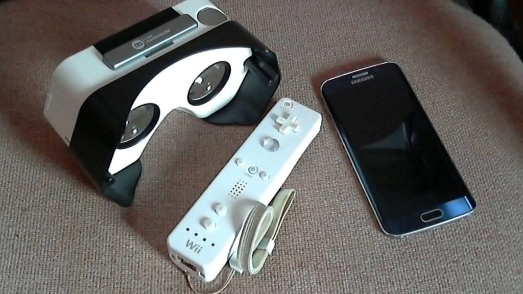
generally-available, later this year. But for the meantime, I’m enjoying quite how hackable VR technologies are. I chucked my Samsung Galaxy S6 edge into an I Am Cardboard DSCVR, paired it with a gaming PC using TrinusVR, used GlovePIE to hook up a Wii remote (playing games with a keyboard or even a gamepad is challenging if your headset doesn’t have a
headstrap, so a one-handed control is needed), and played a game of Gone Home. It’s a cheap and simple way to jump into VR
gaming, especially if – like me – you already own the electronic components: the phone, PC, and Wiimote.
My VR system is more-ghetto than yours.
While the media seems to mostly fixate on the value of VR in “action” gaming – shoot-’em-ups, flight simulators, etc. – I actually think there’s possibly greater value in it more
story-driven genres. I chose Gone Home for my experiment, above, because it’s an adventure that you play at your own pace, where the amount you get out of it as a story depends
on your level of attention to detail, not how quickly you can pull a trigger. Especially on this kind of highly-affordable VR gear, “twitchy” experiences that require rapid head turning
are particularly unsatisfying, not-least because the response time of even the fastest screens is always going to be significantly slower than that of real life. But as a storytelling
medium (especially in an affordable form) it’s got incredible potential.
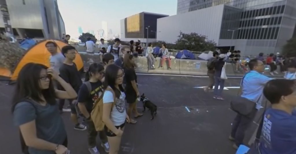
Nothing quite gives you a feel of the human scale of the Hong Kong protests like being able to look around you, as if you’re stood in the middle of them.
I was really pleased to discover that some content creators are already experimenting with the storytelling potential of immersive VR experiences. An example would be the video
Hong Kong Unrest – a 360° Virtual Reality Documentary, freely-available on YouTube. Standing his camera (presumably a
Jump camera rig, or something similar) amongst the crowds of the 2014 Hong Kong protests, the creator of this documentary gives us a great opportunity to feel as though we’re standing
right there with the protesters. The sense of immersion of being “with” the protesters is, in itself, a storytelling statement that shows the filmmaker’s bias: you’re encouraged to
empathise with the disenfranchised Hong Kong voters, to feel like you’re not only with them in a virtual sense, but emotionally with them in support of their situation. I’m afraid that
watching the click-and-drag version of the video doesn’t do it justice: strap a Cardboard to your head to get the full experience.
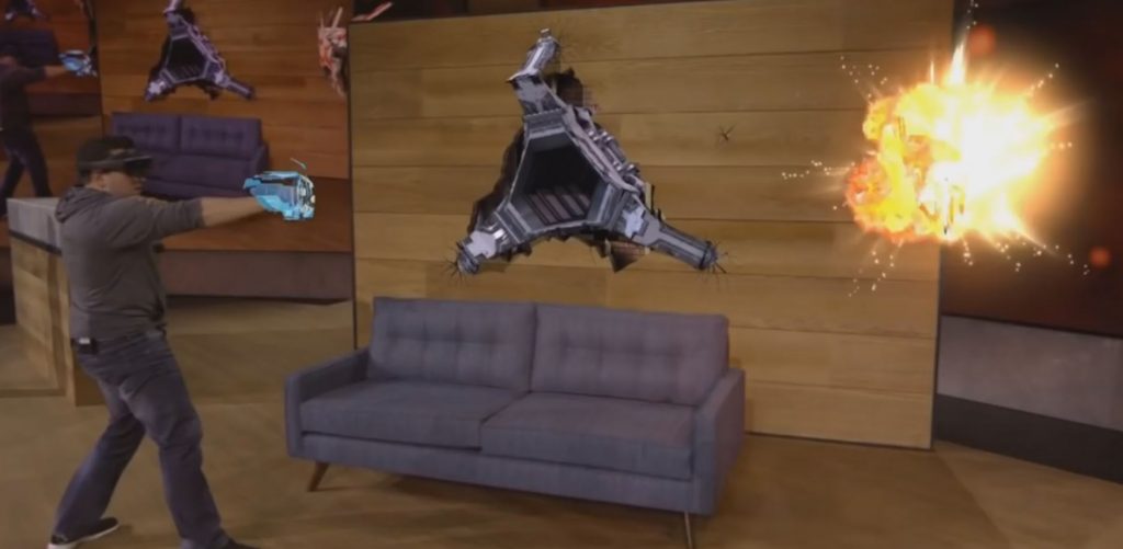
Don’t go thinking that I’m not paying attention to the development of the Hololens, too: I am, because it looks amazing. I just don’t know… what it’s for. And, I suspect, neither does
Microsoft.
But aside from the opportunities it presents, Virtual Reality brings huge new challenges for content creators, too. Consider that iconic spaghetti western The Good, The Bad, And The Ugly. The opening scene drops us right into one of the artistic themes of the film –
the balance of wide and close-up shots – when it initially shows us a wide open expanse but then quickly fills the frame with the face of Tuco (“The Ugly”), giving us the experience of
feeling suddenly cornered and trapped by this dangerous man. That’s a hugely valuable shot (and a director’s wet dream), but it represents something that we simply don’t have a way of
translating into an immersive VR setting! Aside from the obvious fact that the viewer could simply turn their head and ruin the surprise of the shot, it’s just not possible to fill the
frame with the actor’s face in this kind of way without forcing the focal depth to shift uncomfortably.
Sergio Leone’s masterpiece makes strategic use of alternating close and wide shots (and shots like the opening, which initially feels open but rapidly becomes claustrophobic).
That’s not to say that there exist stories that we can’t tell using virtual reality… just that we’re only just beginning to find out feet with this new medium. When stage directors took
their first steps into filmography in the early years of the 20th century, they originally tried to shoot films “as if” they were theatre (albeit, initially, silent theatre): static
cameras shooting an entire production from a single angle. Later, they discovered ways in which this new medium could provide new ways to tell stories: using title cards to set the
scene, close-ups to show actors’ faces more-clearly, panning shots, and so on.
Similarly: so long as we treat the current generation of VR as something different from the faltering steps we took two and a half decades ago, we’re in frontier territory and feeling
our way in VR, too. Do you remember when smartphone gaming first became a thing and nobody knew how to make proper user interfaces for it? Often your tiny mobile screen would simply try
to emulate classic controllers, with a “d-pad” and “buttons” in the corners of the screen, and it was awful… but nowadays, we better-understand the relationship that people have with
their phones and have adapted accordingly (perhaps the ultimate example of this, in my opinion, is the addictive One More Line, a minimalist game with a single-action “press anywhere” interface).
A few seconds after this photograph was taken, a T-rex came bounding out from the treeline and I literally jumped.
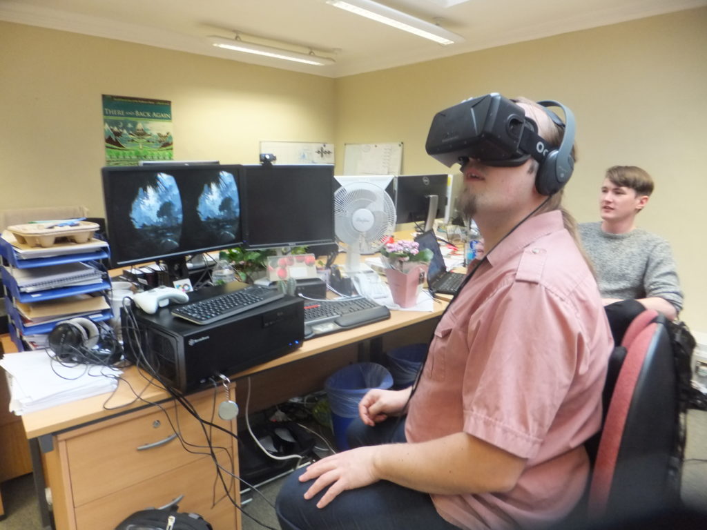
I borrowed an Oculus Rift DK2 from a co-worker’s partner (have I mentioned lately that I have the most awesome co-workers?) to get a little experience with it, and it’s honestly one of
the coolest bits of technology I’ve ever had the priviledge of playing with: the graphics, comfort, and responsiveness blows Cardboard out of the water. One of my first adventures –
Crytek’s tech demo Back to Dinosaur Island – was a visual spectacle even despite my apparently-underpowered
computer (I’d hooked the kit up to Gina, my two-month old 4K-capable media centre/gaming PC: I suspect that Cosmo, my multi-GPU watercooled beast might have fared
better). But I’ll have more to say about that – and the lessons I’ve learned – in the final part of this blog post.
This is the first in a three-part blog post about telling stories using virtual reality. Read all of the parts
here.
As part of my work at the Bodleian… but to a greater extent “just for fun”… I’ve spent the last few weeks playing with virtual reality. But
first, a history lesson.
Virtual Reality’s biggest failing is that it’s sheer coolness is equally offset by what an idiot you look like when you’re using it.
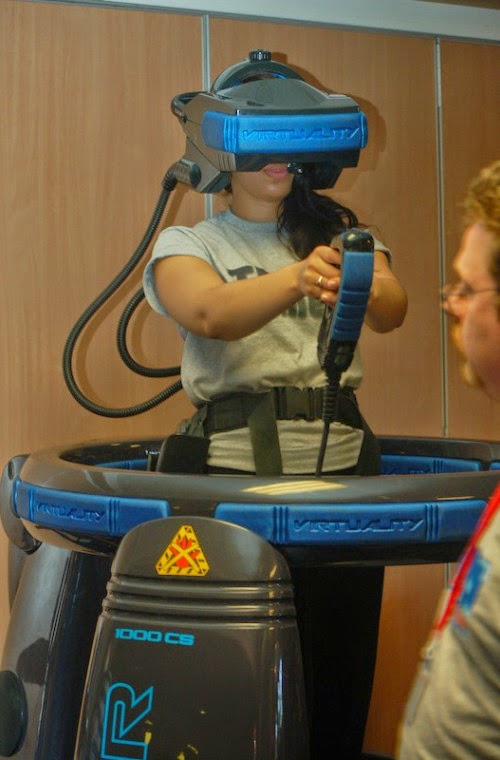
This isn’t the first time I’ve used virtual reality. The first time, for me, was in the early 1990s, at the Future Entertainment
Show, where I queued for a shot at Grid Busters on a Virtuality 1000-CS. The Virtuality 1000 was powered by an
“Expality”: functionally an Amiga 3000 with specially-written software for reading the (electromagnetically-sensed) facing of the
headset and the accompanying “space joystick”… and providing output via a pair of graphics cards (one for each eye) to LCD screens. The screens were embedded in chunky bits on the sides
of the helmet and projected towards mirrors and lenses at the far end – this apparently being an effort to reduce how “front-heavy” it felt, but I can tell you that in practice a
Virtuality headset felt weighty on your neck, even for its era!
Nonetheless, the experience stuck with me: I returned to school and became the envy of my friends (the nerdy ones, at least) when I told them about my VR adventure, and – not least
thanks to programs like Tomorrow’s World and, of course, the episode of Bad Influence that reminded
me quite how badly I wanted to get myself down to Nottingham for a go at Legend Quest – I was genuinely filled with optimism that within the decade, playing a VR game would
have gone from the fringes of science fiction to being something where everybody-knew-somebody who did it routinely.
A modern computer and VR headset combined probably weighs less than this reconditioned Virtuality 1000 headset.
I never managed to get to play Legend Quest, and that first “VR revolution” swiftly fell flat. My generation was promised all of the hi-tech science, immersion, and magical
experience of The Lawnmower Man, but all we were left with was the overblown promises, expensive effects, and ill-considered user experience of, well… The Lawnmower
Man. I discovered Virtuality machines in arcades once or twice, but they seemed to be out-of-order more often than not, and they quickly disappeared. You can’t really blame the
owners of arcades: if a machine costs you in the region of £40,000 to buy and you can charge, say, £1 for a 3-minute go on it (bear in mind that even the most-expensive digital arcade
machines tended to charge only around 30p, at this time, and most were 10p or 20p), and it needs supervision, and it can’t be maintained by your regular guy… well, that swiftly begins
to feel like a bad investment.
The Lawnmower Man has a lot to answer for.
Plus, the fifth generation of games consoles came along: the (original) Sony PlayStation, the
Nintendo N64, and – if you really wanted the highest-technology system (with the absolute least imaginative developers) – the Sega Saturn. These consoles came at price points that made
them suitable Christmas gifts for the good boys and girls of middle-class parents and sported 3D polygon graphics of the type that had previously only been seen in arcades, and the slow
decline of the video arcade accelerated dramatically. But home buyers couldn’t afford five-figure (still moderately-experimental) VR systems, and the market for VR dried up in a matter
of years. Nowadays, if you want to play on a Virtuality machine like the one I did, you need to find a collector (you might start with this guy from
Leicester, whose website was so useful in jogging my memory while I wrote this blog post).
And Jesus wept, for there were no more VR machines anywhere for, like, two decades.
2016 is the year in which this might change. The need for ubiquitous cheap computing has made RAM and even processors so economical that we throw them away when we’re done with
them. The demands of modern gaming computers and consoles has given us fast but affordable graphics rendering hardware. And the battle for the hottest new smartphones each year has
helped to produce light, bright, high-resolution screens no bigger than the palm of your hand.
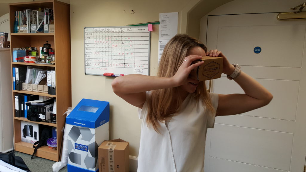
In fact, smartphones are now the simplest and cheapest way to play with VR. Under the assumption that you’ve already got a smartphone, you’re only a couple of cheap
plastic lenses and a bit of cardboard away from doing it for yourself. So that’s how my team and I started out playing: with the wonderfully-named Google Cardboard. I know that Google Cardboard is old-hat now and all the early adopters have even got their grandmothers using it now, but
it’s still a beautiful example of how economical VR threatens to become if this second “VR revolution” takes hold. Even if you didn’t already own a compatible
smartphone, you could buy a second-hand one on eBay for as little as £30: that’s an enormous difference from the £40K Virtuality machines of my youth, which had only a fraction of the
power.
An original-style Google Cardboard makes you look as much of a fool as any VR headset does. But more-specifically like a fool with a box on their head.
I’m going somewhere with this, I promise: but I wanted to have a jumping-off point from which to talk about virtual reality more-broadly first and it felt like I’d be overstretching if
I jumped right in at the middle. Y’know, like the second act of The Lawnmower Man. In the next part of this series, I’d like to talk about the storytelling opportunities that
modern VR offers us, and some of the challenges that come with it, and share my experience of playing with some “proper” modern hardware – an Oculus Rift.
As you’re no-doubt aware, Home Secretary Theresa May is probably going to get her way with her “snooper’s
charter” by capitalising on events in Paris (even though that makes no sense), and before long, people working for
law enforcement will be able to read your Internet usage history without so much as a warrant (or, to put it as the UN’s privacy chief put it, it’s “worse than scary”).
Or as John Oliver put it, “This bill could write into law a huge invasion of privacy.” Click to see a clip.
In a revelation that we should be thankful of as much as we’re terrified by, our government does not understand how the Internet works. And that’s why it’s really easy for
somebody with only a modicum of geekery to almost-completely hide their online activities from observation by their government and simultaneously from hackers. Here’s a device that I
built the other weekend, and below I’ll tell you how to do it yourself (and how it keeps you safe online from a variety of threats, as well as potentially giving you certain other
advantages online):
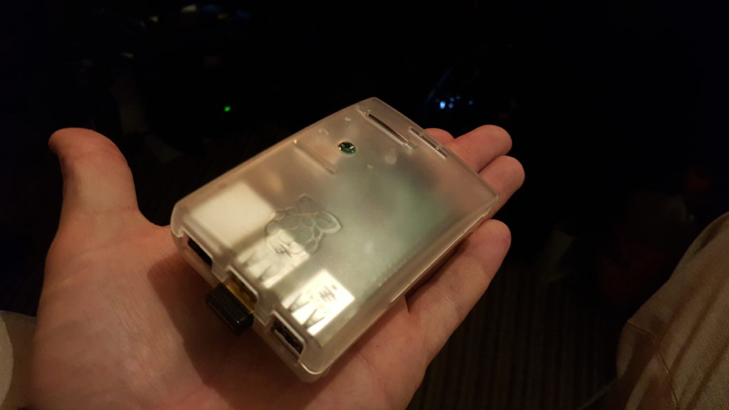
It’s small, it’s cute, and it goes a long way to protecting my privacy online.
I call it “Iceland”, for reasons that will become clear later. But a more-descriptive name would be a “Raspberry Pi VPN Hotspot”. Here’s what you’ll need if you want to build one:
A Raspberry Pi Model B (or later) – you can get these from less than £30 online and it’ll come with an SD card that’ll let it boot Raspbian, which is the Linux
distribution I’ve used in my example: there’s no reason you couldn’t use another one if you’re familiar with it
A USB WiFi dongle that supports “access point” mode – I’m using an Edimax one that cost me under a fiver – but it took a little hacking to make it work – I’ve heard
that Panda and RALink dongles are easier
A subscription to a VPN with OpenVPN support and at least one endpoint outside of the UK – I’m using VyprVPN because
I have a special offer, but there are lots of cheaper options: here’s a great article about
choosing one
A basic familiarity with a *nix command line, an elementary understanding of IP networking, and a spare 20 minutes.
From here on, this post gets pretty geeky. Unless you plan on building your own little box to encrypt all of your home’s WiFi traffic until it’s well out of the UK and
close-to-impossible to link to you personally (which you should!), then you probably ought to come back to it another time.
Here’s how it’s done:
1. Plug in, boot, and install some prerequisites
Plug the WiFi dongle into a USB port and connect the Ethernet port to your Internet router. Boot your Raspberry Pi into Raspbian (as described in the helpsheet that comes with
it), and run:
If, like me, you’re using an Edimax dongle, you need to do an extra couple of steps to make it work as an access point. Skip this bit if you’re using one of the other dongles I listed
or if you know better.
Get OpenVPN configuration files from your VPN provider: often these will be available under the iOS downloads. There’ll probably be one for each available endpoint. I chose the one for
Reyjkavik, because Iceland’s got moderately sensible privacy laws and I’m pretty confident that it would take judicial oversight for British law enforcement to collaborate with
Icelandic authorities on getting a wiretap in place, which is the kind of level of privacy I’m happy with. Copy your file to /etc/openvpn/openvpn.conf and edit it: you may find that you
need to put your VPN username and password into it to make it work.
sudo service openvpn start
You can now test your VPN’s working, if you like. I suggest connecting to the awesome icanhazip.com and asking it where you are (you can use your
favourite GeoIP website to tell you what country it thinks you’re in, based on that):
curl -4 icanhazip.com
Another option would be to check with a GeoIP service directly:
curl freegeoip.net/json/
4. Set up your firewall and restart the VPN connection
Unless your VPN provider gives you DNAT (and even if they do, if you’re paranoid), you should set up a firewall to allow only outgoing connections to be established, and then restart
your VPN connection:
sudo iptables -A INPUT -i tun0 -m conntrack --ctstate RELATED,ESTABLISHED -j ACCEPT
sudo iptables -A INPUT -i tun0 -j DROP
sudo sh -c "iptables-save > /etc/iptables.nat.vpn.secure"
sudo sh -c "echo 'up iptables-restore < /etc/iptables.nat.vpn.secure' >> /etc/network/interfaces"
sudo service openvpn restart
5. Configure your WiFi hotspot
Configure bind as your DNS server, caching responses on behalf of Google’s DNS servers, or another DNS server that you trust. Alternatively, you can just configure your DHCP clients to
use Google’s DNS servers directly, but caching will probably improve your performance overall. To do this, add a forwarder to /etc/bind/named.conf.options:
forwarders {
  8.8.8.8;
  8.8.4.4;
};
Restart bind, and make sure it loads on boot:
sudo service bind9 restart
sudo update-rc.d bind9 enable
Edit /etc/udhcpd.conf. As a minimum, you should have a configuration along these lines (you might need to tweak your IP address assignments to fit with your local network – the “router”
and “dns” settings should be set to the IP address you’ll give to your Raspberry Pi):
start 192.168.0.2
end 192.168.0.254
interface wlan0
remaining yes
opt dns 192.168.0.1
option subnet 255.255.255.0
opt router 192.168.0.1
option lease 864000 # 10 days
Enable DHCP by uncommenting (remove the hash!) the following line in /etc/default/udhcpd:
#DHCPD_ENABLED="yes"
Set a static IP address on your Raspberry Pi in the same subnet as you configured above (but not between the start and end of the DHCP list):
sudo ifconfig wlan0 192.168.0.1
And edit your /etc/network/interfaces file to configure it to retain this on reboot (you’ll need to use tabs, not spaces, for indentation):
Right – onto hostapd, the fiddliest of the tools you’ll have to configure. Create or edit /etc/hostapd/hostapd.conf as follows, but substitute in your own SSID, hotspot password, and
channel (to minimise interference, which can slow your network down, I recommend using WiFi scanner tool on your mobile to find which channels your neighbours aren’t using, and
use one of those – you should probably avoid the channel your normal WiFi uses, too, so you don’t slow your own connection down with crosstalk):
Hook up this configuration by editing /etc/default/hostapd:
DAEMON_CONF="/etc/hostapd/hostapd.conf"
Fire up the hotspot, and make sure it runs on reboot:
sudo service hostapd start
sudo service udhcpd start
sudo update-rc.d hostapd enable
sudo update-rc.d udhcpd enable
Finally, set up NAT so that people connecting to your new hotspot are fowarded through the IP tunnel of your VPN connection:
sudo sh -c "echo 1 > /proc/sys/net/ipv4/ip_forward"
sudo sh -c "echo net.ipv4.ip_forward=1 >> /etc/sysctl.conf"
sudo iptables -t nat -A POSTROUTING -o tun0 -j MASQUERADE
sudo sh -c "iptables-save > /etc/iptables.nat.vpn.secure"
6. Give it a go!
Connect to your new WiFi hotspot, and go to your favourite GeoIP service. Or, if your VPN endpoint gives you access to geographically-limited services, give those a go (you’d be amazed
how different the Netflix catalogues are in different parts of the world). And give me a shout if you need any help or if you have any clever ideas about how this magic little box can
be improved.
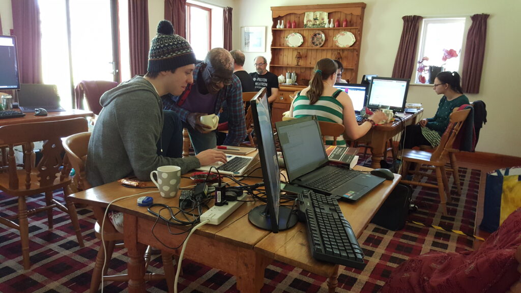
Last month I got the opportunity to attend the EEBO-TCP Hackfest,
hosted in the (then still very-much under construction) Weston Library at my workplace. I’ve
done a couple of hackathons and similar get-togethers before, but this one was somewhat different in that it was unmistakably geared towards a different kind of geek than the
technology-minded folks that I usually see at these things. People like me, with a computer science background, were remarkably in the minority.
Me in the Weston Library (still under construction, as evidenced by the scaffolding in the background).
Instead, this particular hack event attracted a great number of folks from the humanities end of the spectrum. Which is understandable, given its theme: the Early English Books Online
Text Creation Partnership (EEBO-TCP) is an effort to digitise and make available in marked-up, machine-readable text formats a huge corpus of English-language books printed between 1475
and 1700. So: a little over three centuries of work including both household names (like Shakespeare, Galileo, Chaucer, Newton, Locke, and Hobbes) and an enormous number of others that
you’ll never have heard of.
After an introduction to the concept and the material, attendees engaged in a speed-networking event to share their thoughts prior to pitching their ideas.
The hackday event was scheduled to coincide with and celebrate the release of the first 25,000 texts into the public domain, and attendees were challenged to come up with ways to use
the newly-available data in any way they liked. As is common with any kind of hackathon, many of the attendees had come with their own ideas half-baked already, but as for me: I had no
idea what I’d end up doing! I’m not particularly familiar with the books of the 15th through 17th centuries and I’d never looked at the way in which the digitised texts had been
encoded. In short: I knew nothing.
The ideas pitch session quickly showed some overlap between different project ideas, and teams were split and reformed a few times as people found the best places for themselves.
Instead, I’d thought: there’ll be people here who need a geek. A major part of a lot of the freelance work I end up doing (and a lesser part of my work at the Bodleian, from
time to time) involves manipulating and mining data from disparate sources, and it seemed to me that these kinds of skills would be useful for a variety of different conceivable
projects.
XML may have been our interchange format, but everything fell into Excel in the end for speedy management even by less-technical team members.
I paired up with a chap called Stephen Gregg, a lecturer in 18th century literature from Bath Spa University. His idea
was to use this newly-open data to explore the frequency (and the change in frequency over the centuries) of particular structural features in early printed fiction: features like
chapters, illustrations, dedications, notes to the reader, encomia, and so on). This proved to be a perfect task for us to pair-up on, because he had the domain knowledge to ask
meaningful questions, and I had the the technical knowledge to write software that could extract the answers from the data. We shared our table with another pair, who had
technically-similar goals – looking at the change in the use of features like lists and tables (spoiler: lists were going out of fashion, tables were coming in, during the 17th century)
in alchemical textbooks – and ultimately I was able to pass on the software tools I’d written to them to adapt for their purposes, too.
A quick meeting on the relative importance of ‘chapters’ as a concept in 16th century literature. Half of the words that the academics are saying go over my head, but I’m formulating
XPath queries in my head while I wait.
And here’s where I made a discovery: the folks I was working with (and presumably academics of the humanities in general) have no idea quite how powerful data mining tools could be in
giving them new opportunities for research and analysis. Within two hours we were getting real results from our queries and were making amendments and refinements in our questions and
trying again. Within a further two hours we’d exhausted our original questions and, while the others were writing-up their findings in an attractive way, I was beginning to look at how
the structural differences between fiction and non-fiction might be usable as a training data set for an artificial intelligence that could learn to differentiate between the two,
providing yet more value from the dataset. And all the while, my teammates – who’d been used to looking at a single book at a time – were amazed by the possibilities we’d uncovered for
training computers to do simple tasks while reading thousands at once.
The area around Old St. Paul’s Cathedral was the place to be if you were a 16th century hipster looking for a new book.
Elsewhere at the hackathon, one group was trying to simulate the view of the shelves of booksellers around the old St. Paul’s Cathedral, another looked at the change in the popularity
of colour and fashion-related words over the period (especially challenging towards the beginning of the timeline, where spelling of colours was less-standardised than towards the end),
and a third came up with ways to make old playscripts accessible to modern performers.
Aside from an increase in the relative frequency of the use of colour words to describe yellow things, there’s not much to say about this graph.
At the end of the session we presented our findings – by which I mean, Stephen explained what they meant – and talked about the technology and its potential future impact – by which I
mean, I said what we’d like to allow others to do with it, if they’re so-inclined. And I explained how I’d come to learn over the course of the day what the word encomium meant.
Presenting our findings in amazing technicolour Excel.
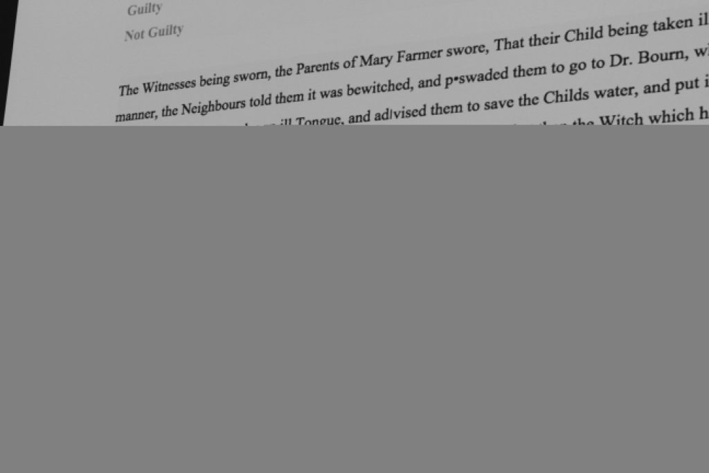
My personal favourite contribution from the event was by Sarah Cole, who adapted the text of a story about a witch
trial into a piece of interactive fiction, powered by Twine/Twee, and then
allowed us as an audience to collectively “play” her game. I love the idea of making old artefacts more-accessible to modern audiences through new media, and this was a fun and
innovative way to achieve this. You can even play her game
online!
(by the way: for those of you who enjoy my IF recommendations: have a
look at Detritus; it’s a delightful little experimental/experiential game)
Things are about to go very badly for Joan Buts.
But while that was clearly my favourite, the judges were far more impressed by the work of my teammate and I, as well as the team who’d adapted my software and used it to investigate
different features of the corpus, and decided to divide the cash price between the four of us. Which was especially awesome, because I hadn’t even realised that there was a
prize to be had, and I made the most of it at the Drinking About Museums event
I attended later in the day.
Cold hard cash! This’ll be useful at the bar, later!
If there’s a moral to take from all of this, it’s that you shouldn’t let your background limit your involvement in “hackathon”-like events. This event was geared towards literature,
history, linguistics, and the study of the book… but clearly there was value in me – a computer geek, first and foremost – being there. Similarly, a hack event I attended last year, while clearly tech-focussed, wouldn’t have
been as good as it was were it not for the diversity of the attendees, who included a good number of artists and entrepreneurs as well as the obligatory hackers.
“Nice work, Stephen.” “Nice work, Dan.”
But for me, I think the greatest lesson is that humanities researchers can benefit from thinking a little bit like computer scientists, once in a while. The code I wrote (which uses Ruby and Nokogiri) is freely
available for use and adaptation, and while I’ve no idea whether or not it’ll ever be useful to anybody again, what it represents is the research benefits of
inter-disciplinary collaboration. It pleases me to see things like the “Library Carpentry” (software for research, with a library slant) seeming to take off.


![GIF showing a variety people watching VR porn. [SFW]](https://media.giphy.com/media/l41lQODMertvSTIjK/giphy.gif)