The <geolocation> element provides a button that, when activated, prompts the user for permission to access their location. Originally, it was designed as a
general <permission> element, but browser vendors indicated that implementing a “one-size-fits-all” element would be too complex. The result was a single-purpose
element, probably the first of several.
<geolocation><strong>Your browser doesn't support <geolocation>. Try Chrome 144+</strong></geolocation>
…
I’ve been waiting for this one. Given that “requesting permission to access a user’s location” has always required user intervention, at least to begin with, it makes
sense to me that it would exist as a form control, rather than just as a JavaScript API.
Implementing directly in HTML means that it degrades gracefully in the standard “if you don’t understand an element, simply render its contents” way that the Web always has. And
it’s really easy to polyfill support in for the new element so you can start using
it today.
My only niggle with <geolocation> is that it still requires JavaScript. It feels like a trick’s been missed, there. What I’d have really wanted would
have been <input type="geolocation">. This would e.g. renders as a button but when clicked (and permission granted) gets the user’s device location and fills the
field (presumably with a JSON object including any provided values, such as latitude, longitude, altitude, accuracy, provider, and so on). Such an element would still provide
all the same functionality of the new element, but would also be usable in a zero-JS environment, just like <input type="file">, <input
type="datetime-local"> and friends.
This is still a huge leap forward and I look forward to its more-widespread adoption. And meanwhile, I’ll be looking into integrating it into both existing applications that use it
and using it in future applications, by preference over the old API-driven approach. I’m grateful to Manuel for sharing what he’s learned!
Modern CSS is freakin’ amazing. Widespread support for nesting, variables, :has, and :not has unlocked so much potential. But I don’t yet see it used widely
enough.
Suppose I have a form where I’m expecting, but not requiring, a user to choose an option from each of several drop-downs. I want to make it more visually-obvious
which drop-downs haven’t yet had an option selected. Something like this:
It’s a slightly gnarly selector, but thanks to nesting you could choose to break it into multiple blocks if you preferred.
What that’s saying is:
a <select>
that contains an <option>
where that <option> does not have a value="..."
and that <option> is currently selected
gains a dotted red outline around it
Or in short: if the default option is selected, highlight it so the user knows they haven’t chosen a value yet. Sweet!
Obviously you could expand this to have different effects for every value, if you wanted.
I can’t understate how valuable it is that we can do this in CSS, nowadays. Compared to doing it in JavaScript… CSS gives better performance and reliability and is much easier to
implement in a progressively-enhanced manner.
Here’s another example, this time using a fun “dress-up Dan” feature I from a redesign of my blog theme that I’m hoping to launch in the New Year:
If you’ve ever wanted to know what I’d look like if I were an elderly Tom Scott, my new design will answer that question!
Every single bit of interactivity shown in the video above… from the “waving” Dan to the popup menu to the emoji-styled checkboxes to the changes to t-shirt and hair
colours… is implemented in CSS.
The underlying HTML is all semantic, e.g. the drop-down menu is a <details>/<summary> pair (with thanks to Eevee for
the inspiration); its contents are checkbox and radiobutton <input>es; the images are SVGs that use CSS variables (another killer feature these years!) to specify
colours (among other things), and virtually everything else… is CSS.
Consider this:
:root{
/* Default values for Dan's t-shirt, hair, and beard colours used throughout the site: */--dan-tshirt:#c3d4d7;
--dan-hair:#3b6f8f;
--dan-beard:#896a51;
/* ...more variables... */
}
/* When the page contains a "checked" checkbox, update some variables: */
:root:has(#dan-tshirt-color-white:checked){--dan-tshirt:#c3d4d7;}
:root:has(#dan-tshirt-color-purple:checked){--dan-tshirt:#7429a8;}
/* ... */
:root:has(#dan-hair-color-natural:checked){--dan-hair:#896a51;}
:root:has(#dan-hair-color-blue:checked){--dan-hair:#3b6f8f;}
/* When "dye beard" is checked, copy the hair colour: */
:root:has(#dan-dye-beard-toggle:checked){--dan-beard:var(--dan-hair);}
The ability to set :root CSS variables, based on the status of user-controlled elements like checkboxes within the document, unlocks amazing options for interactivity. It
also works in smaller scopes like HTML Web Components, of course, for encapsulated functionality.
If you’re still using JavaScript for things like this, perhaps it’s time you looked at how much CSS has grown up this last decade or so. CSS gives you performance benefits, less
fragility, and makes it easier for you to meet your accessibility and usability goals.
You can still enrich what you create with JavaScript if you like (I’ve got a few lines of JS that save those checkbox states to localStorage so they persist
through page loads, for example).
But a CSS-based approach moves more of your functionality from the “nice to have” to “core” column. And that’s something we can all get behind, right?
An additional thing I wanted to implement – again, for the next version of my blog’s theme – was an “alt text viewer”. Mastodon has one, and it’s excellent2.
Mastodon’s viewer requires JavaScript, but I was inspired when I saw James come up with a
CSS-based version that used a re-styled checkbox.
But I wanted to do one better. Displaying alt text, too, seems like an example of what would semantically be best-represented by a
<details>/<summary> pair.
Clicking on the image shows a larger version in a lightbox; clicking on the ‘alt’ button shows the alt text… all in semantic HTML and vanilla CSS.3
My first attempt tried to put the alt-text widget inside the <summary> of the original image, but that’s an accessibility no-no, so instead I
wrap both<details> blocks (the lightbox, and the alt-text revealer) inside a container and then reposition the latter over the former.
The rest is all the same kinds of tricks I demonstrated previously, to ensure that you can click in-and-out of both in an intuitive way and that keyboard navigation works as you’d
expect.
I can’t use it on my blog yet (because if I do, it’ll probably break horribly when I add the functionality to my entire theme, later!), but I’ve put together a demonstration page that showcases the technique, plus a GitHub repo with all of the code (which is all public domain/unlicensed). Go have a
play and tell me what you think!
Footnotes
1 As a secondary goal, using <details>/<summary>
means that it’ll behave better when CSS is disabled or unavailable, which’ll make it easier to celebrate Naked CSS Day!
2 Why would I, a sighted person, need an alt text viewer, you ask? All kinds of reasons.
Good alt text is for everybody, and can help by providing context, e.g. “explaining” the joke or identifying the probably-well-known-but-I-didn’t-recognise-them subject of a
photo. Here’s some more reasons.
3 If you love owls and you love accessibility, this is the kind of example you should give
a hoot about.
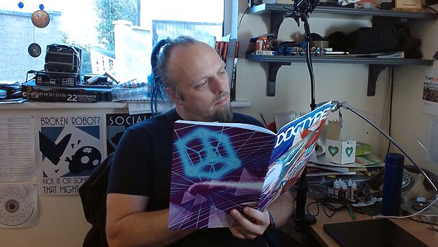
This weekend, I received my copy of DOCTYPE, and man: it feels like a step back to yesteryear to type in a computer program from a
magazine: I can’t have done that in at least thirty years.
So yeah, DOCTYPE is a dead-tree (only) medium magazine containing the source code to 10 Web pages which, when typed-in to your computer, each provide you with some kind of fun and
interactive plaything. Each of the programs is contributed by a different author, including several I follow and one or two whom I’m corresponded with at some point or another, and each
brings their own personality and imagination to their contribution.
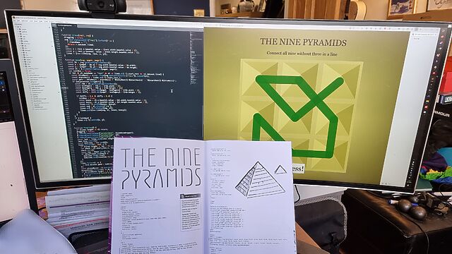
I opted to start with Stuart Langridge‘s The Nine Pyramids, a puzzle game about trying to connect all nodes in a 3×3 grid in a
continuous line bridging adjacent (orthogonal or diagonal) nodes without visiting the same node twice nor moving in the same direction twice in a row (that last provision is described
as “not visiting three in a straight line”, but I think my interpretation would have resulted in simpler code: I might demonstrate this, down the line!).
The puzzle actually made me stop to think about it for a bit, which was unexpected and pleasing!
Per tradition with this kind of programming, I made a couple of typos, the worst of which was missing an entire parameter in a CSS conic-gradient() which resulted in the
majority of the user interface being invisible: whoops! I found myself reminded of typing-in the code for Werewolves and
Wanderer from The Amazing Amstrad Omnibus, whose data section – the part most-liable to be affected by a typographic bug without introducing a syntax error – had
a helpful “checksum” to identify if a problem had occurred, and wishing that such a thing had been possible here!
But thankfully a tiny bit of poking in my browser’s inspector revealed the troublesome CSS and I was able to complete the code, and then the puzzle.
I’ve really been enjoying DOCTYPE, and you can still buy a copy if you’d like one of your own. It manages to simultaneously feel both fresh and nostalgic,
and that’s really cool.
A few years ago I implemented a pure HTML + CSS solution for lightbox images, which I’ve been using on my blog ever since. It works by
pre-rendering an invisible <dialog> for each lightboxable image on the page, linking to the anchor of those dialogs, and exploiting the :target selector
to decide when to make the dialogs visible. No Javascript is required, which means low brittleness and high performance!
It works, but it’s got room for improvement.
One thing I don’t like about it is that it that it breaks completely if the CSS fails for any reason. Depending upon CSS is safer than depending upon JS (which breaks all
the time), but it’s still not great: if CSS is disabled in your browser or just “goes wrong” somehow then you’ll see a hyperlink… that doesn’t seem to go anywhere (it’s an
anchor to a hidden element).
A further thing I don’t like about it is it’s semantically unsound. Linking to a dialog with the expectation that the CSS parser will then make that dialog visible isn’t really
representative of what the content of the page means. Maybe we can do better.
🚀 Wired: <details>-based HTML+CSS lightboxes?
Here’s a thought I had, inspired by Patrick Chia’s <details> overlay trick and by
the categories menu in Eevee’s blog: what if we used a <details> HTML element for a lightbox? The thumbnail image would go in the
<summary> and the full image (with loading="lazy" so it doesn’t download until the details are expanded) beneath, which means it “just works” with or
without CSS… and then some CSS enhances it to make it appear like a modal overlay and allow clicking-anywhere to close it again.
Let me show you what I mean. Click on one of the thumbnails below:
Each appears to pop up in a modal overlay, but in reality they’re just unfolding a <details> panel, and some CSS is making the contents display as if if were
an overlay, complete click-to-close, scroll-blocking, and a blur filter over the background content. Without CSS, it functions as a traditional <details> block.
Accessibility is probably improved over my previous approach, too (though if you know better, please tell me!).
The code’s pretty tidy, too. Here’s the HTML:
<detailsclass="details-lightbox"aria-label="larger image">
<summary>
<imgsrc="thumb.webp"alt="Alt text for the thumbnail image.">
</summary>
<div>
<imgsrc="full.webp"alt="Larger image: alt text for the full image."loading="lazy">
</div>
</details>
The CSS is more-involved, but not excessive (and can probably be optimised a little further):
Native CSS nesting is super nice for this kind of thing. Being able to use :has on the body to detect whether there exists an open lightbox and prevent
scrolling, if so, is another CSS feature I’m appreciating today.
I’m not going to roll this out anywhere rightaway, but I’ll keep it in my back pocket for the next time I feel a blog redesign coming on. It feels tidier and more-universal than my
current approach, and I don’t think it’s an enormous sacrifice to lose the ability to hotlink directly to an open image in a post.
Do you remember when your domestic ISP – Internet Service Provider – used to be an Internet Services Provider? They
were only sometimes actually called that, but what I mean is: when ISPs provided more than one Internet service? Not just connectivity, but… more.
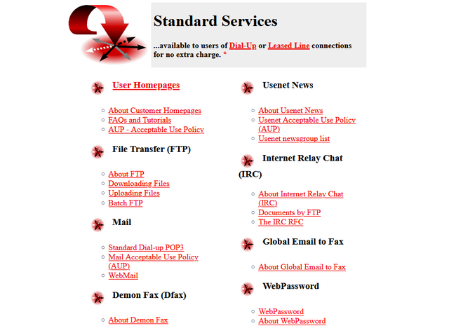
One of the first ISPs I subscribed to had a “standard services” list longer than most modern ISPs complete services list!
ISPs twenty years ago
It used to just be expected that your ISP would provide you with not only an Internet connection, but also some or all of:
I don’t remember which of my early ISPs gave me a free license for HoTMetaL Pro, but I was very appreciative of it at the time.
ISPs today
The ISP I hinted at above doesn’t exist any more, after being bought out and bought out and bought out by a series of owners. But I checked the Website of the current owner to see what
their “standard services” are, and discovered that they are:
Optional 4G backup connectivity (for an extra fee)
A voucher for 3 months access to a streaming service3
The connection is faster, which is something, but we’re still talking about the “baseline” for home Internet access then-versus-now. Which feels a bit galling, considering that (a)
you’re clearly, objectively, getting fewer services, and (b) you’re paying more for them – a cheap basic home Internet subscription today, after accounting
for inflation, seems to cost about 25% more than it did in 2000.4
Are we getting a bum deal?
Not every BBS nor ISP would ever come to support the blazing speeds of a 33.6kbps modem… but when you heard the distinctive scream of its negotiation at close to the Shannon Limit of
the piece of copper dangling outside your house… it felt like you were living in the future.
Would you even want those services?
Some of them were great conveniences at the time, but perhaps not-so-much now: a caching server, FTP site, or IRC node in the building right at the end of my
dial-up connection? That’s a speed boost that was welcome over a slow connection to an unencrypted service, but is redundant and ineffectual today. And if you’re still using a
fax-to-email service for any purpose, then I think you have bigger problems than your ISP’s feature list!
Some of them were things I wouldn’t have recommend that you depend on, even then: tying your email and Web hosting to your connectivity provider traded
one set of problems for another. A particular joy of an email address, as opposed to a postal address (or, back in the day, a phone number), is that it isn’t tied to where
you live. You can move to a different town or even to a different country and still have the same email address, and that’s a great thing! But it’s not something you can
guarantee if your email address is tied to the company you dial-up to from the family computer at home. A similar issue applies to Web hosting, although for a true traditional “personal
home page”: a little information about yourself, and your bookmarks, it would be fine.
But some of them were things that were actually useful and I miss: honestly, it’s a pain to have to use a third-party service for newsgroup
access, which used to be so-commonplace that you’d turn your nose up at an ISP that didn’t offer it as standard. A static IP being non-standard on fixed connections is a sad reminder
that the ‘net continues to become less-participatory, more-centralised, and just generally more watered-down and shit: instead of your connection making you “part of” the Internet,
nowadays it lets you “connect to” the Internet, which is a very different experience.5
A page like this used to be absolutely standard on the Website6
of any ISP worth its salt.
Yeah, sure, you can set up a static site (unencumbered by any opinionated stack) for free on Github Pages, Neocities, or wherever, but the barrier to entry has been raised
by just enough that, doubtless, there are literally millions of people who would have taken that first step… but didn’t.
And that makes me sad.
Footnotes
1 ISP-provided shared FTP servers would also frequently provide locally-available copies
of Internet software essentials for a variety of platforms. This wasn’t just a time-saver – downloading Netscape Navigator from your ISP rather than from half-way across the world was
much faster! – it was also a way to discover new software, curated by people like you: a smidgen of the feel of a well-managed BBS, from the comfort of your local ISP!
2 ISP-provided routers are, in my experience, pretty crap 50% of the time… although
they’ve been improving over the last decade as consumers have started demanding that their WiFi works well, rather than just works.
3 These streaming services vouchers are probably just a loss-leader for the streaming
service, who know that you’ll likely renew at full price afterwards.
4 Okay, in 2000 you’d have also have had to pay per-minute for the price of the
dial-up call… but that money went to BT (or perhaps Mercury or KCOM), not to your ISP. But my point still stands: in a world where technology has in general gotten cheaper
and backhaul capacity has become underutilised, why has the basic domestic Internet connection gotten less feature-rich and more-expensive? And often with worse
customer service, to boot.
5 The problem of your connection not making you “part of” the Internet is multiplied if
you suffer behind carrier-grade NAT, of course. But it feels like if we actually cared enough to commit to rolling out IPv6 everywhere we could obviate the need for that particular
turd entirely. And yet… I’ll bet that the ISPs who currently use it will continue to do so, even as the offer IPv6 addresses as-standard, because they buy into their own idea that
it’s what their customers want.
6 I think we can all be glad that we no longer write “Web Site” as two separate words, but
you’ll note that I still usually correctly capitalise Web (it’s a proper noun: it’s the Web, innit!).
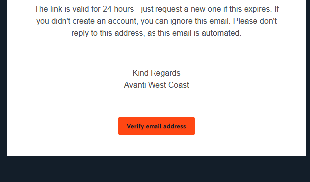
Clearly that certificate only applies to their website, though, and not to e.g. their emails. When you sign up an account with them, you need to verify your email address. They send you
a (HTML-only) email with a link to click. Here’s what that link looks like to a sighted person:
So far, so good. But here’s the HTML code they’re using to create that button. Maybe you’ll spot
the problem:
Despite specifying the font to use three times, they don’t actually have any alt text. So for somebody who can’t see that image, the link is
completely unusable1.
This made me angry enough that I gave up on my transaction and bought my train tickets from LNER instead.
Accessibility matters. And that includes emails. Do better, Avanti.
Footnotes
1 Incidentally, this also makes the email unusable for privacy-conscious people who, like
me, don’t routinely load remote images in emails. But that’s a secondary concern, really.
The video below is presented in portrait orientation, because your screen is taller than it is wide.
The video below is presented in landscape orientation, because your screen is wider than it is tall.
The video below is presented in square orientation (the Secret Bonus Square Video!), because your screen has approximately the same width as as its height. Cool!
This is possible (with a single <video> element, and without any Javascript!) thanks to some cool HTML features you might not be aware of, which I’ll briefly explain
in the video. Or scroll down for the full details.
<videocontrols><sourcesrc="squareish.mp4"media="(min-aspect-ratio: 0.95) and (max-aspect-ratio: 1.05)"/><sourcesrc="portrait.mp4"media="(orientation: portrait)"/><sourcesrc="landscape.mp4"/></video>
This code creates a video with three sources: squareish.mp4 which is shown to people on “squareish” viewports, failing that portrait.mp4 which is shown to
people whose viewports are taller than wide, and failing that landscape.mp4 which is shown to anybody else.
That’s broadly-speaking how the video above is rendered. No JavaScript needed.
Browsers only handle media queries on videos when they initially load, so you can’t just tip your phone over or resize the window: you’ll need to reload the page, too. But it works!
Give it a go: take a look at the video in both portrait and landscape modes and let me know what you think1.
Adding adaptive bitrate streaming with HLS
Here’s another cool technology that you might not have realised you could “just use”: adaptive bitrate streaming with HLS!
You’ve used adaptive bitrate streaming before, though you might not have noticed it. It’s what YouTube, Netflix, etc. are doing when your network connection degrades and you quickly get
dropped-down, mid-video, to a lower-resolution version2.
Turns out you can do it on your own static hosting, no problem at all. I used this guide (which has a great
description of the parameters used) to help me:
This command splits the H.264 video landscape.mp4 into three different resolutions: the original “v1” (1920×1080, in my case, with 96kbit audio), “v2” (1280×720, with
96kbit audio), and “v3” (640×360, with 48kbit audio), each with a resolution-appropriate maximum bitrate, and forced keyframes every 48th frame. Then it breaks each of those into HLS
segments (.ts files) and references them from a .m3u8 playlist.
The output from this includes:
Master playlist landscape.m3u8, which references the other playlists with reference to their resolution and bandwidth, so that browsers can make smart choices,
Playlists landscape_0.m3u8 (“v1”), landscape_1.m3u8 (“v2”), etc., each of which references the “parts” of that video,
Directories landscape_0/, landscape_1/ etc., each of which contain
data00.ts, data01.ts, etc.: the actual “chunks” that contain the video segments, which can be downloaded independently by the browser as-needed
Bringing it all together
We can bring all of that together, then, to produce a variable-aspect, adaptive bitrate, HLS-streamed video player… in pure HTML and suitable for static hosting:
<videocontrols><sourcesrc="squareish.m3u8"type="application/x-mpegURL"media="(min-aspect-ratio: 0.95) and (max-aspect-ratio: 1.05)"/><sourcesrc="portrait.m3u8"type="application/x-mpegURL"media="(orientation: portrait)"/><sourcesrc="landscape.m3u8"type="application/x-mpegURL"/></video>
You could, I suppose, add alternate types, poster images, and all kinds of other fancy stuff, but this’ll do for now.
One solution is to also provide the standard .mp4 files as an alternate <source>, and that’s fine I guess, but you lose the benefit of HLS (and
you have to store yet more files). But there’s a workaround:
Polyfill full functionality for all browsers
If you’re willing to use a JavaScript polyfill, you can make the code above work on virtually any device. I gave this a go, here, by:
Adding some JavaScript code that detects affected `<video>` elements and applying the fix if necessary:
// Find all <video>s which have HLS sources:for( hlsVideo of document.querySelectorAll('video:has(source[type="application/x-mpegurl"]), video:has(source[type="vnd.apple.mpegurl"])') ) {
// If the browser has native support, do nothing:if( hlsVideo.canPlayType('application/x-mpegurl') || hlsVideo.canPlayType('application/vnd.apple.mpegurl') ) continue;
// If hls.js can't help fix that, do nothing:if ( ! Hls.isSupported() ) continue;
// Find the best source based on which is the first one to match any applicable CSS media queriesconst bestSource =Array.from(hlsVideo.querySelectorAll('source')).find(source=>window.matchMedia(source.media).matches)
// Use hls.js to attach the best source:const hls =new Hls();
hls.loadSource(bestSource.src);
hls.attachMedia(hlsVideo);
}
It makes me feel a little dirty to make a <video>depend on JavaScript, but if that’s the route you want to go down while we wait for HLS support to become
more widespread (rather than adding different-typed sources) then that’s fine, I guess.
This was a fun dive into some technologies I’ve not had the chance to try before. A fringe benefit of being a generalist full-stack developer is that when you’re “between jobs”
you get to play with all the cool things when you’re brushing up your skills before your next big challenge!
(Incidentally: if you think you might be looking to employ somebody like me, my CV is over there!)
Footnotes
1 There definitely isn’t a super-secret “square” video on this page, though. No
siree. (Shh.)
2 You can tell when you get dropped to a lower-resolution version of a video because
suddenly everybody looks like they’re a refugee from Legoland.
When you’re writing online, being unique doesn’t matter nearly as much as being found.
I’m not sure I could disagree more. But I’ve jumped in half way through his post. Let’s backtrack a bit.
Andy begins:
A blogger showed me his website the other day.
…
But no one was reading it.
Firstly: let’s just observe that you were shown a website… and now you’re talking about it… but you haven’t linked to it? You’re complaining about its lack of discoverability,
while simultaneously being part of the problem.
Hyperlinks remain, as they have been since the mid-to-late 1990s, a primary mechanism in helping search engines’ spiders to discover new sites, and nowadays they’re doubly-important
because they help establish legitimacy.
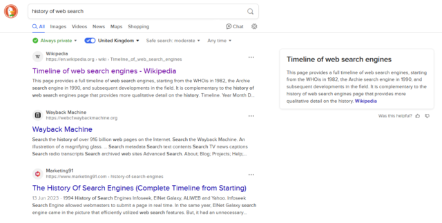
When you search for, say, “history of web search” and this Wikipedia article is at the top, a significant
reason for that is that people link to that page when talking about the history of web search! A secondary reason is that lots of people link to Wikipedia in
general.
Your mileage may vary depending on your preferred search engine and other factors.
Berating somebody for an unindexed site… but not linking to that site… feels awfully-close to victim-blaming!
(Especially recently, as still-dominant search engine Google continues to make it harder and harder for “new” sites to get onto the ladder.)
When I asked him why he didn’t just use WordPress or Bear Blog, he looked offended.
“Those are so basic. Everyone uses those. I wanted something unique.”
I’m not sure I understand the logic of the person whose argument against e.g. WordPress is that it’s not “unique”. There are lots of great reasons that you might use WordPress. There
are lots of great reasons that you might not. The right choice of CMS should be based on a variety of factors.
It’s possible that the person being referred to meant “customisable”. They’d still be wrong (in the case of WordPress, at least: Bear Blog offers significantly less customisation
options, which is fine if the other features are what you’re looking for), but anyway: the short of it is that I briefly agreed, here, until:
WordPress powers about 43% of all websites. That means search engines know exactly how to read WordPress sites.
They know where to look for the content, the metadata, the tags.
Let’s correct the points here:
Search engines know exactly how to read HTML. WordPress outputs HTML. (If you’re outputting HTML, your site can be indexed. Hell, even that isn’t a firm
requirement: my plaintext-only blog shows up in search engines!)
Web standards dictate how content, metadata, and tags should be laid out. A search engine’s spider doesn’t look at your site and go “hey, it’s WordPress, so I need to
look for this“. Instead, it’ll generally look for content and metadata based on established standards. Titles, headings, <meta> tags, semantic elements:
these are the things a search engine looks for.
Sure, WordPress gets those things right. But they’re not hard to get right. You shouldn’t use WordPress (or Bear, or anything else) based just on the fact
that it exposes metadata correctly. Any site can do this. And because what’s eventually exposed to the search engine – and to the user – is HTML code… which is independent of the CMS
that generated it… it doesn’t have to matter what the underlying CMS is.
Then there’s some more confusion:
Here’s what matters: WordPress and other major platforms have spent years optimising for search engines and social sharing.
They’ve spent millions making sure posts load fast.
This sounds like it’s conflating WordPress (the open-source CMS) with one or more of several WordPress hosting providers (probably WordPress.com). That’s a common mistake, but it is a mistake.
WordPress can do terrible SEO. WordPress can be really slow. Trust me: in a previous life I’ve made a part of my living out of fixing and improving people’s WordPress-powered websites!
A large part of this comes from WordPress’s flexibility: the theme you choose, for example, can completely change the functionality of your site. Inspired by my plain text blog,
Terence Eden made a WordPress theme that does the same thing! That WordPress theme completely
upends the way that most people would use WordPress, but it’s still fundamentally WordPress, even though it exposes to search engines no HTML code, no metadata,
and no tags.
WordPress can also do great SEO, and it can be really fast. A properly-configured WordPress site can be a well-oiled machine. But if you conflate WordPress itself with its output,
you’re arguing against a straw man.
Don’t get me wrong: I love WordPress! But I dislike people making the false claim that if you’re not using it (or another popular blogging tool), you’re destined to fail at SEO. There’s
nothing “magical” about WordPress. It just takes content and renders HTML, in the end!
But all of this is moot, perhaps, when we get back to that first point:
When you’re writing online, being unique doesn’t matter nearly as much as being found.
This entire statement presupposes the purpose of “writing online”.
It’s 100% okay to write for yourself, first and foremost. It’s also okay to write for a small target audience, like for your friends or family. It’s okay to write content that
isn’t exposed to search engines (consider all of the wonderful content that my fellow RSS Club members put out, sometimes!). It’s
okay to write just for the joy of making things.
A website doesn’t have to be “professional”, as Andy’s post goes on to imply. A website doesn’t have to be anything in particular. A website can just… be. And that’s
enough.
Large companies find HTML & CSS frustrating “at scale” because the web is a fundamentally anti-capitalist mashup art experiment, designed to give consumers all the power.
This. This is what I needed to be reminded, today.
When somebody complains that the Web is hard to scale, they’re already working against the grain of the Web.
At its simplest – and the way we used to use it – a website is a collection of .html files, one of which might have a special name so the webserver knows to put it first.
Writing HTML is punk rock. A “platform” is the tool of the establishment.
Was playing around with some HTML and made a cable car for my page. Hmh.
Beautiful. It feels like it ought to have been wrapped in a HTML Web Component, maybe called <cable-car>, with progressive enhancement bonus features (maybe it’ll
only run during daylight hours? or when the wind isn’t too fast?)?
Terence Eden, who’s apparently inspiring several posts this week, recently shared a way to attach a hook to WordPress’s
get_the_post_thumbnail() function in order to remove the extraneous “closing mark” from the (self-closing in HTML) <img> element.
By default, WordPress outputs e.g. <img src="..." />, where <img src="..."> would suffice.
It’s an inconsequential difference for most purposes, but apparently it bugs him, so he fixed it… although he went on to observe that he hadn’t managed to successfully tackle
all the instances in which WordPress was outputting redundant closing marks.
This is a problem that I’ve already solved here on my blog. My solution’s slightly hacky… but it works!
There are many things you could say about the HTML produced to make the page you’re reading now. But “it needs fewer />s” isn’t among them.
My Solution: Runing HTMLTidy over WordPress
Tidy is an excellent tool for tiding up HTML! I used to use its predecessor back in
the day for all kind of things, but it languished for a few years and struggled with support for modern HTML features. But
in 2015 it made a comeback and it’s gone from strength to strength ever since.
I run it on virtually all pages produced by DanQ.me (go on, click “View Source” and see for yourself!), to:
Standardise the style of the HTML code and make it easier for humans to read1.
Bring old-style emphasis tags like <i>, in my older posts, into a more-modern interpretation, like <em>.
Hoist any inline <style> blocks to the <head>, and detect any repeated inline style="..."s to convert to classes.
Repair any invalid HTML (browsers do this for you, of course, but doing it server-side makes parsing easier for the
browser, which might matter on more-lightweight hardware).
WordPress isn’t really designed to have Tidy bolted onto it, so anything it likely to be a bit of a hack, but here’s my approach:
Install libtidy-dev and build the PHP bindings to it.
Note that if you don’t do this the code might appear to work, but it won’t actually tidy anything2.
Add a new output buffer to my theme’s header.php3, with a callback function: ob_start('tidy_entire_page').
Without an corresponding ob_flush or similar, this buffer will close and the function will be called when PHP
finishes generating the page.
Define the function tidy_entire_page($buffer) Have it instantiate Tidy ($tidy = new tidy) and use $tidy->parseString (with your buffer and Tidy preferences) to tidy the code, then
return $tidy.
Ensure that you’re caching the results!
You don’t want to run this every page load for anonymous users! WP Super Cache on “Expert” mode (with the
requisite webserver configuration) might help.
1 I miss the days when most websites were handwritten and View Source typically looked
nice. It was great to learn from, too, especially in an age before we had DOM debuggers. Today: I can’t justify
dropping my use of a CMS, but I can make my code readable.
2 For a few of its extensions, some PHP developer made the interesting choice to fail silently if the required extension is missing. For example: if you don’t have the
zip extension enabled you can still usePHPto make ZIP files, but they won’t be
compressed. This can cause a great deal of confusion for developers! A similar issue exists with tidy: if it isn’t installed, you can still call all of the
methods on it… they just don’t do anything. I can see why this decision might have been made – to make the language as portable as possible in production – but I’d
prefer if this were an optional feature, e.g. you had to set try_to_make_do_if_you_are_missing_an_extension=yes in your php.ini to enable it, or if
it at least logged that it had done so.
3 My approach probably isn’t suitable for FSE (“block”) themes, sorry.
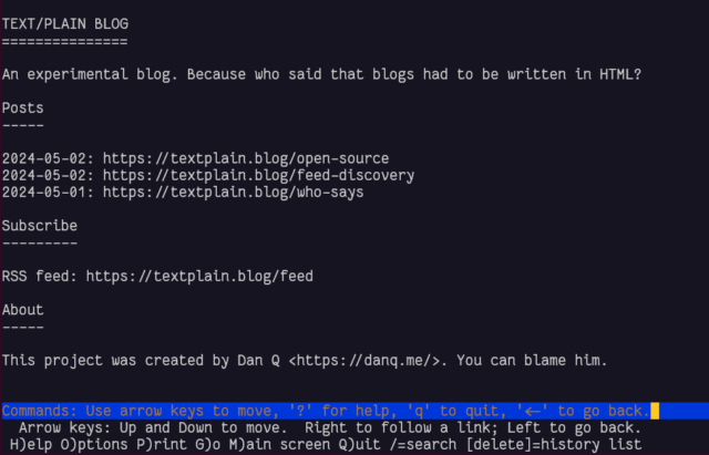
theunderground.blog‘s content, with the exception of its homepage, is delivered entirely through an XML Atom feed. Atom feed entries do require <title>s, of course, so that’s not the strongest counterexample!
This blog is available over several media other than the Web. For example, you can read this blog post:
We’ve looked at plain text, which as a format clearly does not have to have a title. Let’s go one step further and implement it. What we’d need is:
A webserver configured to deliver plain text files by preference, e.g. by adding directives like index index.txt; (for Nginx).5
An index page listing posts by date and URL. Most browser won’t render these as “links” so users will have to copy-paste
or re-type them, so let’s keep them short,
Pages for each post at those URLs, presumably without any kind of “title” (just to prove a point), and
An RSS feed: usually I use RSS as shorthand for all feed
types, but this time I really do mean RSS and not e.g. Atom because RSS, strangely, doesn’t require that an <item> has a <title>!
Unlike other sites, I didn’t need to test textplain.blog in Lynx to
know it’d work well. But I did anyway.
In the end I decided it’d benefit from being automated as sort-of a basic flat-file CMS, so I wrote it in PHP. All requests are routed by the webserver to the program, which determines whether they’re a request for the homepage, the RSS feed, or a valid individual post, and responds accordingly.
It annoys me that feed
discovery doesn’t work nicely when using a Link: header, at least not in any reader I tried. But apart from that, it seems pretty solid, despite its limitations. Is this,
perhaps, an argument for my.well-known/feedsproposal?
You can click an image and see a full-window popup dialog box containing a larger version of the image.
The larger version of the image isn’t loaded until it’s needed.
You can close the larger version with a close button. You can also use your browser’s back button.
You can click again to download the larger version/use your browser to zoom in further.
You can share/bookmark etc. the URL of a zoomed-in image and the recipient will see the same image (and return to the
image, in the right blog post, if they press the close button).
No HTTP round trip is required when opening/closing a lightbox: it’s functionally-instantaneous.2
No JavaScript is used at all.
Visitors can click on images to see a larger version, with a “close” button. No JavaScript needed.
Here’s how it works –
The Markup
<figureid="img3336"aria-describedby="caption-img3336"><ahref="#lightbox-img3336"role="button"><imgsrc="small-image.jpg"alt="Alt text is important."width="640"height="480"></a><figcaptionid="caption-img3336">
Here's the caption.
</figcaption></figure>
... (rest of blog post) ...
<dialogid="lightbox-img3336"class="lightbox"><ahref="large-image.jpg"><imgsrc="large-image.jpg"loading="lazy"alt="Alt text is important."></a><aclass="close"href="#img3336"title="Close image"role="button">×</a></dialog>
The HTML is pretty simple (and I automatically generate it, of course).
For each lightboxed image in a post, a <dialog> for that image is appended to the post. That dialog contains a larger copy of the image (set to
loading="lazy" so the browser have to download it until it’s needed), and a “close” button.
The image in the post contains an anchor link to the dialog; the close button in the dialog links back to the image in the post.3 I wrap the lightbox image itself in a link to the full version of the
image, which makes it easier for users to zoom in further using their browser’s own tools, if they like.
Even without CSS, this works (albeit with “scrolling” up and down to the larger image). But the clever bit’s yet to
come:
The Style
body:has(dialog:target) {
/* Prevent page scrolling when lightbox open (for browsers that support :has()) */position:fixed;
}
a[href^='#lightbox-'] {
/* Show 'zoom in' cursor over lightboxed images. */cursor: zoom-in;
}
.lightbox {
/* Lightboxes are hidden by-default, but occupy the full screen and top z-index layer when shown. */all:unset;
display:none;
position:fixed;
top:0;
left:0;
width:100%;
height:100%;
z-index:2;
background:#333;
}
.lightbox:target {
/* If the target of the URL points to the lightbox, it becomes visible. */display: flex;
}
.lightboximg {
/* Images fill the lightbox. */object-fit:contain;
height:100%;
width:100%;
}
/* ... extra CSS for styling the close button etc. ... */
Here’s where the magic happens.
Lightboxes are hidden by default (display: none), but configured to fill the window when shown.
They’re shown by the selector .lightbox:target, which is triggered by the id of the <dialog> being referenced by the anchor part of
the URL in your address bar!
Summary
It’s neither the most-elegant nor cleanest solution to the problem, but for me it hits a sweet spot between developer experience and user experience. I’m always disappointed when
somebody’s “lightbox” requires some heavyweight third-party JavaScript (often loaded from a CDN), because that seems to be the
epitome of the “take what the Web gives you for free, throw it away, and reimplement it badly in JavaScript” antipattern.
There’s things I’ve considered adding to my lightbox. Progressively-enhanced JavaScript that adds extra value and/or uses the Popover API where available, perhaps? View Transitions to animate the image “blowing up” to the larger size, while the full-size image loads in the
background? Optimistic preloading when hovering over the image4? “Previous/next” image links when lightboxing a gallery? There’s lots of potential to expand it
without breaking the core concept here.
I’d also like to take a deeper dive into the accessibility implications of this approach: I think it’s pretty good, but accessibility is a big topic and there’s always more to
learn.
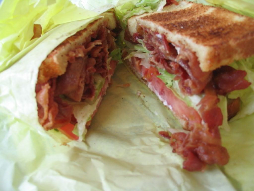
In the meantime, why not try out my lightbox by clicking on this picture of my dog (photographed here staring longingly at the bacon sandwich picture above, perhaps).
I hope the idea’s of use to somebody else looking to achieve this kind of thing, too.
Footnotes
1 Where JavaScript is absolutely necessary, I (a) host it on the same domain, for
performance and privacy-respecting reasons, and (b) try to provide a functional alternative that doesn’t require JavaScript, ideally seamlessly.
2 In practice, the lightbox images get lazy-loaded, so there can be a short round
trip to fetch the image the first time. But after that, it’s instantaneous.
3 The pair – post image and lightbox image – work basically the same way as footnotes,
like this one.
4 I already do this with links in general using the excellent instant.page.


![Stylish (for circa 2000) webpage for HoTMetaL Pro 6.0, advertising its 'unrivaled [sic] editing, site management and publishing tools'.](https://bcdn.danq.me/_q23u/2025/08/hotmetal-pro-6-640x396.jpg)