A New Keyboard

I already own the best mouse in the world. Maybe it’s time for a new keyboard, too.

An unexpected parcel.
What a large package! I wasn't expecting that!

A few weeks ago, Adam blogged about his trip to London last year, and mentioned that, after trips out to Soho’s “G-A-Y” nightclub when he was younger, he’d often surprise himself the following morning to wake up in some quite distant travel zones of London. My favourite bit was when he mentioned that, on one ocassion, he’d…

…somehow managed to whore my way beyond the reach of the Underground.

Adam

I replied with a comment, stating, among other things:

You owe me a fresh herbal tea. Also a new keyboard, which might never recover from the nasal spraying of herbal tea that it’s just been exposed to.

Dan

(it’s not a particularly original comment, I know: Jimmy said something similar in a comment on this very blog, about four years ago)

A gift note from Mr. A Westwood: Hi Dan, As requested, one replacement keyboard. I do hope that it's a suitable replacement and that nobody's got their wires crossed. Happy tapping! Adam xx
This note went a little way to explaining the parcel.

In any case: the week before last I received a pair of unexpected parcels. I opened the first, an Amazon box, and pulled out a note. It was from Adam, and stated that the contents were “a replacement keyboard”, assuming that “nobody’s got their wires crossed.”

The 'keyboard' that Adam had sent.
Adam's instrument. You need to wrap your lips around the tube and give it a good blow, while you finger the other end.

A musical keyboard: this one’s powered by air (I’d have never guessed that Stagg would have made such a thing!). The musician blows into a tube while they play the notes in order to elicit a tune. It doesn’t sound bad, actually, although I do feel that it could do with a MIDI port. And an air-driven dynamo to power that port. And then a battery-powered pump so that you don’t need to blow it at all.

The second parcel continued the theme:

Several boxes of fruit and herbal teas.
Hot and fruity: just the way I like them.

A selection of herbal and fruit teas, from Asda’s Morrisons’ range. There was no note in this parcel, but it was pretty clear by now who the sender must be. I’d have been ever so confused if I’d have opened the second parcel one first.

So thank you, Adam, you crazy old fool, for making me laugh out loud yet again. I shall have to compose a song in your honour: and given the amount of air intake that’s needed to keep the keyboard playing, I shall call it, The Big Puff Song.

× × × ×

Ageism, Nightline, and Counselling

As a trainee counsellor, I’ve had plenty of opportunity of late for self-analysis and reflection. Sometimes revelations come at unexpected times, as I discovered recently.

A counselling session in progress.

I was playing the part of a client in a role-play scenario for another student on my course when I was struck by a realisation that I didn’t feel that my “counsellor” was able to provide an effective and empathetic response to the particular situations I was describing. It didn’t take me long to spot that the reason I felt this way was her age. Probably the youngest in our class – of whose span of ages I probably sit firmly in the middle – her technical skill is perfectly good, and she’s clearly an intelligent and emotionally-smart young woman… but somehow, I didn’t feel like she would be able to effectively support me.

And this turned out to be somewhat true: the session ended somewhat-satisfactorily, but there were clear moments during which I didn’t feel that a rapport had been established. Afterwards, I found myself wondering: how much of this result was caused by her approach to listening to me… and how much was caused by my perception of how she would approach listening to me? Of the barriers that lay between us, which had I erected?

Since then, I’ve spent a little time trying to get to the bottom of this observation about myself, asking: from where does my assumption stem that age can always be associated with an empathic response? A few obvious answers stand out: for a start, there’s the fact that there probably is such a trend, in general (although it’s still unfair to make the outright assumption that it will apply in any particular case, especially with somebody whose training should counteract that trend). Furthermore, there’s the assumption that one’s own experience is representative: I know very well that at 18 years old, my personal empathic response was very weak, and so there’s the risk that I project that onto other young adults.

However, the most-interesting source for this prejudice, that I’ve found, has been Nightline training.

The Nightline Association
The Nightline Association, umbrella body representing student Nightlines around the UK and overseas

Many years ago, I was a volunteer at Aberystwyth Nightline. I worked there for quite a while, and even after I’d graduated and moved on, I would periodically go back to help out with training sessions, imparting some of what I’d learned to a new generation of student listeners.

As I did this, a strange phenomenon began to occur: every time I went back, the trainees got younger and younger. Now of course this isn’t true – it’s just that I was older each time – but it was a convincing illusion. A second thing happened, too: every time I went back, the natural aptitude of the trainees, for the work, seemed to be less fine-tuned than it had the time before. Again, this was just a convincing illusion: through my ongoing personal development and my work with Samaritans, Oxford Friend, and others, I was always learning new skills to apply to helping relationships, but each new batch of trainees was just getting off to a fresh start.

This combination of illusions is partly responsible for the idea, in my mind, that “younger = less good a listener”: for many years, I’ve kept seeing people who are younger and younger (actually just younger than me, by more) and who have had less and less listening experience (actually just less experience relative to me, increasingly). It’s completely false, but it’s the kind of illusion that nibbles at the corners of your brain, if you’ll let it.

Practicing good self-awareness helps counsellors to find the sources of their own prejudices and challenge them. But it’s not always easy, and sometimes the realisations come when you least expect them.

On This Day In 2004

Looking Back

On this day in 2004 I handed in my dissertation, contributing towards my BEng in Software Engineering. The topic of my dissertation was the Three Rings project, then in its first incarnation, a web application originally designed to help university Nightlines to run their services.

An early Three Rings Directory page. If you remember when Three Rings used to look like this, then you're very old.

I’d originally started developing the project early in the previous academic year, before I’d re-arranged how I was going to finish my course: Three Rings celebrates its tenth birthday this year. This might be considered to have given me a head start over my peers, but in actual fact it just meant that I had even more to write-up at the end. Alongside my work at SmartData a few days a week (and sometimes at weekends), that meant that I’d been pretty damn busy.

A page from my dissertation, covering browser detection and HTTPS support (then, amazingly, still not-quite-universal in contemporary browsers).

I’d celebrated hitting 10,000 words – half of the amount that I estimated that I’d need – but little did I know that my work would eventually weigh in at over 30,000 words, and well over the word limit! In the final days, I scrambled to cut back on text and shunt entire chapters into the appendices (A through J), where they’d be exempt, while a team of volunteers helped to proofread everything I’d done so far.

Go on then; have another screenshot of an ancient web application to gawk at.

Finally, I was done, and I could relax. Well: right up until I discovered that I was supposed to have printed and bound two copies, and I had to run around a busy and crowded campus to get another copy run off at short notice.

Looking Forward

Three Rings went from strength to strength, as I discussed in an earlier “on this day”. When Bryn came on board and offered to write programs to convert Three Rings 1 data into Three Rings 2 data, in 2006, he borrowed my dissertation as a reference. After he forgot that he still had it, he finally returned it last month.

The inside front cover of my dissertation, along with a note from Bryn.

Later still in 2009, Ruth expanded Three Rings as part of her Masters dissertation, in a monumental effort to add much-needed features at the same time as getting herself a degree. After handing it in and undergoing her defense (which went better than she expected), she got a first.

My dissertation (left) back on my bookshelf, where it belongs.

Today, Three Rings continues to eat a lot of my time, and now supports tens of thousands of volunteers at hundreds of different helplines and other charities, including virtually every Nightline and the majority of all Samaritans branches.

It’s grown even larger than I ever imagined, back in those early days. I often tell people that it started as a dissertation project, because it’s simpler than the truth: that it started a year or two before that, and provided a lot of benefit to a few Nightlines, and it was just convenient that I was able to use it as a part of my degree because otherwise I probably wouldn’t have had time to make it into what it became. Just like I’m fortunate now to have the input of such talented people as I have, over the last few years, because I couldn’t alone make it into the world-class service that it’s becoming.

This blog post is part of the On This Day series, in which Dan periodically looks back on years gone by.

× × × × ×

Visitor Tracking Without Cookies (or How To Abuse HTTP 301s)

Last week I was talking to Alexander Dutton about an idea that we had to implement cookie-like behaviour using browser caching. As I first mentioned last year, new laws are coming into force across Europe that will require websites to ask for your consent before they store cookies on your computer. Regardless of their necessity, these laws are badly-defined and ill thought-out, and there’s been a significant lack of information to support web managers in understanding and implementing the required changes.

British Telecom's implementation of the new cookie laws. Curiously, if you visit their site using the Opera web browser, it assumes that you've given consent, even if you click the button to not do so.
British Telecom’s implementation of the new cookie laws. Curiously, if you visit their site using the Opera web browser, it assumes that you’ve given consent, even if you click the button to not do so.

To illustrate one of the ambiguities in the law, I’ve implemented a tool which tracks site visitors almost as effectively as cookies (or similar technologies such as Flash Objects or Local Storage), but which must necessarily fall into one of the larger grey areas. My tool abuses the way that “permanent” (301) HTTP redirects are cached by web browsers.

[callout][button link=”http://c301.scatmania.org/” align=”right” size=”medium” color=”green”]See Demo Site[/button]You can try out my implementation for yourself. Click on the button to see the sample site, then close down all of your browser windows (or even restart your computer) and come back and try again: the site will recognise you and show you the same random number as it did the first time around, as well as identifying when your first visit was.[/callout]

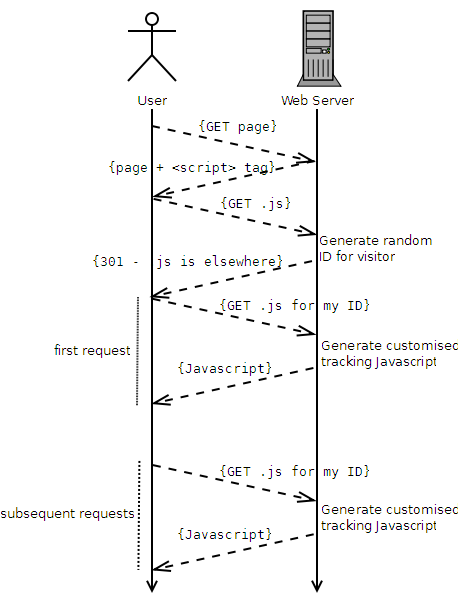
Here’s how it works, in brief:

  1. A user visits the website.
  2. The website contains a <script> tag, pointing at a URL where the user’s browser will find some Javascript.
  3. The user’s browser requests the Javascript file.
  4. The server generates a random unique identifier for this user.
  5. The server uses a HTTP 301 response to tell the browser “this Javascript can be found at a different web address,” and provides an address that contains the new unique identifier.
  6. The user’s browser requests the new document (e.g. /javascripts/tracking/123456789.js, if the user’s unique ID was 123456789).
  7. The resulting Javascript is generated dynamically to automatically contain the ID in a variable, which can then be used for tracking purposes.
  8. Subsequent requests to the server, even after closing the browser, skip steps 3 through 5, because the user’s browser will cache the 301 and re-use the unique web address associated with that individual user.
How my "301-powered 'cookies'" work.
How my “301-powered ‘cookies'” work.

Compared to conventional cookie-based tracking (e.g. Google Analytics), this approach:

  • Is more-fragile (clearing the cache is a more-common user operation than clearing cookies, and a “force refresh” may, in some browsers, result in a new tracking ID being issued).
  • Is less-blockable using contemporary privacy tools, including the W3C’s proposed one: it won’t be spotted by any cookie-cleaners or privacy filters that I’m aware of: it won’t penetrate incognito mode or other browser “privacy modes”, though.

Moreover, this technique falls into a slight legal grey area. It would certainly be against the spirit of the law to use this technique for tracking purposes (although it would be trivial to implement even an advanced solution which “proxied” requests, using a database to associate conventional cookies with unique IDs, through to Google Analytics or a similar solution). However, it’s hard to legislate against the use of HTTP 301s, which are an even more-fundamental and required part of the web than cookies are. Also, and for the same reasons, it’s significantly harder to detect and block this technique than it is conventional tracking cookies. However, the technique is somewhat brittle and it would be necessary to put up with a reduced “cookie lifespan” if you used it for real.

[callout][button link=”http://c301.scatmania.org/” align=”right” size=”medium” color=”green”]See Demo Site[/button] [button link=”https://gist.github.com/avapoet/5318224″ align=”right” size=”medium” color=”orange”]Download Code[/button] Please try out the demo, or download the source code (Ruby/Sinatra) and see for yourself how this technique works.[/callout]

Note that I am not a lawyer, so I can’t make a statement about the legality (or not) of this approach to tracking. I would suspect that if you were somehow caught doing it without the consent of your users, you’d be just as guilty as if you used a conventional approach. However, it’s certainly a technically-interesting approach that might have applications in areas of legitimate tracking, too.

Update: The demo site is down, but I’ve update the download code link so that it still works.

×

Star Wars – Machete Order

This weekend, Ruth, JTA and I watched the Star Wars films in a single sitting, in Machete Order. What’s Machete Order, you ask? Well, assuming that you’re too busy to click the link and find out, the short summary is that you:

Machete Order. The way Star Wars should be enjoyed.

This is a remarkable and unusual order in which to watch the films, but it’s not without its merits, especially compared to the two most-common alternatives: Release Order and Episode Order:

[spb_message color=”alert-warning” width=”1/1″ el_position=”first last”]Spoiler Alert! The remainder of this article contains extensive spoilers about the Star Wars universe. If you haven’t seen the films yet, go watch them in the order specified above and then come back. It’ll only take you about 11 hours; I’ll wait.[/spb_message]

  • Release Order – IV, V, VI, I, II, III – has the problem that you either watch the original cut of Return of the Jedi, and see Sebastian Shaw playing the ghost of the “unmasked” Darth Vader at the end (and then go “that doesn’t look anything like him!” when you get to Attack of the Clones), or you watch the 2004 edit of Return of the Jedi, in which they inserted Hayden Christensen in his place, and you go “who’s that guy? we’ve never seen him before!”, because he hasn’t been introduced until the next film that you’ll watch.
  • Episode Order – I, II, III, IV, V, VI – should fix that problem, but it introduces an even worse problem: it completely ruins the surprise that Luke’s father is Darth Vader (and as a result, also ruins the surprise that Leia is Luke’s sister, and results in more “eww” moments when we see them kiss in The Empire Strikes Back).

Machete Order fixes those problems. The new films become a “flashback” in a longer ongoing narrative, and the timing couldn’t be better. At the end of The Empire Strikes Back, Luke has just learned that Darth Vader is his father, and so we zip back by about 20 years and see the story of how Anakin Skywalker became Darth Vader. You couldn’t plan it better.

Darth Vader
Darth Vader. You probably knew that already.

You lose The Phantom Menace, but seriously, you’re not missing much (and you can always go back and watch it later): a surprisingly dull podrace, an incredibly annoying alien, “midichlorians”… all of these are dropped. You get to start and end with the strongest movies. And the continuity is actually pretty beautiful, seeing Attack of the Clones and Revenge of the Sith as a flashback rather than a series in their own right.

JTA tweets about Star Wars: Machete Order
JTA tweets from the front lines about Star Wars: Machete Order

So what did we learn:

  • This is absolutely the way to watch Star Wars. If I ever come across somebody who’s never seen any of them films, this is the order that I’ll recommend that they watch them.
  • It takes a surprising amount of energy to sit and watch 11 hours of a story in a single sitting. Make sure you’ve got plenty of booze and snacks lined-up, and are ready to sacrifice a day, if you want to do this in one stretch. It wasn’t quite as hard as when we watched all of the Lord of the Rings movies (Directors’ Cuts, no less) back to back at a Troma Night many years ago, but it was still a bit of a marathon.
  • The model shots (IV, V, VI) have aged, but they still look okay. The CGI effects (II, III) have aged, and they look awful. Watching a mixture of old and new films in this way exaggerates this.

If you’d like to learn more about why this is such a great way to watch these films, I’d highly recommend that you read the original article that inspired us. And then – whether you’ve seen the films before or not – you should totally go and do this too.

×

One Hundred And Sixty

When I first went to university, in 1999, I got my first mobile phone. Back then, messaging features on mobiles were a bit more simplistic than they are today.

For example, phones were only just starting to appear that could handle multi-SMS messages. For those without this feature there was a new skill to be learned.

With practice, we got to be particularly good at cutting out messages down to the requisite number of characters to fit into a single SMS: just 160 characters.

We even learned how to meaningfully split messages in our heads, with indicators (ellipses, or numbers showing message parts), to carry longer concepts. (4/19)

Even when multi-message capable phones came out (I got one in 2000), these skills were still useful. At 10p or 12p per message, you soon learned to be concise.

Nowadays, this skill has lost its value. With more and more people having “unlimited SMS” plans or enormous quantities of credits, there’s no need to be brief.

If you’ve got an iPhone, you don’t even get told how long your message is, I hear. You just keep typing. And that’s not uncommon on other kinds of handset too.

Your phone’s still splitting your message up, in the background. Putting markers in, so that other phones can understand. And these markers are human-readable.

Just in case your message is going to a phone that’s over about 12 years old, your smartphone makes sure that the markers would be understood by humans. (9/19)

So now we’ve got smartphones talking to each other in a language that humans designed to talk to one another in. Does that feel really strange to anybody else?

I looked at my phone while I wrote a message, today. I noticed that number in the corner, that indicated that my message would span 3 texts. And I didn’t care.

Why would I? It’s a vestige of an older form of communication. Someday, it’ll look as primitive as the paintings on the walls of caves, daubed by early humans.

But for now, I remember. And, somehow, the skill I learned all those years ago – a trick that’s alien to almost anybody younger than me – has a new, fresh use.

Twitter. 140 character messages. A little bit less than a text, which seems strange. Are they really trying to make us even more brief than those early phones?

The skill is still the same. Think ahead. Prune. Plan. Snip. And, if you absolutely must span several messages, make it clear to your reader so that they know.

I see a whole new generation of people learning this skill that I once learned. It’s not the same (it never will be): they don’t pay 10p every time they tweet.

But you know what? It’s just as pointless now as it was the first time around. If you want to say something, say it. If 36p is too much, risk a 10-second call!

And in the case of the Twitter generation: if your message doesn’t fit on Twitter, then it probably doesn’t belong on Twitter. I’m a 160-character-or-more man.

I’m not sure I’m cut out for the Twitterverse with its 140-character limits. But it’s nice to remember how to think in 160, just like I have in this blog post.

Moving Things Around With CSS Transitions

As I indicated in my last blog post, my new blog theme has a “pop up” Dan in the upper-left corner. Assuming that you’re not using Internet Explorer, then when you move your mouse cursor over it, my head will “duck” back behind the bar below it.

My head "pops up" in the top-left hand corner of the site, and hides when you hover your mouse cursor over it.

This is all done without any Javascript whatsoever: it’s pure CSS. Here’s how it’s done:

<div class="sixteen columns">
  <div id="dans-creepy-head"></div>
  <h1 id="site-title" class="graphic">
    <a href="/" title="Scatmania">Scatmania</a>
  </h1>
  <span class="site-desc graphic">
    The adventures and thoughts of &quot;Scatman&quot; Dan Q
  </span>
</div>

The HTML for the header itself is pretty simple: there’s a container (the big blue bar) which contains, among other things, a <div> with the id "dans-creepy-head". That’s what we’ll be working with. Here’s the main CSS:

#dans-creepy-head {
  position: absolute;
  top: -24px;
  left: 15px;
  width: 123px;
  height: 133px;
  background: url(/dans-creepy-head.png) top left no-repeat;
  transition: all 800ms;
  -o-transition: all 800ms;
  -webkit-transition: all 800ms;
  -moz-transition: all 800ms;
}
#dans-creepy-head:hover {
  top: 100px;
  height: 60px;
}

The CSS sets a size, position, and background image to the <div>, in what is probably a familiar way. A :hover selector changes the style to increase the distance from the top of the container (from -24px to 100px) and to decrease the height, cropping the image (from 133px to 60px – this was necessary in this case to prevent the bottom of the image from escaping out from underneath the masking bar that it’s supposed to be “hiding behind”). With just that code, you’d have a perfectly workable “duck”, but with a jerky, one-step animation.

The transition directive (and browser-specific prefix versions -o-transition, -webkit-transition, and -moz-transition, for compatability) are what makes the magic happen. This element specifies that any ("all") style is changed on this element (whether via CSS directives, as in this case, or by a change of class or properties by a Javascript function), that a transition effect will be applied to those changes. My use of  "all" is a lazy catch-all – I could have specified the individual properties ( top and  height) that I was interested in changing, and even put different periods on each, but I’ll leave it to you to learn about CSS3 transition options for yourself. The  800ms is the duration of the transition: in my case, 0.8 seconds.

html.ie #dans-creepy-head:hover {
  top: -24px;
  height: 133px;
}
@media (max-width: 780px) {
  #dans-creepy-head {
    display: none;
  }
}

I apply some CSS to prevent the :hover effect from taking place in Internet Explorer, which doesn’t support transitions. The "ie" class is applied to the  <html> tag using Paul Irish’s technique, so it’s easy to detect and handle IE users without loading separate stylesheet files for them. And finally, in order to fit with my newly-responsive design, I make the pop-up head disappear when the window is under 780px wide (at which point there’d be a risk of it colliding with the title).

That’s all there is to it! A few lines of CSS, and you’ve got an animation that degrades gracefully. You could equally-well apply transformations to links (how about making them fade in or out, or change the position of their background image?) or, with a little Javascript, to your tabstrips and drop-down menus.

×

Top of the World

This Saturday, my dad finally made it to the North Pole. Or, at least: some of him did.

Members of the polar trek team in training in Norway, last month.
Members of the polar trek team in training in Norway, last month. With thanks to Geoff Major (click photo for his blog post about the training).

My dad was killed in February while training for his planned exhibition to the North Pole, fundraising for charity TransAid. Since his funeral last month, my life’s been a whirlwind of emotional ups and downs and administrative challenges with the handling of his estate, of which I’m an executor.

Geoff Major's tweet about my dad reaching his destination.
Geoff Major’s tweet about my dad reaching his destination.

So it was a really special moment to discover that, this weekend, my dad finally made it to the pole. My sisters and I had arranged that a portion of his cremated ashes would be carried with the polar trek team and scattered at what must be one of the most remote places on Earth – the very top of the world. It’s nice to think that not even death was enough to stop my dad from getting to the planet’s most Northernmost spot, even if he had to be carried for the last 600 miles.

My dad, "dressed for cold weather", according to my sister.
My dad, “dressed for cold weather”, according to my sister.

Meanwhile, donations flooded in faster than ever to my dad’s fundraising page, taking the grand total to over £12,000 – significantly in excess of the £10,000 he’d hoped to raise. My family and I are gobsmacked with the generosity of the people who’ve donated, and incredibly grateful to them as well as to the team that took him on the last ten days of his journey to the Pole.

The fundraising total, according to JustGiving.
The fundraising total, according to JustGiving. A significant amount of money was also raised offline, via donations at or around my dad’s wake, and is not included in this already-impressive total.

It pleases me that my dad gets to trespass somewhere he shouldn’t be, one last time: this time, breaking the international conventions that require that nothing gets “left” at the North Pole. The remainder of my fathers ashes will be scattered by my sisters and I from the top of a particular mountain, as he’d sometimes said that he’d wanted.

And after all of these adventures, I think he deserves to get what he wants. With no apologies for the pun: he’s urn‘d it!

× ×

A New Look

Well, it’s been over a year since I last updated the look-and-feel of my blog, so it felt like it was time for a redesign. The last theme was made during a period that I was just recovering from a gloomy patch, and that was reflected the design: full of heavy, dark reds, blacks, and greys, and it’s well-overdue a new look!

The old Scatmania design: very serious-looking, and with dark, moody colours.

I was also keen to update the site to in line with the ideas and technologies that are becoming more commonplace in web design, nowadays… as well as using it as a playground for some of the more-interesting CSS3 features!

This new design has elements in common with the theme before last: a big blue header, an off-white background, and sans-serif faces.

Key features of the new look include:

  • A theme that uses strong colours in the footer and header, to “frame” the rest of the page content.
  • A responsive design that rescales dynamically all the way from a mobile phone screen through tablets, small 4:3 monitors, and widescreen ratios (try resizing your browser window!).
  • CSS transitions to produce Javascript-less dynamic effects: hover your cursor over the picture of me in the header to make me “hide”.
  • CSS “spriting” to reduce the number of concurrent downloads your browser has to make in order to see the content. All of the social media icons, for example, are one file, split back up again using background positioning. They’re like image maps, but a million times less 1990s.
  • Front page “feature” blocks to direct people to particular (tagged) areas of the site, dynamically-generated (from pre-made templates) based on what’s popular at any given time.
  • A re-arrangement of the controls and sections based on the most-popular use-cases of the site, according to visitor usage trends. For example, search has been made more-prominent, especially on the front page, the “next post”/”previous post” controls have been removed, and the “AddToAny” sharing tool has been tucked away at the very bottom.

[spb_message color=”alert-warning” width=”1/1″ el_position=”first last”]Note that some of these features will only work in modern browsers, so Internet Explorer users might be out of luck![/spb_message]

As always, I’m keen to hear your feedback (yes, even from those of you who subscribe by RSS). So let me know what you think!

× ×

Personal Effects

Since my dad’s funeral, a little over a month ago, I’ve been responsible – as executor of his will – for leading the efforts to deal with the distribution of his estate. By necessity of the complexity of the case, we’ve had to draft some friendly lawyers, but there’s still been an awful lot to be taken care of by my sisters, my mother, my dad’s partner, and I, among others. Some bits have been easier than others.

Cheque made out to "Executor of Mr P Huntley"
TV Licensing, for example, have been particularly useless, as evidenced by this cheque.

Standard Life‘s pensions department, for example, made my dealings with them very easy: they explained exactly what they needed from me, exactly what they’d do with it, and how quickly they could act upon it. TV Licensing, on the other hand, seem to be working against me rather than for me, issuing me a cheque made out as it is to “Executor of MR P HUNTLEY”, which was subsequently rejected by my bank on account of being in the name of nobody at all. I suppose I could easily change my name in order to accept that cheque, but that seems like the wrong solution. Plus I’ve always felt like more of a “Dan” than an “Executor”.

A copy of Internet Explorer 4 At A Glance
For some reason, my dad kept his copy of the (rather thick) book “Internet Explorer 4 At A Glance”; a book whose necessity I would have questioned even back in 2001, when it was published.

I’ve begun packing up the contents of my dad’s house, too, so that they can be meaningfully distributed to whoever ought to have them. This leads to an inevitable clash, of course, between the lawyers and the local council. The former want us to remove as little as possible before they can appraise the value of the contents, which is relevant to the assessment of inheritance tax. The latter demand that the house be left unfurnished so that it does not become liable for council tax. In order to walk the fine line between the two I’ve been packaging things up based on their types: his vast library of transport books in these boxes, etc. And despite great efforts (such as the work it took to disassemble the rusty old trampoline in the back garden), it still feels like there’s a long, long, long way to go.

× ×

The Meats I Miss

I’ve been a vegetarian for a year and a bit, now, and it’s not significantly easier than it was to begin with. There are lots of meats that I miss. And there are some meats that I expected to miss, that I don’t. Here’s my experience:

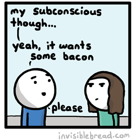
This is how my subconscious communicates with me, too. Click for the original comic.

The things I miss the most:

  • Fish finger sandwiches. I know they’re not to everybody’s taste, but these things are just delicious.
  • Chicken in convenient things. What do you mean, I can’t have the dupiaza unless it’s with chicken? You do other dishes with vegetables!
  • Minced beef. Chilli-non-carne and vegetable bolognese aren’t quite the same as their meaty counterparts, especially when I rarely get the opportunity to put mushrooms in instead.
  • Having a wide variety of choice. If I grab myself a lazy pre-made sandwich from the supermarket, my choices are – at best – limited to cheese-and-tomato or egg mayo. There are plenty of great veggie sandwich fillings: like falafel and hummus, roasted peppers, brie and pickle, curried tofu and lettuce, carrot and rocket, or even QuornTM. But I’ve had to get used to many supermarkets giving me a choice of one or two (and this is also the case in a shocking number of restaurants, too).
This is the fourth time I’ve used this photo on my blog, and it isn’t getting any easier. Man, that’s a tasty-looking sandwich.

And things I don’t miss as much as I expected to:

  • Bacon. I’ve had the ocassional craving for crispy, well-done bacon. This is odd, because as a meat-eater I generally preferred my bacon barely cooked at all. But I’ve not missed bacon as much as I’d feared, and that’s great, because JTA‘s still liable to cook it, and the smell might otherwise have been intolerable.
  • Steak. I occasionally feel like I’m missing out, but this is more-often because I’m stuck with a limited choice on a restaurant menu than that the steak in itself looked particularly tasty. I guess I wasn’t as attached to lumps of beef or mutton as I suspected!
  • Cooking with meat. I expected to have some difficulties here: I cook a variety of different things, some of them well. And of those, the vast majority had a meat component. Meat-substitutes aren’t always suitable (even where they are adequate), so I’ve had to discover a stack of new things that I can put together in the kitchen. But this turned out to be simpler than I thought… perhaps in part thanks to the number of vegetarians I’ve lived with or dated over the years.
The webcomic-o-sphere loves bacon. Click for the original comic.

So there we go. There are things I miss more than I thought, and there are things I’ve missed less. And there’s not a particularly strong pattern between them.

If you’ve restricted your diet (e.g. by choosing to be vegetarian), what do you miss? Or if you haven’t, what do you think you’d miss the most? I think we all know how Adam feels, at least…

×

On This Day in 2040

Looking Forward

On this day in 2040 I first managed to get my Internet Time Portal working. It’s been a long time coming, but my efforts have finally paid off. The trick was just to run The Wayback Machine in reverse, which just required the integration of my flux capacitor with the webserver. Thankfully, Apache 5‘s plugin architecture’s made it pretty easy, but I’ve already talked about how time-travel/webserver integration works back in my blog posts at the end of 2039, so I won’t bore you with them all again.

Despite what I said about password security back in 2011, I haven’t actually changed the password for my blog in 28 years, so it was the obvious target for my first reverse-websurfing experiment. That’s why past-me will be surprised to find this article posted to his blog, now that I’ve connected back in time and posted it. And I know he’ll be surprised, because I was.

In fact, it was probably this moment – this surprising moment back in April 2012 – that first made me realise that reverse-chronological web access was possible. That’s why I spent most of the next three decades cracking the secret and finally working out a way to send information back in time through the Internet.

Looking Back

There’s so much potential for this new technology. I’m hoping that soon the technology will evolve to the point where I’ll even be able to use ancient and outdated Internet protocols like “Facebook” (remember that fad?) to actually communicate directly with the people of the early 21st century. Just think of what we can learn from them!

After the second coming of Jesus in 2028 resulted in the deletion the mysterious “Video R” from the entire Internet, as well as from the minds of everybody on Earth, we’ve only been able to speculate what this mysterious media contained. Whatever it was, it was something so offensive to our Lord and Saviour that He saw fit to wipe it from the face of the Earth… but you can’t help but be curious, can’t you? Of course, those of you reading this back in 2012 can still see the video, you lucky lucky guys.

The possibilities are limitless. As soon as I’ve finished making this post, I’ll be trying to make contact with the past version of myself and see if past-Dan is capable of looking up this Wikipedia article for me: for some reason I can’t get access to it now, in 2040…

This blog post is part of the On This Day series, in which Dan periodically looks back on years yet to come.

8-Bit Google Maps

It’s like stepping back in time through videogaming history. And also sideways, into a parallel universe of knights and dragons.

8-bit Google Maps. At different view levels, you’ll see mountainous areas (Wales is worth looking at) and sprites for cities of different sizes.

It’s like Google Maps, but in the style of retro top-down, turn-based RPGs. It’s really quite impressive: it’s presumably being generated at least semi-dynamically (as it covers the whole world), but it’s more than a little impressive. It sometimes makes mistakes with rivers – perhaps where their visibility from the air is low – but nonetheless an interesting feat from a technical perspective.

There’s “8-bit Street View”, too.

Nice one, Google. Go take a look.

Fetch Quest

Commissioned, a webcomic I’ve been reading for many years now, recently made a couple of observations on the nature of “fetch quests” in contemporary computer role-playing games. And naturally – because my brain works that way – I ended up taking this thought way beyond its natural conclusion.

Today’s children are presumably being saturated with “fetch quests” in RPGs all across the spectrum from fantasy Skyrim-a-likes over to modern-day Grand Theft Auto clones and science fiction Mass Effect-style video games. And the little devil on my left shoulder asks me how this can be manipulated for fun and profit.

A typical fetch quest, taken to an illogical extreme. It's only a matter of time until you see this in a video game.

The traditional “fetch quest” goes as follows: I’ll give you what you need (the sword that can kill the monster, the job that you need to impress your gang, the name of the star that the invasion fleet are orbiting, or whatever), in exchange for you doing a delivery for me. Either I want you to take something somewhere, or I want you to pick something up, or – in the most overused and thankfully falling out of fashion example – I want you to bring me X number of Y object… 9 shards of triforce, 5 orc skulls, $10,000, or whatever. Needless to say, about 50% of the time there’ll be some kind of challenge along the way (you need to steal the item from a locked safe, you’ll be offered a bribe to “lose” the item, or perhaps you’ll just be mobbed by ninja robots as you ride along on your hypercycle), which is probably for the best because it’s the only thing that adds fun to role-playing a postman. I wonder if being attacked by mage princes is something that real-life couriers dream about?

This really doesn’t tally with normality. When you want something in the real world, you pay for it, or you don’t get it. But somehow in computer RPGs – even ones which allegedly try to model the real world – you’ll find yourself acting as an over-armed deliveryman every ten to fifteen minutes. And who wants to be a Level 38 Dark Elf Florist and Dog Walker?

YAFQ.

So perhaps… just perhaps… this will begin to shape the future of our reality. If the children of today start to see the “fetch quest” as a perfectly normal way to introduce yourself to somebody, then maybe someday it will be socially acceptable.

I’m going to try it. The next time that somebody significantly younger than me looks impatient in the queue for the self-service checkouts at Tesco, I’m going to offer to let them go in front of me… but only if they can bring me a tin of sweetcorn! “I can’t go myself, you see,” I’ll say, “Because I need to hold my place in the queue!” A tin of sweetcorn may not be as impressive-sounding as, say, the Staff of Fire Elemental Control, but it gets the job done. And it’s one of your five-a-day, too.

Or when somebody asks me for help fixing their broken website, I’ll say “Okay, I’ll help; but you have to do something for me. Bring me the bodies of five doughnuts, to prove yourself worthy of my assistance.”

It’s going to be a big thing, I promise.

× ×

Searching For A Virgin

You just can’t rely on GMail’s “contacts” search any more. Look what it came up with:

Not a result I'd commonly associate with the word "virgin".

With apologies to those of you who won’t “get” this: the person who came up in the search results is a name that is far, far away, in my mind, from the word “virgin”.

In not-completely-unrelated news, I use a program called SwiftKey X on my phone, which uses Markov chains (as I’ve described before) to intelligently suggest word completion and entire words and phrases based on the language I naturally use. I had the software thoroughly parse my text messages, emails, and even this blog to help it learn my language patterns. And recently, while writing a text message to my housemate Paul, it suggested the following sentence as the content of my message:

I am a beautiful person.

I have no idea where it got the idea that that’s something I’m liable to say with any regularity. Except now that it’s appeared on my blog, it will. It’s all gone a little recursive.

×