Milk and Mail Notifications with Flic 2 Buttons

I’ve been playing with a Flic Hub LR and some Flic 2 buttons. They’re “smart home” buttons, but for me they’ve got a killer selling point: rather than locking you in to any particular cloud provider (although you can do this if you want), you can directly program the hub. This means you can produce smart integrations that run completely within the walls of your house.

Here’s some things I’ve been building:

Prerequisite: Flic Hub to Huginn connection

Screenshot showing the location of the enabled "Hub SDK web access open" setting in the Flic Hub settings page of the Flic app.
Step 1. Enable SDK access. Check!

I run a Huginn instance on our household NAS. If you’ve not come across it before, Huginn is a bit like an open-source IFTTT: it’s got a steep learning curve, but it’s incredibly powerful for automation tasks. The first step, then, was to set up my Flic Hub LR to talk to Huginn.
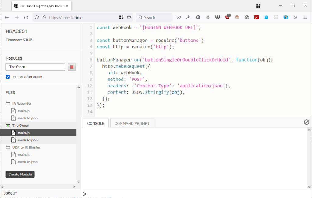
Screenshot showing the Flic Hub SDK open in Firefox. Three modules are loaded: "IR Recorder", "UDP to IR Blaster", and "The Green", the latter of which is open. "The Green" shows JavaScript code to listen for 'buttonSingleOrDoubleClickOrHold' events then transmits them as HTTP POST requests to a 'webHook' URL.
Checking ‘Restart after crash’ seems to help ensure that the script re-launches after e.g. a power cut. Need the script?

This was pretty simple: all I had to do was switch on “Hub SDK web access open” for the hub using the Flic app, then use the the web SDK to add this script to the hub. Now whenever a button was clicked, double-clicked, or held down, my Huginn installation would receive a webhook ping.

Flow chart showing a Flic 2 button sending a Bluetooth 5 LE message to a Flic Hub LR, which sends a Webook notification to Huginn (depicted as a raven wearing a headset), which sends a message to an unidentified Internet Of Things device, "probably" over HTTPS.
Depending on what you have Huginn do “next”, this kind of set-up works completely independently of “the cloud”. (Your raven can fly into the clouds if you really want.)

For convenience, I have all button-presses sent to the same Webhook, and use Trigger Agents to differentiate between buttons and press-types. This means I can re-use functionality within Huginn, e.g. having both a button press and some other input trigger a particular action.

You’ve Got Mail!

By our front door, we have “in trays” for each of Ruth, JTA and I, as well as one for the bits of Three Rings‘ post that come to our house. Sometimes post sits in the in-trays for a long time because people don’t think to check them, or don’t know that something new’s been added.

I configured Huginn with a Trigger Agent to receive events from my webhook and filter down to just single clicks on specific buttons. The events emitted by these triggers are used to notify in-tray owners.
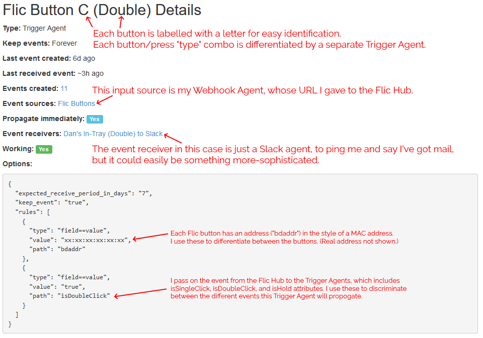
Annotated screenshot showing a Huginn Trigger Agent called "Flic Button C (Double) Details". Annotations show that: (1) "C" is the button name and that I label my buttons with letters. (2) "Double" is the kind of click I'm filtering for. (3) The event source for the trigger is a webhook called "Flic Buttons" whose URL I gave to my Flic Hub. (4) The event receiver for my Trigger Agent is called "Dan's In-Tray (Double) to Slack", which is a Slack Agent, but could easily be something more-sophisticated. (5) The first filter rule uses path: bdaddr, type: field==value, and a value equal to the MAC address of the button; this filters to events from only the specified button. (6) The second filter rule uses path: isDoubleClick, type: field==value, and value: true; this filters to events of type isDoubleClick only and not of types isSingleClick or isHold.
Once you’ve made three events for your first button, you can copy-paste from then on.

In my case, I’ve got pings being sent to mail recipients via Slack, but I could equally well be integrating to other (or additional) endpoints or even performing some conditional logic: e.g. if it’s during normal waking hours, send a Pushbullet notification to the recipient’s phone, otherwise send a message to an Arduino to turn on an LED strip along the top of the recipient’s in-tray.

I’m keeping it simple for now. I track three kinds of events (click = “post in your in-tray”, double-click = “I’ve cleared my in-tray”, hold = “parcel wouldn’t fit in your in-tray: look elsewhere for it”) and don’t do anything smarter than send notifications. But I think it’d be interesting to e.g. have a counter running so I could get a daily reminder (“There are 4 items in your in-tray.”) if I don’t touch them for a while, or something?

Remember the Milk!

Following the same principle, and with the hope that the Flic buttons are weatherproof enough to work in a covered outdoor area, I’ve fitted one… to the top of the box our milkman delivers our milk into!

Top of a reinforced polystyrene doorstep milk storage box, showing the round-topped handle. A metal file sits atop the box, about to be used to file down the handle.
The handle on the box was almost exactly the right size to stick a Flic button to! But it wasn’t flat enough until I took a file to it.

Most mornings, our milkman arrives by 7am, three times a week. But some mornings he’s later – sometimes as late as 10:30am, in extreme cases. If he comes during the school run the milk often gets forgotten until much later in the day, and with the current weather that puts it at risk of spoiling. Ironically, the box we use to help keep the milk cooler for longer on the doorstep works against us because it makes the freshly-delivered bottles less-visible.
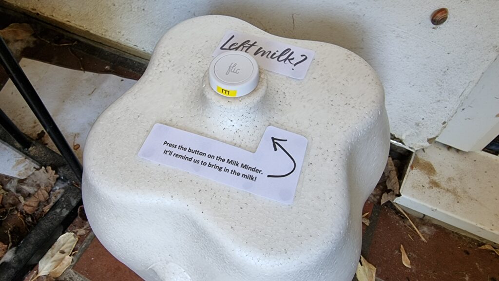
Milk container, with a Flic 2 button attached to the handle of the lid and a laminated notice attached, reading: "Left milk? Press the button on the Milk Minder. It'll remind us to bring in the milk!"
Now that I had the technical infrastructure already in place, honestly the hardest part of this project was matching the font used in Milk & More‘s logo.

I’m yet to see if the milkman will play along and press the button when he drops off the milk, but if he does: we’re set! A second possible bonus is that the kids love doing anything that allows them to press a button at the end of it, so I’m optimistic they’ll be more-willing to add “bring in the milk” to their chore lists if they get to double-click the button to say it’s been done!

Future Plans

I’m still playing with ideas for the next round of buttons. Could I set something up to streamline my work status, so my colleagues know when I’m not to be disturbed, away from my desk, or similar? Is there anything I can do to simplify online tabletop roleplaying games, e.g. by giving myself a desktop “next combat turn” button?

Flic Infared Transceiver on the side of a bookcase, alongside an (only slighter smaller than it) 20p piece, for scale.
My Flic Hub is mounted behind a bookshelf in the living room, with only its infrared transceiver exposed. 20p for scale: we don’t keep a 20p piece stuck to the side of the bookcase all the time.

I’m quite excited by the fact that the Flic Hub can interact with an infrared transceiver, allowing it to control televisions and similar devices: I’d love to be able to use the volume controls on our media centre PC’s keyboard to control our TV’s soundbar: and because the Flic Hub can listen for UDP packets, I’m hopeful that something as simple as AutoHotkey can make this possible.

Or perhaps I could make a “universal remote” for our house, accessible as a mobile web app on our internal Intranet, for those occasions when you can’t even be bothered to stand up to pick up the remote from the other sofa. Or something that switched the TV back to the media centre’s AV input when consoles were powered-down, detected by their network activity? (Right now the TV automatically switches to the consoles when they’re powered-on, but not back again afterwards, and it bugs me!)

It feels like the only limit with these buttons is my imagination, and that’s awesome.

× × × × × × ×

Bash+Batch In One File

Today I wanted to write a script that I could execute from both *nix (using Bash or a similar shell) and on Windows (from a command prompt, i.e. a batch file). I found Max Norin’s solution which works, but has a few limitations, e.g. when run it outputs either the word “off” when run in *nix or the word “goto” when run on Windows. There’s got to be a sneaky solution, right?

Here’s my improved version:

 1
 2
 3
 4
 5
 6
 7
 8
 9
10
11
12
@goto(){
  # Linux code here
  uname -o
}

@goto $@
exit

:(){
@echo off
rem Windows script here
echo %OS%

Mine exploits the fact that batch files can prefix commands with @ to suppress outputting them as they execute. So @goto can be a valid function name in bash/zsh etc. but is interpreted as a literal goto command in a Windows Command Prompt. This allows me to move the echo off command – which only has meaning to Windows – into the Windows section of the script and suppress it with @.

The file above can be saved as e.g. myfile.cmd and will execute in a Windows Command Prompt (or in MS-DOS) or your favourite *nix OS. Works in MacOS/BSD too, although obviously any more-sophisticated script is going to have to start working around the differences between GNU and non-GNU versions of core utilities, which is always a bit of a pain! Won’t work in sh because you can’t define functions like that.

But the short of it is you can run this on a stock *nix OS and get:

$ ./myfile.cmd
GNU/Linux

And you can run it on Windows and get:

> .\myfile.cmd
Windows_NT

You can’t put a shebang at the top because Windows hates it, but there might be a solution using PowerShell scripts (which use hashes for comments: that’s worth thinking about!). In any case: if the interpreter strictly matters you’ll probably want to shell to it on line 3 with e.g. bash -c.

Why would you want such a thing? I’m not sure. But there is is, if you do.

Do What You’re Bad At

This post is also available as a video. If you'd prefer to watch/listen to me talk about this topic, give it a look.

This blog post is also available as a video. Would you prefer to watch/listen to me tell you about how I’ve learned to enjoy doing what I’m bad at?

There are a great number of things that I’m bad at. One thing I’m bad at (but that I’m trying to get better at) is being more-accepting of the fact that there are things that I am bad at.

Against a pale background, Dan, deep in thought and with a finger to his lips, staring into space. A stylised thought bubble above him shows that he is thinking about himself thinking about himself thinking about himself, and so on (implied to infinity).
I’ve also been thinking about how I’m bad at thinking about how I’m bad at thinking about how I’m bad at thinking about…

I’m pretty bad in a pub quiz. I’m bad at operating my pizza oven without destroying cookware. I’m especially bad at learning languages. I’m appallingly bad at surfing. Every time my work periodically leans in that direction I remember how bad I am at React. And I’ve repeatedly shown that I’m bad at keeping on top of blogging, to the extent that I’ve periodically declared bankruptcy on my drafts folder.

So yeah, pretty bad at things.

But hang on: that assessment isn’t entirely true.

Photograph showing a yellow banana on a pink background. The banana has a silver chain wrapped around it three times. Photo courtesy Deon Black.
I’m also particularly bad at choosing suitable stock photos for use in blog posts.

Being Bad

As a young kid, I was a smart cookie. I benefited from being an only child and getting lots of attention from a pair of clever parents, but I was also pretty bright and a quick learner with an interest in just about anything I tried. This made me appear naturally talented at a great many things, and – pushed-on by the praise of teachers, peers, and others – I discovered that I could “coast” pretty easily.

But a flair for things will only carry you so far, and a problem with not having to work hard at your education means that you don’t learn how to learn. I got bitten by this when I was in higher education, when I found that I actually had to work at getting new information to stick in my head (of course, being older makes learning harder too, as became especially obvious to me during my most-recent qualification)!

Dan, aged around 4, dressed in a duffel coat, bobble hat and gloves, kneeling on a red plastic sledge in a snow-filled garden. The garden is bordered by a wire fence, and in the background a man can be seen scraping icee off a car.
Ignore the fact that you’ve now seen me trying to sledge uphill and just accept that I was a clever kid (except at photography), okay?

A side-effect of these formative experiences is that I grew into an adult who strongly differentiated between two distinct classes of activities:

  1. Things I was good at, either because of talent or because I’d thoroughly studied them already. I experienced people’s admiration and respect when I practised these things, and it took little effort to stay “on top” of these fields, and
  2. Things I was bad at, because I didn’t have a natural aptitude and hadn’t yet put the time in to learning them. We don’t often give adults external reinforcement for “trying hard”, and I’d become somewhat addicted to being seen as awesome… so I shied away from things I was “bad at”.

The net result: I missed out on opportunities to learn new things, simply because I didn’t want to be seen as going through the “amateur” phase. In hindsight, that’s really disappointing! And this “I’m bad at (new) things” attitude definitely fed into the imposter syndrome I felt when I first started at Automattic.

Being Better

Leaving the Bodleian after 8½ years might have helped stimulate a change in me. I’d carved out a role for myself defined by the fields I knew best; advancing my career would require that I could learn new things. But beyond that, I benefited from my new employer whose “creed culture” strongly promotes continuous learning (I’ve vlogged about this before), and from my coach who’s been great at encouraging me towards a growth mindset.

A cake with icing printed with a picture of Dan in a library. Beneath are iced the words "Good Luck Dan".
“Good Luck Dan”, my Bodleian buddies said. But perhaps they should’ve said “Keep Learning Dan”.

But perhaps the biggest stimulus to remind me to keep actively learning, even (especially?) when it’s hard, might have been the pandemic. Going slightly crazy with cabin fever during the second lockdown, I decided to try and teach myself how to play the piano. Turns out I wasn’t alone, as I’ve mentioned before: the pandemic did strange things to us all.

I have no real experience of music; I didn’t even get to play recorder in primary school. And I’ve certainly got no talent for it (I can hear well enough to tell how awful my singing is, but that’s more a curse than a blessing). Also, every single beginners’ book and video course I looked at starts from the assumption that you’re going to want to “feel” your way into it, and that just didn’t sit well with the way my brain works.

Animation showing Dan, wearing a black t-shirt and tracksuit bottoms, playing an upright piano.
90% of what I do in front of a piano might be described as “Dan Mucks About (in B Minor)”, but that’s fine by me.

I wanted a theoretical background before I even sat down at a keyboard, so I took a free online course in music theory. Then I started working through a “beginners’ piano” book we got for the kids. Then I graduated to “first 50 Disney songs”, because I know how virtually all of them sound well enough that I’d be able to hear where I was going wrong. Since then, I’ve started gradually making my way through a transcription of Einaudi’s Islands. Feeling like I’d got a good handle on what I was supposed to be doing, I then took inspiration from a book JTA gave me and started trying to improvise.

Most days, I get no more than about 10 minutes on the piano. But little by little, day by day, that’s enough to learn. Nowadays even my inner critic perfectionist can tolerate hearing myself play. And while I know that I’ll probably never be as good as, say, the average 8-year-old on YouTube, I’m content in my limited capacity.

Three books on a blue-and-white tablecloth: John Thompson's Easiest Piano Course (Part One), First 50 Disney Songs, and Essential Einaudi - Islands. Beneath them sits a simplified diagram showing the circle of fifths.
Let’s start at the very beginning. (A very good place to start.)

If I’m trying to cultivate my wonder syndrome, I need to stay alert for “things I’m bad at” that I could conceivably be better at if I were just brave enough to try to learn. I’m now proudly an “embarrassingly amateur” pianist, which I’m at-long-last growing to see as better than a being non-pianist.

Off the back of that experience, I’m going to try to spend more time doing things that I’m bad at. And I’d encourage you to do the same.

× × × × ×

Mathematics of Mid-Journey Refuelling

I love my electric car, but sometimes – like when I need to transport five people and a week’s worth of their luggage 250 miles and need to get there before the kids’ bedtime! – I still use our big ol’ diesel-burning beast. And it was while preparing for such a journey that I recently got to thinking about the mathematics of refuelling.

Car display showing "Please refuel. Range: 40ml"
I don’t know why you’d measure range in millilitres in the first place, but I’m hearing that I ought to fill up the car before we go.

It’s rarely worth travelling out-of-your-way to get the best fuel prices. But when you’re on a long road trip anyway and you’re likely to pass dozens of filling stations as a matter of course, you might as well think at least a little about pulling over at the cheapest.

You could use one of the many online services to help with this, of course… but assuming you didn’t do this and you’re already on the road, is there a better strategy than just trusting your gut and saying “that’s good value!” when you see a good price?

It turns out this is an application for the Secretary Problem (and probably a little more sensible than the last time I talked about it!).

A woman's hand reaches for one of four fuel pump nozzles. Photo by Gustavo Fring, used under the Pexels License.
If you can’t decide which nozzle is best, mix up a cocktail of them all. #TerribleProTip

Here’s how you do it:

  1. Estimate your outstanding range R: how much further can you go? Your car might be able to help you with this. Let’s say we’ve got 82 miles in the tank.
  2. Estimate the average distance between filling stations on your route, D. You can do this as-you-go by counting them over a fixed distance and continue from step #4 as you do so, and it’ll only really mess you up if there are very few. Maybe we’re on a big trunk road and there’s a filling station about every 5 miles.
  3. Divide R by D to get F: the number of filling stations you expect to pass before you completely run out of fuel. Round down, obviously, unless you’re happy to push your vehicle to the “next” one when it breaks down. In our example above, that gives us 16 filling stations we’ll probably see before we’re stranded.
  4. Divide F by e to get T (use e = 2.72 if you’re having to do this in your head). Round down again, for the same reason as before. This gives us T=5.
  5. Drive past the next T filling stations and remember the lowest price you see. Don’t stop for fuel at any of these.
  6. Keep driving, and stop at the first filling station where the fuel is the same price or cheaper than the cheapest you’ve seen so far.
Dan sitting in the driving seat of a car, doing maths on a portable whiteboard.
Obviously you should take care doing maths on the road. Don’t drink and derive!

This is a modified variant of the Secretary Problem because it’s possible for two filling stations to have the same price, and that’s reflected in the algorithm above by the allowance for stopping for fuel at the same price as the best you saw during your sampling phase. It’s probably preferable to purchase sub-optimally than to run completely dry, right?

Of course, you’re still never guaranteed a good solution with this approach, but it maximises your odds. Your own risk-assessment might rank “not breaking down” over pure mathematical efficiency, and that’s on you.

× × ×

Wonder Syndrome

Ruth wrote an excellent post this month entitled Wonder Syndrome. It attempts to reframe imposter syndrome (which is strongly, perhaps disproportionately, present in tech fields) as a positive indicator that there’s still more to learn:

Being aware of the boundaries of our knowledge doesn’t make us imposters, it makes us explorers. I’m going to start calling mine “Wonder Syndrome”, and allowing myself to be awed by how much I still have to learn, and then focusing in and carrying on with what I’m doing because although I may not reach the stars, I’ve come a long way up the mountain. I can learn these things, I can solve these problems, and I will.

This really resonated with me, and not just because I’ve totally bought into the Automattic creed, which literally opens with the assertion that “I will never stop learning”. (Other parts of the creed feel like they parallel Ruth’s post, too…)

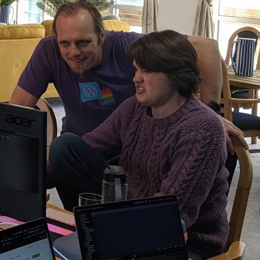
Dan and Jacob look at a piece of code together; Dan is smiling but Jacob looks disgusted.
I don’t recall exactly what I’m advising a fellow Three Rings developer to do, here, but I don’t think he’s happy about it.

I just spent a week at a Three Rings DCamp (a “hackathon”, kinda), and for the umpteenth time had the experience of feeling like everybody thinks I know everything, while on the inside I still feel like I’m still guessing a third of the time (and on StackOverflow for another third!).

The same’s true at work: people ask me questions about things that I suppose, objectively, are my “specialist subjects” – web standards, application security, progressive enhancement, VAT for some reason – and even where I’m able to help, I often get that nagging feeling like there must be somebody better than me they could have gone to?

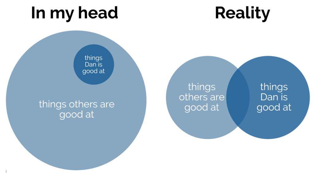
Pair of Venn diagrams. The first, titled "In my head", shows "things Dan is good at" as a subset of "things others are good at". The second, titled "Reality", shows an intersection between "things others are good at" and "things Dan is good at" but plenty of unshared space in each.
You’ve probably seen diagrams like this before. After all: I’m not smart or talented enough to invent anything like this and I don’t know why you’d listen to anything I have to say on the subject anyway. 😂

You might assume that I love Ruth’s post principally because it plays to my vanity. The post describes two kinds of knowledgeable developers, who are differentiated primarily by their attitude to learning. One is satisfied with the niche they’ve carved out for themselves and the status that comes with it and are content to rest on their laurels; the other is driven to keep pushing and learning more and always hungry for the next opportunity to grow. And the latter category… Ruth’s named after me.

Woman on laptop, looking concerned towards camera, captioned "are you even good enough to have imposter syndrome?"
Wait, what if I’m not Have I been faking it this entire blog post?

Bnd while I love the post, my gut feeling to being named after such an ideal actually makes me slightly uncomfortable. The specific sentence that gets me is (emphasis mine):

Dans have no interest in being better than other people, they just want to know more than they did yesterday.

I wish that was me, but I’m actually moderately-strongly motivated by a desire to feel like I’m the smartest person in the room! I’m getting this urge under control (I’m pretty sure I was intolerable as a child and have been improving by instalments since then!). Firstly, because it’s an antisocial pattern to foster, but also because it limits my ability to learn new things to have to go through the awkward, mistake-filled “I’m a complete amateur at this!” phase. But even as I work on this I still get that niggling urge, more often than I’d like, to “show off”.

Of course, it could well be that what I’m doing right now is catastrophising. I’m taking a nice thing somebody’s said about me, picking the one part of it that I find hardest to feel represents me, and deciding that I must be a fraud. Soo… imposter syndrome, I guess. Damn.

Or to put it a better way: Wonder Syndrome. I guess this is another area for self-improvement.

(I’m definitely adopting Wonder Syndrome into my vocabulary, as an exercise in mitigating imposter syndrome. If you’ve not read Ruth’s post in full, you should go and do that next.)

× ×

Child Photographers

Taking a photo of our kids isn’t too hard: their fascination with screens means you just have to switch to “selfie mode” and they lock-on to the camera like some kind of narcissist homing pigeon. Failing that, it’s easy enough to distract them with something that gets them to stay still for a few seconds and not just come out as a blur.

Dan with the kids and his bike, on the way to school.
“On the school run” probably isn’t a typical excuse for a selfie, but the light was good.

But compared to the generation that came before us, we have it really easy. When I was younger than our youngest is , I was obsessed with pressing buttons. So pronounced was my fascination that we had countless photos, as a child, of my face pressed so close to the lens that it’s impossible for the camera to focus, because I’d rushed over at the last second to try to be the one to push the shutter release button. I guess I just wanted to “help”?

Monoshcome photo of Dan, circa 1982, poiting towards the camera.
Oh wait… is there something on that camera I can press?

In theory, exploiting this enthusiasm should have worked out well: my parents figured that if they just put me behind the camera, I could be persuaded to take a good picture of others. Unfortunately, I’d already fixated on another aspect of the photography experience: the photographer’s stance.

When people were taking picture of me, I’d clearly noticed that, in order to bring themselves down to my height (which was especially important given that I’d imminently try to be as close to the photographer as possible!) I’d usually see people crouching to take photos. And I must have internalised this, because I started doing it too.

Dan's mum and dad, with the top halves of their heads cut-off by the poor framing of the picture.
Another fantastic photo by young Dan: this one shows around 80% of my mum’s face and around 100% of my dad’s manspreading.

Unfortunately, because I was shorter than most of my subjects, this resulted in some terrible framing, for example slicing off the tops of their heads or worse. And because this was a pre-digital age, there was no way to be sure exactly how badly I’d mucked-up the shot until days or weeks later when the film would be developed.


Dan's dad crouches next to a bus in a somewhat lopsided-photo.
I imagine that my dad hoped to see more of whatever bus that is, in this photo, but he’s probably just grateful that I didn’t crop off any parts of his body this time.

In an effort to counteract this framing issue, my dad (who was always keen for his young assistant to snap pictures of him alongside whatever article of public transport history he was most-interested in that day) at some point started crouching himself in photos. Presumably it proved easier to just duck when I did rather than to try to persuade me not to crouch in the first place.

As you look forward in time through these old family photos, though, you can spot the moment at which I learned to use a viewfinder, because people’s heads start to feature close to the middle of pictures.

Dan's dad on a train station.
This is a “transitional period” photo, evidenced by the face that my dad is clearly thinking about whether or not he needs to crouch.

Unfortunately, because I was still shorter than my subjects (especially if I was also crouching!), framing photos such that the subject’s face was in the middle of the frame resulted in a lot of sky in the pictures. Also, as you’ve doubtless seem above, I was completely incapable of levelling the horizon.

Extremely blurred close-up photo of Dan's face.
This is the oldest photo I can find that was independently taken by our youngest child, then aged 3. I’m the subject, and I’m too close to the lens, blurred because I’m in motion, and clearly on my way to try to “help” the photographer. Our ages might as well be reversed.

I’d like to think I’ve gotten better since, but based on the photo above… maybe the problem has been me, all along!

× × × ×

Say… “Cheese?”

For lunch today I taste-tested five different plant-based vegan “cheeses” from Honestly Tasty. Let’s see if they’re any good.

Prefer video?

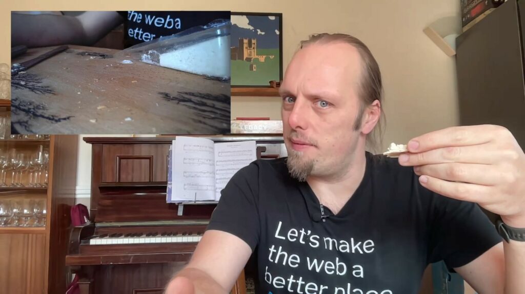
This blog post is available as a video (here or on YouTube), for those who like that sort of thing. The content’s slightly different, but you do get to see my face when I eat the one that doesn’t agree with me.

Background

I’ve been vegetarian or mostly-vegetarian to some degree or another for a little over ten years (for those who have trouble keeping up: I currently eat meat only on weekends, and not including beef or lamb), principally for the environmental benefits of a reduced-meat lifestyle. But if I’m really committed to reducing the environmental impact of my diet, the next “big” thing I still consume is dairy products.

My milk consumption is very low nowadays, but – like many people who might aspire towards dropping dairy – it’s quitting cheese that poses the biggest challenge. I’m not even the biggest fan of cheese, and I don’t know how I’d do without it: there’s just, it seems, no satisfactory substitute.

It’s possible, though, that my thinking on this is outdated. Especially in recent years, we’re getting better and better at making convincing (or, at least, tasty!) plant-based substitutes to animal based foods. And so, inspired by a conversation with some friends, I thought I’d try a handful of new-generation plant-based cheeses and see how I got on. I ordered a variety pack from Honestly Tasty (who’ll give you 20% off your first order if you subscribe your favourite throwaway email address to their newsletter) and gave it a go.

Bree

Dan eats some Bree.
It’s supposed to taste like Brie, I guess, but it’s not convincing. The texture of the rind is surprisingly good, but the inside is somewhat homogeneous and flat. They’ve tried to use mustard powder to provide Brie’s pepperiness and acetic acid for its subtle sourness, but it feels like there might be too much of the former (or perhaps I’m just a little oversensitive to mustard) and too little of the latter. It’s okay, but I wouldn’t buy it again.

Ched Spread

Dan eats Ched Spread.
This was surprisingly flavoursome and really quite enjoyable. It spreads with about the consistency of pâté and has a sharp tang that really stands out. You wouldn’t mistake it for cheese, but you might mistake it for a cheese spread: there’s a real “cheddary” flavour buried in there.

Blue

Dan eats 'Blue' Veganzola.
This is supposed to be modelled after Gorgonzola, and it might as well be because I don’t like either it or the cheese it’s based on. I might loathe Blue slightly less than most blue cheeses, but that doesn’t mean I’d willingly subject myself to this again in a hurry. It’s matured with real Penicillium Roqueforti, apparently, along with seaweed, and it tastes like both of these things are true. So yeah: I hated this one, but you shouldn’t take that as a condemnation of its quality as a cheese substitute because I’d still rather eat it than the cheese that it’s based on. Try for yourself, I guess.

Herbi

Dan eating Herbi.
This was probably my favourite of the bunch. It’s reminiscent of garlic & herb Boursin, and feels like somebody in the kitchen where they cooked it up said to themselves, “how about we do the Ched Spread, but with less onion and a whole load of herbs mixed-through”. It seems that it must be easier to make convincingly-cheesy soft cheeses than hard cheeses, but I’m not complaining: this would be great on toast.

Shamembert

Dan serves a Shamembert.
If you’d served me this and told me it was a baked Camembert… I wouldn’t be fooled. But I wouldn’t be disappointed either. It moves a lot like Camembert and it tastes… somewhat like it. But whether or not that’s “enough” for you, it’s perfectly delicious and I’d be more than happy to eat it or serve it to others.

In summary…

Honestly Tasty’s Ched Spread, Herbi, and Shamembert are perfectly acceptable (vegan!) substitutes for cheese. Even where they don’t accurately reflect the cheese they attempt to model, they’re still pretty good if you take them on their own merits: instead of comparing them to their counterparts, consider each as if it were a cheese spread or soft cheese in its own right and enjoy accordingly. I’d buy them again.

Their Bree failed to capture the essence of a good ripe Brie and its flavour profile wasn’t for me something to enjoy outside of its attempts at emulation. And their “Veganzola” Blue cheese… was pretty grim, but then that’s what I think of Gorgonzola too, so maybe it’s perfect and I just haven’t the palate for it.

× × × × ×

Nginx Caching for Passenger Applications

Suppose you’re running an application on a Passenger + Nginx powered server and you want to add caching.

Perhaps your application has a dynamic, public endpoint but the contents don’t change super-frequently or it isn’t critically-important that the user always gets up-to-the-second accuracy, and you’d like to improve performance with microcaching. How would you do that?

Where you’re at

Diagram showing the Internet connecting to an Nginx+Passenger webserver, connecting to an application written for Ruby, Python, or NodeJS.
Not pictured: the rest of the Internet.

Your configuration might look something like this:

1
2
3
4
5
6
7
server {
  # listen, server_name, ssl, logging etc. directives go here
  # ...

  root               /your/application;
  passenger_enabled  on;
}

What you’re looking for is proxy_cache and its sister directives, but you can’t just insert them here because while Passenger does act act like an upstream proxy (with parallels like e.g. passenger_pass_header which mirrors the behaviour of proxy_pass_header), it doesn’t provide any of the functions you need to implement proxy caching of non-static files.

Where you need to be

Instead, what you need to to is define a second server, mount Passenger in that, and then proxy to that second server. E.g.:

 1
 2
 3
 4
 5
 6
 7
 8
 9
10
11
12
13
14
15
16
17
18
19
20
21
22
23
24
25
# Set up a cache
proxy_cache_path /tmp/cache/my-app-cache keys_zone=MyAppCache:10m levels=1:2 inactive=600s max_size=100m;

# Define the actual webserver that listens for Internet traffic:
server {
  # listen, server_name, ssl, logging etc. directives go here
  # ...

  # You can configure different rules by location etc., but here's a simple microcache:
  location / {
    proxy_pass http://127.0.0.1:4863; # Proxy all traffic to the application server defined below
    proxy_cache           MyAppCache; # Use the cache defined above
    proxy_cache_valid     200 3s;     # Treat HTTP 200 responses as valid; cache them for 3 seconds
    proxy_cache_use_stale updating;   # (Optional) send outdated response while background-updating cache
    proxy_cache_lock      on;         # (Optional) only allow one process to update cache at once
  }
}

# (Local-only) application server on an arbitrary port number to act as the upstream proxy:
server {
  listen 127.0.0.1:4863;

  root               /your/application;
  passenger_enabled  on;
}

The two key changes are:

  • Passenger moves to a second server block, localhost-only, on an arbitrary port number (doesn’t need HTTPS, of course, but if your application detects/”expects” HTTPS you might need to tweak your headers).
  • Your main server block proxies to the second as its upstream, and you can add whatever caching directives you like.

Obviously you’ll need to be smarter if you host a mixture of public and private content (e.g. send Vary: headers from your application) and if you want different cache durations on different addresses or types of content, but there are already great guides to help with that. I only wrote this post because I spent some time searching for (nonexistent!) passenger_cache_ etc. rules and wanted to save the next person from the same trouble!

×

Printing Maps from Dungeondraft

I really love Dungeondraft, an RPG battle map generator. It’s got great compatibility with online platforms like Foundry VTT and Roll20, but if you’re looking to make maps for tabletop play, there’s a few tips I can share:

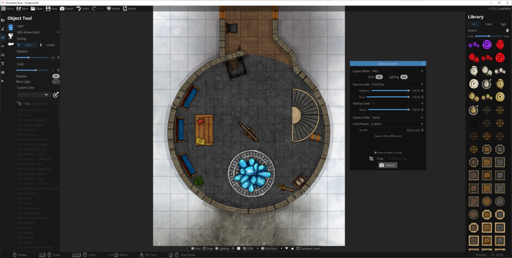
Screenshot showing Dungeondraft being used to edit a circular tower. The Export window is visible.
Tabletop players can’t zoom in and will appreciate you printing with good contrast.

Planning and designing

Dungeondraft has (or can be extended with) features to support light levels and shadow-casting obstructions, openable doors and windows, line-of sight etc… great to have when you’re building for Internet-enabled tabletops, but pointless when you’re planning to print out your map! Instead:

  • Think about scale: I’m printing to A4 sheets and using inch-size squares, so every 11 x 8 squares equates to one sheet of paper. Knowing this, I can multiply-up to a whole number of sheets of paper and this informs my decisions about how to best make use of the maps (and what will and won’t fit on my dining table!).
  • Focus on legibility: Your printer probably won’t have the same kind of resolution as your screen, and your players can’t “zoom in” to get details. Play with the grid styles (under Map Settings) to find what works best for you, and try not to clash with your floor patterns. If you’re printing in monochrome, use the “Printer-Friendly” camera filter (also under Map Settings, or in the Export Options dialog) to convert to gorgeous line-art. Make sure critical elements have sufficient contrast that they’ll stand out when printed or your players might walk right over that chest, campfire, or bookshelf.
  • Think about exposure: You don’t get digital “fog of war” on the tabletop! Think about how you’re going to reveal the map to your players: plan to print in multiple sections to put together, jigsaw style, or have card to “cover” bits of the map. Think about how the tool can help you here: e.g. if you’ve got multiple buildings the players can explore, use a higher “level” or roof layer to put roofs on your buildings, then print the relevant parts of that level separately: now you’ve got a thematic cover-up that you can remove to show the insides of the building. Go the other way around for secret doors: print the empty wall on your main map (so players can’t infer the location of the secret door by the inclusion of a cover-up) and the secret door/passage on the overlay, so you can stick it onto the map when they find it.
Monochrome map showing a crane tower and attached dwelling.
If you’re printing in black and white, line art can be a gorgeous look.

Printing it out

There’s no “print” option in Dungeondraft, so – especially if your map spans multiple “pages” – you’ll need a multi-step process to printing it out. With a little practice, it’s not too hard or time-consuming, though:

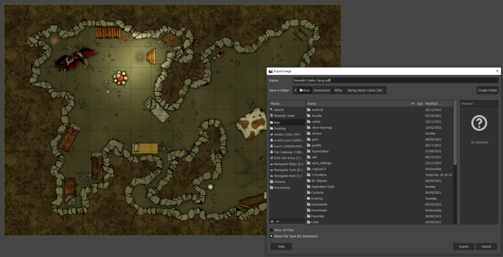
Screenshot showing a cavern map in Gimp, with the Export Image dialog open and PDF selected as the output format.
Gimp makes light work of converting a PNG into a PDF.

Export your map (level by level) from Dungeondraft as PNG files. The default settings are fine, but pay attention to the “Overlay level” setting if you’re using smart or complex cover-ups as described above.

To easily spread your map across multiple pages, you’ll need to convert it to a PDF. I’m using Gimp to do this. Simply open the PNG in Gimp, make any post-processing/last minute changes that you couldn’t manage in Dungeondraft, then click File > Export As… and change the filename to have a .pdf extension. You could print directly from Gimp, but in my experience PDF reader software does a much better job at multi-page printing.

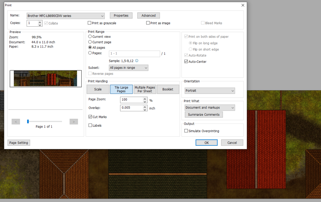
Foxit print dialog showing a preview of a map printed across 6 sheets of A4 paper.
Check the print preview before you click the button!

Open your PDF in an appropriate reader application with good print management. I’m using Foxit, which is… okay? Print it, selecting “tile large pages” to tell it to print across multiple sheets. Assuming you’ve produced a map an appropriate size for your printer’s margins, your preview should be perfect. If not, you can get away with reducing the zoom level by up to a percent or two without causing trouble for your miniatures. If you’d like the page breaks to occur at specific places (for exposure/reveal reasons), go back to Gimp and pad one side of the image by increasing the canvas size.

Check the level of “overlap” specified: I like to keep mine low and use the print margins as the overlapping part of my maps when I tape them together, but you’ll want to see how your printer behaves and adapt accordingly.

Multiple sheets of A4 paper joined with a slight overlap by long strips of sticky tape.
The overlap provides stability, rigidity, and an explanation as to exactly what that character tripped over when they rolled a critical fail on a DEX check.

If you’re sticking together multiple pages to make a single large map, trim off the bottom and right margins of each page: if you printed with cut marks, this is easy enough even without a guillotine. Then tape them together on the underside, taking care to line-up the features on the map (it’s not just your players who’ll appreciate a good, visible grid: it’s useful when lining-up your printouts to stick, too!).

I keep my maps rolled-up in a box. If you do this too, just be ready with some paperweights to keep the edges from curling when you unfurl them across your gaming table. Or cut into separate rooms and mount to stiff card for that “jigsaw” effect! Whatever works best for you!

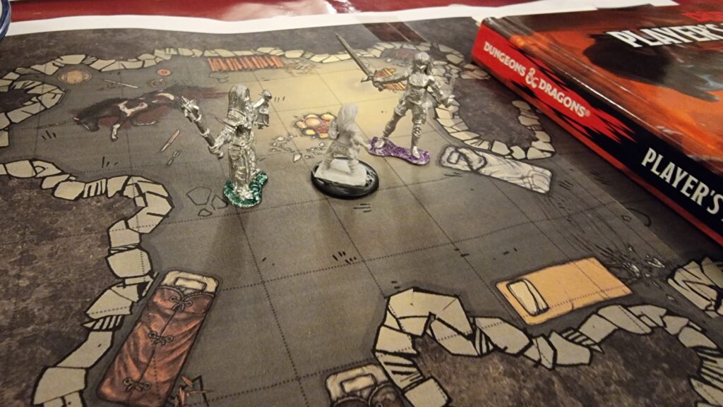
Miniatures on a cave map, with the D&D Player's Handbook acting as a paperweight.
Any hefty tome, e.g. the 5e Player’s Handbook, can act as a paperweight.
× × × × × ×

DNDle (Wordle, but with D&D monster stats)

Don’t have time to read? Just start playing:

Play DNDle

There’s a Wordle clone for everybody

Am I too late to get onto the “making Wordle clones” bandwagon? Probably; there are quite a few now, including:

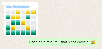
Screenshot showing a WhatsApp conversation. Somebody shares a Wordle-like "solution" board but it's got six columns, not five. A second person comments "Hang on a minute... that's not Wordle!"
I’m sure that by now all your social feeds are full of people playing Wordle. But the cool nerds are playing something new…

Now, a Wordle clone for D&D players!

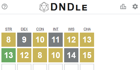
But you know what hasn’t been seen before today? A Wordle clone where you have to guess a creature from the Dungeons & Dragons (5e) Monster Manual by putting numeric values into a character sheet (STR, DEX, CON, INT, WIS, CHA):

Screenshot of DNDle, showing two guesses made already.
Just because nobody’s asking for a game doesn’t mean you shouldn’t make it anyway.

What are you waiting for: go give DNDle a try (I pronounce it “dindle”, but you can pronounce it however you like). A new monster appears at 10:00 UTC each day.

And because it’s me, of course it’s open source and works offline.

The boring techy bit

  • Like Wordle, everything happens in your browser: this is a “backendless” web application.
  • I’ve used ReefJS for state management, because I wanted something I could throw together quickly but I didn’t want to drown myself (or my players) in a heavyweight monster library. If you’ve not used Reef before, you should give it a go: it’s basically like React but a tenth of the footprint.
  • A cache-first/background-updating service worker means that it can run completely offline: you can install it to your homescreen in the same way as Wordle, but once you’ve visited it once it can work indefinitely even if you never go online again.
  • I don’t like to use a buildchain that’s any more-complicated than is absolutely necessary, so the only development dependency is rollup. It resolves my import statements and bundles a single JS file for the browser.
×

Automattic International

(This is yet another post about Automattic. Seee more posts about my experience of working at Automattic.)

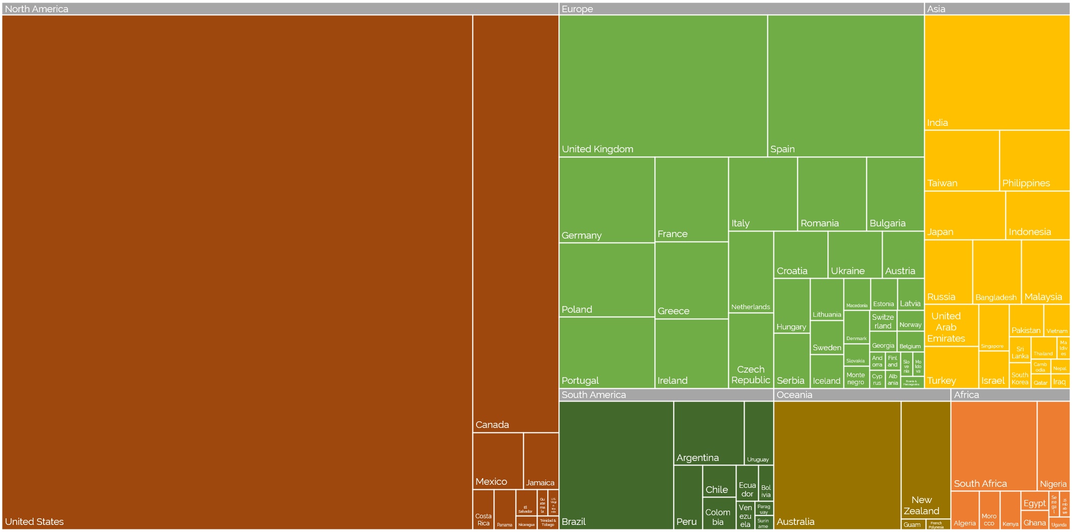
Off the back of my recent post about privileges I enjoy as a result of my location and first language, even at my highly-multinational employer, and inspired by my colleague Atanas‘ data-mining into where Automatticians are located, I decided to do another treemap, this time about which countries Automatticians call home:

Where are the Automatticians?

Treemap showing countries of Automatticians. North America and specifically the USA dominates, the UK has the most in Europe, etc.
If raw data’s your thing (or if you’re just struggling to make out the names of the countries with fewer Automatticians), here’s a CSV file for you.

To get a better picture of that, let’s plot a couple of cartograms. This animation cycles between showing countries at (a) their actual (landmass) size and (b) approximately proportional to the number of Automatticians based in each country:

Animation showing countries "actual size" changing to proportional-to-Automattician-presence.
This animation alternates between showing countries at “actual size” and proportional to the number of Automatticians based there. North America and Europe dominate the map, but there are other quirks too: look at e.g. how South Africa, New Zealand and India balloon.

Another way to consider the data would be be comparing (a) the population of each country to (b) the number of Automatticians there. Let’s try that:

Animation showing countries proportional to population changing to proportional-to-Automattician-presence.
Here we see countries proportional to their relative population change shape to show number of Automatticians, as seen before. Notice how countries with larger populations like China shrink away to nothing while those with comparatively lower population density like Australia blow up.

There’s definitely something to learn from these maps about the cultural impact of our employee diversity, but I can’t say more about that right now… primarily because I’m not smart enough, but also at least in part because I’ve watched the map animations for too long and made myself seasick.

A note on methodology

A few quick notes on methodology, for the nerds out there who’ll want to argue with me:

  1. Country data was extracted directly from Automattic’s internal staff directory today and is based on self-declaration by employees (this is relevant because we employ a relatively high number of “digital nomads”, some of whom might not consider any one country their home).
  2. Countries were mapped to continents using this dataset.
  3. Maps are scaled using Robinson projection. Take your arguments about this over here.
  4. The treemaps were made using Excel. The cartographs were produced based on work by Gastner MT, Seguy V, More P. [Fast flow-based algorithm for creating density-equalizing map projections. Proc Natl Acad Sci USA 115(10):E2156–E2164 (2018)].
  5. Some countries have multiple names or varied name spellings and I tried to detect these and line-up the data right but apologies if I made a mess of it and missed yours.
× × ×

Coco the Criminal and Peanut the Prophet

There’s a bird feeder in my garden. I’ve had it for about a decade now – Ruth got it for me, I think, as a thirtieth birthday present – and it’s still going strong and mostly-intact, despite having been uprooted on several occasions to move house.

I like that I can see it from my desk.

A greater spotted woodpecker hangs off a feeder cage with a fat/seed ball inside.
A woodpecker’s been a regular visitor this winter.

This month, though, it lost a piece, when one of its seed cages was stolen in a daring daylight heist by a duo of squirrels who climbed up the (“climb-proof”) pole, hung upside-down from the hooks, and unscrewed the mechanism that held the feeder in place.

Not content to merely pour out and devour the contents, the miscreants made off with the entire feeder cage. It hasn’t been seen since. I’ve scoured the lawn, checked behind the bushes, peered around bins and fence posts… it’s nowhere to be found. It’s driving me a little crazy that it’s vanished so-thoroughly.

Grey squirrel sitting on a log.
Artists’ recreation of one of the culprits. (Courtesy @mikebirdy.)

I can only assume that the squirrels, having observed that the feeder would routinely be refilled once empty, decided that it’d be much more-convenient for them if it the feeder were closer to their home:

“Hey, Coco!”

“Yeah, Peanut?”

“Every time we steal the nuts in this cage, more nuts appear…”

“Yeah, it’s a magic cage. Everysquirrel knows that, Peanut!”

“…but we have to come all the way down here to eat them…”

“It’s a bit of a drag, isn’t it?”

“…so I’ve been thinking, Coco: wouldn’t it be easier if the cage was… in our tree?”

Bird feeder with a missing cage: only its lid continues to hang.
Scene of the crime.

I like to imagine that the squirrels who live in whatever-tree the feeder’s now hidden in are in the process of developing some kind of cargo cult around it. Once a week, squirrels sit and pray at the foot of the cage, hoping to appease the magical god who refills it. Over time, only the elders will remember seeing the feeder ever being full, and admonish their increasingly-sceptical youngers ones to maintain their disciplined worship. In decades to come, squirrel archaeologists will rediscover the relics of this ancient (in squirrel-years) religion and wonder what inspired it.

Or maybe they dumped the feeder behind the shed. I’d better go check.

× × ×

Automattic Privilege

I’ve been thinking recently about three kinds of geographic privilege I enjoy in my work at Automattic. (See more posts about my experience of working at Automattic.)

1. Timezone Privilege

Take a look at the map below. I’m the pink pin here in Oxfordshire. The green pins are my immediate team – the people I work with on a day-to-day basis – and the blue pins are people outside of my immediate team but in its parent team (Automattic’s org chart is a bit like a fractal).

World map showing the locations of Dan, his immediate team, and its parent team. There's a cluster of nine pins Europe, a few pins further East in Russia and Indonesia, one in Cape Town, two in North America, and one in Central America.
I’m the pink pin; my immediate team are the green pins. People elsewhere in our parent team are the blue pins. Some pins represent multiple people.

Thinking about timezones, there are two big benefits to being where I am:

  1. I’m in the median timezone, which makes times that are suitable-for-everybody pretty convenient for me (I have a lot of lunchtime/early-afternoon meetings where I get to watch the sun rise and set, simultaneously, through my teammates’ windows).
  2. I’m West of the mean timezone, which means that most of my immediate coworkers start their day before me so I’m unlikely to start my day blocked by anything I’m waiting on.

(Of course, this privilege is in itself a side-effect of living close to the meridian, whose arbitrary location owes a lot to British naval and political clout in the 19th century: had France and Latin American countries gotten their way the prime median would have probably cut through the Atlantic or Pacific oceans.)

2. Language Privilege

English is Automattic’s first language (followed perhaps by PHP and Javascript!), not one of the 120 other languages spoken by Automatticians. That’s somewhat a consequence of the first language of its founders and the language in which the keywords of most programming languages occur.

It’s also a side-effect of how widely English is spoken, which in comes from (a) British colonialism and (b) the USA using Hollywood etc. to try to score a cultural victory.

Treemap showing languages spoken by Automatticians: English dominates, followed by Spanish, French, German, Italian, Hindi, Portugese, Mandarin, Russian, Japanese, Polish, Afrikaans, Dutch, Green, Catalan, Cantonese, Romanian, and many others.
Languages self-reportedly spoken by Automatticians, sized proportional to the number of speakers. No interpretation/filtering has been done, so you’ll see multiple dialects of the same root language.

I’ve long been a fan of the concept of an international axillary language but I appreciate that’s an idealistic dream whose war has probably already been lost.

For now, then, I benefit from being able to think, speak, and write in my first language all day, every day, and not have the experience of e.g. my two Indonesian colleagues who routinely speak English to one another rather than their shared tongue, just for the benefit of the rest of us in the room!

3. Passport Privilege

Despite the efforts of my government these last few years to isolate us from the world stage, a British passport holds an incredible amount of power, ranking fifth or sixth in the world depending on whose passport index you follow. Compared to many of my colleagues, I can enjoy visa-free and/or low-effort travel to a wider diversity of destinations.

Normally I might show you a map here, but everything’s a bit screwed by COVID-19, which still bars me from travelling to many places around the globe, but as restrictions start to lift my team have begun talking about our next in-person meetup, something we haven’t done since I first started when I met up with my colleagues in Cape Town and got assaulted by a penguin.

But even looking back to that trip, I recall the difficulties faced by colleagues who e.g. had to travel to a different country in order tom find an embassy just to apply for the visa they’d eventually need to travel to the meetup destination. If you’re not a holder of a privileged passport, international travel can be a lot harder, and I’ve definitely taken that for granted in the past.

I’m going to try to be more conscious of these privileges in my industry.

× ×

EGXchange – a digital EGX wallet

I’ve just launched EGXchange.org, a digital wallet for new currency Emma Goldcoin, which I’ve mentioned previously (including a discussion with the author in my comments section).

Homepage of EGXchange.org, showing the slogan "Everybody has an EGX wallet. Log in to yours now."
Of course, you don’t strictly need a digital wallet to use EGX. But as we’re in a culture where people invariably ask “is there an app for it?”, I thought I’d make one.

You can install it as an offline-first progressive web application, which means that this could be the first ever digital currency to have an app that works without an Internet connection. That’s probably something no other digital currency can claim to have, right?

Here’s what it looks like if I send 0.1 EGX to my friend Chris using the app:

Naturally, I wouldn’t be backing Emma Goldcoin if it didn’t represent such a brilliant step up better-known digital currencies like Bitcoin, Ripple, and Etherium. Specific features unique to Emma Goldcoin include:

  • Using it doesn’t massively contribute to energy wastage and environmental damage.
  • It doesn’t increase the digital divide by helping early adopters at the expense of late adopters.
  • It’s entirely secure: it’s mathematically impossible to “steal”EGX.
  • Emma Goldcoin is so simple that you don’t even need a computer to use it: it “just works”.

Sure, it’s got its downsides, and I’d encourage you to read the specification if you’d like to learn more about what those are. Or if you already know what EGX is all about and just want to try a new way to manage your portfolio, give my new site EGXchange.org a go!

Taking a Jackbox Zoom Party to the Next Level

A love a good Jackbox Game. There’s nothing quite like sitting around the living room playing Drawful, Champ’d Up, Job Job, Trivia Murder Party, or Patently Stupid. But nowadays getting together in the same place isn’t as easy as it used to be, and as often as not I find my Jackbox gaming with friends or coworkers takes place over Zoom, Around, Google Meet or Discord.

There’s lots of guides to doing this – even an official one! – but they all miss a few pro tips that I think can turn a good party into a great party. Get all of this set up before your guests are due to arrive to make yourself look like a super-prepared digital party master.

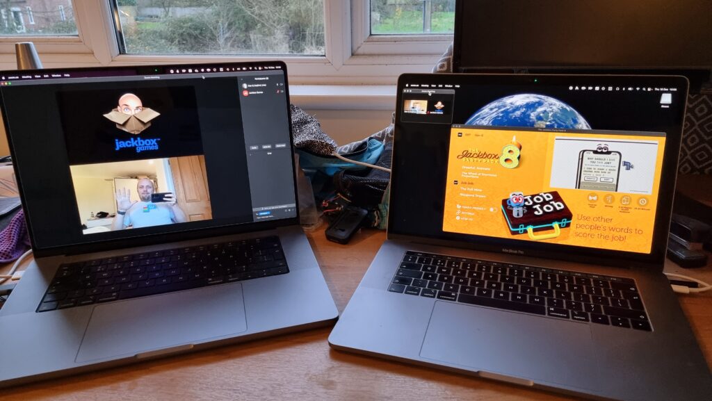
1. Use two computers!

Two laptops: one showing a full-screen Zoom chat with Dan and "Jackbox Games"; the second showing a windowed copy of Jackbox Party Pack 8.
You can use more than two, but two should be considered the minimum for the host.

Using one computer for your video call and a second one to host the game (in addition to the device you’re using to play the games, which could be your phone) is really helpful for several reasons:

  • You can keep your video chat full-screen without the game window getting in the way, letting you spend more time focussed on your friends.
  • Your view of the main screen can be through the same screen-share that everybody else sees, helping you diagnose problems. It also means you experience similar video lag to everybody else, keeping things fair!
  • You can shunt the second computer into a breakout room, giving your guests the freedom to hop in and out of a “social” space and a “gaming” space at will. (You can even set up further computers and have multiple different “game rooms” running at the same time!)

2. Check the volume

3.5mm adapter plugged into the headphone port on a laptop.
Plugging an adapter into the headphone port tricks the computer into thinking some headphones are plugged in without actually needing the headphones quietly buzzing away on your desk.

Connect some headphones to the computer that’s running the game (or set up a virtual audio output device if you’re feeling more technical). This means you can still have the game play sounds and transmit them over Zoom, but you’ll only hear the sounds that come through the screen share, not the sounds that come through the second computer too.

That’s helpful, because (a) it means you don’t get feedback or have to put up with an echo at your end, and (b) it means you’ll be hearing the game exactly the same as your guests hear it, allowing you to easily tweak the volume to a level that allows for conversation over it.

3. Optimise the game settings

Jackbox games were designed first and foremost for sofa gaming, and playing with friends over the Internet benefits from a couple of changes to the default settings.

Sometimes the settings can be found in the main menu of a party pack, and sometimes they’re buried in the game itself, so do your research and know your way around before your party starts.

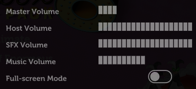
Jackbox settings screen showing Master Volume at 20%, Music Volume at 50%, and Full-screen Mode disabled

Turn the volume down, especially the volume of the music, so you can have a conversation over the game. I’d also recommend disabling Full-screen Mode: this reduces the resolution of the game, meaning there’s less data for your video-conferencing software to stream, and makes it easier to set up screen sharing without switching back and forth between your applications (see below).

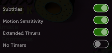
Jackbox accessibility settings: Subtitles, Motion Sensitivity, and Extended Timers are turned on.
Turning on the Motion Sensitivity or Reduce Background Animations option if your game has it means there’ll be less movement in the background of the game. This can really help with the video compression used in videoconferencing software, meaning players on lower-speed connections are less-likely to experience lag or “blockiness” in busy scenes.

It’s worth considering turning Subtitles on so that guests can work out what word they missed (which for the trivia games can be a big deal). Depending on your group, Extended Timers is worth considering too: the lag introduced by videoconferencing can frustrate players who submit answers at the last second only to discover that – after transmission delays – they missed the window! Extended Timers don’t solve that, but they do mean that such players are less-likely to end up waiting to the last second in the first place.

Jackbox game content settings; "Filter US-centric content" is switched on.
Finally: unless the vast majority or all of your guests are in the USA, you might like to flip the Filter US-Centric Content switch so that you don’t get a bunch of people scratching their heads over a cultural reference that they just don’t get.

By the way, you can use your cursor keys and enter to operate Jackbox games menus, which is usually easier than fiddling with a mouse.

4. Optimise Zoom’s settings

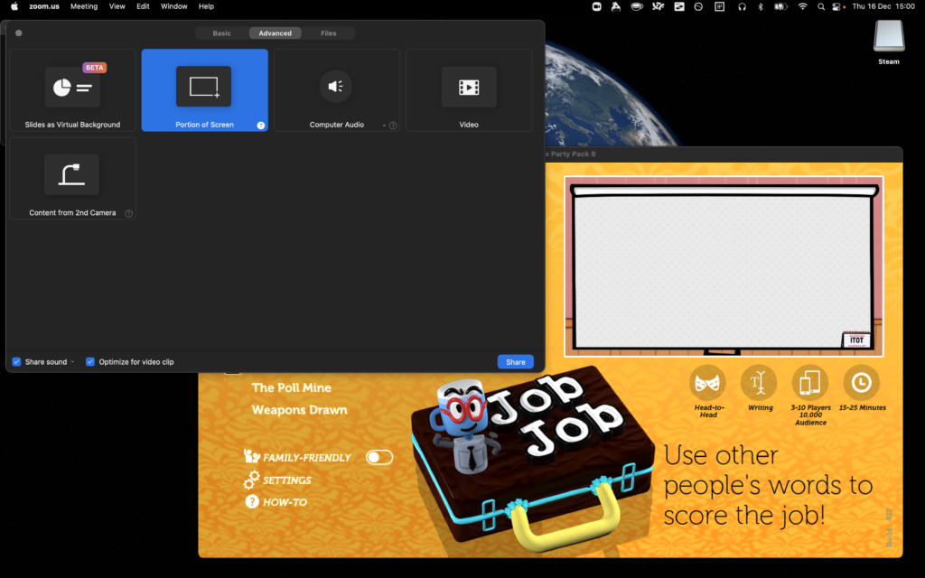
MacOS desktop showing a Jackbox game running and Zoom being configured to show a "portion of screen".
A few quick tweaks to your settings can make all the difference to how great the game looks.

Whatever videoconferencing platform you’re using, the settings for screen sharing are usually broadly similar. I suggest:

  • Make sure you’ve ticked “Share sound” or a similar setting that broadcasts the game’s audio: in some games, this is crucial; in others, it’s nice-to-have. Use your other computer to test how it sounds and tweak the volume accordingly.
  • Check “Optimize for video clip”; this hints to your videoconferencing software that all parts of the content could be moving at once so it can use the same kind of codec it would for sending video of your face. The alternative assumes that most of the screen will stay static (because it’s the desktop, the background of your slides, or whatever), which works better with a different kind of codec.
  • Use “Portion of Screen” sharing rather than selecting the application. This ensures that you can select just the parts of the application that have content in, and not “black bars”, window chrome and the like, which looks more-professional as well as sending less data over the connection.
  • If your platform allows it, consider making the mouse cursor invisible in the shared content: this means that you won’t end up with an annoying cursor sitting in the middle of the screen and getting in the way of text, and makes menu operation look slicker if you end up using the mouse instead of the keyboard for some reason.

Don’t forget to shut down any software that might “pop up” notifications: chat applications, your email client, etc.: the last thing you want is somebody to send you a naughty picture over WhatsApp and the desktop client to show it to everybody else in your party!

× × × × × ×