This checkin to GC7R0HB The Fairy Elevator reflects a geocaching.com log entry. See more of Dan's cache logs.
Reassembled hoist mechanism. Improved route of paracord to make ascent easier but it’s still a wrap-it-round-your-hand-and-heave job.
This checkin to GC7R0HB The Fairy Elevator reflects a geocaching.com log entry. See more of Dan's cache logs.
Reassembled hoist mechanism. Improved route of paracord to make ascent easier but it’s still a wrap-it-round-your-hand-and-heave job.
This checkin to OK045C The Fairy Elevator reflects an opencache.uk log entry. See more of Dan's cache logs.
Reassembled hoist mechanism. Improved route of paracord to make ascent easier but it’s still a wrap-it-round-your-hand-and-heave job.
This is a repost promoting content originally published elsewhere. See more things Dan's reposted.
This is a repost promoting content originally published elsewhere. See more things Dan's reposted.
The government will next week confirm the launch date for a UK-wide age block on online pornography as privacy campaigners continue to raise concerns about how websites and age verification companies will use the data they collect.
The plan for implementing the long-delayed age block, which has been beset by technical difficulties, is expected to be announced alongside the government’s other proposals for tackling online content harmful to children, although it could be several months before the system is fully up and running.
The age block will require commercial pornography sites to show that they are taking sufficient steps to verify their users are over 18, such as by uploading a passport or driving licence or by visiting a newsagent to buy a pass only available to adults. Websites which fail to comply risk substantial fines or having their websites banned by all British internet service providers.
…
It’s a good job that the government doesn’t have anything big and complicated to be working on, right now, so they have loads of free time to establish a sex-shaming, unenforceable, and inevitably-ineffective law to impinge upon the liberties of individuals. Sigh.
This is a repost promoting content originally published elsewhere. See more things Dan's reposted.
As someone with a good deal of interest in the digital accessibility space, I follow WebAIM’s work closely. Their survey results are priceless insights into how disabled people actually use the web, so when the organization speaks with authority on a subject, I listen.
WebAIM’s accessibility analysis of the top 1,000,000 homepages was released to the public on February 27, 2019. I’ve had a few days to process it, and frankly, it’s left me feeling pretty depressed. In a sea of already demoralizing findings, probably the most notable one is that pages containing ARIA—a specialized language intended to aid accessibility—are actually more likely to have accessibility issues.
I don’t think this is intentional malice on the part of authors, but it is worth saying that the road to hell is paved with good intentions. These failures via omission and ignorance actively separate people from their civil rights.
I view the issue largely as an education problem, and that education is tied into what the market demands.
Although the replies to this Twitter thread are heartwarming, I realistically understand that accessibility knowledge isn’t what employers are largely demanding. Because of this, people entering into the web design and development space simply may not be aware of accessibility as a technical concern.
Overwhelmingly, crushingly, we shove new developers towards learning JavaScript single page application frameworks (SPAs). While many of these frameworks pay lip service towards preserving accessibility, if you do your homework you find that the majority of them were built without assistive technology in mind. These considerations were bolted on later, when their creators figured out that the things they threw away to get a more app-like experience actually mattered.
My go-to examples are routing and focus management. It’s a sad, sorry state of affairs that this critical functionality oftentimes requires third party plugins to make them capable of interfacing with assistive technology. The decision to use SPAs, and all that come with them, can often come from baseless nerd navelgazing—many business owners would be livid to find out that the technology choices their teams are making are actively incurring legal liability.
Punching down
It’s too easy and too irresponsible to lay blame solely on new developers. Turning again to the WebAIM survey, we know that over 50% of all form inputs are not labeled. This is basic stuff, things that people who have been working in the industry for any significant length of time should know. How can we expect the advanced, state-driven stuff to be built robustly if we’re all failing HTML 101?
What if we’re losing?
It’s a tough question, but one I think is worth asking.
In some respects, practicing web accessibility has never been better. Firefox has an accessibility inspector now, which is straight-up amazing. We have near-magical developer tools (plural!), dedicated conferences, podcasts, meetups, and highly paid people in influential positions making grandiose declarations about the importance of empathy.
And yet, WebAIM’s report. All these incremental improvements aren’t compounding at an equal or greater pace than the things they’re trying to combat.
It’s code and design issues stemming from a market demand problem, yes. But I also think it’s a process problem. Namely, we can’t shovel all our blame on the developers—classically the go-to scapegoats for organizational failure.
We’re all to blame for the state of things—I’m no exception. A lack of understanding and wholesale adoption of antipatterns are also at fault. Just because a big name company does something doesn’t mean it’s intrinsically good.
Technology solutions to social problems
If we can’t get the majority of web practitioners to care about, much less implement accessible websites, what can be done? Browsers already describe websites the best way they know how, via the Document Object Model (DOM). Assistive technologies describe what the DOM contains the best they can, even utilizing specialized heuristics to accommodate code that isn’t quite good enough.
But “isn’t quite good enough” isn’t the same as outright bad—these specialized programs can only do so much.
Seeing machines
I’ve been paying attention to Mozilla’s efforts to create an interstitial popup blocker. For those unfamiliar with interstitials, they’re the annoying (often inaccessible) on-page modals that commonly ask you to do things like sign up for newsletters.
The trick here is these interstitial are different from traditional popups in that you can’t just block anything that spawns from the page you’re currently visiting. They’re a little more tricky, in that it’s just another “layer” of the website you’re visiting, and therefore can’t be clipped away with tidy logic.
Mozilla’s approach is to ask for examples of interstitials people find on the web, and then use that corpus of information to train a machine learning algorithm to understand what an interstitial popup “looks” like. Armed with that knowledge, it can then strip away the code of anything that qualifies as interstitial-ish.
It’s a fiendishly clever idea, and probably one of the few applications of machine learning I’ve encountered that actually has merit. It also got me wondering: if we can’t change how assistive technology generates descriptions of the DOM, can we change how it views websites instead?
If we can teach a computer to identify what all the various bits that make up a website look like, maybe we can attack the problem of inaccessible experiences from a slightly different direction. Once the computer “views” a page and reports on what it sees, it can then read out the text contained in those identified areas. Screen readers sort of already do this, and even have specialized functionality for when the text isn’t actually text.
We’re starting to see hints of this kind of thinking already. Examples that come to mind are Sarah Drasner’s brilliant CodePen that uses Azure’s Computer Vision API to automatically generate alt descriptions for images. Airbnb’s sketching interfaces project is also a tiny, powerful glimpse into this sort of future.
However
It’s really easy to say someone should do something, but it’s far more difficult to actually do it. Debating the merits of hypotheticals only takes you so far.
I’m not naïve enough to think this sort of idea would require a non-trivial amount of engineering to create. The field of digital accessibility is small and commonly viewed as unglamorous work, so I’m not holding my breath for venture capital firms to line up for the chance to give me funding for this half-baked concept.
There’s also the uncomfortable truth that this sort of automation is only as good as the data it’s trained on, and the field of machine learning is rife with algorithmic bias. When you start to use data at scale to make decisions, you also perpetuate the biases inherent in that data.
Furthermore, when you rely on this approach to navigate the web, you start to get into a very uncomfortable problem in delivering equivalent experiences; namely editorializing the experience for someone instead of presenting it to them the way someone who wasn’t relying on that technology would.
A practical example of this is automatically generated alt descriptions. If a system is built to reject certain kinds of information—say nudity—it won’t generate the information a person who doesn’t rely on the description will be privy to. It also may not be the nudity the system thinks it is.
A classical Greek statue meets all the criteria for a naked person, yet it is not. There have been, however, situations where it is flagged as pornography and a description is not generated. If you need an example of how this sort of thing falls apart at scale, just look at tumblr.
Another way of saying it: implicitly defining the parameters of what is acceptable for expression via automation can have the effect of reducing individual autonomy. This is unconscionable.
Finally, not every disabled user is a screen reader user. The machine learning approach doesn’t work for many different kinds of disability situations, notably cognitive concerns.
Social solutions to technology problems
I’m a big nerd, so of course I led with an idea for software. But all too often we conflate creating something with creating good.
As touched on earlier, it seems like the pace of inaccessible digital experiences is moving far faster than our attempts to fix them. I’m skeptical of technology’s ability to solve the problem on its own.
It’s also far more easy to destroy than it is to repair. If you don’t believe me, spend some time conducting a manual website accessibility audit. It oftentimes feels like a tedious, frustrating, thankless experience that firmly paints you as the enemy for people who just want to move fast and break things. However, it is a very vital thing to do.
So, what can we do about this state of affairs?
Learn from history
Digital accessibility is a niche practice. That’s not a value judgement, it’s just the way things are. Again, it’s hard to fault someone for creating an inaccessible experience if they simply haven’t learned the concept exists.
And yet, seventy percent of websites are non-compliant. It’s a shocking statistic. What if I told you that seventy percent of all bridges were structurally unsound?
Some engineers who work with physical materials have a constant reminder of the gravity of the decisions they make. They wear iron rings to be reminded that they have an obligation to the public good, and that actual lives are on the line. I like that idea a lot—I think it’s a concept we as an industry could benefit from if we borrowed from it thematically.
It’d take some organizing to get to a place where we do such a thing. And maybe that’s a good thing—right now it feels like we’re an industry of overpaid, fly-by-night plumbers who have the luxury of saying they don’t believe in using wrenches.
Directed effort
It was a bitter, frustrating, oftentimes thankless task, but we should also acknowledge that web standards won. It took a ton of time and effort to get to this point, but think about what didn’t make it: closed, centralized, brittle technologies that were pay-to-play and difficult to understand and maintain.
We should also think about what technologies are available to us today, how they serve the people that use them, and how so much of it is built from these standards. While it may feel frustrating doing the work now, maybe that inflection point is just beyond the horizon.
Reframing
Selfishly, I’d love a future where it’s commonplace for interview candidates to be selected not only because of their JavaScript prowess, but also because they can offer a sound explanation of why using a
buttonelement is important.I’m really excited to see digital accessibility get more mainstream attention, but I’m also concerned. I don’t want it to have fifteen minutes of fame. I want it to be a first class, top-of-mind consideration for everyone in the industry.
I really admire the people who are using their privilege as an influential industry member to push for this reality. Ethan Marcotte and Sara Soueidan come immediately to mind—they are doing an amazing job lending credibility to the practice as they learn more about the space. This is also not to diminish their other efforts, which have done so much to drive the web forward.
It’s been great seeing more and more accessibility talks appearing on the conference circuit, as well. The subject matter hasn’t historically gotten a lot of mainstream stage presence. This meant that there have been less opportunities for people to discover digital accessibility was even was a concern, much less be positioned as a glamorous subject that was worth spending a few thousand dollars on a ticket to hear someone talk about.
I also think the push to diversify our industry voices has helped bring accessibility concerns to the forefront, as well as other important topics. And speaking of diversification, I’d be remiss if I didn’t mention Kat Holmes’ work on Inclusive Design. If you want to read a brilliant treatise on reframing, read Mismatch.
Acknowledgment
I also think it’s worth acknowledging that we’re all standing on the shoulders of giants. New voices (such as myself), are speaking about what we’ve learned largely due to the fact that there’s been existing material to learn from. People like Léonie Watson, Marco Zehe, Steve Faulkner, Glenda Sims, Billy Gregory, Lainey Feingold, Mike Paciello, to name a few.
They’ve done incredible work in this space, and are continuing to do so. It’d be wise to listen to what they have to say.
This is a personal post on a personal website, so it’s admittedly a little more rough and glum than what I usually put out. However, I don’t have the right to be tired or demotivated. I’m frustrated for sure, and feelings of defeatism are hard to quell, but the stakes are too high for self-pity.
I’m also not so arrogant as to assume my ideas are new in this space. I don’t have comments on my blog, but if you want to talk about anything this post covered, feel free to chime in on Twitter.
I’ll keep writing, and I’ll keep pushing for what is important. I hope you’ll join me.

Kiwi flowers look exactly like you’d think they would. #woah
I’m not sure that I process death in the same way that “normal” people do. I blame my family.
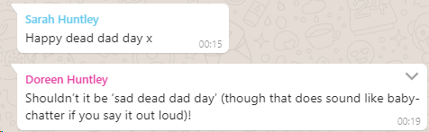
When my grandmother died in 2006 I was just in the process of packing up the car with Claire to try to get up to visit her before the inevitable happened. I received the phone call to advise me that she’d passed, and – ten emotional minutes later – Claire told me that she’d “never seen anybody go through the five stages of grief as fast as that before”. Apparently I was a textbook example of the Kübler-Ross model, only at speed. Perhaps I should volunteer to stand in front of introductory psychology classes and feel things, or something.
Since my dad’s death seven years ago, I’ve marked Dead Dad Day every 19 February a way that’s definitely “mine”: with a pint or three of Guinness (which my dad enjoyed… except if there were a cheaper Irish stout on draught because he never quite shook off his working-class roots) and some outdoors and ideally a hill, although Oxfordshire makes the latter a little difficult. On the second anniversary of my dad’s death, I commemorated his love of setting out and checking the map later by making my first geohashing expedition: it seemed appropriate that even without him, I could make a journey without either of us being sure of either the route… or the destination.
As I implied at his funeral, I’ve always been far more-interested in celebrating life than mourning death (that might be why I’m not always the best at supporting those in grief). I’m not saying that it isn’t sad that he went before his time: it is. What’s worst, I think, is when I remember how close-but-not-quite he came to getting to meet his grandchildren… who’d have doubtless called him “Grandpeter”.
We all get to live, and we’re all going to die, and I’d honestly be delighted if I thought that people might remember me with the same kind of smile (and just occasionally tear) that finds my face every Dead Dad Day.
This is a repost promoting content originally published elsewhere. See more things Dan's reposted.
This is a repost promoting content originally published elsewhere. See more things Dan's reposted.
…
With 20+ years of kottke.org archives, I’ve been thinking about this issue [continuing to host old content that no longer reflects its authors views] as well. There are many posts in the archive that I am not proud of. I’ve changed my mind in some cases and no longer hold the views attributed to me in my own words. I was too frequently a young and impatient asshole, full of himself and knowing it all. I was unaware of my privilege and too frequently assumed things of other people and groups that were incorrect and insensitive. I’ve amplified people and ideas in the past that I wouldn’t today.
…
Very much this! As another blogger with a 20+ year archive, I often find myself wondering how much of an impression of me is made upon my readers by some of my older posts, and what it means to retain them versus the possibility – never yet exercised – of deleting them. I certainly have my fair share of posts that don’t represent me well or that are frankly embarrassing, in hindsight!
I was thinking about this recently while following a thread on BoardGameGeek in which a poster advocated for the deletion of a controversial article from the site because, as they said:
…people who stumble on our site and see this game listed could get a very (!!!) bad impression of the hobby…
This is a similar concern: a member of an online community is concerned that a particular piece of archived content does not reflect well on them. They don’t see any way in which the content can be “fixed”, and so they propose that it is removed from the community. Parallels can be drawn to the deletionist faction within Wikipedia (if you didn’t know that Wikipedia had large-scale philosophical disputes before now, you’re welcome: now go down the meta-wiki rabbit hole).
As for my own blog, I fall on the side of retention: it’s impossible to completely “hide” my past by self-censorship anyway as there’s sufficient archives and metadata to reconstruct it, and moreover it feels dishonest to try. Instead, though, I do occasionally append rebuttals to older content – where I’ve time! – to help contextualise them and show that they’re outdated. I’ve even considered partially automating this by e.g. adding a “tag” that I can rapidly apply to older posts that haven’t aged well which would in turn add a disclaimer to the top of them.
Cool URIs don’t change. But the content behind them can. The fundamental message ought to be preserved, where possible, and so appending and retaining history seems to be a more-valid approach than wholesale deletion.
Nice: getting an unexpected parcel. ?
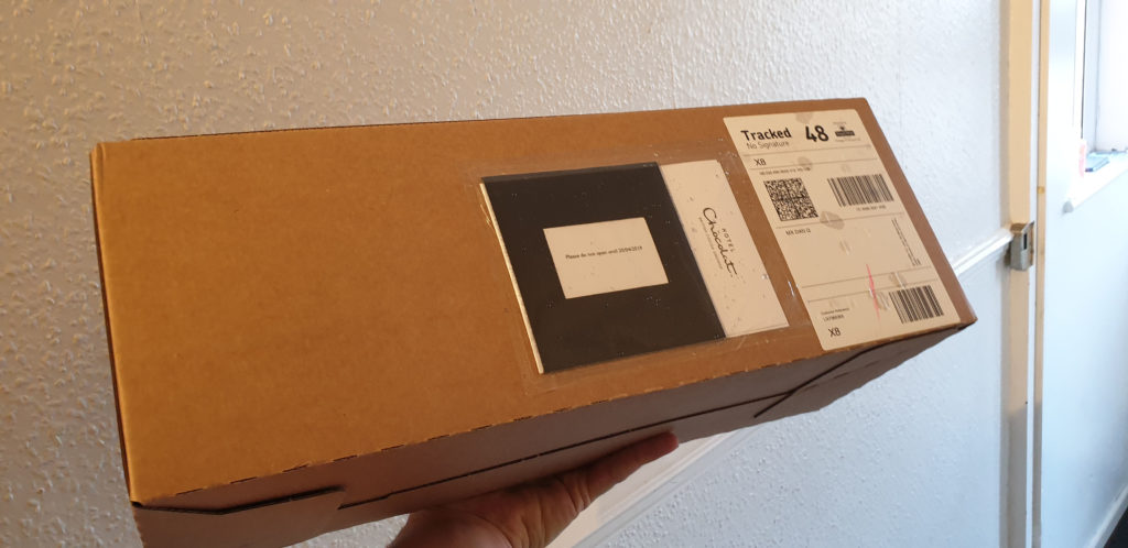
Nicer: from Hotel Chocolat. ?
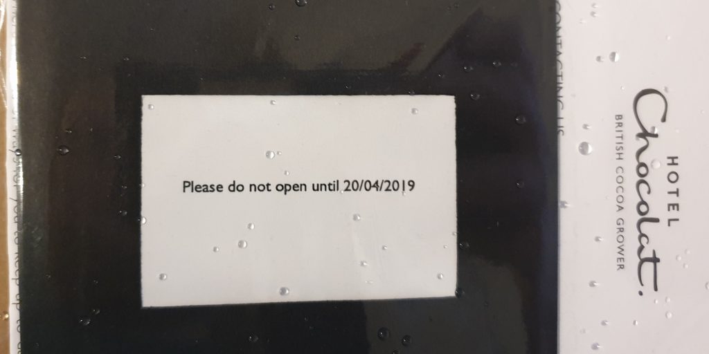
Less nice: not being allowed to open it until Easter. ?
This is a repost promoting content originally published elsewhere. See more things Dan's reposted.
There is a distinct lack of coloration in today’s automobiles, with the majority seemingly finished in a shade that could be found on a greyscale chart. Things are no better in the interior; nearly always black, beige or grey, colours that architectural and couture designers refer to as neutrals. To make matters worse, these shades are all too often matched to the exterior pigment (i.e. black with black, silver with grey) to create insidious and mind-numbing monochrome vehicles that appear to have simply been dipped whole into a large vat of colourant.

1937 Delahaye 135, ivory and navy blue with dark red leather
Things were not always this gloomy. From the dawn of motoring through the 1920s, cars were painted in a full spectrum of colours, often in vivid combinations. The world’s first motor vehicle, the 1886 Benz Patent-Motorwagen was green, with its fully-exposed engine finished in bright red. At the Villa d’Este or Pebble Beach Concours d’Elegance one sees a veritable riot of colour that would likely be a bit shocking to today’s consumers: black with orange, yellow with orange, dark and light blue, dark and light green, red with blue, maroon with red; the palette was limitless.
…
I’m not even remotely “into” cars but I loved this article… and I do think that it’s a bit of a shame that cars don’t exhibit the variety of colour that they used to, any longer. As a kid, I remember that the old chap who lived on the other side of our street kept a remarkably old-fashioned but regal looking car (I’ve no idea what it was: I was only very young) in racing green with maroon trim and leather, and chrome window frames. I used to think how cool it was that he got to have a car that was so distinctive and unusual, because it was already rare to see things that didn’t just fit into the same boxy, bland palettes. Since then, things have only gotten worse: I can’t remember the time that my daily commute took me past a car that wasn’t painted in an all-encompassing single-colour coat of metallic black, white, silver, red, or blue and with interior plastic entirely in one of two shades of dark grey.
Hopefully it’s just a phase that we, as a society, are going through.
I’m a big believer in the idea that the hardware I lay my hands on all day, every day, needs to be the best for its purpose. On my primary desktop, I type on a Das Keyboard 4 Professional (with Cherry MX brown switches) because it looks, feels, and sounds spectacular. I use the Mac edition of the keyboard because it, coupled with a few tweaks, gives me the best combination of features and compatibility across all of the Windows, MacOS, and Linux (and occasionally other operating systems) I control with it. These things matter.

I also care about the mouse I use. Mice are, for the most part, for the Web and for gaming and not for use in most other applications (that’s what keyboard shortcuts are for!) but nonetheless I spend plenty of time holding one and so I want the tool that feels right to me. That’s why I was delighted when, in replacing my four year-old Logitech MX1000 in 2010 with my first Logitech Performance MX, I felt able to declare it the best mouse in the world. My Performance MX lived for about four years, too – that seems to be how long a mouse can stand the kind of use that I give it – before it started to fail and I opted to replace it with an identical make and model. I’d found “my” mouse, and I was sticking with it. It’s a great shape (if you’ve got larger hands), is full of features including highly-configurable buttons, vertical and horizontal scrolling (or whatever you want to map them to), and a cool “flywheel” mouse wheel that can be locked to regular operation or unlocked for controlled high-speed scrolling at the touch of a button: with practice, you can even use it as a speed control by gently depressing the switch like it was a brake pedal. Couple all of that with incredible accuracy on virtually any surface, long battery life, and charging “while you use” and you’ve a recipe for success, in my mind.
My second Performance MX stopped properly charging its battery this week, and it turns out that they don’t make them any more, so I bought its successor, the Logitech MX Master 2S.
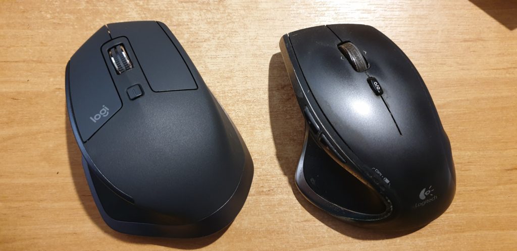
The MX Master 2S is… different… from its predecessor. Mostly in good ways, sometimes less-good. Here’s the important differences:
All in all, the MX Master 2S isn’t such an innovative leap forward over the Performance MX as the Performance MX was over the MX1000, but it’s still great that this spectacular series of heavyweight workhouse feature-rich mice continues to innovate and, for the most part, improve upon the formula. This mouse isn’t cheap, and it isn’t for everybody, but if you’re a big-handed power user with a need to fine-tune all your hands-on hardware to get it just right, it’s definitely worth a look.
This is a repost promoting content originally published elsewhere. See more things Dan's reposted.

A man threatened to sue a technology magazine for using his image in a story about why all hipsters look the same, only to find out the picture was of a completely different guy.
…
The original article was pretty interesting, too.
This is a repost promoting content originally published elsewhere. See more things Dan's reposted.
Asynchronous JavaScript in the form of Single Page Applications (SPA) offer an incredible opportunity for improving the user experience of your web applications. CSS frameworks like Bootstrap enable developers to quickly contribute styling as they’re working on the structure and behaviour of things.
Unfortunately, SPA and CSS frameworks tend to result in relatively complex solutions where traditionally separated concerns – HTML-structure, CSS-style, and JS-behaviour – are blended together as a matter of course — Counter to the lessons learned by previous generations.
This blending of concerns can prevent entry level developers and valued specialists (Eg. visual design, accessibility, search engine optimization, and internationalization) from making meaningful contributions to a project.
In addition to the increasing cost of the few developers somewhat capable of juggling all of these concerns, it can also result in other real world business implications.
…
What is a front-end developer? Does anybody know, any more? And more-importantly, how did we get to the point where we’re actively encouraging young developers into habits like writing (cough React cough) files containing a bloaty, icky mixture of content, HTML (markup), CSS (style), and Javascript (behaviour)? Yes, I get that the idea is that individual components should be packaged together (if you’re thinking in a React-like worldview), but that alone doesn’t justify this kind of bullshit antipattern.
It seems like the Web used to have developers. Then it got complex so we started differentiating back-end from front-end developers and described those who, like me, spanned the divide, as full-stack developers We gradually became a minority as more and more new developers, deprived of the opportunity to learn each new facet organically in this newly-complicated landscape, but that’s fine. But then… we started treating the front-end as the only end, and introducing all kinds of problems as a result… and most people don’t seem to have noticed, yet, exactly how much damage we’re doing to Web applications’ security, maintainability, future-proofibility, archivability, addressibility…
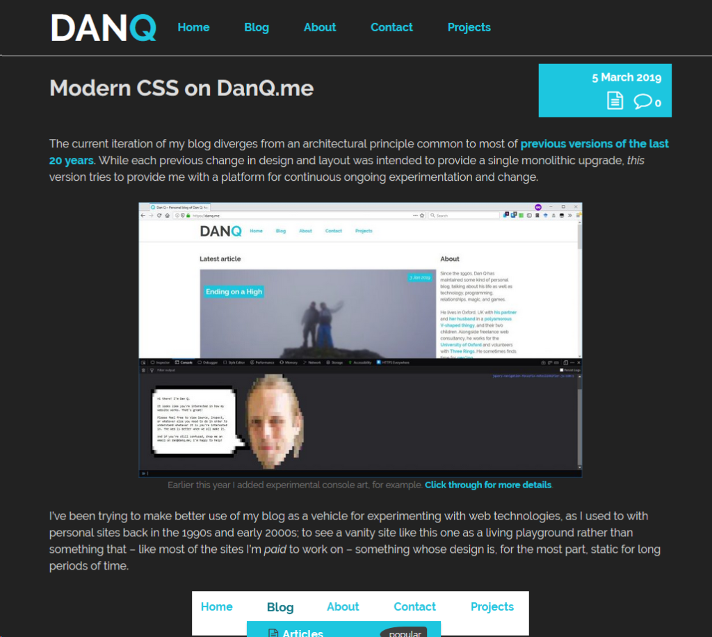
The current iteration of my blog diverges from an architectural principle common to most of previous versions of the last 20 years. While each previous change in design and layout was intended to provide a single monolithic upgrade, this version tries to provide me with a platform for continuous ongoing experimentation and change.

I’ve been trying to make better use of my blog as a vehicle for experimenting with web technologies, as I used to with personal sites back in the 1990s and early 2000s; to see a vanity site like this one as a living playground rather than something that – like most of the sites I’m paid to work on – something whose design is, for the most part, static for long periods of time.
Among the things I’ve added prior to the initial launch of this version of the design are gracefully-degrading grids, reduced-motion support, and dark-mode support – three CSS features of increasing levels of “cutting edge”-ness but each of which is capable of being implemented in a way that does not break the site’s compatibility. This site’s pages are readable using (simulations of) ancient rendering engines or even in completely text-based browsers, and that’s just great.
Here’s how I’ve implemented those three features:
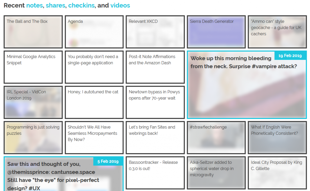
The grid of recent notes, shares, checkins and videos on my
homepage is powered by the display: grid; CSS directive. The number of columns varies by screen width from six
on the widest screens down to three or just one on increasingly small screens. Crucially, grid-auto-flow: dense; is used to ensure an even left-to-right filling of the
available space even if one of the “larger” blocks (with grid-column: span 2; grid-row: span 2;) is forced for space reasons to run onto the next line. This means that
content might occasionally be displayed in a different order from that in which it is written in the HTML (which is reverse
order of publication), but in exchange the items are flush with both sides.
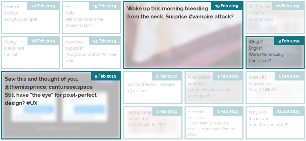
grid-auto-flow:
                dense;
means that the “3 Feb” item is allowed to bubble-up and fill the gap, appearing out-of-order but flush with the edge.
Not all web browsers support display: grid; and while that’s often only one of design and not of readability because these browsers will fall back to usually-very-safe
default display modes like block and inline, as appropriate, sometimes there are bigger problems. In Internet Explorer 11, for example, I found (with thanks to
@_ignatg) a problem with my directives specifying the size of these cells (which are actually <li> elements because, well,
semantics matter). Because it understood the directives that ought to impact the sizing of the list items but not
the one that redeclared its display type, IE made… a bit of a mess of things…

Do websites need to look the same in every browser? No. But the content should be readable regardless, and here my CSS was rendering my content unreadable. Given that Internet Explorer users represent a little under 0.1% of visitors to my site I don’t feel the need to hack it to have the same look-and-feel: I just need it to have the same content readability. CSS Feature Queries to the rescue!
CSS Feature Queries – the @supports selector – make it possible to apply parts of your stylesheet if and only if
the browser supports specific CSS features, for example grids. Better yet, using it in a positive manner (i.e. “apply these
rules only if the browser supports this feature”) is progressive enhancement, because browsers that don’t understand the @supports selector act in
the same way as those that understand it but don’t support the specified feature. Fencing off the relevant parts of my stylesheet in a @supports (display: grid) { ... }
block instructed IE to fall back to displaying that content as a boring old list: exactly what I needed.
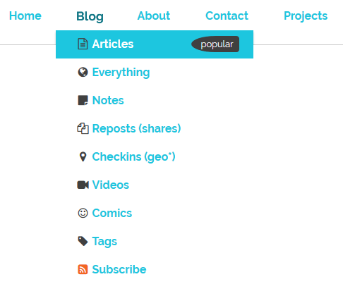
I like to put a few “fun” features into each design for my blog, and while it’s nowhere near as quirky as having my head play peek-a-boo when you hover your cursor over it, the current header’s animations are in the same ballpark: hover over or click on some of the items in the header menu to see for yourself..

These kinds of animations are fun, but they can also be problematic. People with inner ear disorders (as well as people who’re just trying to maximise the battery life on their portable devices!) might prefer not to see them, and web designers ought to respect that choice where possible. Luckily, there’s an emerging standard to acknowledge that: prefers-reduced-motion. Alongside its cousins inverted-colors, prefers-reduced-transparency, prefers-contrast and prefers-color-scheme (see below for that last one!), these new CSS tools allow developers to optimise based on the accessibility features activated by the user within their operating system.
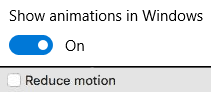
If you’ve tweaked your accessibility settings to reduce the amount of animation your operating system shows you, this website will respect that choice as well by not animating the
contents of the title, menu, or the homepage “tiles” any more than is absolutely necessary… so long as you’re using a supported browser, which right now means Safari or Firefox (or the
“next” version of Chrome). Making the change itself is pretty simple: I just added a @media screen and (prefers-reduced-motion: reduce) { ... } block to disable or
otherwise cut-down on the relevant animations.
Similarly, operating systems are beginning to support “dark mode”, designed for people trying to avoid eyestrain when using their computer at night. It’s possible for your browser to respect this and try to “fix” web pages for you, of course, but it’s better still if the developer of those pages has anticipated your need and designed them to acknowledge your choice for you. It’s only supported in Firefox and Safari so far and only on recent versions of Windows and MacOS, but it’s a start and a helpful touch for those nocturnal websurfers out there.
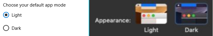
It’s pretty simple to implement. In my case, I just stacked some overrides into a @media (prefers-color-scheme: dark) { ... } block, inverting the background and primary
foreground colours, softening the contrast, removing a few “bright” borders, and darkening rather than lightening background images used on homepage tiles. And again, it’s an example of
progressive enhancement: the (majority!) of users whose operating systems and/or browsers don’t yet support this feature won’t be impacted by its inclusion in my stylesheet, but those
who can make use of it can appreciate its benefits.
This isn’t the end of the story of CSS experimentation on my blog, but it’s a part of the it that I hope you’ve enjoyed.