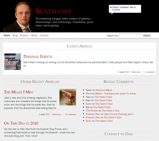
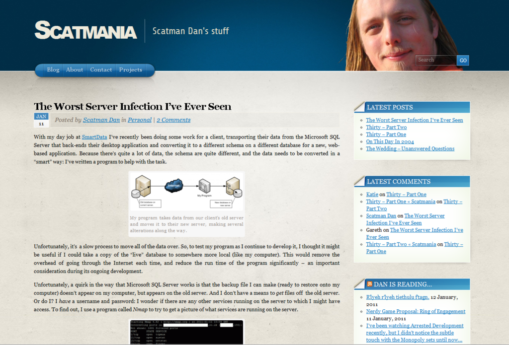
Well, it’s been over a year since I last updated the look-and-feel of my blog, so it felt like it was time for a redesign. The last theme was made during a period that I was just recovering from a gloomy patch, and that was reflected the design: full of heavy, dark reds, blacks, and greys, and it’s well-overdue a new look!

I was also keen to update the site to in line with the ideas and technologies that are becoming more commonplace in web design, nowadays… as well as using it as a playground for some of the more-interesting CSS3 features!

Key features of the new look include:
- A theme that uses strong colours in the footer and header, to “frame” the rest of the page content.
- A responsive design that rescales dynamically all the way from a mobile phone screen through tablets, small 4:3 monitors, and widescreen ratios (try resizing your browser window!).
- CSS transitions to produce Javascript-less dynamic effects: hover your cursor over the picture of me in the header to make me “hide”.
- CSS “spriting” to reduce the number of concurrent downloads your browser has to make in order to see the content. All of the social media icons, for example, are one file, split back up again using background positioning. They’re like image maps, but a million times less 1990s.
- Front page “feature” blocks to direct people to particular (tagged) areas of the site, dynamically-generated (from pre-made templates) based on what’s popular at any given time.
- A re-arrangement of the controls and sections based on the most-popular use-cases of the site, according to visitor usage trends. For example, search has been made more-prominent, especially on the front page, the “next post”/”previous post” controls have been removed, and the “AddToAny” sharing tool has been tucked away at the very bottom.
[spb_message color=”alert-warning” width=”1/1″ el_position=”first last”]Note that some of these features will only work in modern browsers, so Internet Explorer users might be out of luck![/spb_message]
As always, I’m keen to hear your feedback (yes, even from those of you who subscribe by RSS). So let me know what you think!
I like the part where you hide the best, like a rabbit! :D
Nice…really like the dynamic layout & resizing. When/if you get time & inclination drop me a line, would like to know more about what you’ve learnt about this approach… S