Our sources report that the underlying reason behind the impressive tech demo for Unreal Engine 5 by Epic Games is to ridicule web developers.
According to the Washington Post, the tech demo includes a new dynamic lighting system and a rendering approach with a much higher geometric detail for both shapes and textures. For
example, a single statue in the demo can be rendered with 33 million triangles, giving it a truly unprecedented level of detail and visual density.
Turns out that the level of computational optimization and sheer power of this incredible technology is meant to make fun of web developers, who struggle to maintain 15fps while
scrolling a single-page application on a $2000 MacBook Pro, while enjoying 800ms delays typing the corresponding code into their Electron-based text editors.
…
Funny but sadly true. However, the Web can be fast. What makes it slow is bloated, kitchen-sink-and-all frontend frameworks, pushing computational effort to the browser with
overcomplicated DOM trees and unnecessarily rich CSS rules, developer
privilege, and blindness to the lower-powered devices that make up most of the browsing world. Oh, and of course embedding a million third-party scripts to get you all the analytics,
advertising, etc. you think you need doesn’t help, either.
The Web will never be as fast as native, for obvious reasons. But it can be fast; blazingly so. It just requires a little thought and consideration. I’ve talked about this recently.
The performance tradeoff isn’t about where the bottleneck is. It’s about who has to carry the burden. It’s one thing for a developer to push the burden onto a
server they control. It’s another thing entirely to expect visitors to carry that load when connectivity and device performance isn’t a constant.
…
This is another great take on the kind of thing I was talking about the other day: some developers who favour heavy frameworks (e.g.
React) argue for the performance benefits, both in development velocity and TTFB. But TTFB alone is not a valid metric of a user’s perception of an application’s performance: if you’re sending a fast payload that then requires extensive
execution and/or additional calls to the server-side, it stands to reason that you’re not solving a performance bottleneck, you’re just moving it.
I, for one, generally disfavour solutions that move a Web application’s bottleneck to the user’s device (unless there are other compelling reasons that it should be there, for example
as part of an Offline First implementation, and even then it should be done with care). Moving the burden of the bottleneck to the user’s device disadvantages those on slower or older
devices and limits your ability to scale performance improvements through carefully-engineered precaching e.g. static compilation. It also produces a tendency towards a thick-client
solution, which is sometimes exactly what you need but more-often just means a larger initial payload and more power consumption on the (probably mobile) user’s device.
Next time you improve performance, ask yourself where the time saved has gone. Some performance gains are genuine; others are just moving the problem around.
How manymoredevelopers have to point out how bloated we’ve made the web with our frameworks, tracking scripts, and other
3rd party solutions before we take things seriously? We’ve been banging on about this for ages. It’s like a plague!
And as Bridget goes on to say, it’s especially important at this unusual time, with many people confined to home and using the Internet to try to get accurate and up-to-date
information and resources (and sometimes overwhelming major websites), that performance, accessibility, and availability matters most.
There’ll be many lessons to learn from the coronavirus crisis. But these lessons aren’t just related to healthcare, or work, or supermarket logistics. No field will be left untouched.
And one of the things that I hope my field learns, when this is over, is the importance of things working even when things get tough. Test the sad paths, test your site under
heavy load, test your site with the CDNs simulated “down”, and develop accordingly. Because this isn’t the worst kind of
crisis we could face, and we have to be ready for the worse ones that could come.
Save your bandwidth: just look at this screenshot of the site instead of visiting.
Going to that page results in about 14 Mb of data being transmitted from their server to your device (which you’ll pay for
if you’re on a metered connection). For comparison, reading my recent post about pronouns results in about 356 Kb of data. In other words, their page is forty times more bandwidth-consuming, despite the fact that my page has about four times the word count. The page
you’re reading right now, thanks to its images, weighs in at about 650 Kb: you could still download it more than twenty times while
you were waiting for theirs.
Well that’s got to be pretty embarassing.
Worse still, the most-heavyweight of the content they deliver is stuff that’s arguably strictly optional and doesn’t add to the message:
Eight different font files are served from three different domains (the fonts alone consume about 140 Kb) – seven more are
queued but not used.
Among the biggest JavaScript files they serve is that of Hotjar analytics: I understand the importance of measuring your impact, but making
your visitors – and the planet – pay for it is a little ironic.
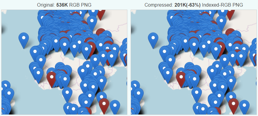
The biggest JavaScript file seems to be for Mapbox, which as far as I can see is never actually used: that map on the page is a static
image which, incidentally, I was able to reduce from 0.5 Mb to 0.2 Mb just by running it through
a free online image compressor.
This took me literally seconds to do but would save about a twelfth of a second for every single typical 4G user to their site. And it’s not even the worst culprit.
And because the site sets virtually no caching headers, even if you’ve visited the website before you’re likely to have to download the whole thing again. Every single
time.
It’s not just about bandwidth: all of those fonts, that JavaScript, their 60 Kb of CSS (this page sent you 13 Kb) all has to be parsed and interpreted by your device. If you’re on a mobile device or a laptop, that means you’re burning through lithium (a non-renewable resource whose extraction and disposal is highly polluting) and
regardless of your device you’re using you’re using more electricity to visit their site than you need to. Coding antipatterns like document.write() and active event
listeners that execute every time you scroll the page keep your processor working hard, turning electricity into waste heat. It took me over 12 seconds on a high-end smartphone and a
good 4G connection to load this page to the point of usability. That’s 12 seconds of a bright screen, a processor running full tilt,a data connection working its hardest, and a
battery ticking away. And I assume I’m not the only person visiting the website today.
This isn’t really about this particular website, of course (and I certainly don’t want to discourage anybody from the important cause of saving the planet!). It’s about the
bigger picture: there’s a widespread and long-standing trend in web development towards bigger, heavier, more power-hungry websites, built on top of heavyweight frameworks that push the
hard work onto the user’s device and which favour developer happiness over user experience. This is pretty terrible: it makes the Web slow, and brittle, and it increases the digital
divide as people on slower connections and older devices get left behind.
Using <input type="text" inputmode="numeric" pattern="[0-9]*"> allows for a degree of separation between how the user enters data (“input mode”), what the browser
expects the user input to contain (type equals number), and potentially how it tries to validate it.
…
I’ve sung the praises of the GDS research team before, and it’s for things like this that I respect them the most: they’re
knowing for taking a deep-dive user-centric approach to understanding usability issues, and they deliver valuable actionable answers off the back of it.
If you’ve got Web forms that ask people for numbers, this is how you should be doing it. If you’re doing so specifically for 2FA purposes, see that post I shared last month on a similar topic.
Don’t understand why Web accessibility is important? Need a quick and easily-digestible guide to the top things you should be looking into in order to make your web applications
screenreader ready? Try this fun, video-game-themed 5 minute video from Microsoft.
There’s a lot more to accessibility than is covered here, and it’s perhaps a little over-focussed on screenreaders, but it’s still a pretty awesome introduction.
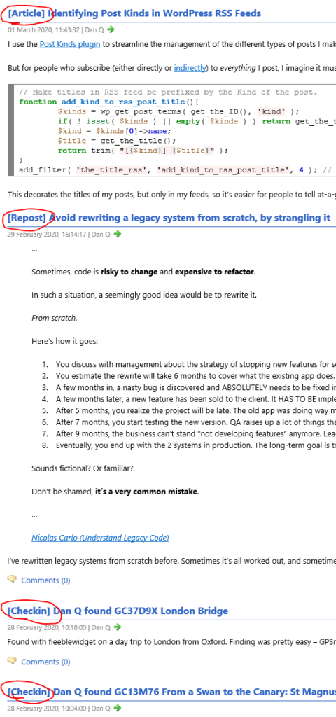
I use the Post Kinds plugin to streamline the management of the different types of posts I make on my blog, based on the
IndieWeb post types list: articles, like this one, are “conventional” blog posts, but I also publish
notes (which are analogous to “tweets”), reposts (“shares” of things I’ve found online, sometimes with commentary), checkins (mostly chronicling my geocaching/geohashing), and others: I’ve extended Post Kinds to facilitate comics and
reviews, for example.
But for people who subscribe (either directly or indirectly) to everything I post, I imagine it must be a little frustrating to sometimes be
unable to identify the type of a post before clicking-through. So I’ve added the following code, which I’m sharing here and on GitHub in case it’s of any use to anybody else, to my theme’s functions.php:
// Make titles in RSS feed be prefixed by the Kind of the post.functionadd_kind_to_rss_post_title(){
$kinds= wp_get_post_terms( get_the_ID(), 'kind' );
if( !isset( $kinds ) ||empty( $kinds ) ) return get_the_title(); // sanity-check.$kind=$kinds[0]->name;
$title= get_the_title();
return trim( "[{$kind}] {$title}" );
}
add_filter( 'the_title_rss', 'add_kind_to_rss_post_title', 4 ); // priority 4 to ensure it happens BEFORE default escaping filters.
This decorates the titles of my posts, but only in my feeds, so it’s easier for people to tell at-a-glance what’s going on:
Down the line I might expand this so that it doesn’t show if the subscriber is, for example, asking only for articles (e.g. via this
feed); I’m coming up with a huge list of things I’d like to do at IndieWebCamp London! But for now, this feels like a nice simple
improvement to a plugin I love that helps it to fit my specific needs.
I first got into web design/development in the late 90s, and only as I type this sentence do I realize how long ago that was.
And boy, it was horrendous. I mean, being able to make stuff and put it online where other people could see it was pretty slick, but we did not have very much to work with.
I’ve been taking for granted that most folks doing web stuff still remember those days, or at least the decade that followed, but I think that assumption might be a wee bit
out of date. Some time ago I encountered a tweet marvelling at what we had to do without
border-radius. I still remember waiting with bated breath for it to be unprefixed!
But then, I suspect I also know a number of folks who only tried web design in the old days, and assume nothing about it has changed since.
I’m here to tell all of you to get off my lawn. Here’s a history of CSS and web design, as I remember it.
(Please bear in mind that this post is a fine blend of memory and research, so I can’t guarantee any of it is actually correct, especially the bits about causality. You may
want to try the W3C’s history of CSS, which is considerably shorter,
has a better chance of matching reality, and contains significantly less swearing.)
(Also, this would benefit greatly from more diagrams, but it took long enough just to write.)
…
I too remember the bad-old days of the pre-CSS and early-CSS Web. Back
then, when we were developing for it, we thought that it was magical. We tolerated issues like having to copy-paste our navigation around a stack of static pages, manually change our
design all over the place etc…. but man… I wouldn’t want to go back to working that way!
This is an excellent long-read for an up-close-and-personal look at how CSS has changed over the decades. Well worth a look if
you’ve any interest in the topic.
I think that CSS would be greatly helped if we solemnly state that “CSS4 is here!” In this post I’ll try to convince you of my viewpoint.
I am proposing that we web developers, supported by the W3C CSS WG, start saying “CSS4 is here!” and excitedly chatter about how it will hit the market any moment now and transform
the practice of CSS.
Of course “CSS4” has no technical meaning whatsoever. All current CSS specifications have their own specific
versions ranging from 1 to 4, but CSS as a whole does not have a version, and it doesn’t need one, either.
Regardless of what we say or do, CSS 4 will not hit the market and will not transform anything. It also does not describe any technical reality.
But if you’ve got more than a little web savvy you might still be surprised to hear me say that CSS4 is here, or even
that it’s a “thing” at all. Welll… that’s because it isn’t. Not officially. Just like JavaScript’s versioning has gone all evergreen these last few years,
CSS has gone the same way, with different “modules” each making their way through the standards and implementation processes
independently. Which is great, in general, by the way – we’re seeing faster development of long-overdue features now than we have through most of the Web’s history – but it
does make it hard to keep track of what’s “current” unless you follow along watching very closely. Who’s got time for that?
When CSS2 gained prominence at around the turn of the millennium it was revolutionary, and part of the reason for that
– aside from the fact that it gave us all some features we’d wanted for a long time – was that it gave us a term to rally behind. This browser already supports it, that browser’s
getting there, this other browser supports it but has a f**ked-up box model (you all know the one I’m talking about)… we at last had an overarching term to discuss what was supported,
what was new, what was ready for people to write articles and books about. Nobody’s going to buy a book that promises to teach them “CSS3 Selectors Level 3, Fonts Level 3, Writing Modes
Level 3, and Containment Level 1”: that title’s not even going to fit on the cover. But if we wrapped up a snapshot of what’s current and called it CSS4… now that’s going to sell.
Can we show the CSS WG that there’s mileage in this idea and make it happen? Oh, I hope so. Because while the
modular approach to CSS is beautiful and elegant and progressive… I’m afraid that we can’t use it to inspire junior developers.
Also: I don’t want this joke to forever remain among the top results
when searching for CSS4…
“Why make the web more boring? Because boring is fast, resilient, fault tolerant, and accessible. Boring is the essence of unobtrusive designs that facilitate interactions rather than
hinder them.” says Jeremy.
He’s right. I’ve become increasingly concerned in recent years in the trend towards overuse of heavyweight frameworks. These frameworks impose limitations on device/network
capabilities, browser features, caching, accessibility, stability, and more. It’s possible to work around many of those limitations, but doing so often takes additional work, and so
most developers, especially junior developers raised on a heavyweight framework who haven’t yet been exposed to the benefits of working around them. Plus, such mitigations tend to make
already-bloated web applications – full of unnecessary cruft – larger still; the network demands of the application grow ever larger.
What are these frameworks for? They often provide valuable components and polyfills, certainly, but they also have a tendency to reimplement what the browser already gives you:
e.g. routing and caching come free with HTTP, buttons and links from HTML, design from CSS, (progressive) interactivity from JS. Every developer should feel free to use a framework if it suits
them and the project they’re working on… but adoption of a framework should only come after consideration and understanding of what it provides, and at what cost.
If you make accessibility or internationalization in a code library an optional component, you just know half of the people deploying it will ignore it—out of ignorance or as
optimization. So taking the side of the end user versus the dev user means just pre-bundling these things
For very similar reasons, I refuse to make accessibility features configurable in my vanilla JS plugins.
…
Very much this. In short:
If you write a library, add accessibility features as standard.
If you fail to do this, you do a disservice to the developers who use your library and, worse, to the users of their software. Accessibility is for everybody, but it’s still
surprisingly hard to get right: don’t make it any harder by neglecting to include it in your library’s design.
Make those accessibility features on-by-default.
You can’t rely on developers to follow your instructions to make the use of your library accessible. Even the most well-meaning developers find themselves hurried by deadlines and by
less-well-meaning managers. Don’t even make accessibility a simple switch: just put it on to begin with.
Don’t provide a feature to disable accessibility features.
If you allow accessibility features to be turned off, developers will turn them off. They’ll do this for all kinds of reasons, like trying to get pixel-perfect accuracy with a design
or to make a web application behave more like a “hip” mobile app. You’ll probably find that you can never fully prevent developers from breaking your accessibility tools, but you must
make it so that doing so must be significantly more-effort than simply toggling a constant.
As part of the preparing to leave the Bodleian I’ve been revisiting a lot of the documentation I’ve written over the last eight
years. It occurred to me that I’ve never written publicly about how the Bodleian’s digital signage/interactives actually work; there are possible lessons to learn.
The Bodleian‘s digital signage is perhaps more-diverse, both in terms of technology and audience, than that of most organisations. We’ve got
signs in areas that are exclusively reader-facing to help students and academics find what they’re looking for, signs in publicly accessible rooms that advertise and educate, and signs
in gallery spaces upon which we try to present engaging and often-interactive content to support exhibitions.
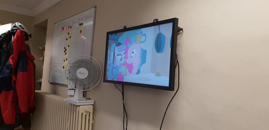
Getting an extra touchscreen for the office for prototyping/user testing purposes was great, even when it wasn’t showing MLP: FiM.
Throughout those three spheres, we’ve routinely delivered a diversity of content (let’s just ignore the countdown clock, for now…). Traditional
directional signage, advertisements, games, digital exhibitions, interpretation, feedback surveys…
In the vast majority of cases – and this is where the Bodleian’s been unusual (though certainly not unique) among cultural sector institutions – we’ve created
those in-house rather than outsourcing them.
Using off-the-shelf technology also allows the Bodleian to in-house much of their hardware maintenance, as a secondary part of other job roles. Singing into your screwdriver remains
optional, though.
To do this economically – the volume of work on interactive signage is inconsistent throughout the year – we needed to align the skills required with skills used elsewhere in the
organisation. To do this, we use the web as our medium! Collectively, the Bodleian’s Digital Communications team already had at least some experience in programming, web design, graphic
design, research, user testing, copyediting etc.: the essential toolkit for web application development.
Whether you were playing Pong on the video wall at the back or testing your Middle-earth knowledge on the touchscreen at the front… behind the
scenes you were interacting with a web page I wrote.
By shifting our digital signage platform to lean heavily on web technologies, we were able to leverage talented people we already had to produce things that we might otherwise
have had to outsource. This, in turn, meant that more exhibitions and displays get digital enhancement, on a shorter turnaround.
It also means that there’s a tighter integration between exhibition content and content for web and social media: it’s easier for us to re-use content across multiple platforms.
Sometimes we’ve even made our digital interactives, or adapted version of them, available directly online, allowing our exhibitions to reach people that can’t get to our physical spaces
at all.
Because we’re able to produce our own content on-demand, even our smaller, shorter-duration displays can have hands-on digital interactives associated with them.
On to the technology! We’re using a real mixture of tech: when it’s donated or reclaimed from previous projects (and when the bidding and acquisition processes are, well… as you’d
expect at the University of Oxford), you learn not to say no to freebies. Our fleet includes:
Samsung Android tablets with freestanding kiosk frames. We run the excellent-value Kiosk Browser Lockdown app on
these, which loads on boot and prevents access to anything but a specified website.
OnelanNTBs connected to a mixture of
touch and non-touch screens, wall-mounted or in kiosk frames. We use Onelan’s standard digital signage features as well as – for interactive content – their built-in touch-capable web
browser.
Dell PCs of the standard variety supplied by University IT services, connected to wall-mounted touch screens, running Google Chrome in Kiosk Mode. More on this below.
The browsers’ responsive simulators are invaluable when we’re targeting signage at five (!) different resolutions.
When you’re developing content for a very small number of browsers and a limited set of screen sizes, you quickly learn to throw a lot of “best practice” web development out of the
window. You’ll never come across a text browser or screen reader, so alt-text doesn’t matter. You’ll never have to rescale responsively, so you might as well absolutely-position almost
everything. The devices are all your own, so you never need to ask permission to store cookies. And because you control the platform, you can get away with making configuration tweaks
to e.g. allow autoplaying videos with audio. Coming from a conventional web developer background to producing digital signage content makes feels incredibly lazy.
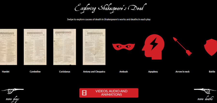
Helping your users see your interactive as “app-like” rather than “web-like” encourages them to feel comfortable engaging with it in ways uncharacteristic of web pages. In our Shakespeare’s Dead interactive, for example, we started the experience in the middle of a long horizontally-scrolling “page”, which might
feel very unusual in a conventional browser.
Using Chrome to run digital signage requires, in the Bodleian’s case, a couple of configuration tweaks and the right command-line switches. We use:
chrome://flags/#overscroll-history-navigation – disabling this prevents users from triggering “back”/”forward” by swiping with two fingers
chrome://flags/#pull-to-refresh – disabling this prevents the user from triggering a “refresh” by scrolling up beyond the top of the page (this only happens on some
kinds of devices)
chrome://flags/#system-keyboard-lock – we don’t use attached keyboards, but if you do, you might want to set this flag so you can use the keyboard.lock()
API to intercept e.g. ALT+F4 so users can’t escape the application
running on startup with e.g. chrome --kiosk --noerrdialogs --allow-file-access-from-files --disable-touch-drag-drop --incognito https://example.com/some/url
Kisok mode makes the browser run fullscreen and prevents e.g. opening additional tabs, giving an instant “app-like” experience. As we don’t have keyboards attached to our
digital signage, this also prevents visitors from closing Chrome.
Turning off error dialogs reduces the risk that an error will result in an unslightly message to the user.
Enabling “file access from files” allows content hosted at file:// addresses to access content at other file:// addresses, which makes it possible to write “offline” sites
(sometimes useful where we’re serving large videos or on previous occasions when WiFi has been shaky) that can still take advantage of features like the Fetch API.
Unless you need drag-and-drop, it’s simpler to disable it; this prevents a user long-press-and-dragging an image around the screen.
Incognito mode ensures that the browser doesn’t remember what site was showing last time it ran; our computers often end up switched off at the wall at the end of the day, and
without this the browser will offer to load the site it had open last time, when it runs.
We usually host our interactives directly on the web, at “secret” addresses, and this is generally preferable to us as we can more-easily make on-the-fly adjustments to
content (plus it makes it easier to hook up analytic tools).
Be sure to test the capabilities of your hardware! Our Onelan NTBs, unlike your desktop PCs, can’t handle multitouch input, which
affects the design of our user interfaces for these devices.
Meanwhile, in the application’s CSS code, we set * { user-select: none; } to prevent the user from highlighting
text by selecting it with their finger. We also make heavy use of absolutely-sized/positioned, overflow: hidden blocks to ensure that scrollbars never appear, and
CSS animations to make content feel dynamic and to draw attention to particular elements.
There’s no substitute for good testing. And there’s no stress-testing quite like letting a 5 year-old loose on your work.
Altogether, this approach gives the Bodleian the capability to produce engaging interactive content at low cost and using the existing skills of their digital and exhibitions teams.
It’s not an approach that would work for every cultural institution: in particular, some of the Bodleian’s sister institutions already
outsource the technical parts of their web work, and so don’t have the expertise in-house to share with a web-powered digital signage solution.
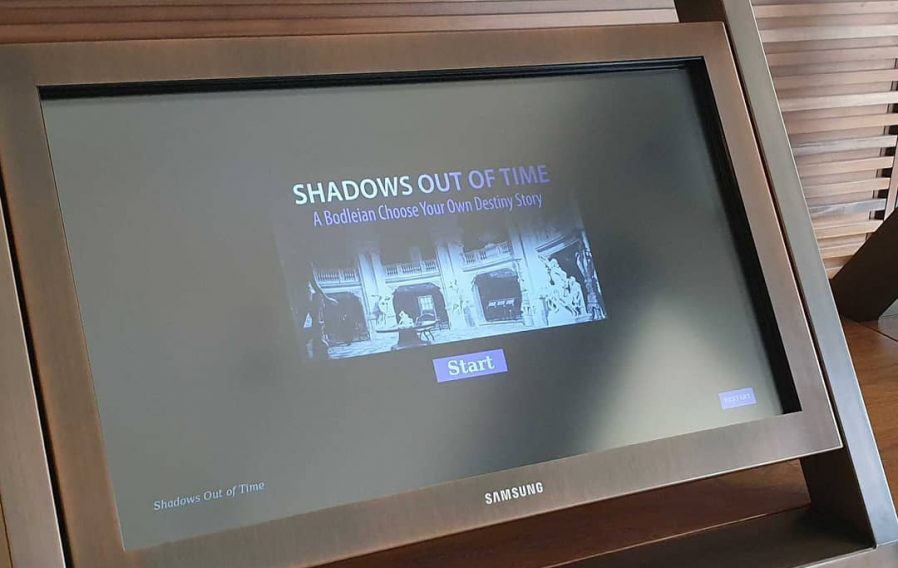
A few minor CSS tweaks to make the buttons finger-friendly and our Halloween game Shadows Out Of
Time, which I’d already made web-friendly, was touchscreen-ready too. I wonder if they’ll get this one out again, this
Halloween?
But for those museums that can fit into this model – or can adapt to do so in future – using the web to produce interactive digital content and digital signage is a highly
cost-effective way to engage with visitors, even (or especially!) when dealing with short-lived and/or rotating displays.
It’s also been among my favourite parts of my job at the Bod these last 8½ years, and I’m sure I’ll miss it!
The vast majority of respondents are still using Sass and vanilla CSS? Wow! This made me pause and think. Because I feel there’s an analogy here between that unseen dark matter,
and the huge crowd of web developers who are using such “boring” technology stacks.
…
This! As a well-established developer who gets things done with a handful of solid, reliable, tried-and-tested toolsets, I’ve sometimes felt like I must be “falling behind” on the
hot-new-tech curve because I can’t keep up with whichever yet-another-Javascript-framework is supposed to be hipthis week. Earlier in my career, I didn’t have this problem. And it’s not just that we’re inventing new libraries, frameworks, and (even) languages faster than ever before –
and I’m pretty sure we are – nor is it that my thirty-something brain is less-plastic than the brain of my twenty-something younger self… it’s simpler than that: it’s that the level of
productivity that’s expected of an engineer of my level of seniority precludes me from playing with more than a couple of new approaches each year. I try, and I manage, to get a working
understanding of a new language and a framework or two most years, and I appreciate that that’s more than I’m expected to do (and more than many will), but it still feels like a drop in
the ocean: there’s always a “new hotness”.
But when I take the time to learn a “new hotness”, these days, nine times out of ten it doesn’t “stick” for me. Why? Because most of the new technologies we seem to be
inventing don’t actually add anything to the vast majority of use cases. Hipper (and often smarter) developers than me might latch on to the latest post-reational database or
the most-heavyweight CSS-in-JS-powered realtime web framework, and they dominate the online discussion, but that doesn’t make their ideas right for my projects. They’re a loud
minority with a cool technology, and I’m a little bit jealous that they have the time to learn and play with it… but I’ll just keep delivering value with the tools I’ve got,
thanks.
The <a> tag is one of the most important building blocks of the Internet. It lets you create a hyperlink: a piece of text, usually colored blue, that you can use to go to a new
page. When you click on a hyperlink, your web browser downloads the new page from the server and displays it on the screen. Most web browsers also store the pages you previously
visited so you can quickly go back to them. The best part is, the <a> tag gives you all of that behavior for free! Just tell the browser
where you want to go, and it handles the rest.
Lately, though, that hasn’t been enough for website developers. The new fad is “client-side navigation”, where instead of relying on the browser to load new pages for you, you write
a bunch of JavaScript code to do it instead. It’s actually really hard to get it right—loading the new page is simple enough, but you also have to write code to display a loading
bar, make the Back and Forward buttons work, show an error page if the connection drops, and so on.
For a while, I didn’t understand why anyone did this. Was it just silly make-work, like how every social network redesigns their website every couple years for no discernable
reason? Do <a> tags interfere with some creepy ad-tracking technique? Was there some really complicated technical reason why you
shouldn’t use them?
…
Spoiler: good old-fashioned <a> hyperlinks tend to outperform Javascript-driven client-side navigation. We already learned about one reason for this – that adding more Javascript code just to get back what the browser gives you for free increases the payload you deliver to the user – but
Carter demonstrates that progressive rendering goes a long way to explaining it, too. You see: browsers understand traditional navigation and are well-equipped with a
suite of shortcuts to help them optimise for it. They can start rendering content before it’s all downloaded, offset (hinted-at) asynchronous data for later, and of course they already
contain a pretty solid caching engine and you don’t even have to implement it yourself.
The other day, I saw someone on Twitter say (I’m not linking to the original tweet because I don’t want to pile-on the author):
I don’t bother with frameworks, I just use vanilla JS.
Roughly translated:
I’m smarter than the thousands of people who tried to solve the problems I’m about to solve. I’m an expert on security, a11y, browser support, and perf. I don’t care about ROI, I
just want to code.
Here’s the thing: frameworks don’t really help you with this stuff.
Very much this. People who use Javascript frameworks because they think they protect them from common web development pitfalls are simply trading away a set of known, solvable problems
and taking on a different set of unknown, unsolvable ones.
I’m not anti-framework, but I am pro-informed-developer. If security, accessibility, performance, and browser support are things you care about – and they absolutely should be – then
you need to know the impact that the tools you choose have upon those things. It’s easy to learn the impact that vanilla JS has on them, but
it’s harder to understand exactly what impact a framework might have or how that impact might be affected by interactions between it and all of the other frameworks and
libraries you mix-in. And many developers don’t bother to learn.
Use frameworks if they’re the right tool for your job. But you should work towards understanding your tools. Incidentally: in doing so, you’ll probably come to discover that
frameworks are the right tool for fewer jobs than you thought.