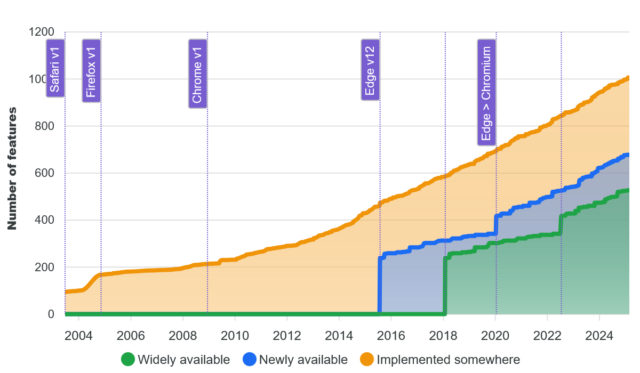
I mentioned yesterday that during Bloganuary I’d put non-Bloganuary-prompt post ideas onto the backburner, and considered extending my daily streak by posting them in February. Here’s part of my attempt to do
that:
Let’s take a trip into the Web of yesteryear, with thanks to our friends at the Internet
Archive’s WayBack Machine.
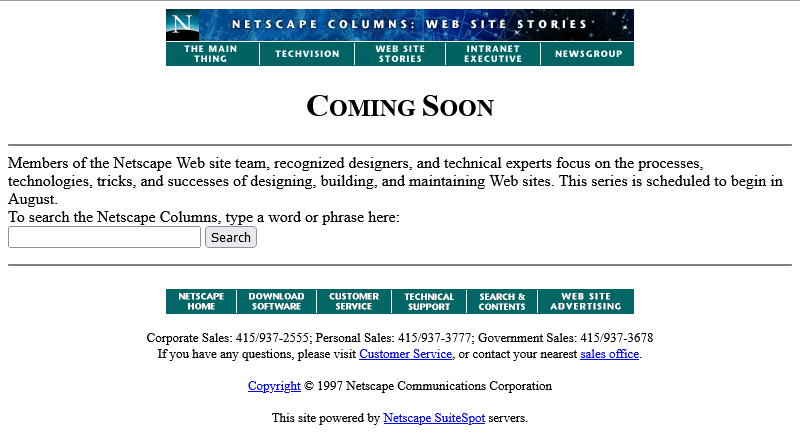
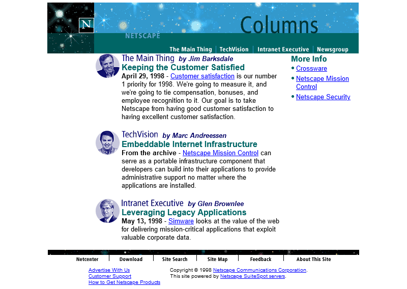
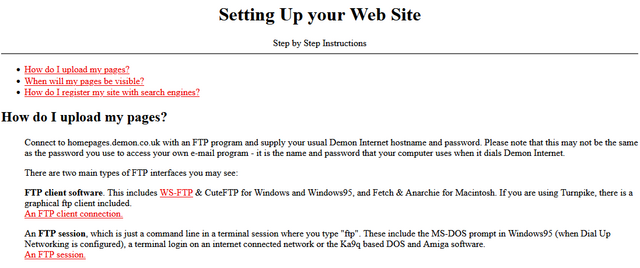
The page we’re interested in used to live at http://www.netscape.com/comprod/columns/webstories/index.html, and promised to be a showcase for best practice in Web
development. Back in October 1996, it looked like this:
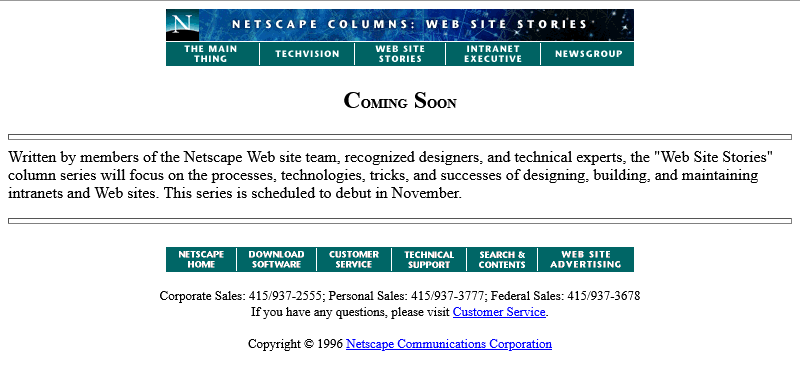
The page is a placeholder for Netscape Webstories (or Web Site Stories, in some places). It’s part of a digital magazine called Netscape Columns which published pieces written by Marc
Andreeson, Jim Barksdale, and other bigwigs in the hugely-influential pre-AOL-acquisition Netscape Communications.
This new series would showcase best practice in designing and building Web sites,
giving a voice to the technical folks best-placed to speak on that topic. That sounds cool!
Those white boxes above and below the paragraph of text aren’t missing images, by the way: they’re horizontal rules, using the little-known size attribute to specify a
thickness of <hr size=4>!
Certainly you’re excited by this new column and you’ll come back in November 1996, right?
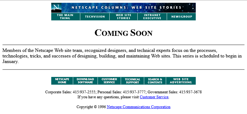
Oh. The launch has been delayed, I guess. Now it’s coming in January.
The <hr>s look better now their size has been reduced, though, so clearly somebody’s paying attention to the page. But let’s take a moment and look at that page
title. If you grew up writing web pages in the modern web, you might anticipate that it’s coded something like this:
<h2 style="font-variant: small-caps; text-align: center;">Coming Soon</h2>
There’s plenty of other ways to get that same effect. Perhaps you prefer font-feature-settings: 'smcp' in your chosen font; that’s perfectly valid. Maybe you’d use
margin: 0 auto or something to centre it: I won’t judge.
But no, that’s not how this works. The actual code for that page title is:
<center>
  <h2>
    <font size="+3">C</font>OMING
    <font size="+3">S</font>OON
  </h2>
</center>
Back when this page was authored, we didn’t have CSS.
The only styling elements were woven right in amongst the semantic elements of a page.
It was simple to understand and easy to learn… but it was a total mess.
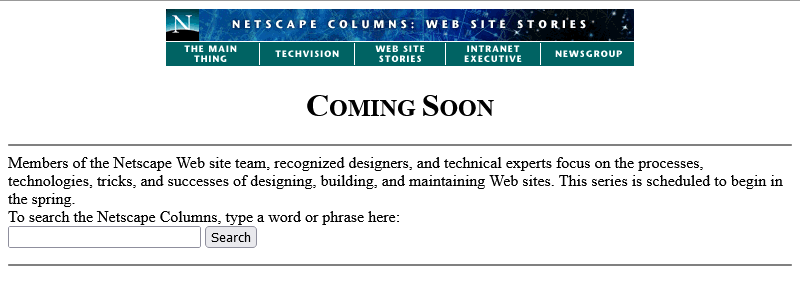
Anyway, let’s come back in January 1997 and see what this feature looks like when it’s up-and-running.
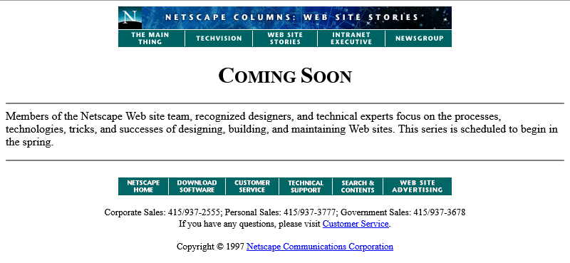
Nope, now it’s pushed back to “the spring”.
Under Construction pages were all the rage back in the nineties. Everybody had one (or several), usually adorned with one or more of about a thousand different animated GIFs for that purpose.

Building “in public” was an act of commitment, a statement of intent, and an act of acceptance of the incompleteness of a digital garden. They’re sort-of coming back into fashion in the
interpersonal Web, with the “garden and stream” metaphor
taking root. This isn’t anything new, of course – Mark Bernstein touched on the concepts in 1998 – but it’s not something that I can ever see returning to
the “serious” modern corporate Web: but if you’ve seen a genuine, non-ironic “under construction” page published to a non-root page of a company’s website within the last
decade, please let me know!

RSS doesn’t exist yet (although here’s a fun fact: the very first version of RSS came out of Netscape!). We’re just going to have to bookmark the page and check back later in the year, I guess…
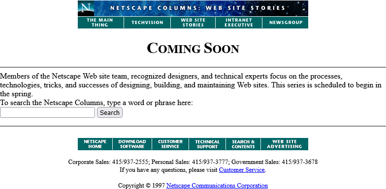
Okay, so February clearly isn’t Spring, but they’ve updated the page… to add a search form.
It’s a genuine <form> tag, too, not one of those old-fashioned <isindex> tags you’d still sometimes find even as late as 1997. Interestingly, it specifies
enctype="application/x-www-form-urlencoded". Today’s developers probably don’t think about the enctype attribute except when they’re doing a form that handles
file uploads and they know they need to switch it to enctype="multipart/form-data", (or their framework does this automatically for them!).
But these aren’t the only options, and some older browsers at this time still defaulted to enctype="text/plain". So long as you’re using a POST
and not GET method, the distinction is mostly academic, but if your backend CGI program anticipates that special
characters will come-in encoded, back then you’d be wise to specify that you wanted URL-encoding or you might get a nasty surprise when somebody turns up using LMB or something
equally-exotic.
Anyway, let’s come back in June. The content must surely be up by now:
Oh come on! Now we’re waiting until August?
At least the page isn’t abandoned. Somebody’s coming back and editing it from time to time to let us know about the still-ongoing series of delays. And that’s not a trivial task: this
isn’t a CMS. They’re probably editing the .html file itself in their favourite text editor, then putting the
appropriate file:// address into their copy of Netscape Navigator (and maybe other browsers) to test it, then uploading the file – probably using FTP – to the webserver… all the while thanking their lucky stars that they’ve only got the one page they need to change.
We didn’t have scripting languages like PHP yet, you see.
We didn’t really have static site generators. Most servers didn’t implement server-side includes. So if you had to make a change to every page on a site, for example editing
the main navigation menu, you’d probably have to open and edit dozens or even hundreds of pages. Little wonder that framesets caught on, despite their
(many) faults, with their ability to render your navigation separately from your page content.
Okay, let’s come back in August I guess:
Now we’re told that we’re to come back… in the Spring again? That could mean Spring 1998, I suppose… or it could just be that somebody accidentally re-uploaded an old copy of
the page.
Hey: the footer’s gone too? This is clearly a partial re-upload: somebody realised they were accidentally overwriting the page with the previous-but-one version, hit “cancel” in their
FTP client (or yanked the cable out of the wall), and assumed that they’d successfully stopped the upload before any damage was
done.
They had not.
I didn’t mention that top menu, did I? It looks like it’s a series of links, styled to look like flat buttons, right? But you know that’s not possible because you can’t rely on
having the right fonts available: plus you’d have to do some <table> trickery to lay it out, at which point you’d struggle to ensure that the menu was the same width
as the banner above it. So how did they do it?
The menu is what’s known as a client-side imagemap. Here’s
what the code looks like:
<a href="/comprod/columns/images/nav.map">
  <img src="/comprod/columns/images/websitestories_ban.gif" width=468 height=32 border=0 usemap="#maintopmap" ismap>
</a><map name="mainmap">
  <area coords="0,1,92,24" href="/comprod/columns/mainthing/index.html">
  <area coords="94,1,187,24" href="/comprod/columns/techvision/index.html">
  <area coords="189,1,278,24" href="/comprod/columns/webstories/index.html">
  <area coords="280,1,373,24" href="/comprod/columns/intranet/index.html">
  <area coords="375,1,467,24" href="/comprod/columns/newsgroup/index.html">
</map>
The image (which specifies border=0 because back then the default behaviour for graphical browser was to put a thick border around images within hyperlinks) says
usemap="#maintopmap" to cross-reference the <map> below it, which defines rectangular areas on the image and where they link to, if you click them! This
ingenious and popular approach meant that you could transmit a single image – saving on HTTP round-trips, which were
relatively time-consuming before widespread adoption of HTTP/1.1‘s persistent connections – along with a little metadata
to indicate which pixels linked to which pages.
The ismap attribute is provided as a fallback for browsers that didn’t yet support client-side image maps but did support server-side image maps: there were a few!
When you put ismap on an image within a hyperlink, then when the image is clicked on the href has appended to it a query parameter of the form
?123,456, where those digits refer to the horizontal and vertical coordinates, from the top-left, of the pixel that was clicked on! These could then be decoded by the
webserver via a .map file or handled by a CGI program. Server-side image maps were sometimes used where client-side maps were undesirable, e.g. when you want to record the actual coordinates
picked in a spot-the-ball competition or where you don’t want to reveal in advance which hotspot leads to what destination, but mostly they were just used as a fallback.
Both client-side and server-side image maps still function in every modern web browser, but I’ve not seen them used in the wild for a long time, not least because they’re hard (maybe
impossible?) to make accessible and they can’t cope with images being resized, but also because nowadays if you really wanted to make an navigation “image” you’d probably cut it into a
series of smaller images and make each its own link.
Anyway, let’s come back in October 1997 and see if they’ve fixed their now-incomplete page:
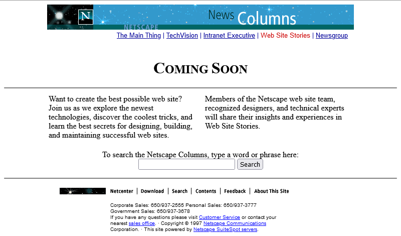
Oh, they have! From the look of things, they’ve re-written the page from scratch, replacing the version that got scrambled by that other employee. They’ve swapped out the banner and
menu for a new design, replaced the footer, and now the content’s laid out in a pair of columns.
There’s still no reliable CSS, so you’re not looking at columns: (no implementations until 2014) nor at
display: flex (2010) here. What you’re looking at is… a fixed-width <table> with a single row and three columns! Yes: three – the middle column
is only 10 pixels wide and provides the “gap” between the two columns of text.
This wasn’t Netscape’s only option, though. Did you ever hear of the <multicol> tag? It was the closest thing the early Web had to a semantically-sound,
progressively-enhanced multi-column layout! The author of this page could have written this:
<multicol cols=2 gutter=10 width=301>
  <p>
    Want to create the best possible web site? Join us as we explore the newest
    technologies, discover the coolest tricks, and learn the best secrets for
    designing, building, and maintaining successful web sites.
  </p>
  <p>
    Members of the Netscape web site team, recognized designers, and technical
    experts will share their insights and experiences in Web Site Stories.
  </p>
</multicol>
That would have given them the exact same effect, but with less code and it would have degraded gracefully. Browsers ignore tags they don’t understand, so a browser without
support for <multicol> would have simply rendered the two paragraphs one after the other. Genius!
So why didn’t they? Probably because <multicol> only ever worked in Netscape Navigator.
Introduced in 1996 for version 3.0, this feature was absolutely characteristic of the First Browser War. The two “superpowers”, Netscape and Microsoft, both engaged in unilateral
changes to the HTML specification, adding new features and launching them without announcement in order to try to get the
upper hand over the other. Both sides would often refuse to implement one-another’s new tags unless they were forced to by widespread adoption by page authors, instead
promoting their own competing mechanisms.
Between adding this new language feature to their browser and writing this page, Netscape’s market share had fallen from around 80% to around 55%, and most of their losses were picked
up by IE. Using <multicol> would have made their page look worse in Microsoft’s hot up-and-coming
browser, which wouldn’t have helped them persuade more people to download a copy of Navigator and certainly wouldn’t be a good image on a soon-to-launch (any day now!) page about
best-practice on the Web! So Netscape’s authors opted for the dominant, cross-platform solution on this page.
Anyway, let’s fast-forward a bit and see this project finally leave its “under construction” phase and launch!
Oh. It’s gone.
Sometime between October 1997 and February 1998 the long promised “Web Site Stories” section of Netscape Columns quietly disappeared from the website. Presumably, it never published a
single article, instead remaining a perpetual “Coming Soon” page right up until the day it was deleted.
I’m not sure if there’s a better metaphor for Netscape’s general demeanour in 1998 – the year in which they finally ceased to be the dominant market leader in web browsers – than the
quiet deletion of a page about how Netscape customers are making the best of the Web. This page might not have been important, or significant, or even completed, but
its disappearance may represent Netscape’s refocus on trying to stay relevant in the face of existential threat.
Of course, Microsoft won the First Browser War. They did so by pouring a fortune’s worth of developer effort into staying technologically one-step ahead, refusing to adopt standards
proposed by their rival, and their unprecedented decision to give away their browser for free.
 A
A 
![Stylish (for circa 2000) webpage for HoTMetaL Pro 6.0, advertising its 'unrivaled [sic] editing, site management and publishing tools'.](https://bcdn.danq.me/_q23u/2025/08/hotmetal-pro-6-640x396.jpg)
 Alpaca
 Anteater
 Bat
Bat
 Beetle
 Butterfly
 Camel
Camel
 Cat
Cat
 Chameleon
 Cobra
Cobra
 Cow
Cow
 Crab
Crab
 Crocodile
 Dog
Dog
 Duck
Duck
 Elephant
 Elk
Elk
 Fish
Fish
 Frog
Frog
 Giraffe
 Hippo
Hippo
 Husky
Husky
 Kangaroo
 Lion
Lion
 Macaw
Macaw
 Manatee
 Monkey
 Mouse
Mouse
 Octopus
 Ostrich
 Owl
Owl
 Panda
Panda
 Pelican
 Penguin
 Pig
Pig
 Rabbit
 Raccoon
 Ray
Ray
 Rhino
Rhino
 Rooster
 Shark
Shark
 Sheep
Sheep
 Sloth
Sloth
 Snake
Snake
 Spider
 Squirrel
 Swan
Swan
 Tiger
Tiger
 Toucan
 Turtle
 Whale
Whale


