I’m keeping an eye out for my next career move (want to hire me?). Off the back of that I’ve been brushing up on the kinds of skills that I might be asked to showcase in any kind of “tech test”.
Not the kind of stuff I can do with one hand tied behind my back1, but the things for which I’d enjoy feeling a little more-confident2. Stuff that’s on my CV that I’ve done and can do, but where I’d like to check before somebody asks me about it in an interview.
React? Sure, I can do that…
LinkedIn, GlassDoor, and bits of the Fediverse are a gold mine for the kinds of things that people are being asked to demonstrate in tech tests these days. Like this post:
My recent React experience has mostly involved Gutenberg blocks and WordPress theme component. This seemed like an excuse to check that I can wrangle a non-WordPress React stack.

Half an hour later, I’d proven to myself that yes, I could throw together a fresh application with React DOM and implement some React components, pass state around and whatnot.
Time to move on to the next thing, right? That’s what a normal person would do.
But that’s not the kind of person I am.
Let’s reimplement this as Web Components
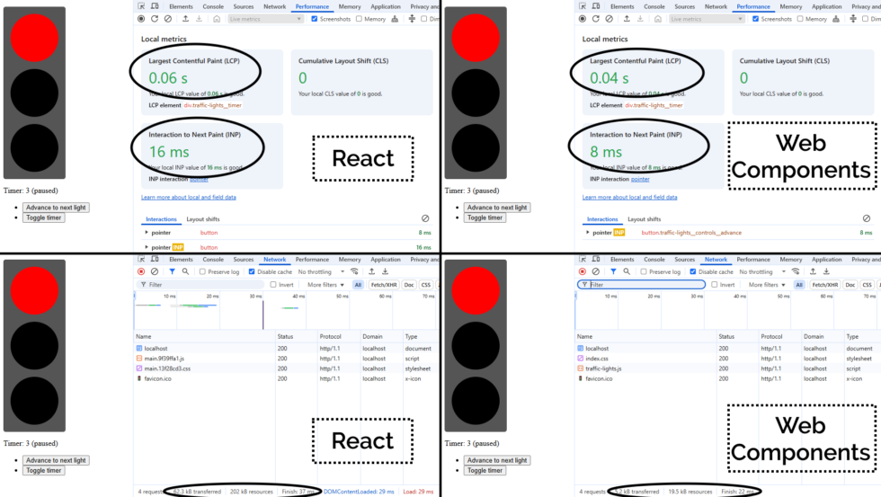
What I found myself thinking was… man, this is chunky. React is… not the right tool for this job.
(Or, increasingly, any job. But I’ll get back to that.)
A minified production build of my new component and its dependencies came in at 202kB (62.3kB compressed). That feels pretty massive for something that does so-little. So as an experiment, I re-implemented my new React component as a vanilla JS Web Component using a custom element. Identical functionality, but no third-party library dependencies. Here’s what I got:
The Web Component version of this control has no dependency chain and uses no JSX, and so it has no transpilation step: the source version is production-ready. You could minify it, but modern HTTP compression makes the impact of that negligible anyway: the whole thing weighs in at 19.5kB (5.2kB compressed) without minification.
And while I appreciate of course that there’s much more to JavaScript complexity and performance than file sizes… and beyond that I appreciate that there’s a lot more to making great components than the resulting bundle size… it’s hard to argue that delivering the same functionality (and less fragility) in a twelfth of the payload isn’t significant.
But there’s a bigger point here:
React is the new jQuery
I’m alarmed by the fact that I’m still seeing job ads for “React developers”, with little more requirement than an ability to “implement things in React”.
From where I’m sitting, React is the new jQuery. It:
-
Was originally built to work around missing or underdeveloped JavaScript functionality
- e.g. React’s components prior to Web Components
- e.g. jQuery’s manipulation prior to
document.querySelectorAll
-
Continued to be valuable as a polyfill and as a standard middleware while that functionality become commonplace
- e.g. React before Web Components became more standardised around 2018
- e.g. jQuery’s
$.ajaxuntil the Fetch API was a reliable replacement to XMLHttpRequest
-
No longer provides enough value to be worth using in a new project
- And yet somehow gets added “out of habit” for many years
If you’ve got a legacy codebase with lots of React in it, you’re still going to need React for a while. Just like how you’re likely to continue to need jQuery for a while until you can tidy up all those edge-cases where you’re using it.
(You might even be locked-in to using both React and jQuery for some time, if say you’ve got a plugin architecture that demands backwards-compatibility: I’m looking at you, WordPress!)
But just as you’re already (hopefully) working to slowly extricate your codebases from any now-unnecessary jQuery dependencies they have… you should be working on an exit plan for your React code, too. It’s done its time; it’s served its purpose: now it’s just a redundant dependency making your bundles cumbersome and harder to debug.
Everything React gives you on the client-side – components, state/hooks, routing4, etc. – is possible (and easy) in modern JavaScript supported in all major browsers. And if you still really want an abstraction layer, there are plenty of options (and they’re all a lot lighter than React!).
The bottom line is, I suppose…
You shouldn’t be hiring “React developers”!
If you’re building a brand new project, you shouldn’t be using React. It should be considered deprecated.
If you’ve got an existing product that depends on React… you should be thinking about how you’ll phase it out over time. And with that in mind, you want to be hiring versatile developers. They’ll benefit from some experience with React, sure, but unless they can also implement for the modern Web of tomorrow, they’ll just code you deeper into your dependency on React.
It’s time you started recruiting “Front-End Developers (React experience a plus)”. Show some long-term thinking! Or else the Web is going to move on without you, and in 5-10 years you’ll struggle to recruit people to maintain your crumbling stack.
You can download all my code and try it for yourself, if you like. The README has lots more information/spicy rants, and the whole thing’s under a public domain license so you can do whatever you like with it.
Footnotes
1 Exploiting or patching an injection vulnerability, optimising an SQL query, implementing a WordPress plugin, constructing a CircleCI buildchain, expanding test coverage over a Rubygem, performing an accessibility audit of a web application, extending a set of high-performance PHP-backed REST endpoints, etc. are all – I’d hope! – firmly in the “hold my beer” category of tech test skills I’d ace, for example. But no two tech stacks are exactly alike, so it’s possible that I’ll want to brush up on some of the adjacent technologies that are in the “I can do it, but I might need to hit the docs pages” category.
2 It’s actually refreshing to be learning and revising! I’ve long held that I should learn a new programming language or framework every year or two to stay fresh and to keep abreast of what’s going on in world. I can’t keep up with every single new front-end JavaScript framework any more (and I’m not sure I’d want to!)! But in the same way as being multilingual helps unlock pathways to more-creative thought and expression even if you’re only working in your native tongue, learning new programming languages gives you a more-objective appreciation of the strengths and weaknesses of what you use day-to-day. tl;dr: if you haven’t written anything in a “new” (to you) programming language for over a year, you probably should.
3 What do job titles even mean, any more? 😂 A problem I increasingly find is that I don’t know how to describe what I do, because with 25+ years of building stuff for the Web, I can use (and have used!) most of the popular stacks, and could probably learn a new one without too much difficulty. Did I mention I’m thinking about my next role? If you think we might “click”, I’d love to hear from you…
4 Though if you’re doing routing only on the client-side, I already hate you. Consider for example the SlimJS documentation which becomes completely unusable if a third-party JavaScript CDN fails: that’s pretty fragile!


