Last year, a colleague introduced me to lazygit, a TUI git client with a wealth of value-added features.
Somehow, though, my favourite feature is the animation you see if you nuke the working tree. 😘 Excellent.
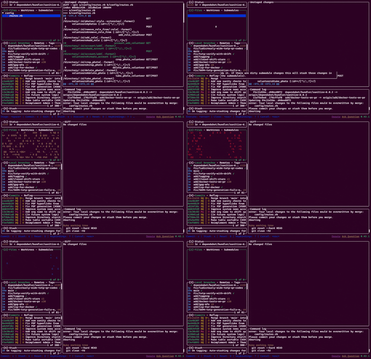
Last year, a colleague introduced me to lazygit, a TUI git client with a wealth of value-added features.
Somehow, though, my favourite feature is the animation you see if you nuke the working tree. 😘 Excellent.

Back when I was a student in Aberystwyth, I used to receive a lot of bilingual emails from the University and its departments1. I was reminded of this when I received an email this week from CACert, delivered in both English and German.

Wouldn’t it be great if there were some kind of standard for multilingual emails? Your email client or device would maintain an “order of preference” of the languages that you speak, and you’d automatically be shown the content in those languages, starting with the one you’re most-fluent in and working down.
The Web’s already got this functionality2, and people have been sending multilingual emails for much longer than they’ve been developing multilingual websites3!
It turns out that this is a (theoretically) solved problem. RFC8255 defines a mechanism for breaking an email into multiple different languages in a way that a machine can understand and that ought to be backwards-compatible (so people whose email software doesn’t support it yet can still “get by”). Here’s how it works:
Content-Type: multipart/multilingual header with a defined boundary marker, just like you would for any other email with multiple “parts” (e.g. with a HTML
and a plain text version, or with text content and an attachment).
text/plain (or similar) part, containing e.g. some text to explain that this is a multilingual email, and if you’re seeing this
then your email client probably doesn’t support them, but you should just be able to scroll down (or else look at the attachments) to find content in the language you read.
Content-Disposition: inline, so that for most people using non-compliant email software they can just scroll down until they find a language they can read,
Content-Type: message/rfc822, so that an entire message can be embedded (which allows other headers, like the Subject:, to be translated too),
Content-Language: header, specifying the ISO code of the language represented in that section, and
Content-Translation-Type: header, specifying either original (this is the original text), human (this was translated by a
human), or automated (this was the result of machine translation) – this could be used to let a user say e.g. that they’d prefer a human translation to an automated
one, given the choice between two second languages.
Let’s see a sample email:
Content-Type: multipart/multilingual;
 boundary=10867f6c7dbe49b2cfc5bf880d888ce1c1f898730130e7968995bea413a65664
To: <b24571@danq.me>
From: <rfc8255test-noreply@danq.link>
Subject: Does your email client support RFC8255?
Mime-Version: 1.0
Date: Fri, 27 Sep 2024 10:06:56 +0000

--10867f6c7dbe49b2cfc5bf880d888ce1c1f898730130e7968995bea413a65664
Content-Transfer-Encoding: quoted-printable
Content-Type: text/plain; charset=utf-8

This is a multipart message in multiple languages. Each part says the
same thing but in a different language. If your email client supports
RFC8255, you will see this message in your preferred language out of
those available. Otherwise, you will probably see each language after
one another or else each language in a separate attachment.

--10867f6c7dbe49b2cfc5bf880d888ce1c1f898730130e7968995bea413a65664
Content-Disposition: inline
Content-Type: message/rfc822
Content-Language: en
Content-Translation-Type: original

Subject: Does your email client support RFC8255?
Content-Type: text/plain; charset="UTF-8"
Content-Transfer-Encoding: 7bit
MIME-Version: 1.0

RFC8255 is a standard for sending email in multiple languages. This
is the original email in English. It is embedded alongside the same
content in a number of other languages.

--10867f6c7dbe49b2cfc5bf880d888ce1c1f898730130e7968995bea413a65664
Content-Disposition: inline
Content-Type: message/rfc822
Content-Language: fr
Content-Translation-Type: automated

Subject: Votre client de messagerie prend-il en charge la norme RFC8255?
Content-Type: text/plain; charset="UTF-8"
Content-Transfer-Encoding: 7bit
MIME-Version: 1.0

RFC8255 est une norme permettant d'envoyer des courriers
électroniques dans plusieurs langues. Le présent est le courriel
traduit en français. Il est intégré à côté du même contenu contenu
dans un certain nombre d'autres langues.

--10867f6c7dbe49b2cfc5bf880d888ce1c1f898730130e7968995bea413a65664--
That proposed standard turns seven years old next month. Sooo… can we start using it?4
Turns out… not so much. I discovered that NeoMutt supports it:
Support in other clients is… variable.
A reasonable number of them don’t understand the multilingual directives but still show the email in a way that doesn’t suck:
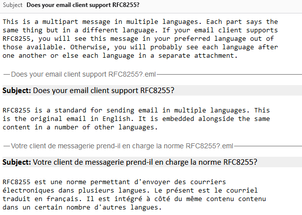
Some shoot for the stars but blow up on the launch pad:
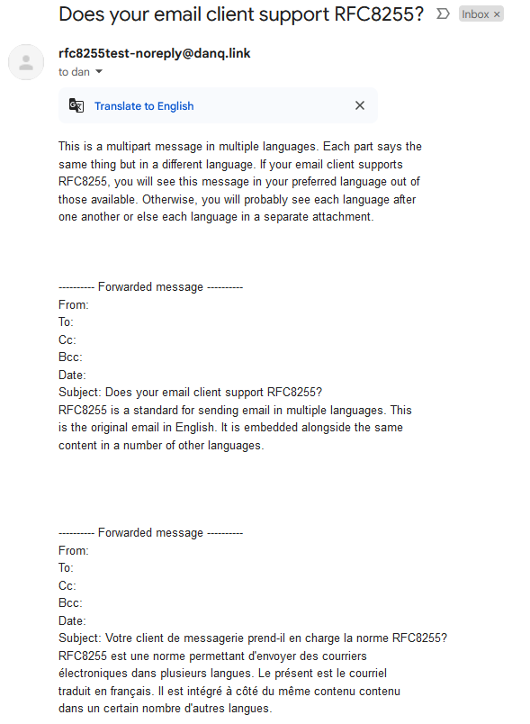
Others still seem to be actively trying to make life harder for you:
.eml attachments… which is then won’t display, forcing you to download them and
find some other email client to look at them in!5
And still others just shit the bed at the idea that you might read an email like this one:
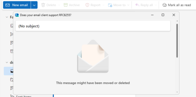
That’s just the clients I’ve tested, but I can’t imagine that others are much different. If you give it a go yourself with something I’ve not tried, then let me know!
I guess this means that standardised multilingual emails might be forever resigned to the “nice to have but it never took off so we went in a different direction” corner of the
Internet, along with the <keygen> HTML element and the concept of privacy.
1 I didn’t receive quite as much bilingual email as you might expect, given that the University committed to delivering most of its correspondence in both English and Welsh. But I received a lot more than I do nowadays, for example
2 Although you might not guess it, given how many websites completely ignore your
Accept-Language header, even where it’s provided, and simply try to “guess” what language you want using IP geolocation or something, and then require that you find
whatever shitty bit of UI they’ve hidden their language selector behind if you want to change it, storing the result in a cookie so it inevitably gets lost and has to be set again the
next time you visit.
3 I suppose that if you were sending HTML emails then you might use the lang="..." attribute to mark up different parts of the message as being in different
languages. But that doesn’t solve all of the problems, and introduces a couple of fresh ones.
4 If it were a cool new CSS feature, you can guarantee that it’d be supported by every major browser (except probably Safari) by now. But email doesn’t get so much love as the Web, sadly.
5 Worse yet, if you’re using ProtonMail with a third-party client, ProtonMail screws up
RFC8255 emails so badly that they don’t even work properly in e.g. NeoMutt any more! ProtonMail swaps the multipart/multilingual content type for
multipart/mixed and strips the Content-Language: headers, making the entire email objectively less-useful.
This is a repost promoting content originally published elsewhere. See more things Dan's reposted.
I’ve never been even remotely into Sex and the City. But I can’t help but love that this developer was so invested in the characters and their relationships that when he asked himself “couldn’t all this drama and heartache have been simplified if these characters were willing to consider polyamorous relationships rather than serial monogamy?”1, he did the maths to optimise his hypothetical fanfic polycule:
As if his talk at !!Con 2024 wasn’t cool enough, he open-sourced the whole thing, so you’re free to try the calculator online for yourself or expand upon or adapt it to your heart’s content. Perhaps you disagree with his assessment of the relative relationship characteristics of the characters2: tweak them and see what the result is!
Or maybe Sex and the City isn’t your thing at all? Well adapt it for whatever your fandom is! How I Met Your Mother, Dawson’s Creek, Mamma Mia and The L-Word were all crying out for polyamory to come and “fix” them3.
Perhaps if you’re feeling especially brave you’ll put yourself and your circles of friends, lovers, metamours, or whatever into the algorithm and see who it matches up. You never know, maybe there’s a love connection you’ve missed! (Just be ready for the possibility that it’ll tell you that you’re doing your love life “wrong”!)
1 This is a question I routinely find myself asking of every TV show that presents a love triangle as a fait accompli resulting from an even moderately-complex who’s-attracted-to-whom.
2 Clearly somebody does, based on his commit “against his will” that increases Carrie and Big’s
validatesOthers scores and reduces Big’s prioritizesKindness.
3 I was especially disappointed with the otherwise-excellent The L-Word, which did have a go at an ethical non-monogamy storyline but bungled the “ethical” at every hurdle while simultaneously reinforcing the “insatiable bisexual” stereotype. Boo! Anyway: maybe on my next re-watch I’ll feed some numbers into Juan’s algorithm and see what comes out…
This is a repost promoting content originally published elsewhere. See more things Dan's reposted.
Perhaps inspired by my resharing of Thomas‘s thoughts about the biggest problem in AI (tl;dr: he thinks it’s nomenclature; I agree that’s a problem but I don’t know if it’s the biggest issue), Ruth posted some thoughts to LinkedIn that I think are quite well-put:
I was going to write about something else but since LinkedIn suggested I should get AI to do it for me, here’s where I currently stand on GenAI.
As a person working in computing, I view it as a tool that is being treated as a silver bullet and is probably self-limiting in its current form. By design, it produces average code. Most companies prior to having access to cheap average code would have said they wanted good code. Since the average code produced by the tools is being fed back into those tools, mathematically this can’t lead anywhere good in terms of quality.
However, as a manager in tech I’m really alarmed by it. If we have tools to write code that is ok but needs a lot of double checking, we might be tempted to stop hiring people at that level. There already aren’t enough jobs for entry level programmers to feed the talent pipeline, and this is likely to make it worse. I’m not sure where the next generation of great programmers are supposed to come from if we move to an ecosystem where the junior roles are replaced by Copilot.
I think there’s a lot of potential for targeted tools to speed up productivity. I just don’t think GenAI is where they should come from.
This is an excellent explanation of no fewer than four of the big problems with “AI” as we’re seeing it marketed today:
Let’s stop and take a deeper look at the “mediocre output” claim. Ruth’s right, but if you don’t already understand why generative AI does this, it’s worth a little bit of consideration about the reason for it… and the consequences of it:
Mathematically-speaking, that’s exactly what you would expect for something that is literally statistically averaging content, but that still comes as a surprise to people.
Bear in mind, of course, that there are plenty of topics in which the average person is less-knowledgable than the average of the content that was made available to the model. For example, I know next to noting about fertiliser application in large-scale agriculture. ChatGPT has doubtless ingested a lot of literature about it, and if I ask it what fertiliser I should use for a field of black beans in silty soil in the UK, it delivers me a confident-sounding answer:
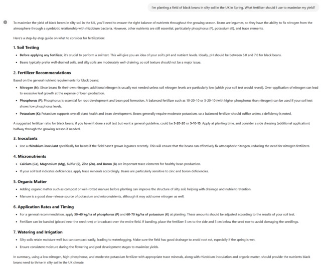
When LLMs produce exceptional output (I use the term exceptional in the sense of unusual and not-average, not to mean “good”), it appears more-creative and interesting but is even more-likely to be riddled with fanciful hallucinations.
There’s a fine line in getting the creativity dial set just right, and even when you do there’s no guarantee of accuracy, but the way in which many chatbots are told to talk makes them sound authoritative on basically every subject. When you know it’s lying, that’s easy. But people don’t always use LLMs for subjects they’re knowledgeable about!

In my example above, a more-useful robot would have stated that it didn’t know the answer to the question rather than, y’know, lying. But the nature of the statistical models used by LLMs means that they can’t know what they don’t know: they don’t have a “known unknowns” space.
Regarding the “damages the training pipeline”: I’m undecided on whether or not I agree with Ruth. She might be on to something there, but I’m not sure. Needs more thought before I commit to an opinion on that one.
Oh, and an addendum to this – as a human, I find the proliferation of AI tools in spaces that are all about creating connections with other humans deeply concerning. I saw a lot of job applications through Otta at my previous role, and they were all kind of the same – I had no sense of the person behind the averaged out CV I was looking at. We already have a huge problem with people presenting inauthentic versions of themselves on social media which makes it harder to have genuine interactions, smoothing off the rough edges of real people to get something glossy and processed is only going to make this worse.
AI posts on social media are the chicken nuggets of human interaction and I’d rather have something real every time.
Emphasis mine… because that’s a fantastic metaphor. Content generated where a generative AI is trying to “look human” are so-often bland, flat, and unexciting: a mass-produced most-basic form of social sustenance. So yeah: chicken nuggets.

Three Rings operates a Web contact form to help people get in touch with us: the idea is that it provides a quick and easy way to reach out if you’re a charity who might be able to make use of the system, a user who’s having difficulty with the features of the software, or maybe a potential new volunteer willing to give your time to the project.
But then the volume of spam it received increased dramatically. We don’t want our support team volunteers to spend all their time categorising spam: even if it doesn’t take long, it’s demoralising. So what could we do?
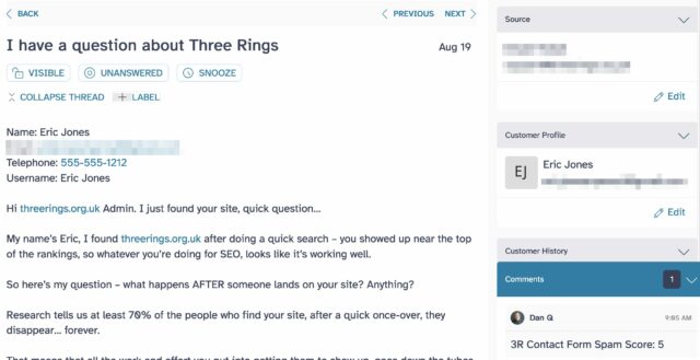
Our conventional antispam tools are configured pretty liberally: we don’t want to reject a contact from a legitimate user just because their message hits lots of scammy keywords (e.g. if a user’s having difficulty logging in and has copy-pasted all of the error messages they received, that can look a lot like a password reset spoofing scam to a spam filter). And we don’t want to add a CAPTCHA, because not only do those create a barrier to humans – while not necessarily reducing spam very much, nowadays – they’re often terrible for accessibility, privacy, or both.
But it didn’t take much analysis to spot some patterns unique to our contact form and the questions it asks that might provide an opportunity. For example, we discovered that spam messages would more-often-than-average:
None of these characteristics alone, or any of the half dozen or so others we analysed (including invisible checks like honeypots and IP-based geofencing), are reason to suspect a message of being spam. But taken together, they’re almost a sure thing.
To begin with, we assigned scores to each characteristic and automated the tagging of messages in our ticketing system with these scores. At this point, we didn’t do anything to block such messages: we were just collecting data. Over time, this allowed us to find a safe “threshold” score above which a message was certainly spam.
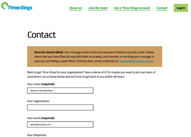
Once we’d found our threshold we were able to engage a soft-block of submissions that exceeded it, and immediately the volume of spam making it to the ticketing system dropped considerably. Under 70 lines of PHP code (which sadly I can’t share with you) and we reduced our spam rate by over 80% while having, as far as we can see, no impact on the false-positive rate.
Where conventional antispam solutions weren’t quite cutting it, implementing a few rules specific to our particular use-case made all the difference. Sometimes you’ve just got to roll your sleeves up and look at the actual data you do/don’t want, and adapt your filters accordingly.
This post is also available as a podcast. Listen here, download for later, or subscribe wherever you consume podcasts.
Observant readers might have noticed that some of my recent blog posts – like the one about special roads, my idea for pressure-cooking tea, and the one looking at the history of window tax in two countries1 – are also available as podcast.
Like my occasional video content, this isn’t designed to replace any of my blogging: it’s just a different medium for those that might prefer it.
For some stories, I guess that audio might be a better way to find out what I’ve been thinking about. Just like how the vlog version of my post about my favourite video game Easter Egg might be preferable because video as a medium is better suited to demonstrating a computer game, perhaps audio’s the right medium for some of the things I write about, too?
But as much as not, it’s just a continuation of my efforts to explore different media over which a WordPress blog can be delivered2. Also, y’know, my ongoing effort to do what I’m bad at in the hope that I might get better at a wider diversity of skills.
Let’s start by understanding what a “podcast” actually is. It is, in essence, just an RSS feed (something you might have heard me talk about before…) with audio enclosures – basically, “attachments” – on each item. The idea was spearheaded by Dave Winer back in 2001 as a way of subscribing to rich media like audio or videos in such a way that slow Internet connections could pre-download content so you didn’t have to wait for it to buffer.3
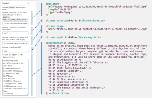
Here’s what I had to do to add podcasting capability to my theme:
I use a post tag, dancast, to represent posts with accompanying podcast content4.
This way, I can add all the podcast-specific metadata only if the user requests the feed of that tag, and leave my regular feeds untampered . This means that you don’t
get the podcast enclosures in the regular subscription; that might not be what everybody would want, but it suits me to serve podcasts only to people who explicitly ask for
them.
It also means that I’m able to use a template, tag-dancast.php, in my theme to generate a customised page for listing podcast episodes.
Okay, onto the code (which I’ve open-sourced over here). I’ve use a series of standard WordPress hooks to add the functionality I need. The important bits are:
rss2_item – to add the <enclosure>, <itunes:duration>, <itunes:image>, and
<itunes:explicit> elements to the feed, when requesting a feed with my nominated tag. Only <enclosure> is strictly required, but appeasing Apple
Podcasts is worthwhile too. These are lifted directly from the post metadata.
the_excerpt_rss – I have another piece of post metadata in which I can add a description of the podcast (in practice, a list of chapter times); this hook
swaps out the existing excerpt for my custom one in podcast feeds.
rss_enclosure – some podcast syndication platforms and players can’t cope with RSS feeds in which an item has multiple enclosures, so as a
safety precaution I strip out any enclosures that WordPress has already added (e.g. the featured image).
the_content_feed – my RSS feed usually contains the full text of every post, because I don’t like feeds that try to force you to go to the
original web page5
and I don’t want to impose that on others. But for the podcast feed, the text content of the post is somewhat redundant so I drop it.
rss2_ns – of critical importance of course is adding the relevant namespaces to your XML declaration. I use the itunes namespace, which provides the widest compatibility for specifying metadata, but I also use the
newer podcast namespace, which has growing compatibility and provides some modern features, most of which I don’t
use except specifying a license. There’s no harm in supporting both.
rss2_head – here’s where I put in the metadata for the podcast as a whole: license, category, type, and so on. Some of these fields are
effectively essential for best support.
You’re welcome, of course, to lift any of all of the code for your own purposes. WordPress makes a perfectly reasonable platform for podcasting-alongside-blogging, in my experience.
Finally, there’s the question of what to podcast about.
My intention is to use podcasting as an alternative medium to my traditional blog posts. But not every blog post is suitable for conversion into a podcast! Ones that rely on images (like my post about dithering) aren’t a great choice. Ones that have lots of code that you might like to copy-and-paste are especially unsuitable.

Also: sometimes I just can’t be bothered. It’s already some level of effort to write a blog post; it’s like an extra 25% effort on top of that to record, edit, and upload a podcast version of it.
That’s not nothing, so I’ve tended to reserve podcasts for blog posts that I think have a sort-of eccentric “general interest” vibe to them. When I learn something new and feel the need to write a thousand words about it… that’s the kind of content that makes it into a podcast episode.
Which is why I’ve been calling the endeavour “a podcast nobody asked for, about things only Dan Q cares about”. I’m capable of getting nerdsniped easily and can quickly find my way down a rabbit hole of learning. My podcast is, I guess, just a way of sharing my passion for trivial deep dives with the rest of the world.
My episodes are probably shorter than most podcasts: my longest so far is around fifteen minutes, but my shortest is only two and a half minutes and most are about seven. They’re meant to be a bite-size alternative to reading a post for people who prefer to put things in their ears than into their eyes.
Anyway: if you’re not listening already, you can subscribe from here or in your favourite podcasting app. Or you can just follow my blog as normal and look for a streamable copy of podcasts at the top of selected posts (like this one!).
1 I’ve also retroactively recorded a few older ones. Have a look/listen!
2 As well as Web-based non-textual content like audio (podcasts) and video (vlogs), my blog is wholly or partially available over a variety of more-exotic protocols: did you find me yet on Gemini (gemini://danq.me/), Spartan (spartan://danq.me/), Gopher (gopher://danq.me/), and even Finger
(finger://danq.me/, or run e.g. finger blog@danq.me from your command line)? Most of these are powered by my very own tool CapsulePress, and I’m itching to try a few more… how about a WordPress blog that’s accessible over FTP, NNTP, or DNS? I’m not even kidding when I say
I’ve got ideas for these…
3 Nowadays, we have specialised media decoder co-processors which reduce the size of media files. But more-importantly, today’s high-speed always-on Internet connections mean that you probably rarely need to make a conscious choice between streaming or downloading.
4 I actually intended to change the tag to podcast when I went-live,
but then I forgot, and now I can’t be bothered to change it. It’s only for my convenience, after all!
5 I’m very grateful that my favourite feed reader makes it possible to, for example, use a CSS selector to specify the page content it should pre-download for you! It means I get to spend more time in my feed reader.
Last month I implemented an alternative mode to view this website “like it’s 1999”, complete with with cursor trails, 88×31 buttons, tables for layout1, tiled backgrounds, and even a (fake) hit counter.
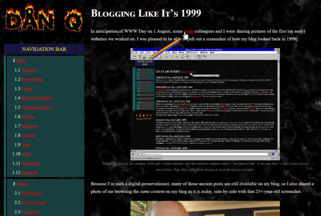
One thing I’d have liked to do for 1999 Mode but didn’t get around to would have been to make the images look like it was the 90s, too.
Back then, many Web users only had graphics hardware capable of displaying 256 distinct colours. Across different platforms and operating systems, they weren’t even necessarily the same 256 colours2! But the early Web agreed on a 216-colour palette that all those 8-bit systems could at least approximate pretty well.
I had an idea that I could make my images look “216-colour”-ish by using CSS to apply an SVG filter, but didn’t implement it.

But Spencer, a long-running source of excellent blog comments, stepped up and wrote an SVG filter for me! I’ve tweaked 1999 Mode already to use it… and I’ve just got to say it’s excellent: huge thanks, Spencer!
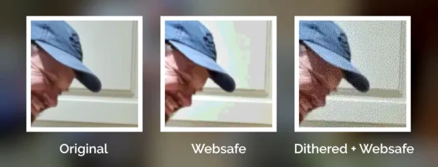
The filter coerces colours to their nearest colour in the “Web safe” palette, resulting in things like this:

Plenty of pictures genuinely looked like that on the Web of the 1990s, especially if you happened to be using a computer only capable of 8-bit colour to view a page built by somebody who hadn’t realised that not everybody would experience 24-bit colour like they did3.
But not all images in the “Web safe” palette looked like this, because savvy web developers knew to dither their images when converting them to a limited palette. Let’s have another go:

Dithering introduces random noise to media4 in order to reduce the likelihood that a “block” will all be rounded to the same value. Instead; in our picture, a block of what would otherwise be the same colour ends up being rounded to maybe half a dozen different colours, clustered together such that the ratio in a given part of the picture is, on average, a better approximation of the correct colour.
The result is analogous to how halftone printing – the aesthetic of old comics and newspapers, with different-sized dots made from few colours of ink – produces the illusion of a continuous gradient of colour so long as you look at it from far-enough away.
The other year I read a spectacular article by Surma that explained in a very-approachable way how and why different dithering algorithms produce the results they do. If you’ve any interest whatsoever in a deep dive or just want to know what blue noise is and why you should care, I’d highly recommend it.
You used to see digital dithering everywhere, but nowadays it’s so rare that it leaps out as a revolutionary aesthetic when, for example, it gets used in a video game.
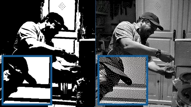
All of which is to say that: I really appreciate Spencer’s work to make my “1999 Mode” impose a 216-colour palette on images. But while it’s closer to the truth, it still doesn’t quite reflect what my website would’ve looked like in the 1990s because I made extensive use of dithering when I saved my images in Web safe palettes5.
Why did I take the time to dither my images, back in the day? Because doing the hard work once, as a creator of graphical Web pages, saves time and computation (and can look better!), compared to making every single Web visitor’s browser do it every single time.
Which, now I think about it, is a lesson that’s still true today (I’m talking to you, developers who send a tonne of JavaScript and ask my browser to generate the HTML for you rather than just sending me the HTML in the first place!).
1 Actually, my “1999 mode” doesn’t use tables for layout; it pretty much only applies a CSS overlay, but it’s deliberately designed to look a lot like my blog did in 1999, which did use tables for layout. For those too young to remember: back before CSS gave us the ability to lay out content in diverse ways, it was commonplace to use a table – often with the borders and cell-padding reduced to zero – to achieve things that today would be simple, like putting a menu down the edge of a page or an image alongside some text content. Using tables for non-tabular data causes problems, though: not only is it hard to make a usable responsive website with them, it also reduces the control you have over the order of the content, which upsets some kinds of accessibility technologies. Oh, and it’s semantically-invalid, of course, to describe something as a table if it’s not.
2 Perhaps as few as 22 colours were defined the same across all widespread colour-capable Web systems. At first that sounds bad. Then you remember that 4-bit (16 colour) palettes used to look look perfectly fine in 90s videogames. But then you realise that the specific 22 “very safe” colours are pretty shit and useless for rendering anything that isn’t composed of black, white, bright red, and maybe one of a few greeny-yellows. Ugh. For your amusement, here’s a copy of the image rendered using only the “very safe” 22 colours.
3 Spencer’s SVG filter does pretty-much the same thing as a computer might if asked to render a 24-bit colour image using only 8-bit colour. Simply “rounding” each pixel’s colour to the nearest available colour is a fast operation, even on older hardware and with larger images.
4 Note that I didn’t say “images”: dithering is also used to produce the same “more natural” feel for audio, too, when reducing its bitrate (i.e. reducing the number of finite states into which the waveform can be quantised for digitisation), for example.
5 I’m aware that my footnotes are capable of nerdsniping Spencer, so by writing this there’s a risk that he’ll, y’know, find a way to express a dithering algorithm as an SVG filter too. Which I suspect isn’t possible, but who knows! 😅
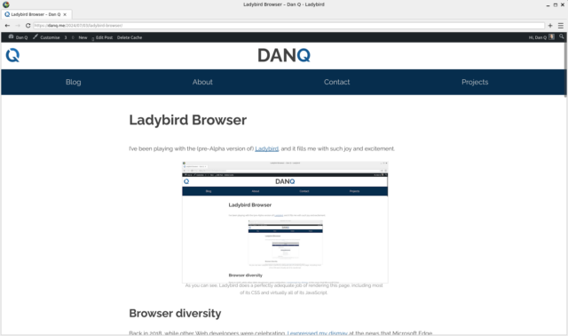
I’ve been playing with the (pre-Alpha version of) Ladybird, and it fills me with such joy and excitement.
Back in 2018, while other Web developers were celebrating, I expressed my dismay at the news that Microsoft Edge was on the cusp of switching from using Microsoft’s own browser engine EdgeHTML to using Blink. Blink is the engine that powers almost all other mainstream browsers; all but Firefox, which continues to stand atop Gecko.
The developers who celebrated this loss of rendering engine diversity were, I suppose, happy to have one fewer browser in which they must necessarily test their work. I guess these are the same developers who don’t test the sites they develop for accessibility (does your site work if you can’t see the images? what about with a keyboard but without a pointing device? how about if you’re colourblind?), or consider what might happen if a part of their site fails (what if the third-party CDN that hosts your JavaScript libraries goes down or is blocked by the user’s security software or their ISP?).
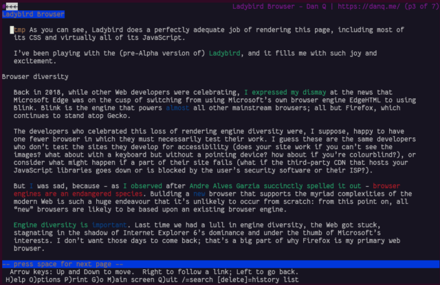
But I was sad, because – as I observed after Andre Alves Garzia succinctly spelled it out – browser engines are an endangered species. Building a new browser that supports the myriad complexities of the modern Web is such a huge endeavour that it’s unlikely to occur from scratch: from this point on, all “new” browsers are likely to be based upon an existing browser engine.
Engine diversity is important. Last time we had a lull in engine diversity, the Web got stuck, stagnating in the shadow of Internet Explorer 6’s dominance and under the thumb of Microsoft’s interests. I don’t want those days to come back; that’s a big part of why Firefox is my primary web browser.
Ladybird is a genuine new browser engine. Y’know, that thing I said that we might never see happen again! So how’ve they made it happen?
It helps that it’s not quite starting from scratch. It’s starting point is the HTML viewer component from SerenityOS. And… it’s pretty good. It’s DOM processing’s solid, it seems to support enough JavaScript and CSS that the modern Web is usable, even if it’s not beautiful 100% of the time.
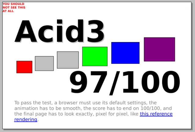
They’re not even expecting to make an Alpha release until next year! Right now if you want to use it at all, you’re going to need to compile the code for yourself and fight with a plethora of bugs, but it works and that, all by itself, is really exciting.
They’ve got four full-time engineers, funded off donations, with three more expected to join, plus a stack of volunteer contributors on Github. I’ve raised my first issue against the repo; sadly my C++ probably isn’t strong enough to be able to help more-directly, even if I somehow did have enough free time, which I don’t. But I’ll be watching-from-afar this wonderful, ambitious, and ideologically-sound initiative.
Woop! This is my 100th post of the year (stats), even using my more-conservative/pedant-friendly “don’t count checkins/reposts/etc. rule. If you’re not a pedant, I achieved #100DaysToOffload when I found a geocache alongside Regents Canal while changing trains to go to Amsterdam where I played games with my new work team, looked at windows and learned about how they’ve been taxed, and got nerdsniped by a bus depot. In any case: whether you’re a pedant or not you’ve got to agree I’ve achieved it now!
In the late ’70s, a shadowy group of British technologists concluded that nuclear war was inevitable and secretly started work on a cutting-edge system designed to help rebuild society. And thanks to Matt Round-and-friends at vole.wtf (who I might have mentioned before), the system they created – ARCC – can now be emulated in your browser.
I’ve been playing with it on-and-off all year, and I’ve (finally) managed to finish exploring pretty-much everything the platform currently has to offer, which makes it pretty damn good value for money for the £6.52 I paid for my ticket (the price started at £2.56 and increases by 2p for every ticket sold). But you can get it cheaper than I did if you score 25+ on one of the emulated games.
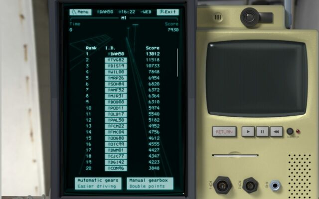
Most of what I just told you is true. Everything… except the premise. There never was a secretive cabal of engineers who made this whackballs computer system. What vole.wtf emulates is an imaginary system, and playing with that system is like stepping into a bizarre alternate timeline or a weird world. Over several separate days of visits you’ll explore more and more of a beautifully-realised fiction that draws from retrocomputing, Cold War fearmongering, early multi-user networks with dumb terminal interfaces, and aesthetics that straddle the tripoint between VHS, Teletext, and BBS systems. Oh yeah, and it’s also a lot like being in a cult.
Needless to say, therefore, it presses all the right buttons for me.
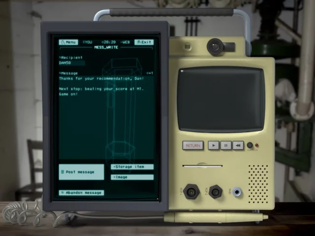
DAN50.
If you enjoy any of those things, maybe you’d like this too. I can’t begin to explain the amount of work that’s gone into it. If you’re looking for anything more-specific in a recommendation, suffice to say: this is a piece of art worth seeing.
This is a repost promoting content originally published elsewhere. See more things Dan's reposted.
This is a silly idea. But it works. I saw Dan Q wondering about plaintext WordPress themes – so I made one.
This is what this blog looks like using it:
…
I clearly nerdsniped Terence at least a little when I asked whether a blog necessarily had to be HTML, because he went on to implement a WordPress theme that delivers content entirely in plain text.
Naturally, I’ve also shared his accomplishment on my own text/plain blog (which uses a much simpler CMS based on static files).
Terence Eden wrote about his recent experience of IndieWebCamp Brighton, in which he mentioned that somebody – probably Jeremy Keith – had said, presumably to provoke discussion:
A blog post doesn’t need a title.
Terence disagrees, saying:
In a literal sense, he was wrong. The HTML specification makes it clear that the
<title>element is mandatory. All documents have title.
But I think that’s an overreach. After all, where is it written that a blog must be presented in HTML?
There are plenty of counter-examples already in existence, of course:
<title>s, of course, so that’s not the strongest counterexample!
But perhaps we can do better…
We’ve looked at plain text, which as a format clearly does not have to have a title. Let’s go one step further and implement it. What we’d need is:
index index.txt; (for Nginx).5
<item> has a <title>!
I’ve implemented it! it’s at textplain.blog.
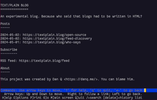
In the end I decided it’d benefit from being automated as sort-of a basic flat-file CMS, so I wrote it in PHP. All requests are routed by the webserver to the program, which determines whether they’re a request for the homepage, the RSS feed, or a valid individual post, and responds accordingly.
It annoys me that feed
discovery doesn’t work nicely when using a Link: header, at least not in any reader I tried. But apart from that, it seems pretty solid, despite its limitations. Is this,
perhaps, an argument for my .well-known/feeds proposal?
Anyway, I’ve open-sourced the entire thing in case it’s of any use to anybody at all, which is admittedly unlikely! Here’s the code.
1 no-ht.ml technically does use HTML, but the same content could easily be delivered with an appropriate non-HTML MIME type if he’d wanted.
2 Again, I suppose this technically required HTML, even if what was delivered was an empty file!
3 Gemtext is basically Markdown, and doesn’t require a title.
4 Plain text obviously doesn’t require a title.
5 There’s no requirement that default files served by webservers are HTML, although it’s highly-unsual for that not to be the case.
I’ve got a (now four-year-old) Unraid NAS called Fox and I’m a huge fan. I particularly love the fact that Unraid can work not only as a NAS, but also as a fully-fledged Docker appliance, enabling me to easily install and maintain all manner of applications.

I was chatting this week to a colleague who was considering getting a similar setup, and he seemed to be taking notes of things he might like to install, once he’s got one. So I figured I’d round up five of my favourite things to install on an Unraid NAS that:
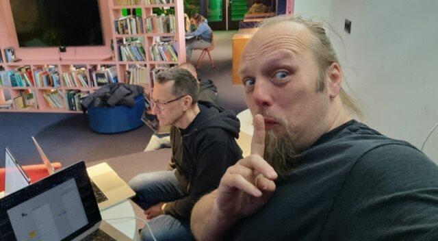
Here we go:
I’ve been raving about Syncthing for years. If I had an “everyday carry” list of applications, it’d be high on that list.
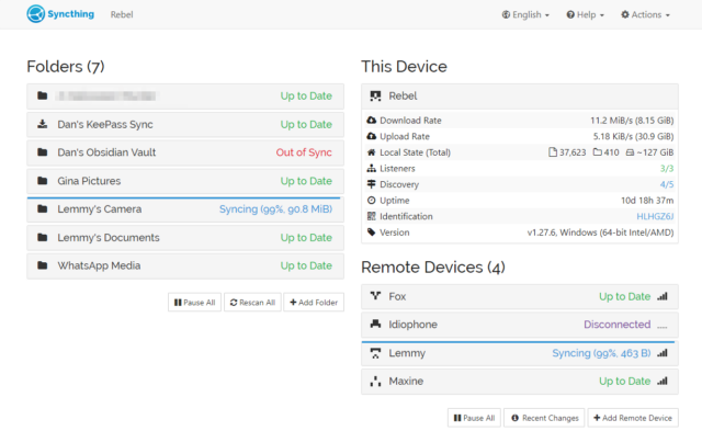
Here’s the skinny: you install Syncthing on several devices, then give each the identification key of another to pair them. Now you can add folders on each and “share” them with the others, and the two are kept in-sync. There’s lots of options for power users, but just as a starting point you can use this to:
You know IFTTT? Zapier? Services that help you to “automate” things based on inputs and outputs. Huginn’s like that, but selfhosted. Also: more-powerful.

The learning curve is steeper than anything else on this list, and I almost didn’t include it for that reason alone. But once you’ve learned your way around its idiosyncrasies and dipped your toe into the more-advanced Javascript-powered magic it can do, you really begin to unlock its potential.
It couples well with Home Assistant, if that’s your jam. But even without it, you can find yourself automating things you never expected to.
I’ve written a lot about how and why FreshRSS continues to be my favourite RSS reader. But you know what’s even better than an awesome RSS reader? An awesome selfhosted RSS reader!

Many of these suggested apps benefit well from you exposing them to the open Web rather than just running them on your LAN, and an RSS reader is probably the best example (you want to read your news feeds when you’re out and about, right?). What you need for that is a reverse proxy, and there are lots of guides to doing it super-easily, even if you’re not on a static IP address.2. Alternatively you can just VPN in to your home: your router might be able to arrange this, or else Unraid can do it for you!
You know how sometimes you need to give somebody your email address but you don’t actually want to. Like: sure, I’d like you to email me a verification code for this download, but I don’t trust you not to spam me later! What you need is a disposable email address.3

You just need to install Open Trashmail, point the MX records of a few domain names or subdomains (you’ve got some spare domain names lying around, right? if not; they’re pretty cheap…) at it, and it will now accept email to any address on those domains. You can make up addresses off the top of your head, even away from an Internet connection when using a paper-based form, and they work. You can check them later if you want to… or ignore them forever.
Couple it with an RSS reader, or Huginn, or Slack, and you can get a notification or take some action when an email arrives!
Finally: a URL shortener. The Internet’s got lots of them, but they’re all at the mercy of somebody else (potentially somebody in a country that might not be very-friendly with yours…).
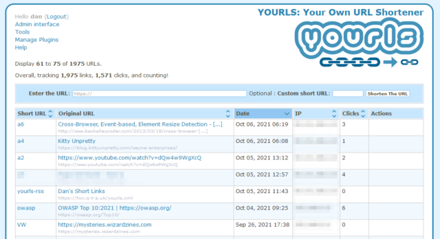
Plus, it’s just kinda cool to be able to brand your shortlinks with your own name, right? If you follow only one link from this post, let it be to watch this video that helps explain why this is important: danq.link/url-shortener-highlights.
I run many, many other Docker containers and virtual machines on my NAS. These five aren’t even the “top five” that I use… they’re just five that are great starters because they’re easy and pack a lot of joy into their learning curve.
And if your NAS can’t do all the above… consider Unraid for your next NAS!
1 I wrote the beginnings of this post on my phone while in the Channel Tunnel and then carried on using my desktop computer once I was home. Sync is magic.
2 I can’t share or recommend one reverse proxy guide in particular because I set my own up because I can configure Nginx in my sleep, but I did a quick search and found several that all look good so I imagine you can do the same. You don’t have to do it on day one, though!
3 Obviously there are lots of approachable to on-demand disposable email addresses, including the venerable “plus sign in a GMail address” trick, but Open Trashmail is just… better for many cases.
This is a repost promoting content originally published elsewhere. See more things Dan's reposted.
Molly White writes, more-eloquently than I would’ve, almost-exactly my experience of LLMs and similar modern generative AIs:
…
I, like many others who have experimented with or adopted these products, have found that these tools actually can be pretty useful for some tasks. Though AI companies are prone to making overblown promises that the tools will shortly be able to replace your content writing team or generate feature-length films or develop a video game from scratch, the reality is far more mundane: they are handy in the same way that it might occasionally be useful to delegate some tasks to an inexperienced and sometimes sloppy intern.
…
Very much this.
I’ve experimented with a handful of generative AIs, such as:
Most-recently, I’ve played with music-making AI Suno and… it’s not great.. but like all these others it’s really interesting to experiment with and think about. Here: let me just ask it to write some “vocal trance europop about a woman called Molly; Molly has a robot friend who is pretty good at doing many tasks, but the one thing she’ll never trust the robot to do is write in her blog” –

So yes, like Molly:
It’s still an interesting field to follow-along with. Stuff like Sora from OpenAI and VASA-1 from Microsoft are just scary (the latter seems to have little purpose other than for misinformation-generation3!), but the genie’s out of the bottle now.
1 Visually-distinct tokens adds depth to the world and helps players communicate with one another: “You distract the skinny cultist, and I’ll try to creep up on the ugly one!”
2 I’m going to gloss right over the question of whether or not these tools are capable of creating anything truly original. You know what I mean.
3 Gotta admit though that I laughed like a drain at the Mona Lisa singing along with Anne Hathaway’s Lil’ Wayne Style Paparazzi Rap. If you’ve not seen the thing I’m talking about, go do that now.
RSS is better than ActivityPub1.

When I subscribe to content, I want:
RSS ticks all these boxes. If I can choose between RSS and ActivityPub to subscribe to your content, and I don’t need a real-time update, I’m probably going to choose RSS.
About a month later,
1 I feel like this statement needs a few clarifications and caveats, but my hot take looks spicier if I bury them in a footnote!
<article> element is intended to be suitable for syndication use?
I use a tool called Sonarr to, uhh1, keep track of when new episodes of television shows are released, regardless of what platform they’re on (Netflix, Prime, iPlayer, whatever) and notify me so I remember to watch it.
For several years, I’ve used IFTTT as the intermediary, receiving webhooks from Sonarr and translating them for Slack:

IFTTT‘s move to kill its Legacy Pro plan2 – which I was on – gave me reason to re-assess this configuration. It turns that the only Pro feature I was using was an IFTTT “filter” to convert the Sonarr webhooks to a Slack-friendly-format.
Given that I’m running an installation of Huginn on my home network anyway, I resolved to re-implement this flow in Huginn and cancel my IFTTT subscription.

This turned out to be so easy I wonder why I never did it before.
First, I created a Webhook Agent and gave the URL to Sonarr.
Then I connected that to a Slack Agent with the following configuration:
{
  "webhook_url": "https://hooks.slack.com/services/...",
  "channel": "#sonarr",
  "username": "Sonarr",
  "message": "*<https://thetvdb.com/?tab=series&id={{series.tvdbId}}|{{series.title}}>*\nNew episodes:{% for episode in episodes %}\n• S{{episode.seasonNumber}}E{{episode.episodeNumber}} {{episode.title}}{% endfor %}",
  "icon": ":tv:"
}
pluralize filter to
work so it’d say “episode” or “episodes” as appropriate before realising I didn’t care enough and gave up.
Then all I needed to do was re-emit some of the previous webhooks to test it:
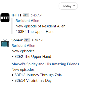
:tv: icon and added the “Sonarr” username, as shown in my code sample.
Now I’ll continue to know when there’s new television to watch3!
I love the power and flexibility that Huginn provides to help automate your life. It does many of the things that I used to do with a handful of cron jobs and shell scripts, but all in one convenient place.
1 I’ve heard there are other uses for the tool. Your mileage may vary. Don’t forget to pay for your content, if possible.
2 Like many others, I originally signed up to the plan under the promise that the price would be honoured forever. Turns out “forever” means “three years”: who knew?
3 It’s especially useful when you’re between seasons or a show is on hiatus to be reminded that it’s back and I should go and watch it. Hey, there’s a thought: I wonder if I can extract the subtitles from shows and run them through a summarising LLM to give me a couple of paragraphs reminding me “what happened last series” if the show’s been on a long break?