I had a smug moment when I saw security researcher Rob Ricci and friends’ paper empirically analysing brute-force attacks against SSH “in the wild”.1 It turns out that putting all your SSH servers on “weird” port
numbers – which I’ve routinely done for over a decade – remains a pretty-effective way to stop all that unwanted traffic2,
whether or not you decide to enhance that with some fail2ban magic.
I was just setting up a new Debian 12 server when I learned about this. I’d already moved the SSH server port away from the default 224, so I figured
I’d launch Endlessh on port 22 to slow down and annoy scanners.
Installation wasn’t as easy as I’d hoped considering there’s a package. Here’s what I needed to do:
Move any existing SSH server to a different port, if you haven’t already, e.g. as shown in the footnotes.
change InaccessiblePaths=/run /var into InaccessiblePaths=/var
Reload the modified service: sudo systemctl daemon-reload
Configure Endlessh to run on port 22 rather than its default of 2222: echo "Port 22" | sudo tee /etc/endlessh/config
Start Endlessh: sudo service endlessh start
To test if it’s working, connect to your SSH server on port 22 with your client in verbose mode, e.g. ssh -vp22 example.com and look for banner lines full of random garbage
appearing at 10 second intervals.
It doesn’t provide a significant security, but you get to enjoy the self-satisfied feeling that you’re trolling dozens of opportunistic script kiddies a day.
Footnotes
1 It’s a good paper in general, if that’s your jam.
2 Obviously you gain very little security by moving to an unusual port number, given that
you’re already running your servers in “keys-only” (PasswordAuthentication no) configuration mode already, right? Right!? But it’s nice to avoid all the unnecessary
logging that wave after wave of brute-force attempts produce.
3 Which I can only assume is pronounced endle-S-S-H, but regardless of how it’s said out
loud I appreciate the wordplay of its name.
4 To move your SSH port, you might run something like echo "Port 12345" | sudo tee
/etc/ssh/sshd_config.d/unusual-port.conf and restart the service, of course.
Our beloved-but-slightly-thick dog will sometimes consent to playing fetch, but one of her favourite games to play is My Ball. Which is a
bit like fetch, except that she won’t let go of the ball.
It’s not quite the same as tug-of-war, though. She doesn’t want you to pull the toy in a back-and-forth before, most-likely, giving up and letting her win1. Nor is My Ball a solo game: she’s not interested
in sitting and simply chewing the ball, like some dogs do.
I’d like to imagine the grunts and snorts she makes at about this moment actually translate to “My ball. Myyyy… ballll. Myyyyy ball! MY BALL! My… BALL!”
No, this is absolutely a participatory game. She’ll sit and whine for your attention to get you to come to another room. Or she’ll bring the toy in question (it doesn’t have to
be a ball) and place it gently on your foot to get your attention.
Your role in this game is to want the ball. So long as you’re showing that you want the ball – occasionally reaching down to take it only for her to snatch it away at
the last second, verbally asking if you can have it, or just looking enviously in its general direction – you’re playing your part in the game. Your presence and participation is
essential, even as your role is entirely ceremonial.
This might look like a game of tug-of-war, but you’ll note that my grip is just barely two-fingered. She’s not pulling, because she doesn’t need to unless I try to take the toy. This
is My Rope, she knows.
Playing it, I find myself reminded of playing with the kids when they were toddlers. The eldest in particular enjoyed spending countless hours playing make-believe games in which the
roles were tightly-scripted2. She’d tell me that, say, I was a talking badger or a grumpy
dragon or an injured patient but immediately shoot down any effort to role-play my assigned character, telling me that I was “doing it wrong” if I didn’t act in exactly the unspoken way
that she imagined my character ought to behave.
But the important thing to her was that I embodied the motivation that she assigned me. That I wanted the rabbits to stop digging too near to my burrow3 or the
princess to stay in her cage4 or to lie down in my hospital bed and await the doctor’s eventual arrival5.
Sometimes I didn’t need to do much, so long as I showed how I felt in the role I’d been assigned.
In this game, the chef was “making soup” (in the sink, apparently) and my job was to “want the soup”.
Somebody with much more acting experience and/or a deeper academic comprehension of the performing arts is going to appear in the comments and tell me why this is, probably.
But I guess what I mean to say is that playing with my dog sometimes reminds me of playing with a toddler. Which, just sometimes, I miss.
Footnotes
1 Alternatively, tug-of-war can see the human “win” and then throw the toy, leading to a
game of fetch after all.
3 “Grr, those pesky rabbits are stopping me sleeping.”
4 “I’ll just contentedly sit on my pile of treasure, I guess?”
5 Playing at being an injured patient was perhaps one of my favourite roles, especially
after a night in which the little tyke had woken me a dozen times and yet still had some kind of tiny-human morning-zoomies. On at least one such occasion I’m pretty sure I actually
fell asleep while the “doctor” finished her rounds of all the soft toys whose triage apparently put them ahead of me in the pecking order. Similarly, I always loved it
when the kids’ games included a “naptime” component.
Yesterday, I fulfilled the primary Three Rings objective I set for myself when I kicked off my sabbatical
twelve weeks ago and migrated the entire application to a new hosting provider (making a stack of related improvements along the way).
Months prior, I was comparing different providers and their relative merits, making sure that our (quirky and specific) needs could be met. Weeks beforehand, I was running a “dry run”
every four or five days, streamlining the process of moving the ~450GB1
of live data while minimising downtime. Days before the event felt like the countdown for a rocket launch, with final preparations underway: reducing DNS time-to-lives, ensuring users
knew about our downtime window, and generally fitting in a little time to panic.
I made reference on International Volunteer Day to how we needed to configure logrotate. When you’re building architecture for a system as gnarly as Three Rings, there’s
about a billion tools that need such careful tweaking2.
The whole operation was amazingly successful. We’d announced an at-risk period of up to six hours and I was anticipating it taking three… but the whole thing was completed within
a downtime window of just two and a half hours. And I fully credit all of the preparation time. It turns out that “measure twice, cut once” is a sensible strategy3.
It’s challenging to pull off a “big”, intensive operation like this in an entirely voluntary operation. I’m not saying I couldn’t have done it were I not on sabbatical, but
it’d certainly have been harder and riskier.
1Three Rings‘ user data is represented by a little under 70GB of MariaDB
databases plus about 380GB of organisational storage: volunteer photos, files, email attachments, and the like. Certainly not massive by comparison to, say, social media sites, search
engines, and larger eCommerce platforms… but large enough that moving it takes a little planning!
2 Okay, a billion tools to configure? That’s an exaggeration. Especially
now: since the architectural changes I’ve put in place this week, for example, production app server builds of Three Rings no require a custom-compiled build of Nginx (yes,
this really was something we used to need).
Some of these titles perhaps don’t look like they belong, but she doesn’t seem to mind.
My initial order of fake book fronts was damaged in transit but the excellent eBay seller I’d been dealing with immediately sent a comparable replacement. This had left me with a
spare-but-damaged set of fake book fronts, but with a little gluing, sawing and filing I was able to turn them into a second usable fake cabinet front.
My 10-year-old’s fake cabinet isn’t quite as sophisticated as mine (no Raspberry Pi Zero, solenoids, or electronic locks) – you just have to know where it is and pull on the correct
corner of it to release it – but she still thinks it’s pretty magical2.
I’ve no idea what she’ll store in here, and given that she’s on the cusp of becoming a teenager it’s possible I don’t want to know. But at least I know the secret to opening
it, should I have to.
A cut-down plank of plyboard stained the right colour, some offcuts of skirting board, a couple of butt hinges, some L-brackets, some bathroom mirror mounting tape, the fake book
fronts, and an hour and a half’s work seems totally worth it to give a child the magical experience of a secret compartment in their bedroom. My carpentry’s improved since my one, too:
this time I measured twice before cutting3 and it paid-off with a cleaner, straighter finish.
Footnotes
1 She was pretty impressed already at the secret cabinet, but perhaps more-so when she
discovered that the fake book fronts I’d used were part of the set of The School for Good and Evil, the apparently-disappointing film version of one of her favourite series’
of books.
2 Which, frankly, it is. I wish I’d had a secret compartment in my bedroom
bookshelves when I was her age!
Today is International Volunteer Day. And because I’m in the middle of my (magical) sabbatical, I’ve had no difficulty dedicating what would have been the entire workday to a variety
of volunteer activities for the benefit of Three Rings, the nonprofit I founded 22 years ago for the purpose of making volunteer management,
and therefore volunteering, easier.
Liveblogging my day
Step one in a highly productive day of tech volunteering is, as you might have expected: coffee.
I’m pretty sure that most folks don’t know what my voluntary work at Three Rings involves1,
and so I decided I’d celebrate this year’s International Volunteer Day by live-blogging what I got up to in a series of notes throughout the day (1, 2, 3, 4, 5, 6, 7, 8)2.
Maybe, I figured, doing so might provide more of an insight into what a developer/devops role at Three Rings looks like.
Regression-testing a fix
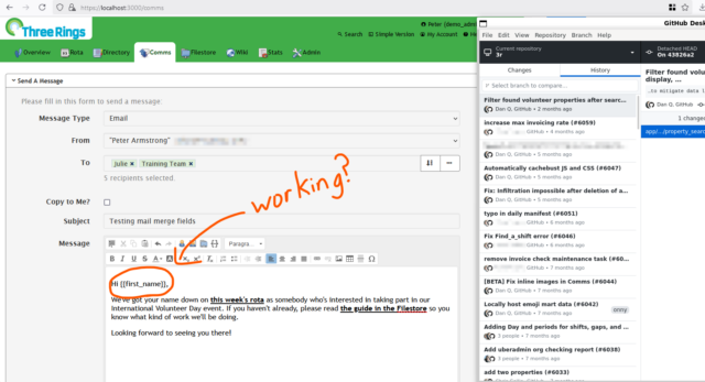
My first task for the day related to a bugfix that we’re looking to deploy. Right now, there’s a problem which sometimes stops the “mail merge”
fields in emails sent by Three Rings3.
We have a candidate fix, but because it’s proposed as a hotfix (i.e. for deployment directly to production), it requires a more-thorough review process involving more volunteer
developers than code which will be made available for beta testing first.
My aim with this task was to roll-back to an earlier version of the software, before the bug was first introduced (by fixing something different!), and ensure that the functionality
remained the same as it always had been.
It turned out that everything was alright, so I reported back to my fellow reviewers about how I’d tested and what my results had been. Once some
more eyes have hit the tests and the new/changed code, that’ll hopefully be ready-to-launch.
Three Rings volunteers primarily communicate via Slack: it helps us to work asynchronously, which supports the fact that our volunteers all have different schedules and preferences
for how they plan their volunteering: some spend whole days, some just a few hours now and then. We’re the ultimate “armchair volunteering” opportunity!
We’re all about collaboration, discussion, learning from one another, and volunteer-empowerment, so my suggestions in this case were non-blocking: I trust my fellow volunteer to
either accept my suggestion (if it’s right), reject it (if it’s wrong), or solicit more reviews or bring it to Slack or our fortnightly dev meeting (if it requires discussion).
Preparing new infrastructure
Next week we’re scheduled to do a big migration of server infrastructure to help provide more future growing-room: it’s exciting, but also a little scary4!
For now, though, all I needed to do was to tweak our logrotate and backup configurations in response to testing of our new systems.
Not all of our developer volunteers also wear a “devops” hat, but a few of us do5.
It’s quite a satisfying role – devops can feel like tidying and organising, and just as a physical space can feel clean, simple, and functional when it’s carefully and minimalistically
laid out, a well-organised cluster of servers humming along in exactly the way they should can be a highly-satisfying thing to be responsible for, too.
Sorting the post
It’s not all techy work, though. And while it’s true that Three Rings has a good group of less-nerdy6 people to handle many of the non-programming tasks that you need
to run a voluntary organisation like ours, it’s also true that many of us wear multiple hats and pull our weight in several different roles.
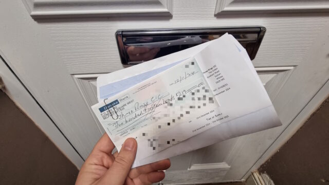
Our time as volunteers may be free, but our servers aren’t, so the larger and richer charities that use our services help contribute to our hosting costs. Most send money digitally,
but some use dual-signatory accounts that require they send cheques.
When people are stuck with Three Rings, or considering using it, or have feature suggestions, or anything else, we encourage them to fill in our contact form. The results of that make their way into our ticketing system where Support Team volunteers help people with whatever it is
they need7.
They asked if they could have a Slack notification when the form was filled, to grab their attention all the quicker if they were already online, so I obliged and added one.
Adding the Slack notifications meant writing some WordPress PHP code, which feels closer to my “day job” than my Three Rings volunteering!
That quick improvement done, it was time to move on to a task both bigger and more-exciting:
Wrapping up a new feature
I’ve recently been working on an upcoming new feature for Three Rings. Inspired by only occasional user requests, this idea’s been sitting in our (long!) backlog for a while
now8:
a way to edit the details of volunteers in your organisation in bulk, as though they were in a spreadsheet.
The feature’s been almost-complete for weeks now, but I had a few last tweaks to make, based on early feedback and show-and-tell sessions.
I’ve been working on this feature by a series of iterations since the end of October, periodically demonstrating it to other Three Rings volunteers and getting early feedback. In the
last round of demonstrations (plus a little user testing, at an in-person Three Rings event) I solicited opinions on how the new feature should be presented, and who it should be made
available to9.
So this afternoon I was working on bits of the user interface and, delightfully, got the feature to a point where I only need to update the test instructions and it’ll be ready for a
full review and consideration for inclusion in our next milestone release, early next year. Hurrah!
It’s only a draft PR for now, but at least the initial checks look positive.
Reflecting on my day
I don’t normally get this much Three Rings work done in a day. Even since my sabbatical started, I don’t always get so productive a day10,
and when I’m working normally I’d probably only get maybe one or two of these achievements done in a typical week.
So I’m hugely appreciative that my employer encourages staff to take a three-month sabbatical every five years. Because it
gives me the opportunity have days like this International Volunteer Day, where I can spend the whole day throwing myself headlong at some valuable volunteering efforts and come out the
other side with the satisfaction that I gave my time to make the world a very slightly better place.
If you’re not already volunteering somewhere, I’d highly recommend that you consider it. Volunteering can be purposeful, enriching, and hugely satisfying. Happy International Volunteer
Day!
Footnotes
1 In fact, most of the charities who use Three Rings’ services are surprised to discover
that we’re a voluntary organisation at all, because we provide the kinds of uptime guarantee, tech support response times, software quality etc. that they might have come to
expect from much-richer organisations with a much larger – and paid! – staff. That we’re a voluntary organisation helping voluntary organisations is so unusual that sometimes people
have been unsure how to handle us: one time, for example, a helpline charity that was considering making use of us declared us “unsustainable” without a commercial model. At some
point in the last decade or two they saw that we’ve outlasted many other services of our type, most of them commercial, and realised: yeah, okay, it turns out we’re in this for the
long haul.
2 Gosh: a nine-post day is gonna keep throwing the stats of my recent streak all over the place, isn’t it?
3 My use of italics for Three Rings isn’t arbitrary, but I’ll admit it is
confusing. “Three Rings” is the name of our nonprofit. “Three Rings” is the name of the software service we provide. Branding is hard when your company name and product name
are the same. And it’s even harder when all of your users insist on abbreviating both to “3R”. 🙄
4 With around 60,000 volunteers depending on Three Rings to coordinate their
efforts, the pressure is always on to minimise downtime. I’ve spent many hours over the last few weeks running and re-running through practice runs of the migration strategy before I
take the lead on it next week.
5 That said, one of the big things I’ve been pushing for in our new infrastructure is new
tools to make it easier for our developers to do “server stuff” like deploying new releases, in an effort to bring us closer to the dream of a continuous integration pipeline. Some
day!
6 Or “normal people”, as they might call themselves.
7 The Support Team are a wonderful and hard-working group of volunteers, who aim to reply
to every contact within 24 hours, 365 days a year, and often manage a lot faster than that. They’re at the front-line of what makes Three Rings a brilliant
system.
8 While we curate a backlog of user requests and prioritise them based on the optimisation
ratio of amount-of-good-done to the amount-of-effort-expected, our developer volunteers enjoy a huge amount of autonomy about what tasks they choose to pick up. It’s not unknown for
developers who also volunteer at other organisations (that might be users of Three Rings) to spend a disproportionate amount of time on features that their
organisation would benefit from, and that’s fine… so long as the new feature will also benefit at least a large minority of the other organisations that depend on
Three Rings. Also, crucially: we try to ensure that new features never inconvenience existing users and the ways in which they work. That’s increasingly challenging in our
22-year-old software tool, but it’s important to us that we’re not like your favourite eCommerce or social networking service that dramatically change their user interface every other
year or drop features without warning nor consideration for who might depend upon them.
9 The new feature’s secured such that it works for everybody: if you accessed it
as a volunteer with low privileges, you might be able to see virtually nothing about most of the other volunteers and be able to edit only a few details about yourself, for example.
But that’d be a pretty-confusing interface, so we concluded that it probably didn’t need to be made available to all volunteers but only those with certain levels of
access. We can always revisit later.
For a long time now, every year we’ve encouraged our two children (now 10 and 8 years old) to each select one new bauble for our Christmas tree1.
They get to do this at the shop adjoining the place from which we buy the tree, and it’s become a part of our annual Christmas traditions.
This approach to decoration: ad-hoc, at the whims of growing children, and spread across many years without any common theme or pattern, means that our tree is decorated in a way that
might be generously described as eclectic. Or might less-generously be described as malcoordinated!
But there’s something beautiful about a deliberately-constructed collection of disparate and disconnected parts.
I’m friends with a couple, for example, who’ve made a collection of the corks from the wine bottles from each of their anniversary celebrations, housed together into a strange showcase.
There might be little to connect one bottle to the next, and to an outsider a collection of used stoppers might pass as junk, but for them – as for us – the meaning comes as a
consequence of the very act of collecting.
Each ornament is an untold story. A story of a child wandering around the shelves of a Christmas-themed store, poking fingerprints onto every piece of glass they can find as they weigh
up which of the many options available to them is the most special to them this year.
And every year, at about this time, they get to relive their past tastes and fascinations as we pull out the old cardboard box and once again decorate our family’s strangely beautiful
but mismatched tree.
It’s pretty great.
Footnotes
1 Sometimes each has made a bauble or similar decoration at their school or
nursery, too. “One a year” isn’t a hard rule. But the key thing is, we’ve never since their births bought a set of baubles.
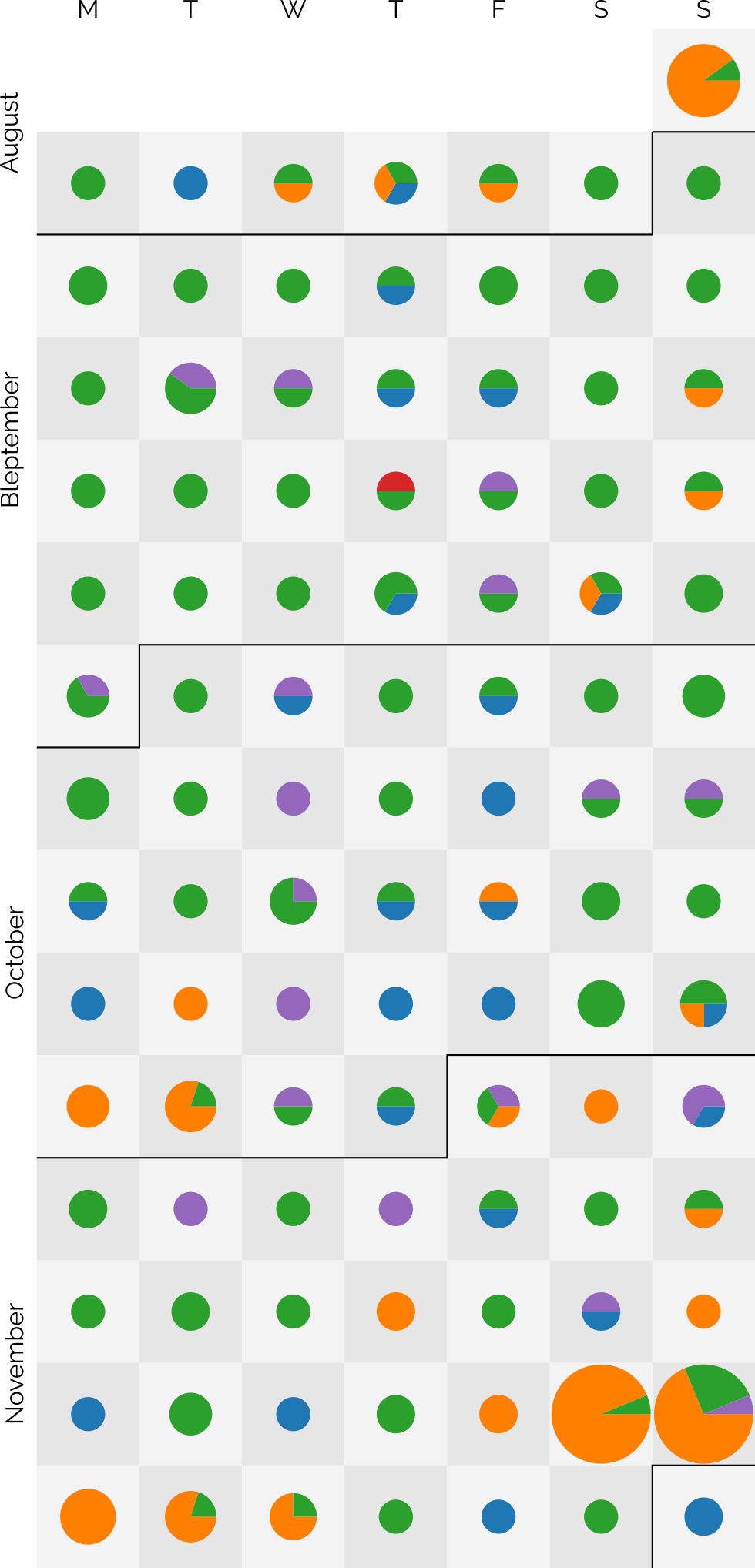
The dots are sized based on the number of posts and broken-down by post kind: articles are blue, notes are green, checkins are orange, reposts are purple, and replies are red3.
I didn’t set out with the aim of getting to a hundred4, as I might well
manage tomorrow, but after a while I began to think it a real possibility. In particular, when a few different factors came together:
Travel’s given me more opportunity for geocaching (and, this last week, geohashing), as reflected in my copious checkin logs for that period.
Earlier this year, inspired by Clayton Errington, I came up with a process to streamline my mobile blogging
“flow”5. I now use a custom
Progressive Web App to provide a better interface for quickly posting on-the-move to one or both of this blog and my personal Mastodon account,
which I tested heavily during Bleptember.
Previous long streaks have sometimes been aided by pre-writing posts in bulk and then scheduling them to come out one-a-day6.
I mostly don’t do that any more: when a post is “ready”, it gets published.
I didn’t want to make a “this is my 100th day of consecutive blogging” on the 100th day. That attaches too much weight to the nice round number. But I wanted to post to
acknowledge that I’m going to make it to 100 days of consecutive blogging… so long as I can think of something worth saying tomorrow. I guess we’ll all have to wait and see.
Footnotes
1 Given that I’ve been blogging for over 26 years, that I’m still finding noteworthy
blogging “firsts” is pretty cool, I think
2 My previous record “streak” was only 37 days, so there’s quite a leap there.
3 A massive 219 posts are represented over the last 99 days: that’s an average of over 2 a
day!
I was a small child the first time I got stuck in an elevator. I was always excited by lifts and the opportunity for button-pushing that they provided1,
and so I’d run ahead of my mum to get into a lift, at which point the doors closed behind me. The call button on the outside didn’t work for some reason, and I wasn’t tall enough to
reach the “open doors” button on the inside. As a result, I was trapped within the elevator until it was called from another floor.
The lift I got stuck in as a child wasn’t here at Liskeard Station in Cornwall2.
This photo is just to provide a sense of scale about how small I once was.
That time as a small child is, I think, the only time I’ve been stuck in a lift as a result of my own incapability. But my most-memorable getting-stuck-in-a-lift was
without a doubt a result of my own stupidity.
How to brake break a lift
Y’see: it turns out that in some lifts, the emergency brakes are sensitive enough that even a little bit of a bounce can cause them to engage. And once they’re locked-on, the lift won’t
move – at all – until the brakes are manually released by an engineer.
As I discovered, way back in March 2004.
Contrary to what TV and movies will teach you, it’s actually incredibly difficult to make a lift “drop” down its shaft.
On behalf of Three Rings, I was speaking at the 2004 Nightline Association conference. While there,
I’d bumped into my friend Fiona, who was also attending the
conference3
The conference was taking place on the upper floor of the Manchester University Students Union building, and as the pair of us got into a lift down to the ground floor, I noticed
something strange.
“Woah! This lift is really spongy, isn’t it?” I asked, noticing how much the cabin seemed to bounce and sag as we stepped into it.
“Yeah,” said Fiona, shifting her weight to give it an experimental jiggle.
The elevator started to descend, and as it did so we both gave it another gentle bump, mostly (in my case at least) with an experimental mindset: did it only wobble so much when it was
stopped at a floor, or did it do it at all times?
It turns out it did so at all times. Except when it bounced between floors, as we were now, the emergency brakes detected this as a problem and locked on. The lift jerked to an
immediate halt. We were stuck.
I was reminded of my 2004 capture-by-a-lift in a dream the other night, which in turn was probably inspired by Ruth sharing with me her
recent experience of using a “smart” lift she found in Dublin.
We shouted for help from people passing on a nearby floor, and they were able to summon assistance from the lift’s maintenance company. Unfortunately, we were told, because it was a
weekend we’d likely have to wait around four hours before anybody could get to us, so we’d have to amuse ourselves in the meantime.
The first thing I learned about Fiona that day
That’s when I made the first of two discoveries that I would make, this day, about Fiona. I learned… that she’s mildly claustrophobic. Not enough to stop her from going into a lift, but
enough that when she knows she can’t get out of a lift, it’s likely to cause her a problem. I realised that I should try to find a way to distract her from our situation, so I
suggested a game.
“How about I-Spy?” I asked, half-jokingly, knowing that this game could surely not occupy us for long within the confines of a small metal box.
“Sure,” she agreed, “You go first.”
The Manchester University Student’s Union building. Image courtesy Peter
McDermott, used under a CC-By-SA license.
“I spy with my little eye… something beginning with… N!” I said. If we were going to be stuck here playing I-Spy for several hours, I might as well pick something deviously tricky.
Embedded into the corners of the floor were four recessed hexagonal nuts: my word was nut. That’d keep her occupied for a while.
I forget what she guessed and when, but she eventually guessed correctly. It probably took less than 5 minutes. Now it was her turn.
The second thing I learned about Fiona that day
Fiona thought for a little while, looking around our tiny prison for inspiration. Eventually, she’d found something:
“I spy with my little eye,” she said. Then, after a pause: “Something beginning with… S.”
“Screw?” I asked, assuming immediately that she’d have chosen something as devious as I’d thought mine was, and noticing that the button panel was secured with a quartet of recessed
flat-head screws. Nope, Fiona indicated.
“Shoes? Oh! Soles?” I suggested, pointing to the bottoms of my shoes, which were visible as I sat on the floor of the lift. Nope.
“Shirt? Socks?” I glanced at myself. I wasn’t sure there was much inside the lift that wasn’t me or Fiona, so it seemed likely that the thing I was looking for was on, or part of,
one of us.
“Step?” I gambled, indicating the metal strip that ran underneath the closed doors. No luck.
“Umm… shaft? Can you see part of the lift shaft somehow?” A smirk and an eye roll. I was getting further from the right answer.
It turns out there’s not much to I-Spy in a stopped elevator. “Six? Seven? No… wait… there aren’t that many floors in this building…”
“Ssss….sliding doors?” “Slit?” “Slot?” Still nothing.
This continued for… three… hours4.
Fiona sat, self-satisfied, smugly enjoying my increasing frustration right up until the point at which the lift engineer arrived and began levering open the doors on one of the two
floors we were between to allow us to wriggle our way out. I must’ve inspected every square centimetre of that tiny space, of myself, and of my gaming companion. Clearly I was alongside
the world grandmaster of I-Spy and hadn’t even known it.
“Okay, I give up,” I said, at last. “What the hell was it?”
Soon, I would make the second of the two discoveries I would make about Fiona that day. That she’s quite profoundly dyslexic.
“Circle,” she said, pointing at the lit ring around the alarm button, which we’d pressed some hours before.
I don’t think it’s possible for a person to spontaneously explode. Because if it were, I’d have done so.
1 My obsession with button-pushing as a child also meant that it was hard to snap a photo
of me, because I always wanted to be the one to press the shutter button. I’ve written about this previously, if you’d like to see
examples of a photos I took as a toddler.
2 The photo is, specifically, Platform 3 of Liskeard Station, which is distinctly separate
from the other two platforms, requiring that you leave the main station and cross the road. This is a quirky consequence of the way this section of the Liskeard to Looe branch line was constructed, which necessitated entering Liskeard at
right angles to the rest of the station.
3 If I remember rightly, I first met Fiona on a bulletin board when she volunteered to
help test Three Rings. She later visited Aberystwyth where she and Kit – who was also helping with the project back in those days – fell in love. It was very sweet.
4 I’d love to say that the three hours flew by, but they didn’t. But it was still
infinitely preferable to being stuck in there alone. And, in fact, there are plenty of people for whom I’d have rather been stuck alone than stuck with.
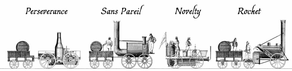
You’re probably familiar with the story of George and Robert Stephenson’s Rocket, a pioneering steam locomotive built in 1829.
If you know anything, it’s that Rocket won a competition and set the stage for a revolution in railways lasting for a century and a half that followed. It’s a cool story, but
there’s so much more to it that I only learned this week, including the bonkers story of 19th-century horse-powered locomotives.
The Rainhill Trials
Ten teams submitted applications to enter the Rainhill Trials, but only five actually took part. Four of these were the steam locomotives illustrated above.
Over the course of the 1820s, the world’s first inter-city railway line – the Liverpool & Manchester Railway – was constructed. It wasn’t initially anticipated that the new railway
would use steam locomotives at all: the technology was in its infancy, and the experience of the Stockton & Darlington railway, over on the other side of the Pennines, shows
why.
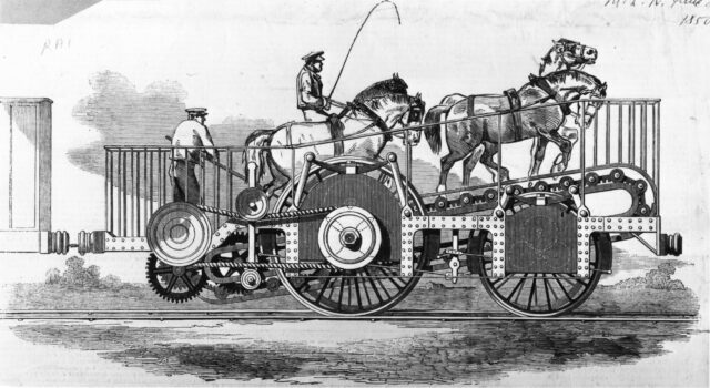
The Stockton & Darlington railway was opened five years before the new Liverpool & Manchester Railway, and pulled its trains using a mixture of steam locomotives and horses1.
The early steam locomotives they used turned out to be pretty disastrous. Early ones frequently broke their cast-iron wheels so frequently; some were too heavy for the lines and needed
reconstruction to spread their weight; others had their boilers explode (probably after safety valves failed to relieve the steam pressure that builds up after bringing the vehicle to a
halt); all got tied-up in arguments about their cost-efficiency relative to horses.
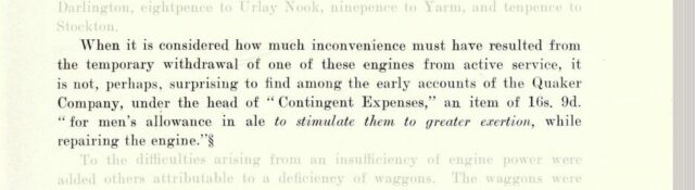
Nowadays, a train can be cancelled and a paying customer might barely get a half-hearted apology and a spot on a crowded rail replacement bus. But back in 1826 even the crew
of a broken-down train might be offered a copious allowance of beer to keep them motivated. Scan from page 119 of The North Eastern Railway; its rise
and development, by William Weaver Tomlinson.
Nearby, at Hetton colliery – the first railway ever to be designed to never require animal power – the Hetton Coal Company had become so-dissatisfied with the reliability and
performance of their steam locomotives – especially on the inclines – that they’d had the entire motive system. They’d installed a cable railway – a static steam engine pulled the mine
carts up the hill, rather than locomotives.
This kind of thing was happening all over the place, and the Liverpool and Manchester Railway Company were understandably cautious about hitching their wagon to the promise of steam
locomotives on their new railway. Furthermore, they were concerned about the negative publicity associated with introducing to populated areas these unpopular smoke-belching engines.
But they were willing to be proven wrong, especially after George Stephenson pointed out that this new, long, railway could find itself completely crippled by a single breakdown were it
to adopt a cable system. So: they organised a competition, the Rainhill Trials, to allow locomotive engineers the chance to prove their engines were up to the challenge.
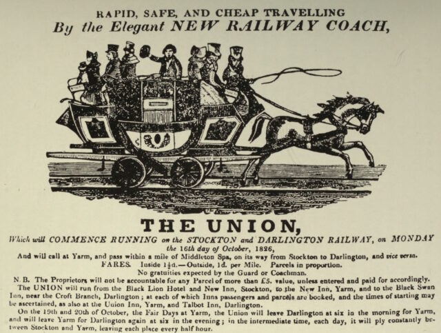
When the Stockton & Darlington line began serving passengers in 1826, their advertisements only ever showed passenger coaches being pulled by horses, never steam locomotives.
The challenge was this: from a cold start, each locomotive had to haul three times its own weight (including their supply of fuel and water), a mile and three-quarters (the first and
last eighth of a mile of which were for acceleration and deceleration, but the rest of which must maintain a speed of at least 10mph), ten times, then stop for a break before doing it
all again.
Four steam locomotives took part in the competition that week. Perseverance was damaged in-transit on the way to the competition and was only able to take part on the
last day (and then only achieving a top speed of 6mph), but apparently its use of roller bearing axles was
pioneering. The very traditionally-designed Sans Pareil was over the competition’s weight limit, burned-inefficiently (thanks perhaps to an overenthusiastic
blastpipe that vented unburned coke right out of the funnel!), and broke down when one of its cylinders cracked2.
Lightweight Novelty – built in a hurry probably out of a fire engine’s parts – was a crowd favourite with its integrated tender and high top speed, but kept breaking
down in ways that could not be repaired on-site. And finally, of course, there was Rocket, which showcased a combination of clever innovations already used in steam
engines and locomotives elsewhere to wow the judges and take home the prize.
But there was a fifth competitor in the Rainhill Trials, and it was very different from the other four.
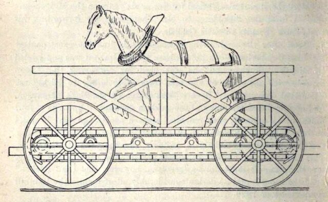
Cycloped
When you hear the words horse-powered locomotive, you probably think of a horse-drawn train. But that’s not a locomotive: a locomotive is a vehicle that, by definition, propels
itself3.
Which means that a horse-powered locomotive needs to carry the horse that provides its power…
If this isn’t the most-zany railway vehicle you’ve ever seen, please share what beats it.
…which is exactly what Cycloped did. A horse runs on a treadmill, which turns the wheels of a vehicle. The vehicle (with the horse on it) move. Tada!4
You might look at that design and, not-unreasonably, decide that it must be less-efficient than just having the horse pull the damn vehicle in the first place. But that isn’t
necessarily the case. Consider the bicycle which can transport itself and a human both faster and using less-energy than the human would achieve by walking. Or look at wind
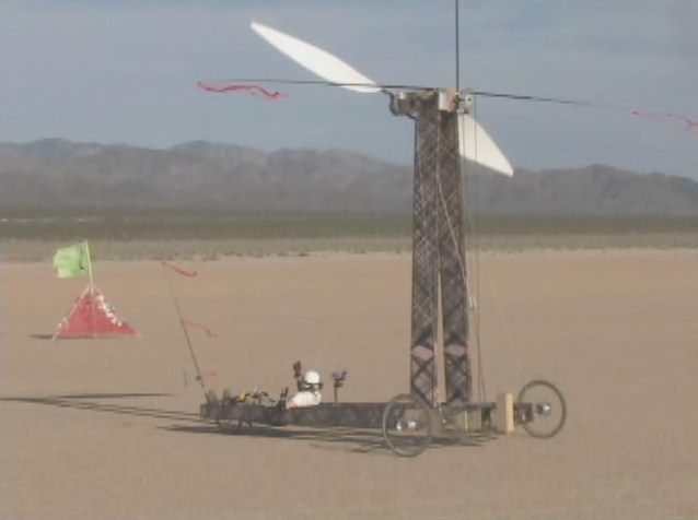
turbine powered vehicles like Blackbird, which was capable of driving under wind
power alone at three times the speed of a tailwind and twice the speed of a headwind. It is mechanically-possible to improve the speed and efficiency of a
machine despite adding mass, so long as your force multipliers (e.g. gearing) is done right.
I’ve long loved this 2010 photo of Blackbird, simultaneously showing a flag (blowing left, with the wind) and a streamer (blowing right, as a result of the wind-powered
vehicle’s speed) demonstrating that it is travelling against the wind, but significantly faster than the wind.
Cycloped didn’t work very well. It was slower than the steam locomotives and at some point the horse fell through the floor of the treadmill. But as I’ve argued above, the
principle was sound, and – in this early era of the steam locomotive, with all their faults – a handful of other horse-powered locomotives would be built over the coming
decades.
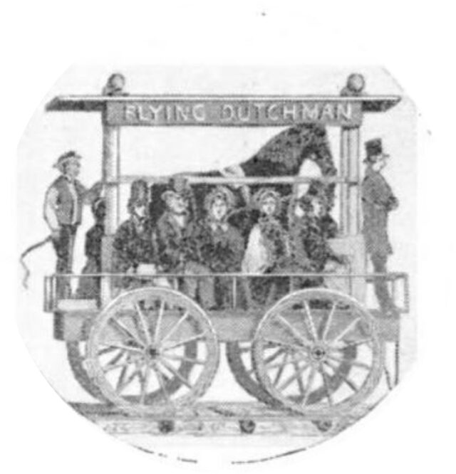
Over in the USA, the South Carolina Canal and Railroad Company successfully operated a passenger service using the Flying Dutchman, a horse-powered locomotive with twelve seats
for passengers. Capable of travelling at 12mph, this demonstrated efficiency multiplication over having the same horse pull the vehicle (which would either require fewer
passengers or a dramatically reduced speed).
This strange contraption was eventually replaced with a steam train, under the understanding that improvements in steam locomotive technology would continue to develop faster than
advancements in techniques for the selective breeding of horses.
As late as the early 1850s, people were still considering this strange approach. The 1851 Great Exhibition at the then brand-new Crystal Palace featured Impulsoria, which
represents probably the pinnacle of this particular technological dead-end.
Capable of speeds up to 20mph, it could go toe-to-toe with many contemporary steam locomotives, and it featured a gearbox to allow the speed and even direction of travel to be
controlled by the driver without having to adjust the walking speed of the two to four horses that provided the motive force.
The reins now arriving on platform one is the Mane Line service to Carlisle. Mind the gallop. Stand clear of the hackamore.
Personally, I’d love to have a go on something like the Flying Dutchman: riding a horse-powered vehicle with the horse is just such a crazy idea, and a road-capable
variant could make for a much better city tour vehicle than those 10-person bike things, especially if you’re touring a city with a particularly equestrian history.
Footnotes
1 From 1828 the Stockton & Darlington railway used horse power only to pull their
empty coal trucks back uphill to the mines, letting gravity do the work of bringing the full carts back down again. But how to get the horses back down
again? The solution was the dandy wagon, a special carriage that a horse rides in at the back of a train of coal
trucks. It’s worth looking at a picture of one, they’re brilliant!
2 Sans Pareil’s cylinder breakdown was a bit of a spicy issue at the time because its
cylinders had been manufactured at the workshop of their rival George Stephenson, and turned out to have defects.
3 You can argue in the comments whether a horse itself is a kind of locomotive. Also – and
this is the really important question – whether or not Fred Flintstone’s car, which is propelled by his feed, is a kind locomotive or not.
4 Entering Cycloped into a locomotive competition that expected, but didn’t
explicitly state, that entrants had to be a steam-powered locomotive, sounds like exactly the kind of creative circumventing of the rules that we all loved Babe (1995) for. Somebody should make a film about Cycloped.
Hypothetically-speaking, what would happen if convicted felon Donald Trump were assassinated in-between his election earlier this month and his inauguration in January?
There’ve been at least two assassination attempts so far, so it’s not beyond the realm of possibility that somebody will have another go at some point1.
Hello, Secret Service agents! Thanks for visiting my blog. I assume I managed to get the right combination of keywords to hit your watchlist. Just to be clear, this is
an entirely hypothetical discussion. I know that you’ve not always been the smartest about telling fiction from reality. But as you’ll see, I’m
just using the recent assassination attempts as a framing device to talk about the history of the succession of the position of President-Elect. Please don’t shoot me.
If the US President dies in office – and this happens around 18% of the time2 – the
Vice-President becomes President. But right now, convicted felon Donald Trump isn’t President. He’s President-Elect, which is a term used distinctly from
President in the US Constitution and other documents.
This card was pretty-much nerfed by Wizards’ ruling that Presidents-Elect, Vice-Presidents etc. were not (yet) kinds of President.
It turns out that the answer is that the Vice-President-Elect becomes President at the inauguration. This boring answer came to us through three different Constitutional Amendments,
each with its own interesting tale.
The Twelfth Amendment (1804) mostly existed to reform the Electoral College. Prior to the adoption of the Twelfth Amendment, the Electoral College members each cast two
ballots to vote for the President and Vice-President, but didn’t label which ballot was which position: the runner-up became Vice-President. The electors would carefully
and strategically have one of their number cast a vote for a third-party candidate to ensure the person they wanted to be Vice-President didn’t tie with the person they wanted to be
President. Around the start of the 19th century this resulted in several occasions on which the President and Vice-President had been bitter rivals but were now forced to work
together3.
While fixing that, the Twelfth Amendment also saw fit to specify what would happen if between the election and the inauguration the President-Elect died: that the House of
Representatives could choose a replacement one (by two-thirds majority), or else it’d be the Vice-President. Interesting that it wasn’t automatically the Vice-President,
though!
It didn’t happen like this. In real life, there was a lot less singing, and a lot more old white men.
The Twentieth Amendment (1933) was written mostly with the intention of reducing the “lame duck” period. Here in the UK, once we elect somebody, they take power
pretty-much immediately. But in the US, an election in November traditionally resulted in a new President being inaugurated almost half a year later, in March. So the Twentieth
Amendment reduced this by a couple of months to January, which is where it is now.
In an era of high-speed road, rail, and air travel and digital telecommunications even waiting from November to January seems a little silly, though. In any case, a secondary feature of
the Twentieth Amendment was that it removed the rule about the House of Representatives getting to try to pick a replacement President first, saying that they’d just fall-back on the
Vice-President in the first instance. Sorted.
Just 23 days later, the new rule almost needed to be used, except that Franklin D. Roosevelt’s would-be assassin Giuseppe Zangara missed his tricky shot.
The Twentieth Amendment (1967) aimed to fix rules-lawyering. The constitution originally said that f the President is removed from office, dies, resigns, or is
otherwise unable to use his powers and fulfil his duties, then those powers and duties go to the Vice-President.
Note the wording there. The constitution said that if a President died, their their duties and powers would go to the Vice-President. Not the Presidency itself. You’d
have a Vice-President, acting as President, who wasn’t actually a President. And that might not matter 99% of the time… but it’s the edge cases that get you.[foonote]Looking
for some rules-lawyering? Okay: what about rules on Presidential term limits? You can’t have more than two terms as President, but what if you’ve had a term as Vice-President
but acting with Presidential powers after the President died? Can you still have two terms? This is the kind of constitutional craziness that munchkin US history scholars get
off on.[/footnote]
It also insisted that if there’s no Vice-President, you’ve got to get one. You’d think it was obvious that if the office of Vice-President exists in part to provide a “backup” President
in case, y’know, the nearly one-in-five chance that the President dies… that a Vice-President who finds themselves suddenly the President would probably want to have one!
But no: 18 Presidents4served without a Vice-President for at least some of their
term: four of them never had a Vice-President. That includes 17th
President Andrew Johnson, who you’d think would have known better. Johnson was Vice-President under Abraham Lincoln until, only a month after the inauguration, Lincoln was assassinated,
putting Johnson in change of the country. And he never had a Vice-President of his own. He served only barely shy of the full four years without one.
Anyway; that was a long meander through the history of the Constitution of a country I don’t even live in, to circle around a question that doesn’t matter. The thought randomly came to
me while I was waiting for the traffic lights at the roadworks outside my house to change. And now I know the answer.
Very hypothetically, of course.
Footnotes
1 My personal headcanon is that the would-be assassins are time travellers from the
future, Chrononauts-style, trying to flip a linchpin and bring about a stable future in which he wasn’t elected. I
don’t know whether or not that makes Elon Musk one of the competing time travellers, but you could conceivably believe that he’s Squa Tront in disguise, couldn’t you?
2 The US has had 45 presidents, of whom eight have died during their time in office. Of
those eight, four – half! – were assassinated! It’s a weird job. 8 ÷ 45 ≈ 18%.
3 If you’re familiar with Hamilton, you’ll recall its characterisation of the
election of 1800 with President Thomas Jefferson dismissing his Vice-President Aaron Burr after a close competition for the seat of President which was eventually settled when
Alexander Hamilton instructed Federalist party members in the House of Representatives to back Jefferson over Burr. The election result really did happen like that – it seems that
whichever Federalist in the Electoral College that was supposed to throw away their second vote failed to do so! – but it’s not true that he was kicked-out by Jefferson: in fact, he
served his full four years as Vice-President, although Jefferson tried to keep him as far from actual power as possible and didn’t nominate him as his running-mate in 1804. Oh, and in
1807 Jefferson had Burr arrested for treason, claiming that Burr was trying to capture part of the South-West of North America and force it to secede and form his own country: the
accusation didn’t stick, but it ruined Burr’s already-faltering political career. Anyway, that’s a diversion.
4 17 different people, but that’s not how we could Presidents apparently.
On a number of occasions over the first two decades of this century I’ve attempted to write a particular short story with a science fiction/alternate history feel. Now, I’ve given up on
it, and that’s… fine.
Fiction
The story’s taken several forms over the years, but the theme’s always been the same: a crazy narrative spun by an isolated society turns out, incredibly, to be true. But ultimately the
people who discover that fact choose to keep it a secret because the flawed lie they live in is preferable to the instability and chaos that they fear could result. It taps into ideas
about conspiracy theories, hidden worlds, and the choices we make when we have to choose between living authentically or living comfortably.
Guess this Obsidian note is off to the “Never” folder, now.
In its most-concrete form, the story covered the political aftermath of the capture by the DPRK of a fishing boat that (allegedly) drifted into North Korean waters1. The North Korea of the story represents the country at its most
isolationist and mysterious, and the captured trawler crew are surprised to experience at Pyongyang a socialist utopia supported by futuristic technology. It turns out that North
Korea’s in-universe propaganda is true: they really are an advanced self-reliant nation whose message of peace is being distorted by Western imperialist leaders. Insofar as the truth is
known in the West, it’s suppressed for fear that the Korean model represents a democratic, post-scarcity future that threatens to undermine the power of the oligarchs of the world.
When the boat and those aboard it are repatriated with the assumption that they will act as ambassadors to the outside world, the crew are subjected to interrogations and cajoling by
their home nations. They mustn’t talk about what they saw North of the 38th parallel, they’re told, with threats of imprisonment and violence if they do and financial inducements
offered for their compliance. But in the end, the most-effective message for getting the wayward fisherfolk on side is their realisation that the world isn’t ready for the truth. In a
dialogue between the imprisoned seafarers, they agree that they should take the bribes and return quietly to their families, not for their own sake but because they believe that telling
their story would lead to a terrible war between two equally-matched parties: a small nation armed with futuristic sci-fi weapons, on one side, and the might of the nuclear superpowers
of the rest of the world.
As a final twist, it’s revealed that the captain of the vessel was actually a spy, aware of the truth the entire time, who allowed the boat to go off-course with an aim of gathering
information on the North Korean situation. The story finishes with the captain, having been instrumental in persuading their crew not to share what they saw, wavering in their
confidence, and possibly being implied to be the author of the story.
Re-reading my notes and drafted content, I’ve got to admit that it’s got a certain feel of… Dr.
Strangelove discovers Wakanda? Or maybe more like the Pueblo incident set in the world of They Live.2
It might’ve been fun to finish, someday, but now it’s not.
Sadder
That nod to Dr. Strangelove is apt, because my aim was to write something which looked farcically at the nature of political competition on a global scale, in a world in
which the zaniest possible conspiracy theory turned out to be true. Strangelove used the existence of a Project Sundial-style doomsday device as the surprise truth; I was using the idea that DPRK propaganda might actually be more-honest than
the narratives of its rivals3.
“Gee, I wish we had one of them doomsday machines,” was funnier when nuclear annihilation was the only existential threat we
were routinely talking about. Nowadays saying it sounds like it carries a bit of Farnsworth’s dejected “I don’t
want to live on this planet anymore” energy.
In my off-and-on-again long-running effort to pen the story, I last made any real effort back in around 2015-2016. Since then, the entire concept hasn’t been funny any more. Today, the
story would be less farce than lampoonery, and not in a good way.
When I first envisaged the concept of the story, researching conspiracy theories meant laughing at Flat Earthers and picking holes in the arguments of the proponents of a “moon landing
hoax”. For the most part, conspiracy theories seemed ridiculous, but not dangerous4.
But somewhere along the way from then to now, conspiracy theories started becoming more… mainstream?
Don’tcha miss when conspiracy theorists were mostly harmless idiots?
It turns out that my comedy villain – the leader of the “free” world who leverages enormous power to lie to and manipulate everybody – isn’t a laughing matter any more.
Perhaps I should try my hand at writing bleak, dystopian fiction instead.
Footnotes
1 Like this incident in 2009, perhaps, although there
are lots of similar examples before and since.
2 In my notes somewhere I’ve got a concept that I never explored for the story which was
that North Korea is under the control of a benevolent alien species trying to uplift humanity, while much of the rest of the developed world is under the influence of a malicious
alien species who’re using their position to push humans to terraform Earth into something more-suited to their needs. So maybe like The Forge of God but with a climate change message? I never really
worked on this idea though because it felt like I was weaving too many concepts into one tiny narrative.
4 Obviously I know there are exceptions and I’m speaking from a position of privilege. For
a long while, for example, conspiracy theories relating to holocaust denialism have caused real harm to people. And of course there’s for a long while been actual damage caused by
folks who (loudly) subscribe to false beliefs about HIV, or 9/11, or Sandy Hook, and countless others.
5 This is the kind of conspiracy theory that should be funny: idiot who bitches
about claimed birthplace of president annoys that president enough that he times a battle with a wanted terrorist, so that the terrorist’s death will coincide with the timeslot of the
idiot’s TV programme. But somehow, the way that politics has gone lately, especially in the USA, means that it’s not funny any more. Easily-disprovable conspiracy theories
were amusing when they were the territory of crazy fringe groups; once they get tens of thousands of (armed, militant) believers, they go from being an amusement to being a dangerous
cult.
Setting up and debugging your FreshRSS XPath Scraper
Okay, so here’s Adam’s blog. I’ve checked, and there’s no RSS feed1, so it’s time to start planning my XPath Scraper. The first thing I want to do is to find some way of identifying the “posts” on the page. Sometimes people use
solid, logical id="..." and class="..." attributes, but I’m going to need to use my browser’s “Inspect Element” tool to check:
If you’re really lucky, the site you’re scraping uses an established microformat like h-feed. No such luck here, though…
The next thing that’s worth checking is that the content you’re inspecting is delivered with the page, and not loaded later using JavaScript. FreshRSS’s XPath Scraper works with the raw
HTML/XML that’s delivered to it; it doesn’t execute any JavaScript2,
so I use “View Source” and quickly search to see that the content I’m looking for is there, too.
New developers are sometimes surprised to see how different View Source and Inspect Element’s output can be3.
This looks pretty promising, though.
Now it’s time to try and write some XPath queries. Luckily, your browser is here to help! If you pop up your debug console, you’ll discover that you’re probably got a predefined
function, $x(...), to which you can path a string containing an XPath query and get back a NodeList of the element.
First, I’ll try getting all of the links inside the #posts section by running $x( '//*[@id="posts"]//a' ) –
Once you’ve run a query, you can expand the resulting array and hover over any element in it to see it highlighted on the page. This can be used to help check that you’ve found what
you’re looking for (and nothing else).
In my first attempt, I discovered that I got not only all the posts… but also the “tags” at the top. That’s no good. Inspecting the URLs of each, I noticed that the post URLs all
contained /posts/, so I filtered my query down to $x( '//*[@id="posts"]//a[contains(@href, "/posts/")]' ) which gave me the
expected number of results. That gives me //*[@id="posts"]//a[contains(@href, "/posts/")]
as the XPath query for “news items”:
I like to add the rules I’ve learned to my FreshRSS configuration as I go along, to remind me what I still need to find.
Obviously, this link points to the full post, so that tells me I can put ./@href as the “item link” attribute in FreshRSS.
Next, it’s time to see what other metadata I can extract from each post to help FreshRSS along:
Inspecting the post titles shows that they’re <h3>s. Running $x( '//*[@id="posts"]//a[contains(@href, "/posts/")]//h3' ) gets them.
Within FreshRSS, everything “within” a post is referenced relative to the post, so I convert this to descendant::h3 for my “XPath (relative to item) for Item
Title:” attribute.
I was pleased to see that Adam’s using a good accessible heading cascade. This also makes my XPathing easier!
Inspecting within the post summary content, it’s… not great for scraping. The elements class names don’t correspond to what the content is4: it looks like Adam’s using a utility class library5.
Everything within the <a> that we’ve found is wrapped in a <div class="flex-grow">. But within that, I can see that the date is
directly inside a <p>, whereas the summary content is inside a <p>within a<div class="mb-2">. I don’t want my code to
be too fragile, and I think it’s more-likely that Adam will change the class names than the structure, so I’ll tie my queries to the structure. That gives me
descendant::div/p for the date and descendant::div/div/p for the “content”. All that remains is to tell FreshRSS that Adam’s using F j, Y as his
date format (long month name, space, short day number, comma, space, long year number) so it knows how to parse those dates, and the feed’s good.
If it’s wrong and I need to change anything in FreshRSS, the “Reload Articles” button can be used to force it to re-load the most-recent X posts. Useful if you need to tweak things. In
my case, I’ve also set the “Article CSS selector on original website” field to article so that the full post text can be pulled into my reader rather than having to visit
the actual site. Then I’m done!
Yet another blog I can read entirely from my feed reader, despite the fact that it doesn’t offer a “feed”.
Takeaways
Use Inspect Element to find the elements you want to scrape for.
Use $x( ... ) to test your XPath expressions.
Remember that most of FreshRSS’s fields ask for expressions relative to the news item and adapt accordingly.
If you make a mistake, use “Reload Articles” to pull them again.
2 If you need a scraper than executes JavaScript, you need something more-sophisticated. I
used to use my very own RSSey for this purpose but nowadays XPath Scraping is sufficient so I don’t bother any more, but RSSey might be a
good starting point for you if you really need that kind of power!
3 If you’ve not had the chance to think about it before: View Source shows you the actual
HTML code that was delivered from the web server to your browser. This then gets interpreted by the browser to generate the DOM, which might result in changes to it: for example,
invalid elements might be removed, ambiguous markup will have an interpretation applied, and so on. The DOM might further change as a result of JavaScript code, browser plugins, and
whatever else. When you Inspect Element, you’re looking at the DOM (represented “as if” it were HTML), not the actual underlying HTML
4 The date isn’t in a <time> element nor does it have a class like
.post--date or similar.
5 I’ll spare you my thoughts on utility class libraries for now, but they’re… not
positive. I can see why people use them, and I’ve even used them myself before… but I don’t think they’re a good thing.
The first weekend of my sabbatical might have set the tone for a lot of the charity hacking that will follow, being dominated by a Three Rings volunteering weekend.
The first fortnight of my sabbatical has consisted of:
Three Rings CIC’s AGM weekend and lots of planning for the future of the organisation and how we make it a better place to volunteer, and better value for our charity users,
You’d be amazed how many churros these children can put away.
The trip to Spain followed a model for European family breaks that we first tried in Paris last year2,
but was extended to give us a feel for more of the region than a simple city break would. Ultimately, we ended up in three separate locations:
The PortAventura World theme park, whose accommodation was certainly a gear shift after the 5-star hotel we’d come from4 but whose rides kept us and the kids delighted for a
couple of days (Shambhala was a particular hit with the eldest kid and me).
A villa in el Vilosell – a village of only 190 people – at which the kids mostly played in the outdoor pool (despite the
sometimes pouring rain) but we did get the chance to explore the local area a little. Also, of course, some geocaching: some local caches are 1-2 years old and yet had so few finds that
I was able to be only the tenth or even just the third person to sign the logbooks!
I’d known – planned – that my sabbatical would involve a little travel. But it wasn’t until we began to approach the end of this holiday that I noticed a difference that a holiday
on sabbatical introduces, compared to any other holiday I’ve taken during my adult life…
Perhaps because of the roles I’ve been appointed to – or maybe as a result of my personality – I’ve typically found that my enjoyment of the last day or two of a week-long trip are
marred somewhat by intrusive thoughts of the work week to follow.
I’m not saying that I didn’t write code while on holiday. I totally did, and I open-sourced it too.
But programming feels different when your paycheque doesn’t depend on it.
If I’m back to my normal day job on Monday, then by Saturday I’m already thinking about what I’ll need to be working on (in my case, it’s usually whatever I left unfinished right before
I left), contemplating logging-in to work to check my email or Slack, and so on5.
But this weekend, that wasn’t even an option. I’ve consciously and deliberately cut myself off from my usual channels of work communication, and I’ve been very disciplined about not
turning any of them back on. And even if I did… my team aren’t expecting me to sign into work for about another 11 weeks anyway!
🤯🤯🤯
Monday and Tuesday are going to mostly be split between looking after the children, and voluntary work for Three Rings (gotta fix that new server architecture!). Probably. Wednesday?
Who knows.
That’s my first taste of the magic of a sabbatical, I think. The observation that it’s possible to unplug from my work life and, y’know, not start thinking about it right away
again.
Maybe I can use this as a vehicle to a more healthy work/life balance next year.
Footnotes
1A sabbatical is a perk offered to
Automatticians giving them three months off (with full pay and benefits) after each five years of work. Mine coincidentally came hot on the tail of my last meetup and soon after a whole lot of drama and a major
shake-up, so it was a very welcome time to take a break… although of course it’s been impossible to completely detach from bits of the drama that have spilled out onto the open
Web!
5 I’m fully aware that this is a symptom of poor work/life balance, but I’ve got two
decades of ingrained bad habits working against me now; don’t expect me to change overnight!
A little under two millennia ago1 there lived
in the Egyptian city of Alexandria a Greek mathematician and inventor named Hero2, and he was a total
badass who invented things that you probably thought came way later, and come up with mathematical tricks that we still use to this day3.
Inventions
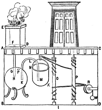
If you know of Hero’s inventions because of his aeolipile4,known
as “Hero’s engine”, I’ve got bad news: it was probably actually invented by his predecessor Vitruvius. But Hero did come up with a way to use the technique to make a
pneumatic temple door that automatically opened when you lit the fires alongside it.
Hero is variably credited with inventing, in some cases way earlier than you’re expecting:
automatic doors (powered either by pressure plates or
by lit fires),
vending machines, which used the weight of a dispensed coin to open a valve and dispense holy water,
windmills (by which I mean wind-powered stationary machines capable of performing useful work),
the force pump – this is the kind of mechanism found in traditional freestanding village water pumps – for use in a fire engine,
float-valve and water-pressure based equilibrium pumps, like those found in many toilet cisterns, and
a programmable robot: this one’s a personal favourite of mine because it’s particularly unexpected – Hero’s cart was a
three-wheeled contraption whose wheels were turned by a falling weight pulling on a rope, but the rope could be knotted and looped back over itself (here’s a modern reimplementation using Lego) to form a programmed path for the cart
It’s just headcanon, but I choose to believe that the reason Hero needed to invent the fire extinguisher might have involved the number of “attempting to make fire do work”
inventions that he came up with.
But I’ve always been more-impressed by the iterative5
mechanism he come up with by which to derive square roots. Here’s how it works:
Let n be the number for which you want to determine the square root.
Let g1 be a guess as to the square root. You can pick any number; it can be 1.
Derive a better guess g2 using g2 = ( g1 + n / g1 ) / 2.
Repeat until gN≈gN-1, for a level of precision acceptable to you. The algorithm will be accurate to within S
significant figures if the derivation of each guess is rounded to S + 1 significant figures.
That’s a bit of a dry way to tell you about it, though. Wouldn’t it be better if I showed you?
Put any number from 1 to 999 into the box below and see a series of gradually-improving guesses as to its square root6.
Interactive Widget
(There should be an interactive widget here. Maybe you’ve got Javascript disabled, or maybe you’re reading this post in your RSS reader?)
Maths is just one of the reasons Hero is my hero. And now perhaps he can be your hero too.
Footnotes
1 We’re not certain when he was born or died, but he wrote about witnessing a solar
eclipse that we know to have occurred in 62 CE, which narrows it down a lot.
2 Or Heron. It’s not entirely certain how his name was pronounced, but I think “Hero”
sounds cooler so I’m going with that.
3 Why am I blogging about this? Well: it turns out that every time I speak on some
eccentric subject, like my favourite magic trick, I come off stage with like three other ideas for presentations, which leads to an
exponential growth about “things I’d like to talk about”. Indeed, my OGN talk on the history of Oxford’s telephone area codewas one of three options I offered to the crowd to vote on at the end of my previous OGN talk! In any case, I’ve decided that the only way I can get all of this
superfluity of ideas out of my head might be to blog about them, instead; so here’s such a post!
4 If the diagram’s not clear, here’s the essence of the aeolipile: it’s a basic steam
reaction-engine, in which steam forces its way out of a container in two different directions, causing the container to spin on its axis like a catherine wheel.
5 You can also conceive of it as a recursive algorithm if that’s your poison, for example
if you’re one of those functional purists who always seem somehow happier about their lives than I am with mine. What’s that about, anyway? I tried to teach myself functional
programming in the hope of reaching their Zen-like level of peace and contentment, but while I got reasonably good at the paradigm, I didn’t find enlightenment. Nowadays I’m of the
opinion that it’s not that functional programming leads to self-actualisation so much as people capable of finding a level of joy in simplicity are drawn to functional programming. Or
something. Anyway: what was I talking about? Oh, yeah: Hero of Alexandria’s derivation of square roots.
Here in my hotel room, high above Barcelona, I woke up. It was still dark outside, so I looked to my phone – sitting in its charging cradle – as a bedside clock. It told me that the
time was 02:30 (01:30 back home), and that the sun would rise at 07:17.
But how long would it be, until then?
Daylight savings time is harmonised across Europe by EU Directive 2000/84/EC1, but for all the good this harmonisation achieves it does not
perfectly remove every ambiguity from questions like this. That it’s 02:30 doesn’t by itself tell me whether or not tonight’s daylight savings change has been applied!
It could be 00:30 UTC, and still half an hour until the clocks go back, or it could be 01:30 UTC, and the clocks went back half an hour ago. I exist in the “hour of uncertainty”, a
brief period that happens once every year2. Right now, I don’t know what time it is.
I remember when it first started to become commonplace to expect digital devices to change their clocks twice a year on your behalf. You’d boot your PC on a morning and it’d pop up a
dialog box to let you know what it had done: a helpful affordance that existed primarily, I assume, to discourage you from making the exact same change yourself, duplicating the effort
and multiplying the problem. Once, I stayed up late on last Saturday in March to see what happened if the computer was running at the time, and sure enough, the helpful popup
appeared as the clocks leapt forward, skipping over sixty minutes in an instant, keeping them like leftovers to be gorged upon later.
Computers don’t do that for us anymore. They still change their clocks, but they do it silently, thanklessly, while we sleep, and we generally don’t give it a second thought.
That helpful dialog that computers used to have had a secondary purpose. Maybe we should bring it back. Not as a popup – heaven knows we’ve got enough of those – but just a subtle
subtext at the bottom of the clock screens on our phones. “Daylight savings: clock will change in 30 minutes” or “Daylight savings: clock changed 30 minutes ago”. Such a message could
appear for, say, six hours or so before and after our strange biannual ritual, and we might find ourselves more-aware as a result.
Of course, I suppose I could have added UTC to my world clock. Collapsed the waveform. Dispelled the ambiguity. Or just allowed myself to doze off and let the unsleeping computers do
their thing while I rested. But instead I typed this, watching as the clock reached 02:59 and then to 02:00. I’d started writing during summertime; I’d finished after it ended, a few
minutes… earlier?


![A browser's debug console executes $x('//*[@id="posts"]//a') , and gets 14 results.](https://bcdn.danq.me/_q23u/2024/11/adam-k-xpath-1-640x188.png)