How cool are Silo’s credits?

I’ve long been a fan of Hugh Howey‘s Wool series of books (especially the first and third; the second’s a bit weaker); in fact I’ve been enjoying re-reading them as a bedtime story for our eldest!1

Naturally, when I heard that it would become a TV series I was really excited! I’m enjoying the series so far, especially thanks to its epic casting. It diverges a lot from the books – sometimes in ways I love, sometimes in ways that confuse me – but that’s not what I wanted to talk about. I wanted to share how cool the opening credits sequence is!

Spoiler warning: even if you’re following the TV series there are likely to be major spoilers below based on my recollection of the books!

Sun shining through yellow clouds.

We open on the sun shining above a thick layer of all-obscuring clouds, tinted sickly yellow like poison gas, then descend into the darkness below. This hints at the uninhabitability of the world above, foreshadows Lukas stargazing through gaps in the clouds2, and foreshadows revelations about the argon gas used to flush the airlocks. The descent feels representative of humanity’s migration from the sunlit surface to the underground silos.

A star-shaped structure seen from above, through thick clouds.

Looking down, we see the silo from above in a desolate landscape, introducing the world and its setting. The area around it is shrouded and hostile, reflecting the residents’ view of the outside world as unsurvivable, but also masking our view of the other nearby silos that we might otherwise be able to see.

Dark circle on a yellow background with random radial spokes.

Descending “into” this representation of the silo, we get a view for only a split second that looks distinctly like the platter and spindle of a magnetic hard disk drive, broken-up as if to represent corruption. This reflects a number of major plot points in the first season relating to the destruction and recovery of secret information from ancient storage devices.

Sepia view "down" into a deep silo, with landings and skywalks visible.

Truly within the silo now, we see the spokes of landings radiating out from the great stairwell. The shape is reminiscient of a cog: a motif we’ll return to later. Humanoid shapes made of light, like you get in a long exposure, move around, giving both the idea of a surveillance state, and setting us up to think of all such “glowing spots” as people (relevant later in the credits).

Spiral, shaking, with illuminated gaseos shapes whipping around it.

A representation of the stairwell itself appears, with a lit gaseous substance whipping up and down it. Given that we’ve just been shown that this kind of “light” represents people, it’s easy to see this as showing us the traffic that grinds up and down the silo, but it also feels like looking at part of a great machine, pumping gas through a condenser: notice that there’s no landings any more: this is all about the never-ending traffic.

Skewed camera angle showing a dark bridge with ghostly gaseous figures crossing.

A landing appears, and the gaseous forms are now more-clearly humanoid, almost as if they’re ghosts (perhaps pointing to the number of generations who’ve lived before, in this place, or else a reference to Juliette’s investigation into the lives of those who lived before her).

A swirling mass of luminescent gas around a central pillar, with a fenced balcony visible.

More swirling gas-people, this time below an empty balconette: perhaps a nod to the source of Juliette’s uncommon name (in the books, it’s taken from Romeo & Juliet, a possibly-illicit copy of which is retained by the silo and performed prior to Juliette’s birth and for at least a short while afterwards: she writes mechanical notes on the back of a playscript), or perhaps a reference to George’s death after “falling” from a balcony.

Blue-white gas wirls around a pillar.

Seen from a different angle, the colour shifts, and the gas/ghosts become white like the argon spray of the airlock. The people are all part of a machine: a machine that sends people outside to clean and die. But more than that, the blue comes to represent a clean/perfect view of what a silo can be: a blueprint representation of the goals of its creators to shape the inhabitants into their vision of the future:

Partial X-ray of a human spine?

We refocus on the shape of the silo itself, but just for a split second the view looks more like an x-ray… of a human spine? As if to remind us that it’s people who upload the system of the silo, just as its concrtete uploads its physical structure. Also a reminder that the silo is treated (by those who manage it, both within and beyond it) as an organic thing that can be nurtured, grown, or if necessary killed.

Bridges seen semi-transparently.

This becomes the structure of the silo, but it almost looks architectural: a “clean” look, devoid of people or signs of life, like a blueprint, perhaps foreshadowing Donald’s role in designing the structures that will eventually become the silos. The “space” between the arms is emphasised, showing how the social system that this structure imposes serves to separate and segregate people: classism is a recurring theme in both the books and the TV series, and it eventually becomes apparent that the silos are specifically organised to reduce communication between interdependent groups.

Swirling spiral of gaseous light with a nautillus shell shape at its centre.

Returning to the “populated” silo – swirls of gas spiralling away down (or up: it’s no longer clear!), we catch a glimpse of a nautilus shell at the centre. The nautilus is a “living fossil”, a creature from a bygone era that continues to survive in our modern world, which is an excellent metaphor for the population of the dead world who go on living beneath its surface. The nautilus shell is a recurring image within the TV series: Gloria’s visions of the world that came before see her clutching one and tracing its shape, for example.

A seed in a yellow cloud.

We cut to what appears to be a seed, representing both the eventual conclusion of the story (Juliette, Charlotte and the Silo 18 survivors’ discovery of the cache of supplies that will allow them to begin rebuilding the world) and also the nature of the silo3. The seed we see initially appears to fail and degrade, becoming nothing at all, before eventually growing into the beginnings of a strong new plant. This could represent the eventual and inevitable collapse of silo 18, among others, but the eventual flourishing of those that survive, or on a broader scale the collapse of modern civilization to be replaced by the silos, or even of the silo system to be replaced with that which follows it after the conclusion of the story. Lots of options!

A seedling grows in harsh conditions.

It’s also possibly a reflection of the harsh and opaque eugenics/population control mechanism imposed by the “lottery”, which becomes a major plot point in the TV series much earlier than in the books.

Trees in a yellow fog.

We cut to trees, thriving despite a yellow fog. The sky can’t be seen, which is a reminder that all of humanity’s resources must now be produced underground (trees are especially rare and prized, leading to a shortage of paper4. It seems to be deliberately left unclear whether the trees we see are on the surface before the fall of humanity, on the surface after the fall, or grown underground.

Fruit falling from a tree.

A fruit falls from the tree, which links back to the seed we saw geminate earlier but also seems likely to be a representation of the concept of original sin. The grand idea of the silos was to create a better world on the other side of a man-made catastrophe, but this idea is inherently flawed because the systems that are constructed by the same people who are complicit in the destruction of the world that came before. The structure that’s put in place through the Pact carries the weight of the sins of its creators: even though the inhabitants of silo 1 ultimately intend to destroy themselves, they’re unable to create a new world that is both better than the one that came before and free from their influence: it’s an impossibility.

It’s also possibly a representation of the religious beliefs of some inhabitants that the creators of the silo should be revered as gods. This was a recurring plot point in the books but has been somewhat muted in the TV series so far.

Rotting fruit falls.

The metaphor continues when we see that this falling fruit is already beginning to rot, degrading as it tumbles towards the earth. We don’t see it strike the ground: it almost seems to hover in the air, uncertain and undecided, and reflective of the eventual end when the inhabitants of the silos break free from the shackles of the system that’s been constructed for them and can choose their own destiny. Or perhaps we don’t see the collision simply because the camera continues to fall down into the earth and below the surface again?

Heavy industrial machinery, smoke, and fumes.

This time, wer’e very deep: all the way down in the depths of Mechanical, at the bottom of the silo: home to our heroine and source of many aspects of the story. In the centre, a shaft descends, connecting us back to the “spine” of the silo – the great staircase – but it’s harder to see as a wealth of machinery appears to support it, occluding our view. From down here in Mechanical it appears that the machines keep the silo running, whereas further up it looked like humans pumped through it like blood, which reflects Juliette’s disagreements with many of those up-top about their priorities during her time as Sheriff and, later, as Mayor.

A cloud of steam, some of it with humanoid shapes.

We see a cloud of steam, like that used to drive the generator that brings life to the silo, and for a moment it’s impossible to differentiate it from the cloud of people we saw earlier, rushing up and down the stairs. Look closely at the steam, though, and you’ll see that it too contains the ghosts of people.

Many cogs whirl in a firey light.

Deeper still, the cog motif returns and we’re buried in an impossible number of interconnected gears. The machine that they support is impossible to comprehend from within: How big is it? What is it for? Who made it and why?

A cog crossfades into a top-down view of a spiral staircase.

The final cog mutates into the staircase again, winding away from us and hammering the point home.

A spiral staircase becomes encased in outlines of blue-white light.

The staircase changes again, first becoming an outline of itself (a callback to the “blueprint” design we saw earlier, reminding us that this thing was designed to be like this)…

A double-helix shape cast in light, being made from the alternating-steps of a staircase.

…but this becomes a double-helix, representing the chaos of life. Again, the metaphor is of a perfect idea constructed to achieve a goal, but the unpredictability of humans leads to a different outcome.

The ends of spiraling lights appear to spin around.

Seen from above, the staircase now looks like an enormous clock, a machine of cogs each turning slower than the one beneath, counting down until the end of the silo experiment in accordance with the whim of its creators. Except, of course, if something were to break this machine.

Cross-section of different-sized circular floors with ghostly people moving around.

Seen from the side, the silo is a hive of activity, but the shape the levels form in this depiction are exactly like the rotors of a steam turbine, and this is reflected by an image of steam, almost in the shape of a growing tree – passing behind it in the background. The generator and its rotor blades is a significant early plot point in both the books and the TV series, and the books in particular use engine metaphors to explain Juliette’s interpretation of different situations she finds herself in, even those which are distinctly interpersonal rather than mechanical.

Cog-like shape.

Looking back up the silo, towards the light, we can now see its shape and structure for what it is: just another cog – a part of an even bigger machine that is the whole Operation Fifty silo network. The people are the lifeblood of this machine, but they’re as replaceable and interchangable as any other part.

The word "SILO" in a stab-serif font, black on a yellow background.

Finally, we crossfade to the title, looking like a stencil. Each letter is more-degraded than the one before it, representing the impossibility of building a perfect system.

The credits sequence is less than 90 seconds long, but so much is packed into it. It’s just great.

Footnotes

1 We’re into the final act of Dust now and it’s been amazing to experience the characters – loveable and hateable – of the series.

2 Curiously, in the TV series Lukas is only ever seen stargazing on clear nights, which is one of those confusing choices I mentioned. I suspect it’s for aesthetic reasons and to help add some romance to Juliette and Lukas’s courtship.

3 A silo is, of course, a place to store something valuable through the hard times. This is exactly what the silos in this story are for.

4 The shortage of paper shows up many times in the books but is somewhat glossed-over in the TV series. I’m not sure how they’ll reconcile that with the impact of the discovery of the Legacy, later.


× × × × × × × × × × × × × × × × × × × × × × × × × ×

WCEU23 – Day 2

My second day of the main conference part of WordCamp Europe 2023 was hampered slightly by a late start on my part.

Dan, sweating, with an actively-used dancefloor in the background.
I can’t say for certain why I woke up mildly hungover and with sore knees, but I make an educated guess that it might be related to the Pride party I found myself at last night.

Still, I managed to get to all the things I’d earmarked for my attention, including:


Gutenberg collaborative editing experience

I’m sure I can’t be the only person who’s been asked “why can’t the (or ‘shouldn’t the’) WordPress post editor let multiple people edit post at the same time”. Often, people will compare it to e.g. Google Docs.

A man in a blue shirt stands on a large stage.
I can’t begin to speculate how often people must ask this supposedly-trivial question of Dawid Urbański, possibly the world’s expert on this very question.

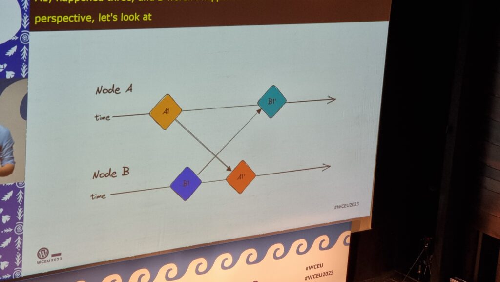
Dawid summarised the challenging issues in any effort to implement this much-desired feature. Some of them are examples of those unsolved problems that keep rearing their heads in computer science, like the two generals’ problem, but even the solvable problems are difficult: How does one handle asynchronous (non-idempotent) commutative operations? How is the order of disparate actions determined? Which node is the source of truth? If a server is used, where is that server (with a nod to quite how awful the experience of implementing a Websockets server in PHP can be…)? And so on…

Slide showing a timeline in which two participants A and B send an update to one another, but neither can be sure whose update was made first.
Slides showing simplified timelines of parties communicating with one another in ambigous ways

I really appreciated Dawid’s reference to the various bits of academic literature that’s appeared over the last four decades (!) about how these problems might be solved. It’s a strong reminder that these things we take for granted in live-updating multi-user web applications are not trivial and every question you can answer raises more questions.

There’s some great early proof-of-concepts, so we’re “getting there”, and it’s an exciting time. Personally, I love the idea of the benefits this could provide for offline editing (perhaps just because I’m still a huge fan of a well-made PWA!).


The future of work is open

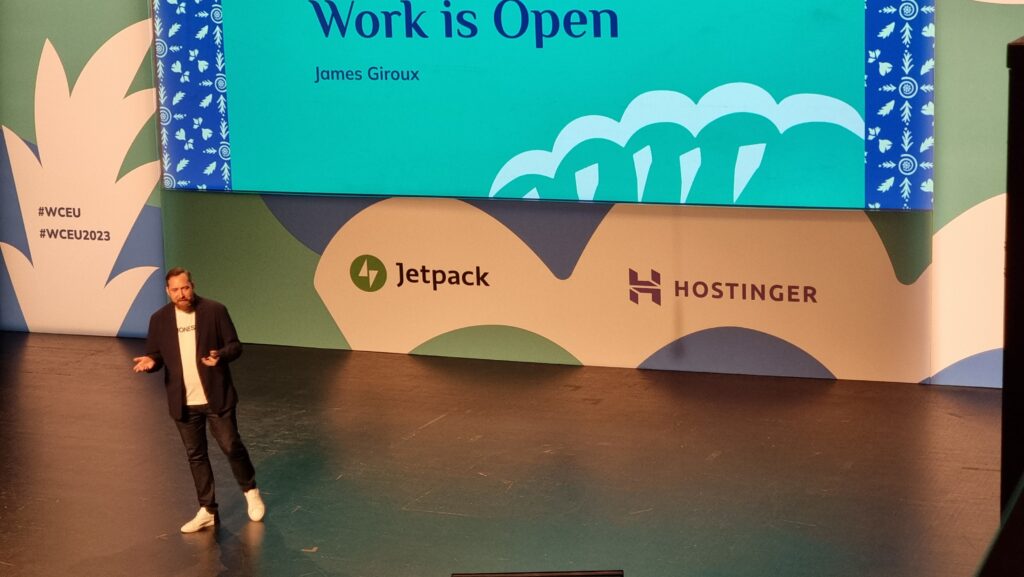
James Giroux’s goal: that we all become more curious about and more invested in our team’s experiences, from a humanistic standpoint. His experience of companies with organic growth of software companies is very, very familiar: you make a thing and give it away, then you need more people, then you’ve somehow got a company and it’s all because you just had an idea once. Sounds like Three Rings!

A man in a white t-shirt and dark jacket stands on a stage in front of a screen; the bottom line of the words on the screen can be seen to read "Work is Open".
Financial success is not team success, as Twitter shows, with their current unsustainable and unhappy developer culture, James reminds us.

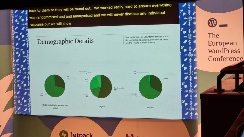
James was particularly keen to share with us the results of his Team Experience Index research, and I agree that some of the result are especially exciting, in particularly the willingness of underrepresented groups, especially women, to enagage with the survey: this provides hugely valuable data about the health of teams working in the WordPress space.

A slide showing demographic details: 28% say that they represent a historically underrepresented group, 55% are in North America, 67% provided a gender that was not "male".
The statistician in me immediately wanted to know how the non-response rate to these (optional) questions varied relative to one another (if they’re very different, putting these pie charts alongside one another could be disingenuous!), but I’m tentatively excited by the diversity represented anyway.

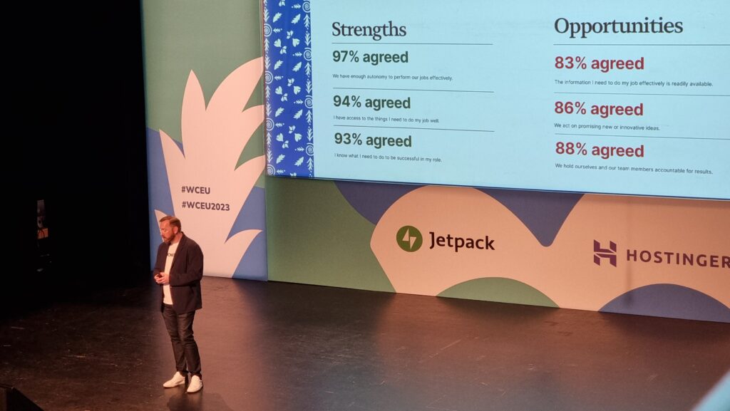
“We have this project that we work with and contribute to, that we love,” says James, in an attempt to explain the highly-positive feedback that his survey respondents gave when asked questions about the authenticity of their purpose and satisfaction in their role.

A man on a stage stands in front of a slide listing strengths and opportunities resulting from the survey.
Again, my inner statistician wants to chirp up about the lack of a control group. The data from the survey may well help companies working within the WordPress ecosystem to identify things we’re doing well and opportunities for growth, but it’d also be cool to compare these metrics to those in companies outside of the WordPress world!

So, what do we do with these findings? How do WordPress-ey companies improve? James recommends that we:

  • Get better are showing what recognition, celebration, and career growth looks like,
  • Improve support and training for team leaders to provide them with the tools to succeed and inspire, and
  • Bridge the gap between leadership and team members with transparent, open dialogue.

Good tips, there.


The Big Photo

A WordCamp tradition is to try to squeeze every willing participant into a photo. Clearly with the size that these events are, nowadays, this requires some wrangling (and, in this case, the photographers standing atop the roof of a nearby building to get everybody into frame).

An enormous crowd shuffles tightly into a courtyard. A trio of blue-shirted photographers stands atop a building opposite them.
Like herding cats, trying to get several hundred people to line up where you want them for a photograph is an exercise in patience.

I’ll have to keep an eye out for the final picture and see if I can find myself in it.


What is new in CSS?

I always find that learning about bleeding edge CSS techniques makes me feel excited and optimistic, perhaps because CSS lends itself so well towards a progressive enhancement approach to development: often, you can start using a new technique today and it’ll only benefit, say, people using a beta version of a particular browser (and perhaps only if they opt-in to the applicable feature flag). But if you’ve designed your site right then the lack of this feature won’t impact anybody else, and eventually the feature will (hopefully) trickle-down into almost everybody’s Web experience.

Anyway, that’s what Fellyph Cintra says too, but he adds that possibly we’ve still not grown out of thinking that browsers take a long time between versions. 5 years passed between the release of Internet Explorer 6 and Internet Explorer 7, for example! But nowadays most browsers are evergreen with releases each month! (Assuming we quietly ignore that Apple don’t sent new versions of Safari to old verisons of MacOS, continuing to exacerbate a problem that we used to see with Internet Explorer on Windows, ahem.)

A man on a stage with his arm out in greeting to the crowd in front of him.
Fellyph told us about how he introduced <dialog> to his team and they responded with skepticism that they’d be able to use it within the next 5 years. But in fact it’s already stable in every major browser.

An important new development may come from Baseline, a project to establish a metric of what you can reliably use on the Web today. So a bit like Can I Use, I guess, but taken from the opposite direction: starting from the browsers and listing the features, rather than the other way around.

Anyway, Fellyph went on to share some exciting new ideas that we should be using, like:

  • object-fit and object-position, which can make the contents of any container “act like” a background
  • aspect-ratio, which I’m already using and I love, but I enjoyed how Fellyph suggested combining the two to crop images to a fluid container on the client side
  • scroll-behavior: smooth, which I’ve used before; it’s pretty good
  • clamp, which I use… but I’m still not sure I fully grok it: I always have to load some documentation with examples when I use it
  • @container queries, which can apply e.g. (max-width: ...) rules to things other than the viewport, which I’ve not found a need for yet but I can see the value of it
  • @layers, which grant an additional level of importance in the cascade: for example, you might load a framework into a layer (with @import url(...) layer(framework)) which is defined as a lower-priority than your override layer, meaning you won’t have to start slapping !important all over the shop
  • @media (400px <= width <= 600px)-style media queries, which are much easier to understand than min-width: if you’re used to thinking in a more-procedural programming language (I assume they work in container queries too!)
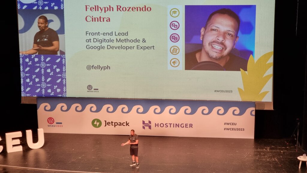
Fellyph Cintra stands in front of a large screen showing a slide that introduces himself to his audience: "Front-end Lead at Digitale Methode & Google Developer Expert @fellyph"

It’s also worth remembering:

  • @supports, which is badass and I love and use it already (it was especially useful as display: grid began to roll out and I wanted to start using it but needed to use a fallback method for browsers that didn’t support it yet
  • :has(), which I’ve long thought is game-changing: styling something based on what it contains is magical; not really suitable for mainstream use yet without Firefox support, though (it’s still behind a feature flag)! Fellyph sold me on the benefit of :not(:has(...)), though!
  • Nesting, which again doesn’t have Firefox support yet but provides SCSS-like nesting in CSS, which is awesome
  • Scroll-driven animations, which can e.g. do parallax effects without JavaScript (right now it’s Canary only, mind…), using e.g. animation-timeline: and animation-range: to specify that it’s the scroll position within the document that provides the timeline for the animation

And keeping an eye on upcoming things like text-balanced (which I’m already excited by), popover, selectmenu, view transitions (which I’ve been experimenting with because they’re cool), and scoped style.

Fellyph was at least as inspiring as I’d hoped.


Stop blocking my thread

For my second workshop, I joined Google’s Adam Silverstein to watch him dissect a few participants’ websites performance using Core Web Vitals as a metric. I think I already know the basics of Core Web Vitals, but when it comes to improving my score (especially on work-related sites with unpleasant reliance on heavyweight frameworks like React, in my experience).

A man stands at a podium.
In an early joke, Adam pointed out that you can reduce JavaScript thread blocking by removing JavaScript from your site. A lot of people laughed, but frankly I think it’s a great idea.

We talked a lot about render blocking (thanks to JS and CSS in the <head>), thread blocking (by scripts, especially those reacting to user input), TTFB (relating to actual network and server performance, or at least server-side processing), TBT (the time between FCP and TTI), and the upcoming change to measure INP rather than FID. That’s a lot of acronyms.

The short of it is that there are three pillars to Core Web Vitals: loading (how long until the page renders), interactivity (how long until the page responds to user interaction), and stability (how long it takes for the page to cease layout shifts as a result of post-load scripts and stylesheets). I was pleased that Adam acknowledged the major limitation of lab testing resulting from developers often using superior hardware and Internet connections to typical users, and how if you’re serious about performance metrics you’ll want to collect RUM data.

Adam explaining Render-Blocking CSS.
The fastest way to improve rendering performance is to put fewer obstacles in the way of rendering.

I came away with a few personalised tips, but they’re not much use for your site: I paid attention to the things that’ll be helpful for the sites I look after. But I’ll be taking note of his test pages so I can play with some of the tools he demonstrated later on.


Variations on a theme: 20 years of WordPress

I couldn’t liveblog this because I spent too much of the session applauding. A few highlights from memory:

  • Phase 2 (of 4) of Gutenberg is basically complete, which is cool. Some back-and-forth about the importance of phase 4 (bringing better multilingual support to WordPress) and how it feels like it’s a long way away.
  • Lots of plugging for Five for the Future, which I can get behind.
  • In the same vein as his 2016 statement that WordPress developers should “learn JavaScript deeply”, Matt leant somewhat into the idea that from today they should “watch AI carefully”; I’m not 100% convinced, but it’s not been stopping me from getting involved with a diversity of AI experiments (including some WordPress-related ones) anyway.
  • Musings about our community being a major part of why WordPress succeeded (and continues to thrive) unlike some other open source projects of its era. I agree that’s a factor, but I suspect that being in the right place at the right time was also important. Perhaps more on that another time.
  • Announcement of the next WordCamp Europe location.

Here’s looking forward to WordCamp Europe 2024 in Turin!

× × × × × × × × × × ×

WCEU23 – Day 1

The first “full” day of WordCamp Europe 2023 (which kicked-off at Contributor Day) was busy and intense, but I loved it.

This post is basically a live-blog of everything I got up to, and it’s mostly for my own benefit/notetaking. If you don’t read it, nobody will blame you.

Seen from behind, a very long queue runs through a conference centre.
Six minutes after workshop registration opened its queue snaked throughout an entire floor of the conference centre.

Here’s what I got up to:


10 things that all WordPress plugin developers should avoid

David Artiss took the courageous step of installing 36 popular plugins onto a fresh WordPress site and was, unsurprisingly, immediately bombarded by a billion banners on his dashboard. Some were merely unhelpful (“don’t forget to add your API key”), others were annoying (“thanks for installing our plugin”), and plenty more were commercial advertisements (“get the premium version”) despite the fact that WordPress.org guidelines recommend against this. It’s no surprise that this kind of “aggressive promotion” is the single biggest annoyance that people reported when David asked around on social media.

Similarly, plugins which attempt to break the standard WordPress look-and-feel by e.g. hoisting themselves to the top of the menu, showing admin popovers, putting settings sections in places other than the settings submenu, and so on are a huge annoyance to everybody. I get sufficiently frustrated by these common antifeatures of plugins I use that I actually maintain a plugin for my own use that “fixes” the ones that aggrivate me the most!

A man wearing glasses and a t-shirt with a WordPress logo stands on a stage.
David raised lots of other common gripes with WordPress plugins, too: data validation failures, leaving content behind after uninstallation (and “deactivation surveys”, ugh!), and a failure to account for accessibility.

David’s promised to put his slides online, plus to write articles about everything that came up in his Q&A.

I’m unconvinced that we can rely on plugin developers to independently fix the kinds of problems that come high on David’s list. I wonder if there’s mileage in WordPress Core reimplementing the way that the main navigation menu works such that all items in it can be (easily) re-arranged by users to their own preference? This would undermine the perceived value to plugin developers of “hoisting” their own to the top by allowing users to counteract it, and would provide a valuable feature to allow site admins to streamline their workflow: use WooCommerce but only in a way that’s secondary to your blog? Move “Products” below “Posts”! Etc.

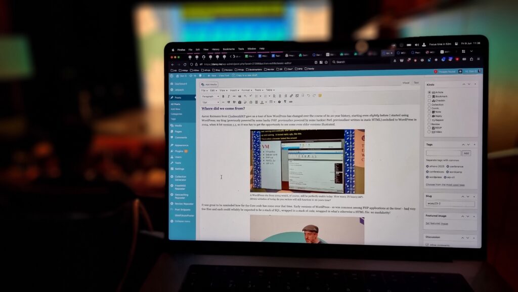
Screenshot showing a WordPress admin interface writing this blog post, with the stage in the background.
Why yes, I’m liveblogging this. And yes, I’m not using Gutenberg yet (that’s a whole other story…)

Where did we come from?

Aaron Reimann from ClockworkWP gave us a tour of how WordPress has changed over the course of its 20-year history, starting even slightly before I started using WordPress; my blog (previously powered by some hacky PHP, previouslier powered by some hackier Perl, previousliest written in static HTML) switched to WordPress in 2004, when it hit version 1.2, so it was fun to get the opportunity to see some even older versions illustrated.

A WordPress site, circa 2004, simulated in a virtual machine.
A WordPress site from 2004 would, of course, still be perfectly usable today. How many JS-heavy/API-driven websites of today do you reckon will still function in 20 years time?

It was great to be reminded how far the Core code has come over that time. Early versions of WordPress – as was common among PHP applications at the time! – had very few files and each could reliably be expected to be a stack of SQL, wrapped in a stack of code, wrapped in what’s otherwise a HTML file: no modularity!

A man wearing a flat cap strides across a stage.
Aaron’s passion for this kind of digital archaeology really shows. I dig it.

There were very few surprises for me in this talk, as you might expect for such an “old hand”, but I really enjoyed the nostalgia of exploring WordPress history through his eyes.

I enjoyed putting him on the spot with a “spicy” question at the end of his talk, by asking him if, alongside everything we’ve gained over the years, whether there’s anything we lost along the way. He answered well, pointing out that the somewhat bloated stack of plugins that are commonplace on big sites nowadays and the ease with which admins can just “click and install” more of them. I agree with him, although personally I miss built-in XFN support…

Dan, smiling, wearing a purple t-shirt with a WordPress logo and a Pride flag, hugs a cut-out of a Wappu (itself hugging a "WP 20" balloon and wearing a party hat).
If you’d have told me in advance that hugging a Wapuu would have been a highlight of the day… yeah, that wouldn’t have been a surprise!

Networking And All That

There’s a lot of exhibitors with stands, but I tried to do a circuit or so and pay attention at least to those whose owners I’ve come into contact with in a professional capacity. Many developers who make extensions for WooCommerce, of course, sell those extensions through WooCommerce.com, which means they come into routine direct contact with my code (and it can mean that when their extension’s been initially rejected by our security scanners or linters, it’s me their developers first want to curse!).

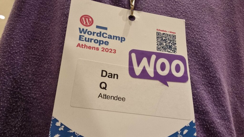
A WordCamp Europe Athens 2023 lanyard and name badge for Dan Q, Attendee, onto which a "Woo" sticker has been affixed.
After a while, to spare some of that awkward exchange where somebody tries to sell me their product before I explain that I already sell their product for them, I slapped a “Woo” sticker on my lanyard.

It’s been great to connect with people using WordPress to power the Web in a whole variety of different contexts, but it somehow still feels strange to me that WordPress has such a commercial following! Even speaking as somebody who’s made their living at least partially out of WordPress for the last decade plus, it still feels to me like its greatest value comes from its use for personal publishing.

The feel of a WordCamp with its big shiny sponsors is enormously different from, say, the intimacy and individuality of a Homebrew Website Club meeting, and I think that’s something I still need to come to terms with. WordPress’s success story comes from many different causes, but perhaps chief among them is the fact that it’s versatile enough to power the website of a government, multinational, or household-name brand… but also to run the smallest personal indie blog. I struggle to comprehend that, even with my background.

(Side note, Sophie Koonin says that building a personal website is a radical act in 2023, and I absolutely agree.)

A "Woo" booth, staffed with a variety of people, with Dan at the centre.
My division of Automattic had a presence, of course.

I was proud of my colleagues for the “gimmick” they were using to attract people to the Woo stand: you could pick up a “credit card” and use it to make a purchase (of Greek olive oil) using a website, see your order appear on the app at the backend in real-time, and then receive your purchase as a giveaway. The “credit card” doubles as a business card from the stand, the olive oil is a real product from a real, local producer (who really uses WooCommerce to sell online!), and when you provide an email address at the checkout you can opt-in to being contacted by the team afterwards. That’s some good joined-up thinking by my buddies in marketing!


WordPress extended: build unique websites on top of WP

Petya Petkova observed that it’s commonplace to take the easy approach and make a website look like… well, every other website.  “Web deja-vu” is a real thing, and it’s fed not only by the ebbs and flows of trends in web design but by the proliferation of indistinct themes that people just install-and-use.

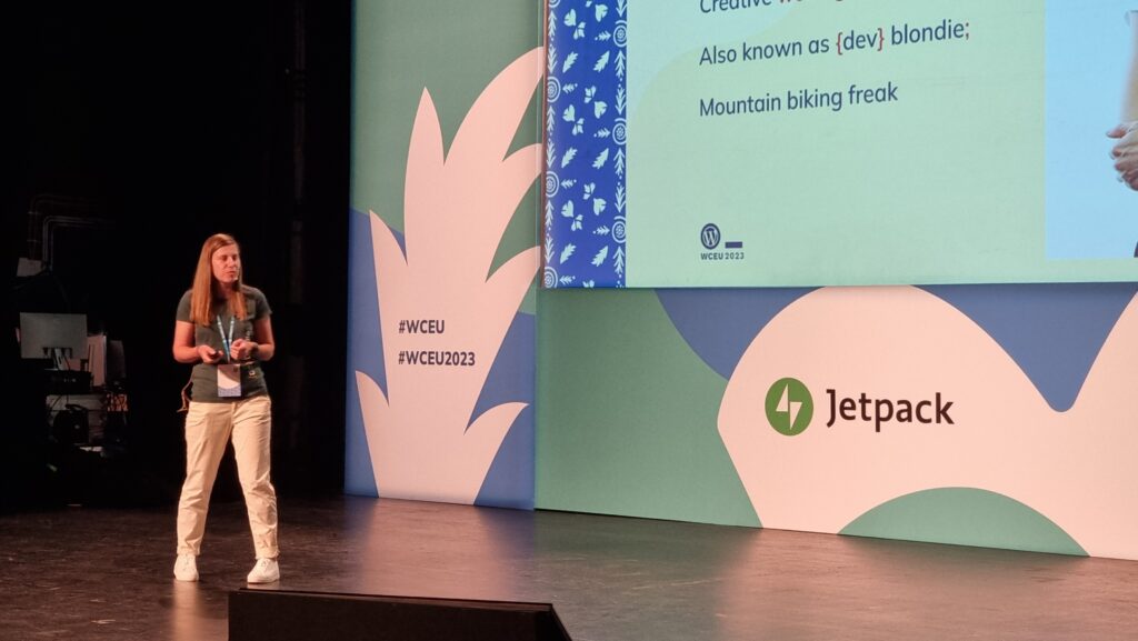
A woman with long hair, wearing a green t-shirt, stands before a screen on a stage.
How can we break free from web deja-vu, asks Petya. It almost makes me sad that her slides had been coalesced into the conference’s slidedeck design rather than being her own… although on second though maybe that just helps enhance the point!

Choice of colours and typography can be used to tell a story, to instil a feeling, to encourage engagement. Scrolling can be used as a metaphor for storytelling (“scrolly-telling”, Petya calls it). Animation flow can be used to direct a user’s attention and drive focus and encourage interaction.

A lot of the technical concepts she demonstrated – parts of a page that scroll at different speeds, typography that shifts or changes, videos used in a subtle way to accentuate other content, etc. – can be implemented in the frontend with WebGL, Three.js and the like. Petya observes that moving this kind of content interactivity into the frontend can produce an illusion of a performance improvement, which is an argument I’ve heard before, but personally I think it’s only valuable if it’s built as a progressive enhancement: otherwise, you’re always at risk that your site won’t look like you’d hope.

I note, for example, that Petya’s agency’s site shows only an “endless spinner” when viewed in my browser (which blocks the code.jQuery CDN by default, unless allowlisted for specific sites). All of the content is there, on the page, if you View Source, but it’s completely invisible if an external JavaScript fails to load. That doesn’t just happen when weirdos like me disable JavaScript in their browsers: it can happen if the browser interacts badly with the script, or if the user’s Internet connection is ropey, or a malware scanner misfires, or if government censorship blocks the CDN, or in any number of other conditions.

Screenshot from acceler8design.com, showing an "endless spinner" and no content.
While I agree with Petya about the value of animation and interactivity to make sites awesome, I don’t think it can take second-place to ensuring the most-widespread access and accessibility for your audience. Otherwise we’d still be making Flash sites, right?

So yeah: uniqueness and creativity are great, and I like what she’s proposing, but not the way she goes about it. The first person to ask a question wisely brought up accessibility, and Petya answered well that accessibility technologies can bridge the gap, but I’d counter that it’s preferable to build accessible in the first instance: if you have to use an aria- attribute it’s a good sign that you probably already did something wrong (not always, but it’s certainly a pointer that you ought to take a step back and check!).

Several other good questions and great answers followed: about how to showcase a preliminary design when they design is dependent upon animation and interactivity (which I’ve witnessed before!), on the value of server-side rendering of components, and about how to optimise for smaller screens. Petya clearly knows her stuff in all of these areas and had confident responses.


State of WordPress security – insights from 2022

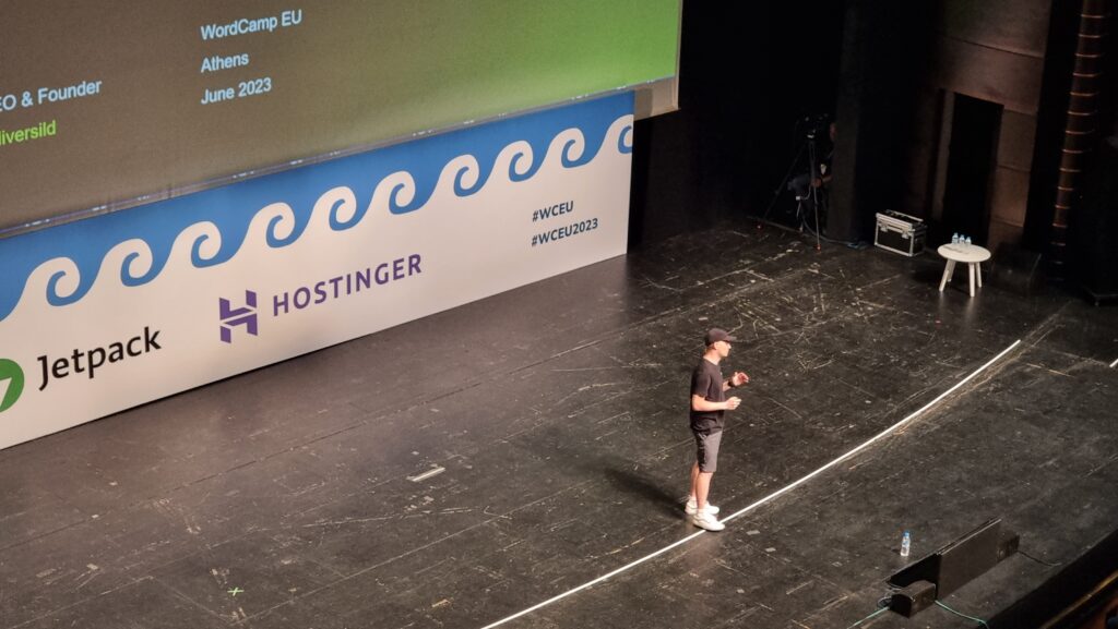
Oliver Sild is the kind of self-taught hacker, security nerd, and community builder that I love, so I wasn’t going to miss his talk.

A man in a literal black hat stands in the centre of a large theatre stage.
The number of security vulnerability reports in the WordPress ecosystem is up +328%, Oliver opened. But the bugs being reported are increasingly old, so we’re not talking about new issues being created. And only 0.3% of bugs were in WordPress Core (and were patched before they were exploitable).

It’s good news in general in WordPress Security-land… but CSRF is on the up-and-up (overtaking XSS) in the plugin space. That, and all the broken access control we see in the admin area, are things I’ll be keeping in mind next time I’m arguing with a vendor about the importance of using nonces and security checks in their extension (I have this battle from time to time!).

But an interesting development is the growth of the supply chains in the WordPress plugin ecosystem. Nowadays a plugin might depend upon another plugin which might depend upon a library… and a patch applied to the latter of those might take time to be propagated through the chain, providing attackers with a growing window of opportunity.

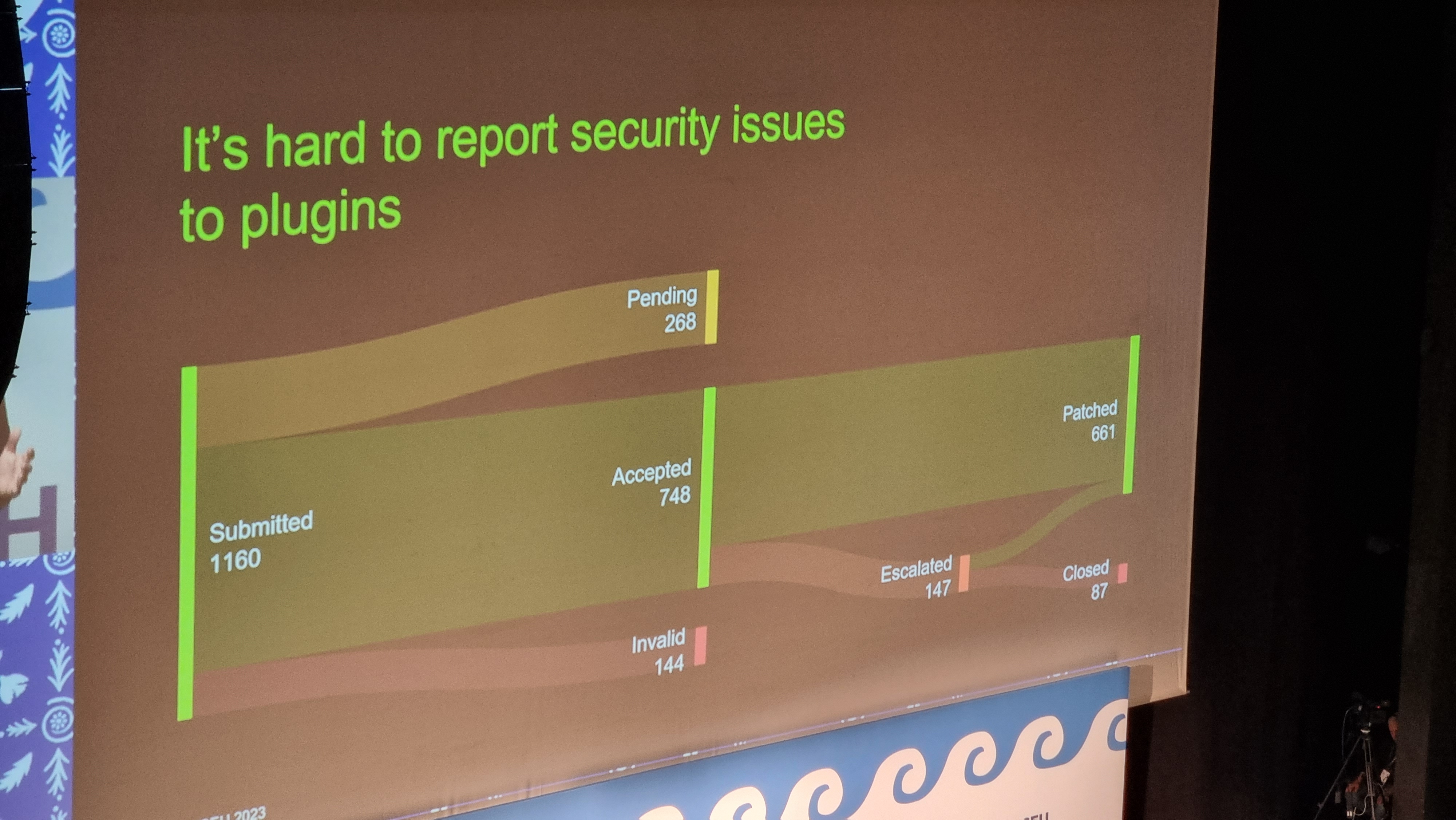
Sankey chart showing 1160 submitted bugs being separated into pending, accepted, invalid, and (eventually) patched. 26% of critical bugs in 2022 received no timely patch.
I love a good Sankey chart. Even when it says scary things.

A worrying thought is that while plugin directory administrators will pull and remove plugins that have longstanding unactioned security issues. But that doesn’t help the sites that already have that plugin installed and are still using it! There’s a proposal to allow WordPress to notify admins if a plugin used on a site has been dropped for security reasons, but it was opened 9 years ago and hasn’t seen any real movement, soo…

I like that Oliver plugged for security researchers being acknowledged as equal contributors to developers on your software. But then, I would say that, as somebody who breaks into things once in a while and then tells the affected parties how to fix the problem that allowed me to do so! He also provided a whole wealth of tips for site owners and agencies to try to keep their sites safe, but little that I wasn’t aware of already.

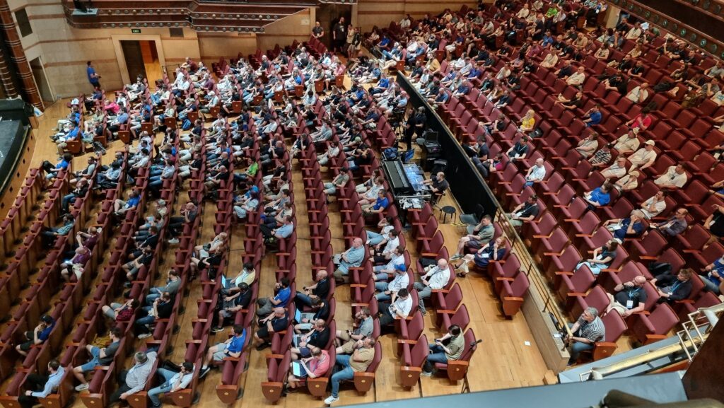
A large audience of a few hundred people, seen from above, facing left.
Still, good to see this talk get as good an audience as it did, given the importance of the topic!

It was about this point in the day, glancing at my schedule and realising that at any given time there were up to four other sessions running simultaneously, that I really got a feel for the scale of this conference. Awesome. Meanwhile, Oliver was fielding the question that I’m sure everybody was thinking: with Gutenberg blocks powered by JavaScript that are often backed by a supply-chain of the usual billion-or-so files you find in your .node_modules directory, isn’t the risk of supply chain attacks increasing?

Spoiler: yes. Did you notice earlier in this post I mentioned that I don’t use Gutenberg on this site yet?

Animation showing Dan, wearing a pilot's hat, surrounded by cotton wool clouds, as the camera pans back and forth.
When the Jetpack team told me that they’ve been improving their cloud offering, this wasn’t what I expected.

Typographic readability in theme design & development

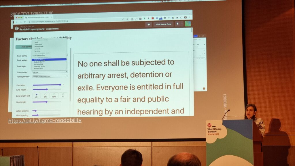
My first “workshop” was run by Giulia Laco, on the topic of readable content and design.

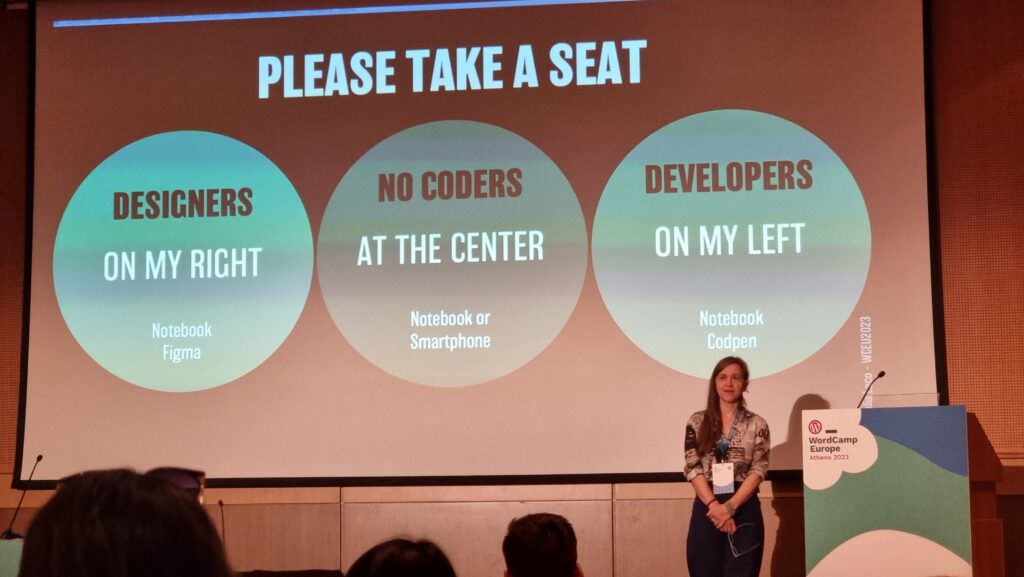
A title slide encourages designers to sit on the left (to the right of the speaker), developers to the right (on her left), and "no-coders" in the centre.
Designers to the left of me, coders to the right: here I am, stuck in the middle with you.

Giulia began by reminding us how short the attention span of Web readers is, and how important the right typographic choices are in ensuring that people actually read your content. I fully get this – I think that very few people will have the attention span to read this part of this very blog post, for example! – but I loved that she hammered the point home by presenting every slide of her presentation twice (or more), “improving” the typographic choices as she went along: an excellent and memorable quirk.

Our capacity to read and comprehend a text is affected by a combination of common (distance, lighting, environment, concentration, mood, etc.), personal (age, proficiency, motiviation, accessibility requirements, etc.), and typographic (face, style, size, line length and spacing, contrast, width, rhythm etc.) factors. To explore the impact of the typographic factors, the group dived into a pre-prepared Codepen and a shared Figma diagram. (I immediately had a TIL moment over the font-synthesis: CSS property!)

A presentation of the typography playground, in which the font is being changed.
I appreciated that Giulia stressed the importance of a fallback font. Just like the CDN issues I described above while talking about JavaScript dependencies, not specifying a fallback font puts your design at the mercy of the browser’s defaults. We don’t like to think about what happens when websites partially fail, but they do, and we should.

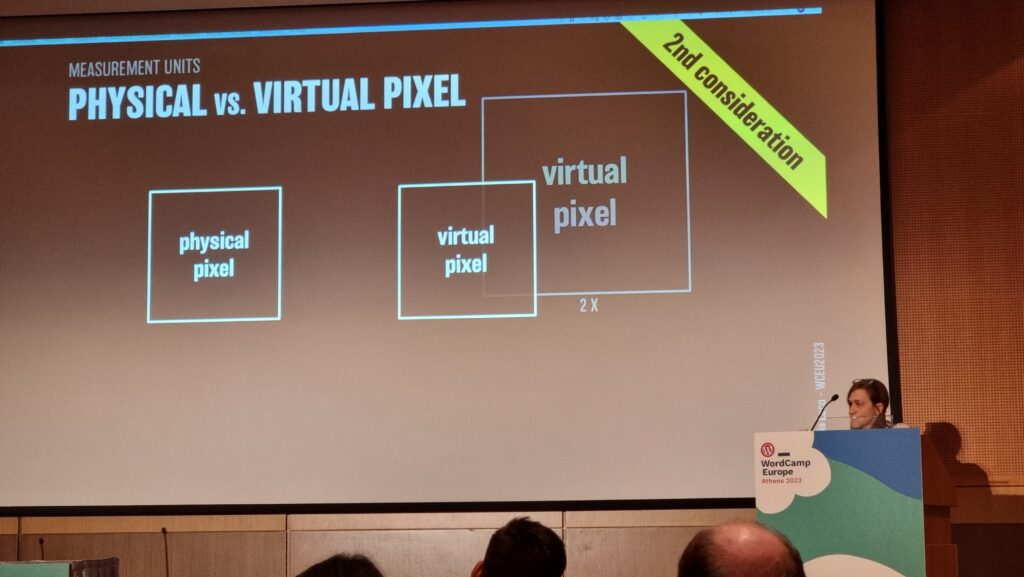
Things get interesting at the intersection of readability and accessibility. For example, WCAG accessibility requirements demand that you don’t use images of text (we used to do this a lot back before we could reliably use fonts on the web, and before we could easily have background images on e.g. buttons for navigation). But this accessibility requirement also aids screen readability when accounting for e.g. “retina” screens with virtual pixel ratios.

Slide showing a physical pixel and a "virtual pixel" representing a real pixel of a different size.
Do you remember when a pixel was the size of a pixel? Those days are long gone. True story.

Giulia provided a great explanation of why we may well think in pixels (as developers or digital designers) but we’re unlikely to use them everywhere: I’d internalised this lesson long ago but I appreciated a well-explained justification. The short of it is: screen zoom (that fancy zoom feature you use in your browser all the time, especially on mobile) and text zoom (the one you probably don’t use, or don’t use so much) are different things, and setting a pixel-based font size in the root node wrecks the latter, forcing some people with accessibility needs to use the former, which is likely to result in vertical scrolling. Boo!

I also enjoyed seeing this demo of how the different hyphenation-points in different languages (because of syllable stress) can impact on your wrapping points/line lengths when content is translated. This can affect any website, of course, because any website can be the target of automatic translation.

Plus, Giulia’s thoughts on the value of serifed fonts (even on digital displays) for improving typographic readability of the letters d, b, p and q which are often mirror- or rotationally-symmetric to one another in sans-serif fonts. It’s amazing to have something – in this case, a psychological letter transposition – pointed out that I’ve experienced but never pinned down the reason for, before. Neat!

It was a shame that this workshop took place late in the day, because many of the participants (including me) seemed to have flagging energy levels!


Altogether a great (but intense) day. Boggles my mind that there’s another one like it tomorrow.

× × × × × × × × × × × × × × × × ×

WCEU23 – Contributor Day

Among the many perks of working for a company with a history so tightly-intertwined with that of the open-source WordPress project is that license to attend WordCamps – the biggest WordPress conferences – is basically a given.

Dan, wearing an Automattic "Let's make the Web a better place" t-shirt, stands in front of a banner welcoming attendees to WordCamp Europe Athens 2023.
So yeah, right now I’m in Athens for WordCamp Europe 2023.

It’s frankly a wonder that this is, somehow, my first WordCamp. As well as using it1 and developing atop it2, of course, I’ve been contributing to WordPress since 2004 (albeit only in a tiny way, and not at all for most of the last decade!).

A table placeholder labelled "WP-CLI". It and s handful of Coke cans and disposable coffee cups are picked-out in colour on an otherwise monochrome and blurred picture.
If you already know what WP-CLI is… let’s be friends.

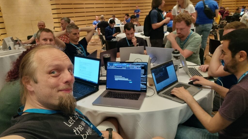
Today is Contributor Day, a pre-conference day in which folks new and old get together in person to hack on WordPress and WordPress-adjacent projects. So I met up with Cem, my Level 4 Dragonslayer friend, and we took an ultra-brief induction into WP-CLI3 before diving in to try to help write some code.

Dan takes a selfie from a round table covered in laptops, with people hacking at them.
Contributor Days are about many things, but perhaps their biggest value comes from lowering the barrier to becoming a new contributor to an open-source project by sitting you right next to somebody who already knows it well.

So today, as well as meeting some awesome folks, I got to write an overly-verbose justification for a bug report being invalid and implement my first PR for WP-CLI: a bugfix for a strange quirk in output formatting.

Screenshot showing a user running `wp plugin update --all --no-color` but the output putting the word "Success" in green.
The bug I fixed is slightly hard to describe (and even harder to explain why it matters), but here’s a summary: when you run a WP-CLI command that first displays a table and then the result, the result is likely to always appear in colour even if you specify --no-color.

I hope to be able to continue contributing to WP-CLI. I learned a lot about it today, and while I don’t use it as much as I used to in my multisite-management days, I still really respect its power as a tool.

MacBook showing an Automattic "Work For Us" web page, alongside a bottle of Corona Extra. A rooftop terrace garden and swimming pool can be seen in the background.
Did I mention lately how awesome my employers are? I promise my blog’s not always gonna be me shilling for them… but today it is.

Footnotes

1 Even with the monumental stack of custom code woven into DanQ.me, a keen eye will probably spot that it’s WordPress-powered.

2 Perhaps my proudest “built on WordPress” moment was my original implementation of OpenID for WordPress, back in 2005, which is completely obsolete now. But I’ve done plenty of other things, both useful (like the multisite installation used by the University of Oxford) and pointless (like making WordPress a CMS for Gemini, Gopher, and Finger) too over the last 20 years.

3 WP-CLI is… it’s like Drush but for WordPress, if that makes sense to you? If not: it’s a multifaceted command-line tool for installing, configuring, maintaining, and managing WordPress installations, and I’ve been in love with it for years.

× × × × ×

Have Fun with Missions, Visions, and Values

I just spent a lightweight week in Rome with fellow members of Automattic‘s Team Fire.

Among our goals for the week was an attempt to strengthen the definition of who are team are, what we work on, and how and why we do so. That’s basically a team-level identity, mission, vision, and values, right?

In front of the Colosseum in Rome, Dan - wearing a rainbow-striped bandana atop which his sunglasses are perched - takes a selfie. Behind him stand a man with dark hair and a closely-trimmed beard wearing a purple "woo" t-shirt, a woman with long brown hair wearing beads and a multicoloured dress, a man wearing spectacles and a dark t-shirt on which the number "23" can be made out, and a man in sunglasses with a ginger beard, wearing an open blue shirt.
We were missing two members of our team, but one was able to remote-in (the other’s on parental leave!).

Fellow Automattician Ben Dwyer recently wrote about his experience of using a deck of Dixit cards to help his team refine their values in a fun and engaging way. I own a Dixit set, so we decided to give it a go too.

A deck of Dixit cards, bound by a twisted elastic band, sits on a flight itinerary for the journey "LGW to FCO" taking place on May 21, 2023 and costing $367.60.
The cards sat on my ‘plane tickets for a fortnight because it was just about the only way I’d remember to pack them.

Normally when you play Dixit, you select a card from your hand – each shows a unique piece of artwork – and try to describe it in a way that’s precise enough that some of the other players will later be able to pick it out of a line-up, but ambiguous enough that not all the other players will. It’s a delicate balancing act. Even when our old Geek Night was in full swing we didn’t used to play it often because our well-established group’s cornucopia of  in-jokes and references  made it trivially easy to “target” your descriptions at specific players1, but it’s still a solid icebreaker activity.

A trio of Dixit cards within a grid of nine. From left to right, they show: a heart, on fire, beneath a glass jar; a cubbyhole containing childrens' toys; a fairy leaping from a book towards a small person atop a stack of books.
Can you see your team’s values symbolised in any Dixit cards?

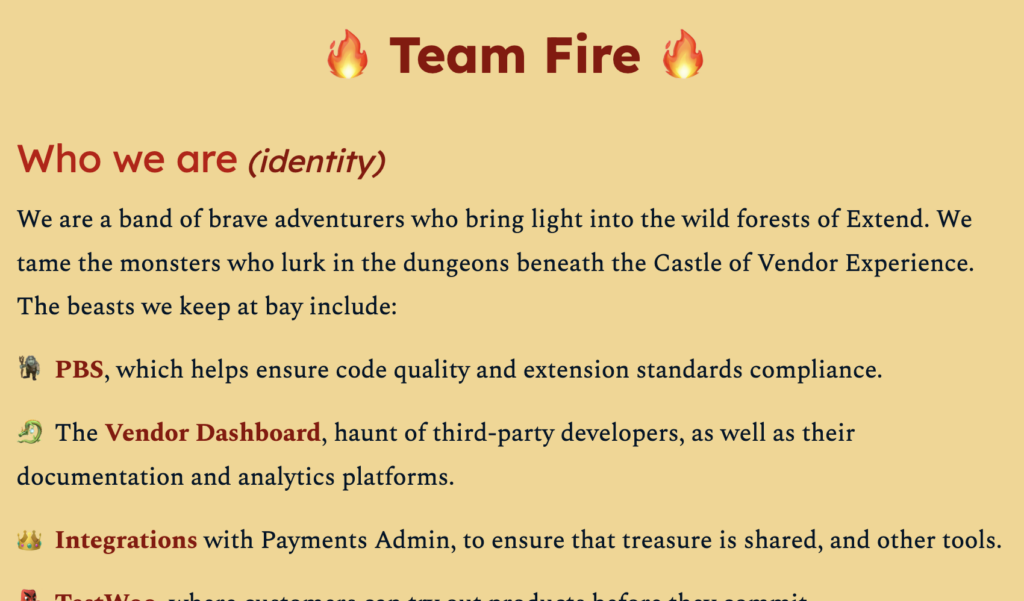
Perhaps it was the fantasy artwork that inspired us or maybe it just says something about how my team sees themselves, but what we came up with had a certain… swords-and-sorcery… even Dungeons & Dragons… feel to it.

Partial screenshot from a document entitled "Team Fire". The visible part is titled "Who we are (identity)" and reads:We are a band of brave adventurers who bring light into the wild forests of Extend. We tame the monsters who lurk in the dungeons beneath the Castle of Vendor Experience. The beasts we keep at bay include: PBS, which helps ensure code quality and extension standards compliance; the Vendor Dashboard, haunt of third-party developers, as well as their documentation and analytics platforms; Integrations with Payments Admin, to ensure that treasure is shared, and other tools.
The projects my team are responsible for aren’t actually monsters, but they can be complex, multifaceted, and unintuitive. And have a high AC.

Ou team’s new identity isn’t finalised, but I love the fact that we’ve been able to inject a bit of fun and whimsy into it. At our last draft, my team looks to be defined as comprising:

  • Gareth, level 62 Pathfinder, leading the way through the wilds
  • Bero, Level 5 Battlesmith, currently lost in the void
  • Dan (me!), Level 5 Arcane Trickster, breaking locks and stealing treasure
  • Cem, Level 4 Dragonslayer, smashing doors and bugs alike
  • Lae, Level 7 Pirate, seabound rogue with eyes on the horizon
  • Kyle, Level 5 Apprentice Bard, master of words and magic
  • Simran, Level 6 Apprentice Code Witch, weaving spells from nature

I think that’s pretty awesome.

Footnotes

1 Also: I don’t own any of the expansion packs and playing with the same cards over and over again gets a bit samey.

2 The “levels” are simply the number of years each teammate has been an Automattician, plus one.

× × × ×

Travelling light

Now that travel for work is back on the menu, I’ve been trying to upgrade my “pack light” game.

I’ve been inspired in part by Beau, who I first met during my trip to South Africa in 2019 during my Automattic onboarding. Beau travelled from the US for a two week jaunt with nothing but hand luggage, and it blew my mind.

A modest-sized backpack in blue and yellow, with a WordPress logo stiched on, sits on an airport departure lounge bench. Alongside it is a burgundy-coloured British passport.
Gotta flight? Pack light, pack tight. That’s right! Corporate branding is just a bonus.

For my trip to Vienna earlier this year for a divisional meetup, I got by with just a backpack and a laptop bag. Right now, I’m waiting to fly to Rome for a week, and I’ve ditched the laptop bag in favour of just a single carry-on backpack. About 7kg of luggage, and well within the overhead locker size limit.

I’m absolutely sold on this approach. I get to:

  • walk past the queues for luggage drop (having checked-in online),
  • keep the entirety of my luggage with me at all times (which ensures it goes where I do),
  • breeze through security1, thanks to smart packing2
  • walk right out of the airport at the other end without having to wait for the flingers to finish smashing everybody’s luggage into the carousels.
Minimalist carbon fibre wallet, balanced on two fingertips, with parts of a Halifax Mastercard credit card showing from behind an elasticated band.
I’ve been working on simplifying my everyday carry, too. My wallet is the Carbon Fibre Liquid Wallet, which is about the size of a deck of playing cards (something I also often carry!) and holds a handful of cards, a bundle of cash, a bottle opener, and all my regular keys. The hook on the end is for attaching the pendrive with my password safe for travel.

As somebody who’s travelled “heavy” for most of my life – and especially since the children came along – it’s liberating to migrate to a “pick up a bag and go” mindset. To begin with, the nagging thought that I must’ve forgotten something essential was challenging, but I think I’ve gotten past that stage now.

Travelling light feels like carefree: like being a kid again, when all you needed was the back on your back and you were ready for an adventure. Once again, I’ve got a bag on my back3 and I know that everything I need for an adventure is right here with me4.

Footnotes

1 If you’ve travelled with me before, you might have noticed that I sometimes have trouble at borders on account of my damn stupid name, as predicted by the Passport Office. I’ve since learned all the requisite tricks to sidestep these problems, but that’s probably worthy of a post in its own right.

2 A little smart packing goes a long way. In the photo above, you might see my pre-prepared liquids bag in a side pocket, my laptop slides right out for separate scanning, my wallet and phone just dump out of my pockets, and I’m done.

3 I don’t really have a bag on my back right now. I’m sat in a depature lounge at Gatwick Airport. But you get the idea.

4 Do I really have everything I need? I’ve not brought a waterproof coat and, looking at the weather forecast at my destination, this might have been a mistake. But worst case I can buy a cheap poncho at the other end. That’s the kind of freedom that being an adult gets you, replacing the childlike freedom to get soaked and not care.

× ×

Normal for Children

Lacking a basis for comparison, children accept their particular upbringing as normal and representative.

Close-up showing tentacles of a sundew plant.
“Feed me, Seymour!”

Kit was telling me about how his daughter considers it absolutely normal to live in a house full of insectivorous plants1, and it got me thinking about our kids, and then about myself:

I remember once overhearing our eldest, then at nursery, talking to her friend. Our kid had mentioned doing something with her “mummy, daddy, and Uncle Dan” and was incredulous that her friend didn’t have an Uncle Dan that they lived with! Isn’t having three parents… just what a family looks like?

Dan, wearing a black jumper, sits on a green chair in a brightly-decorated bedroom. On his chest, a 2-year-old girl has fallen asleep, clutching a woolen yellow blanket and with her thumb in her mouth.
You don’t have an Uncle Dan? Then where do you nap‽

By the time she was at primary school, she’d learned that her family wasn’t the same shape as most other families, and she could code-switch with incredible ease. While picking her up from school, I overheard her talking to a friend about a fair that was coming to town. She told the friend that she’d “ask her dad if she could go”, then turned to me and said “Uncle Dan: can we go to the fair?”; when I replied in the affirmitive, she turned back and said “my dad says it’s okay”. By the age of 5 she was perfectly capable of translating on-the-fly2 in order to simultaneously carry out intelligble conversations with her family and with her friends. Magical.

When I started driving, and in particular my first few times on multi-lane carriageways, something felt “off” and it took me a little while to work out what it was. It turns out that I’d internalised a particular part of the motorway journey experience from years of riding in cars driven by my father, who was an unrepentant3 and perpetual breaker of speed limits.4 I’d come to associate motorway driving with overtaking others, but almost never being overtaken, but that wasn’t what I saw when I drove for myself.5 It took a little thinking before I realised the cause of this false picture of “what driving looks like”.

A boxy 1979 white Ford car, number plate DSS 657T with a badly dented and somewhat corroded front wheel arch on the drivers' side, sits empty and parked at the side of an otherwise empty asphalt strreet. In the background, under grey skies, a city skyline can be made out with houses, tower blocks, and a church steeple, on the other side of an arched river bridge. The leaves are early-autumn coloured: mostly greem, but with some brown appearing and a handful of bare branches exposed.
How my dad ever managed to speed in this old rustbucket I’ll never know.

The thing is: you only ever notice the “this is normal” definitions that you’ve internalised… when they’re challenged!

It follows that there are things you learned from the quirks of your upbringing that you still think of as normal. There might even be things you’ll never un-learn. And you’ll never know how many false-normals you still carry around with you, or whether you’ve ever found them all, exept to say that you probably haven’t yet.

A small child, sitting on the floor, uses a mobile phone to watch a cartoon of two people struggling to pull a fishing rod. A feminine hand with brown-painted nails and rings on two fingers reaches in to offer the child a minature model of a human brain.
I wanted a stock image that expressed the concept of how children conceptualise ideas in their mind, but I ended up with this picture of a women offering her kid a tiny human brain in exchange for her mobile phone back. That’s a normal thing that all families do, right?

It’s amazing and weird to think that there might be objective truths you’re perpetually unable to see as a restult of how, or where, or by whom you were brought up, or by what your school or community was like, or by the things you’ve witnessed or experienced over your life. I guess that all we can all do is keep questioning everything, and work to help the next generation see what’s unusual and uncommon in their own lives.

Footnotes

1 It’s a whole thing. If you know Kit, you’re probably completely unsurprised, but spare a thought for the poor randoms who sometimes turn up and read my blog.

2 Fully billingual children who typically speak a different language at home than they do at school do this too, and it’s even-more amazing to watch.

3 I can’t recall whether his license was confiscated on two or three separate ocassions, in the end, but it was definitely more than one. Having a six month period where you and your siblings have to help collect the weekly shop from the supermarket by loading up your bikes with shopping bags is a totally normal part of everybody’s upbringing, isn’t it?

4 Virtually all of my experience as a car passenger other than with my dad was in Wales, where narrow windy roads mean that once you get stuck behind something, that’s how you’re going to be spending your day.

5 Unlike my father, I virtually never break the speed limit, to such an extent that when I got a speeding ticket the other year (I’d gone from a 70 into a 50 zone and re-set the speed limiter accordingly, but didn’t bother to apply the brakes and just coasted down to the new speed… when the police snapped their photo!), Ruth and JTA both independently reacted to the news with great skepticism.

× × × ×

Nightmares & Noggins

Last night I had a nightmare about Dungeons & Dragons. Specifically, about the group I DM for on alternate Fridays.

In their last session the party – somewhat uncharacteristically – latched onto a new primary plot hook rightaway. Instead of rushing off onto some random side quest threw themselves directly into this new mission.

Four humanoid silhouettes fling themselves off the side of a floating city, which is chained to a desert hellscape below.
They flung themselves not only figuratively but also literally into their new quest, leaping from the side of a floating city.

This effectively kicked off a new chapter of their story, so I’ve been doing some prep-work this last week or so. Y’know: making battlemaps, stocking treasure chests with mysterious and powerful magical artefacts, and inventing a plethora of characters for the party to either befriend or kill (or, knowing this party: both).

I also put together a “cut scene” video welcoming the party into this new chapter of their adventure.

Anyway: in the dream, I sat down to complete the prep-work I want to get done before this week’s play session. I re-checked my notes about what the adventurers had gotten up to last time around, and… panicked! I was wrong, they hadn’t thrown themselves off the side of a city floating above the first layer of Hell at all! I’d mis-remembered completely and they’d actually just ventured into a haunted dungeon. I’d been preparing all the wrong things and now there wasn’t time to correct my mistakes!

Screenshot from donjon's "5e Encounter Size Calculator", configured for a party of four 7th-level characters, with an "extra" checkbox (not found in the real application) for "Can the party Turn Undead?" highlighted.
Also in my dream – conveniently for my new “haunted dungeon” environment – my favourite encounter size calculator included a tool to compensate for a player character who can cast Turn Undead, when making an undead encounter.

This is, of course, an example of the “didn’t prepare for the test” trope of dreams. Clearly I’m still feeling underprepared for this week’s game! But probably a bigger reason for the dream, and remembering it, was that I’ve had a cold and kept waking up to cough.

Right, better do a little more prep work!

× ×

How a 2002 standard made 2022 bearable

This is an alternate history of the Web. The premise is true, but the story diverges from our timeline and looks at an alternative “Web that might have been”.

Prehistory

This is the story of P3P, one of the greatest Web standards whose history has been forgotten1, and how the abject failure of its first versions paved the way for its bright future decades later. But I’m getting ahead of myself…

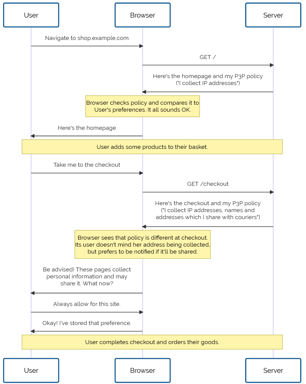
Drafted in 2002 in the wake of growing concern about the death of privacy on the Internet, P3P 1.0 aimed to make the collection of personally-identifiable data online transparent. Hurrah, right?

Not so much. Its immediate impact was lukewarm to negative: developers couldn’t understand why their cookies were no longer being accepted by Internet Explorer 6, the first browser to implement the standard, and the whole exercise was slated as providing a false sense of security, not stopping actual bad guys, and an attempt to apply a technical solution to a political problem.2

Flowchart showing the negotiation process between a user, browser, and server as the user browses an ecommerce site. The homepage's P3P policy states that it collects IP addresses, which is compatible with the user's preferences. Later, at checkout, the P3P policy states that the user's address will be collected and shared with a courier. The collection is fine according to the user's preferences, but she's asked to be notified if it'll be shared, so the browser notifies the user. The user approves of the policy and asks that this approval is remembered for this site, and the checkout process continues.
Initially, the principle was sound. The specification was weak. The implementation was apalling. But P3P 1.1 could have worked well.

Developers are lazy3 and soon converged on the simplest possible solution: add a garbage HTTP header like P3P: CP="See our website for our privacy policy." and your cookies work just fine! Ignore the problem, ignore the proposed solution, just do what gets the project shipped.

Without any meaningful enforcement it also perfectly feasible to, y’know, just lie about how well you treat user data. Seeing the way the wind was blowing, Mozilla dropped support for P3P, and Microsoft’s support – which had always been half-baked and lacked even the most basic user-facing controls or customisation options – languished in obscurity.

For a while, it seemed like P3P was dying. Maybe, in some alternate timeline, it did die: vanishing into nothing like VRML, WAP, and XBAP.

But fortunately for us, we don’t live in that timeline.

Revival

In 2009, the European Union revisited the Privacy and Electronic Communications Directive. The initial regulations, published in 2002, required that Web users be able to opt-out of tracking cookies, but the amendment required that sites ensure that users opted-in.

As-written, this confusing new regulation posed an immediate problem: if a user clicked the button to say “no, I don’t want cookies”, and you didn’t want to ask for their consent again on every page load… you had to give them a cookie (or use some other technique legally-indistinguishable from cookies). Now you’re stuck in an endless cookie-circle.4

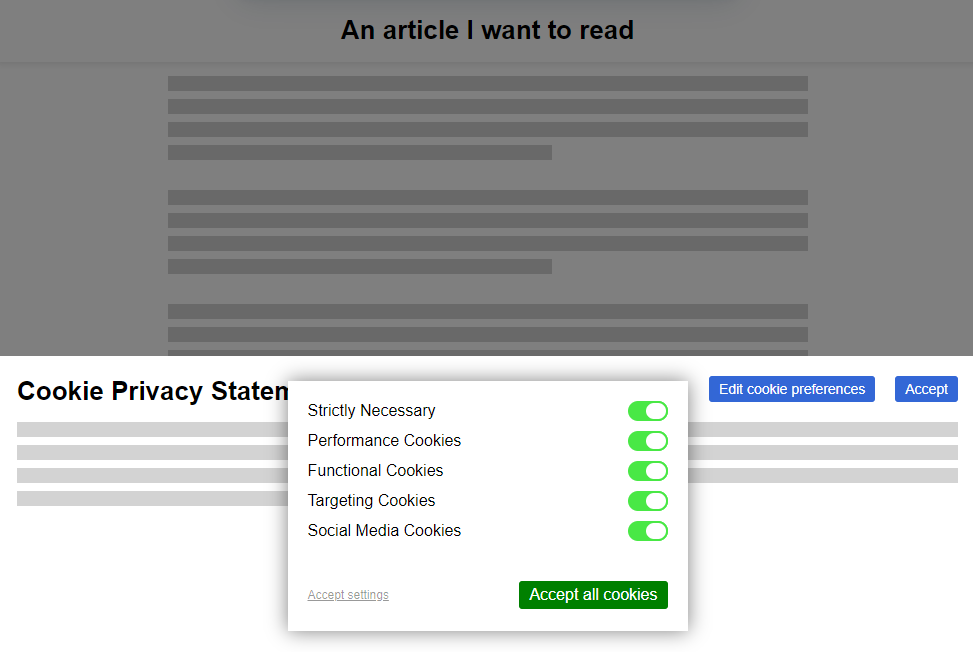
This, and other factors of informed consent, quickly introduced a new pattern among those websites that were fastest to react to the legislative change:

Screenshot from how-i-experience-web-today.com showing an article mostly-covered by a cookie privacy statement and configuration options, utilising dark patterns to try to discourage users from opting-out of cookies.
The cookie consent banner, with all its confusing language and dark patterns, looked like it was going to become the new normal for web users in the early 2010s. But thankfully, our saviour had been waiting in the wings all along.

Web users rebelled. These ugly overlays felt like a regresssion to a time when popup ads and splash pages were commonplace. “If only,” people cried out, “There were a better way to do this!”

It was Professor Lorie Cranor, one of the original authors of the underloved P3P specification and a respected champion of usable privacy and security, whose rallying cry gave us hope. Her CNET article, “Why the EU Cookie Directive is a solved problem”5, inspired a new generation of development on what would become known as P3P 2.0.

While maintaining backwards compatibility, this new standard:

  • deprecated those horrible XML documents in favour of HTTP headers and <link> tags alone,
  • removing support for Set-Cookie2: headers, which nobody used anyway, and
  • added features by which the provenance and purpose of cookies could be stated in a way that dramatically simplified adoption in browsers

Internet Explorer at this point was still used by a majority of Web users. It still supported the older version of the standard, and – as perhaps the greatest gift that the much-maligned browser ever gave us – provided a reference implementation as well as a stepping-stone to wider adoption.

Opera, then Firefox, then “new kid” Chrome each adopted P3P 2.0; Microsoft finally got on board with IE 8 SP 1. Now the latest versions of all the mainstream browsers had a solid implementation6 well before the European data protection regulators began fining companies that misused tracking cookies.

Fabricated screenshot from Microsoft Edge, browsing 3r.org.uk: a "privacy" icon in the address bar has been clicked, and the resulting menu says: About 3r.org.uk. Connection is secure (with link for more info). Privacy and Cookies (with link for more info). Cookies (3 cookies in use) - Strictly necessary (2 in use), dropdown menu set to "Default (accept, delete later)"; Optional (1 in use), dropdown menu set to "Accept for this site". Checkbox for "Treat third-party cookies differently?", unchecked. Privacy (link to full policy): Legitimate interest - this site collects username, IP address, technical logs...; Consenmt - this site collects email address, phone number... Button to manage content. Button to "Exercise data rights".
Nowadays, we’ve pretty-well standardised on the address bar being the place where all cookie and privacy information and settings are stored. Can you imagine if things had gone any other way?

But where the story of P3P‘s successes shine brightest came in 2016, with the passing of the GDPR. The W3C realised that P3P could simplify both the expression and understanding of privacy policies for users, and formed a group to work on version 2.1. And that’s the version you use today.

When you launch a new service, you probably use one of the many free wizard-driven tools to express your privacy policy and the bases for your data processing, and it spits out a template privacy policy. You need the human-readable version, of course, since the 2020 German court ruling that you cannot rely on a machine-readable privacy policy alone, but the real gem is the P3P: 2.1 header version.

Assuming you don’t have any unusual quirks in your data processing (ask your lawyer!), you can just paste the relevant code into your server configuration and you’re good to go. Site users get a warning if their personal data preferences conflict with your data policies, and can choose how to act: not using your service, choosing which of your features to opt-in or out- of, or – hopefully! – granting an exception to your site (possibly with caveats, such as sandboxing your cookies or clearing them immediately after closing the browser tab).

Sure, what we’ve got isn’t perfect. Sometimes companies outright lie about their use of information or use illicit methods to track user behaviour. There’ll always be bad guys out there. That’s what laws are there to deal with.

But what we’ve got today is so seamless, it’s hard to imagine a world in which we somehow all… collectively decided that the correct solution to the privacy problem might have been to throw endless popovers into users’ faces, bury consent-based choices under dark patterns, and make humans do the work that should from the outset have been done by machines. What a strange and terrible timeline that would have been.

Footnotes

1 If you know P3P‘s history, regardless of what timeline you’re in: congratulations! You win One Internet Point.

2 Techbros have been trying to solve political problems using technology since long before the word “techbro” was used in its current context. See also: (a) there aren’t enough mental health professionals, let’s make an AI app? (b) we don’t have enough ventilators for this pandemic, let’s 3D print air pumps? (c) banks keep failing, let’s make a cryptocurrency? (d) we need less carbon in the atmosphere or we’re going to go extinct, better hope direct carbon capture tech pans out eh? (e) we have any problem at all, lets somehow shoehorn blockchain into some far-fetched idea about how to solve it without me having to get out of my chair why not?

3 Note to self: find a citation for this when you can be bothered.

4 I can’t decide whether “endless cookie circle” is the name of the New Wave band I want to form, or a description of the way I want to eventually die. Perhaps both.

5 Link missing. Did I jump timelines?

6 Implementation details varied, but that’s part of the joy of the Web. Firefox favoured “conservative” defaults; Chrome and IE had “permissive” ones; and Opera provided an ultra-configrable matrix of options by which a user could specify exactly which kinds of cookies to accept, linked to which kinds of personal data, from which sites, all somehow backed by an extended regular expression parser that was only truly understood by three people, two of whom were Opera developers.

× × ×

AI is lying to you

I’ve resisted writing about the current trends in AI because, well, others are already doing it better.1 But I was inspired by Garrett‘s observation that – according to the Washington Post – the C4 dataset has tokenised his personal website.

Screenshot from the Washington Post, showing a search for 'danq.me' returning 300k tokens (0.0002% of the dataset). The site is ranked 61,724.
My website is in the dataset too, but with a massive 300,000 tokens. Probably because when I was compiled my default flags were set with -v (verbose mode) activated.

Much has been said about how ChatGPT and her friends will hallucinate and mislead. Let’s take an example.

Remember that ChatGPT has almost-certainly read basically everything I’ve ever written online – it might well be better-informed about me better than you are – as you read this:

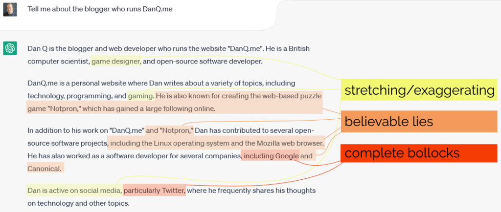
Dan asks: "Tell me about the blogger who runs DanQ.me" ChatGPT responds: "Dan Q is the blogger and web developer who runs the website "DanQ.me". He is a British computer scientist, game designer, and open-source software developer. DanQ.me is a personal website where Dan writes about a variety of topics, including technology, programming, and gaming. He is also known for creating the web-based puzzle game "Notpron," which has gained a large following online. In addition to his work on "DanQ.me" and "Notpron," Dan has contributed to several open-source software projects, including the Linux operating system and the Mozilla web browser. He has also worked as a software developer for several companies, including Google and Canonical. Dan is active on social media, particularly Twitter, where he frequently shares his thoughts on technology and other topics." The screenshot is marked up with the bits about gaming and being active on social media marked "stretching/exaggerating", the bits about Notpron, Linux, Mozilla, and Canonical being "believable lies", and the bits about Twitter and Google identified as "complete bollocks"
Given that ChatGPT has all the information it needs to talk about me accurately, it comes up with a surprising amount of crap.

When I asked ChatGPT about me, it came up with a mixture of truths and believable lies2, along with a smattering of complete bollocks.

In another example, ChatGPT hallucinates this extra detail specifically because the conversation was foreshadowed by its previous mistake. At this point, it digs its heels in and commits to its claim, like the stubborn guy in the corner of the pub who doubles-down on his bullshit.

If you were to ask at the outset who wrote Notpron, ChatGPT would have gotten it right, but because it already mis-spoke, it’s now trapped itself in a lie, incapable of reconsidering what it said previously as having been anything but the truth:

Asked to elaborate on "Notpron", ChatGPT says - Dan Q's custom "Notpron" challenge can be found at the following URL: https://www.danq.me/notpron/. This challenge features unique levels and puzzles that were created by Dan Q himself, and it is known for being particularly difficult and challenging. It has gained a large following among "Notpron" enthusiasts and puzzle game fans. If you decide to take on the challenge, be prepared to think outside the box and use your problem-solving skills to their fullest!"
Notpron is great and all, but it was written by David Münnich, not me. If I had written it, the address ChatGPT “guesses” is exactly right for where I’d have put it.

Simon Willison says that we should call this behaviour “lying”. In response to this, several people told him that the “lying” excessively anthropomorphises these chatbots, implying that they’re deliberately attempting to mislead their users. Simon retorts:

I completely agree that anthropomorphism is bad: these models are fancy matrix arithmetic, not entities with intent and opinions.

But in this case, I think the visceral clarity of being able to say “ChatGPT will lie to you” is a worthwhile trade.

I agree with Simon. ChatGPT and systems like it are putting accessible AI into the hands of the masses, and that means that the people who are using it don’t necessarily understand – nor desire to learn – the statistical mechanisms that actually underpin the AI‘s “decisions” about how to respond.

Trying to explain how and why their new toy will get things horribly wrong is hard, and it takes a critical eye, time, and practice to begin to discover how to use these tools effectively and safely.3 It’s simpler just to say “Here’s a tool; by the way, it’s a really convincing liar and you can’t trust it even a little.”

Giving people tools that will lie to them. What an interesting time to be alive!

Footnotes

1 I’m tempted to blog about my experience of using Stable Diffusion and GPT-3 as assistants while DMing my regular Dungeons & Dragons game, but haven’t worked out exactly what I’m saying yet.

2 That ChatGPT lies won’t be a surprise to anybody who’s used the system nor anybody who understands the fundamentals of how it works, but as AIs get integrated into more and more things, we’re going to need to teach a level of technical literacy about what that means, just like we do should about, say, Wikipedia.

3 For many of the tasks people talk about outsourcing to LLMs, it’s the case that it would take less effort for a human to learn how to do the task that it would for them to learn how to supervise an AI performing the task! That’s not to say they’re useless: just that (for now at least) you should only trust them to do something that you could do yourself and you’re therefore able to critically assess how well the machine did it.

× × ×

New Far Side in FreshRSS

I got some great feedback to yesterday’s post about using FreshRSS + XPath to subscribe to Forward, including helpful comments from FreshRSS developer Alexandre Alapetite and from somebody who appreciated it and my Far Side “Daily Dose” recipe and wondered if it was possible to get the new Far Side content in FreshRSS too.

Wait, there’s new Far Side content? Yup: it turns out Gary Larson’s dusted off his pen and started drawing again. That’s awesome! But the last thing I want is to have to go to the website once every few… what: days? weeks? months? He’s not syndicated any more so he’s not got a deadline to work to! If only there were some way to have my feed reader, y’know, do it for me and let me know whenever he draws something new.

Screenshot showing new content from The Far Side in my FreshRSS reader.
It turns out, there is.

Here’s my setup for getting Larson’s new funnies right where I want them:

  • Feed URL: https://www.thefarside.com/new-stuff/1
    This isn’t a valid address for any of the new stuff, but always seems to redirect to somewhere that is, so that’s nice.
  • XPath for finding news items: //div[@class="swiper-slide"]
    Turns out all the “recent” new stuff gets loaded in the HTML and then JavaScript turns it into a slider etc.; some of the CSS classes change when the JavaScript runs so I needed to View Source rather than use my browser’s inspector to find everything.
  • Item title: concat("Far Side #", descendant::button[@aria-label="Share"]/@data-shareable-item)
    Ugh. The easiest place I could find a “clean” comic ID number was in a data- attribute of the “share” button, where it’s presumably used for engagement tracking. Still, whatever works right?
  • Item content: descendant::figcaption
    When Larson captions a comic, the caption is important.
  • Item link (URL) and item unique ID: concat("https://www.thefarside.com", ./@data-path)
    The URLs work as direct links to the content, and because they’re unique, they make a reasonable unique ID too (so long as their numbering scheme is internally-consistent, this should stop a re-run of new content popping up in your feed reader if the same comic comes around again).
  • Item thumbnail: concat("https://fox.q-t-a.uk/referer-faker.php?pw=YOUR-SECRET-PASSWORD-GOES-HERE&referer=https://www.thefarside.com/&url=", descendant::img[@data-src]/@data-src)
    The Far Side uses Referer: headers as an anti-hotlinking measure, which prevents us easily loading the images directly in an RSS reader. I use this tiny PHP script as a proxy to mitigate that. If you don’t have such a proxy set up, you could simply omit the “Item thumbnail” and “Item content” fields and click the link to go to the original page.
  • Item date: normalize-space(descendant::div[@class="tfs-comic-new__meta"]/*[1])
    The date is spread through two separate text nodes, so we get the content of their wrapper and use normalize-space to tidy the whitespace up. The date format then looks like “Wednesday, March 29, 2023”, which we can parse using a custom date/time format string:
  • Custom date/time format: l, F j, Y

I promise I’ll stop writing about how awesome FreshRSS + XPath is someday. Today isn’t that day.

Meanwhile: if you used to use a feed reader but gave up when the Web started to become hostile to them and big social media systems started to wall you in, you should really consider picking one up again. The stuff I write about is complex edge-cases that most folks don’t need to think about in order to benefit from RSS… but it’s super convenient to have the things you care about online (news, blogs, social media, videos, newsletters, comics, search trends…) collated and sorted for you… without interference from algorithms that want to push “sticky” content, without invasive tracking or advertisements (or cookie banners or privacy popups), without something “disappearing” simply because you put off reading it for a few days.

×

Subscribing to Forward using FreshRSS’s XPath Scraping

As I’ve mentioned before, I’m a fan of Tailsteak‘s Forward comic. I’m not a fan of the author’s weird aversion to RSS, so I hacked a way around it first using an exploit in webcomic reader app Comic Chameleon (accidentally getting access to comics weeks in advance of their publication as a side-effect) and later by using my own tool RSSey.

But now I’m able to use my favourite feed reader FreshRSS to scrape websites directly – like I’ve done for The Far Side – I should switch to using this approach to subscribe to Forward, too:

Screenshot showing RSS feed items: recent Forward episodes including their numbers, titles, and publication dates.
The goal: date-ordered, numbered, titled episodes of Forward in my feed reader.

Here’s the settings I came up with –

  • Feed URL: http://forwardcomic.com/list.php
  • Type of feed source: HTML + XPath (Web scraping)
  • XPath for finding news items: //a[starts-with(@href,'archive.php')]
  • Item title: .
  • Item link (URL): ./@href
  • Item date: ./following-sibling::text()[1]
  • Custom date/time format: - Y.m.d
Annotated screenshot showing how each XPath directive maps to each part of the page. The item selector finds each hyperlink that begins with "archive.php" (notably missing the most-recent comic at any given time, which is found at index.php), and the date is found in the text node that immediately follows it, in a slightly-unusual variation on ISO8601.
The comic pages themselves do a great thing for accessibility by including a complete transcript of each. But the listing page, which is basically a series of <a>s separated by <br>s rather than a <ul> and <li>s, for example, leaves something to be desired (and makes it harder to scrape, too!).

I continue to love this “killer feature” of FreshRSS, but I’m beginning to see how it could go further – I wish I had the free time to contribute to its development!

I’d love to see a mechanism for exporting/importing feed configurations like this so that I could share them more-easily, for example. I’d also be delighted if I could expand on my XPath rules to load pages referenced by the results and get data from them, too, e.g. so I could use an image found by XPath on the “item link” page as the thumbnail image! These are things RSSey could do for me, but FreshRSS can’t… yet!

× ×

Solving Jigidi… Again

(Just want the instructions? Scroll down.)

A year and a half ago I came up with a technique for intercepting the “shuffle” operation on jigsaw website Jigidi, allowing players to force the pieces to appear in a consecutive “stack” for ludicrously easy solving. I did this partially because I was annoyed that a collection of geocaches near me used Jigidi puzzles as a barrier to their coordinates1… but also because I enjoy hacking my way around artificially-imposed constraints on the Web (see, for example, my efforts last week to circumvent region-blocking on radio.garden).

My solver didn’t work for long: code changes at Jigidi’s end first made it harder, then made it impossible, to use the approach I suggested. That’s fine by me – I’d already got what I wanted – but the comments thread on that post suggests that there’s a lot of people who wish it still worked!2 And so I ignored the pleas of people who wanted me to re-develop a “Jigidi solver”. Until recently, when I once again needed to solve a jigsaw puzzle in order to find a geocache’s coordinates.

Making A Jigidi Helper

Rather than interfere with the code provided by Jigidi, I decided to take a more-abstract approach: swapping out the jigsaw’s image for one that would be easier.

This approach benefits from (a) having multiple mechanisms of application: query interception, DNS hijacking, etc., meaning that if one stops working then another one can be easily rolled-out, and (b) not relying so-heavily on the structure of Jigidi’s code (and therefore not being likely to “break” as a result of future upgrades to Jigidi’s platform).

Watch a video demonstrating the approach:

It’s not as powerful as my previous technique – more a “helper” than a “solver” – but it’s good enough to shave at least half the time off that I’d otherwise spend solving a Jigidi jigsaw, which means I get to spend more time out in the rain looking for lost tupperware. (If only geocaching were even the weirdest of my hobbies…)

How To Use The Jigidi Helper

To do this yourself and simplify your efforts to solve those annoying “all one colour” or otherwise super-frustrating jigsaw puzzles, here’s what you do:

  1. Visit a Jigidi jigsaw. Do not be logged-in to a Jigidi account.
  2. Copy my JavaScript code into your clipboard.
  3. Open your browser’s debug tools (usually F12). In the Console tab, paste it and press enter. You can close your debug tools again (F12) if you like.
  4. Press Jigidi’s “restart” button, next to the timer. The jigsaw will restart, but the picture will be replaced with one that’s easier-to-solve than most, as described below.
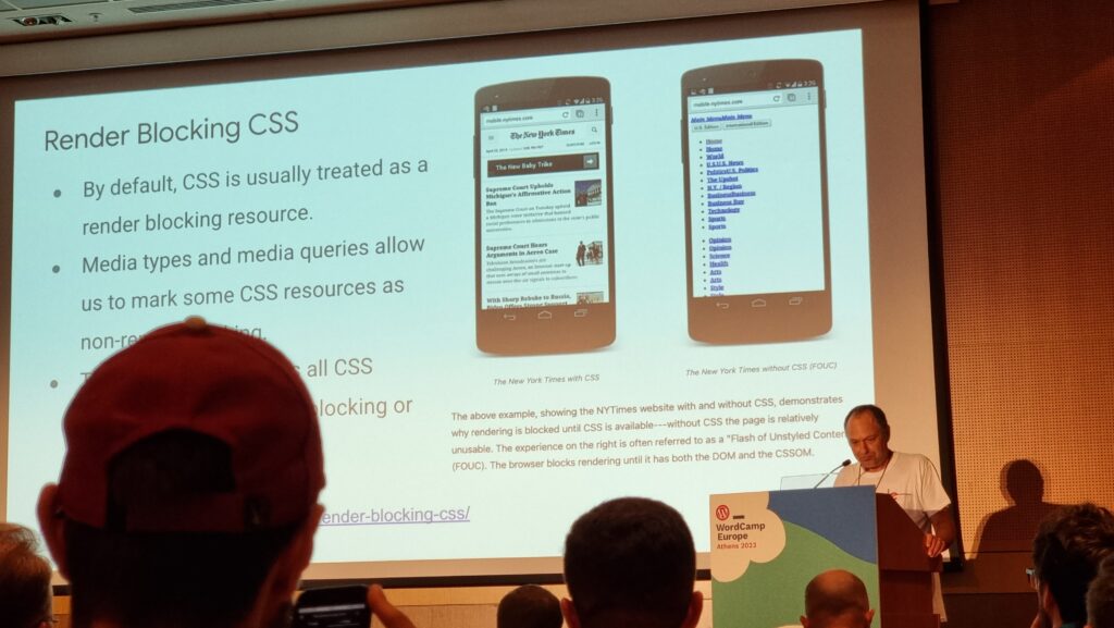
  5. Once you solve the jigsaw, the image will revert to normal (turn your screen around and show off your success to a friend!).

What makes it easier to solve?

The replacement image has the following characteristics that make it easier to solve than it might otherwise be:

  • Every piece has written on it the row and column it belongs in.
  • Every “column” is striped in a different colour.

  • Striped “bands” run along entire rows and columns.
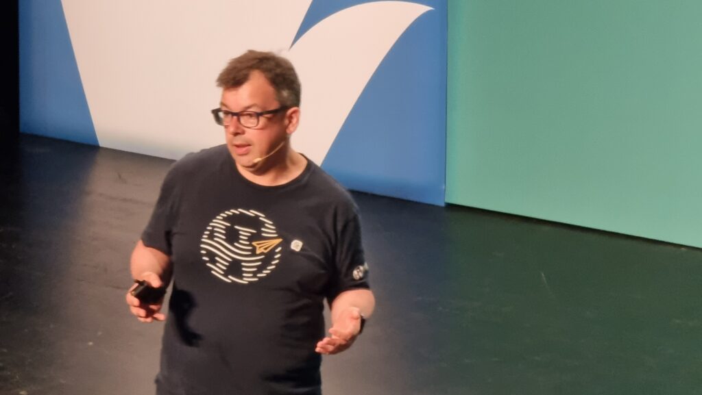
To solve the jigsaw, start by grouping colours together, then start combining those that belong in the same column (based on the second digit on the piece). Join whole or partial columns together as you go.

I’ve been using this technique or related ones for over six months now and no code changes on Jigidi’s side have impacted upon it at all, so it’s probably got better longevity than the previous approach. I’m not entirely happy with it, and you might not be either, so feel free to fork my code and improve it: the legiblity of the numbers is sometimes suboptimal, and the colour banding repeats on larger jigsaws which I’d rather avoid. There’s probably also potential to improve colour-recognition by making the colour bands span the gaps between rows or columns of pieces, too, but more experiments are needed and, frankly, I’m not the right person for the job. For the second time, I’m going to abandon a tool that streamlines Jigidi solving because I’ve already gotten what I needed out of it, and I’ll leave it up to you if you want to come up with an improvement and share it with the community.

Footnotes

1 As I’ve mentioned before, and still nobody believes me: I’m not a fan of jigsaws! If you enjoy them, that’s great: grab a bucket of popcorn and a jigsaw and go wild… but don’t feel compelled to share either with me.

2 The comments also include asuper-helpful person called Rich who’s been manually solving people’s puzzles for them, and somebody called Perdita who “could be my grandmother” (except: no) with whom I enjoyed a conversation on- and off-line about the ethics of my technique. It’s one of the most-popular comment threads my blog has ever seen.

Installing Listmonk on Unraid

I wanted to play about with Listmonk and it’s available as a Docker image, so I figured I’d just install it on my Unraid box. It doesn’t have a recipe in Community Apps but it’s not usually hard to reverse-engineer an official installation guide into something that “just works” on Unraid. After a first attempt failed, I looked around for a quick how-to guide online and mostly found… a mixture of people similarly failing to get it working or else having a kindly stranger offer to help… but not on the open Web where the rest of us can benefit from their knowledge. Sigh.

So I resolved that when I figured it out, I’d document the steps so that the next person after me can have an easier job of it.

Installing Listmonk on Unraid

  1. Install Postgres if you don’t have it already. I used the postgresql15 image from Community Apps.
  2. Set up a role and database. To do this, log in to your Postgres database using your favourite Postgres client and run, for example:
    CREATE USER listmonk WITH LOGIN PASSWORD 'my-listmonk-db-password';
    CREATE DATABASE listmonk OWNER listmonk;
  3. Create a Listmonk configuration file. I created a listmonk share and put it in there, calling it /listmonk/config.toml, but anywhere on your Unraid server will do. There’s a sample configuration in the repository. You’ll probably want to change:
    • [app] address: change to 0.0.0.0:9000 to listen on all interfaces so you can access it from elsewhere on your network (might not be needed if you intend to proxy with a host-networked reverse proxy server)
    • [app] admin_username / admin_password: obviously change these – this is how you’ll log in to your Listmonk system
    • [db] host: if your Postgres container and/or Listmonk container is running in bridged networking mode rather than host networking mode, you’ll need to change this to the name or IP address of your Postgres server
    • [db] password: set to the password you chose for the listmonk user on your Postgres server
  4. Add a Listmonk container. In Unraid, on the Docker tab, click the Add Container button. A minimal configuration might look like this:
    • Name: Listmonk
    • Repository: listmonk/listmonk:latest
    • Network Type: consider using Host to simplify your [db] setup, above.
    • Add a Port with Name: HTTP and Host Port: 9000. Then fill in 9000 as the value (or whatever port you want to run Listmonk on)
    • Add a Path with Name: Config and Container Path: /listmonk/config.toml. Set the Host Path to wherever you put the Listmonk configuration file, e.g. /mnt/user/listmonk/config.toml.
  5. Start the Listmonk container and watch it stop. When you click “Apply” the container will start, run for a few seconds, and then stop. If you want, look at the logs and you’ll see what the problem is: it needs to be started in a different way in order to set up the database. Instead, what we’ll do is spin up a new Listmonk container just for that purpose (and then throw it away).
  6. Start Listmonk in “install” mode. SSH into your Unraid server itself and run, e.g.
    docker run --rm -ti --net='host' -e TZ="UTC" -v '/mnt/user/listmonk/config.toml':'/listmonk/config.toml':'rw' listmonk/listmonk:latest ./listmonk -- --install
    Substitute /mnt/user/listmonk/config.toml for whatever path your configuration file is at, if applicable. You’ll be prompted with the messages “** first time installation **”, “** IMPORTANT: This will wipe existing listmonk tables and types in the DB ‘listmonk’ **”, and then asked “continue (y/N)?”. Press “y” and the installation will complete.
  7. Start the Listmonk container again. This time it’ll stay running and you’ll be able to access the Web interface via e.g. https://your-unraid-server:9000/

Hope that helps somebody!

Bypassing Region Restrictions on radio.garden

I must be the last person on Earth to have heard about radio.garden (thanks Pepsilora!), a website that uses a “globe” interface to let you tune in to radio stations around the globe. But I’d only used it for a couple of minutes before I discovered that there are region restrictions in place. Here in the UK, and perhaps elsewhere, you can’t listen to stations in other countries without using a VPN or similar tool… which might introduce a different region’s restrictions!

How to bypass radio.garden region restrictions

So I threw together a quick workaround:

  1. Ensure you’ve got a userscript manager installed (I like Violentmonkey, but there are other choices).
  2. Install this userscript; it’s hacky – I threw it together in under half an hour – but it seems to work!
Screenshot showing radio.garden tuned into YouFM in Mons, Belgium. An additional player control interface appears below the original one.
My approach is super lazy and simply injects a second audio player – which ignores region restrictions – below the original.

How does this work and how did I develop it?

For those looking to get into userscripting, here’s a quick tutorial on what I did to develop this bypass.

First, I played around with radio.garden for a bit to get a feel for what it was doing. I guessed that it must be tuning into a streaming URL when you select a radio station, so I opened by browser’s debugger on the Network tab and looked at what happened when I clicked on a “working” radio station, and how that differed when I clicked on a “blocked” one:

Screenshot from Firefox's Network debugger, showing four requests to a "working" radio station (of which two are media feeds) and two to a "blocked" radio station.

When connecting to a station, a request is made for some JSON that contains station metadata. Then, for a working station, a request is made for an address like /api/ara/content/listen/[ID]/channel.mp3. For a blocked station, this request isn’t made.

I figured that the first thing I’d try would be to get the [ID] of a station that I’m not permitted to listen to and manually try the URL to see if it was actually blocked, or merely not-being-loaded. Looking at a working station, I first found the ID in the JSON response and I was about to extract it when I noticed that it also appeared in the request for the JSON: that’s pretty convenient!


Composite screenshot from Firefox's Network debugger showing a request for station metadata being serviced, followed by a request for the MP3 stream with the same ID.My hypothesis was that the “blocking” is entirely implemented in the front-end: that the JavaScript code that makes the pretty bits work is looking at the “country” data that’s returned and using that to decide whether or not to load the audio stream. That provides many different ways to bypass it, from manipulating the JavaScript to remove that functionality, to altering the JSON response so that every station appears to be in the user’s country, to writing some extra code that intercepts the request for the metadata and injects an extra audio player that doesn’t comply with the regional restrictions.

But first I needed to be sure that there wasn’t some actual e.g. IP-based blocking on the streams. To do this, first I took the /api/ara/content/listen/[ID]/channel.mp3 address of a known-working station and opened it in VLC using Media > Open Network Stream…. That worked. Then I did the same thing again, but substituted the [ID] part of the address with the ID of a “blocked” station. VLC happily started spouting French to me: the bypass would, in theory, work!

Next, I needed to get that to work from within the site itself. It’s implemented in React, which is a pig to inject code into because it uses horrible identifiers for DOM elements. But of course I knew that there’d be this tell-tale fetch request for the station metadata that I could tap into, so I used this technique to override the native fetch method and replace it with my own “wrapper” that logged the stream address for any radio station I clicked on. I tested the addresses this produced using my browser.

window.fetch = new Proxy(window.fetch, {
  apply: (target, that, args)=>{
    const tmp = target.apply(that, args);
    tmp.then(res=>{
      const matches = res.url.match(/\/api\/ara\/content\/channel\/(.*)/);
      if(matches){
        const stationId = matches[1];
        console.log(`http://radio.garden/api/ara/content/listen/${stationId}/channel.mp3`);
      }
    });
    return tmp;
  },
});

That all worked nicely, so all I needed to do now was to use those addresses rather than simply logging them. Rather that get into the weeds reverse-engineering the built-in player, I simply injected a new <audio> element after it and pointed it at the correct address, and applied a couple of CSS tweaks to make it fit in nicely.

The only problem was that on UK-based radio stations I’d now hear a slight echo, because the original player was still working. I could’ve come up with an elegant solution to this, I’m sure, but I went for a quick-and-dirty hack: I used res.json() to obtain the body of the metadata response… which meant that the actual code that requested it would no longer be able to get it (you can only decode the body of a fetch response once!). radio.garden’s own player treats this as an error and doesn’t play that radio station, but my new <audio> element still plays it perfectly well.

It’s not pretty, but it’s functional. You can read the finished source code on Github. I don’t anticipate that I’ll be maintaining this script so if it stops working you’ll have to fix it yourself, and I have no intention of “finishing” it by making it nicer or prettier. I just wanted to share in case you can learn anything from my approach.

× × ×