When was the last time you tested your website in a text-only browser like Lynx (or ELinks, or one of several others)? Perhaps you should.
I’m a big fan of CSS Naked Day. I love the idea of JS Naked Day, although I missed it earlier this month (I was busy abroad, plus my aggressive caching, including in service workers, makes it hard to reliably make sweeping changes for short periods). I’m a big fan of the idea that, for the vast majority of websites, if it isn’t at least usable without any CSS or JavaScript, it should probably be considered broken.
This year, I thought I’d celebrate the events by testing DanQ.me in the most-limited browser I had to-hand: Lynx. Lynx has zero CSS or JavaScript support, along with limited-to-no support for heading levels, tables, images, etc. That may seem extreme, but it’s a reasonable analogue for the level of functionality you might routinely expect to see in the toughest environments in which your site is accessed: slow 2G connections from old mobile hardware, people on the other side of highly-restrictive firewalls or overenthusiastic privacy and security software, and of course users of accessibility technologies.
Here’s what broke (and some other observations):
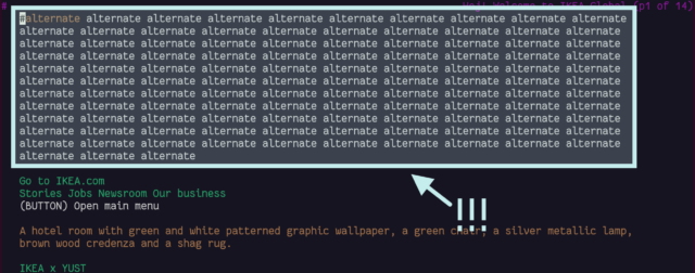
<link rel="alternate">s at the top
I see the thinking that Lynx (and in an even more-extreme fashion, ELinks) have with showing “alternate versions” of a page at the top, but it’s not terribly helpful: most of mine are designed to help robots, not humans!

I wonder if switching from <link rel="alternate"> elements to Link: HTTP headers would
indicate to Lynx that it shouldn’t be putting these URLs in humans’ faces, while still making them accessible to all the
services that expect to find them? Doing so would require some changes to my caching logic, but might result in a cleaner, more human-readable HTML file as a side-effect. Possibly something worth investigating.
Fortunately, I ensure that my <link rel="alternate">s have a title attribute, which is respected by Lynx and ELinks and makes these scroll-past links
slightly less-confusing.

hreflang attribute.
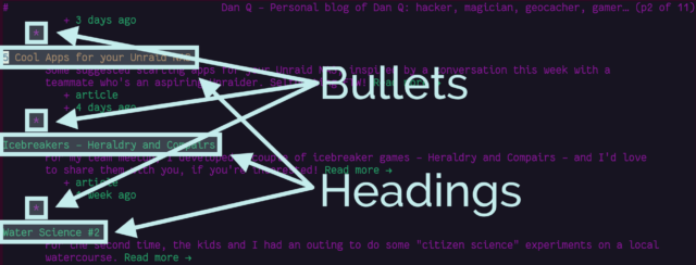
Post list indentation
Posts on the homepage are structured a little like this:
<li>
  <a href="...">
    <h2>Post Title</h2>
    <p>...post metadata, image, and things...</p>
  </a>
</li>
Strictly-speaking, that’s not valid. Heading elements are only permitted within flow elements. I chose to implement it that way because it seemed to be the most semantically-correct way
to describe the literal “list of posts”. But probably my use of <h2> is not the best solution. Let’s see how Lynx handles it:

It’s not intolerable, but it’s a little ugly.
CSS lightboxes add a step to images
I use a zero-JavaScript approach to image lightboxes: you can see it by clicking
on any of the images in this post! It works by creating a (closed) <dialog> at the bottom of the page, for each image. Each <dialog> has a unique
id, and the inline image links to that anchor.
Originally, I used a CSS :target selector to detect when the link had been clicked and show the
<dialog>. I’ve since changed this to a :has(:target) and directed the link to an element within the dialog, because it works better on browsers
without CSS support.
It’s not perfect: in Lynx navigating on an inline image scrolls down to a list of images at the bottom of the page and selects the current one: hitting the link again now offers to download the image. I wonder if I might be better to use a JavaScript-powered lightbox after all!
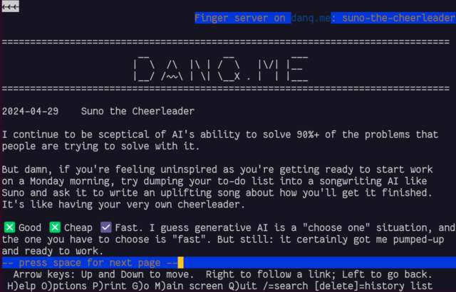
gopher: and finger: links work perfectly!
I was pleased to discover that gopher: and finger: links to alternate copies of a post… worked perfectly! That shouldn’t be a surprise – Lynx natively supports
these protocols.

In a fun quirk and unusually for a standard of its age, the Finger specification did not state the character encoding that ought to be used. I guess the authors just assumed everybody reading it would use ASCII. But both my WordPress-to-Finger bridge and Lynx instead assume that UTF-8 is acceptable (being a superset of ASCII, that seems fair!) which means that emoji work (as shown in the screenshot above). That’s nuts, isn’t it?
You can’t react to anything
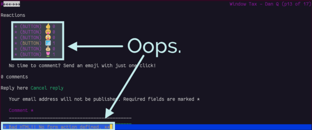
Back in November I added the ability to “react” to a post by clicking an emoji, rather than typing out a full comment. Because I was feeling lazy, the feature was (and remains) experimental, and I didn’t consider it essential functionality, I implemented it mostly in JavaScript. Without JavaScript, all you can do is see what others have clicked.

In a browser with no JavaScript but with functional CSS, the buttons correctly appear disabled.
But with neither technology available, as in Lynx, they look like they should work, but just… don’t. Oops.

If I decide to keep the reaction buttons long-term, I’ll probably reimplement them so that they function using plain-old HTML
and HTTP, using a <form>, and refactor my JavaScript to properly progressively-enhance the buttons for
those that support it. For now, this’ll do.
Comment form honeypot
The comment form on my blog posts works… but there’s a quirk:
<textarea> appears!
That’s an annoyance. It turns out it’s a honeypot added by Akismet: a fake comments field, normally hidden, that tries to trick spam bots into filling it (and thus giving themselves away): sort-of a “reverse CAPTCHA” where the robots do something extra, unintentionally, to prove their inhumanity. Lynx doesn’t understand the code that Akismet uses to hide the form, and so it’s visible to humans, which is suboptimal both because it’s confusing but also because a human who puts details into it is more-likely to be branded a spambot!
I might look into suppressing Akismet adding its honeypot field in the first place, or else consider one of the alternative anti-spam plugins for WordPress. I’ve heard good things about Antispam Bee; I ought to try it at some point.
Overall, it’s pretty good
On the whole, DanQ.me works reasonably well in browsers without any JavaScript or CSS capability, with only a few optional features failing to function fully. There’s always room for improvement, of course, and I’ve got a few things now to add to my “one day” to-do list for my little digital garden.
Obviously, this isn’t really about supporting people using text-mode browsers, who probably represent an incredible minority. It’s about making a real commitment to the semantic web, to accessibility, and to progressive enhancement! That making your site resilient, performant, and accessible also helps make it function in even the most-uncommon of browsers is just a bonus.
Terence Eden wrote about his recent experience of IndieWebCamp Brighton, in which he mentioned that somebody – probably Jeremy Keith – had said, presumably to provoke discussion: A blog post doesn’t need a title. Terence disagrees, saying: In a literal sense, he was wrong. The HTML specification
Read more →