While working on something else entirely1, I had a random thought:
Could the :checked and and :has pseudo-classes and the subsequent-sibling (~) selector be combined to perform interactive filtering
without JavaScript?
Turns out, yes. Have a play with the filters on the side of this. You can either use:
- “OR” mode, so you can show e.g. “all mammals and carnivores”, or
- “AND” mode, so you can show e.g. “all mammals that are carnivores”.
Filter the animals!
(if it doesn’t work right where you are, e.g. in a feed reader, you can view it “standalone”)
-
 Alpaca
-
 Anteater
-
 Bat
Bat
-
 Beetle
-
 Butterfly
-
 Camel
Camel
-
 Cat
Cat
-
 Chameleon
-
 Cobra
Cobra
-
 Cow
Cow
-
 Crab
Crab
-
 Crocodile
-
 Dog
Dog
-
 Duck
Duck
-
 Elephant
-
 Elk
Elk
-
 Fish
Fish
-
 Frog
Frog
-
 Giraffe
-
 Hippo
Hippo
-
 Husky
Husky
-
 Kangaroo
-
 Lion
Lion
-
 Macaw
Macaw
-
 Manatee
-
 Monkey
-
 Mouse
Mouse
-
 Octopus
-
 Ostrich
-
 Owl
Owl
-
 Panda
Panda
-
 Pelican
-
 Penguin
-
 Pig
Pig
-
 Rabbit
-
 Raccoon
-
 Ray
Ray
-
 Rhino
Rhino
-
 Rooster
-
 Shark
Shark
-
 Sheep
Sheep
-
 Sloth
Sloth
-
 Snake
Snake
-
 Spider
-
 Squirrel
-
 Swan
Swan
-
 Tiger
Tiger
-
 Toucan
-
 Turtle
-
 Whale
Whale
The source code is available to download under the Unlicense, but the animal images are CC-BY licensed (with thanks to Aslan Almukhambetov).
How does it work?
There’s nothing particularly complicated here, although a few of the selectors are a little verbose.
First, we set the initial state of each animal. In “OR” mode, they’re hidden, because each selected checkbox is additive. In “AND” mode, they’re shown, because checking a checkbox can only ever remove an animal from the result set:
#filters:has(#filter-or:checked) ~ #animals .animal {
  display: none;
}

#filters:has(#filter-and:checked) ~ #animals .animal {
  display: flex;
}
The magic of the :has pseudo-class is that it doesn’t change the scope, which means that after checking whether “AND” or “OR” is checked within the #filters,
the #animals container is still an adjacent element.

Then all we need to do is to use daisy-chain :has to show animals with a particular class if that class is checked in “OR” mode, or to hide animals that don’t have a particular class in “AND” mode. Here’s what that looks like:
#filters:has(#filter-or:checked):has(#aquatic:checked)  ~ #animals .aquatic,
#filters:has(#filter-or:checked):has(#bird:checked)     ~ #animals .bird,
...
#filters:has(#filter-or:checked):has(#reptile:checked)  ~ #animals .reptile {
  display: flex;
}

#filters:has(#filter-and:checked):has(#aquatic:checked) ~ #animals .animal:not(.aquatic),
#filters:has(#filter-and:checked):has(#bird:checked)    ~ #animals .animal:not(.bird),
...
#filters:has(#filter-and:checked):has(#reptile:checked) ~ #animals .animal:not(.reptile) {
  display: none;
}
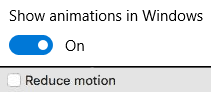
It could probably enjoy an animation effect to make it clearer when items are added and removed2, but that’s a consideration for another day.
Many developers would be tempted to use JavaScript to implement the client-side version of a filter like this. And in some cases, that might be the right option.
But it’s always worth remembering that:
- A CSS solution is almost-always more-performant than a JS one.
- A JS solution is usually less-resilient than a CSS one: a CDN failure, unsupported API, troublesome content-blocker or syntax error will typically have a much larger impact on JavaScript.
- For the absolutely maximum compatibility, consider what you can do in plain HTML, or on the server-side, and treat anything on the client-side as progressive enhancement.
Footnotes
1 The thing I was actually working on when I got distracted was an OAuth provider implementation for Three Rings, connected with work that took place at this weekend’s hackathon to (eventually) bring single-sign-on “across” Three Rings CIC’s products. Eventually being the operative word.
2 Such an animation should, of course, be wrapped in a @media
(prefers-reduced-motion: no-preference) media query!