I really love Dungeondraft, an RPG battle map generator. It’s got great compatibility with online platforms like Foundry VTT and Roll20, but if you’re looking to make maps for tabletop play, there’s a few tips I can share:
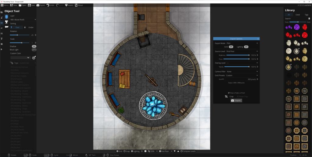
Planning and designing
Dungeondraft has (or can be extended with) features to support light levels and shadow-casting obstructions, openable doors and windows, line-of sight etc… great to have when you’re building for Internet-enabled tabletops, but pointless when you’re planning to print out your map! Instead:
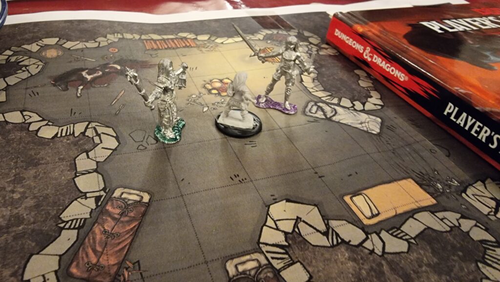
- Think about scale: I’m printing to A4 sheets and using inch-size squares, so every 11 x 8 squares equates to one sheet of paper. Knowing this, I can multiply-up to a whole number of sheets of paper and this informs my decisions about how to best make use of the maps (and what will and won’t fit on my dining table!).
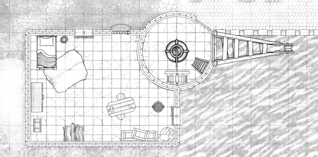
- Focus on legibility: Your printer probably won’t have the same kind of resolution as your screen, and your players can’t “zoom in” to get details. Play with the grid styles (under Map Settings) to find what works best for you, and try not to clash with your floor patterns. If you’re printing in monochrome, use the “Printer-Friendly” camera filter (also under Map Settings, or in the Export Options dialog) to convert to gorgeous line-art. Make sure critical elements have sufficient contrast that they’ll stand out when printed or your players might walk right over that chest, campfire, or bookshelf.
- Think about exposure: You don’t get digital “fog of war” on the tabletop! Think about how you’re going to reveal the map to your players: plan to print in multiple sections to put together, jigsaw style, or have card to “cover” bits of the map. Think about how the tool can help you here: e.g. if you’ve got multiple buildings the players can explore, use a higher “level” or roof layer to put roofs on your buildings, then print the relevant parts of that level separately: now you’ve got a thematic cover-up that you can remove to show the insides of the building. Go the other way around for secret doors: print the empty wall on your main map (so players can’t infer the location of the secret door by the inclusion of a cover-up) and the secret door/passage on the overlay, so you can stick it onto the map when they find it.
Printing it out
There’s no “print” option in Dungeondraft, so – especially if your map spans multiple “pages” – you’ll need a multi-step process to printing it out. With a little practice, it’s not too hard or time-consuming, though:
Export your map (level by level) from Dungeondraft as PNG files. The default settings are fine, but pay attention to the “Overlay level” setting if you’re using smart or complex cover-ups as described above.
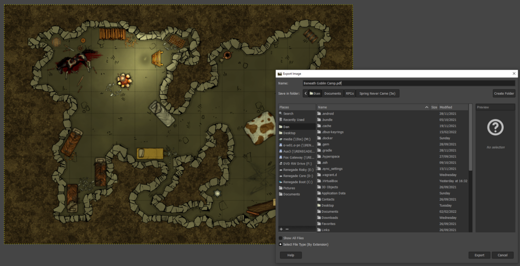
To easily spread your map across multiple pages, you’ll need to convert it to a PDF. I’m using Gimp to do this. Simply open the PNG in Gimp, make any post-processing/last minute changes that you couldn’t manage in Dungeondraft, then click File >
Export As… and change the filename to have a .pdf extension. You could print directly from Gimp, but in my experience PDF reader software does a much better job at multi-page printing.
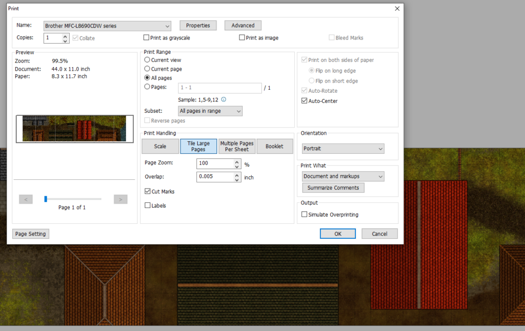
Open your PDF in an appropriate reader application with good print management. I’m using Foxit, which is… okay? Print it, selecting “tile large pages” to tell it to print across multiple sheets. Assuming you’ve produced a map an appropriate size for your printer’s margins, your preview should be perfect. If not, you can get away with reducing the zoom level by up to a percent or two without causing trouble for your miniatures. If you’d like the page breaks to occur at specific places (for exposure/reveal reasons), go back to Gimp and pad one side of the image by increasing the canvas size.
Check the level of “overlap” specified: I like to keep mine low and use the print margins as the overlapping part of my maps when I tape them together, but you’ll want to see how your printer behaves and adapt accordingly.
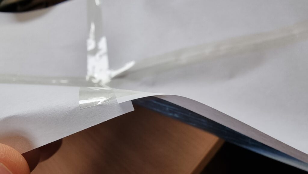
If you’re sticking together multiple pages to make a single large map, trim off the bottom and right margins of each page: if you printed with cut marks, this is easy enough even without a guillotine. Then tape them together on the underside, taking care to line-up the features on the map (it’s not just your players who’ll appreciate a good, visible grid: it’s useful when lining-up your printouts to stick, too!).
I keep my maps rolled-up in a box. If you do this too, just be ready with some paperweights to keep the edges from curling when you unfurl them across your gaming table. Or cut into separate rooms and mount to stiff card for that “jigsaw” effect! Whatever works best for you!
0 comments