Dan Q found GC6102Y Minecrafty 3 – Zombie

This checkin to GC6102Y Minecrafty 3 - Zombie reflects a geocaching.com log entry. See more of Dan's cache logs.

Found via quick diversion from my expedition to the 2019-05-27 51 -1 geohashpoint nearby. I don’t often find myself on this side of the city and I was pleased to find a good-sized and well maintained geocache here, in a park I’d never visited! Initially I took 6 the wrong path and had to double back but soon knew where to look. TFTC, SL.

Geohashing expedition 2019-05-27 51 -1

This checkin to geohash 2019-05-27 51 -1 reflects a geohashing expedition. See more of Dan's hash logs.

Location

Hashpoint appears to be at the very end of Bleache Place, a suburban cul-de-sac in South-East Oxford. Looks very close to, but not on, the driveway of number 15. Possibly a convenient nearby lamp post for possibly attaching a “the Internet was here” sign?

Participants

Plans

(So long as he can get enough of his coursework done to justify taking a break), Dan Q plans to cycle out to the hashpoint at some point during the day.

Expedition

14:55 – okay, I’ve not finished as much of my coursework as I’d hoped, but I’ve finished enough that I can afford to take a break of a couple of hours to cycle out to the hashpoint, do a silly grin, put up a “The internet was here!” sign, and whatnot. Here we go!

15:58 – Success! Photos, tracklog, and details to follow. I’ve put a sign up so I wanted to put a message here for anybody who happens to see it and visit this page before I get home and finish writing-up!

Came home via geocache GC6102Y, safely home by 17:15 and back to studying!

Tracklog

Photos


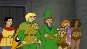
Caverna Do Dragão

This is a repost promoting content originally published elsewhere. See more things Dan's reposted.

Dungeons & Dragons (80s TV show)Remember that 80s TV show Dungeons & Dragons?

It turns out that Renault’s target customer base in Brazil do, too. Presumably it was a way bigger deal over there than it was here, because this new car ad feels like it could genuinely be a trailer for a live-action reboot of the series. And now I want to watch it.

(I do have some questions, though. Like: Diana was only 14 years old when she and her friends were transported to the Realm of Dungeons and Dragons… so when did she learn to drive? Am I supposed to believe that she just rolled a natural 20 on that driving check? And where does Sheila go when she turns invisible so that Bobby doesn’t end up sitting on her transparent-lap? And how does the car’s navigation computer work: are we to believe that there’s a GNSS network in the skies above the Realm? The Internet must know!)

×

The man who made Einstein world-famous

This is a repost promoting content originally published elsewhere. See more things Dan's reposted.

It is hard to imagine a time when Albert Einstein’s name was not recognised around the world.

But even after he finished his theory of relativity in 1915, he was nearly unknown outside Germany – until British astronomer Arthur Stanley Eddington became involved.

Einstein’s ideas were trapped by the blockades of the Great War, and even more by the vicious nationalism that made “enemy” science unwelcome in the UK.

But Einstein, a socialist, and Eddington, a Quaker, both believed that science should transcend the divisions of the war.

It was their partnership that allowed relativity to leap the trenches and make Einstein one of the most famous people on the globe.

I hadn’t heard this story before, and it’s well-worth a read.

I Don’t Watch YouTube (Like You Watch YouTube)

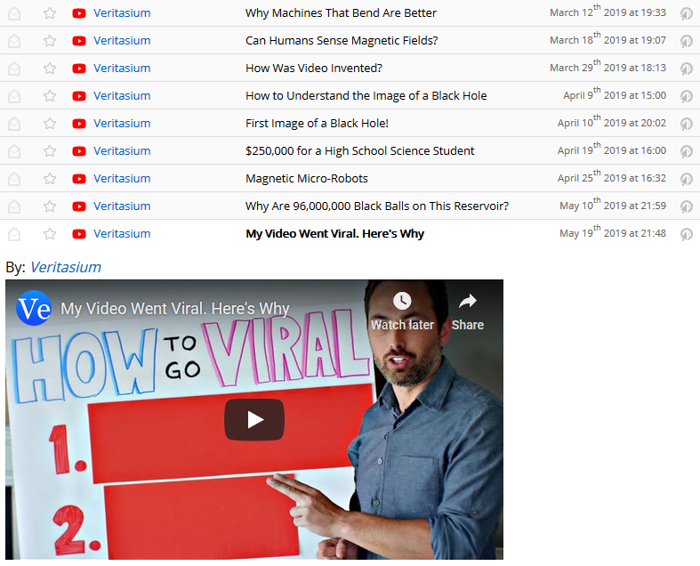
I was watching a recent YouTube video by Derek Muller (Veritasium), My Video Went Viral. Here’s Why, and I came to a realisation: I don’t watch YouTube like most people – probably including you! – watch YouTube. And as a result, my perspective on what YouTube is and does is fundamentally biased from the way that others probably think about it.

The Veritasium video My Video Went Viral. Here’s Why is really good and you should definitely watch at least 7 minutes of it in order to influence the algorithm.

The magic moment came for me when his video explained that the “subscribe” button doesn’t do what I’d assumed it does. I’m probably not alone in my assumptions: I’ll bet that people who use the “subscribe” button as YouTube intend don’t all realise that it works the way that it does.

Like many, I’d assumed the “subscribe” buttons says “I want to know about everything this creator publishes”. But that’s not what actually happens. YouTube wrangles your subscription list and (especially) your recommendations based on their own metrics using an opaque algorithm. I knew, of course, that they used such a thing to manage the list of recommended next-watches… but I didn’t realise how big an influence it was having on the way that most YouTube users choose what they’ll watch!

Veritasium explains how the YouTube subscriber model has changed over time
“YouTube started doing some experiments… where they would change what was recommended to your subscribers. No longer was a subscription like ‘I want to see every video by this person’; it was more of a suggestion…”

YouTube’s metrics for “what to show to you” is, of course, biased by your subscriptions. But it’s also biased by what’s “trending” (which in turn is based on watch time and click-through-rate), what people-who-watch-the-things-you-watch watch, subscription commonalities, regional trends, what your contacts are interested in, and… who knows what else! AAA YouTubers try to “game” it, but the goalposts are moving. And the struggle to stay on-top, especially after a fluke viral hit, leads to the application of increasingly desperate and clickbaity measures.

This is a battle to which I’ve been mostly oblivious, until now, because I don’t watch YouTube like you watch YouTube.

Veritasium explains the YouTube "frontpage" algorithm.
“You could be a little bit disappointed in the way the game is working right now… I challenge you to think of a better way.”
Hold my beer.

Tom Scott produced an underappreciated sci-fi short last year describing a theoretical AI which, in 2028, caused problems as a result of its single-minded focus. What we’re seeing in YouTube right now is a simpler example, but illustrates the problem well: optimising YouTube’s algorithm for any factor or combination of factors other than a user’s stated preference (subscriptions) will necessarily result in the promotion of videos to a user other than, and at the expense of, the ones by creators that they’ve subscribed to. And there are so many things that YouTube could use as influencing factors. Off the top of my head, there’s:

  • Number of views
  • Number of likes
  • Ratio of likes to dislikes
  • Number of tracked shares
  • Number of saves
  • Length of view
  • Click-through rate on advertisements
  • Recency
  • Subscriber count
  • Subscriber engagement
  • Popularity amongst your friends
  • Popularity amongst your demographic
  • Click-through-ratio
  • Etc., etc., etc.
Veritasium videos in my RSS reader
A Veritasium video I haven’t watched yet? Thanks, RSS reader.

But this is all alien to me. Why? Well: here’s how I use YouTube:

  1. Subscription: I subscribe to creators via RSS. My RSS reader doesn’t implement YouTube’s algorithm, of course, so it just gives me exactly what I subscribe to – no more, no less.It’s not perfect (for example, it pisses me off every time it tells me about an upcoming “premiere”, a YouTube feature I don’t care about even a little), but apart from that it’s great! If I’m on-the-move and can’t watch something as long as involved TheraminTrees‘ latest deep-thinker, my RSS reader remembers so I can watch it later at my convenience. I can have National Geographic‘s videos “expire” if I don’t watch them within a week but Dr. Doe‘s wait for me forever. And I can implement my own filters if a feed isn’t showing exactly what I’m looking for (like I did to strip the sport section from BBC News’ RSS feed). I’m in control.
  2. Discovery: I don’t rely on YouTube’s algorithm to find me new content. I don’t mind being a day or two behind on what’s trending: I’m not sure I care at all? I’m far more-interested in recommendations curated by a human. If I discover and subscribe to a channel on YouTube, it was usually (a) mentioned by another YouTuber or (b)  linked from a blog or community blog. I’m receiving recommendations from people I already respect, and they have a way higher hit-rate than YouTube’s recommendations.(I also sometimes discover content because it’s exactly what I searched for, e.g. I’m looking for that tutorial on how to install a fiddly damn kiddy seat into the car, but this is unlikely to result in a subscription.)
Robot with a computer.
I for one welcome our content-recommending robot overlords. (So long as their biases can be configured by their users, not the networks that create them…)

This isn’t yet-another-argument that you should use RSS because it’s awesome. (Okay, so it is. RSS isn’t dead, and its killer feature is that its users get to choose how it works. But there’s more I want to say.)

What I wanted to share was this reminder, for me, that the way you use a technology can totally blind you to the way others use it. I had no idea that many YouTube creators and some YouTube subscribers felt increasingly like they were fighting YouTube’s algorithms, whose goals are different from their own, to get what they want. Now I can see it everywhere! Why do schmoyoho always encourage me to press the notification bell and not just the subscribe button? Because for a typical YouTube user, that’s the only way that they can be sure that their latest content will be seen!

Veritasium encourages us to "ring that bell".
“There is one way… to short-circuit this effect… ring that bell.”
If I may channel Yoda for a moment: No… there is another!

Of course, the business needs of YouTube mean that we’re not likely to see any change from them. So until either we have mainstream content-curating AIs that answer to their human owners rather than to commercial networks (robot butler, anybody?) or else the video fediverse catches on – and I don’t know which of those two are least-likely! – I guess I’ll stick to my algorithm-lite subscription model for YouTube.

But at least now I’ll have a better understanding of why some of the channels I follow are changing the way they produce and market their content…

× × × × ×

Going Critical

This is a repost promoting content originally published elsewhere. See more things Dan's reposted.

If you’ve spent any time thinking about complex systems, you surely understand the importance of networks.
Networks rule our world. From the chemical reaction pathways inside a cell, to the web of relationships in an ecosystem, to the trade and political networks that shape the course of history.
Or consider this very post you’re reading. You probably found it on a social network, downloaded it from a computer network, and are currently deciphering it with your neural network.
But as much as I’ve thought about networks over the years, I didn’t appreciate (until very recently) the importance of simple diffusion.
This is our topic for today: the way things move and spread, somewhat chaotically, across a network. Some examples to whet the appetite:
  • Infectious diseases jumping from host to host within a population
  • Memes spreading across a follower graph on social media
  • A wildfire breaking out across a landscape
  • Ideas and practices diffusing through a culture
  • Neutrons cascading through a hunk of enriched uranium
A quick note about form.
Unlike all my previous work, this essay is interactive. There will be sliders to pull, buttons to push, and things that dance around on the screen. I’m pretty excited about this, and I hope you are too.
So let’s get to it. Our first order of business is to develop a visual vocabulary for diffusion across networks.

A simple model

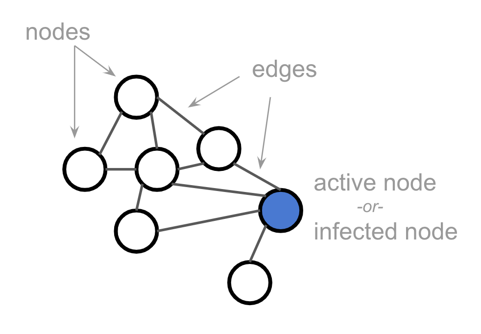
I’m sure you all know the basics of a network, i.e., nodes + edges.
To study diffusion, the only thing we need to add is labeling certain nodes as active. Or, as the epidemiologists like to say, infected:
This activation or infection is what will be diffusing across the network. It spreads from node to node according to rules we’ll develop below.
Now, real-world networks are typically far bigger than this simple 7-node network. They’re also far messier. But in order to simplify — we’re building a toy model here — we’re going to look at grid or lattice networks throughout this post.
(What a grid lacks in realism, it makes up for in being easy to draw ;)
Except where otherwise specified, the nodes in our grid will have 4 neighbors, like so:
And we should imagine that these grids extend out infinitely in all directions. In other words, we’re not interested in behavior that happens only at the edges of the network, or as a result of small populations.
Given that grid networks are so regular, we can simplify by drawing them as pixel grids. These two images represent the same network, for example:
Alright, let’s get interactive.

Fabulous (interactive! – click through for the full thing to see for yourself) exploration of network interactions with applications for understanding epidemics, memes, science, fashion, and much more. Plus Kevin’s made the whole thing CC0 so everybody can share and make use of his work. Treat as a longread with some opportunities to play as you go along.

Danny Daycare

This is a repost promoting content originally published elsewhere. See more things Dan's reposted.

“Have you had a good wee day out?”

This isn’t how I behave when I’m out cycling with one of our little ‘uns in tow. But sometimes, just sometimes, when I see a solid-looking jump… I wish it could be. Honestly: our eldest would be well up for this! (And would probably be quite disappointed to sit around until the end where they reveal that, obviously, they swapped the small child for a doll for many of the shots.)

Accessibility Resources

This is a repost promoting content originally published elsewhere. See more things Dan's reposted.

As it’s Global Accessibility Awareness, I’m sharing a list of accessibility resources that I regularly refer to. Happy reading, watching and listening!

A fabulously-useful concise list of some of the hottest articles, books, and webinars on accessibility in web development; saved for my later convenience.

JavaScript and the mobile-only user

This is a repost promoting content originally published elsewhere. See more things Dan's reposted.

It’s 2019. No one disables JavaScript.

Actually (cue Adam Conover!)… some people do. They represent about a tenth of a percent (0.1%) of the people who don’t get your JavaScript file, though, and they’ve chosen to browse the web that way, so let’s ignore them for a second.

I see this argument—that one one disables JS in 2019—as an argument for not bothering to care or worry about progressive enhancement. But it’s wrong!

There are plenty of other reasons why people don’t get your JavaScript.

  • Your CDN fails
  • An ad blocker or filewall got a little overly aggressive
  • A JS error (either in your code or something third-party) stops all of the JS from rendering
  • The file times out because it’s too big or too slow to parse

Today, I want to focus on that last one.

So very much this. Web bloat is becoming a huge issue (incidentally, I was pleased to see that DanQ.me’s homepage Web Bloat Score is in the region of a nice, clean 0.1, but I’m confident that there’s still plenty I could do to improve it); it’s easy to see how developers on their powerful desktops and laptops and with their WiFi-connected high-end smartphones might overlook people on older, less-powerful devices and slower, lower-bandwidth connections.

I’m not saying that Javascript is bad: it’s not! I’m saying that where functionality exists in simpler, more-lightweight technologies (like good old-fashioned links and regular <input> elements, both of which are routinely reimplemented in the front-end), then those technologies should be used in the first instance. If you want to build on top of that with Javascript, that’s great! But starting from the ground floor when building for the web is the surest way to support the widest diversity of potential users (and it makes it easier to achieve your accessibility goals, too!)

Review of The Rusty Bicycle

This review of The Rusty Bicycle originally appeared on Google Maps. See more reviews by Dan.

Visited today for the first time. Discovered when I came to order that special offers (e.g. £5 lunchtime pizzas) on the menu aren’t actually honoured when you come to order unless you agree to install their “app”. Their app is appalling: currently averaging 1.7/5 on the app store, and I can see why!

By the time I’d looked at the app’s privacy policy, I decided it was better to pay full price rather than use it: the app requests permissions to access virtually all of your phone’s data and the privacy policy states that your use of it grants them the right to track your GPS location from then on (seriously!). No thank you!

Cocktails were okay. Food was pretty good, but not quite good enough to take away the sour taste left by the “app” experience. I’d visit again… but only if they moved towards honouring the special offers they advertise… WITHOUT the precondition that you agree to give all of your personal data to them first.

Permission to Write Stuff

This is a repost promoting content originally published elsewhere. See more things Dan's reposted.

I would say treat the web like that big red button of the original Flip camera. Just push it, write something and then publish it. It may not be perfect, but nothing ever is anyway. I write all sorts of crap on my blog — some of it really niche like snippets for Vim. Yet it’s out there just in case someone finds it useful at some point — not least me when I forget how I’ve done something.

I write all kinds of crap on my blog, too, and for mostly the same reasons: my blog is for me, first and foremost. Hopefully others, from time to time, find it interesting or useful, but I can’t in good faith argue that I keep the shit I wrote in the 90s or early 2000s here for the benefit of the Internet as a whole! It’s for me first.

Good analogy with the Flip camera (follow the link through to Brendan’s post for the full explanation).

The Side Effects of Vaccines – How High is the Risk?

This is a repost promoting content originally published elsewhere. See more things Dan's reposted.

Kurzgesagt tells it like it is. The thing I love the most about this video is the clickbaity title that’s clearly geared to try to get the attention of antivaxxers and the “truth teaser” opening which plays a little like many antivaxxer videos and other media… and then the fact that it goes and drops a science bomb on all the fools who tout their superstitious bollocks. Awesome.

css-only-chat/README.md at master · kkuchta/css-only-chat · GitHub

This is a repost promoting content originally published elsewhere. See more things Dan's reposted.

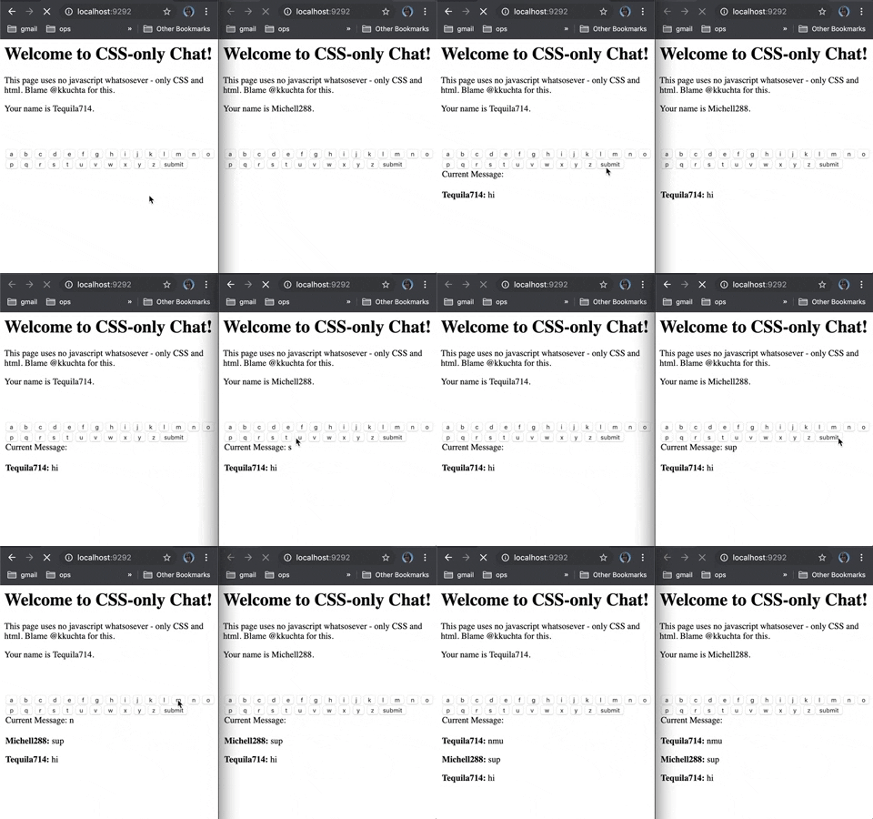
CSS-Only Chat

A truly monstrous async web chat using no JS whatsoever on the frontend.

Wait what

This is an asynchronous chat that sends + receives messages in the browser with no reloads and no javascript.

Ok so how

Background-images loaded via pseudoselectors + a forever-loading index page (remember Comet?).

Say that again?

Ok, so there are two things we need the browser to do: send data and receive data. Let’s start with the first.

Sending Data

CSS is really limited in what it can do. However, we can use it to effectively detect button presses:

.some-button:active {
  background-image: url('some_image.jpg')
}

What’s cool is that a browser won’t actually load that background image until this selector is used – that is, when this button is pressed. So now we have a way to trigger a request to a server of our choice on a button press. That sounds like data sending!

Now, of course, this only works once per button (since a browser won’t try to load that image twice), but it’s a start.

Receiving Data

Since we can’t use JS, it’s really hard to change a page after it’s already been loaded. But it is possible.

Back before websockets were widely supported, we had to use clever hacks if we wanted to push data from a server to a client in an ongoing basis. One such hack was just to make the page never finish loading. It turns out that you can tell the browser to start rendering a page before it’s finished loading (using the Transfer-Encoding: chunked http header). And when you do that, you don’t actually have to stop loading the page. You can just keep adding stuff to the bottom of the html forever, at whatever rate you want.

So, for example, you could start sending a normal html page, then just stop sending html (while still telling the client you’re sending) until you’re ready to deliver another message.

Now, all this lets us do is periodically append html to the page. What can we do with that? How about, when you load the index page, this happens:

  1. We load up the first pile of html we want to show. A welcome message, etc.
  2. We stop loading html for a while until we want to send some sort of update.
  3. Now we load up a <style> element that display: none‘s all the previous html
  4. Then we load up whatever new html we want to show
  5. Finally we wait until the next update we want to send and GOTO 3.

Single-use buttons?

Ok, so we have that problem earlier where each button is only single-use. It tries to send a get request once, then never will again.

Thankfully, our method of receiving data fixes that for us. Here’s what happens:

  1. We show an “a” button whose background image is like “img/a”.
  2. When you press it, the server receives the image request for “a”
  3. The server then pushes an update to the client to hide the current button and replace it with one whose background images is “image/aa”.

If the buttons you pressed were “h”, “e”, and “l”, then the “a” button’s background image url would be “img/hela”. And since we’re replacing all buttons every time you press one, the single-use button problem goes away!

Misc other details

  • We actually encode a bit more info into the button urls (like each client’s id)
  • Because the data-sending and data-receiving happens on different threads, we need inter-thread communication. That sounds like work, so we’ll just use Redis pubsub for that.

FAQ

What inspired this? Chernobyl, Hindenburg, The Tacoma Narrows Bridge…

Really? No, it was this clever tweet by davywtf.

Why’s your code suck Why do you suck?

No but really Because I was mostly making this up as I went. There’s a lot of exploratory coding here that I only minimally cleaned up. If I rebuilt it I’d store the UI state for a client in redis and just push it out in its entirety when needed via a single generic screen-updating mechanism.

What could go wrong with this technique? Broken by browser bg-image handling changes; long-request timeouts; running out of threads; fast-clicking bugs; generic concurrency headaches; poor handling by proxies; it’s crazy inaccessible; etc etc

Should I use this in real life? Dear god yes.

I have an idea for how this could be made better/worse/hackier Tweet at me (@kkuchta). I’m always down to see a terrible idea taken further!

Practical Details

If you want to install and use this locally you should:

  1. Re-evaluate your life choices
  2. If you simply must continue, check out INSTALL.md

If you want to contribute, see number 1 above. After that, just fork this repo, make a change, and then open a PR against this repo.