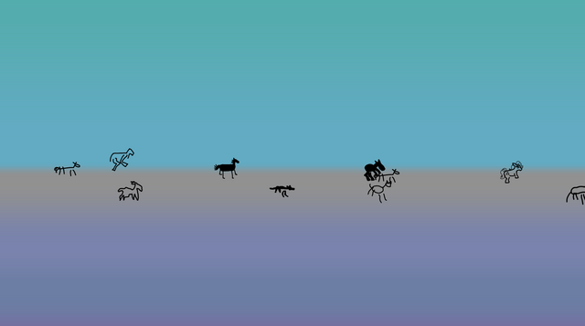
Honestly I just wanted to play around with gradients. But gradients without anything on the horizon lack something, so I added horses. Since I can’t draw horses, now you
can draw them. And watch them parade across the screen alongside horses drawn by people you probably wouldn’t like. Or maybe you would, how should I know?!
…
I love a good (by which I mean stupid) use of a .horse domain name. I’m not sure anything will ever beat endless.horse, but gradient.horse might be a close second.
Draw a horse. Watch it get animated and run wild and free with the horses that other people have drawn. That is all.
Welcome to my 88×31 button creator, this is a pretty rough and ready implementation so it could be buggy, please let me know if you find any issues.
This supports gif despite the basic canvas tag limitation courtesy of gif.js – none of
this would be possible without that project.
…
Dan (whose website is freakin’ awesome, by the way) has done an amazing job with this new 88×31 generator. Look at this (trashy, but I don’t care) button I threw together in literally
seconds, with it:
Have a play, and remind yourself that the Web is brilliant.
What about when you want to keep global styles out of your component, like with a third-party widget that gets loaded on lots of different pages?
I kind-of sort-of see the logic in that. But I also think wanting your component to not look like a cohesive part of the page its loaded into is weird and unexpected.
…
I so-rarely disagree with Chris on JavaScript issues, but I think I kinda do on this one. I fully agree that the Shadow DOM is usually a bad idea and its
encapsulation concept encourages exactly the kind of over-narrow componentised design thinking that React also suffers from. But I think that the rebuttal Chris picks up
on is valid… just sometimes.
When I created the Beige Buttons component earlier this year, I used the shadow DOM. It was the
first time I’ve done so: I’ve always rejected it in my previous (HTML) Web Components for exactly the reasons Chris describes. But I
maintain that it was, in this case, the right tool for the job. The Beige Buttons aren’t intended to integrate into the design of the site on which they’re placed, and
allowing the site’s CSS to interact with some parts of it – such as the “reset” button – could fundamentally undermine the experience it intends to create!
I appreciate that this is an edge case, for sure, and most Web Component libraries almost certainly shouldn’t use the shadow DOM. But I don’t think it’s valid to
declare it totally worthless.
That said, I’ve not yet had the opportunity to play with Cascade Layers, which – combined with directives like all: reset;, might provide a way to strongly
override the style of components without making it impossibly hard for a site owner to provide their own customised experience. I’m still open to persuasion!
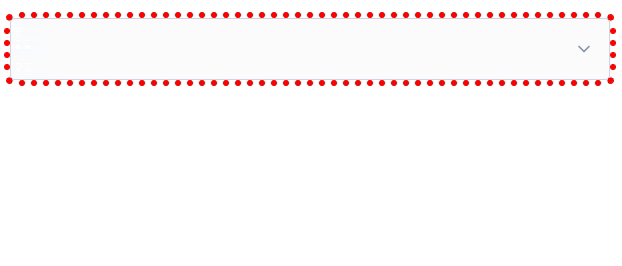
Modern CSS is freakin’ amazing. Widespread support for nesting, variables, :has, and :not has unlocked so much potential. But I don’t yet see it used widely
enough.
Suppose I have a form where I’m expecting, but not requiring, a user to choose an option from each of several drop-downs. I want to make it more visually-obvious
which drop-downs haven’t yet had an option selected. Something like this:
It’s a slightly gnarly selector, but thanks to nesting you could choose to break it into multiple blocks if you preferred.
What that’s saying is:
a <select>
that contains an <option>
where that <option> does not have a value="..."
and that <option> is currently selected
gains a dotted red outline around it
Or in short: if the default option is selected, highlight it so the user knows they haven’t chosen a value yet. Sweet!
Obviously you could expand this to have different effects for every value, if you wanted.
I can’t understate how valuable it is that we can do this in CSS, nowadays. Compared to doing it in JavaScript… CSS gives better performance and reliability and is much easier to
implement in a progressively-enhanced manner.
Here’s another example, this time using a fun “dress-up Dan” feature I from a redesign of my blog theme that I’m hoping to launch in the New Year:
If you’ve ever wanted to know what I’d look like if I were an elderly Tom Scott, my new design will answer that question!
Every single bit of interactivity shown in the video above… from the “waving” Dan to the popup menu to the emoji-styled checkboxes to the changes to t-shirt and hair
colours… is implemented in CSS.
The underlying HTML is all semantic, e.g. the drop-down menu is a <details>/<summary> pair (with thanks to Eevee for
the inspiration); its contents are checkbox and radiobutton <input>es; the images are SVGs that use CSS variables (another killer feature these years!) to specify
colours (among other things), and virtually everything else… is CSS.
Consider this:
:root{
/* Default values for Dan's t-shirt, hair, and beard colours used throughout the site: */--dan-tshirt:#c3d4d7;
--dan-hair:#3b6f8f;
--dan-beard:#896a51;
/* ...more variables... */
}
/* When the page contains a "checked" checkbox, update some variables: */
:root:has(#dan-tshirt-color-white:checked){--dan-tshirt:#c3d4d7;}
:root:has(#dan-tshirt-color-purple:checked){--dan-tshirt:#7429a8;}
/* ... */
:root:has(#dan-hair-color-natural:checked){--dan-hair:#896a51;}
:root:has(#dan-hair-color-blue:checked){--dan-hair:#3b6f8f;}
/* When "dye beard" is checked, copy the hair colour: */
:root:has(#dan-dye-beard-toggle:checked){--dan-beard:var(--dan-hair);}
The ability to set :root CSS variables, based on the status of user-controlled elements like checkboxes within the document, unlocks amazing options for interactivity. It
also works in smaller scopes like HTML Web Components, of course, for encapsulated functionality.
If you’re still using JavaScript for things like this, perhaps it’s time you looked at how much CSS has grown up this last decade or so. CSS gives you performance benefits, less
fragility, and makes it easier for you to meet your accessibility and usability goals.
You can still enrich what you create with JavaScript if you like (I’ve got a few lines of JS that save those checkbox states to localStorage so they persist
through page loads, for example).
But a CSS-based approach moves more of your functionality from the “nice to have” to “core” column. And that’s something we can all get behind, right?
An additional thing I wanted to implement – again, for the next version of my blog’s theme – was an “alt text viewer”. Mastodon has one, and it’s excellent2.
Mastodon’s viewer requires JavaScript, but I was inspired when I saw James come up with a
CSS-based version that used a re-styled checkbox.
But I wanted to do one better. Displaying alt text, too, seems like an example of what would semantically be best-represented by a
<details>/<summary> pair.
Clicking on the image shows a larger version in a lightbox; clicking on the ‘alt’ button shows the alt text… all in semantic HTML and vanilla CSS.3
My first attempt tried to put the alt-text widget inside the <summary> of the original image, but that’s an accessibility no-no, so instead I
wrap both<details> blocks (the lightbox, and the alt-text revealer) inside a container and then reposition the latter over the former.
The rest is all the same kinds of tricks I demonstrated previously, to ensure that you can click in-and-out of both in an intuitive way and that keyboard navigation works as you’d
expect.
I can’t use it on my blog yet (because if I do, it’ll probably break horribly when I add the functionality to my entire theme, later!), but I’ve put together a demonstration page that showcases the technique, plus a GitHub repo with all of the code (which is all public domain/unlicensed). Go have a
play and tell me what you think!
Footnotes
1 As a secondary goal, using <details>/<summary>
means that it’ll behave better when CSS is disabled or unavailable, which’ll make it easier to celebrate Naked CSS Day!
2 Why would I, a sighted person, need an alt text viewer, you ask? All kinds of reasons.
Good alt text is for everybody, and can help by providing context, e.g. “explaining” the joke or identifying the probably-well-known-but-I-didn’t-recognise-them subject of a
photo. Here’s some more reasons.
3 If you love owls and you love accessibility, this is the kind of example you should give
a hoot about.
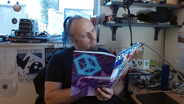
This weekend, I received my copy of DOCTYPE, and man: it feels like a step back to yesteryear to type in a computer program from a
magazine: I can’t have done that in at least thirty years.
So yeah, DOCTYPE is a dead-tree (only) medium magazine containing the source code to 10 Web pages which, when typed-in to your computer, each provide you with some kind of fun and
interactive plaything. Each of the programs is contributed by a different author, including several I follow and one or two whom I’m corresponded with at some point or another, and each
brings their own personality and imagination to their contribution.
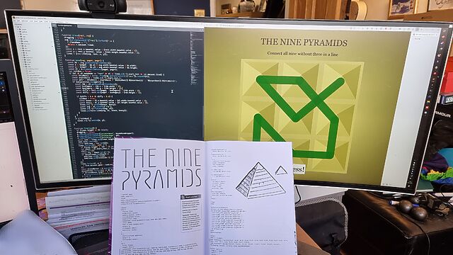
I opted to start with Stuart Langridge‘s The Nine Pyramids, a puzzle game about trying to connect all nodes in a 3×3 grid in a
continuous line bridging adjacent (orthogonal or diagonal) nodes without visiting the same node twice nor moving in the same direction twice in a row (that last provision is described
as “not visiting three in a straight line”, but I think my interpretation would have resulted in simpler code: I might demonstrate this, down the line!).
The puzzle actually made me stop to think about it for a bit, which was unexpected and pleasing!
Per tradition with this kind of programming, I made a couple of typos, the worst of which was missing an entire parameter in a CSS conic-gradient() which resulted in the
majority of the user interface being invisible: whoops! I found myself reminded of typing-in the code for Werewolves and
Wanderer from The Amazing Amstrad Omnibus, whose data section – the part most-liable to be affected by a typographic bug without introducing a syntax error – had
a helpful “checksum” to identify if a problem had occurred, and wishing that such a thing had been possible here!
But thankfully a tiny bit of poking in my browser’s inspector revealed the troublesome CSS and I was able to complete the code, and then the puzzle.
I’ve really been enjoying DOCTYPE, and you can still buy a copy if you’d like one of your own. It manages to simultaneously feel both fresh and nostalgic,
and that’s really cool.
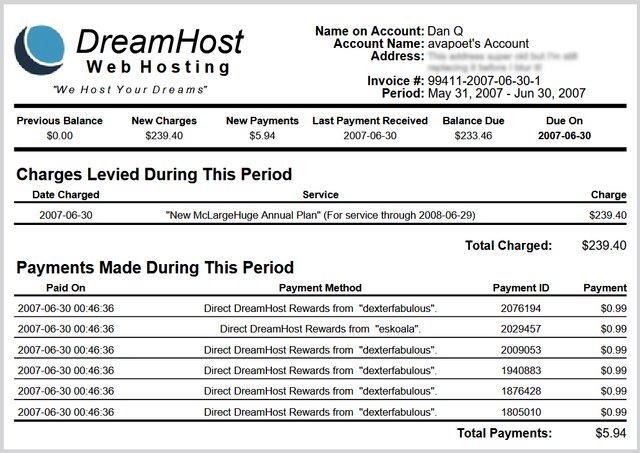
About twenty years ago, after a a tumultuouslife, Big.McLargeHuge – the shared server of several other Abnibbers and I – finally and fatally kicked the bucket. I spun up its replacement, New.McLargeHuge, on hosting company DreamHost, and this blog (and many other sites) moved over to it1.
Wow, I’d forgotten half of these websites existed.
I only stayed with DreamHost for a few years before switching to Bytemark, with whom I was a loyal customer right up until a few years
ago2, but in that time I took advantage of DreamHost’s “Refer & Earn” program, which
allowed me to create referral codes that, if redeemed by others who went on to become paying customers, would siphon off a fraction of the profits as a “kickback” against my server
bills. Neat!3
DreamHost’s referrals had a certain “pyramid scheme” feel in that you could get credit for the people referred by the people you referred.
A year or so after I switched to ByteMark, DreamHost decided I owed them money: probably because of a
“quirk” in their systems. I disagreed with their analysis, so I ignored their request. They “suspended” my account (which I wasn’t using anyway), and that was the end of it.
Right?
But the referral fees continued to trickle in. For the last seventeen years, I’ve received a monthly email advising me that my account had been credited, off the back of a
referral.
I have no explanation as to why the amount of the referral reward fluctuates, but I can only assume that it’s the result of different people on different payment schedules?
About once a year I log in and check the balance. I was quite excited to discover that, at current rates, they’d consider me “paid-up” for my (alleged) debt by around Spring 2026!
I had this whole plan that I’d write a blog post about it when the time came. It could’ve been funny!
But it’s not to be: DreamHost emailed me last night to tell me that they’re killing their “Refer & Earn” program; replacing it with something different-but-incompatible (social media’s
already having a grumble about this, I gather).
So I guess this is the only blog post you’ll get about “that time DreamHost decided I owed them money and I opted to pay them back in my referral fees over the course of eighteen
years”.
No big loss.
Footnotes
1 At about the same time I moved Three
Rings over from its previous host, Easily, to DreamHost too, in order to minimise the number of systems I had to keep an eye on. Oh, how different things are now, when I’ve
got servers and domain registrations and DNS providers all over the damn place!
2 Bytemark have rapidly gone downhill since their acquisition by Iomart a while back, IMHO.
3 Nowadays, this blog (and several of my other projects) is hosted by Linode, whose acquisition by Akamai seems not to have caused any problems with, so that’s fab.
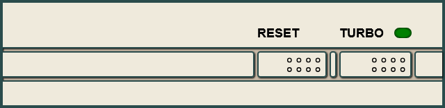
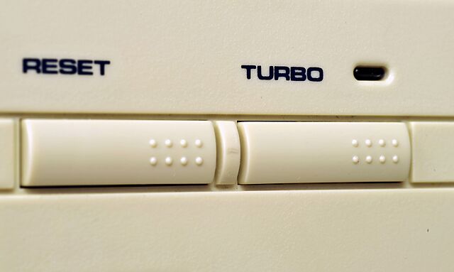
Back before PCs were black, they were beige. And even further back, they’d have not only “Reset” and “Power” buttons, but also a “Turbo” button.
I’m not here to tell you what it did1. No, I’m here to show you how to re-live
those glory days with a Turbo button of your very own, implemented as a reusable Web Component that you can install on your very own website:
Go on, press the Turbo button and see what happens.
(Don’t press the Reset button; other people are using this website!)
If you’d like some beige buttons of your own, you can get them at Beige-Buttons.DanQ.dev. Two lines of code and you can
pop them on any website you like. Also, it’s open-source under the Unlicense so you can take it, break it, or do what you like with it.
I’ve been slumming it in some Web Revivalist circles lately, and it might show. Best Resolution (with all its 88×31s2),
which I launched last month, for example.
You might anticipate seeing more retro fun-and-weird going on here. You might be right.
2 I guess that’s another “if you know, you know”, but at least you’ll get fewer
conflicting answers if you search for an explanation than you will if you try to understand the turbo button.
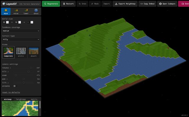
It’s not often these days that I have the experience of “I didn’t know the Web could do that‽”
Once was when I saw DHTML Lemmings, for example, at a time when adding JavaScript to a page usually
meant you were doing nothing more-sophisticated than adding a tooltip/popover or switching the images in your mystery
meat navigation menu. Another was when I saw Google Earth’s browser-based implementation for the first time, performing 3D manipulations of a quality that I’d
previously only seen in dedicated applications.
But I got that today when I played with Layoutit! Terra (from the folks behind one of the better CSS grid layout generators). It’d be
pretty cool if it were “just” a Transport Tycoon-like landscape generator and editor, but the thing that blew my mind was discovered that it’s implemented entirely in HTML and CSS… not
a line of JavaScript to be seen. Even speaking as somebody who played… and then reverse-engineered… things like Blackle Mori’s CSS Puzzle
Box, I can’t even begin to fathom how I’d begin to conceive of such a thing, let alone implement it.
Way back in the day, websites sometimes had banners or buttons (often 88×31 pixels, for complicated historical reasons) to indicate what screen
resolution would be the optimal way to view the site. Just occasionally, you still see these today.
Folks who were ahead of the curve on what we’d now call “responsive design” would sometimes proudly show off that you could use any resolution, in the same way as they’d
proudly state that you could use any browser1!
I saw a “best viewed at any size” 88×31 button recently, and it got me thinking: could we have a dynamic button that always
shows the user’s current resolution as the “best” resolution. So it’s like a “best viewed at any size” button… except even more because it says “whatever
resolution you’re at… that’s perfect; nice one!”
Anyway, I’ve made a website: best-resolution.danq.dev. If you want a “Looks best at [whatever my visitor’s screen
resolution is]” button, you can get one there.
1 I was usually in the camp that felt that you ought to be able to access my site with any
browser, at any resolution and colour depth, and get an acceptable and satisfactory experience. I guess I still am.
2 If you’re reading this via RSS or have JavaScript disabled then you’ll probably see an
“any size” button, but if you view it on the original page with JavaScript enabled then you should see your current browser inner width and height shown on the button.
This post advocates minimizing dependencies in web pages that you do not directly control. It conflates dependencies during build time and dependencies in the browser. I maintain
that they are essentially the same thing, that both have the same potential problems, and that the solution is the snappy new acronym HtDTY – Host the Damn Thing Yourself.
…
If your resources are large enough to cause a problem if you Host the Damn Things Yourself then consider finding ways to cut back on their size. Or follow my related advice –
HtDToaSYHaBRW IMCYMbT(P)WDWYD : Host the Damn Thing on a Service You Have A Business Relationship With, It May Cost You Money But They (Probably) Won’t Dick With Your Data.
…
Host the Damn Thing Yourself (HtDTY) is an excellent suggestion; I’ve been a huge fan of the philosophy for ages, but I like this acronym. (I wish it was pronounceable, but you can’t
have everything.)
Andrew’s absolutely right, but I’m not even sure he’s expressed all the ways in which he’s right. Here are my reasons to HtDTY, especially for frontend resources:
Security: As Andrew observes, you can’t protect against supply chain attacks if your supply chain wide open to exploitation. And I’m glad that he points out that
version pinning doesn’t protect you from this (although subsource integrity can).
Privacy: Similarly, Andrew nailed this one. If you host your fonts on Google Fonts, for example, you’re telling one of the biggest data-harvesting companies on the
Internet who’s accessing your website. Don’t do that (in that specific example, google-webfonts-helper is your friend).
Performance: Andrew rightly deconstructs the outdated argument that CDN caching improves your site’s performance. Edge caching might, in some
circumstances, but still has the problems listed above. But this argument can go further than Andrew’s observation that CDNs aren’t that much of a benefit… because sticking to just
one domain name means (a) fewer DNS lookups, (b) fewer TLS handshakes, (c) better compression, if e.g. your JavaScript assets are bundled or at least delivered in the same pipeline,
and (d) all the benefits of HTTP/2 and HTTP/3, like early hints, pipelining, etc. Nowadays, it can often be faster to not-use a CDN (depending on lots of factors), in
addition to all the above benefits.
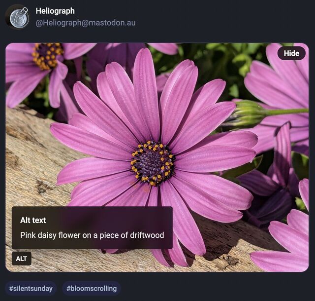
Mastodon shows an “Alt” button in the bottom right of images that have associated alt text. This button, when clicked, shows the alt text the author has written for the image.
…
After using this button a few times, I realised how much I appreciated reading the alt text for an image. Reading the alt text helped me better understand an image. In some cases, I
saw posts where the alt text contained context about an image I otherwise would not have had (i.e. the specific name of the game from which a screenshot was taken).
…
Like James, I’ve also long enjoy Mastodon’s tools to help explore alt-text more-easily, but until I saw this blog post of his I’d never have considered porting such functionality to my
own sites.
He’s come up with an implementation, described in his post, that works pretty well. I find myself wondering if a <details>/<summary> UI metaphor
might be more appropriate than a visually-hidden checkbox. Where CSS is disabled or fails, James’ approach displays a checkbox, the word “ALT”, and the entire alt text, which is
visually confusing and will result in double-reading by screen readers.
A <details>/<summary> approach would be closer to
semantically-valid (though perhaps I’m at risk of making them a golden hammer?), and would degrade more gracefully
into situations in which CSS wasn’t available.
Still, a wonderful example of what can be done and something I might look at replicating during my next bout of blog redesigning!
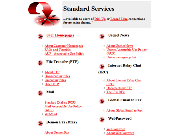
Do you remember when your domestic ISP – Internet Service Provider – used to be an Internet Services Provider? They
were only sometimes actually called that, but what I mean is: when ISPs provided more than one Internet service? Not just connectivity, but… more.
One of the first ISPs I subscribed to had a “standard services” list longer than most modern ISPs complete services list!
ISPs twenty years ago
It used to just be expected that your ISP would provide you with not only an Internet connection, but also some or all of:
I don’t remember which of my early ISPs gave me a free license for HoTMetaL Pro, but I was very appreciative of it at the time.
ISPs today
The ISP I hinted at above doesn’t exist any more, after being bought out and bought out and bought out by a series of owners. But I checked the Website of the current owner to see what
their “standard services” are, and discovered that they are:
Optional 4G backup connectivity (for an extra fee)
A voucher for 3 months access to a streaming service3
The connection is faster, which is something, but we’re still talking about the “baseline” for home Internet access then-versus-now. Which feels a bit galling, considering that (a)
you’re clearly, objectively, getting fewer services, and (b) you’re paying more for them – a cheap basic home Internet subscription today, after accounting
for inflation, seems to cost about 25% more than it did in 2000.4
Are we getting a bum deal?
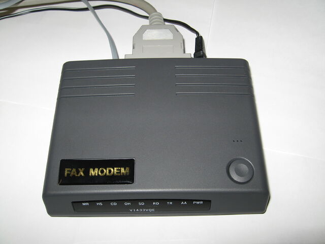
Not every BBS nor ISP would ever come to support the blazing speeds of a 33.6kbps modem… but when you heard the distinctive scream of its negotiation at close to the Shannon Limit of
the piece of copper dangling outside your house… it felt like you were living in the future.
Would you even want those services?
Some of them were great conveniences at the time, but perhaps not-so-much now: a caching server, FTP site, or IRC node in the building right at the end of my
dial-up connection? That’s a speed boost that was welcome over a slow connection to an unencrypted service, but is redundant and ineffectual today. And if you’re still using a
fax-to-email service for any purpose, then I think you have bigger problems than your ISP’s feature list!
Some of them were things I wouldn’t have recommend that you depend on, even then: tying your email and Web hosting to your connectivity provider traded
one set of problems for another. A particular joy of an email address, as opposed to a postal address (or, back in the day, a phone number), is that it isn’t tied to where
you live. You can move to a different town or even to a different country and still have the same email address, and that’s a great thing! But it’s not something you can
guarantee if your email address is tied to the company you dial-up to from the family computer at home. A similar issue applies to Web hosting, although for a true traditional “personal
home page”: a little information about yourself, and your bookmarks, it would be fine.
But some of them were things that were actually useful and I miss: honestly, it’s a pain to have to use a third-party service for newsgroup
access, which used to be so-commonplace that you’d turn your nose up at an ISP that didn’t offer it as standard. A static IP being non-standard on fixed connections is a sad reminder
that the ‘net continues to become less-participatory, more-centralised, and just generally more watered-down and shit: instead of your connection making you “part of” the Internet,
nowadays it lets you “connect to” the Internet, which is a very different experience.5
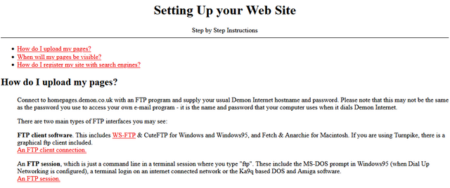
A page like this used to be absolutely standard on the Website6
of any ISP worth its salt.
Yeah, sure, you can set up a static site (unencumbered by any opinionated stack) for free on Github Pages, Neocities, or wherever, but the barrier to entry has been raised
by just enough that, doubtless, there are literally millions of people who would have taken that first step… but didn’t.
And that makes me sad.
Footnotes
1 ISP-provided shared FTP servers would also frequently provide locally-available copies
of Internet software essentials for a variety of platforms. This wasn’t just a time-saver – downloading Netscape Navigator from your ISP rather than from half-way across the world was
much faster! – it was also a way to discover new software, curated by people like you: a smidgen of the feel of a well-managed BBS, from the comfort of your local ISP!
2 ISP-provided routers are, in my experience, pretty crap 50% of the time… although
they’ve been improving over the last decade as consumers have started demanding that their WiFi works well, rather than just works.
3 These streaming services vouchers are probably just a loss-leader for the streaming
service, who know that you’ll likely renew at full price afterwards.
4 Okay, in 2000 you’d have also have had to pay per-minute for the price of the
dial-up call… but that money went to BT (or perhaps Mercury or KCOM), not to your ISP. But my point still stands: in a world where technology has in general gotten cheaper
and backhaul capacity has become underutilised, why has the basic domestic Internet connection gotten less feature-rich and more-expensive? And often with worse
customer service, to boot.
5 The problem of your connection not making you “part of” the Internet is multiplied if
you suffer behind carrier-grade NAT, of course. But it feels like if we actually cared enough to commit to rolling out IPv6 everywhere we could obviate the need for that particular
turd entirely. And yet… I’ll bet that the ISPs who currently use it will continue to do so, even as the offer IPv6 addresses as-standard, because they buy into their own idea that
it’s what their customers want.
6 I think we can all be glad that we no longer write “Web Site” as two separate words, but
you’ll note that I still usually correctly capitalise Web (it’s a proper noun: it’s the Web, innit!).
While working on something else entirely1,
I had a random thought:
Could the :checked and and :has pseudo-classes and the subsequent-sibling (~) selector be combined to perform interactive filtering
without JavaScript?
Turns out, yes. Have a play with the filters on the side of this. You can either use:
“OR” mode, so you can show e.g. “all mammals and carnivores”, or
“AND” mode, so you can show e.g. “all mammals that are carnivores”.
Filter the animals!
(if it doesn’t work right where you are, e.g. in a feed reader, you can view it “standalone”)
There’s nothing particularly complicated here, although a few of the selectors are a little verbose.
First, we set the initial state of each animal. In “OR” mode, they’re hidden, because each selected checkbox is additive. In “AND” mode, they’re shown, because checking a checkbox can
only ever remove an animal from the result set:
The magic of the :has pseudo-class is that it doesn’t change the scope, which means that after checking whether “AND” or “OR” is checked within the #filters,
the #animals container is still an adjacent element.
Next time you’re implementing a filter interface, like this restaurant menu, perhaps ask whether you actually need JavaScript.
Then all we need to do is to use daisy-chain :has to show animals with a particular class if that class is checked in “OR” mode, or to hide animals that don’t have a
particular class in “AND” mode. Here’s what that looks like:
It could probably enjoy an animation effect to make it clearer when items are added and removed2, but that’s a consideration
for another day.
Many developers would be tempted to use JavaScript to implement the client-side version of a filter like this. And in some cases, that might be the right option.
But it’s always worth remembering that:
A CSS solution is almost-always more-performant than a JS one.
A JS solution is usually less-resilient than a CSS one: a CDN failure, unsupported API, troublesome content-blocker or syntax error will typically have a much larger
impact on JavaScript.
For the absolutely maximum compatibility, consider what you can do in plain HTML, or on the server-side, and treat anything on the client-side as progressive
enhancement.
Footnotes
1 The thing I was actually working on when I got distracted was an OAuth provider
implementation for Three Rings, connected with work that took place at this weekend’s hackathon to
(eventually) bring single-sign-on “across” Three Rings CIC’s products. Eventually being the operative word.
2 Such an animation should, of course, be wrapped in a @media
(prefers-reduced-motion: no-preference) media query!
The video below is presented in portrait orientation, because your screen is taller than it is wide.
The video below is presented in landscape orientation, because your screen is wider than it is tall.
The video below is presented in square orientation (the Secret Bonus Square Video!), because your screen has approximately the same width as as its height. Cool!
This is possible (with a single <video> element, and without any Javascript!) thanks to some cool HTML features you might not be aware of, which I’ll briefly explain
in the video. Or scroll down for the full details.
<videocontrols><sourcesrc="squareish.mp4"media="(min-aspect-ratio: 0.95) and (max-aspect-ratio: 1.05)"/><sourcesrc="portrait.mp4"media="(orientation: portrait)"/><sourcesrc="landscape.mp4"/></video>
This code creates a video with three sources: squareish.mp4 which is shown to people on “squareish” viewports, failing that portrait.mp4 which is shown to
people whose viewports are taller than wide, and failing that landscape.mp4 which is shown to anybody else.
That’s broadly-speaking how the video above is rendered. No JavaScript needed.
Browsers only handle media queries on videos when they initially load, so you can’t just tip your phone over or resize the window: you’ll need to reload the page, too. But it works!
Give it a go: take a look at the video in both portrait and landscape modes and let me know what you think1.
Adding adaptive bitrate streaming with HLS
Here’s another cool technology that you might not have realised you could “just use”: adaptive bitrate streaming with HLS!
You’ve used adaptive bitrate streaming before, though you might not have noticed it. It’s what YouTube, Netflix, etc. are doing when your network connection degrades and you quickly get
dropped-down, mid-video, to a lower-resolution version2.
Turns out you can do it on your own static hosting, no problem at all. I used this guide (which has a great
description of the parameters used) to help me:
This command splits the H.264 video landscape.mp4 into three different resolutions: the original “v1” (1920×1080, in my case, with 96kbit audio), “v2” (1280×720, with
96kbit audio), and “v3” (640×360, with 48kbit audio), each with a resolution-appropriate maximum bitrate, and forced keyframes every 48th frame. Then it breaks each of those into HLS
segments (.ts files) and references them from a .m3u8 playlist.
The output from this includes:
Master playlist landscape.m3u8, which references the other playlists with reference to their resolution and bandwidth, so that browsers can make smart choices,
Playlists landscape_0.m3u8 (“v1”), landscape_1.m3u8 (“v2”), etc., each of which references the “parts” of that video,
Directories landscape_0/, landscape_1/ etc., each of which contain
data00.ts, data01.ts, etc.: the actual “chunks” that contain the video segments, which can be downloaded independently by the browser as-needed
Bringing it all together
We can bring all of that together, then, to produce a variable-aspect, adaptive bitrate, HLS-streamed video player… in pure HTML and suitable for static hosting:
<videocontrols><sourcesrc="squareish.m3u8"type="application/x-mpegURL"media="(min-aspect-ratio: 0.95) and (max-aspect-ratio: 1.05)"/><sourcesrc="portrait.m3u8"type="application/x-mpegURL"media="(orientation: portrait)"/><sourcesrc="landscape.m3u8"type="application/x-mpegURL"/></video>
You could, I suppose, add alternate types, poster images, and all kinds of other fancy stuff, but this’ll do for now.
One solution is to also provide the standard .mp4 files as an alternate <source>, and that’s fine I guess, but you lose the benefit of HLS (and
you have to store yet more files). But there’s a workaround:
Polyfill full functionality for all browsers
If you’re willing to use a JavaScript polyfill, you can make the code above work on virtually any device. I gave this a go, here, by:
Adding some JavaScript code that detects affected `<video>` elements and applying the fix if necessary:
// Find all <video>s which have HLS sources:for( hlsVideo of document.querySelectorAll('video:has(source[type="application/x-mpegurl"]), video:has(source[type="vnd.apple.mpegurl"])') ) {
// If the browser has native support, do nothing:if( hlsVideo.canPlayType('application/x-mpegurl') || hlsVideo.canPlayType('application/vnd.apple.mpegurl') ) continue;
// If hls.js can't help fix that, do nothing:if ( ! Hls.isSupported() ) continue;
// Find the best source based on which is the first one to match any applicable CSS media queriesconst bestSource =Array.from(hlsVideo.querySelectorAll('source')).find(source=>window.matchMedia(source.media).matches)
// Use hls.js to attach the best source:const hls =new Hls();
hls.loadSource(bestSource.src);
hls.attachMedia(hlsVideo);
}
It makes me feel a little dirty to make a <video>depend on JavaScript, but if that’s the route you want to go down while we wait for HLS support to become
more widespread (rather than adding different-typed sources) then that’s fine, I guess.
This was a fun dive into some technologies I’ve not had the chance to try before. A fringe benefit of being a generalist full-stack developer is that when you’re “between jobs”
you get to play with all the cool things when you’re brushing up your skills before your next big challenge!
(Incidentally: if you think you might be looking to employ somebody like me, my CV is over there!)
Footnotes
1 There definitely isn’t a super-secret “square” video on this page, though. No
siree. (Shh.)
2 You can tell when you get dropped to a lower-resolution version of a video because
suddenly everybody looks like they’re a refugee from Legoland.


![Stylish (for circa 2000) webpage for HoTMetaL Pro 6.0, advertising its 'unrivaled [sic] editing, site management and publishing tools'.](https://bcdn.danq.me/_q23u/2025/08/hotmetal-pro-6-640x396.jpg)
 Alpaca
 Anteater
 Bat
Bat
 Beetle
 Butterfly
 Camel
Camel
 Cat
Cat
 Chameleon
 Cobra
Cobra
 Cow
Cow
 Crab
Crab
 Crocodile
 Dog
Dog
 Duck
Duck
 Elephant
 Elk
Elk
 Fish
Fish
 Frog
Frog
 Giraffe
 Hippo
Hippo
 Husky
Husky
 Kangaroo
 Lion
Lion
 Macaw
Macaw
 Manatee
 Monkey
 Mouse
Mouse
 Octopus
 Ostrich
 Owl
Owl
 Panda
Panda
 Pelican
 Penguin
 Pig
Pig
 Rabbit
 Raccoon
 Ray
Ray
 Rhino
Rhino
 Rooster
 Shark
Shark
 Sheep
Sheep
 Sloth
Sloth
 Snake
Snake
 Spider
 Squirrel
 Swan
Swan
 Tiger
Tiger
 Toucan
 Turtle
 Whale
Whale
