Using the Web for Exhibition Interactives

As part of the preparing to leave the Bodleian I’ve been revisiting a lot of the documentation I’ve written over the last eight years. It occurred to me that I’ve never written publicly about how the Bodleian’s digital signage/interactives actually work; there are possible lessons to learn.

The Bodleian‘s digital signage is perhaps more-diverse, both in terms of technology and audience, than that of most organisations. We’ve got signs in areas that are exclusively reader-facing to help students and academics find what they’re looking for, signs in publicly accessible rooms that advertise and educate, and signs in gallery spaces upon which we try to present engaging and often-interactive content to support exhibitions.

Test digital signage screen showing My Little Pony: Friendship is Magic
Getting an extra touchscreen for the office for prototyping/user testing purposes was great, even when it wasn’t showing MLP: FiM.

Throughout those three spheres, we’ve routinely delivered a diversity of content (let’s just ignore the countdown clock, for now…). Traditional directional signage, advertisements, games, digital exhibitions, interpretation, feedback surveys…

In the vast majority of cases – and this is where the Bodleian’s been unusual (though certainly not unique) among cultural sector institutions – we’ve created those in-house rather than outsourcing them.

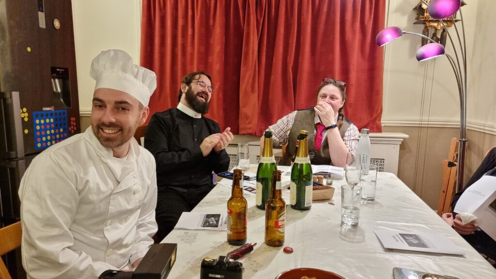
Dan sings into a screwdriver handle alongside three touchscreens.
Using off-the-shelf technology also allows the Bodleian to in-house much of their hardware maintenance, as a secondary part of other job roles. Singing into your screwdriver remains optional, though.

To do this economically – the volume of work on interactive signage is inconsistent throughout the year – we needed to align the skills required with skills used elsewhere in the organisation. To do this, we use the web as our medium! Collectively, the Bodleian’s Digital Communications team already had at least some experience in programming, web design, graphic design, research, user testing, copyediting etc.: the essential toolkit for web application development.

Pong on the Heritage Window (video wall) and a Tolkien-themed quiz on an i-Board (upright touchscreen)
Whether you were playing Pong on the video wall at the back or testing your Middle-earth knowledge on the touchscreen at the front… behind the scenes you were interacting with a web page I wrote.

By shifting our digital signage platform to lean heavily on web technologies, we were able to leverage talented people we already had to produce things that we might otherwise have had to outsource. This, in turn, meant that more exhibitions and displays get digital enhancement, on a shorter turnaround.

It also means that there’s a tighter integration between exhibition content and content for web and social media: it’s easier for us to re-use content across multiple platforms. Sometimes we’ve even made our digital interactives, or adapted version of them, available directly online, allowing our exhibitions to reach people that can’t get to our physical spaces at all.

Kiosk interface for an Ada Lovelace display in 2015.
Because we’re able to produce our own content on-demand, even our smaller, shorter-duration displays can have hands-on digital interactives associated with them.

On to the technology! We’re using a real mixture of tech: when it’s donated or reclaimed from previous projects (and when the bidding and acquisition processes are, well… as you’d expect at the University of Oxford), you learn not to say no to freebies. Our fleet includes:

  • Samsung Android tablets with freestanding kiosk frames. We run the excellent-value Kiosk Browser Lockdown app on these, which loads on boot and prevents access to anything but a specified website.
  • Onelan NTBs connected to a mixture of touch and non-touch screens, wall-mounted or in kiosk frames. We use Onelan’s standard digital signage features as well as – for interactive content – their built-in touch-capable web browser.
  • Dell PCs of the standard variety supplied by University IT services, connected to wall-mounted touch screens, running Google Chrome in Kiosk Mode. More on this below.
Chrome Dev Tools showing the Sheldonian Bust "Thinking 3D" exhibit
The browsers’ responsive simulators are invaluable when we’re targeting signage at five (!) different resolutions.

When you’re developing content for a very small number of browsers and a limited set of screen sizes, you quickly learn to throw a lot of “best practice” web development out of the window. You’ll never come across a text browser or screen reader, so alt-text doesn’t matter. You’ll never have to rescale responsively, so you might as well absolutely-position almost everything. The devices are all your own, so you never need to ask permission to store cookies. And because you control the platform, you can get away with making configuration tweaks to e.g. allow autoplaying videos with audio. Coming from a conventional web developer background to producing digital signage content makes feels incredibly lazy.

Shakespeare's Dead
Helping your users see your interactive as “app-like” rather than “web-like” encourages them to feel comfortable engaging with it in ways uncharacteristic of web pages. In our Shakespeare’s Dead interactive, for example, we started the experience in the middle of a long horizontally-scrolling “page”, which might feel very unusual in a conventional browser.

This is the “techy bit”. Skip it?

Using Chrome to run digital signage requires, in the Bodleian’s case, a couple of configuration tweaks and the right command-line switches. We use:

  • chrome://flags/#overscroll-history-navigation – disabling this prevents users from triggering “back”/”forward” by swiping with two fingers
  • chrome://flags/#pull-to-refresh – disabling this prevents the user from triggering a “refresh” by scrolling up beyond the top of the page (this only happens on some kinds of devices)
  • chrome://flags/#system-keyboard-lock – we don’t use attached keyboards, but if you do, you might want to set this flag so you can use the keyboard.lock() API to intercept e.g. ALT+F4 so users can’t escape the application
  • running on startup with e.g. chrome --kiosk --noerrdialogs --allow-file-access-from-files --disable-touch-drag-drop --incognito https://example.com/some/url
    • Kisok mode makes the browser run fullscreen and prevents e.g. opening additional tabs, giving an instant “app-like” experience. As we don’t have keyboards attached to our digital signage, this also prevents visitors from closing Chrome.
    • Turning off error dialogs reduces the risk that an error will result in an unslightly message to the user.
    • Enabling “file access from files” allows content hosted at file:// addresses to access content at other file:// addresses, which makes it possible to write “offline” sites (sometimes useful where we’re serving large videos or on previous occasions when WiFi has been shaky) that can still take advantage of features like the Fetch API.
    • Unless you need drag-and-drop, it’s simpler to disable it; this prevents a user long-press-and-dragging an image around the screen.
    • Incognito mode ensures that the browser doesn’t remember what site was showing last time it ran; our computers often end up switched off at the wall at the end of the day, and without this the browser will offer to load the site it had open last time, when it runs.
    • We usually host our interactives directly on the web, at “secret” addresses, and this is generally preferable to us as we can more-easily make on-the-fly adjustments to content (plus it makes it easier to hook up analytic tools).

"Talking Maps" exhibition panel showing bioproductivity map.
Be sure to test the capabilities of your hardware! Our Onelan NTBs, unlike your desktop PCs, can’t handle multitouch input, which affects the design of our user interfaces for these devices.

Meanwhile, in the application’s CSS code, we set * { user-select: none; } to prevent the user from highlighting text by selecting it with their finger. We also make heavy use of absolutely-sized/positioned, overflow: hidden blocks to ensure that scrollbars never appear, and CSS animations to make content feel dynamic and to draw attention to particular elements.

Annabel explores the Talking Maps digital interactives.
There’s no substitute for good testing. And there’s no stress-testing quite like letting a 5 year-old loose on your work.

Altogether, this approach gives the Bodleian the capability to produce engaging interactive content at low cost and using the existing skills of their digital and exhibitions teams. It’s not an approach that would work for every cultural institution: in particular, some of the Bodleian’s sister institutions already outsource the technical parts of their web work, and so don’t have the expertise in-house to share with a web-powered digital signage solution.

Shadows Out Of Time on a touchscreen
A few minor CSS tweaks to make the buttons finger-friendly and our Halloween game Shadows Out Of Time, which I’d already made web-friendly, was touchscreen-ready too. I wonder if they’ll get this one out again, this Halloween?

But for those museums that can fit into this model – or can adapt to do so in future – using the web to produce interactive digital content and digital signage is a highly cost-effective way to engage with visitors, even (or especially!) when dealing with short-lived and/or rotating displays.

It’s also been among my favourite parts of my job at the Bod these last 8½ years, and I’m sure I’ll miss it!

× × × × × × × × ×

Which Face is Real?

This is a repost promoting content originally published elsewhere. See more things Dan's reposted.

But while we’ve learned to distrust user names and text more generally, pictures are different. You can’t synthesize a picture out of nothing, we assume; a picture had to be of someone. Sure a scammer could appropriate someone else’s picture, but doing so is a risky strategy in a world with google reverse search and so forth. So we tend to trust pictures. A business profile with a picture obviously belongs to someone. A match on a dating site may turn out to be 10 pounds heavier or 10 years older than when a picture was taken, but if there’s a picture, the person obviously exists.

No longer. New adverserial machine learning algorithms allow people to rapidly generate synthetic ‘photographs’ of people who have never existed. Already faces of this sort are being used in espionage.

Computers are good, but your visual processing systems are even better. If you know what to look for, you can spot these fakes at a single glance — at least for the time being. The hardware and software used to generate them will continue to improve, and it may be only a few years until humans fall behind in the arms race between forgery and detection.

Our aim is to make you aware of the ease with which digital identities can be faked, and to help you spot these fakes at a single glance.

I was at a conference last month where research was presented which concluded pretty solidly that the mechanisms used to make “deepfakes” meant that it was probably impossible to create artificial intelligence that can learn to distinguish between real and fake pictures of humans. Simply put, this is because the way we make such images is with generative adversarial networks, an AI technique which thrives upon having an effective discriminator component, and any research into differentiating between real and fake images feeds the capability of the next generation of discriminators!

Instead, then, the best medium-term defence against deepfakes is training humans to be able to identify them, and that’s what this website aims to do. I was pleased that I did very well on my first attempt (I sort-of knew what to look for already, based on a basic understanding of the underlying technologies) but I was also pleased that I was able to learn to do better with the aid of the authors’ tips. Nice.

Bus Station, Unbound

This is a repost promoting content originally published elsewhere. See more things Dan's reposted.

Back in February my friend Katie shared with me an already four-year-old piece of interactive fiction, Bus Station: Unbound, that I’d somehow managed to miss the first time around. In the five months since then I’ve periodically revisited and played through it and finally gotten around to writing a review:

All of the haunting majesty of its subject, and a must-read-thrice plot

Perhaps it helps to be as intimately familiar with Preston Bus Station – in many ways, the subject of the piece – as the protagonist. This work lovingly and faithfully depicts the space and the architecture in a way that’s hauntingly familiar to anybody who knows it personally: right down to the shape of the rubberised tiles near the phone booths, the forbidding shadows of the underpass, and the buildings that can be surveyed from its roof.

But even without such a deep recognition of the space… which, ultimately, soon comes to diverge from reality and take on a different – darker, otherworldly – feel… there’s a magic to the writing of this story. The reader is teased with just enough backstory to provide a compelling narrative without breaking the first-person illusion. No matter how many times you play (and I’ve played quite a few!), you’ll be left with a hole of unanswered questions, and you’ll need to be comfortable with that to get the most out of the story, but that in itself is an important part of the adventure. This is a story of a young person who doesn’t – who can’t – know everything that they need to bring them comfort in the (literally and figuratively) cold and disquieting world that surrounds them, and it’s a world that’s presented with a touching and tragic beauty.

Through multiple playthroughs – or rewinds, which it took me a while to notice were an option! – you’ll find yourself teased with more and more of the story. There are a few frankly-unfair moments where an unsatisfactory ending comes with little or no warning, and a handful of places where it feels like your choices are insignificant to the story, but these are few and far between. Altogether this is among the better pieces of hypertext fiction I’ve enjoyed, and I’d recommend that you give it a try (even if you don’t share the love-hate relationship with Preston Bus Station that is so common among those who spent much of their youth sitting in it).

It’s no secret that I spent a significant proportion of my youth waiting for or changing buses at (the remarkable) Preston Bus Station, and that doubtless biases my enjoyment of this game by tingeing it with nostalgia. But I maintain that it’s a well-written piece of hypertext interactive fiction with a rich, developed world. You can play it starting from here, and you should. It looks like the story’s accompanying images died somewhere along the way, but you can flick through them all here and get a feel for the shadowy, brutalist, imposing place.

How a video game community filled my nephew’s final days with joy

This is a repost promoting content originally published elsewhere. See more things Dan's reposted.

Michael Holyland was elated by the empathy, kindness and creativity of the team behind his favourite video game Elite Dangerous. Photograph: Mathew James Westhorpe

My nephew, Michael, died on 22 May 2019. He was 15 years old.

He loved his family, tractors, lorries, tanks, spaceships and video games (mostly about tractors, lorries, tanks and spaceships), and confronted every challenge in his short, difficult life with a resolute will that earned him much love and respect. Online in his favourite game, Elite Dangerous by Frontier Developments, he was known as CMDR Michael Holyland.

In Michael’s last week of life, thanks to the Elite Dangerous player community, a whole network of new friends sprang up in our darkest hour and made things more bearable with a magnificent display of empathy, kindness and creativity. I know it was Michael’s wish to celebrate the generosity he was shown, so I’ve written this account of how Frontier and friends made the intolerable last days of a 15-year-old boy infinitely better.

I’m not crying, you’re crying.

A beautiful article which, despite its tragedy, does an excellent job of showcasing how video gaming communities can transcend barriers of distance, age, and ability and bring joy to the world. I wish that all gaming communities could be this open-minded and caring, and that they could do so more of the time.

Metropoloid: A Metropolis Remix

This is a repost promoting content originally published elsewhere. See more things Dan's reposted.

Yaz writes, by way of partial explanation:

You could fit almost the entire history of videogames into the time span covered by the silent film era, yet we consider it a mature medium, rather than one just breaking out of its infancy. Like silent movies, classic games are often incomplete, damaged, or technically limited, but have a beauty all their own. In this spirit, indie game developer Joe Blair and I built Metropoloid, a remix of Fritz Lang’s Metropolis which replaces its famously lost score with that of its contemporaries from the early days of games.

I’ve watched Metropolis a number of times over the decades, in a variety of the stages of its recovery, and I love it. I’ve watched it with a pre-recorded but believed-to-be-faithful soundtrack and I’ve watched it with several diolive accompaniment. But this is the first time I’ve watched it to the soundtrack of classic (and contemporary-retro) videogames: the Metroid, CastlevaniaZeldaMega Man and Final Fantasy series, Doom, Kirby, F-Zero and more. If you’ve got a couple of hours to spare and a love of classic film and classic videogames, then you’re in the slim minority that will get the most out of this fabulous labour of love (which, at the time of my writing, has enjoyed only a few hundred views and a mere 26 “thumbs up”: it certainly deserves a wider audience!).

Killed by Google – The Google Graveyard & Cemetery

This is a repost promoting content originally published elsewhere. See more things Dan's reposted.

Fusion Tables… Fabric… Inbox… Google+… goo.gl… Goggles… Site Search… Glass… Now… Code… Bump!… Gears… Desktop Search…

Just some of the projects and services that Google has offered and then killed; this site aims to catalogue them all. Some, like Wave, were given to the community (Wave lived on for a while as an Apache project but is now basically dead), but most, like Reader, were assassinated in a misguided attempt to drive traffic to other services (ultimately, Reader was killed perhaps to try to get people onto Google+, which was then also killed).

Google can’t be trusted to maintain the services of theirs that you depend upon (relevant XKCD?). That’s not a phenomenon that’s unique to Google, of course: it’s perhaps just that they produce so many new and often-experimental services that they inevitably cease supporting more of them than some of the many other providers who’ve killed the silos that people depended upon.

How could things be better? For a start, Google could make a better commitment to open-source and developing standards rather than platforms. But if you don’t think you can trust them to do that – and you can’t – then the only solution for individuals is to use fewer Google products to break the Google-monoculture. Encourage the competition to weaken their position, and break free from silos in general where it’s possible to do so.

148+ projects and services dead. But hey, we’re getting Stadia so everything’s okay, right? <sigh>

Pac-Man: The Untold Story of How We Really Played The Game

This is a repost promoting content originally published elsewhere. See more things Dan's reposted.

Unrestored Pac-Man machine with worn paint in a specific place on the left-hand side.

Human beings leave physical impressions upon the things they love and use just as much as their do upon the lives of people and the planet they live upon. For every action, there’s a reaction. For every pressure, there’s an affect on mass and volume. And in the impressions left by that combination, particularly if you’re lucky enough to see the sides of a rare, unrestored  vintage Pac-Man cabinet, lies the never before told story of how we really played the game.

Until now, I don’t believe anyone has ever written about it.

Interesting exploration of the history of the cabinets housing Pac-Man, observing the ergonomic impact of the controls on the way that people would hold the side of the machine and, in turn, how that would affect where and how the paint would wear off.

I love that folks care about this stuff.

Pong

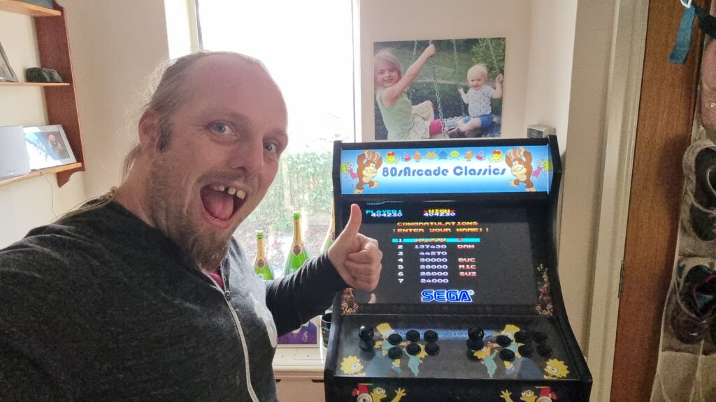
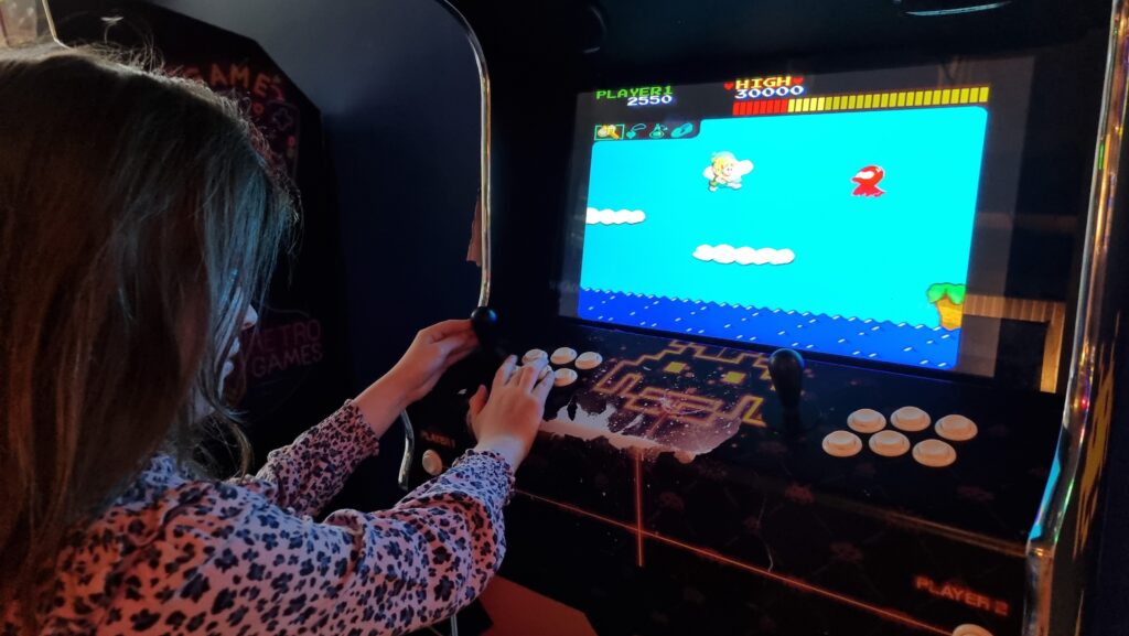
I’ve recently been reimplementing retro arcade classic Pong to show off during a celebration of World Digital Preservation Day 2018 yesterday at the Bodleian Libraries. Here’s how that went down.

Frak on the BBC Micro, amongst the rest of a pile of computing nostalgia
The Bodleian has a specific remit for digital archiving… but sometimes they just like collecting stuff, too, I’m sure.

The team responsible for digital archiving had plans to spend World Digital Preservation Day running a stand in Blackwell Hall for some time before I got involved. They’d asked my department about using the Heritage Window – the Bodleian’s 15-screen video wall – to show a carousel of slides with relevant content over the course of the day. Or, they added, half-jokingly, “perhaps we could have Pong up there as it’ll be its 46th birthday?”

Parts of the Digital Archiving display table
Free reign to play about with the Heritage Window while smarter people talk to the public about digital archives? Sure, sign me up.

But I didn’t take it as a joke. I took it as a challenge.

Emulating Pong is pretty easy. Emulating Pong perfectly is pretty hard. Indeed, a lot of the challenge in the preservation of (especially digital) archives in general is in finding the best possible compromise in situations where perfect preservation is not possible. If these 8″ disks are degrading, is is acceptable to copy them onto a different medium? If this video file is unreadable in modern devices, is it acceptable to re-encode it in a contemporary format? These are the kinds of questions that digital preservation specialists have to ask themselves all the damn time.

Pong prototype with a SNES controller on my work PC
The JS Gamepad API lets your web browser talk to controller devices.

Emulating Pong in a way that would work on the Heritage Window but be true to the original raised all kinds of complications. (Original) Pong’s aspect ratio doesn’t fit nicely on a 16:9 widescreen, much less on a 27:80 ultrawide. Like most games of its era, the speed is tied to the clock rate of the processor. And of course, it should be controlled using a “dial”.

By the time I realised that there was no way that I could thoroughly replicate the experience of the original game, I decided to take a different track. Instead, I opted to reimplement Pong. A reimplementation could stay true to the idea of Pong but serve as a jumping-off point for discussion about how the experience of playing the game may be superficially “like Pong” but that this still wasn’t an example of digital preservation.

Two participants play Pong on the Heritage Window
Bip… boop… boop… bip… boop… bip…

Here’s the skinny:

  • A web page, displayed full-screen, contains both a <canvas> (for the game, sized appropriately for a 3 × 3 section of the video wall) and a <div> full of “slides” of static content to carousel alongside (filling a 2 × 3 section).
  • Javascript writes to the canvas, simulates the movement of the ball and paddles, and accepts input from the JS Gamepad API (which is awesome, by the way). If there’s only one player, a (tough! – only three people managed to beat it over the course of the day!) AI plays the other paddle.
  • A pair of SNES controllers adapted for use as USB controllers which I happened to own already.
My Javascript-powered web applications dominate the screens in Blackwell Hall.
Increasingly, the Bodleian’s spaces seem to be full of screens running Javascript applications I’ve written.

I felt that the day, event, and game were a success. A few dozen people played Pong and explored the other technology on display. Some got nostalgic about punch tape, huge floppy disks, and even mechanical calculators. Many more talked to the digital archives folks and I about the challenges and importance of digital archiving. And a good time was had by all.

I’ve open-sourced the entire thing with a super-permissive license so you can deploy it yourself (you know, on your ultrawide video wall) or adapt it as you see fit. Or if you’d just like to see it for yourself on your own computer, you can (but unless you’re using a 4K monitor you’ll probably need to use your browser’s mobile/responsive design simulator set to 3200 × 1080 to make it fit your screen). If you don’t have controllers attached, use W/S to control player 1 and the cursor keys for player 2 in a 2-player game.

Happy 46th birthday, Pong.

× × × × ×

Note #11906

Playing Pong at the @bodleianlibs for #WDPD2018 #dp0c.

SNES controller Pong on the Heritage Window

×

Note #11893

Some days my job… isn’t like other people’s jobs. Lately, I’ve been reimplementing Pong in Javascript for the @bodleianlibs’ video wall for an event on Thursday.

Forza Horizon 4 is really very British

This is a repost promoting content originally published elsewhere. See more things Dan's reposted.

Forza Horizon 4

There is a phenomenon of culture that I’m not convinced has a name. Living in the UK, the vast, vast majority of the media I consume is from the US. And nearly always has been. While television was more localised, all my life the films and games (and indeed an awful lot of the TV) I’ve watched and played has not only come from America, but been set there, or created by people whose perception of life is based there. And, while we may share a decent proportion of a common language, we really are very different countries and indeed continents. The result of this being, the media I watch that comes from the US is in many senses alien, to the point where a film set in an American high school might as well be set on a spaceship for all the familiarity it will have to my own lived experiences.

Which makes playing Forza Horizon 4 a really bloody weird thing. It’s… it’s British. Which is causing my double-takes to do double-takes.

I’m not usually a fan of driving games, but this review of Forza Horizon 4 on Rock Paper Shotgun makes me want to give it a try. It sounds like the designers have worked incredibly hard to make the game feel genuinely-British without falling back on tired old tropes.