Hey, let’s set up an account with Hive. After the security scares they faced in the mid-2010s, I’m sure they’ll be competent at
making a password form, right?
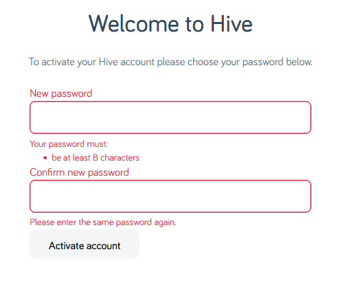 Your password must be at least 8 characters; okay.
Just 8 characters would be a little short in this day and age, I reckon, but what do I care: I’m going to make a long and random one with my password safe anyway. Here we go:
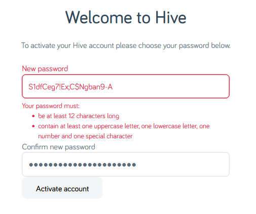 I’ve unmasked the password field so I can show you what I tried.
Obviously the password I eventually chose is unrelated to any of my screenshots.
I’ve unmasked the password field so I can show you what I tried.
Obviously the password I eventually chose is unrelated to any of my screenshots.
Now my password must be at least 12 characters long, not 8 as previously indicated. That’s still not a problem.
Oh, and must contain at least one of four different character classes: uppercase, lowercase, numbers, and special characters. But wait… my proposed password already does
contain all of those things!
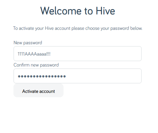 Let’s simplify.
The password 1111AAAAaaaa!!!! is valid… but S1dfCeg7!Ex;C$Ngban9-A is not. I guess my password is too
strong?
Composition rules are bullshit already. I’d already checked to make sure my surname didn’t appear in the password in case that was the problem (on a few occasions services have forbidden me from using the letter “Q” in random passwords
because they think that would make them easier to guess… wot?). So there must be something else amiss. Something that the error message is misleading about…
A normal person might just have used the shit password that Hive accepted, but I decided to dig deeper.
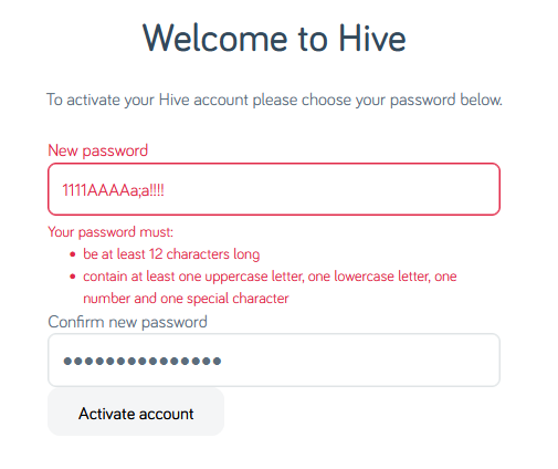 Using the previously-accepted password again but with a semicolon in it… fails. So clearly
the problem is that some special characters are forbidden. But we’re not being told which ones, or that that’s the problem. Which is exceptionally sucky user experience,
Hive.
Using the previously-accepted password again but with a semicolon in it… fails. So clearly
the problem is that some special characters are forbidden. But we’re not being told which ones, or that that’s the problem. Which is exceptionally sucky user experience,
Hive.
At this point it’s worth stressing that there’s absolutely no valid reason to limit what characters are used in a password. Sometimes well-meaning but ill-informed
developers will ban characters like <, >, ' and " out of a misplaced notion that this is a good way to protect against XSS and
injection attacks (it isn’t; I’ve written about this before…), but banning ; seems especially obtuse (and inadequately explaining that in
an error message is just painfully sloppy). These passwords are going to be hashed anyway (right… right!?) so there’s really no reason to block any character, but anyway…
I wondered what special characters are forbidden, and ran a quick experiment. It turns out… it’s a lot:
-
Characters Hive forbids use of in passwords include
- , . + = " £
^ # ' ( ) { } * | < >
: ` – also space
-
“Special” characters Hive they allow:
! @ $ % & ?
What the fuck, Hive. If you require that users add a “special” character to their password but there are only six special characters you’ll accept (and they don’t even include the most
common punctuation characters), then perhaps you should list them when asking people to choose a password!
Or, better yet, stop enforcing arbitrary and pointless restrictions on passwords. It’s not 1999 any more.
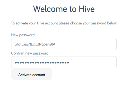 I eventually found a password that would be accepted. Again, it’s not the
one shown above, but it’s more than a little annoying that this approach – taking the diversity of punctuation added by my password safe’s generator and swapping them all for
exclamation marks – would have been enough to get past Hive’s misleading error message.
I eventually found a password that would be accepted. Again, it’s not the
one shown above, but it’s more than a little annoying that this approach – taking the diversity of punctuation added by my password safe’s generator and swapping them all for
exclamation marks – would have been enough to get past Hive’s misleading error message.
Having eventually found a password that worked and submitted it…
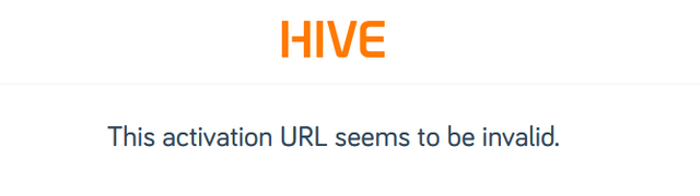
…it turns out I’d taken too long to do so, so I got treated to a different misleading error message. Clearly the problem was that the CSRF token had expired, but instead they told me
that the activation URL was invalid.
If I, a software engineer with a quarter of a century of experience and who understands what’s going wrong, struggle with setting a password on your site… I can’t begin to image the
kinds of tech support calls that you must be fielding.
Do better, Hive.