
Tag: user interface
-
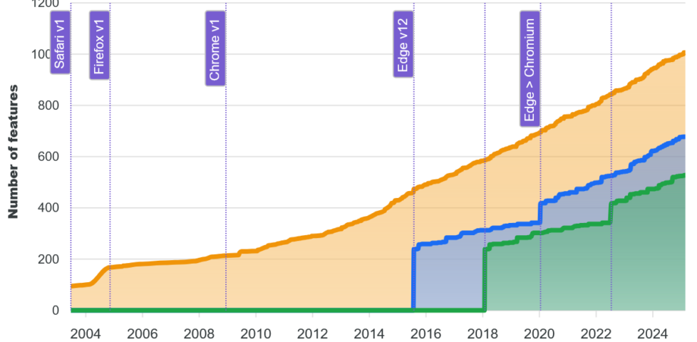
WebDX: Does More Mean Better?
I like the work that the WebDX Community Group have been doing, but I find myself asking: are we at risk of implying that giving the Web 'more' features invariably makes it 'better'?
-
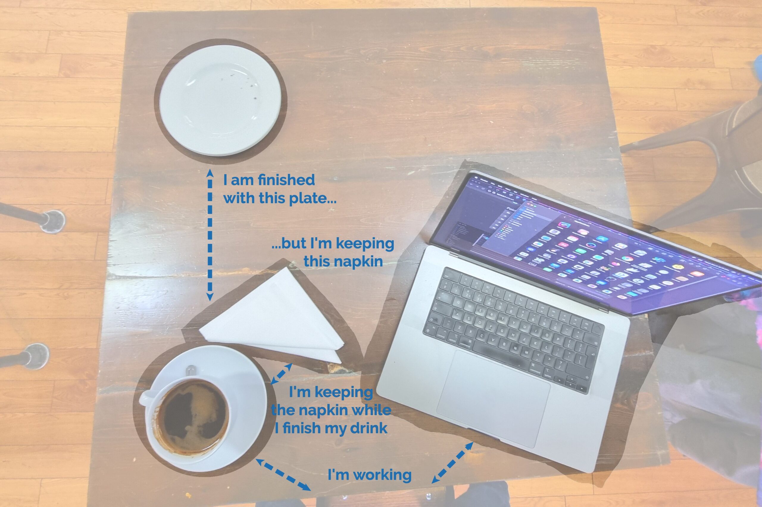
Possible future presentation concept: using a cafe/dining metaphor to help explain the proximity principle in user interface design (possibly with a "live waitstaffing" demo?).
Great idea? Or stupid idea?
Alt
Photo looking down on a square wooden table in a cafe environment. Far from the photographer, a plate containing a couple of crumbs is pushed far to the other side of the table. Closer to him is a cup of coffee, two folded napkins, and an open MacBook. Arrows and captions draw attention to the relative distances between the components of the scene, labelling them as follows - "I am finished with this plate..." (refering to its relative distance), "...but I'm keeping this napkin" (which is closer to the coffee than the discarded plate), "I'm keeping the napkin while I finish my drink" (the two are close together), and "I'm working" (based on the relative position of the photographer and his laptop).
-
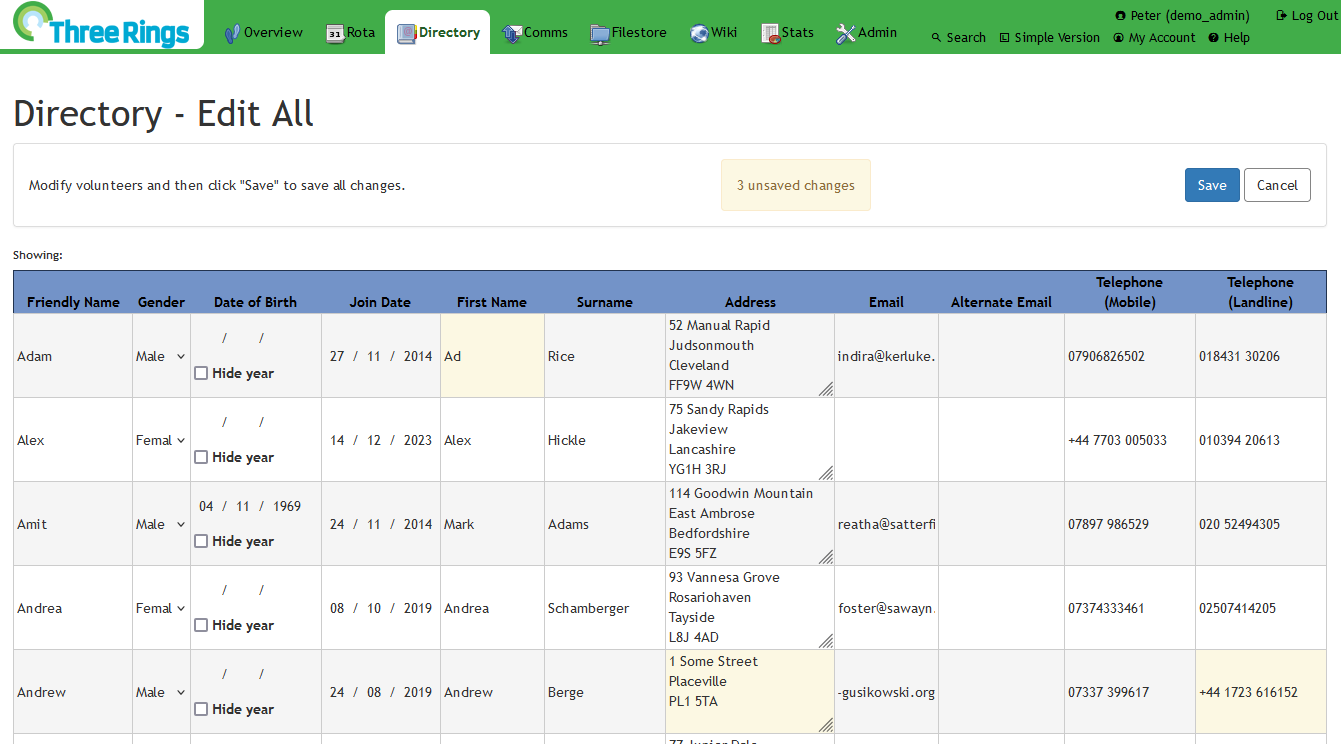
For my final bit of Three Rings volunteering this International Volunteer Day, I'm working on improving the UI of a new upcoming feature: a spreadsheet-like page that makes it easy for administrators to edit the details of many volunteers simultaneously (all backed by the usual level of customisation and view/edit permissions that Three Rings is known for).
Alt
Screenshot showing a web page, 'Three Rings Directory - Edit All': a spreadsheet-like view of multiple volunteers, some of whom have had personal details like First Name, Address, or Telephone changed, resulting in these being highlighted and a prompt appearing to allow the changes to be saved/committed.
It's a moderately-popular request, and I can see it being helpful to volunteer coordinators at many different types of voluntary organisation.
Don't have time to write up the test instructions today, though, because I've got to wrap up my volunteering and go do some childwrangling, so that'll do for now!
-
Shiftless Progressive Enhancement
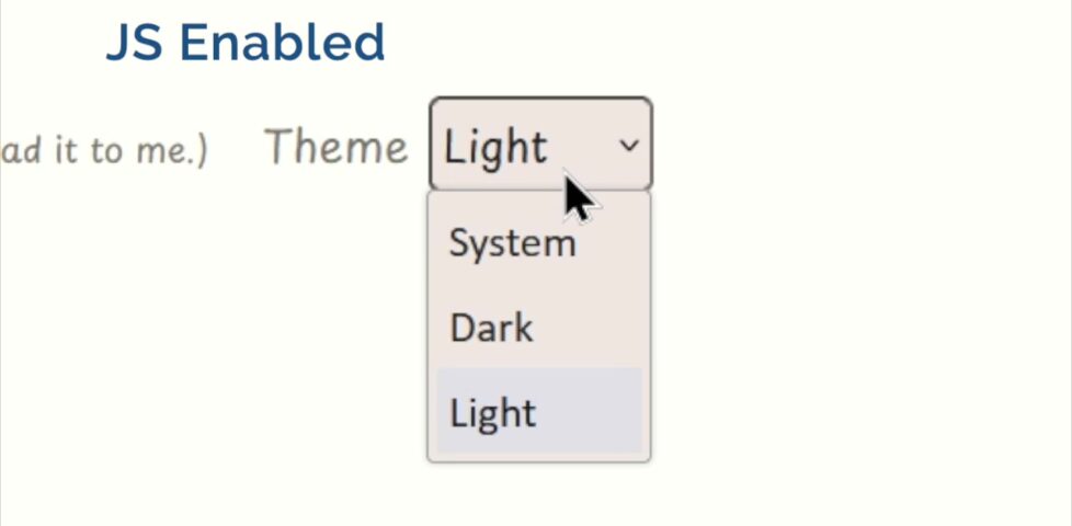
Today a 7-year-old helped remind me that progressive enhancement doesn't have to mean render-blocking DOM manipulation nor ugly layout shifts.
-
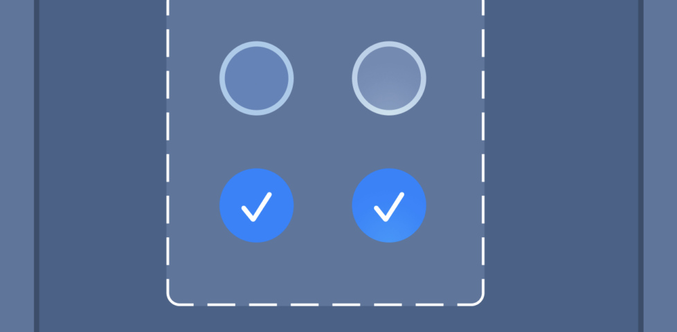
In Loving Memory of Square Checkbox
Niki observes that Apple's new visionOS design violates the long-established standard (that was already being eroded by 'imaginative' Web designers) that checkboxes are square and radiobuttons are round.
-

Gutenberg versus Elementor - the beginners challenge
Dan comments on "Gutenberg versus Elementor - the beginners challenge" and what WordPress developers might learn from it about UX.
-

Tesco Abingdon's phone menu system is diabolical, Dan discovers.
-
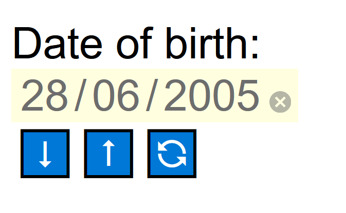
Higher/Lower Datepicker
Can Dan make an even-worse "date of birth" field than those spinner ones?
-
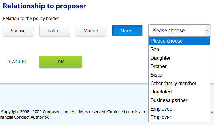
Confused.com Confuses Me
Confused.com's user interface makes Dan cry when he tries to comparison-shop car insurance. Here's why.
-
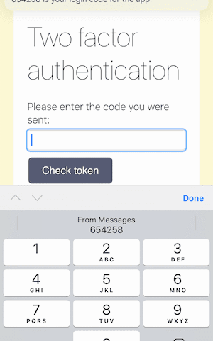
HTML attributes to improve your two factor experience
Dan summarises a Twilio article showing how your tags can be improved to better-support two-factor authentication.
-
Joe's First Computer Encounter
Jennifer Morrow shares a story about a user testing experience during which a serendipitous encounter taught her more than she could have expected.
-
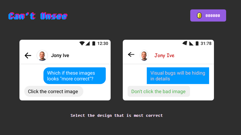
Saw this and thought of you, @themissprince: cantunsee.space
Still have "the eye" for pixel-perfect design? #UX -
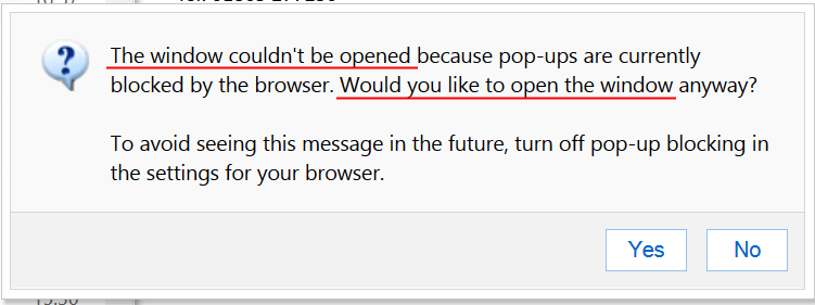
The window can't be opened. But I can open it anyway. Wait, what?
-
The Good, The Bad, And The Ugly Of System Tray Icons
What the fuck is that icon for? Despite the best efforts of icon designer to (apparently) make clear and comprehensible icons, and by computer users to learn and understand them, I still remain perplexed from time to time by the plethora of icons in my system tray (sorry, I mean Taskbar Notification Area). Let's take …