The Modern Programmer’s Dictionary

In the field of  software development, there’s always something new to learn. Whether it’s a new language, framework, API or methodology, your need to study is never through – even if you’re a FORTRAN developer. But one of the more esoteric areas of your education will come in the form of the language programmers use, and I don’t mean programming languages.

And so I present to you a dictionary of modern programmer language (much of it shamelessly lifted from a discussion on Stack Overflow):

Ajah

Ajax, but returning HTML rather than XML (e.g. using jQuery‘s $.load method). Similarly, Ajaj, when you expect script to be returned (e.g. $.getScript).

Bicrement

Adding 2 to a number.

Boolean Zen

A principle of programming lacked by those who perform expressions to compare variables to boolean constants. For example, if (userHasLoggedIn == true) lacks Boolean Zen, because the == true at best does nothing at all, and at worst results in an unnecessary evaluation.

Classtrophobia

When someone chooses not to use the obvious object-oriented approach when it is available.

Common Law Feature

A bug in some software which has existed so long that it has begun to be depended upon by the users, who will complain loudly when it is “fixed”.

Doctype Decoration

In web development, the practice of putting a Doctype Declaration (e.g. <!DOCTYPE html PUBLIC "-//W3C//DTD XHTML 1.1//EN" "http://www.w3.org/TR/xhtml11/DTD/xhtml11.dtd">) into the document despite not actually writing standards-compliant code. Often accompanied by putting a “Valid HTML & CSS” link on the site, but never actually checking that the site passes the validator’s test.

Egyptian Brackets

That style of coding which puts the opening brace { of a block on the same line as the expression (wrapped in parentheses) before it, e.g.:

if (expression){

So called because the ){ sort-of looks like a stereotypical ancient Egyptian pose, depending on your preferred coding font:

Floater

A bug that sits at the top of the bug tracking system, but nobody claims responsibility for it. Everybody just works around it.

Flock of Geese Code

A block of deeply-nested and heavily-indented code forming a tight V-shaped wedge. Often occurs when adding functionality to a complex block of evaluations, by a developer who hasn’t noticed that perhaps a return statement, exception-handling, the && operator or even a goto statement might be more appropriate! Especially poignant when using a bracketed-block language, where you’ll see a string of closing braces flying away at the end of the code.

Hi-Driven Development

A variety of printf-debugging where you pepper your code with alert('hi'); in order to find out where it’s going wrong, rather than breaking out a proper debugger. Other acceptable string literals include “hello”, “here”, “xyzzy”, etc.

Higgs-Bugson

A bug that you believe to exist based on sparse log data and theoretical examination, but you have no evidence to support the idea that it has ever actually been observed, except perhaps vague anecdotal evidence from users.

Hindenbug

A catastrophic bug resulting in a devastating loss (typically of data). “Oh, the humanity!”

headlessCamels

CamelCase words lacking a leading capital letter, as required or recommended for various languages, frameworks, and styles. As opposed to ProudCamels.

Heisenbug

First noticed on Usenet in the 80s, but still awesome: a bug that defies investigation because, during debugging (when you’re observing it), it behaves differently.

Hydra Code

Code so bug-riddled that killing one problem results in two more in it’s place, like the mythological Lernaean Hydra‘s many heads.

IRQed

Interrupted while you were trying to program. Not necessarily by somebody with an actual flag.

Loch Ness Monster Bug

An important bug, if ever it could be proven to exist. Only ever observed once or twice by users who were unable to back up or reproduce their claims. These users often go on to swear by the existence of the bug, blaming it for all kinds of unusual phenomena even in completely unrelated systems for years to come.

Ninja Comments

Comments which are so stealthy that you can’t see them at all. It’s almost as if the code weren’t documented at all!

NOPping

Like napping, but what programmers do while they’re downtiming while waiting for a computer to finish a task. Based on the NOOP or NOP operation found in many low-level languages.

NP Hilarious

An algorithm whose complexity is a joke, whether deliberately (e.g. Bogosort, but not Quantum Bogosort) or not.

Object Oriented Pasta

Spaghetti code wrapped up into classes to look like proper object-oriented code. Also Ravioli.

Pokémon Exception Handling

For when you positively, absolutely, “gotta catch ’em all.” I’m talking about hideous code like this:

try {
MessageBox.Show(message);
} catch(Exception exc) {
MessageBox.Show(exc.Message);
}

See also Try, Catch, Forget.

Refucktoring

As defined by Jason Gorman: refactoring code in such a way that you are now the only person capable of maintaining it. E.g. stripping all comments and whitespace from an arcane bit of code that you wrote in order to give yourself the illusion of being indispensable. Results in Mortgage Code (code which pays your mortgage because you can’t be fired while it exists).

Rubberducking

Sometimes you’re working on a problem and what you really need to do to solve it is to talk through the problem with somebody else. The other person doesn’t even need to be a developer: often, they don’t even need to listen – they just need to be there while you talk your way to your own solution. So much so, that they might as well be replaced with a rubber duck, sat atop your monitor. A name come up with by a programmer who apparently actually did this.

Scar Tissue

Commented-out blocks of old code, after refactoring, that have been checked in to the main codebase.

Shrug Report

A bug report which contains no reproducible information whatsoever, or is so unclear as to be ambiguous. Often contains phrases like “doesn’t work”, or doesn’t show how the anticipated behaviour differs from that observed (e.g. “when I click the print icon, the document is printed onto A4 paper from the feeder tray of the printer”).

Smug Report

A bug report submitted by a user who acts as if they know more about the system than the developer does.

Stringly-Typed

Use of strings for all kinds of inappropriate variables, like strings containing the words “true” and “false” for use in comparisons (not helped by the fact that some languages, like PHP, will let you get away with boolean comparisons on these). Also common among inexperience database developers, who’ll make an entire database of VARCHARs because they’re then able to store whatever they want in there, right?

Troolian Logic

Using a boolean variable to deliberately hold three states of information: true, false, and null. Often requires the use of the === operator to function properly.

Try, Catch, Forget

An exception handling strategy based purely on catching exceptions and then doing nothing with them. In other words, telling your program “if something goes wrong… carry on anyway!” Sometimes also seen as a Trynally – a block of code with a try and a finally block, but no catch blog at all. See also Pokémon Exception Handling.

Unicorny

Adjective used to describe a requested feature that’s so early in the planning stages it might as well be imaginary. Used by Yehuda Katz to describe some of Rails‘ upcoming features.

Yoda Conditions

Expressions that test for (literal == variable) rather than the more-common (variable == literal). The former is preferred by some programmers because it reduces the risk of accidentally using a single-equals rather than a double-equals (this mistake would produce a compiler error rather than simply misbehaving). So-called because it results in Yoda-like phraseology (e.g. “has no errors, the form does”).

×

Troma Night Adventure

Because I promised you some Aber-nostalgia.

Do you remember the RockMonkey Wiki? Many years ago, Ruth bought the domain name rockmonkey.org.uk as a gift for Andy K, who’d been nicknamed “Rock Monkey” for longer than anybody could remember. He decided that what he wanted to host there was a wiki engine, and I helped him get one set up. Soon, every Abnibber and Troma Night veteran was using it, filling the pages with all kinds of junk.

Soon, Jon launched the wiki’s first WikiGame: a maze exploration game using littered with Dungeon Master Java screenshots and monsters aplenty (monsters like Tubgirl and Lesbians and The Splurg). This kicked off a series of other WikiGames, mostly by Jon, Andy R, and myself (although Andy K started about a dozen of them and Ruth got some way through developing her first).

My biggest contribution was probably TromaNightAdventure, a text-based adventure in which the player attempts to explore Aberystwyth to collect (at least) three Troma Night stars, some pizza, some beer, and some films. It was an epic quest, far larger than I’d meant for it to grow, with multiple non-linear ways to win and a scoring system that told you exactly by how much you’d beaten it (some, but few, people managed to score the maximum number of points).

The screenshot above isn’t from the RockMonkey Wiki. It’s from my relaunched version of Troma Night Adventure. That’s right: I’ve dug up the final backup of the RockMonkey Wiki, extracted the relevant content, knocked together a mini version of the wiki engine and the WikiGameToolkit, and re-launched the game. It’s read-only, of course: this isn’t a real wiki; the real wiki is long-gone. But it does have a few extra features than the original, like a pictorial inventory and a nippy Ajax-powered interface. If you’re looking for some nostalgia about the old RockMonkey Wiki or about Troma Nights back in Aberystwyth, here’s your ticket:

The Good, The Bad, And The Ugly Of System Tray Icons

What the fuck is that icon for? Despite the best efforts of icon designer to (apparently) make clear and comprehensible icons, and by computer users to learn and understand them, I still remain perplexed from time to time by the plethora of icons in my system tray (sorry, I mean Taskbar Notification Area). Let’s take a tour:

This is a good start. It’s a clear, obvious icon that just screams out what it is and what it does. It’s blatantly the volume control. If it’s got more lines, the speakers are louder. No lines, and it’s muted. It’s also a lot clearer than the standard volume icon that came with earlier versions of Windows, which tried too much to look like a speaker, and not like a representation of a speaker. There’s a reason that speed camera signs in the UK look like old-fashioned cameras: it’s about the representation (can you imagine an iconic form that actually represented a speed camera – how stupid would that look?).

And now it all goes rapidly downhill. What the fuck does this icon mean? It’s a monitor with a growth in the top-left corner which I’m lead to believe is supposed to be an Ethernet cable. Seriously, Microsoft? You almost had this one right in earlier versions of Windows, when you had the “two computers with a line between them” metaphor, which is a more clear representation of network than this is. And when it’s connecting? A pair of spinning balls! What the fuck does that mean? It means “something’s happening” without giving any clue as to whether my pen drive is mounting or my toast is nearly done.

Oh, it’s a flag. I guess this must be the icon I click on to, I don’t know, help aircraft land on my computer. While I applaud Microsoft’s efforts to make everyday users know about the maintenance tasks they ought to be doing on their computer (like backups), this icon doesn’t scream out “DO SOMETHING OR YOU MIGHT LOSE ALL YOUR DATA!” to me. Then again, my work puts me in contact with people who ignore even their I.T. departments telling them about the importance of backups, so this might be a losing battle anyway. That’s probably why Windows is waving the white flag.

As a side note, am I the only one who’s noticed that the Windows 7 taskbar and the new standard notification icons, above, are starting to bear a remarkable similarity to MacOS (at least, left in their default configuration), with it’s Dock and Notifcation Area. Unfortunately, Microsoft didn’t take the time to tell every software manufacturer that white is the new colourful, so only Windows’ own icons appear in shiny white: everything else looks just like it used to. Like these:

This is the icon for my wireless network device. Usually I don’t bother with these, but this this particular app is the first of it’s kind that I’ve actually found to be better than Windows’ own (excellent) Wireless Zero Configuration tool. Unfortunately, it’s icon leaves a little to be desired. Thanks to mobile phones, everybody and their grandmother now understands the universal icon for “signal strength” is a series of bars ascending like steps. Except for NetGear, apparently, who believe that the best icon would be a radioactive laptop whose screen changes colour from green through yellow to red to represent signal strength. I hope none of their customers are colourblind.

I like my keyboards (and mice) big and feature rich: I’ve got big hands and I have no problem memorising what functions and macros I’ve mapped to a dozen or so hotkeys. That’s why, as well as having the best mouse in the world, I have a related keyboard with about a million buttons. This icon, which depicts a keyboard and mouse, links to the applet that configures those hotkeys, and provides notifications about my mouse’s battery level.

It’s not the clearest icon in the world – how about a little more contrast between the mouse and keyboard there? – but it’s perfectly functional.

Obvious Bluetooth icon is obvious. Kthxbye.

Although I do wonder why the Bluesoleil driver stack – which I tend to use rather than the Microsoft one or the one provided by my chipset manufacturer, because of it’s fantastic support for just-about-everything from Wiimotes to OBEX/OPP – uses an icon with a very-slightly-different Blue, which only irritates you if you, like me, frequently have multiple Bluetooth dongles installed with different stacks attached to each. I guess that’s just me.

You can almost see where Microsoft is trying to go with the safely remove hardware icon, but it just doesn’t seem right. It only shows a USB plug, yet (for some unknown reason) provides features to unmount, for example, my internal SATA hard drives. And the little green “tick” icon suggests that this icon back-ends onto an application which is “doing fine” and doesn’t need my attention. So, as always, I happily yank out my pen drive without unmounting it, and it always turns out fine because I’m not the kind of idiot that does so while I’m copying files to and from it.

Ah, Sandboxie, how I love you. This icon’s actually pretty good, and I couldn’t think of a better one for an application that “runs other applications in a sandbox” – see, it’s a stylised sandbox! My only objection is that the best icon that the designer could come up with for when the application is working in the background is what looks like a sandbox with five cat turds in it. Seriously. Seriously; let me show you:

If that’s supposed to show me that my sandbox is in use then, well, yes, I guess it does. It could also be to indicate that my sandbox needs cleaning – a routine operation with the application – in which case, yes, it also works. Maybe it’s a better icon than I thought. Or maybe it’s just telling me to shoot the cat.

ZoneAlarm. I used to like the ZoneAlarm icon, back when it was two little bar charts – one red, one green – that indicated the amount of traffic coming and going from my computer. Now it still does that, but when there’s minimal traffic it shows this “Z” icon instead. This icon’s also okay, but it irritates me that the icon changes so drastically. If I’m looking for an icon, I want it to look somewhat vaguely sort-of the same as when I left it, not completely different.

What? An amorphous blob? I guess this much be the button to click if I run out of jelly cubes. Nope, it’s the icon for WebDrive, a wonderful little abstraction layer that allows S3, SCP, FTP, FTPS etc to be mounted transparently as local drives: in short, it makes it so that any application can manage files stored on just about any remote system can be edited as if they were local, which is a sickeningly lazy way to manage a network. It makes me feel dirty, and I love it.

On the other hand, the icon sucks. What does it mean? It looks like a piece of nondescript corporate artwork. Their other products don’t fare much better – they make an FTP server whose icon is the same as the WebDrive icon, but in red and blue instead of blue and orange.

One of these days somebody will release a program that allows me to easily change the system tray icons of other programs, and I will love it dearly. So long as it has a good icon.

You fail, Skype. When I think of you, I think of your lovely blue icon with the “S” in the middle. What you’ve got here is the same icon but in green and without the “S”. So… not the same icon at all. The worst of it is, I can see what they’re trying to achieve. It’s green because my status is “online”, but couldn’t you have used your regular icon and given it a thick green border, or made the cancerous growths on the top and the bottom turn green, instead? That way, I could still tell at-a-glance that you were Skype and not some mucus that had gotten stuck to the corner of my screen.

Okay, it’s a fox. Thankfully this icon is distinct, at least, unless you’re running some variety of furry-fandom-focussed-feed-fetcher, and doesn’t take long to identify as being the stunning AnyDVD, the flagship product of SlySoft, who use the fox head icon as their corporate image, too. I’ll let this one off, but surely an icon that somehow featured an optical disc in it might have been a little better?


This is a perfectly good icon. It’s for Giganews Accelerator, an abstraction layer that adds SSL, compression, and rate-limiting controls to any newsreader software. Most of you won’t care even a little about what any of that means, so here’s the scoop: the icon uses the style of their company logo, it’s small, legible, and distinct, and it’s shaped like a “down” arrow, which is pretty sensible for an application that streamlines downloading.

In other news, Giganews are a fantastic usenet provider and you should really give them a look.

Another perfectly good icon, this time for XMing. The artifacts around the edges are probably the result of the icon being designed to appear only on grey backgrounds, which is a little sloppy, but better that than for this mostly-black icon to disappear completely on black backgrounds. Again, many of you will have never heard of or care what this program is, but trust me: this is a perfectly good icon.

A computer… wearing a hat. You know, this one almost makes sense, if you think about it hard enough or if you’ve had a couple of drinks first. It’s the icon for Pageant, a part of the PuTTY suite, and it… no, wait: wearing a hat isn’t a good icon, is it? A good icon for this application, which stores the keys you use for connecting to other computers, might be more like a keyring, if it weren’t for the fact that every application in the world already used a keyring, sometimes completely inappropriately, like in the case of some versions of the Windows Genuine Advantage nagware. I initially thought that the hat metaphor was a good one, because it was about the different roles you’re in (or “hats” that you put on your computer), but that’s not a good metaphor because it’s possible to store any number of keys in Pageant, but very few people wear more than one hat. At least, not if they don’t want to get laughed at.

A speech bubble, sort-of, and the distinctive green spot of an instant messaging program. Not bad, although if I were running multiple instant messengers there’d be no way for me to know that this minimalist icon belonged to Pidgin. Of course, the theory with Pidgin is that you don’t need to run any other instant messengers (in my case, Pidgin keeps me simultaneously on four Google Talk accounts, MSN, ICQ, Yahoo!, IRC, Facebook Chat, and others), so you can see why they thought that would be okay. They’re wrong, of course, because I’m having to run Skype as well, but the theory was sound.

Like I said, it’s not a bad icon, but Pidgin has such a distinctive logo (a pigeon!) that you’d think they’d have tried to work that in, somewhere. On the other hand, I can’t complain too much because the program allows me to choose my own icons anyway. And also, it’s awesome.

Another pretty-good icon, this time for Synergy+, which helps me pretend that I’m hacking into The Matrix by running several computers (all running different operating systems) and a crazy number of monitors (of all shapes and sizes) simultaneously. Right now I’m surrounded by five screens and let me tell you, having 7.5MP of screen real estate in front of you (while most of your friends with just one high-def widescreen monitor have about 2MP) makes for a fabulous way of organising yourself. Instead of putting windows behind one another, just fling them over onto one of your other monitors, and glance across when you need them! Computer slowing down a little? Move some of your processing off onto your other computers, and get all your speed right back again. It’s like supercomputing on your desktop.

Anyway – the icon’s okay, because it’s the “ring” icon of Synergy with a “lightning bolt” that appears when connection has been established. It’d be better if it had more granularity (if the network connections between my computers failed, but at least one was still connected, the icon would still show a lightning bolt: how about a full lightning bolt if all the connections are working, and half a bolt if only some are?), but it’s still quite workable.

Another good icon. It’s AutoHotkey, and it’s, well, the AutoHotkey icon. I suppose it could have been a letter H “key” from a keyboard, but then again, half the things I use AutoHotkey for feel more like macro programming and less like shortcut keys. The key (hah!) thing is that I can identify it at a glance, and it’s perfectly good at that.

This is the icon for Quartz, SmartData‘s (really very good) in-house timesheet/task tracking solution. To plug the application a little more; it sits in your system tray and you click on it to change tasks (for example, right now I’m on my lunch break, but when I get back from lunch I’ll select the project I’m working on this afternoon. It collates all of the data that you and your staff have been working on and presents reports and statistics about how efficient you’re being (by comparison to the actual costs of your staff time, quoted costs for work, and so on), blah blah blah. It’s pretty cool. The icon… that’s debatable. In fact, Alex (lead developer on Quartz) and I have debated it many, many times.

It’s a clock. Well, yeah, that’s a pretty good starting point for a time tracking application, and it’s reasonably distinct. It changes the colour of the face when you’re on breaks, so you don’t forget to tell it when you’re back. And that’s about it. Basic and functional.

But there are two improvements I’d like to see. Firstly, the problem with a clock is it’s a little too generic. I’m actually surprised that more applications don’t have a clock icon (other than the long-dead Windows Clock). Secondly, it’d be awesome if I could tell even more at-a-glance, by associating colours, perhaps, to different projects, and having a little coloured “button” in the corner of the icon, like we saw earlier with Pidgin, that indicated which task I was currently on. I suppose I could just mouse-over the icon, but I’ve got 7.5MP of desktop, here, and it’s a long way from wherever-I-am to the Quartz icon.

On the other hand, I suppose I could just poke Alex until this feature makes it into the application. That’s what I usually do.

It’s a lightning bolt! Honestly, this could be the icon for anything: some anti-virus software, an instant messenger, a BitTorrent client: really, anything at all. As it happens, it’s the icon for Daemon Tools, disc virtualisation software. Again: seriously, couldn’t you have put a picture of a compact disc somewhere into the icon? Perhaps you could have even had a number in the corner, showing how many disc images were mounted right now, or changed the colour based on whether or not the virtual drive was being accessed? Maybe you could have done anything that it’s a dull and uninspiring lightning bolt icon. Such great software, let down by a shitty icon.

A fabulous icon. It’s for a VNC Server, and it’s even got the letters “VNC” in it. It’s a little plain, but perfectly functional, and it even changes colour when a connection has been established.

And finally: the Language Bar icon. I turn off all of the superfluous bits, leaving just the icon, and I only keep that because it changes colour (to a colour chosen by me, which is nice) when I change keyboard layout. I periodically switch between QWERTY and Dvorak keyboard layouts, depending on what I’m writing, and sometimes I use different layouts in different applications on the same monitor: it’s on these occasions that I’m thankful that I’m able to glance down and see easily what keyboard I’m typing on. It kinda ruins the sleek white icons that Microsoft are providing these days that the first thing I do with them is add a colourful (pink, no less) version of the same, but as we’ve already discovered; these white icons aren’t making the impact they were supposed to anyway, it seems.

(if you’d never heard of Dvorak before right now, I highly recommend you read the Dvorak Zine, especially if you write a lot and you aren’t a programmer)

So that’s my notification area: a mixture of good, bad, and ugly. Icon design and selection is often a lower consideration for developers than other parts of user interface design, and it’s easy to fuck up – especially because you can never be sure what environments your icon will ultimately inhabit, or what they’ll end up next to – and I’m not claiming that I could do any better… well; except in those cases above where I’ve specifically said that I could and how I’d do it, but these are the absolute worst cases.

BiCon: The Game

I shan’t be at BiCon this year, but I thought I’d share with you all something that tickled me today. Last year, at a Naked Lunch, I ended up chatting to several geeks about Interactive Fiction, and I through out a few ideas for a BiCon-themed piece of Interactive Fiction. Little did I know that this idea had sunk in, and cogs had begun to turn…

Rach has just released BiCon 2010: The Game, and it fully embodies everything that’s fabulous about BiCon. It’s also a really good bit of IF, for a first full adventure, and involves some fascinating hacking of the gender pronouns system for Inform. I tip my hat to the author.

(there’s some discussion going on about the game on the BiCon LiveJournal community)

The Best Mouse In The World

This was one of my most-popular articles in 2010. It continues to be popular in Spain (¡Hola! Mucho gusto). If you enjoyed it, you might also enjoy:

The Old

Back in 2006, I ordered a new mouse for my computer. Previously, I’d been using a series of mid-to-high-end five-button optical mice, like Microsoft’s IntelliMouse series: when you’re doing a lot of coding, websurfing, and video gaming, “extra” buttons make a big difference, and the IntelliMouse is fast and responsive and usable in either hand: a perfectly good all-rounder mouse. But when I destroyed my last mouse with a little too much overenthusiasm in an Unreal Tournament 2004 deathmatch, I thought it might be time to look for something a little… sturdier.

Relatively new to the European market at that time was Logitech’s new MX1000: the  world’s first generally-available laser mouse: instead of using a little red LED, these mice use an invisible laser to track movements, which apparently makes them far more sensitive and accurate on a wider range of surfaces. As an ultra high-end premium mouse, the MX1000 also came with a wheel that was not only clickable but “rockable” for sideways scrolling and five other buttons (aside from the wheel and the usual three), but it was wireless and used it’s own special “cradle” to recharge. I bought one, and for years I’ve described it as the best mouse I’ve ever owned.


This mouse was so good, in fact, that I’d always planned that when it finally kicked the bucket, I’d replace it with another one exactly the same. When I said that this was the best mouse I’d ever owned, I wasn’t kidding. It fit my palm in a way that I’d never experienced before (I have pretty big hands, and I find that those piddly little mice that are so popular to be  just useless for me, leaving me with my wrist dragging around on the desk like a beaver’s tail). I genuinely like the quirky bonus selling points of this mouse, like its unusual “thumb rest” and its wonderful little LED gauge that tells you when it needs recharging.

My MX1000 is still going strong, despite years of heavy (ab)use. I use my mouse for hours a day, every day, and it needs to not only feel great but be rugged and durable, too. But the time comes in the life of every mouse when it’s time to be retired to less-intensive duties. Here’s the underside of my MX1000 today:


See how scuffed and worn it is from the hundreds of miles it’s travelled back and forth across my desk? Even the non-slip teflon pads are beginning to wear down! And the two little copper contacts on the right, there, are tarnished – sometimes it takes a couple of attempts, these days, to get the pins to make a connection when dropping it into the charging cradle. It’s time that this little mouse was put out to pasture.

But my plan – my plan to replace it with another one just the same – can’t come to pass: Logitech no longer manufacture the fabulous MX1000! Oh noes! I know it’s still possible to buy old stock or unopened second-hand ones on eBay, but this feels to me more like the universe’s way of telling me that it’s time to look for something new.

The New

So I’ve gotten myself the successor to the MX1000: a Logitech Performance MX.


And here are my observations after using it for a few days:

Pros Cons
  • It’s just like an MX1000 – ludicrously accurate, sensitive, and fabulous to hold and use.
  • It’s slightly lighter than the MX1000.
  • Rather than charging in a cradle, it charges via a MicroUSB cable (either from a computer or a supplied power adapter), so you can continue to use it while it charges (I’m just using the cable I sometimes use to attach my phone to my PC).
  • Even more buttons! All configurable by application or usable for their default functions.
  • The wheel can now operate in “clicky” or “flywheel” modes, and the “flywheel” mode – in which the wheel just keeps on spinning freely – is very nice.
  • The “Unifying” USB receiver can apparently have up to six devices connected to it (although why you’d have six mice/keyboards, which are the only devices yet to use the technology, is beyond me).
  • The teflon pads and even the rechargable battery are now replacable, to keep the mouse running for longer.
  • The mouse now uses “Darkfield” technology, which allows the laser to work even on transparent or reflective surfaces. I have no idea how this black magic works, but it’s cool: I’ve tried the mouse on mirrors and on glass and it genuinely does seem to work, but I can’t work out how!
  • The new texture of the thumb rest is more pleasant than the plasticky feel of the MX1000 (which becomes apparent if you have sweaty hands).
  • It’s possible to change the mouse sensitivity “on the fly” using pre-configured button presses, which JTA tells me is useful (I’ve never had a mouse with such a feature before, so I’ll reserve judgment).
  • Charging using a cable isn’t quite so cool nor as convenient as just dropping the mouse into a charging cradle.
  • More of the MX1000s buttons “just worked” without the special driver software installed.
  • It’s still using a proprietary wireless pairing and communication system. Seriously, Logitech, would it have been so hard to use Bluetooth and save me from using up another USB port?
  • The battery gauge only turns on for a few seconds after you first start using the mouse in a long time, or when it’s getting low: I suppose this must be a measure to conserve battery life, but it does make it slightly harder to tell the battery level “at a glance”.
  • The “rocking” of the wheel to scroll left and right no longer produces an audible “click”, depriving you of feedback.
  • The driver package is 25MB. Seriously: why does it need to be this large?
  • Perhaps a little too big for some people’s hands? This isn’t a mouse for people with a small hand.

In short, the verdict is that the Performance MX is a worthwhile successor to the MX1000, and a great replacement when the time comes. And if you’re still using an LED or even a wired mouse (trust me, when you go wireless and lose the “tug” of the cable pulling your mouse back, you never want to go back), perhaps now is the time to upgrade.

Update – 8 March 2019: it took a while, but an even better mouse has now dethroned this one.

× × ×

Kitty

~$ sudo gem install kitty
Successfully installed kitty-0.0.2
1 gem installed
Installing ri documentation for kitty-0.0.2...
Installing RDoc documentation for kitty-0.0.2...

~$ kitty
     ____
    (.   \
      \  |
       \ |___(\--/)
     __/    (  . . )
    "'._.    '-.O.'
         '-.  \ "|\
            '.,,/'.,,

~$ kitty
         /\_/\
    /\  / o o \
   //\\ \~(*)~/
   `  \/   ^ /
      | \|| ||
      \ '|| ||
       \)()-())

Kitty. That is all.

Hiding In Plain “Site”

I’ve written a program called PicInHTML, which makes web pages with concealed images which are shown when text on the page is selected. What’s clever about these page are how they work: they’re a single file, with no dependence on images nor Javascript, and they work by leveraging the little-used ::selected CSS selector. Each individual letter on the page is given a CSS class to associate it with the colour of a corresponding pixel in the source image, and selecting the text changes the background colour to that pixel colour.

That’s a wordy way of putting it. Let’s try an example:

An example of a special page - selecting the text in this page reveals the Reddit alien. Click on the image to see the discussion about this example on Reddit.

Give it a go on any of the following pages. You’ll need to not be using Microsoft Internet Explorer, I’m afraid, as it doesn’t support the ::selected CSS selector. All you have to do is select the text on the page to reveal the secret image!

If you’re interested in the mechanics of how it works, or you’d like to get a copy of the source code and have a play yourself, see my project page on PicInHTML. You could also try looking at the source code of any of the pages, above: they’re not too-hard to read, especially for machine-generated code.

!
An example of a special page - selecting the text in this page reveals the Reddit alien. Click on the image to see the discussion about this example on Reddit.

T

×

One-Time Pad In Javascript

A few months ago, I spent one lunchtime writing a One-Time Pad Encryption/Decryption Engine in Javascript. I’d meant to blog about it at the time, but I forgot, but I came across it again today and thought it was cool enough to share with you all.

If you already appreciate why that’s cool, go play with it. If you don’t, allow me to explain.

What is a One-Time Pad and why is it awesome?

One-time pads are a form of cryptography which are simple enough to do by hand (you don’t need a computer, but it helps), versatile enough to transport any message, and – this is the clever part – completely unbreakable.

Yes, completely unbreakable. It doesn’t matter if you have a billion supercomputers and a billion years, a one-time pad is mathematically sound. So long as it’s used properly, it’s unbreakable, but it’s the difficulty and discipline required in using them properly – as well as difficulties in finding secure ways to share keys over long distances – that makes them impractical for widespread use.

They did, however, see a lot of use in espionage during the Second World War and the Cold War, and continue to be used today for some diplomatic messages, as well as occasionally by particularly paranoid civilians.

So what’s the story?

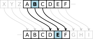
You’re probably familiar with the concept of a Caesar Cipher – you may have even played with them as a child – which is perhaps most-often seen nowadays in the form of ROT13. Put simply, a caesar cipher “rotates” letters through the alphabet, so perhaps A becomes B, B becomes C, C becomes D, and so on (in this example, Z would become A). So my message “IF YOU READ THIS YOU ARE GAY” becomes “JG ZPV SFBE UIJT ZPV BSF HBZ”. I can send that message to you, having already agreed with you the code, and you can roll each letter back by one (so A becomes Z, B becomes A, etc.), to get back the original message.

This is fundamentally flawed and offer no real security at all, of course. But suppose we made a couple of enhancements to our plain old Caesar Cipher. First, let’s add some punctuation to our alphabet (space, full stop, comma – we’ll treat these as letters in their own right which come after ‘Z’). Then, instead of rotating each letter in our message the same number of steps around, we’ll vary it. So let’s agree that the first letter will rotate 3 places, the second by 18, and the third by 11: then the fourth by 3 again, the fifth by 18, the sixth by 11, and so on. If we encode the same message now, we get:

  • I becomes L (rotated by 3)
  • F becomes X (rotated by 18)
  • [space] becomes I (rotated by 11)
  • Y becomes a comma (,)

And so on. Suddenly that’s a lot more secure than our plain old Caesar Cipher! Congratulations: you just invented the Vigenère Cipher. Unfortunately for you, it’s almost 500 years old already. Even more unfortunately, it’s still not very secure. It’s fine for passing notes in class, but it won’t do for sending orders to your agent on the other side of the Iron Curtain!

How is a One-Time Pad different?

The “key” to the cipher we used above is 3, 18, 11, and the problem is that the key ends up being re-used (repeated) throughout the course of the message. If the message was the word “ELF” (encrypted to “HAQ”), and we agreed never to use that same key again, then anybody who intercepted the message – even if they knew we were using a Vigenère Cipher – wouldn’t know what we’d said, except to say that it had three or fewer letters. We could equally have said “MAN” (using the key 8, 17, 8), “EAT” (using the key 0, 17, 14), or “EGG” (using the key 0, 23, 1). If we ever used the same key – 3, 18, 11 – again, our code would become vulnerable to frequency analysis, which is a technique for working out what the key might be based on the likelyhood of particular letters or words (especially common ones) being used in combination.

It’s pretty easy to see how to fix this: all you have to do is to choose a key that is at least as long as the message you want to encrypt, and never reuse the key.

This is how a one-time pad works. Suppose you and I agree a series of numbers, like this: 64191 25746 89891 93406 33604 89879. You keep a copy, and I keep a copy, and we never tell anybody else those numbers, or the order in which they appear.
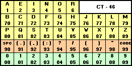
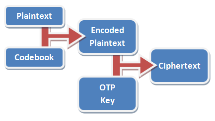
When I want to send you a message, I first convert that message into a series of numbers, using a codebook or codetable. In the example codetable below – which has been optimised for the English language – the most-commonly used letters are represented by one digit each, while less-frequently used numbers are represented by two digits. So the message “STEAL THE PANTIES” becomes 82832 17890 83752 80148 33282. It’s important to remember that this still isn’t encrypted; it’s just encoded: turned into a format suitable for encryption.

If we often talk about “panties” in our messages (and who doesn’t?), we might add that word to our codebook to make it faster to write: for example, we might assign it the code “11” – in the table above, the prefix “99” means “look it up in the codebook”, so instead of writing “panties” as “80148 33282”, we’d write it as “9911” – cold war spies had whole dictionaries of most-common words assigned to numbers to make them shorter to write out! That makes our message: 82832 17890 83752 99110. In this particular implementation, we add a padding zero to make it up to a nice round block of five digits.

Next, we encrypt the message using our pre-arranged secret key, 64191 25746 89891 93406 33604 89879. To do this, we just take each digit in the message and add it to each digit in the key, ignoring any “tens” column. So 8 plus 6 is (1)4, 2 plus 4 is 6, 8 plus 1 is 9, and so on, to get our encrypted message.

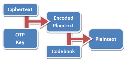
All you have to do to decode it is run the whole thing backwards. From each digit in the message, deduct the corresponding value in the key – if you get any negative numbers, just add 10 to them so that they’re not negative any more. Then run the resulting encoded number through your codebook to get back the secret message.

In practice, using a codebook is optional, but very-highly recommended. In the basic codebook I’ve provided with my implementation, the word “condition” goes down from being “71547 23833 54” to just “99114 7”. A well-designed codebook will contain not only common words in your language, but anticipated words for the things that you expect to talk about in your messages (like “MISSION”, “CAPTURED”, and – of course – “PANTIES”).

Messages encrypted using one-time pads are so secure that it’s safe to send the message itself completely in the clear, which is exactly what we used to do. Especially during the cold war, but still today (and increasingly), governments have been able to communicate with spies in foreign countries simply by broadcasting strings of numbers over conventional radio, from what are called numbers stations by radio enthusiasts (and also by conspiracy theorists, of course). Of course, nowadays it’s perhaps more-feasible to send many kinds of messages by e-mail – and there are a number of one-time pad systems optimised for fully-computerised use, although there exists a greater risk of being traced online than by simply tuning in a radio.

Now: go have a play!

Click the link – One-Time Pad Encryption/Decryption Engine in Javascript – to try out my one-time pad engine and encrypt and decrypt a few messages of your own. It’s quite deliberately written in a way which does not communicate with my server at all, once the program has downloaded (unplug your computer from your Internet connection if you like, and you’ll find that it still works), so I’m not able to see what you’re encrypting. You can use your own codebook if you like, and the entire source code for the page should be reasonably easy to read, if you’re that way inclined. Have fun!

However, you certainly shouldn’t actually use it for passing secret messages around: read the caveats below if you can’t work out why for yourself!

Caveats

  • The first challenge with using one-time pads is finding a good secret key. People have used all kinds of things – patterns in music, entire text of books – that are all flawed and imperfect. The only secret key good enough for use in a one time pad is a cryptographically-random set of number. The random numbers generated by a conventional computer are not good enough: I suggest you get yourself five ten-sided dice and roll them all simultaneously, writing down the numbers which come up as they appear in front of you from left to right. Repeatedly. Yes, this is a boring process. For convenience, my implementation will generate random numbers for you, if you like, but they’re not good enough for actual use. The United States broke a German one-time pad in 1944 because the machine they used to generate the random numbers was not sufficiently random.
  • The second challenge is getting your secret key to the friend to whom you want to send secret messages. This must be done in person. If you transmit it by any other medium, it could already have been compromised. Even if you encrypt it, the system can only be considered to be as good as that encryption, which defeats the point entirely. During the cold war, KGB spies were issued with tiny keybooks like the one shown on the right. A book this small can be hidden in any number of places, as anybody who’s been geocaching knows! After receiving and decoding a message, the page used to provide the key could easily be burned, eaten, or otherwise destroyed.
  • A third challenge comes from the fact that no key must ever be re-used. As soon as a key is re-used, the code is no longer unbreakable. A combined U.S effort broke a 1945 Soviet one-time pad after the same key was used several times: once the U.S. knew something about the contents of some of the messages (they contained leaked British intelligence), they were able to partially break the key.
  • There must be no way for an unauthorised party to observe the plaintext before it has been encrypted or after it has been decrypted. Your desktop PC won’t do, because your enemy can read your screen through the wall, install a keylogger, or just peep through your window!
  • And, of course, as with all cryptography, your system is only as secure as the people involved. If your friend can be bribed, blackmailed, tricked or tortured into giving up information, the system fails. Obviously to maximise your ability to protect your system you should issue different keybooks to each of your trusted friends – this also helps to prevent them from talking to one another and organising a coup against you!

Further Reading

×

SuperGenPass In MicroB On The Nokia N900/Maemo

In the unlikely event that I’m not the only person who uses SuperGenPass to manage my passwords and MicroB on Maemo on my Nokia N900, here’s a few tips that I thought I’d share (they’re also valid on the N800 and N810 and “hacker edition” N770s, too, I expect):

  • You don’t have a Bookmarks Toolbar (where would you put it on a 3½ inch screen?), so once you’ve customised your SuperGenPass bookmarklet, you’ll need to click-and-hold on the generated link, and then select “Add bookmark” to save it to your bookmarks).
  • Use it as normal: either fill your master password into the form and click your Bookmarks menu and select the bookmarklet, or select the bookmarklet and give it your master password. Don’t forget when using complex forms or changing passwords that Maemo provides a full clipboard so you can copy/paste passwords around where the need arises (thankfully quite rarely).
  • If you’re irritated by the “You have requested an encrypted page that contains some unencrypted information” warnings that you see when logging into SSL-secured websites (and the fact that unlike desktop Firefox, you can’t turn it off from the settings), here’s how you disable it:
    • Enter the web address – about:config
    • Agree to the warning page, if you’re presented with one
    • Type “security.warn_viewing_mixed” into the search box, or browse the properties list for that option
    • Select it by clicking on it, and tap the Enter key to toggle it from true to false.
  • I don’t yet know the reason for the fleeting “Maximum number of characters reached” message, but it doesn’t seem to impact on functionality of SuperGenPass. Does anybody else know what it’s about or how it can be suppressed?

Nokia N900

I’ve just got myself a new mobile phone, and I thought I’d spend a moment to gloat about some of it’s more awesome features (and mutter under my breath about a few of the things that are less-fabulous about it).

So, my new phone is a Nokia N900. You’re not likely to have seen many of these floating around, yet, because they’re new to the UK and they’re currently in somewhat short supply, but thanks to some careful negotiation I’ve gotten my clammy mits on one just a little ahead of the curve.

I’m now loathe to say what I was initially inclined to about it – that it’s quite a remarkable phone – because it’s not really a phone (although it is quite remarkable). As somebody who has always gone for smartphones with heaps of geeky features, I’ve often gone through conversations like the one in the comic, above: where somebody has said “but can it make calls?” These comments tend to come from people who want a phone that makes calls, maybe sends texts, and little else, and often this “purist” view of mobile telephony somebody gives them a strange superiority complex (or perhaps it’s just a backlash against the feature-creep of modern portable devices: who knows). As for me, I don’t care – I want all of those extra features. I couldn’t imagine any more owning a phone without – at least – a fully-featured web browser, camera, bluetooth, wifi, and the capability for me to install (and ideally develop) my own applications onto it, such as connectivity tools, an instant messenger, and so on.

A Nokia N900 on a phone call

However, the Nokia N900 is the first communicator – yes, that’s the word I’m going to use, instead – where I’ve honestly felt that the telephony features “come second”. I suppose it’s the result of the natural progression of Nokia’s Nxxx range of PDAs that this should be the case – the N900 is the first in the series to actually support use of a mobile phone network at all; at least directly. In the device’s default configuration, out-of-the-box, supposing you wanted to make a cellular call, you’d need to:

  1. Switch desktops (by “swiping” one desktop along) or access the applications menu (by tapping the on-screen button for that purpose).
  2. Tap the “Phone” icon, which by default sits in 6th place on the list. Yes, 6th.
  3. Dial the number you wanted to call.

That’s about 66% steps more than just about any other phone ever made. (okay, there’s actually a faster way, but supposing you wanted to exclusively use the touch-screen interface, the above instructions are correct) I know a lot of people who would be put off by that, but I’m not one of them: I’m well past the point where phone calls are the primary thing I use my phone for!

There’s a few things that make the Nokia N900 remarkable by comparison to the phones I’ve had before:

Touchscreen (& hidden keyboard)

Superficially, the major change to my previous phones is the addition of a touchscreen, which seems to be The Thing if you want to make a smartphone these days, thanks to Apple’s innovations in that area. Unusually, the N900 also has a slide-out QWERTY keyboard. The slide-out keyboard takes some getting used to, because it’s best operated by your thumbs, which isn’t the way I’m used to using a keyboad. It also makes the phone almost twice as thick as the iPhone and slightly thicker than the HTC Magic, which may be a turn-off to those who like their devices skinny (again, not something that’s ever been a concern to me).

I’m quite pleased with the touchscreen. There’s a stylus embedded in the edge of the case (this is a resistive touchscreen, not a capacitative one like the iPhone, so a stylus can be used), which can be good for clicking tiny links on web pages without zooming in, sketching, and so on, but mostly I’ve just been using my big chunky fingers and that’s worked fine. While the hardware’s multitouch-capable, the factory-installed software isn’t (more on that later), presumably to avoid a lawsuit (there are a lot of complicated patents in that area right now), but having never owned a multitouch-capable phone I don’t miss it. Instead, there’s a good deal of standardised gestures – for example, drawing a spiral in a clockwise or anticlockwise direction can be used to zoom in and out.

The keyboard noticibly lacks a tab key, norkies (angle-brackets), and a few other uncommon pieces of punctuation, which is slightly disappointing (for a geek phone!), because acessing these using the alternate method is just slightly slower than would be ideal. Perhaps these could have been supplied as “special” characters on some of the keys which have no alternate function (e.g. the cursor keys): still, it should be reasonably easy to write this kind of functionality.

Operating System & architecture

Maemo OS screenshot

A particularly unusual feature of the Nokia N900 is it’s choice of operating system. It’s not that Linux-based smartphones are particularly rare per se – after all, Google Android is Linux-powered and the iPhone OS is based on a BSD kernel – but the thinking that’s behind the N900 that is unusual. You see, the N900 gives you root as-standard. If you want to install a different Linux distribution or completely change the one that comes with the device, you can – without “jailbreaking” the device or invalidating your warranty. The standard operating system for the N900, Maemo 5, is based on Debian Linux but with Matchbox and Hildon providing the GUI. This means that the entire operating system is open-source and virtually free of patents and restrictions, and the community support is quite significant. Plus, there’s something distinctly sexy about opening up a terminal on your new phone and typing “sudo apt-get install dosbox” onto it, and a few minutes later having a fully-functional DOS emulator running in your pocket.

I suppose you have to be my kind of geek to truly appreciate that.

Fresh from the factory, the N900 comes with the usual selection of tools – phone, SMS (Nokia have finally improved their stone-age predictive text system to a modern one with support for word-completion, Markov chains, and so on), address book, web browser (based on Mozilla Firefox, and with Flash 9.6 support – there’s nothing quite like watching Flash videos on your mobile, stutter-free), etc. There’s quite a lot more reliance on the community than on other devices: for example, despite the inlusion of an FM tuner in the hardware, there’s no software to support it unless you install it yourself. As a Linux geek, that suits me down to the ground, but this isn’t a phone for everybody – it’ll never be popular and it won’t hit the mainstream in the way that the iPhone and Android-powered phones have.

Want support for Ogg Vorbis in your media player (damn right you do): just install a community-supported codec package. Same goes for video formats, whatever applications or games you want, and so on. There’s a package to readily allow plain old Debian repo packages to “just work” on it, too, without recompilation, so there’s an immense number of applications already available without even having to go near the Ovi Store, Nokia’s answer to the Android Marketplace and the Apple App Store.

The hardware

Nokia N900 with keybord extended

If you’re the kind of geek who cares, the hardware for this device is really quite spectacular. But if you’re that kind of geek, you already know where to look it up… and if you’re not, you don’t need me to repeat it. Suffice to say that the N900 is nippy and responsive even when performing intensive tasks (like simultaneously restoring archives from parity files while listening to radio repeats on iPlayer and playing 3D-accelerated video games), thanks to a generous amount of RAM and a good seperation of responsibilities between the three (yes, three) individual processor cores.

This is a geek’s device, and it comes with all kinds of surprising extras for developers to tap into. As well as Bluetooth, the tilt sensors and accelerometers (some idiot has already written an app that detects how high you can throw your N900 based on what planet you’re on and the accelerometer readings – sounds like a quick way to break your new toy, to me!), two cameras (one a 5MP one, like the high-end Nseries phones), it’s even got an infared transmitter, so you’re only a copy of LIRC away from a universal remote, too.

Thanks to last year’s industry standards agreement, the N900 uses the new “standardised” mobile phone charger, so at least you shouldn’t have to throw out your charger ever again (at least, until mobile phones start charging by induction, as standard), and you’ll always be able to charge from USB. But in a genuine bit of Nokia care, the N900 box also contains an adapter that can be used to convert any old-style or even old-old-style Nokia charger into the new standard format, which is a world of awesome (what else was I going to do with my collection of Nokia chargers?). Thanks for thinking of us, Nokia. Oh: and the environment, I guess.

And now, the things I don’t like

It’s not all rainbows and kittens, though. There’s a few things about the N900 that haven’t won all of my praise and support just yet:

  • Why do virtually all of the default apps run exclusively in either “portrait” or “landscape” mode? Some applications will automatically switch when you rotate the phone, but not all of them: personally, I like to be able to browse the web in “portrait” from time to time! I’m sure it’ll be patched soon enough, but it’s a minor annoyance for now.
  • It would have been nice to have a physical “Task Manager” button on the device, for when a full-screen application has made the standard one inaccessible (this isn’t the iPhone – this is a true multitasking machine – so being able to switch apps “fast” would be nice, like we could on Symbian). On the other hand, there’s an app for that.
  • There’s no native A2DP support, so those “next track”/”previous track” buttons on your Bluetooth headset are officially useless. Would this really have been so hard to have in the standard package? Can somebody write it, please?
  • There are a few teething bugs in the first release of the Mail For Exchange package, which I use to synchronise my address book and calendar with my online accounts, resulting in some synchronisations simply failing (although failing-safely, of course: no data was damaged). Considering that Nokia have had working code to do this for several years now, porting it and then testing the port really shouldn’t have been so difficult.

So there we have it

An official thumbs-up from me, so long as you’re a geek and don’t mind the fact that this phone is – for the next month or two, I suspect – going have have the kinds of teething problems I’ve listed above. I’ll reiterate that this isn’t a phone for a regular Joe: if you’re not going to appreciate the freedom you’ve got with a device like this, you’d be better to save your money and get a HTC Nexus One or iPhone 3GS, or hold on for a couple of months and check out the spectacular-looking Sony Ericcson XPERIA X10.

The N900 is a phone for people with balls and a passion for the most open of open-source. And it’s awesome.

Your Experience May Differ

To: Daniel Hill <dlh9@….>
From: Dan Q <dan@….>
Subject: Aberystwyth University Is Awesome! Warning: Your Experience May Differ.

Dear Daniel,

There’s an age-old tradition amongst Aberystwyth graduates, and in particular amongst Computer Science graduates. But to truly understand it, you first need to understand a little bit about Aberystwyth University. Also, to understand recursion, you must first understand recursion (you’ll “get” that joke by your second year, if you don’t already).

As you know, your username is “dlh9”. There’s a reason for that: The letters are your initials. “But I don’t have a middle name,” I hear you cry (or, at least, not one that the University know about), “Where’s the ‘L’ come from?” Well, it turns out that Information Services, who look after all of the computer networks, have a System [TM]. And their System [TM] is that staff get usernames like “abc”, undergrads get “abc1”, postgrads get “abc12”.

(this has lead to some awesome usernames: for example, “bed” used to be the username of somebody from Residential Services, and “sad” was once the username of one of the counsellors at the Students’ Union)

Anyway, I digress. I was talking about usernames. The digit in your username is the year you started your course. So, because you’re starting this year, yours is “9” (see, ‘cos it’s 2009 – get it?). You’re not allowed to spend more than nine years getting your degree, so that’s a pretty good primary key (you probably know what one of those is, but if not, you will before the academic year is out). Postgraduates get two digits because they often hang around for years and years. I don’t know what would happen if somebody spent a century getting their PhD, but I’m guessing that it wouldn’t be pretty.

And so there’s been a long-standing tradition amongst Aber grads, and particularly Comp. Sci. Aber grads, and especially particularly Comp. Sci. Aber grads-who-graduated-and-got-jobs-in-Aberystwyth and never got around to leaving… that when their username comes up for “renewal” – when a decade passes after they first started their course – they finger (you’ll learn what that means soon enough, too) the Aber computer systems and check if their username has been re-assigned. It’s a great way to make yourself feel old, as if the annual influx of younger-every-year Freshers didn’t do that perfectly well already.

Over the years, I’ve seen many friends play this little game. Some of them won, but most of them lost – it turns out that the odds aren’t really on your side: there are 17,576 conceivable username combinations each year – from aaa9 to zzz9 – and only 3,000 new students, so odds are less than 50% whether or not you ignore the statistical biases that mean that things like “qxz9” (Quentin X. Zachary?) are basically never going to turn up.

So imagine my surprise when I, for the first time, get to play the game, today… and I not only win, but I get a double-win, because the person to whom my old username has been recycled is an undergraduate in my old department!

Yes: I was the last owner of “dlh9”. I was “dlh9” from 1999, when I started, to 2004, when I graduated, an alumni of the Computer Science Department at what was then the University of Wales, Aberystwyth (it changed it’s name to Aberystwyth University shortly afterwards – this, combined with the fact that I have since changed my name by deed poll, means that I am the proud owner of a degree certificate that contains neither my name nor the name of an existing university!). At the time, my name was Daniel Huntley – I didn’t have a middle name, either – and I spent five years getting a four-year degree in Software Engineering before I started working for a software company here in this very town. I haven’t yet got around to leaving.

It still feels strange to write an e-mail to your e-mail address – my old e-mail address. It feels like I’m writing an e-mail to myself. I wonder what I’d have made of it if I’d have received this e-mail when I first arrived at University. It’s not so hard to imagine: the person I am now would be unrecognisable to the person I was back then, just like I am a complete stranger to you, but writing to you nonetheless. But even if you discard this e-mail and never think of it again, you’ll have done me a wonderful service by allowing me the chance to participate in a fascinating thought experiment that has granted me a great and deep nostalgia for the time I spent at that University.

(by the way; I apologise if your e-mail address is still getting the spam it used to get when it belonged to me)

Like me, Aber’s changed over the last ten years. The University’s changed, and the Computer Science Department has changed too. But I’m sure that you’ll find the place as beautiful and as satisfying as it has always been: this remarkable town on the West coast of Wales, where the mountains meet the sea, full of strange and quirky characters, a million miles from anywhere, and truly unique. I find myself longing for you to have *my* experience of Aberystwyth; to do all the great things I did, to meet all the great people I did – but you won’t. You won’t have the same lovers; you won’t discover the same music; you won’t join the same clubs; you won’t have the same beautiful sunsets while you roast burgers on disposable barbeques and the rising tide laps at your ankles; you won’t have the same hangovers; you won’t scrape through the same exams; you won’t steal the same traffic cones; you won’t climb the same mountains. A different story told differently.

You won’t have any of the things that made my time here in Aberystwyth so wonderful for the last ten years, but don’t dispair, because you’ll have something far better – you’ll have all of your own marvellous experiences. Mine are mine in nostalgia alone, but yours are yet to come. And I hope you have an ass-kickingly good time, because that’s what every Aber Comp. Sci undergrad deserves when they come to this magical corner of the world.

When you get as far as your lectures, tell Richard Shipman I said “Hi”. That’ll put you in his good books, I’m sure. ;-)

And if you see me around town, give me a wave and I’ll buy you a pint. If you got nothing else from reading this old man’s drivel, you just earned yourself a free pint. When I was a student, I’d have called that a win-win. Your experience may differ.

Good luck, and best wishes;


Dan Q

Home

jQuery Is Awesome. Yet Again.

I know that this probably isn’t news to any of you who care about such things and follow the world of web development even a little… it’s not even news to me, really – I’ve been an advocate of this particular programming library for a while now. But today in particular, I just felt so enamoured by the elegance of the jQuery Javascript Framework that I had to tell you about it.

This line of code:

$('.alpha').not(':has(.beta:visible)').hide();

Hides all elements with the class “alpha” which contain no visible elements with the class “beta” (i.e. if it contains any visible elements of class “beta”, the “alpha” is not hidden).

And it’s just beautiful. Just to compare how elegant it is to something else, here’s the equivalent code in Prototype, another popular Javascript framework, which in itself still shortens the amount of code that this would take in plain-old vanilla Javascript:

$$('.alpha').each(function(element){
var has_visible_beta = false;

element.childElements().each(function(inner_element){
if (
inner_element.hasClassName('beta') && inner_element.visible()) has_visible_beta = true;
});
if (
has_visible_beta) element.hide();
});

(okay, that Prototype code could probably be a hair simpler, but you get my point)

Wow.

My New Pet Hate

I have a new pet hate.

A personal pet hate of mine for a long while has been that often, when I ask somebody for a screenshot to show me what’s going wrong with some software they’re using, they’ll take a screenshot or two, then paste them into a Microsoft Word document, and then e-mail me the Word document.

Why would you do such a thing? You’ve got Paint: paste it into Paint and save it, and you’ll get:

  • A faster result. Paint loads a lot faster than Word.
  • A smaller file. Even a Bitmap saved in Paint (the default) will usually be smaller than a Word document. A JPEG or a PNG will be even smaller still, which means it’s more suitable for e-mail and be faster still.
  • A more-compatible result. Just about anybody can open whatever you produce with Paint, without requiring a word-processor that’s compatible with the version of Word you’re using).

And that’s without even looking at the benefit directly to me: that I don’t need to re-extract your pictures so that I can upload actual pictures, not a document, to our bug tracking system, or the benefit that I can view thumbnails of your screenshots to sort and manage them easily.

But no; I have a new pet hate:

It’s when somebody who’s using Microsoft Outlook sends me a HTML e-mail with several screenshots… each one of them inside a separate Word document attached to the message. WTF?

  1. You could just have pasted the image straight into Outlook. Less work for you, easier for me, faster for everybody. It’s just like pasting it into Word, except you don’t have to open Word (or create a new document), and the images end up stored more-like actual images attached to an e-mail.
  2. One Word document per screenshot? Why? Do you just enjoy thinking about the fact that I’ll now have to open 15 – yes, 15! – different Word documents just to extract the screenshot from each and save it as an image file like you should have in the first place!

Sorry; it’s probably just me who gets bugged quite so much by this.

Update, 15th June 2011: almost two years later, I’ve revisited this topic having found something even more annoying than using Word documents as a medium for screenshots…

My Firefox Window

It didn’t occur to me until somebody looked over my shoulder and commented on it, today, that I actually have an at-least slightly unusual layout for my Firefox window. I thought I’d share with you all the thinking behind the particular collection of add-ons and tweaks that go into my day-to-day web browsing:

I’m a big fan of maximising the amount of screen real estate available for browsing, minimising the chrome that surrounds it. That’s why I use the LittleFox theme. It’s not the prettiest theme around, but it’s tiny, simplistic, and works with every version of Firefox I’ve ever thrown it at. It saves space by reducing the size of icons and excess space around tabs and buttons, and it does a great job of it.

To save even more precious vertical space (and because I’m generally running at high screen resolutions, and can spare the horizontal screen space), I combine my menu bar, toolbar, address bar and search boxes into a single toolbar. You can do this by right-clicking on the menu bar and clicking “Customize…” I drop the refresh, stop, and home buttons. I never pressed refresh nor stop anyway, always using the shortcut keys (F5 or CTRL-R, and ESC, respectively), and I my homepage is about:blank. On computers running at lower screen resolutions I’ve previously used the Searchbar Autosizer add-on to tuck-away the search box when I’m not using it, but nowadays I rarely bother.

I frequently find myself with dozens of tabs open, and I loathe it when tabbed applications force me to “scroll” left and right through my tabs (I’d rather my tabs just got narrower and narrower, until only the favicon remains), so I use about:config to change the browser.tabs.tabMinWidth setting to 0, which, after you’ve restarted your browser, changes this behaviour.

In addition to the add-ons that can be seen in my status bar – ColorZilla (in the bottom-left, so not visible in the screenshot above), Adblock Plus, FireGPG, Firebug (and a few extensions), Google Reader Watcher, Greasemonkey, HTML Validator, NoScript (with noscript.firstRunRedirection set to false, to stop it’s nagging), and ShowIP, I use one further add-on to tidy up my “bookmarks toolbar”.

The Status Buttons add-on gives you the capability to drag-drop any other user interface component into the right-hand side of the status bar: I use this to move the entire contents of the Bookmarks Toolbar down into the status bar, tucked out of the way. I remove the titles from most of the bookmarks (I can identify these, my most-frequently-used sites, by their favicons), adding them only where there’d otherwise be ambiguity as to the purpose of the icon.

All of these tweaks give me a huge browsing space that works the way that I want it to. I’m a heavy user of keyboard shortcuts – I pretty much only use the mouse to click hyperlinks and the buttons in the status bar – so this kind of layout suits me very well. One of the great things about Firefox is it’s flexibility: that you can make these kinds of tweaks so easily. And hopefully if you’re a similar kind of power user you’ll take some of these tips and be able to make use of them, too.

×

Internet Explorer 8 More Popular Than 6

Today is a good day for the web. Internet Explorer 8, which actually has reasonably good standards support, is now more widely-used than Internet Explorer 6, which is horrific to code for (Internet Explorer 7 isn’t much better).

It’s always been hard to write good quality web sites that work in Internet Explorer 7 and below: generally, I’ve always taken the approach of writing sites to comply with the standards and then to put in hacks specifically to address the problems introduced by IE6 and IE7. The sooner that we can disregard these browsers, the better.

Despite the stupid marketing campaigns Microsoft’s been pursuing to try to increase adoption of IE8, I’m at least a little thankful that they’re apparently working. I’ll be so glad the next time I can launch a site and not even have to think about using <!–[if IE 6]> conditional comments.