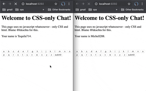
CSS-Only Chat
A truly monstrous async web chat using no JS whatsoever on the frontend.

Wait what
This is an asynchronous chat that sends + receives messages in the browser with no reloads and no javascript.
Ok so how
Background-images loaded via pseudoselectors + a forever-loading index page (remember Comet?).
Say that again?
Ok, so there are two things we need the browser to do: send data and receive data. Let’s start with the first.
Sending Data
CSS is really limited in what it can do. However, we can use it to effectively detect button presses:
.some-button:active {
  background-image: url('some_image.jpg')
}
What’s cool is that a browser won’t actually load that background image until this selector is used – that is, when this button is pressed. So now we have a way to trigger a request
to a server of our choice on a button press. That sounds like data sending!
Now, of course, this only works once per button (since a browser won’t try to load that image twice), but it’s a start.
Receiving Data
Since we can’t use JS, it’s really hard to change a page after it’s already been loaded. But it is possible.
Back before websockets were widely supported, we had to use clever hacks if we wanted to push data from a server to a client in an ongoing basis. One such hack was just to make the
page never finish loading. It turns out that you can tell the browser to start rendering a page before it’s finished loading (using the Transfer-Encoding: chunked http
header). And when you do that, you don’t actually have to stop loading the page. You can just keep adding stuff to the bottom of the html forever, at whatever rate you
want.
So, for example, you could start sending a normal html page, then just stop sending html (while still telling the client you’re sending) until you’re ready to deliver another
message.
Now, all this lets us do is periodically append html to the page. What can we do with that? How about, when you load the index page, this happens:
- We load up the first pile of html we want to show. A welcome message, etc.
- We stop loading html for a while until we want to send some sort of update.
- Now we load up a
<style> element that display: none‘s all the previous html
- Then we load up whatever new html we want to show
- Finally we wait until the next update we want to send and GOTO 3.
Single-use buttons?
Ok, so we have that problem earlier where each button is only single-use. It tries to send a get request once, then never will again.
Thankfully, our method of receiving data fixes that for us. Here’s what happens:
- We show an “a” button whose background image is like “img/a”.
- When you press it, the server receives the image request for “a”
- The server then pushes an update to the client to hide the current button and replace it with one whose background images is “image/aa”.
If the buttons you pressed were “h”, “e”, and “l”, then the “a” button’s background image url would be “img/hela”. And since we’re replacing all buttons every time you press one,
the single-use button problem goes away!
Misc other details
- We actually encode a bit more info into the button urls (like each client’s id)
- Because the data-sending and data-receiving happens on different threads, we need inter-thread communication. That sounds like work, so we’ll just use Redis pubsub for that.
FAQ
What inspired this? Chernobyl, Hindenburg, The Tacoma Narrows Bridge…
Really? No, it was this clever tweet by davywtf.
Why’s your code suck Why do you suck?
No but really Because I was mostly making this up as I went. There’s a lot of exploratory coding here that I only minimally cleaned up. If I rebuilt it I’d store
the UI state for a client in redis and just push it out in its entirety when needed via a single generic screen-updating mechanism.
What could go wrong with this technique? Broken by browser bg-image handling changes; long-request timeouts; running out of threads; fast-clicking bugs; generic
concurrency headaches; poor handling by proxies; it’s crazy inaccessible; etc etc
Should I use this in real life? Dear god yes.
I have an idea for how this could be made better/worse/hackier Tweet at me (@kkuchta). I’m always down to
see a terrible idea taken further!
Practical Details
If you want to install and use this locally you should:
- Re-evaluate your life choices
- If you simply must continue, check out INSTALL.md
If you want to contribute, see number 1 above. After that, just fork this repo, make a change, and then open a PR against this repo.