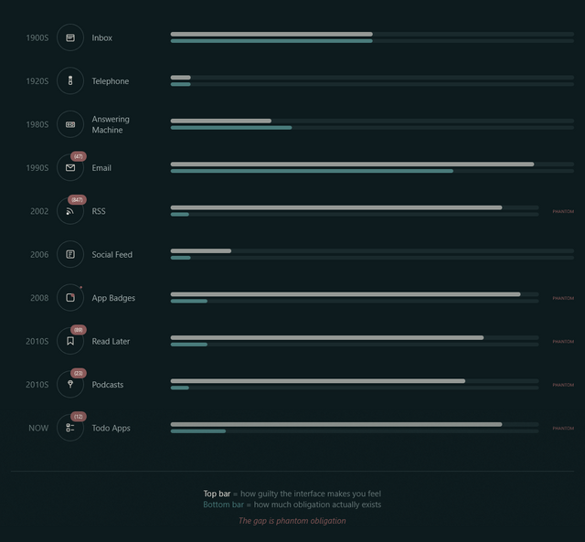
A week or so ago, Terry Godier – who’s been thinking a lot about UX assumptions lately – argued that the design of most feed readers produces an effect called “phantom obligation”.
He observes that the design of feed readers – which still lean on the design of the earliest feed readers, which adopted the design of email software to minimise the learning curve – makes us feel obligated to stay on top of all our incoming content with its “unread counts”.
Phantom obligation
Email’s unread count means something specific: these are messages from real people who wrote to you and are, in some cases, actively waiting for your response. The number isn’t neutral information. It’s a measure of social debt.
But when we applied that same visual language to RSS (the unread counts, the bold text for new items, the sense of a backlog accumulating) we imported the anxiety without the cause.
…
RSS isn’t people writing to you. It’s people writing, period. You opted to be notified of their existence. The interface implied debt where none existed. The obligation became phantom.
For a while now I’ve been encouraging people to see their feed reader as something distinct from email, and Terry’s expertly summarised exactly why. When people think of RSS as being like email, they’re encouraged to idolise “inbox zero” for both. But that’s not the right metaphor for RSS at all.
From where I’m sitting
I use FreshRSS as my feed reader, and I love it. But here’s the thing: I use the same application for two different kinds of feeds. I call them slow content and fast content.2
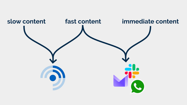
Slow content
Blogs, news, podcasts, webcomics, vlogs, etc. I want to know that there is unread content, but I don’t need to know how much.
In some cases, I configure my reader to throw away stuff that’s gotten old and stale; in other cases, I want it to retain it indefinitely so that I can dip in when I want to. There are some categories in which I’ll achieve “inbox zero” most days3… but many more categories where the purpose of my feed reader is to gather and retain a library of things I’m likely to be interested in, so that I can enjoy them at my leisure.
I also use my RSS reader to subscribe to a few mailing lists (where an RSS feed isn’t available for some reason). These – like blogs – are often “people writing, period” content and shouldn’t have been sent by email in the first place!4
Fast content
Some of the things I subscribe to, though, I do want to know about. Not necessarily immediately, but “same day” for sure! This includes things like when it’s a friend’s birthday (via the Abnib Birthdays feed) or when there’s an important update to some software I selfhost.
This is… things I want to know about promptly, but that I don’t want to be interrupted for! I appreciate that this kind of subscription isn’t an ideal use for a feed reader… but I use my feed reader with an appropriate frequency that it’s the best way for me to put these notifications in front of my eyeballs.
I agree with Terry that unread counts and notification badges are generally a UX antipattern in feed readers… but I’d like to keep them for some purposes. So that’s exactly what I do.
How I use FreshRSS (to differentiate slow and fast content)
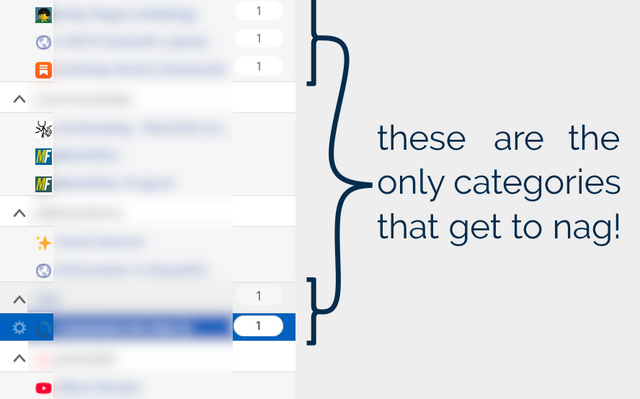
FreshRSS already provides categories. But what I do is simply… not show unread counts except for designated feeds and categories. To do that, I use the CustomCSS extension for FreshRSS (which nowadays comes as-standard!), giving it the following code (note that I want to retain unread count badges only for feed #1 and categories #6 and #8 and their feeds):
.aside.aside_feed {
  /* Hide all 'unread counts' */
  .category, .feed {
    .title:not([data-unread="0"])::after,
    .item-title:not([data-unread="0"])::after {
      display: none;
    }
  }

  /* Re-show unread counts only within:
   * - certain numbered feeds (#f_*) and
   * - categories (#c_*)
   */
  #f_1, #c_6, #c_8 {
    &, .feed {
    .title:not([data-unread="0"])::after,
    .item-title:not([data-unread="0"])::after {
      display: block;
    }
  }
}
That’s how I, personally, make my feed reader feel less like an inbox and more like a… I don’t know… a little like a library, a little like a newsstand, a little like a calendar… and a lot like a tool that serves me, instead of another oppressive “unread” count.
Maybe it’ll help you too.
Footnotes
1 Or whenever you like. It’s ‘slow content’. I’m not the boss of you.
2 A third category, immediate content, is stuff where I might need to take action as soon as I see it, usually because there’s another human involved – things like this come to me by email, Slack, WhatsApp, or similar. It doesn’t belong in a feed reader.
3 It’s still slow content even if I inbox-zero it most days… because I don’t inbox-zero it every day! I don’t feel bad ignoring or skipping it if I’m, for example, not feeling the politics news right now (and can you blame me?). This is fundamentally different than ignoring an incoming phone call or a knock at the door (although you’re absolutely within your rights to do that too, if you don’t have the spoons for it).
4 I’m yet to see a mailing list that wouldn’t be better as either a blog (for few-to-many communication) or a forum (for many-to-many communication), frankly. But some people are very wedded to their email accounts as “the way” to communicate!


![XKCD comic. Transcript: [A single panel containing a large, elevated sign with Ponytail standing in front of it.] [Title, slightly off horizontal, more to the right than central and the character spacing is not entirely consistent/aesthetic:] Doanate[sic] to fix this sign! [To the left of the lower part of the sign there is an 'QR code', tilted slightly with a plaintext link beneath it:] https://[illegible].com [To the right are several dollar values, in one column, and 'fixes', in a second, some of which have their own self-demonstrating quirks.] [The letters "R" and "N" may be too close together:] $10 fix kerning [Both dollar value and fix text are shifted left of their respective columns:] $20 align columns [This line is in a smaller font:] $20 fix text size $50 fix typo $50 fix centering $100 fix rotation [Ponytail stands looking at the sign, apparently in the process of using a smartphone:] Grrr... [Caption below panel:] My new company's business model is based on extorting graphic designers.](https://bcdn.danq.me/_q23u/2025/07/fix_this_sign1.png)
 Alpaca
 Anteater
 Bat
Bat
 Beetle
 Butterfly
 Camel
Camel
 Cat
Cat
 Chameleon
 Cobra
Cobra
 Cow
Cow
 Crab
Crab
 Crocodile
 Dog
Dog
 Duck
Duck
 Elephant
 Elk
Elk
 Fish
Fish
 Frog
Frog
 Giraffe
 Hippo
Hippo
 Husky
Husky
 Kangaroo
 Lion
Lion
 Macaw
Macaw
 Manatee
 Monkey
 Mouse
Mouse
 Octopus
 Ostrich
 Owl
Owl
 Panda
Panda
 Pelican
 Penguin
 Pig
Pig
 Rabbit
 Raccoon
 Ray
Ray
 Rhino
Rhino
 Rooster
 Shark
Shark
 Sheep
Sheep
 Sloth
Sloth
 Snake
Snake
 Spider
 Squirrel
 Swan
Swan
 Tiger
Tiger
 Toucan
 Turtle
 Whale
Whale