It’s my final day in the cute garden office of the AirBnB we’re living in, this week, and every time I step through the door I catch a glimpse
of our small, sandy-coloured dog squatting in the garden.
Except the dog isn’t even here. My brain keeps getting tricked… by this statue of a pig:
Mike Cook wrote a provocative blog post this weekend; an
anti-preservationist argument for video games. The essence of his arguments seem to boil down to:
Emphasising creation over preservation is liberating, as demonstrated by the imagination in the livecoding community.
Archiving without intensive curation is building an emotional or intellectual safety net you never expect to be used.
Digital preservation is a lossy process: effort spent on accurately preserving some media is at the expense of other media, whose lossy preservation paints in inaccurate picture of
what is lost.
Recreation, rather than strict preservation, ensures the continuity of the most culturally-important parts of games
Art is important for culture, and it’s important for nostalgia, but it’s hard to draw the line between where one purpose ends and the other begins.
He concludes to say:
60 games are released on Steam every day.
There are 294 game jams active on Steam as I write this.
Preserve nothing. Make more.
To make is to preserve.
Let games die.
Digital preservationism
Philosophically-speaking, there’s no doubt that I am a digital preservationist. I argue against unnecessary URI changes. I donate to
The Internet Archive. Back at the Bodleian, I used to carve out free time from project work to spend time making sure the University’s “older”
exhibition websites could be made to survive1. My approach to running out of hard drive space is to buy more hard drives. Even my blog retains
content going back into the last millennium2!
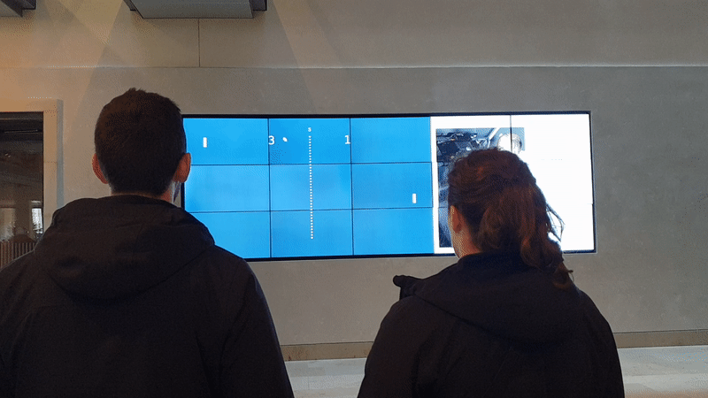
My reimplementation of Pong had several distinct differences from the original… but to a layperson – for whom Pong are the target audience! – those differences are
irrelevant. To what level fidelity matters depends on many factors, and the biggest problem is that we don’t know what those factors are until it’s time to retrieve these historical
media.
This screenshot isn’t from the original site but from my homage to it. More on that later.
This makes it seem like I’m very much on the side of recreation, rather than preservation, but that’s not the case. In both of these projects I started by disassembling the
original works.
That I chose to make them accessible to a modern audience by reimplementation rather than by emulation was an artistic choice. I opted for lower fidelity by making something
mildly-transformative. I chose to appeal to the widest possible audience, at the expense of presenting an experience that was totally in-keeping with the original.
But I couldn’t have done that without access to the originals. Had I recreated Pong from memory rather than from re-playing it, I’d have doubtless introduced
inconsistencies that would have “felt wrong” to people whose memories of the game, while fundamentally accurate, differed from mine. Had I recreated Axe Feather without
first coming up with a mechanism to extract and reformat the video clips in the original I’d have failed to tap into the specific nostalgia of some of its users, which was tied to the
specific actor who performed in it3.
So I guess it’s important to me that somebody is preserving these things. So that I can use them to create new things. I stand for preservation for culture’s
sake, so that I personally can enjoy the benefits for nostalgia’s sake.
For all that I feel like I’m making the case for “preserve everything; work out what’s important later”, Mike’s argument gives me an uncomfortable cognitive dissonance. Because
I’ve also come to discover a joy in the ephemeral, too.
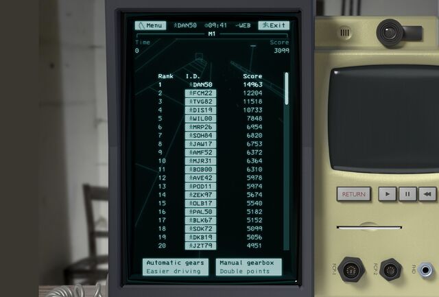
I don’t know who’ll preserve ARCC, with its permanently-capped 500-playerbase limit, but I’m happy that I’ll probably always hold
the highscore on driving/racing minigame M1.
Increasingly, I’m okay with just taking the experience of something with me. It bothers me that my memory is fallible and that I can’t necessarily recreate a digital
experience whose technology has been lost to time, but I am, for the most part, okay with it.
Some of the best gaming experiences I’ve ever had are impossible to “capture” in an archive anyway. They were conversations over the tabletop roleplaying table, or moments of tension
resulting from a videogame’s emergent gameplay, or random occurrences unlikely to be replicated. Those get preserved in my memory alone, retold as stories with
gradually-decreasing accuracy as new memories take their place.
That said…
Who decides what games get preserved?
I feel like the decision about what to preserve and how should be in the hands of the audience of a piece of art, not its creators. If a videogame (or film, or book, or
whatever) is culturally-significant enough to warrant a high-fidelity preservation, it ought to be ultimately up to the members of that culture to make that decision!
Transport Tycoon Deluxe met that bar, and it’s possible to play both faithful recreations or modern reimplementations (the latter having excellent new features)
courtesy of the OpenTTD project4.
But modern videogames are, perhaps, getting harder to preserve. Always-online features, insidious DRM, digital distribution, live updates, and games-as-a-service streaming
all shift the balance of power more-firmly into the hands of publishers5
rather than players. It’s already hard to play a randomly-selected thirty-year-old videogame today; I reckon it’ll be almost impossible to do the same thirty years
hence.
Saying “let games die” feels a bit like giving up to that inevitability. Like saying to the slimier publishers “it’s okay, we didn’t care about keeping that anyway” when they shut down
servers or remotely kill games. I know that’s not what Mike’s saying, but it could be wilfully misinterpreted that way.
Anyway: I don’t have a nice conclusion to any of this. Just a lot of mixed-up feelings.
2 Even where those writings don’t really represent me well any more.
3 It turns out that, for a significant number of folks who are mostly younger-than-me,
this advertisement represented a kind of sexual awakening, based on some of the comments and emails I’ve received about it!
4 Which I’ve also donated too. Turns out I’m happy to invest in both pure
preservation and in spiritual-successor reimplementation!
5 Supposing that Sonic Rumble Party somehow wasn’t a catastrophic
pay-to-win nightmare and somehow was deemed culturally-significant… how would you go about archiving it? Without Sega/Sonic Team’s consent, you’d be totally out of luck.
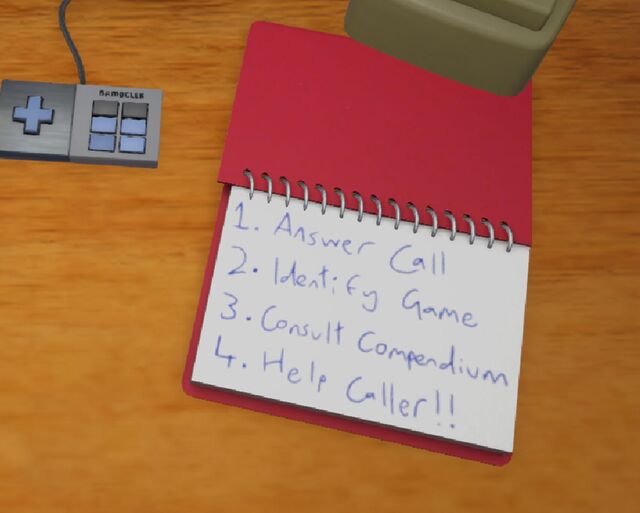
…a visual novel on screen, where you’re working a fictional hint line, with critical information in The Compendium, a dog-eared binder full of official docs mixed with handwritten
notes from previous counselors who figured out what actually works.
So yeah. It’s a bit like… Keep Talking and Nobody Explodes, except instead of bomb defusal, you’re working on a computer game hint line in their heyday of circa 1993.
Customers call you, and you have to help them with their video game problems, ideally in accordance with company policy to try to guide the customer to their own answer
rather than telling them the solution outright. Oh, and also sometimes people call up about products that aren’t covered and you need to identify this promptly and get on to the next
caller.
Obviously you’ve already got an encyclopaedic knowledge of all the games already? No, you don’t, because before they could even start on making Hint Line
’93, the creators first needed to invent a fictional video games company, a catalogue of fictional games (including faked screenshots, history, lore, and BBS posts),
and more. But it wouldn’t matter anyway, because you get a thick manual – the compendium – of hints and tips to refer to
(also code wheels, post-its, and lots more).
The exhibit is designed to be experienced in-person, but – given that I live on the other side of the planet – I was delighted to see that the museum put a (less-tactile) version online
for visitors around the world to play.
Also: speaking as somebody with an awesome name, there are so many people with awesome names involved with this project. Mars
Buttfield-Addison and Paris Buttfield-Addison are perhaps my favourite. Excellent names.
Where could I possibly start this list if not with eccentric games-as-art proponent Pippin Barr. Created in 2016, It is as if you were
playing chess is an interactive experience that encourages you to mimic the physical movements of playing a digital chess game, without actually ever looking at a chessboard.
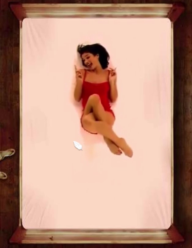
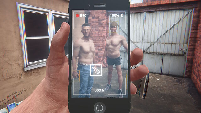
It’s a 67-second portrait video featuring four partially-dressed young men somewhere in what looks like Tyneside. Two of them kiss before one of the pair swigs from a spirits bottle and
takes a drag from a cigarette, throwing both onto the floor afterwards3.
Finally, the least-dressed young man (seemingly with the consent of all involved) repeatedly strikes the drinker/smoker with a folding chair.
It’s… quite something.
Unless you watch the video and then play the game, it’s hard to explain quite how faithful a recreation it is… and yet it also permits you to subvert the story, by
changing the order of events, how passionately the lads kiss, how much alcohol is consumed (or spilled), how long to drag on the cigarette, or the level of aggression in the chair
strikes. Also, there’s an easter egg if you manage to beat the victim enough…
In his blog post Hard Lads as an important failure, the game’s creator
Robert Yang describes it as “neorealist fumblecore”, and goes into wonderful detail about the artistic choices he made in creating it. The game is surreal, queer, and an absolute
masterpiece.
Let’s sidestep a moment out of video games and take a look at a book.
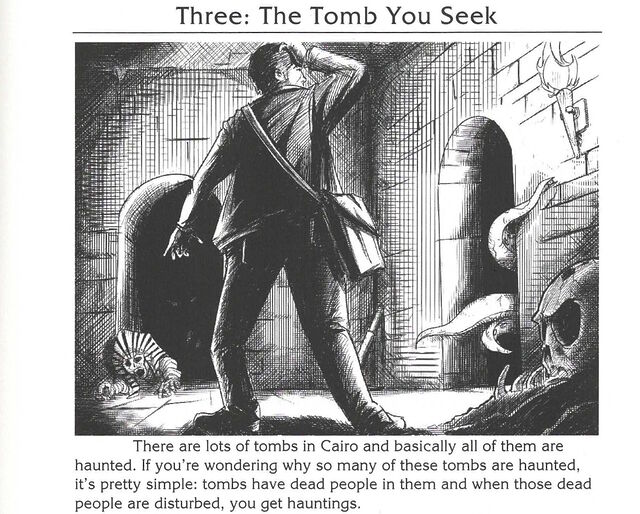
Top Ten Games You Can Play In Your Head By Yourself, edited by Sam Gorski (founder of Corridor Digital) and D. F. Lovett and based on an original series of gamebooks written pseudonymously by “J. Theophrastus Bartholomew”, initially looks like exactly what it
claims to be. That is, a selective reprint of a very-1980s-looking series of solo roleplaying game prompts.
Except that’s clearly a lie. There’s no evidence that J. Theophrastus Bartholomew exists as an author (even used as a pen name), nor do any of the fourteen books credited to him in the
foreword. The alleged author only as a framing device by the actual authors: the “editors”.
Seriously, what even is this book?
Superficially, the book presents a series of ten… “prompts”, I suppose. It’s like reading the rules of a Choose Your Own Adventure gamebook, or else the flavour and background in
an Advanced Dungeons & Dragons module.
Each prompt sets up a premise and describes it as if it would later integrate with a ruleset… but no ruleset is forthcoming. Instead, completing the story and also how
to go about completing the story is left entirely up to the reader.
It’s disarming, like if a recipe book consisted of a list of dishes and cuisines, a little about the history and culture of each… and no instructions on how to make it.
But what’s most-weird about the book (and there’s plenty more besides) are the cross-references between the chapters4.
Characters from one adventure turn up in another. Interstitial “Shadows and Treasures” chapters encourage you to reflect upon previous adventures and foreshadow those that follow.
There’s more on its RPGGeek page (whose existence surprised me!), along with a blog post by Lovett. They’re doing a horror-themed sequel, which I
don’t feel the need to purchase, but I’d got to say from what I’ve seen so far that they’ve once-again really nailed the aesthetic.
I have no idea who the book is “for”, but it’s proven surprisingly popular in some circles.
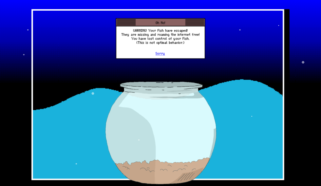
What is Mackerelmedia Fish? I’ve had a thorough and pretty complete experience of it, now, and I’m still not sure. It’s one or more (or
none) of these, for sure, maybe:
A point-and-click, text-based, or hypertext adventure?
A statement about the fragility of proprietary technologies on the Internet?
An ARG set in a parallel universe in which the 1990s never ended?
A series of surrealist art pieces connected by a loose narrative?
…
What I can tell you with confident is what playing feels like. And what it feels like is the moment when you’ve gotten bored waiting for page 20 of Argon Zark to finish appear so you decide to reread your already-downloaded copy of the 1997 a.r.k bestof book, and for a moment you think to yourself: “Whoah; this must be what living in the
future feels like!”
…
Mackerelmedia Fish is a mess of half-baked puns, retro graphics, outdated browsing paradigms and broken links. And that’s just part of what makes it great.
Historical fact: escaped fish was one of the primary reasons for websites failing in 1996.
Just because I wrote about it before doesn’t mean that you shouldn’t play it now, especially if you missed out on it during the insanity of Lockdown
1.0.
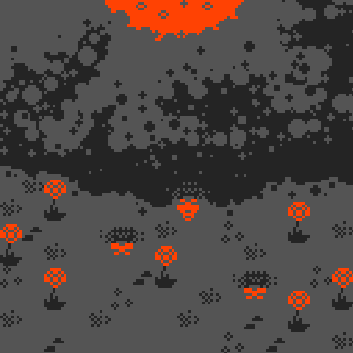
As an amateur beekeeper, semi-professional game designer, and generally pedantic person, I decided to play all the games I could find on the subject and rate them
according to their “realism”. The rating goes from one (⬢⬡⬡⬡⬡) to five (⬢⬢⬢⬢⬢) honeycomb cells.
I intentionally avoided all the games in which bees are completely anthropomorphized or function like a spaceship, and games in which bees play a secondary role. I did include short
and semi-abstract games when they referenced the bees actual behavior. Realism is not a matter of visual definition or sheer procedural complexity. In my view, even a tiny game can
capture something compelling about this fascinating insect.
Ha-bee-tat is one of only four games to which Paolo awards a full five honeycombs. And Paolo is picky, so that’s high praise indeed for the realism of this game,
which is – get this – also surprisingly educational on the subject of different species of bee! Neat!
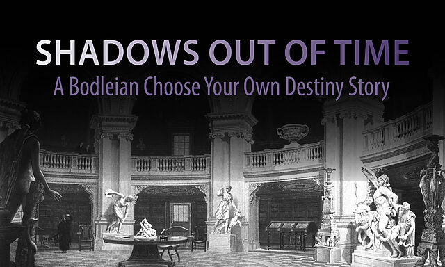
This Twine-based adventure was released for my last Halloween at the Bodleian, based mostly upon the work of my then-colleague Brendon Connelly. We were aiming for something slightly unnerving, slightly Lovecraftian… and very Bodleian Libraries.
The Bodleian’s Comms team and I came up with all kinds of imaginative and unusual ways to engage with the wider world, of which this was just one.
Obviously I’ve written about it before, but if I can just take a moment to explain what we were going for, which didn’t come out in any of
the IFDB reviews or anything:
The story is cyclical: the protagonist keeps waking up, completely alone, in a seemingly abandoned world, having nodded off half way through The Shadow Out of Time in a Bodleian reading room. As they explore the eerie and empty world5, the protagonist catches vague
glimpses of another figure moving around the space as well, always just out of reach in the distance or beyond a window. There are even hints that this other person has been following
them: a book left open can be found closed again, or vice-versa, for example.
Eventually, exhausted, the character needs to rest, waking up again6 in order to continue their explorations, and it gradually becomes apparent that they are the ghost
that haunts the library. The shadows they’re witnessing are echoes of their past and future self, playing through the permutations of the game as they remain trapped in an endless and
futile chase with their own tail.
When I first wrote about this video, I remarked that it was sad that it was under-loved, attracting only a few hundred views on YouTube and only a
couple of dozen “thumbs up”. Six years on… I’m sad to say it’s not done much better for popularity, with low-thousands of views and, like, six-dozen “thumbs up”. Possibly
this (lack of) reaction is (part of the reason) why its creator Yaz Minsky has kind-of gone quiet online these last few years.
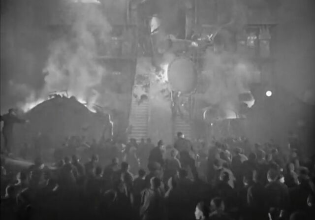
I always thought that this staircase looked like something out of an early Zelda game. Now it can sound like it too.
So what it is?
Well, you know how you’ve probably never seen Metropolis with a musical score quite like the one
composer Gottfried Huppertz intended? Well this… doesn’t solve that problem. Instead it re-scores the film with video game
soundtracks from the likes of Metroid, Castlevania, Zelda, Mega Man, Final Fantasy, Doom,Kirby, and
F-Zero, among others.
And it… works. It still deserves more love, so if you’ve got a spare couple of hours, put it on!
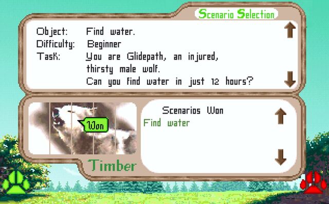
Like Ha-bee-tat, this is a realistic, pixelated, educational video game about nature. It came out in 1994 but I didn’t get around to playing it until twenty-five years
later in 2019, when I accidentally discovered it while downloading Wolfenstein to my DOSBox.
Like many games of its vintage, it’s not always easy. Imagine my delight when my wolf Glidepath, fighting his injury, managed to find water without getting shot by a human
(and it only took like five attempts).
What you’re seeing is a review of Wolf… but for wolves. I’m not aware of any other posts on that entire site that make the same gag, or
anything like it. That’s weird. And brilliant.
People have done similar thinigs in a variety of ways, but this was one of the most-ambitious:
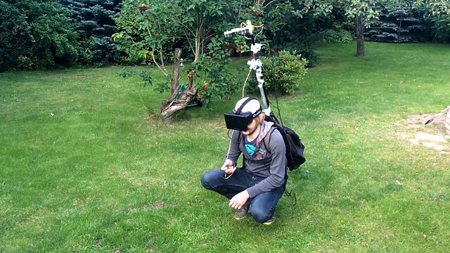
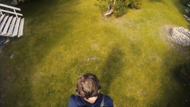
I’m sure the Steam Frame will make light work of this heavyweight rig, but that’s not the point.
As part of a two-day hack project, these folks put together a mechanism to mount some cameras up a pole, from a backpack containing a computer, connected to a VR headset. The idea was
that you’d be able to explore the world with the kind of “over-the-shoulder cam” that you might be used to in some varieties of videogame.
Theirs was just an experiment in proving what was possible within a “real world” game world. But ever since I saw this video, I’ve wondered about the potential to make what is
functionally an augmented reality game out of it. With good enough spatial tracking, there’d be nothing to stop the world as-shown-to-your-eyes containing objects
that aren’t present in the real world.
Like… what if you were playing Pokemon Go, but from a top down view of yourself as you go around and find creatures out and about in the real world. Not just limited to looking
through your phone as a lens, you’d be immersed in the game in a whole new way.
More “above the head” than “over the shoulder”, but the principle’s much the same.
I’m also really interested in what the experience of seeing yourself from the “wrong” perspective is like. Is it disassociating? Nauseating? Liberating? I’m sure we’ve all done one of
those experiments where, by means of mirrors or props, we experience the illusory sensation of our hand being touched when
it’s not actually our hand. What’s that like when you’re able to visually step completely out of your own body, and yet still move and feel
it perfectly?
There are so many questions that this set-up raises, and I’m yet to see anybody try to answer them.
Even folks who are familiar with the NetHack idiom The DevTeam Thinks Of Everything are still likely to be
impressed with the sheer diversity of objects and their interactions available in Counterfeit Monkey.
What makes it weird? The fact that there’s not really anything else quite like it. Within your first half hour or so of play you’ll probably have acquired your core toolkit – your
full-alphabet letter remover, restoration gel, and monocle – and you’ll begin to discover that you can do just about anything with anything.
Find some BRANDY (I’m don’t recall if there is any in the game; this is just an example) and you can turn it into a BRAND, then into some BRAN,
then into a BRA7. And while there might not exist any puzzles in the game for which you’ll need a bra, each of these items will have a
full description when you look at it. Can you begin to conceive of the amount of work involved in making a game like this?
It’s now over a decade old and continues to receive updates as a community-run project! It’s completely free8,
and if you haven’t played it yet, congratulations: you’re about to have an amazing time. Pay attention to the tutorial, and be sure to use an interpreter that supports the
UNDO command (or else be sure to SAVE frequently!).
I remain interested in things that push the boundaries of what a “game” is or otherwise make the space “fun and weird”. If you’ve seen something I should see, let me know!
Footnotes
1 The blog post got deleted but the Wayback Machine has a copy.
2 Note you don’t get to see a video of me playing It is as if you were making
love; you’re welcome.
3 Strangely – although it’s hard to say that anything in this video is more-strange than
any other part – one of the “hard lads” friends’ then picks up his fag end and takes a drag
4 This, in case it wasn’t obvious to you already, is likely to be a big clue that the
authors’ claim that each chapter was “found” from somewhere different can be pretty-well dismissed.
5 I wanted it to draw parallels to The Langoliers, a Stephen King short story about a group of people who get trapped alone in “yesterday”.
6 Until they opt to “stay asleep forever”, ending the game.
8Counterfeit Monkey is free, but it was almost charityware: if it turns
out you love it as much as I did then you might follow my lead and make a donation to
Emily’s suggested charity the Endangered Language Fund. Just sayin’.
She sent it to my “send me a postcard” PO box (even though she’s got my actual address), which I’m guessing was an indication that
it was being “sent” to me “as if” she were a stranger on the Internet.
Whatever the reason, it was an uplifting piece of mail to receive.
In other things-are-improving news, our insurance company (finally! – after lots of checks and paperwork at their end) accepted liability for paying for the repairs we’ll need and for
our temporary accommodation (including the places we’ve already been living for the last few weeks).
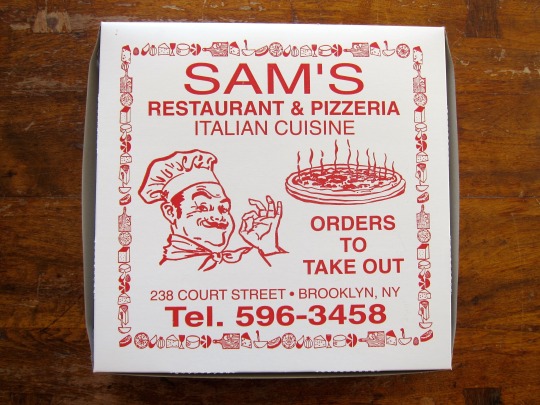
One of my goals was to uncover the origin of the ubiquitous Winking Chef. We’ve all seen him – the chubby mustachioed man wearing a chef’s hat and often making a gesture of approval
with his hand. I dug around as much as I could – searching old magazines and websites looking for the origin of the image. Of course generic chef images go way back in print
advertising but I was looking for one image in particular, the one I grew up with on my pizza boxes in New Jersey. Who was this guy? Was the image based on a real person? What’s the
deal????
…
There are few people in this world who are more-obsessed with pizza than I, but Scott’s gotta be one of them. Since discovering this blog post of his I now really want to
go on one of his pizza-themed walking tours of New York City. But you might have guessed that.
Anyway: Scott – who has a collection of pizza boxes, by the way (in case you needed evidence that he’s even more pizza-fixated than me) – noticed the “winking chef” image,
traced its origin, and would love to tell you about it. An enjoyable little read.
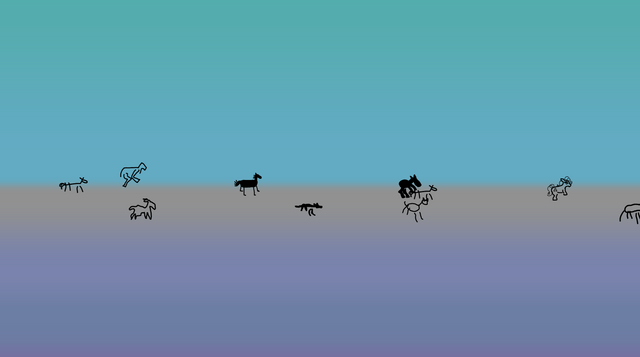
Honestly I just wanted to play around with gradients. But gradients without anything on the horizon lack something, so I added horses. Since I can’t draw horses, now you
can draw them. And watch them parade across the screen alongside horses drawn by people you probably wouldn’t like. Or maybe you would, how should I know?!
…
I love a good (by which I mean stupid) use of a .horse domain name. I’m not sure anything will ever beat endless.horse, but gradient.horse might be a close second.
Draw a horse. Watch it get animated and run wild and free with the horses that other people have drawn. That is all.
This is a blog post about things that make me nostalgic for other things that, objectively, aren’t very similar…
When I hear Dawnbreaker, I feel like I’m nine years old…
…and I’ve been allowed to play OutRun on the arcade cabinet at West View
Leisure Centre. My swimming lesson has finished, and normally I should go directly home.
On those rare occasions I could get away1
with a quick pause in the lobby for a game, I’d gravitate towards the Wonderboy machine. But there was something about the tactile
controls of OutRun‘s steering wheel and pedals that gave it a physicality that the “joystick and two buttons” systems couldn’t replicate.
The other thing about OutRun was that it always felt… fast. Like, eye-wateringly fast. This was part of what gave it such appeal2.
OutRun‘s main theme, Magical Sound Shower, doesn’t actually sound much like Dawnbreaker. But
both tracks somehow feel like… “driving music”?
But somehow when I’m driving or cycling and it this song comes on, I’m instantly transported back to those occasionally-permitted childhood games of OutRun4.
When I start a new Ruby project, I feel like I’m eleven years old…
It’s not quite a HELLO WORLD, but it’s pretty-similar.
At first I assumed that the tedious bits and the administrative overhead (linking, compiling, syntactical surprises, arcane naming conventions…) was just what “real”, “grown-up”
programming was supposed to feel like. But Ruby helped remind me that programming can be fun for its own sake. Not just because of the problems you’re solving or the product
you’re creating, but just for the love of programming.
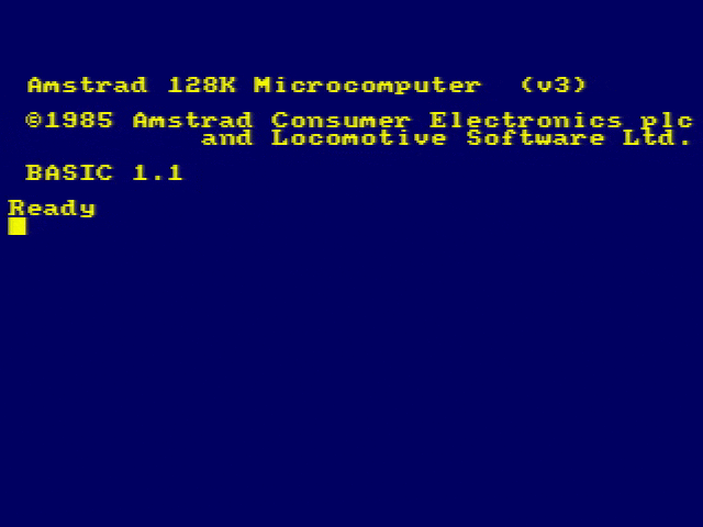
The experience of starting a new Ruby project feels just like booting up my Amstrad CPC and being able to joyfully write code that will just work.
I still learn new programming languages because, well, I love doing so. But I’m yet to find one that makes me want
to write poetry in it in the way that Ruby does.
When I hear In Yer Face, I feel like I’m thirteen years old…
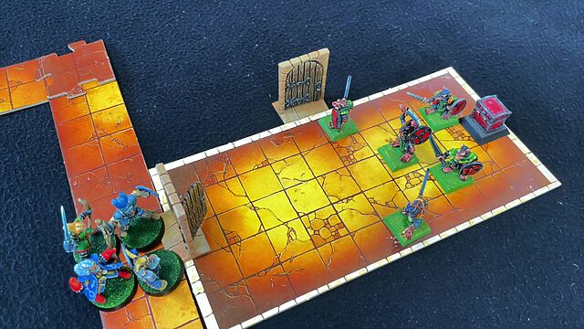
…and I’m painting Advanced HeroQuest miniatures6 in the attic at my dad’s house.
I’ve cobbled together a stereo system of my very own, mostly from other people’s castoffs, and set it up in “The Den”, our recently-converted attic7,
and my friends and I would make and trade mixtapes with one another. One tape began with 808 State’s In Yer Face8,
and it was often the tape that I would put on when I’d sit down to paint.
Advanced HeroQuest came with some fabulously ornate secondary components, like the doors that were hinged so their their open/closed state could be toggled, and I spent
way too long painting almost the entirety of my base set.
In a world before CD audio took off, “shuffle” wasn’t a thing, and we’d often listen to all of the tracks on a medium in sequence9.
That was doubly true for tapes, where rewinding and fast-forwarding took time and seeking for a particular track was challenging compared to e.g. vinyl. Any given song would loop around
a lot if I couldn’t be bothered to change tapes, instead just flipping again and again10.
But somehow it’s whenever I hear In Yer Face11
that I’m transported right back to that time, in a reverie so corporeal that I can almost smell the paint thinner.
When I see a personal Web page, I (still) feel like I’m fifteen years old…
…and the Web is on the cusp of becoming the hot “killer application” for the Internet. I’ve been lucky enough to be “online” for a few years by now12,
and basic ISP-provided hosting would very soon be competing with cheap, free, and ad-supported services like Geocities to be “the
place” to keep your homepage.
Nowadays, even with a hugely-expanded toolbox, virtually every corporate homepage fundamentally looks the same:
Logo in the top left
Search and login in the top right, if applicable
A cookie/privacy notice covering everything until you work out the right incantation to make it go away without surrendering your firstborn child
A “hero banner“
Some “below the fold” content that most people skip over
A fat footer with several columns of links, to ensure that all the keywords are there so that people never have to see this page and the search engine will drop
them off at relevant child page and not one of their competitors
Finally, a line of icons representing various centralised social networks: at least one is out-of-date, either because (a) it’s been renamed, (b) it’s changed its
branding, or (c) nobody with any moral fortitude uses that network any more14
But before the corporate Web became the default, personal home pages brought a level of personality that for a while I worried was forever dead.
2 Have you played Sonic Racing: CrossWorlds? The first time I played it I was overwhelmed by the speed and colours of the
game: it’s such a high-octane visual feast. Well that’s what OutRun felt like to those of us who, in the 1980s, were used to much-simpler and slower arcade games.
3 Also, how cool is it that Metrik has a blog, in this day and age? Max props.
4 Did you hear, by the way, that there’s talk of a movie adaptation of OutRun, which could turn out to be the worst
videogame-to-movie concept that I’ll ever definitely-watch.
5 In very-approximate order: C, Assembly, Pascal, HTML, Perl, Visual Basic (does that even
count as a “grown-up” language?), Java, Delphi, JavaScript, PHP, SQL, ASP (classic, pre-.NET), CSS, Lisp, C#, Ruby, Python (though I didn’t get on with it so well), Go, Elixir… plus
many others I’m sure!
6 Or possibly they were Warhammer Quest miniatures by this point; probably this memory spans one, and also the other, blended together.
7 Eventually my dad and I gave up on using the partially-boarded loft to intermittently
build a model railway layout, mostly using second-hand/trade-in parts from “Trains & Transport”, which was exactly the nerdy kind of model shop you’re imagining right now: underlit
and occupied by a parade of shuffling neckbeards, between whom young-me would squeeze to see if the mix-and-match bin had any good condition HO-gauge flexitrack. We converted the
attic and it became “The Den”, a secondary space principally for my use. This was, in the most part, a concession for my vacating of a large bedroom and instead switching to the
smallest-imaginable bedroom in the house (barely big enough to hold a single bed!), which in turn enabled my baby sister to have a bedroom of her own.
8 My copy of In Yer Face was possibly recorded from the radio by my friend ScGary, who always had a tape deck set up with his finger primed close to the record key when the singles chart came on.
9 I soon learned to recognise “my” copy of tracks by their particular cut-in and -out
points, static and noise – some of which, amazingly, survived into the MP3 era – and of course the tracks that came before or after them, and
there are still pieces of music where, when I hear them, I “expect” them to be followed by something that they used to some mixtape I listened to a lot 30+ years
ago!
10 How amazing a user interface affordance was it that playing one side of an audio
cassette was mechanically-equivalent to (slowly) rewinding the other side? Contrast other tape formats, like VHS, which were one-sided and so while rewinding there was
literally nothing else your player could be doing. A “full” audio cassette was a marvellous thing, and I especially loved the serendipity where a recognisable “gap” on one
side of the tape might approximately line-up with one on the other side, meaning that you could, say, flip the tape after the opening intro to one song and know that you’d be
pretty-much at the start of a different one, on the other side. Does any other medium have anything quite analogous to that?
11 Which is pretty rare, unless I choose to put it on… although I did overhear it
“organically” last summer: it was coming out of a Bluetooth speaker in a narrowboat moored in the Oxford Canal near Cropredy, where I was using the towpath to return from a long walk to nearby Northamptonshire where I’d been searching for a geocache. This was a particularly surprising
place to overhear such a song, given that many of the boats moored here probably belonged to attendees of Fairport’s Cropredy Convention, at which – being a folk music festival – one
might not expect to see significant overlap of musical taste with “Madchester”-era acid house music!
12 My first online experiences were on BBS systems, of which my very first was on a
mid-80s PC1512 using a 2800-baud acoustic coupler! I got onto the Internet at a point in the early 90s at which the Web
existed… but hadn’t yet demonstrated that it would eventually come to usurp the services that existed before it: so I got to use Usenet, Gopher, Telnet and IRC before I saw
my first Web browser (it was Cello, but I switched to Netscape Navigator soon after it was released).
13 On the rare occasion I close my browser, these days, it re-opens with whatever
hundred or so tabs I was last using right back where I left them. Gosh, I’m a slob for tabs.
14 Or, if it’s a Twitter icon: all three of these.
15 Of course, they’re harder to find. SEO-manipulating behemoths dominate the search
results while social networks push their “apps” and walled gardens to try to keep us off the bigger, wider Web… and the more you cut both our of your online life, the calmer and
happier you’ll be.
Scroll art is a form of ASCII art where a program generates text output in a command line terminal. After the terminal window
fills, it begins to scroll the text upwards and create an animated effect. These programs are simple, beautiful, and accessible as programming projects for beginners. The SAM is a
online collection of several scroll art examples.
Here are some select pieces:
Zig-zag, a simple periodic pattern in a dozen lines of code.
Program output is limited to text (though this could include emoji and color.)
Once printed, text cannot be erased. It can only scroll up.
But these restrictions compel creativity. The benefit of scroll art is that beginner programmers can create scroll art apps with a minimal amount of experience. Scroll art
requires knowing only the programming concepts of print, looping, and random numbers. Every programming langauge has these features, so scroll art can be created in
any programming language without additional steps. You don’t have to learn heavy abstract coding concepts or configure elaborate software libraries.
…
Okay, so: scroll art is ASCII art, except the magic comes from the fact that it’s very long and as your screen scrolls to show it, an animation effect becomes apparent. Does that make
sense?
Anyway, The Scroll Art Museum has lots of them, and they’re much better than mine. I especially love the faux-parallax effect in Skulls and Hearts, created by a “background” repeating pattern being scrolled by a number of lines slightly off from its
repeat frequency while a foreground pattern with a different repeat frequency flies by. Give it a look!
I think of ElonStan420 standing in that exhibit hall, eyeing those cars with disdain because all that time, energy, care, and expression “doesn’t really matter”. Those hand-painted
pinstripes don’t make the car faster or cheaper. Chrome-plated everything doesn’t make it more efficient. No one is going to look under the hood anyway.
…
Don’t read the comments on HackerNews, Adam! (I say this, but I’ve yet to learn not to do so myself, when occasionally my writing escapes from my site and finds its way over there.)
But anyway, this is a fantastic piece about functionalism. Does it matter whether your website has redundant classes defined in the HTML? It renders the same anyway, and odds are good
that nobody will ever notice! I’m with Adam: yes, of course it can matter. It doesn’t have to, but coding is both a science and an art, and
art matters.
…
Should every website be the subject of maximal craft? No, of course not. But in a industry rife with KPI-obsessed, cookie-cutter, vibe-coded, careless slop, we could use
more lowriders.
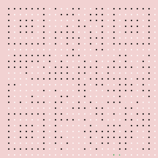
Generated a QR code as usual, minimising its size by making the URL uppercase (allows a smaller character set to be used) and maximising its resilience by ramping up the error
correction to the maximum.
Masked off all but the central 7% of each row and column, leaving just a grid of spots, and then re-adding the three large and one small square and the “zebra crossing” stripes that
connect the large squares, to ensure rapid discovery.
With a pink mask in place to help me see where I was working, drew lines, dots, and whatever else I liked over the black spots but not touching the white ones, to build a maze.
Removed the pink mask, leaving just black and white. Tested a bit.
It’s just about possible to scan this super-minimal QR code, but having the positioning elements in place to help the scanner identify that it is something
scannable makes a huge difference.
Obviously this isn’t a clever idea for real-world scenarios. The point of QR codes’ resilience and error correction is to compensate for suboptimal conditions “in the
field”, like reflections, glare, dust, grime, low light conditions, and so on.
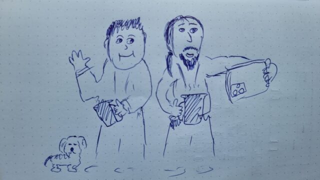
Fellow Abnibbers and I, who see each other extraordinary infrequently in our diaspora, have a tradition of sharing a group selfie when we happen to
coincide. I forgot to take one when @garethbowker@infosec.exchange and I met today, and by way of penance I tried to draw what I
should have done.
Unfortunately I can’t draw. He looks much less like a potato in real life! Think I got his dog right, though.


