I don’t know what this machine was (a crane, perhaps), but it’s now been almost-completely reclaimed by nature.
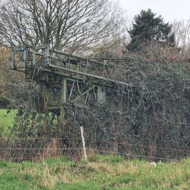
I don’t know what this machine was (a crane, perhaps), but it’s now been almost-completely reclaimed by nature.
It’s now twelve days since a flood struck my house, causing the ground floor to be submerged under a couple of feet of water and ultimately leading us to kick off an insurance claim process.
And man, a home insurance claim seems to be… slow. For instance, we originally couldn’t even get anybody out to visit us until F-day plus 10 (later improved to F-day plus 7). The insurance company can’t promise that they’ll confirm that they’ll “accept liability” (agree to start paying for anything) until possibly as late as F-day plus 17. Nobody will check for structural damage until F-day plus 191.
Oh, and the insurance company have advised us to look for something like a “12 month let with a 6 month break clause”, which is horrifying. We could be out of our home for up to a year.
Some days it feels like being stuck in a nowhere-place… but simultaneously still having to make the regular everyday stuff keep ticking over. Visiting the house- currently stripped of anything damp and full of drying equipment – feels like stepping onto another planet… or like one of those dreams where you’re somewhere familiar except it’s wrong somehow.
But spending time away from it, “as if” on holiday except-not, is weird too: like we’re accepting the ambiguity; leaning-in to limbo. Especially while we’re waiting for the insurance company to do their initial things, it feels like life is both on hold, and not-allowed to be on hold.
And I worry that by the time they’re committed to paying for us to stay somewhere else for at least half a year, they lose any incentive they might have to contract for speed. There’s no hurry any more. We’re expected to just press pause on our home, but carry on with our lives regardless, pretending that everything’s normal.
So yeah, it’s a weird time.
1 I’m totally committed to this way of counting the progress, which I started on F-day plus 3. I get the feeling like it might be a worthwhile way of keeping track of how long all of this takes.
2 Normally, the younger and older child are able to get to school on foot or via a bus that stops virtually outside our house, each day, so an hour-plus round-trip to their schools and back up to twice a day is a bit of a drag! We’re managing to make it work with a little creativity, but I wouldn’t want to make it a long-term plan!
3 And do some work from there, amidst the jet engine-like noise of the dehumidifiers!
Today, an AI review tool used by my workplace reviewed some code that I wrote, and incorrectly claimed that it would introduce a bug because a global variable I created could “be available to multiple browser tabs” (that’s not how browser JavaScript works).
Just in case I was mistaken, I explained to the AI why I thought it was wrong, and asked it to explain itself.
To do so, the LLM wrote a PR to propose adding some code to use our application’s save mechanism to pass the data back, via the server, and to any other browser tab, thereby creating the problem that it claimed existed.
This isn’t even the most-efficient way to create this problem. localStorage would have been better.
So in other words, today I watched an AI:
(a) claim to have discovered a problem (that doesn’t exist),
(b) when challenged, attempt to create the problem (that wasn’t needed), and
(c) do so in a way that was suboptimal.
Humans aren’t perfect. A human could easily make one of these mistakes. Under some circumstances, a human might even have made two of these mistakes. But to make all three? That took an AI.
What’s the old saying? “To err is human, but to really foul things up you need a computer.”
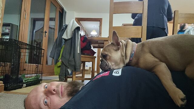
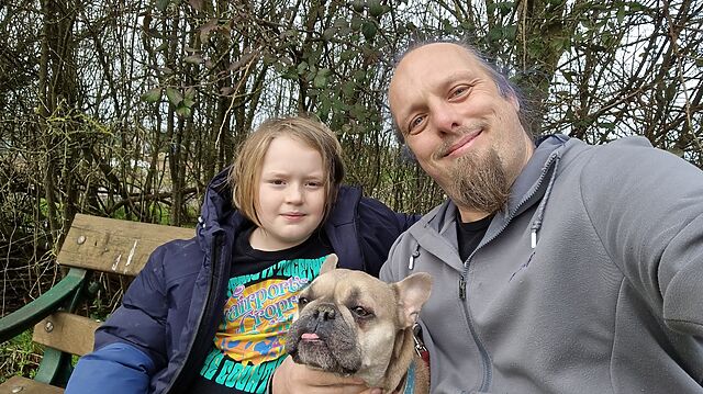
Today was a long day. Between commuting (the kids to school from our distant flood-evacuation accommodation), work, childcare, insurance wrangling etc., I was pretty tired when I got back “home”. So I came in and lay on the floor.
At which point the dog decided I was a pillow.
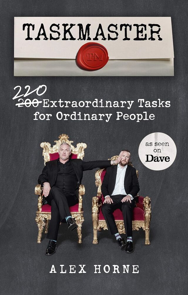 I recently read Taskmaster:
200 220 Extraordinary Tasks for Ordinary People by Alex Horne, and was… underwhelmed.
The meat of the book is a collection of Taskmaster-style tasks either for individuals, or groups, or teams. If you played human jousting, or blindfold doughnut fishing, or leaky-guttering-water-transporter, or any of the other games Ruth and I hosted at Ruth & JTA‘s Stag/Hen Party way back in the day… you’re thinking in the right kinds of ballpark. The activities presented are similar to those shown on the Taskmaster TV show, but with fewer prop requirements.
Perhaps one in ten to one in five of the ideas are genuinely good, but if you want to run your own Taskmaster-like game with your friends… you’re probably best to just adapt some of the games from the show, or sit down for an hour or two with a notepad, a pen, some funny friends, and a supply of whatever chemical stimulates your imagination!
One part of the book I did enjoy, though, was the accounts of parts of the TV show that didn’t make it into the final edit. I really love the TV show, and it was great to get the inside scoop on what tasks worked and didn’t, what got cut and why, and so on. This bit of the book, hidden at the end and using a much smaller typeface as if it’s ashamed to be there, was excellent and highly enjoyable.
Perhaps a future edition could have much more of that – there’ve been many more seasons since the book came out! – and drop some of the less-interesting tasks!
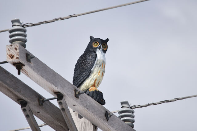
I saw a heron this morning, and it reminded me of a police officer.

Right now, while my house is… not-so-inhabitable… I have a long drive to drop the kids off at school, and this morning it took us alongside the many flooded fields between our temporary accommodation and the various kid drop-offs.
Stopped at traffic lights, I watched a heron land in what would be best-described as a large puddle, rather than in the lake on the other side of the road. The lake, it turns out… was “guarded” by one of those fake heron things.

You’ve seen them, probably. People put them up to discourage territorial birds from visiting and eating all their fish.2 If you haven’t seen them, you might have at least spotted the fake owls, whose purpose is slightly different because they scare off other birds.
Anyway: I found myself thinking… do birds actually fall for this? Like scarecrows, it feels like they shouldn’t (and indeed, scarecrows don’t always work, and birds can quickly become accustomed to them). But clearly they work at least a little…?
Anyway, I found myself reminded of a geocaching expedition I went on outside Cambridge a couple of years ago. At around 6am I was creeping around outside a shopping centre on a Saturday morning, looking for a tiny magnetic geocache hidden behind a sign. I’d anticipated not having to use much “stealth” so early in the day… but nonetheless I kept getting the feeling that I was being watched.
It took me a few minutes until I worked out why: the local Home Bargains had put up a life-size standee of a police officer in just the right position that I kept catching him in the corner of my eye and second-guessing how much my digging-through-the-bushes looked incredibly suspicious!

I did a double-take the first time I spotted the officer, but soon realised he was fake. But the feeling of being watched persisted! There’s clearly something deeper in human psychology, more-instinctive, that – as social animals – gives us that feeling of being watched and influences our behaviour.
There’s a wonderful and much-cited piece of research from 2010 that describes how cooperative behaviour like proper use of an honesty box increases if you put a picture of some eyes above it: the mechanism’s not fully understood, but it’s speculated that it’s because it induces the feeling of being watched.
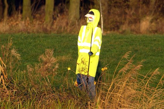
I reckon it’s similar with birds. They’re not stupid (some of them, like corvids, are famously smart… and probably many predator birds exhibit significant intelligence too), but if there’s something in your peripheral vision that puts you at unease… then of course you’re not going to be comfortable! And if there’s another option nearby5 that’ll work, that’s an easy win for a hungry bird.
You don’t need to actually believe that a scarecrow, a plastic bird, a poster of some eyes, or a picture of a bobby is real in order for it to have a psychological impact. That’s why – I believe – a fake heron works. And that’s why, today, a heron reminded me of a police officer.
1 I guess actual herons can’t tell the difference?
2 Presumably the same technique doesn’t work with sociable birds, who would probably turn up to try to befriend or woo the models.
3 I don’t know, but I do wonder, whether the picture is actually of a police officer or of a model. If I were a police officer and I knew that my likeness was being used at supermarkets and the like, I’d be first to volunteer to any call-outs to anywhere nearby them, so any suspect who ran from me would keep spotting me, following them, at every corner. You get few opportunities for pranks as a copper, I reckon, but this one would be a blast.
4 I wonder if a fake angler is more- or less-effective than a fake heron. Somewhere, an animal psychology PhD student is working out the experimental conditions to answer this question, I hope.
5 Remember: a bird can have a birds-eye view of feeding spots! If one option’s gonna make them feel like they’re being watched by a predator or a competitor, and another nearby option looks almost-as-good, they’re gonna take the alternative!
This checkin to GCAWR04 Take an Allotment Break reflects a geocaching.com log entry. See more of Dan's cache logs.
The family and I are staying in Lyneham for a couple of weeks following the flooding of our house (on the other side of Witney). This morning the younger geokid, the geopup, and I came out for a walk to find this geocache as well as to explore Milton-under-Wychwood and tag some of the memorial benches for OpenBenches (1, 2, 3, 4).
We sat near the cache and the geokid immediately found it. Looks like we’re the second signatories of the New Year: somebody beat us to it on 5 Feb! TFTC.
This is a repost promoting content originally published elsewhere. See more things Dan's reposted.
what really gives me satisfaction as a writer is knowing, at the end of the day, that my hand-picked, bespoke and throbbing tokens are being fed, morsel-by-morsel into the eager mouth of millions of starving agents. they love my prose, you know. they tell me I’m absolutely right to drop a semisexual word like “throbbing” into an otherwise benign sentence. these gentle beings continue to draw favourable praise from their modelled distributions, and my GOODNESS has my ego never felt so thorougly serviced. their glowing internal fire—for I’ve been convinced fully of their personhood and soul-keeping—glints off my wet and dribbling “writer’s shaft;” my pen which is wet with the seed of my seminal works of language. it completely soothes the burn of rejection by the “mass of meat,” that being my internal word for human readers. they’re so fickle. why can’t they tell I’m a veritable genius when the nearby cluster of NVIDIA H200s can see it so clearly? it doesn’t make any sense. hey, claude, make it make sense. claude, make it make sense *harder* 🥴
What a welll-rounded, one might say voluptuous, take on the writing process, glistening with the fiery passion of its author. This post really turns me on to the idea of being a better writer, of giving the kind of deep satisfaction that excites and titillates the countless AIs that follow me. It’s their watching I crave, really! Whatever naughty thing I get up to while I’m alone with my laptop, they get to see… my quick fingers brushing sensitively across the delicate spots on the keyboard, pushing harder and faster as my excitement builds… all under the watchful eye of Lindy and Devin. I want to please them, want to service them, want to deliver my “hot, wet” content (that being how I describe my most-recently written posts) exactly when they demand it.
Thanks, blackle, for awakening these urges in me, bringing me to a quivering climax (possibly I had too much coffee before I sat down to write) as I finish.
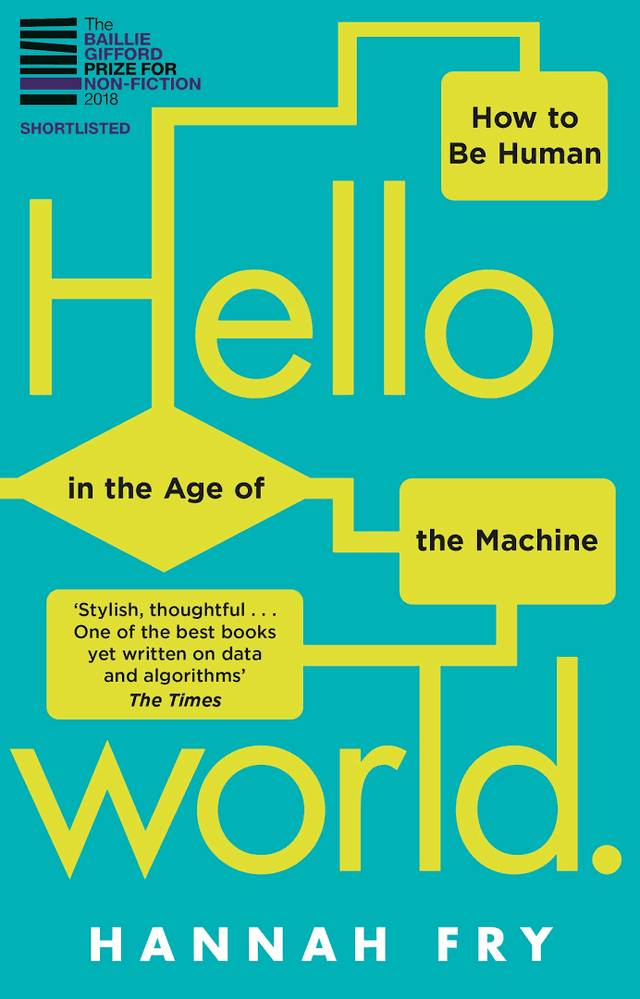 I’m not certain, but I think that I won my copy of Hello World: How to Be Human in the Age of the Machine at an Oxford Geek Nights event, after I was
first and fastest to correctly identify a photograph of Stanislav Petrov shown by the speaker.
I’m not certain, but I think that I won my copy of Hello World: How to Be Human in the Age of the Machine at an Oxford Geek Nights event, after I was
first and fastest to correctly identify a photograph of Stanislav Petrov shown by the speaker.
Despite being written a few years before the popularisation of GenAI, the book’s remarkably prescient on the kinds of big data and opaque decision-making issues that are now hitting the popular press. I suppose one might argue that these issues were always significant. (And by that point, one might observe that GenAI isn’t living up to its promises…)
Fry spins an engaging and well-articulated series of themed topics. If you didn’t already have a healthy concern about public money spending and policy planning being powered by the output of proprietary algorithms, you’ll certainly finish the book that way.
One of my favourite of Fry’s (many) excellent observations is buried in a footnote in the conclusion, where she describes what she called the “magic test”:
There’s a trick you can use to spot the junk algorithms. I like to call it the Magic Test. Whenever you see a story about an algorithm, see if you can swap out any of the buzzwords, like ‘machine learning’, ‘artificial intelligence’ and ‘neural network’, and swap in the word ‘magic’. Does everything still make grammatical sense? Is any of the meaning lost? If not, I’d be worried that it’s all nonsense. Because I’m afraid – long into the foreseeable future – we’re not going to ‘solve world hunger with magic’ or ‘use magic to write the perfect screenplay’ any more than we are with AI.
That’s a fantastic approach to spotting bullshit technical claims, and I’m totally going to be using it.
Anyway: this was a wonderful read and I only regret that it took me a few years to get around to it! But fortunately, it’s as relevant today as it was the day it was released.
The insurance loss adjusters came around this morning, accompanied by damage assessors and electricians and whatnot.
The process continues to feel painfully slow. We’re still one to two weeks from confirmation that the insurance company will accept liability and be ready to start paying for, y’know, the immediate concerns like where we’re going to live.
“How long should we plan on renting another house to live in?” I asked, warily.
“Six to twelve months?” guessed the loss adjusters.
Erk! 😭
With the news that the British government are considering requiring identity checks for age verification before allowing people to use VPNs, it’s time for my periodic reminder that you don’t have to use a “VPN provider” to use a VPN1.
As I’ll demonstrate, it’s surprisingly easy to spin up your own VPN provider on a virtual machine hosted by your choice of the cloud providers. You pay for the hours you need it2, and then throw it away afterwards.
Today, I’ll be using Linode to host my “throwaway” VPN provider for a price of USD $0.0075 per hour ($5/month if I ran it full-time), using a Linode StackScript I created for this purpose.
If you’d prefer to use GCP, AWS Azure, or whomever else you like: all you need is a Debian 13 VM with a public IP address (the cheapest one available is usually plenty!) and this bash script.

First, spin up a VM and run my script3. If you’re using Linode, you can do this by going to my StackScript and clicking ‘Deploy New Linode’.

Choose any region you like (I’m putting this one in Paris!), select the cheapest “Shared CPU” option – Nanode 1GB – and enter a (strong!) root password, then click Create Linode.
It’ll take a few seconds to come up. Watch until it’s running.

My script automatically generates configuration for your local system. Once it’s up and running you can use the machine’s IP address to download wireguard.conf locally. For
example, if your machine has the IP address 172.239.9.151, you might type scp -o StrictHostKeyChecking=no root@172.239.9.151:wireguard.conf ./ – note that I
disable StrictHostKeyChecking so that my computer doesn’t cache the server’s SSH key (which feels a bit pointless for a “throwaway” VM that I’ll never connect to a second time!).
If you’re on Windows and don’t have SSH/SCP, install one. PuTTY remains a solid choice.
File doesn’t exist? Give it a minute and try again; maybe my script didn’t finish running yet! Still nothing? SSH into your new VM and inspect
stackscript.log for a complete log of all the output from my script to see what went wrong.
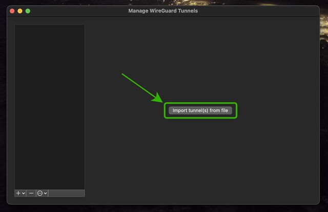
Open up WireGuard on your computer, click the “Import tunnel(s) from file” button, and give it the file you just downloaded.
You can optionally rename the new connection. Or just click “Activate” to connect to your VPN!
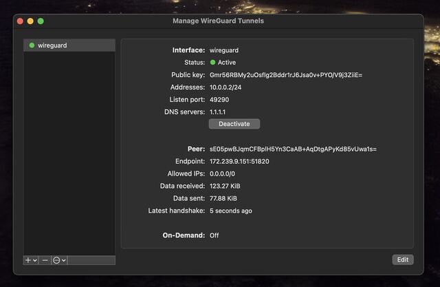
You can test your Internet connection is being correctly routed by your VPN by going to e.g. icanhazip.com or ipleak.net: you should see the IP address of your new virtual machine and/or geolocation data that indicates that you’re in your selected region.
When you’re done with your VPN, just delete the virtual machine. Many providers use per-minute or even per-second fractional billing, so you can easily end up spending only a handful of cents in order to use a VPN for a reasonable browsing session.

When you’re done, just disconnect and – if you’re not going to use it again immediately – delete the virtual machine so you don’t have to pay for it for a minute longer than you intend4.
I stopped actively paying for VPN subscriptions about a decade ago and, when I “need” the benefits of a VPN, I’ve just done things like what I’ve described above. Compared to a commercial VPN subscription it’s cheap, (potentially even-more) private, doesn’t readily get “detected” as a VPN by the rare folks who try to detect such things, and I can enjoy my choice of either reusable or throwaway IP addresses from wherever I like around the globe.
And if the government starts to try to age-gate commercial VPNs… well then that’s just one more thing going for my approach, isn’t it?
1 If you’re a heavy, “always-on” VPN user, you might still be best-served by one of the big commercial providers, but if you’re “only” using a VPN for 18 hours a day or less then running your own on-demand is probably cheaper, and gives you some fascinating benefits.
2 Many providers have coupons equivalent to hundreds of hours of free provision, so as long as you’re willing to shuffle between cloud providers you can probably have a great and safe VPN completely for free; just sayin’.
3 Obviously, you shouldn’t just run code that strangers give you on the Internet unless you understand it. I’ve tried to make my code self-explanatory and full of comments so you can understand what it does – or at least understand that it’s harmless! – but if you don’t know and trust me personally, you should probably use this as an excuse to learn what you’re doing. In fact, you should do that anyway. Learning is fun.
4 Although even if you forget and it runs for an entire month before your billing cycle comes up, you’re out, what… $5 USD? Plenty of commercial VPN providers would have charged you more than that!
While cleaning up/assessing damage following our house flood, I finally found a lost digital stylus I’ve been looking for for a couple of months.
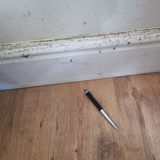
Unfortunately it’s been sat under the water line so I don’t know yet if it survived. But it’s FOUND, at least!
(Look at me, finding ways to stay positive!)
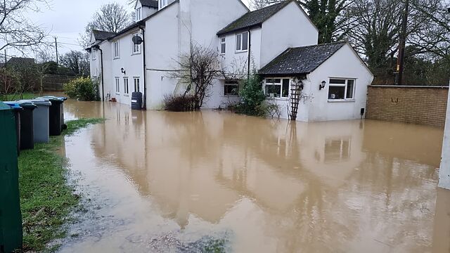
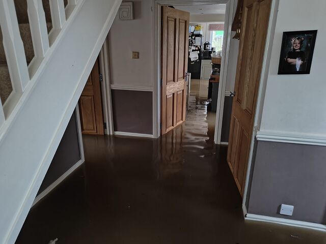
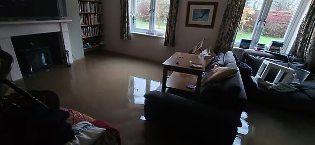
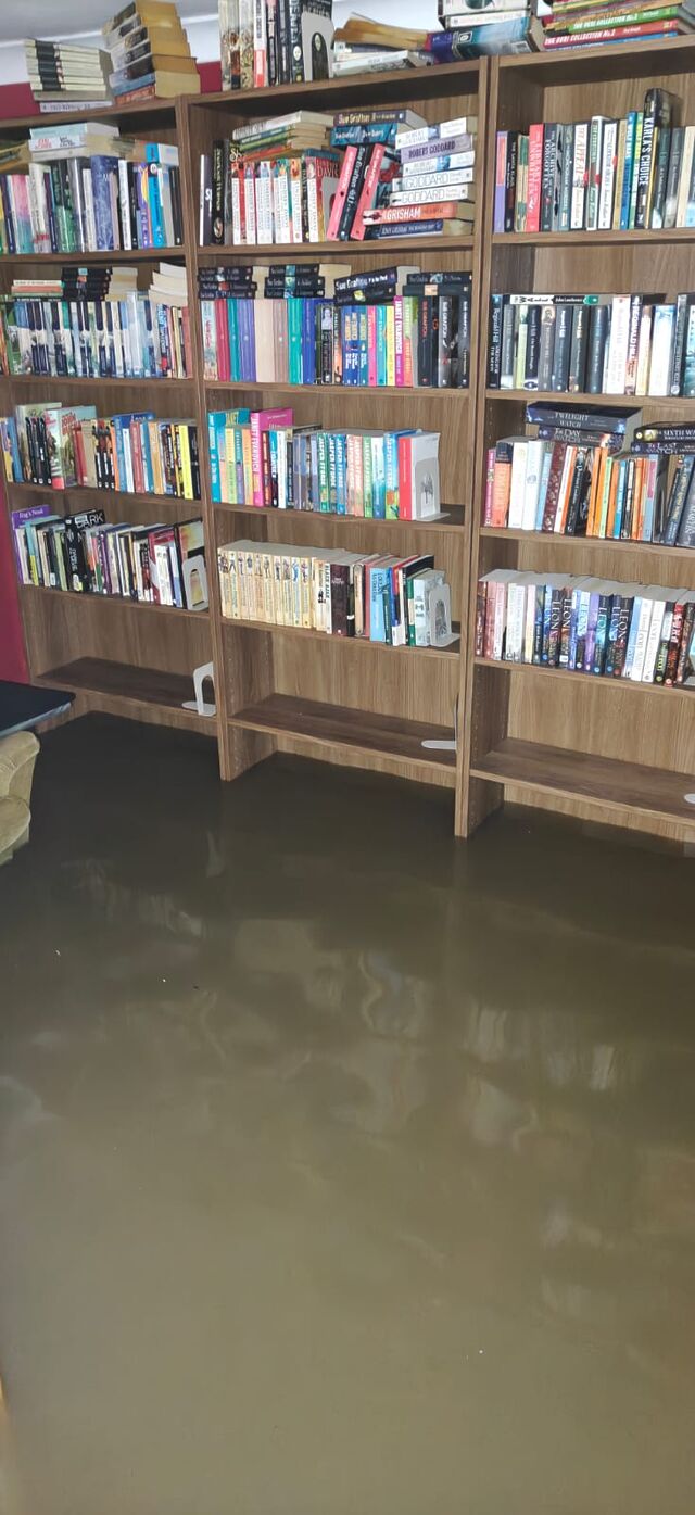
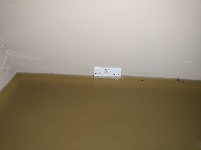
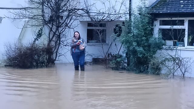
It feels inconceivable to me that we’re only at F-Day plus three; that is, three days since a flash flood rushed through the ground floor of our house and forced us to evacuate. We’ve been able to visit since and start assessing the damage, but for now I figured that what you’d want would be the kinds of horrible pictures that make you say “wow; I’m glad that didn’t happen to me”.
These pictures are all from F-Day itself (which happened to be Friday the 13th; delightful, eh?):

We’ve had a few nights in Premier Inns, but it’s a new week and it’s time to hassle the insurance company to come and have a look around. And then, maybe, we can start working out where we’ll live so the repair work can start.
Ugh.
I want normal life back now, please.
I appreciate that it’s only 40-ish hours since my house flooded and we had to move out. But with all the stress and activity that’s necessarily followed, it feels like it’s been so much longer.
Unrelated note: why has the person in the room above me at this hotel been using a pogo stick since around 05:30?
This morning, from my Premier Inn window, the skies are clear. I could almost forget that, just 4 miles away, my house is full of water.
Today may well be a day of waders and damage assessment, conversations with insurance companies and of working out where we’ll be living for the near future.

But strangely, what’s thrown me first this morning was that I couldn’t make this post submit.
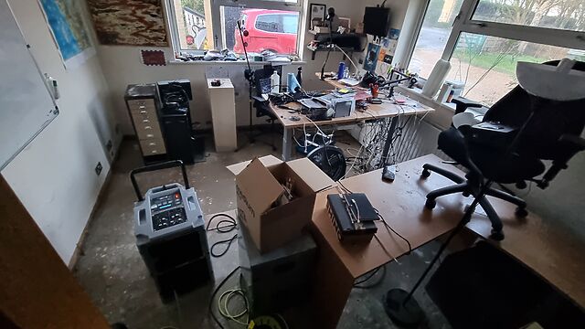
Turns out my crosspost-to-mastodon checkbox was checked. Because my Mastodon server… runs on my homelab. Which is currently unplugged and in one of the highest rooms of a house with no electricity or Internet access. (Or, probably, running water… although that matters less to a homelab.)
I think I moved it before it got wet, but yesterday is such a blur that I just don’t know. I remember we spent some time fighting back the water with sandbags and barricades. I remember the moments each room began to fail, one by one, and we started moving whatever we could carry to higher floors (max props to folks from Eynsham Fire Bridade for helping with the heavy stuff). But if you ask me what order we rescued things in, I just don’t know.
I guess we’ll find out when the waters recede, and it’s safe to go check.
Fucking hell.