The dog came out for a walk with the eldest kid and I, but we couldn’t stop her sticking her head down rabbitholes!

(Oh, and the dog kept doing it, too.)
The dog came out for a walk with the eldest kid and I, but we couldn’t stop her sticking her head down rabbitholes!
(Oh, and the dog kept doing it, too.)
This is a repost promoting content originally published elsewhere. See more things Dan's reposted.
Mastodon shows an “Alt” button in the bottom right of images that have associated alt text. This button, when clicked, shows the alt text the author has written for the image.
…
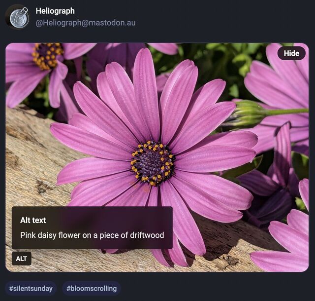
After using this button a few times, I realised how much I appreciated reading the alt text for an image. Reading the alt text helped me better understand an image. In some cases, I saw posts where the alt text contained context about an image I otherwise would not have had (i.e. the specific name of the game from which a screenshot was taken).
…
Like James, I’ve also long enjoy Mastodon’s tools to help explore alt-text more-easily, but until I saw this blog post of his I’d never have considered porting such functionality to my own sites.
He’s come up with an implementation, described in his post, that works pretty well. I find myself wondering if a <details>/<summary> UI metaphor
might be more appropriate than a visually-hidden checkbox. Where CSS is disabled or fails, James’ approach displays a checkbox, the word “ALT”, and the entire alt text, which is
visually confusing and will result in double-reading by screen readers.
 A
A <details>/<summary> approach would be closer to
semantically-valid (though perhaps I’m at risk of making them a golden hammer?), and would degrade more gracefully
into situations in which CSS wasn’t available.
Still, a wonderful example of what can be done and something I might look at replicating during my next bout of blog redesigning!
Looking forward to the school run starting again next week… so I get a bonus excuses for walks around our beautiful village!
This post is also available as a podcast. Listen here, download for later, or subscribe wherever you consume podcasts.
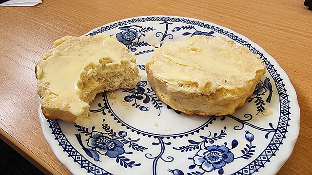
The cheese scones from
My local supermarket
Are hexagonal.
It’s not for packing.
Their film-covered rectangle
Leaves corner gaps.
Are perhaps they made
In honeycomb baking tins?
Baked by bumblebee?
Or else it’s branding.
A visual identity.
Trying to sell more.
A six-sided scone
Does not taste better to me,
Nor warm up faster.
The butter doesn’t care
For the shape of your scone,
Mr. John Sainsbury.
This is a repost promoting content originally published elsewhere. See more things Dan's reposted.
Turns out I’m not quite done obsessing over Musical Transients (previously, previouslier), and I found this video of a YouTuber playing the album on Clone Hero, because the album’s got an official Clone Hero chart to download and play.
Anyway: Acai turns out to be not only a kickass Clone Hero player, but he’s also a fun and charismatic commentator to take along for the ride.
Incidentally, it was fun to see that the same level of attention to detail has been paid to the on-screen lyrics for Clone Hero as were to the subtitles on the video version of the album. For example, they’ll sometimes imply that the next line is what you’re expecting it to be, based on a familiarity with the song, only to bait-and-switch it out for the actual lyrics at the last second. Genius.
This is a repost promoting content originally published elsewhere. See more things Dan's reposted.
Yesterday I shared Psynwav’s Musical Transients, with which I’ve become briefly obsessed. Shortly after my post, an AOTY user posted a very positive review of the album that strongly echoes my interpretation of it.
Do I need a “spoiler warning” here? Part of what made the album wonderful for me was coming in blind and not understanding that, somehow, it was both a mashup collection and a concept album. I’d seriously recommend listening to it yourself and making your own mind up first, before you read my or anybody else’s interpretation of the themes of the piece.
But assuming that you already listened to it, or that you’re ignoring my suggestion, here’s sophie’s review:
… what?
I am floored. Absolutely flummoxed. This is the first album in a minute to leave me completely speechless. Trying to express how incredible what the fuck I just listened to was is more than difficult, but I suppose I can try because this album is unbelievably underrated and deserves a million times the attention it’s currently getting. There are really two main pillars holding this up (don’t overthink that analogy, no, a building with two pillars wouldn’t hold up but that doesn’t matter shut up), those being the execution and the concept. On a purely technical level, this album is unbelievable. These mashups are so well-achieved, so smooth and believable and un-clunky. The execution of the record is to such a high standard it almost tricks you, like the best mashup albums do, into believing the pieces of song were always meant to be in this iteration. Purely from a how-does-it-sound perspective, Musical Transients is remarkable.
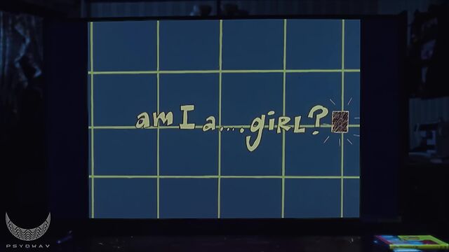
But the second pillar, the one that really shook me to my core, is the concept. Don’t read past this point if you don’t want it to get spoiled. Essentially, the narrator of Musical Transients is a person who realizes he is a she. It’s a trans self-realization project, and one handled with an unbelievable amount of telling care. The mashups are placed together in a very purposeful manner to express this story chronologically, and the result is a pretty incomparable arc and deeply involving experience. Despite not a single note being original, you really feel the person behind the screen making it, their story. And despite the subject matter often being focused on the confusion and depression a trans person might feel, Musical Transients feels more like a towering celebration of trans identity and existence than a depressive meditation on trans suffering. It’s a remarkable feat of storytelling and mashup production that just works on so many different levels. To me, it has to be among the most impeccably crafted, achingly beautiful albums of the year.
Yes. Yes, this.
I absolutely agree with sophie that there are two things which would individually make this an amazing album, but taken together they elevate the work to something even greater.
The first aspect of its greatness is the technical execution of the album. Effortless transitions1 backed by clever use of pitch and tempo shifts, wonderfully-executed breakspoints between lines, within lines, even within words, and such carefully-engineered extraction of the parts of each of the component pieces that it’s hard to believe that Psynwav doesn’t secretly have access to the studio master recordings of many of them2.
But the second is the story the album tells. Can you tell a story entirely through a musical mashup of other people’s words? You absolutely can, and Musical Transients might be the single strongest example.
I was perhaps in the third or fourth track, on my first listen-through, when I started asking myself… “Wait a minute? Is this the story of a trans person’s journey of self-discovery, identity, and coming out?” And at first I thought that I might be reading more into it than was actually there. And then it took until the tremendous, triumphant final track before I realised “Oh shit, that’s exactly what it’s about. How is it even possible to convey that message in an album like this?”
This is a concept album unlike any other that I’ve ever heard. It tells a heartwarming story of trans identity and of victory in the face of adversity. You’re taken along with the protagonist’s journey, discovering and learning as you go, with occasional hints as the the underlying meaning gradually becoming more and more central to the message. It’s as if you, the listener, are invited along to experience the same curiosity, confusion, and compromise as the past-version of the protagonist, finding meaning as you go along, before “getting it” and being able to celebrate in her happiness.
And it does all of this using a surprising and entertaining medium that’s so wonderfully-executed that it can be enjoyed even without the obvious4 message that underpins it.
Okay, maybe now I can be done gushing about this album. Maybe.
1 See what I did there… no, wait, not yet…
2 Seriously: how do you isolate the vocals from the chorus of We Will Rock You while cleanly discarding the guitar sounds? They’re at almost-exactly the same pitch!
3 A subtle visual affordance in the music video might the VHS lines that indicate when we’re being told “backstory”, which unceremoniously disappear for the glorious conclusion, right after Eminem gets cut off, saying “My name is…”.
4 Yes, obvious. No, seriously; I’m not reaching here. Trans identity is a clear and unambiguous theme, somehow, without any lyrics explicitly talking about that topic being written; just the careful re-use of the words of other. Just go listen to it and you’ll see!
This is a repost promoting content originally published elsewhere. See more things Dan's reposted.
This is the age we’re shifting into: an era in which post-truth politics and deepfake proliferation means that when something looks “a bit off”, we assume (a) it’s AI-generated, and (b) that this represents a deliberate attempt to mislead. (That’s probably a good defence strategy nowadays in general, but this time around it’s… more-complicated…)
…
So if these fans aren’t AI-generated fakes, what’s going on here?
The video features real performances and real audiences, but I believe they were manipulated on two levels:
- Will Smith’s team generated several short AI image-to-video clips from professionally-shot audience photos
- YouTube post-processed the resulting Shorts montage, making everything look so much worse
…
I put them side-by-side below. Try going full-screen and pause at any point to see the difference. The Instagram footage is noticeably better throughout, though some of the audience clips still have issues.
…
The Internet’s gone a bit wild over the YouTube video of Will Smith with a crowd. And if you look at it, you can see why: it looks very much like it’s AI-generated. And there’d be motive: I mean, we’ve already seen examples where politicians have been accused (falsely, by Trump, obviously) of using AI to exaggerate the size of their crowds, so it feels believable that a musician’s media team might do the same, right?
But yeah: it turns out that isn’t what happened here. Smith’s team did use AI, but only to make sign-holding fans from other concerts on the same tour appear to all be in the same place. But the reason the video “looks AI-generated” is because… YouTube fucked about with it!
It turns out that YouTube have been secretly experimenting with upscaling shorts, using AI to add detail to blurry elements. You can very clearly see the effect in the video above, which puts the Instagram and YouTube versions of the video side-by-side (of course, if YouTube decide to retroactively upscale this video then the entire demonstration will be broken anyway, but for now it works!). There are many points where a face in the background is out-of-focus in the Instagram version, but you can see in the YouTube version it’s been brought into focus by adding details. And some of those details look a bit… uncanny valley.
Every single bit of this story – YouTube’s secret experiments on creator videos, AI “enhancement” which actually makes things objectively worse, and the immediate knee-jerk reaction of an understandably jaded and hypersceptical Internet to the result – just helps cement that we truly do live in the stupidest timeline.
Last month, my friend Gareth observed that the numbered lists in my blog posts “looked wrong” in his feed reader. I checked, and I decided I was following the standards correctly and it must have been his app that was misbehaving.
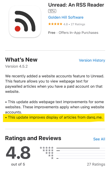
So he contacted the authors of Unread, his feed reader, and they fixed it. Pretty fast, I’ve got to say. And I was amused to see that I’m clearly now a test case because my name’s in their release notes!
This is a repost promoting content originally published elsewhere. See more things Dan's reposted.
Musical Transients from Psynwav1 is without a doubt the best mashup/mixtape-album I’ve heard since Neil Cicierega’s Mouth Moods (which I’ve listened to literally hundreds of times since its release in 2017). Well-done, Psynwav.
It’s possible, of course… that my taste in music is not the same as your taste in music, and that’s fine.
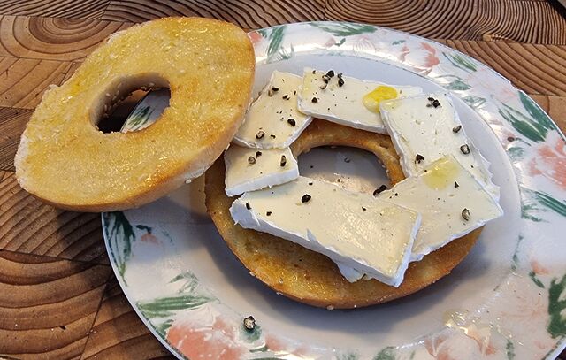
Maybe I’m just hungry, but this morning’s breakfast bagel with brie looks especially scrumptious, right?
What if a QR code could look like a maze, hand-drawn with MS Paint?

Inspired by Oscar Cunningham‘s excellent “working QR code in the style of Piet Mondrain” and Andrew Taylor‘s “logical extension of the idea”, earlier this week, I decided to extend upon my much-earlier efforts to (ab)use QR codes and throw together the disgusting thing you see above.
Here’s how I made it:
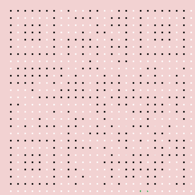
Obviously this isn’t a clever idea for real-world scenarios. The point of QR codes’ resilience and error correction is to compensate for suboptimal conditions “in the field”, like reflections, glare, dust, grime, low light conditions, and so on.
But it’s kinda fun, right?
This is a repost promoting content originally published elsewhere. See more things Dan's reposted.
…
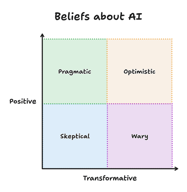
I’ve grouped these four perspectives, but everything here is a spectrum. Depending on the context or day, you might find yourself at any point on the graph. And I’ve attempted to describe each perspectively [sic] generously, because I don’t believe that any are inherently good or bad. I find myself switching between perspectives throughout the day as I implement features, use tools, and read articles. A good team is probably made of members from all perspectives.
Which perspective resonates with you today? Do you also find yourself moving around the graph?
…
An interesting question from Sean McPherson. He sounds like he’s focussed on LLMs for software development, for which I’ve drifted around a little within the left-hand-side of the graph. But perhaps right now, this morning, you could simplify my feelings like this:
![]() My stance is that AI-assisted coding can be helpful (though the question remains open about whether it’s “worth
it”), so long as you’re not trying to do anything that you couldn’t do yourself, and you know how you’d go about doing it yourself. That is: it’s only useful to
accelerate tasks that are in your “known knowns” space.
My stance is that AI-assisted coding can be helpful (though the question remains open about whether it’s “worth
it”), so long as you’re not trying to do anything that you couldn’t do yourself, and you know how you’d go about doing it yourself. That is: it’s only useful to
accelerate tasks that are in your “known knowns” space.
As I’ve mentioned: the other week I had a coding AI help me with some code that interacted with the Google Sheets API. I know exactly how I’d go about it, but that journey would have to start with re-learning the Google Sheets API, getting an API key and giving it the appropriate permissions, and so on. That’s the kind of task that I’d be happy to outsource to a less-experienced programmer who I knew would bring a somewhat critical eye for browsing StackOverflow, and then give them some pointers on what came back, so it’s a fine candidate for an AI to step in and give it a go. Plus: I’d be treating the output as “legacy code” from the get-go, and (because the resulting tool was only for my personal use) I wasn’t too concerned with the kinds of security and accessibility considerations that GenAI can often make a pig’s ear of. So I was able to palm off the task onto Claude Sonnet and get on with something else in the meantime.
If I wanted to do something completely outside of my wheelhouse: say – “write a program in Fortran to control a robot arm” – an AI wouldn’t be a great choice. Sure, I could “vibe code” something like that, but I’d have no idea whether what it produced was any good! It wouldn’t even be useful as a springboard to learning how to do that, because I don’t have the underlying fundamentals in robotics nor Fortran. I’d be producing AI slop in software form: the kind of thing that comes out when non-programmers assume that AI can completely bridge the gap between their great business idea and a fully working app!
They’ll get a prototype that seems to do what you want, if you squint just right, but the hard part of software engineering isn’t making a barebones proof-of-concept! That’s the easy bit! (That’s why AI can do it pretty well!) The hard bit is making it work all the time, every time; making it scale; making it safe to use; making it maintainable; making it production-ready… etc.
But I do benefit from coding AI sometimes. GenAI’s good at summarisation, which in turn can make it good at relatively-quickly finding things in a sprawling codebase where your explanation of those things is too-woolly to use a conventional regular expression search. It’s good at generating boilerplate that’s broadly-like examples its seen before, which means it can usually be trusted to put together skeleton applications. It’s good at “guessing what comes next” – being, as it is, “fancy autocomplete” – which means it can be helpful for prompting you for the right parameters for that rarely-used function or for speculating what you might be about to do with the well-named variable you just created.
Anyway: Sean’s article was pretty good, and it’s a quick and easy read. Once you’ve read it, perhaps you’ll share where you think you sit, on his diagram?
This is a repost promoting content originally published elsewhere. See more things Dan's reposted.
…
Solving problems with LLMs is like solving front-end problems with NPM: the “solution” comes through installing more and more things — adding more and more context, i.e. more and more packages.
- LLM: Problem? Add more context.
- NPM: Problem? There’s a package for that.
…
As I’m typing this, I’m thinking of that image of the evolution of the Raptor engine, where it evolved in simplicity:

This stands in contrast to my working with LLMs, which often wants more and more context from me to get to a generative solution:

…
Jim Nielsen speaks to my experience, here. Because a programming LLM is simply taking inputs (all of your code, plus your prompt), transforming it through statistical analysis, and then producing an output (replacement code), it struggles with refactoring for simplicity unless very-carefully controlled. “Vibe coding” is very much an exercise in adding hacks upon hacks… like the increasingly-ludicrous epicycles introduced by proponents of geocentrism in its final centuries before the heliocentric model became fully accepted.

I don’t think that AIs are useless as a coding tool, and I’ve successfully used them to good effect on several occasions. I’ve even tried “vibe coding”, about which I fully agree with ‘s observation that “vibe code is legacy code”. Being able to knock out something temporary, throwaway, experimental, or for personal use only… while I work on something else… is pretty liberating.
For example: I couldn’t remember my Google Sheets API and didn’t want to re-learn it from the sprawling documentation site, but wanted a quick personal tool to manipulate such a sheet from a remote system. I was able to have an AI knock up what I needed while I cooked dinner for the kids, paying only enough attention to check-in on its work. Is it accessible? Is it secure? Is it performant? Is it maintainable? I can’t answer any of those questions, and so as a professional software engineer I have to reasonably assume the answer to all of them is “no”. But its only user is me, it does what I needed it to do, and I didn’t have to shift my focus from supervising children and a pan in order to throw it together!
Anyway: Jim hits the nail on the head here, as he so often does.
<dialog>-based HTML+CSS lightboxes
A few years ago I implemented a pure HTML + CSS solution for lightbox images, which I’ve been using on my blog ever since. It works by
pre-rendering an invisible <dialog> for each lightboxable image on the page, linking to the anchor of those dialogs, and exploiting the :target selector
to decide when to make the dialogs visible. No Javascript is required, which means low brittleness and high performance!
One thing I don’t like about it is that it that it breaks completely if the CSS fails for any reason. Depending upon CSS is safer than depending upon JS (which breaks all the time), but it’s still not great: if CSS is disabled in your browser or just “goes wrong” somehow then you’ll see a hyperlink… that doesn’t seem to go anywhere (it’s an anchor to a hidden element).
A further thing I don’t like about it is it’s semantically unsound. Linking to a dialog with the expectation that the CSS parser will then make that dialog visible isn’t really representative of what the content of the page means. Maybe we can do better.
<details>-based HTML+CSS lightboxes?
Here’s a thought I had, inspired by Patrick Chia’s <details> overlay trick and by
the categories menu in Eevee’s blog: what if we used a <details> HTML element for a lightbox? The thumbnail image would go in the
<summary> and the full image (with loading="lazy" so it doesn’t download until the details are expanded) beneath, which means it “just works” with or
without CSS… and then some CSS enhances it to make it appear like a modal overlay and allow clicking-anywhere to close it again.
Let me show you what I mean. Click on one of the thumbnails below:


Each appears to pop up in a modal overlay, but in reality they’re just unfolding a <details> panel, and some CSS is making the contents display as if if were
an overlay, complete click-to-close, scroll-blocking, and a blur filter over the background content. Without CSS, it functions as a traditional <details> block.
Accessibility is probably improved over my previous approach, too (though if you know better, please tell me!).
The code’s pretty tidy, too. Here’s the HTML:
<details class="details-lightbox" aria-label="larger image">
  <summary>
    <img src="thumb.webp" alt="Alt text for the thumbnail image.">
  </summary>
  <div>
    <img src="full.webp" alt="Larger image: alt text for the full image." loading="lazy">
  </div>
</details>
The CSS is more-involved, but not excessive (and can probably be optimised a little further):
.details-lightbox {
  summary {
    display: block;
    cursor: zoom-in;

    &::before {
      content: '';
      backdrop-filter: none;
      transition: backdrop-filter 0.5s, background 0.2s;
      background: transparent;
    }
  }

  & > div img {
    max-width: 95vw;
    max-height: 95vh;
    box-shadow: 0 0 12px #fff6;
    opacity: 0;
    transition: filter 0.3s, opacity 0.6s;
    filter: blur(6px);
  }

  &[open] > div {
    position: fixed;
    top: 0;
    left: 0;
    width: 100vw;
    height: 100vh;
    display: flex;
    align-items: center;
    justify-content: center;
    z-index: 110;
    pointer-events: none;

    img {
      opacity: 1;
      filter: none;
    }
  }

  &[open] > summary {
    cursor: auto;

    &::before {
      content: '';
      background: #000a;
      backdrop-filter: blur(6px);
      position: fixed;
      top: 0;
      left: 0;
      width: 100vw;
      height: 100vw;
      z-index: 109;
    }
  }
}

body:has(.details-lightbox[open]) {
  overflow: hidden;
}
Native CSS nesting is super nice for this kind of thing. Being able to use :has on the body to detect whether there exists an open lightbox and prevent
scrolling, if so, is another CSS feature I’m appreciating today.
I’m not going to roll this out anywhere rightaway, but I’ll keep it in my back pocket for the next time I feel a blog redesign coming on. It feels tidier and more-universal than my current approach, and I don’t think it’s an enormous sacrifice to lose the ability to hotlink directly to an open image in a post.
What do you think?
A moderately-large house spider dropped down and startled my dog as she napped in her basket, so now she’s hiding under my desk and refusing to return to bed. 🙄😂