Now I’ve added support for Spartan3 too and, seeing as the implementations shared functionality, I’ve
combined all three – Gemini, Spartan, and Gopher – into a single package: CapsulePress.
CapsulePress is a Gemini/Spartan/Gopher to WordPress bridge. It lets you use WordPress as a CMS for any or all of
those three non-Web protocols in addition to the Web.
For example, that means that this post is available on all of:
It’s also possible to write posts that selectively appear via different media: if I want to put something exclusively on my gemlog, I can, by assigning metadata that
tells WordPress to suppress a post but still expose it to CapsulePress. Neat!
Using Gemini and friends in the 2020s make me feel like the dream of the Internet of the nineties and early-naughties is still alive. But with fewer banner ads.
I’ve open-sourced the whole thing under a super-permissive license, so if you want your own WordPress blog to “feed” your Gemlog… now you can. With a few caveats:
It’s hard to use. While not as hacky as the disparate piles of code it replaced, it’s still not the cleanest. To modify it you’ll need a basic comprehension of all
three protocols, plus Ruby, SQL, and sysadmin skills.
It’s super opinionated. It’s very much geared towards my use case. It’s improved by the use of templates. but it’s still probably only suitable for this
site for the time being, until you make changes.
It’s very-much unfinished. I’ve got a growing to-do list, which should
be a good clue that it’s Not Finished. Maybe it never will but. But there’ll be changes yet to come.
Whether or not your WordPress blog makes the jump to Geminispace4, I hope you’ll came take a look at mine at one of the URLs linked above,
and then continue to explore.
If you’re nostalgic for the interpersonal Internet – or just the idea of it, if you’re too young to remember it… you’ll find it there. (That Internet never actually went away,
but it’s harder to find on today’s big Web than it is on lighter protocols.)
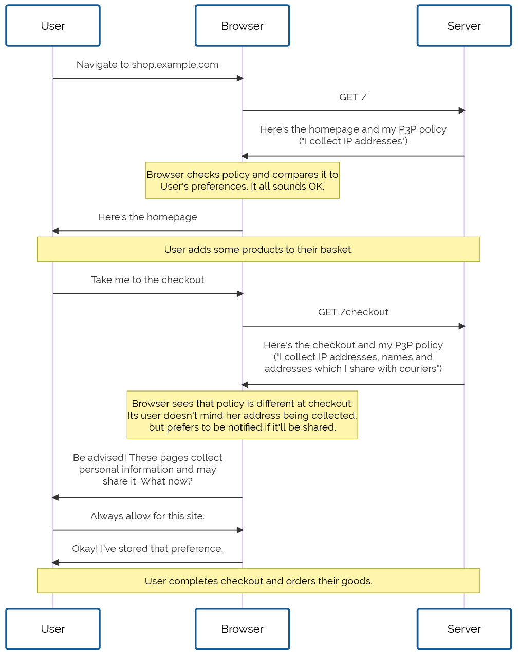
This is an alternate history of the Web. The premise is true, but the story diverges from our timeline and looks at an alternative “Web that might have been”.
Prehistory
This is the story of P3P, one of the greatest Web standards whose history has been forgotten1, and how the abject failure of its first versions paved the
way for its bright future decades later. But I’m getting ahead of myself…
Drafted in 2002 in the wake of growing concern about the death of privacy on the Internet, P3P 1.0 aimed to make the collection of personally-identifiable data online transparent. Hurrah, right?
Initially, the principle was sound. The specification was weak. The implementation was apalling. But P3P 1.1
could have worked well.
Developers are lazy3 and soon converged on the simplest possible solution: add a garbage HTTP header like P3P: CP="See our website for our privacy policy." and your cookies work just fine! Ignore the problem, ignore the
proposed solution, just do what gets the project shipped.
Without any meaningful enforcement it also perfectly feasible to, y’know, just lie about how well you treat user data. Seeing the way the wind was blowing, Mozilla dropped
support for P3P, and Microsoft’s support – which had always been half-baked and lacked even the most basic user-facing
controls or customisation options – languished in obscurity.
For a while, it seemed like P3P was dying. Maybe, in some alternate timeline, it did die: vanishing into
nothing like VRML, WAP, and XBAP.
But fortunately for us, we don’t live in that timeline.
Revival
In 2009, the European Union revisited the Privacy and Electronic Communications
Directive. The initial regulations, published in 2002, required that Web users be able to opt-out of tracking cookies, but the amendment required that sites ensure that
users opted-in.
As-written, this confusing new regulation posed an
immediate problem: if a user clicked the button to say “no, I don’t want cookies”, and you didn’t want to ask for their consent again on every page load… you had to give them a cookie
(or use some other technique
legally-indistinguishable from cookies). Now you’re stuck in an endless cookie-circle.4
This, and other factors of informed consent, quickly introduced a new pattern among those websites that were fastest to react to the legislative change:
The cookie consent banner, with all its confusing language and dark patterns, looked like it was going to become the new normal for web users in the early 2010s. But thankfully, our
saviour had been waiting in the wings all along.
Web users rebelled. These ugly overlays felt like a regresssion to a time when popup ads and splash pages were commonplace. “If only,” people cried out, “There were a better way to do
this!”
It was Professor Lorie Cranor, one of the original authors of the underloved P3P specification and a respected champion of usable privacy and security, whose rallying cry gave us hope. Her CNET article, “Why
the EU Cookie Directive is a solved problem”5, inspired a new generation of development on what would become known as P3P 2.0.
While maintaining backwards compatibility, this new standard:
deprecated those horrible XML documents in favour of HTTP
headers and <link> tags alone,
removing support for Set-Cookie2: headers, which nobody used anyway, and
added features by which the provenance and purpose of cookies could be stated in a way that dramatically simplified adoption in browsers
Internet Explorer at this point was still used by a majority of Web users. It still supported the older
version of the standard, and – as perhaps the greatest gift that the much-maligned browser ever gave us – provided a reference implementation as well as a stepping-stone to wider
adoption.
Opera, then Firefox, then “new kid” Chrome each adopted P3P 2.0; Microsoft finally got on board with IE 8 SP 1. Now the latest versions of all the mainstream browsers had a solid
implementation6
well before the European data protection regulators began fining companies that misused tracking cookies.
Nowadays, we’ve pretty-well standardised on the address bar being the place where all cookie and privacy information and settings are stored. Can you imagine if things had
gone any other way?
But where the story of P3P‘s successes shine brightest came in 2016, with the passing of the GDPR. The W3C realised that P3P could simplify both the expression and understanding of privacy policies for users, and formed a group to work on version 2.1. And that’s
the version you use today.
When you launch a new service, you probably use one of the many free wizard-driven tools to express your privacy policy and the bases for your data processing, and it spits out a
template privacy policy. You need the human-readable version, of course, since the 2020 German court ruling that you cannot rely on a machine-readable privacy policy alone, but
the real gem is the P3P: 2.1 header version.
Assuming you don’t have any unusual quirks in your data processing (ask your lawyer!), you can just paste the relevant code into your server configuration and you’re good to go. Site
users get a warning if their personal data preferences conflict with your data policies, and can choose how to act: not using your service, choosing which of your
features to opt-in or out- of, or – hopefully! – granting an exception to your site (possibly with caveats, such as sandboxing your cookies or clearing them immediately after closing
the browser tab).
Sure, what we’ve got isn’t perfect. Sometimes companies outright lie about their use of information or use illicit methods to track user behaviour. There’ll always be bad guys out there. That’s what laws are there to deal with.
But what we’ve got today is so seamless, it’s hard to imagine a world in which we somehow all… collectively decided that the correct solution to the privacy problem might have been to
throw endless popovers into users’ faces, bury consent-based choices under dark patterns, and make humans do the work that should from the outset have been done by machines. What a
strange and terrible timeline that would have been.
Footnotes
1 If you know P3P‘s
history, regardless of what timeline you’re in: congratulations! You win One Internet Point.
2 Techbros have been trying to solve political problems using technology since long before
the word “techbro” was used in its current context. See also: (a) there aren’t enough mental health professionals, let’s make an AI app? (b) we don’t have enough ventilators for this
pandemic, let’s 3D print air pumps? (c) banks keep failing, let’s make a cryptocurrency? (d) we need less carbon in the atmosphere or we’re going to go extinct, better hope direct
carbon capture tech pans out eh? (e) we have any problem at all, lets somehow shoehorn blockchain into some far-fetched idea about how to solve it without me having to get out of my
chair why not?
3 Note to self: find a citation for this when you can be bothered.
4 I can’t decide whether “endless cookie circle” is the name of the New Wave band I want
to form, or a description of the way I want to eventually die. Perhaps both.
6 Implementation details varied, but that’s part of the joy of the Web. Firefox favoured
“conservative” defaults; Chrome and IE had “permissive” ones; and Opera provided an ultra-configrable matrix of options by which a user could specify exactly which kinds of cookies to
accept, linked to which kinds of personal data, from which sites, all somehow backed by an extended regular expression parser that was only truly understood by three people, two of
whom were Opera developers.
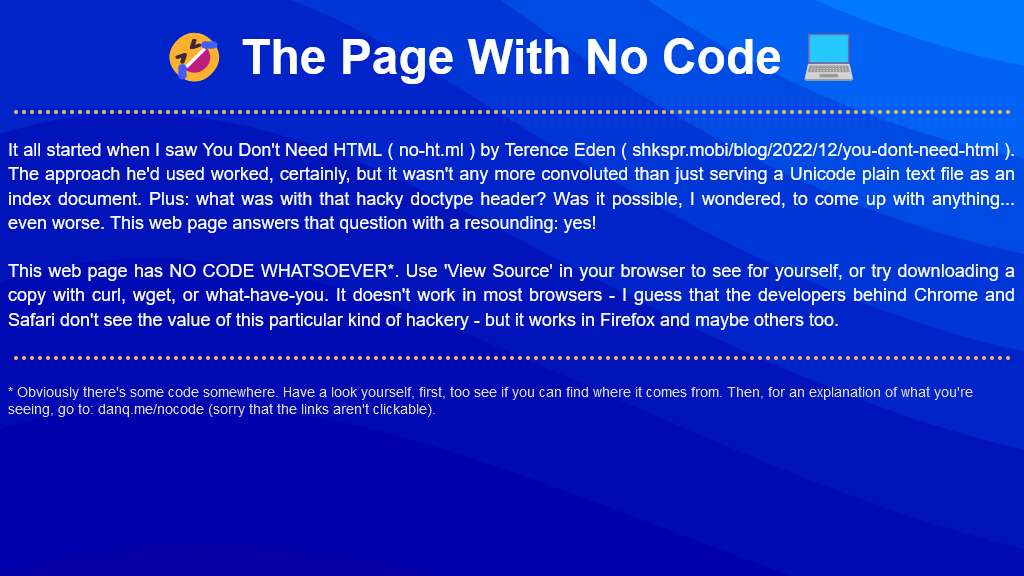
It all started when I saw no-ht.ml, Terence Eden‘s hilarious response to Salma
Alam-Naylor‘s excellent HTML is all you need to make a website. The latter is an
argument against both the silly amount of JavaScript with which websites routinely burden their users, but also even against depending on CSS. As a fan of CSS Naked Day and a firm
believer in using JS only for progressive enhancement, I’m obviously in favour.
Obviously no-ht.ml is to be taken as tongue-in-cheek, but as you’re about to see: it caught my interest and got me thinking: how could I go even further.
Terence’s site works by delivering a document with a
claimed MIME type of text/html, but which contains only the (invalid) “HTML” code
<!doctype UNICODE><meta charset="UTF-8"><plaintext> (to work around browsers’ wish to treat the page as HTML). This is followed by a block of UTF-8 plain text making use of spacing
and emoji to illustrate and decorate the content. It’s frankly very silly, and I love it.1
I think it’s possible to go one step further, though, and create a web page with no code whatsoever. That is, one that you can read as if it were a regular web page, but where
using View Source or e.g. downloading the page with curl will show you… nothing.
I present: The Page With No Code! (It’ll probably only work if you’re using Firefox, for reasons that will become apparent later.)
I’d encourage you to visit The Page With No Code, use View Source to confirm for yourself that it truly has no code, and see if you can work out for yourself how it manages
this feat… before coming back here for an explanation. Again: probably Firefox-only.
Once you’ve had a look for yourself and had a chance to form an opinion, here’s an explanation of the black magic that makes this atrocity possible:
The page is blank. It’s delivered with Content-Type: text/html. Your browser interprets a completely-blank page as faulty and corrects it to a functionally-blank
minimal HTML page: <html><head></head><body></body></html>.
<body> and <html> elements can be styled with CSS; this includes the ability to add
content:::before and ::after each
element. If only we could load a stylesheet then content injection is possible.
We use the fourth way to inject
CSS – a Link: HTTP header – to deliver a CSS payload (this, unfortunately, only works in Firefox). To further obfuscate what’s happening and remove the need for a round-trip, this is encoded
as a data: URI.
The stylesheet – and all the page content – is right there in the Link: header if you just care to decode it! Observe that while 5.84kB of
data are transferred, the browser rightly states that the page is zero bytes in size.
My server-side implementation of this broke in 2023 after I upgraded Nginx; my new version doesn’t support the super-long Link: header needed
to make this hack work, so I’ve updated the page to use the Link: to reference the CSS file rather than embed it via a data URI. It’s not as cool, but it at least means you can
still see the page. Thanks to Thomas Bradshaw for pointing out the problem.
Footnotes
1 My first reaction was “why not just deliver something with Content-Type:
text/plain; charset=utf-8 and dispense with the invalid code, but perhaps that’s just me overthinking the non-existent problem.
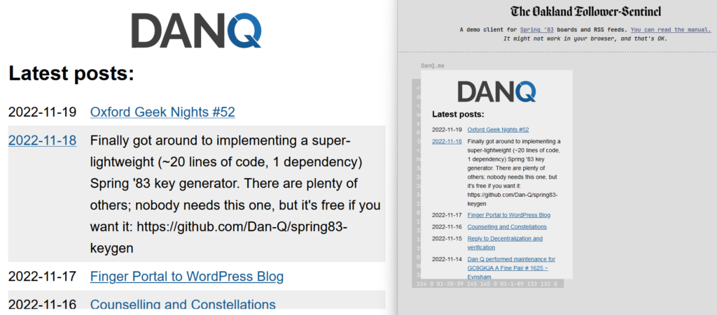
Just in time for Robin Sloan to give up on Spring ’83, earlier this month I finally got aroud to launching STS-6 (named for the first mission of the Space Shuttle Challenger in Spring 1983), my experimental Spring ’83 server. It’s
been a busy year; I had other things to do. But you might have guessed that something like this had been under my belt when I open-sourced a keygenerator for the protocol the other day.
If you’ve not played with Spring ’83, this post isn’t going to make much sense to you. Sorry.
My server is, as far as I can tell, very different from any others in a few key ways:
It does not allow third-party publishing at all. Some might argue that this undermines the aim of the exercise, but I disagree. My IndieWeb inclinations lead me to
favour “self-hosted” content, shared from its owners’ domain. Also: the specification clearly states that a server must implement a denylist… I guess my denylist simply includes all keys that are
not specifically permitted.
It’s geared towards dynamic content.My primary board self-publishes whenever I produce a new blog post, listing the most recent blog posts published. I have
another half-implemented which shows a summary of the most-recent post, and another which would would simply use a WordPress page as its basis – yes, this was content
management, but published over Spring ’83.
It provides helpers to streamline content production. It supports internal references to other boards you control using the format {{board:123}}which are
automatically converted to addresses referencing the public key of the “current” keypair for that board. This separates the concept of a board and its content template from that
board’s keypairs, making it easier to link to a board. To put it another way, STS-6 links are self-healing on the server-side (for local boards).
It helps automate content-fitting. Spring ’83 strictly requires a maximum board size of 2,217 bytes. STS-6 can be configured to fit a flexible amount of dynamic
content within a template area while respecting that limit. For my posts list board, the number of posts shown is moderated by the size of the resulting board: STS-6 adds more and
more links to the board until it’s too big, and then removes one!
It provides “hands-off” key management features. You can pregenerate a list of keys with different validity periods and the server will automatically cycle through
them as necessary, implementing and retroactively-modifying <link rel="next"> connections to keep them current.
I’m sure that there are those who would see this as automating something that was beautiful because it was handcrafted; I don’t know whether or not I agree, but had Spring ’83
taken off in a bigger way, it would always only have been a matter of time before somebody tried my approach.
From a design perspective, I enjoyed optimising an SVG image of my header so it could meaningfully fit into the board. It’s
pretty, and it’s tolerably lightweight.
If you want to see my server in action, patch this into your favourite Spring ’83 client:
https://s83.danq.dev/10c3ff2e8336307b0ac7673b34737b242b80e8aa63ce4ccba182469ea83e0623
A dead end?
Without Robin’s active participation, I feel that Spring ’83 is probably coming to a dead end. It’s been a lot of fun to play with and I’d love to see what ideas the experience of it
goes on to inspire next, but in its current form it’s one of those things that’s an interesting toy, but not something that’ll make serious waves.
In his last lab essay Robin already identified many of the key issues with the system (too complicated, no interpersonal-mentions, the challenge of keys-as-identifiers, etc.) and while
they’re all solvable without breaking the underlying mechanisms (mentions might be handled by Webmention, perhaps, etc.), I
understand the urge to take what was learned from this experiment and use it to help inform the decisions of the next one. Just as John Postel’s Quote of the Day protocol doesn’t see much use any more (although maybe if my
finger server could support QotD?) but went on to inspire the direction of many subsequent “call-and-response” protocols,
including HTTP, it’s okay if Spring ’83 disappears into obscurity, so long as we can learn what it did
well and build upon that.
Meanwhile: if you’re looking for a hot new “like the web but lighter” protocol, you should probably check out Gemini. (Incidentally, you
can find me at gemini://danq.me, but that’s something I’ll write about another day…)
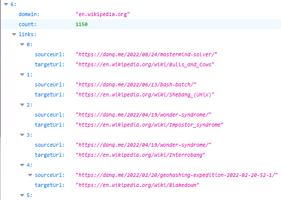
That’s a really useful thing to have in this new age of the web, where Refererer: headers are no-longer commonly passed cross-domain and Google Search no longer provides the link: operator. If you want to know if I’ve ever
linked to your site, it’s a bit of a drag to find out.
To nobody’s surprise whatsoever, I’ve made a so many links to Wikipedia that I might be single-handedly responsible for their PageRank.
So, obviously, I’ve written an implementation for WordPress. It’s really basic right now, but the source code can be
found here if you want it. Install it as a plugin and run wp outbound-links to kick it off. It’s fast: it takes 3-5 seconds to parse the entirety of danq.me,
and I’ve got somewhere in the region of 5,000 posts to parse.
You can see the results at https://danq.me/.well-known/links – if you’ve ever wondered “has Dan ever linked to my site?”, now you can find the
answer.
If this could be useful to you, let’s collaborate on making this into an actually-useful plugin! Otherwise it’ll just languish “as-is”, which is good enough for my purposes.
Different games in the same style (absurdle plays adversarially like my cheating hangman
game, crosswordle involves reverse-engineering a wordle colour grid into a crossword, heardle
is like Wordle but sounding out words using the IPA…)
I’m sure that by now all your social feeds are full of people playing Wordle. But the cool nerds are playing something new…
Now, a Wordle clone for D&D players!
But you know what hasn’t been seen before today? A Wordle clone where you have to guess a creature from the Dungeons & Dragons (5e) Monster Manual by putting numeric values into a
character sheet (STR, DEX, CON, INT, WIS, CHA):
Just because nobody’s asking for a game doesn’t mean you shouldn’t make it anyway.
What are you waiting for: go give DNDle a try (I pronounce it “dindle”, but you can pronounce it however you like). A new monster
appears at 10:00 UTC each day.
And because it’s me, of course it’s open source and works offline.
The boring techy bit
Like Wordle, everything happens in your browser: this is a “backendless” web application.
I’ve used ReefJS for state management, because I wanted something I could throw together quickly but I didn’t want to drown myself (or my players)
in a heavyweight monster library. If you’ve not used Reef before, you should give it a go: it’s basically like React but a tenth of the footprint.
A cache-first/background-updating service worker means that it can run completely offline: you can install it to your homescreen in the
same way as Wordle, but once you’ve visited it once it can work indefinitely even if you never go online again.
I don’t like to use a buildchain that’s any more-complicated than is absolutely necessary, so the only development dependency is rollup. It
resolves my import statements and bundles a single JS file for the browser.
But sometimes, they disappear slowly, like this kind of web address:
http://username:password@example.com/somewhere
If you’ve not seen a URL like that before, that’s fine, because the answer to the question “Can I still use HTTP Basic Auth in URLs?” is, I’m afraid: no, you probably can’t.
But by way of a history lesson, let’s go back and look at what these URLs were, why they died out, and how web
browsers handle them today. Thanks to Ruth who asked the original question that inspired this post.
Basic authentication
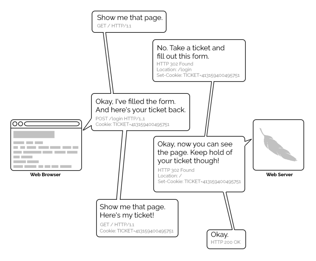
The early Web wasn’t built for authentication. A resource on the Web was theoretically accessible to all of humankind: if you didn’t want it in the public eye, you didn’t put
it on the Web! A reliable method wouldn’t become available until the concept of state was provided by Netscape’s invention of HTTP
cookies in 1994, and even that wouldn’t see widespread for several years, not least because implementing a CGI (or
similar) program to perform authentication was a complex and computationally-expensive option for all but the biggest websites.
A simplified view of the form-and-cookie based authentication system used by virtually every website today, but which was too computationally-expensive for many sites in the 1990s.
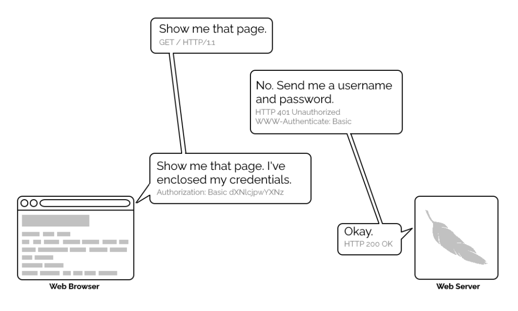
1996’s HTTP/1.0 specification tried to simplify things, though, with the introduction of the WWW-Authenticate header. The idea was that when a browser tried to access something that required
authentication, the server would send a 401 Unauthorized response along with a WWW-Authenticate header explaining how the browser could authenticate
itself. Then, the browser would send a fresh request, this time with an Authorization: header attached providing the required credentials. Initially, only “basic
authentication” was available, which basically involved sending a username and password in-the-clear unless SSL (HTTPS) was in use, but later, digest authentication and a host of others would appear.
For all its faults, HTTP Basic Authentication (and its near cousins) are certainly elegant.
Webserver software quickly added support for this new feature and as a result web authors who lacked the technical know-how (or permission from the server administrator) to implement
more-sophisticated authentication systems could quickly implement HTTP Basic Authentication, often simply by adding a .htaccessfile to the relevant directory.
.htaccess files would later go on to serve many other purposes, but their original and perhaps best-known purpose – and the one that gives them their name – was access
control.
Credentials in the URL
A separate specification, not specific to the Web (but one of Tim Berners-Lee’s most important contributions to it), described the general structure of URLs as follows:
At the time that specification was written, the Web didn’t have a mechanism for passing usernames and passwords: this general case was intended only to apply to protocols that
did have these credentials. An example is given in the specification, and clarified with “An optional user name. Some schemes (e.g., ftp) allow the specification of a user
name.”
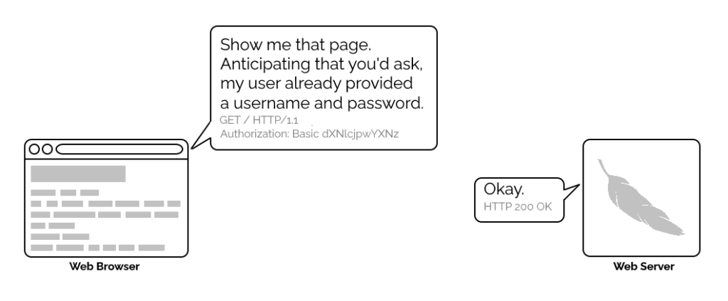
But once web browsers had WWW-Authenticate, virtually all of them added support for including the username and password in the web address too. This allowed for
e.g. hyperlinks with credentials embedded in them, which made for very convenient bookmarks, or partial credentials (e.g. just the username) to be included in a link, with the
user being prompted for the password on arrival at the destination. So far, so good.
Encoding authentication into the URL provided an incredible shortcut at a time when Web round-trip times were much longer owing to higher latencies and no keep-alives.
This is why we can’t have nice things
The technique fell out of favour as soon as it started being used for nefarious purposes. It didn’t take long for scammers to realise that they could create links like this:
https://YourBank.com@HackersSite.com/
Everything we were teaching users about checking for “https://” followed by the domain name of their bank… was undermined by this user interface choice. The poor victim would
actually be connecting to e.g. HackersSite.com, but a quick glance at their address bar would leave them convinced that they were talking to YourBank.com!
Theoretically: widespread adoption of EV certificates coupled with sensible user interface choices (that were never made) could
have solved this problem, but a far simpler solution was just to not show usernames in the address bar. Web developers were by now far more excited about forms and
cookies for authentication anyway, so browsers started curtailing the “credentials in addresses” feature.
Users trained to look for “https://” followed by the site they wanted would often fall for scams like this one: the real domain name is after the @-sign. (This attacker is
also using dword notation to obfuscate their IP address; this
dated technique wasn’t often employed alongside this kind of scam, but it’s another historical oddity I enjoy so I’m shoehorning it in.)
(There are other reasons this particular implementation of HTTP Basic Authentication was less-than-ideal, but this reason is the big one that explains why things had to change.)
One by one, browsers made the change. But here’s the interesting bit: the browsers didn’t always make the change in the same way.
How different browsers handle basic authentication in URLs
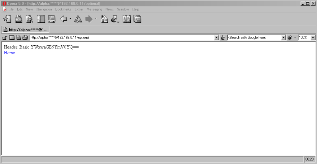
Let’s examine some popular browsers. To run these tests I threw together a tiny web application that outputs
the Authorization: header passed to it, if present, and can optionally send a 401 Unauthorized response along with a WWW-Authenticate: Basic realm="Test Site" header in order to trigger basic authentication. Why both? So that I can test not only how browsers handle URLs containing credentials when an authentication request is received, but how they handle them when one is not. This is relevant because
some addresses – often API endpoints – have optional HTTP authentication, and it’s sometimes important for a user agent (albeit typically a library or command-line one) to pass credentials without
first being prompted.
In each case, I tried each of the following tests in a fresh browser instance:
Go to http://<username>:<password>@<domain>/optional (authentication is optional).
Go to http://<username>:<password>@<domain>/mandatory (authentication is mandatory).
Experiment 1, then f0llow relative hyperlinks (which should correctly retain the credentials) to /mandatory.
Experiment 2, then follow relative hyperlinks to the /optional.
I’m only testing over the http scheme, because I’ve no reason to believe that any of the browsers under test treat the https scheme differently.
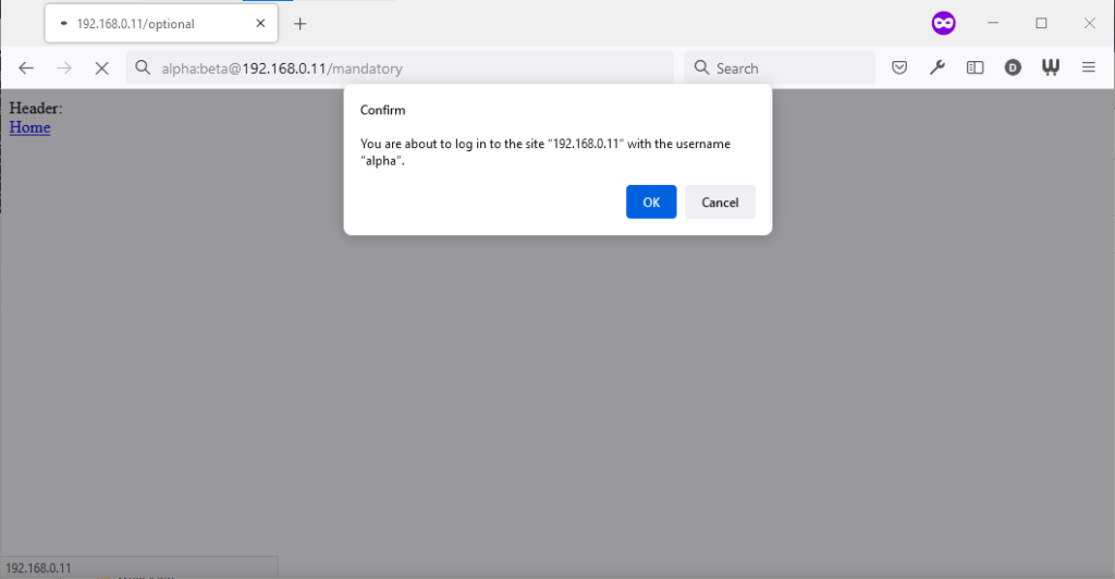
Chromium desktop family
Chrome 93 and Edge 93 both immediately suppressed the username and password from the address bar, along with the “http://” as we’ve come to expect of them. Like the “http://”, though,
the plaintext username and password are still there. You can retrieve them by copy-pasting the entire address.
Opera 78 similarly suppressed the username, password, and scheme, but didn’t retain the username and password in a way that could be copy-pasted out.
Authentication was passed only when landing on a “mandatory” page; never when landing on an “optional” page. Refreshing the page or re-entering the address with its credentials did not
change this.
Navigating from the “optional” page to the “mandatory” page using only relative links retained the username and password and submitted it to the server when it became mandatory,
even Opera which didn’t initially appear to retain the credentials at all.
Navigating from the “mandatory” to the “optional” page using only relative links, or even entering the “optional” page address with credentials after visiting the “mandatory” page, does
not result in authentication being passed to the “optional” page. However, it’s interesting to note that once authentication has occurred on a mandatory page, pressing enter at
the end of the address bar on the optional page, with credentials in the address bar (whether visible or hidden from the user) does result in the credentials being passed to
the optional page! They continue to be passed on each subsequent load of the “optional” page until the browsing session is ended.
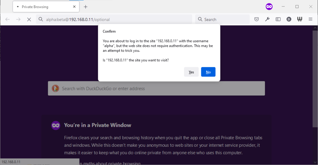
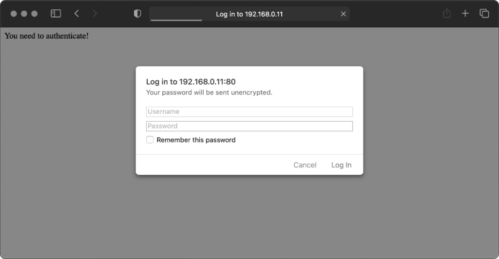
Firefox desktop
Firefox 91 does a clever thing very much in-line with
its image as a browser that puts decision-making authority into the hands of its user. When going to the “optional” page first it presents a dialog, warning the user that they’re going
to a site that does not specifically request a username, but they’re providing one anyway. If the user says that no, navigation ceases (the GET request for the page takes place the same
either way; this happens before the dialog appears). Strangely: regardless of whether the user selects yes or no, the credentials are not passed on the “optional” page. The credentials
(although not the “http://”) appear in the address bar while the user makes their decision.
Similar to Opera, the credentials do not appear in the address bar thereafter, but they’re clearly still being stored: if the refresh button is pressed the dialog appears again. It does
not appear if the user selects the address bar and presses enter.
Similarly, going to the “mandatory” page in Firefox results in an informative dialog warning the user
that credentials are being passed. I like this approach: not only does it help protect the user from the use of authentication as a tracking technique (an old technique that I’ve not
seen used in well over a decade, mind), it also helps the user be sure that they’re logging in using the account they mean to, when following a link for that purpose. Again, clicking
cancel stops navigation, although the initial request (with no credentials) and the 401 response has already occurred.
Visiting any page within the scope of the realm of the authentication after visiting the “mandatory” page results in credentials being sent, whether or not they’re included in the
address. This is probably the most-true implementation to the expectations of the standard that I’ve found in a modern graphical browser.
Safari desktop
Safari 14 never displays or uses credentials provided via the web address, whether or not
authentication is mandatory. Mandatory authentication is always met by a pop-up dialog, even if credentials were provided in the address bar. Boo!
Once passed, credentials are later provided automatically to other addresses within the same realm (i.e. optional pages).
Older browsers
Let’s try some older browsers.
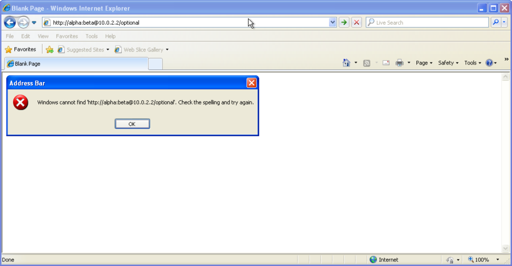
From version 7 onwards – right up to the final version 11 – Internet Explorer fails to even recognise
addresses with authentication credentials in as legitimate web addresses, regardless of whether or not authentication is requested by the server. It’s easy to assume that this is yet
another missing feature in the browser we all love to hate, but it’s interesting to note that credentials-in-addresses is permitted for ftp:// URLs…
…and if you go back a little way, Internet Explorer 6 and below supported credentials in the address bar pretty
much as you’d expect based on the standard. The error message seen in IE7 and above is a deliberate design
decision, albeit a somewhat knee-jerk reaction to the security issues posed by the feature (compare to the more-careful approach of other browsers).
These older versions of IE even (correctly) retain the credentials through relative hyperlinks, allowing them to be passed when
they become mandatory. They’re not passed on optional pages unless a mandatory page within the same realm has already been encountered.
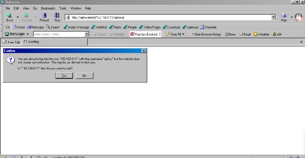
Pre-Mozilla Netscape behaved the same way. Truly this was the de facto standard for a long period on the Web, and the varied approaches we see today are the
anomaly. That’s a strange observation to make, considering how much the Web of the 1990s was dominated by incompatible implementations of different Web features (I’ve written about the <blink> and <marquee> tags before, which was perhaps the most-visible division between
the Microsoft and Netscape camps, but there were many, many more).
Interestingly: by Netscape 7.2 the browser’s behaviour had evolved
to be the same as modern Firefox’s, except that it still displayed the credentials in the address bar for all to see.
Now here’s a real gem: pre-Chromium Opera. It would send credentials to “mandatory” pages and remember them for the
duration of the browsing session, which is great. But it would also send credentials when passed in a web address to “optional” pages. However, it wouldn’t remember
them on optional pages unless they remained in the address bar: this feels to me like an optimum balance of features for power users. Plus, it’s one of very few browsers that
permitted you to change credentials mid-session: just by changing them in the address bar! Most other browsers, even to this day, ignore changes to HTTP Authentication credentials, which was sometimes be a source of frustration back in the day.
Finally, classic Opera was the only browser I’ve seen to mask the password in the address bar, turning it into a series of asterisks. This ensures the user knows that a
password was used, but does not leak any sensitive information to shoulder-surfers (the length of the “masked” password was always the same length, too, so it didn’t even leak the
length of the password). Altogether a spectacular design and a great example of why classic Opera was way ahead of its time.
The Command-Line
Most people using web addresses with credentials embedded within them nowadays are probably working with code, APIs,
or the command line, so it’s unsurprising to see that this is where the most “traditional” standards-compliance is found.
I was unsurprised to discover that giving curl a username and password in the URL meant that
username and password was sent to the server (using Basic authentication, of course, if no authentication was requested):
However, wgetdid catch me out. Hitting the same addresses with wget didn’t result in the credentials being sent
except where it was mandatory (i.e. where a HTTP 401 response and a WWW-Authenticate: header was received on the initial attempt). To force wget to
send credentials when they haven’t been asked-for requires the use of the --http-user and --http-password switches:
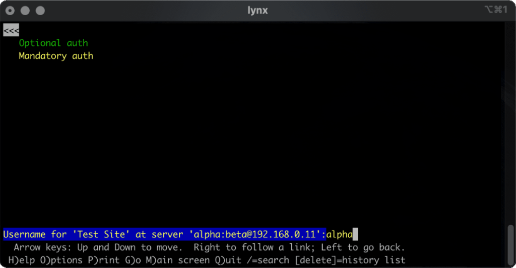
lynx does a cute and clever thing. Like most modern browsers, it does not submit credentials unless specifically requested, but if
they’re in the address bar when they become mandatory (e.g. because of following relative hyperlinks or hyperlinks containing credentials) it prompts for the username and password,
but pre-fills the form with the details from the URL. Nice.
What’s the status of HTTP (Basic) Authentication?
HTTP Basic Authentication and its close cousin Digest Authentication (which overcomes some of the security limitations of running Basic Authentication over an
unencrypted connection) is very much alive, but its use in hyperlinks can’t be relied upon: some browsers (e.g. IE, Safari)
completely munge such links while others don’t behave as you might expect. Other mechanisms like Bearer see widespread use in APIs, but nowhere else.
The WWW-Authenticate: and Authorization: headers are, in some ways, an example of the best possible way to implement authentication on the Web: as an
underlying standard independent of support for forms (and, increasingly, Javascript), cookies, and complex multi-part conversations. It’s easy to imagine an alternative
timeline where these standards continued to be collaboratively developed and maintained and their shortfalls – e.g. not being able to easily log out when using most graphical browsers!
– were overcome. A timeline in which one might write a login form like this, knowing that your e.g. “authenticate” attributes would instruct the browser to send credentials using an
Authorization: header:
In such a world, more-complex authentication strategies (e.g. multi-factor authentication) could involve encoding forms as JSON. And single-sign-on systems would simply involve the browser collecting a token from the authentication provider and passing it on to the
third-party service, directly through browser headers, with no need for backwards-and-forwards redirects with stacks of information in GET parameters as is the case today.
Client-side certificates – long a powerful but neglected authentication mechanism in their own right – could act as first class citizens directly alongside such a system, providing
transparent second-factor authentication wherever it was required. You wouldn’t have to accept a tracking cookie from a site in order to log in (or stay logged in), and if your
browser-integrated password safe supported it you could log on and off from any site simply by toggling that account’s “switch”, without even visiting the site: all you’d be changing is
whether or not your credentials would be sent when the time came.
The Web has long been on a constant push for the next new shiny thing, and that’s sometimes meant that established standards have been neglected prematurely or have failed to evolve for
longer than we’d have liked. Consider how long it took us to get the <video> and <audio> elements because the “new shiny” Flash came to dominate,
how the Web Payments API is only just beginning to mature despite over 25 years of ecommerce on the Web, or how we still can’t
use Link: headers for all the things we can use <link> elements for despite them being semantically-equivalent!
The new model for Web features seems to be that new features first come from a popular JavaScript implementation, and then eventually it evolves into a native browser feature: for
example HTML form validations, which for the longest time could only be done client-side using scripting languages. I’d love
to see somebody re-think HTTP Authentication in this way, but sadly we’ll never get a 100% solution in JavaScript alone: (distributed SSO is almost certainly off the table, for example, owing to cross-domain limitations).
Or maybe it’s just a problem that’s waiting for somebody cleverer than I to come and solve it. Want to give it a go?
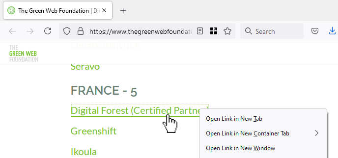
Here’s a perfect example I bumped into earlier this week, courtesy of The Green Web Foundation. This looks like a
hyperlink… but if you open it in a new tab/window, you see a page (not even a 404 page!) with the text “It looks like nothing was found at this location.”
In the site shown in the screenshot above, the developer took something the web gave them for free (a hyperlink), threw it away (by making it a link-to-nowhere), and rebuilt its
functionality with Javascript (without thinking about the fact that you can do more with hyperlinks than click them: you can click-and-drag them, you can bookmark them, you can share
them, you can open them in new tabs etc.). Ugh.
Something you can clearly type a numeric day, month and year into is best.
Three dropdowns are slightly worse, but at least if you use native HTML <select> elements keyboard
users can still “type” to filter.
Everything else – including things that look like <select>s but are really funky React <div>s, is pretty terrible.
Calendars can be great for choosing your holiday date range. But pressing “Prev” ~480 times to get to my month of birth isn’t good. Also: what’s with the time “sliders”? (Yes, I know I’ve implemented these myself, in the past, and I’m sorry.)
People designing webforms that require me to enter my birthdate:
I am begging you: just let me type it in.
Typing it in is 6-8 quick keystrokes. Trying to navigate a little calendar or spinny wheels back to the 1970s is time-consuming, frustrating and unnecessary.
They’re right. Those little spinny wheels are a pain in the arse if you’ve got to use one to go back 40+ years.
These things are okay (I guess) on mobile/touchscreen devices, though I’d still prefer the option to type in my date of birth. But send one to my desktop and I will
curse your name.
Can we do worse?
If there’s one thing we learned from making the worst volume control in the world, the other
year, it’s that you can always find a worse UI metaphor. So here’s my attempt at making a date of birth field that’s somehow
even worse than “date spinners”:
My datepicker implements a game of “higher/lower”. Starting from bounds specified in the HTML code and a random guess, it
narrows-down its guess as to what your date of birth is as you click the up or down buttons. If you make a mistake you can start over with the restart button.
Amazingly, this isn’t actually the worst datepicker into which I’ve entered my date of birth! It’s cognitively challenging compared to most, but it’s relatively fast at
narrowing down the options from any starting point. Plus, I accidentally implemented some good features that make it better than plenty of the datepickers out there:
It’s progressively enhanced – if the Javascript doesn’t load, you can still enter your date of birth in a sensible way.
Because it leans on a <input type="date"> control, your browser takes responsibility for localising, so if you’re from one of those weird countries that prefers
mm-dd-yyyy then that’s what you should see.
It’s moderately accessible, all things considered, and it could easily be improved further.
It turns out that even when you try to make something terrible, so long as you’re building on top of the solid principles the web gives you for free, you can accidentally end
up with something not-so-bad. Who knew?
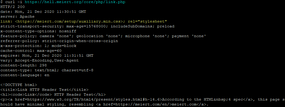
While talking about external CSS, he hinted at what I consider to be a distinct fourth way with its own unique use
cases:; using the Link: HTTP header. I’d like to share with you how it works and why I think it needs to be
kept in people’s minds, even if it’s not suitable for widespread deployment today.
Injecting CSS using the Link: HTTP Header
Every one of Jeremy’s suggestions involve adding markup to the HTML document itself. Which makes sense; you almost always
want to associate styles with a document regardless of the location it’s stored or the medium over which it’s transmitted. The most popular approach to adding CSS to a page uses the <link> HTML element, but did you know… the <link> element has a semantically-equivalent HTTP header,Link:.
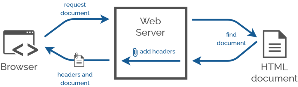
A webserver adds headers when it serves a document anyway. Adding one more is no big deal.
Why is this important?
This isn’t something you should put on your website right now. This (21-year-old!) standard is still only really supported in Firefox and pre-Blink Opera, so you lose perhaps 95% of the
Web (it could be argued that because CSSought to be considered
progressive enhancement, it’s tolerable so long as your HTML is properly-written).
If it were widely-supported, though, that would be a really good thing: HTTP headers beat meta/link tags for configurability, performance management, and separation of concerns. Need some specific examples? Sure:
here’s what you could use HTTP stylesheet linking for:
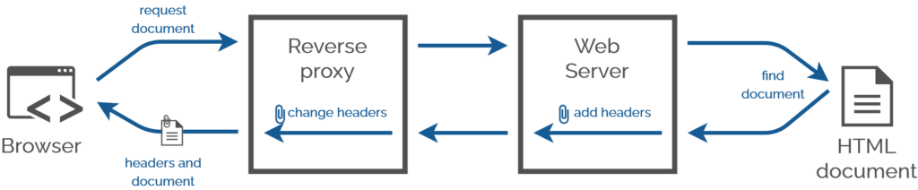
You have no idea how many times in my career I’d have injected CSS Link: headers using a reverse proxy server the
standard was universally-implemented. This technique would have made one of my final projects at the Bodleian so much easier…
Performance improvement using aggressively preloaded “top” stylesheets before the DOM parser even fires up.
Stylesheet injection by edge caches to provide regionalised/localised changes to brand identity.
Strong separation of content and design by hosting content and design elements in different systems.
Branding your staff intranet differently when it’s accessed from outside the network than inside it.
Rebranding proprietary services on your LAN without deep inspection, using reverse proxies.
Less-destructive user stylesheet injection by plugins etc. that doesn’t risk breaking icky on-page Javascript (e.g. theme switchers).
Browser detection? 😂 You could use this technique today to detect Firefox. But you absolutely
shouldn’t; if you think you need browser detection in CSS, use this instead.
Unfortunately right now though, stylesheet Link: headers remain consigned to the bin of “cool stylesheet standards that we could probably use if it weren’t for fucking Google”; see also
alternate stylesheets.
This weekend I announced and then hosted Homa Night II, an effort to use
technology to help bridge the chasms that’ve formed between my diaspora of friends as a result mostly of COVID. To a lesser extent
we’ve been made to feel distant from one another for a while as a result of our very diverse locations and lifestyles, but the resulting isolation was certainly compounded by lockdowns
and quarantines.
Long gone are the days when I could put up a blog post to say “Troma Night tonight?” and expect half a dozen friends to turn up at my house.
Back in the day we used to have a regular weekly film night called Troma Night, named after the studio
who dominated our early events and whose… genre… influenced many of our choices thereafter. We had over 300 such film
nights, by my count, before I eventually left our shared hometown of Aberystwyth ten years ago. I wasn’t the last one of the Troma Night
regulars to leave town, but more left before me than after.
Observant readers will spot a previous effort I made this year at hosting a party online.
Earlier this year I hosted Sour Grapes, a murder mystery party (an irregular highlight of our Aberystwyth social calendar,
with thanks to Ruth) run entirely online using a mixture of video chat and “second screen”
technologies. In some ways that could be seen as the predecessor to Homa Night, although I’d come up with most of the underlying technology to make Homa Night possible on a
whim much earlier in the year!
The idea spun out of a few conversations on WhatsApp but the final name – Homa Night – wasn’t agreed until early in November.
How best to make such a thing happen? When I first started thinking about it, during the first of the UK’s lockdowns, I considered a few options:
Streaming video over a telemeeting service (Zoom, Google Meet, etc.)
Very simple to set up, but the quality – as anybody who’s tried this before will attest – is appalling. Being optimised for speech rather than music and sound effects gives the audio
a flat, scratchy sound, video compression artefacts that are tolerable when you’re chatting to your boss are really annoying when they stop you reading a crucial subtitle, audio and
video often get desynchronised in a way that’s frankly infuriating, and everybody’s download speed is limited by the upload speed of the host, among other issues. The major benefit of
these platforms – full-duplex audio – is destroyed by feedback so everybody needs to stay muted while watching anyway. No thanks!
Teleparty or a similar tool Teleparty (formerly Netflix Party, but it now supports more services) is a pretty clever way to get almost exactly what I want:
synchronised video streaming plus chat alongside. But it only works on Chrome (and some related browsers) and doesn’t work on tablets, web-enabled TVs, etc., which would exclude some
of my friends. Everybody requires an account on the service you’re streaming from, potentially further limiting usability, and that also means you’re strictly limited to the media
available on those platforms (and further limited again if your party spans multiple geographic distribution regions for that service). There’s definitely things I can learn from
Teleparty, but it’s not the right tool for Homa Night.
“Press play… now!”
The relatively low-tech solution might have been to distribute video files in advance, have people download them, and get everybody to press “play” at the same time! That’s at least
slightly less-convenient because people can’t just “turn up”, they have to plan their attendance and set up in advance, but it would certainly have worked and I seriously
considered it. There are other downsides, though: if anybody has a technical issue and needs to e.g. restart their player then they’re basically doomed in any attempt to get back
in-sync again. We can do better…
A custom-made synchronised streaming service…?
A custom solution that leveraged existing infrastructure for the “hard bits” proved to be the right answer.
So obviously I ended up implementing my own streaming service. It wasn’t even that hard. In case you want to try your own, here’s how I did it:
Media preparation
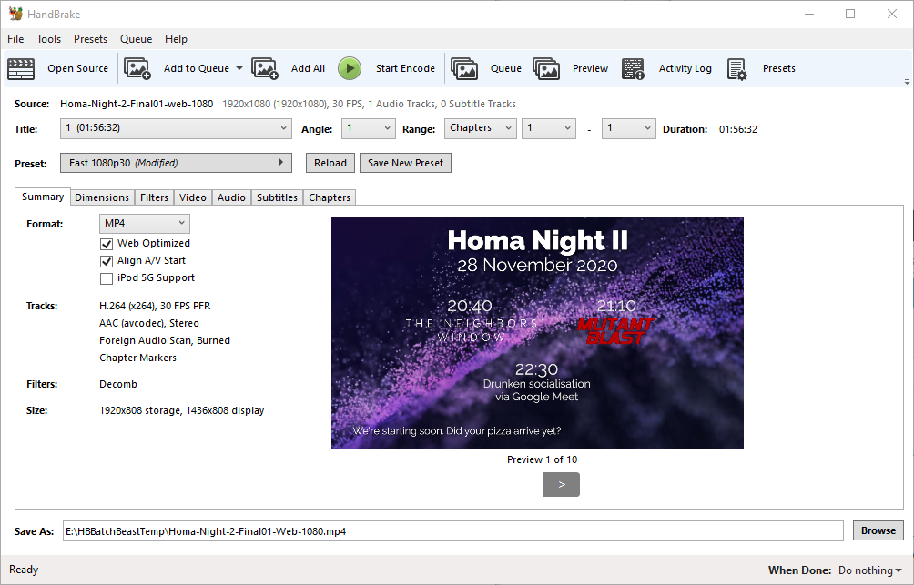
First, I used Adobe Premiere to create a video file containing both of the night’s films, bookended and separated by “filler” content to provide an introduction/lobby, an intermission,
and a closing “you should have stopped watching by now” message. I made sure that the “intro” was a nice round duration (90s) and suitable for looping because I planned to hold people
there until we were all ready to start the film. Thanks to Boris & Oliver for the background
music!
Honestly, the intermission was just an excuse to keep my chroma key gear out following its most-recent use.
Next, I ran the output through Handbrake to produce “web optimized” versions in 1080p and 720p output sizes. “Web optimized” in this case means that
metadata gets added to the start of the file to allow it to start playing without downloading the entire file (streaming) and to allow the calculation of what-part-of-the-file
corresponds to what-part-of-the-timeline: the latter, when coupled with a suitable webserver, allows browsers to “skip” to any point in the video without having to watch the intervening
part. Naturally I’m encoding with H.264 for the widest possible compatibility.
Even using my multi-GPU computer for the transcoding I had time to get up and walk around a bit.
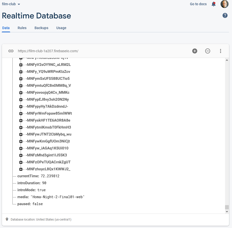
Real-Time Synchronisation
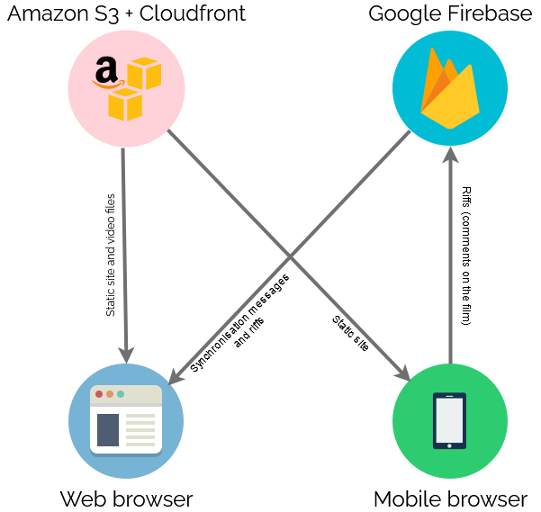
To keep everybody’s viewing experience in-sync, I set up a Firebase account for the application: Firebase provides an easy-to-use Websockets
platform with built-in data synchronisation. Ignoring the authentication and chat features, there wasn’t much
shared here: just the currentTime of the video in seconds, whether or not introMode was engaged (i.e. everybody should loop the first 90 seconds, for now), and
whether or not the video was paused:
Firebase makes schemaless real-time databases pretty easy.
To reduce development effort, I never got around to implementing an administrative front-end; I just manually went into the Firebase database and acknowledged “my” computer as being an
administrator, after I’d connected to it, and then ran a little Javascript in my browser’s debugger to tell it to start pushing my video’s currentTime to the server every
few seconds. Anything else I needed to edit I just edited directly from the Firebase interface.
Other web clients’ had Javascript to instruct them to monitor these variables from the Firebase database and, if they were desynchronised by more than 5 seconds, “jump” to the correct
point in the video file. The hard part of the code… wasn’t really that hard:
// Rewind if we're passed the end of the intro loopfunction introModeLoopCheck() {
if (!introMode) return;
if (video.currentTime > introDuration) video.currentTime =0;
}
function fixPlayStatus() {
// Handle "intro loop" modeif (remotelyControlled && introMode) {
if (video.paused) video.play(); // always play
introModeLoopCheck();
return; // don't look at the rest
}
// Fix current timeconst desync =Math.abs(lastCurrentTime - video.currentTime);
if (
(video.paused && desync > DESYNC_TOLERANCE_WHEN_PAUSED) ||
(!video.paused && desync > DESYNC_TOLERANCE_WHEN_PLAYING)
) {
video.currentTime = lastCurrentTime;
}
// Fix play statusif (remotelyControlled) {
if (lastPaused &&!video.paused) {
video.pause();
} elseif (!lastPaused && video.paused) {
video.play();
}
}
// Show/hide paused notification
updatePausedNotification();
}
Web front-end
Finally, there needed to be a web page everybody could go to to get access to this. As I was hosting the video on S3+CloudFront anyway, I put the HTML/CSS/JS there too.
I decided to carry the background theme of the video through to the web interface too.
I tested in Firefox, Edge, Chrome, and Safari on desktop, and (slightly less) on Firefox, Chrome and Safari on mobile. There were a few quirks to work around, mostly to do with browsers
not letting videos make sound until the page has been interacted with after the video element has been rendered, which I carefully worked-around by putting a popup “over” the
video to “enable sync”, but mostly it “just worked”.
Delivery
On the night I shared the web address and we kicked off! There were a few hiccups as some people’s browsers got disconnected early on and tried to start playing the film before it was
time, and one of these even when fixed ran about a minute behind the others, leading to minor spoilers leaking via the rest of us riffing about them! But on the whole, it worked. I’ve
had lots of useful feedback to improve on it for the next version, and I might even try to tidy up my code a bit and open-source the results if this kind of thing might be useful to
anybody else.
I’ve been working as part of the team working on the new application framework called the Endpoint Encabulator and wanted to share with you what I think makes our project so
exciting: I promise it’ll make for two minutes of your time you won’t seen forget!
Naturally, this project wouldn’t have been possible without the pioneering work that preceded it by John Hellins Quick, Bud Haggart, and others. Nothing’s invented in a vacuum. However,
my fellow developers and I think that our work is the first viable encabulator implementation to provide inverse reactive data binding suitable for deployment in front of a
blockchain-driven backend cache. I’m not saying that all digital content will one day be delivered through Endpoint Encabulator, but… well; maybe it will.
If the technical aspects go over your head, pass it on to a geeky friend who might be able to make use of my work. Sharing is caring!
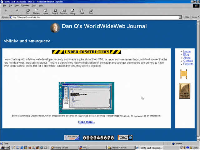
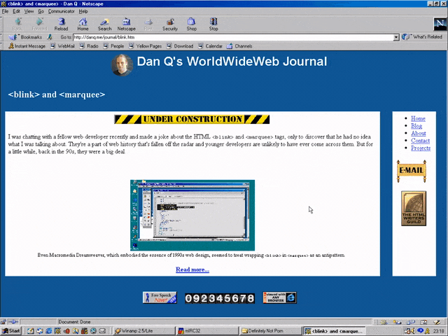
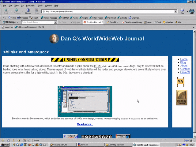
I was chatting with a fellow web developer recently and made a joke about the HTML <blink> and
<marquee> tags, only to discover that he had no idea what I was talking about. They’re a part of web history that’s fallen off the radar and younger developers are
unlikely to have ever come across them. But for a little while, back in the 90s, they were a big deal.
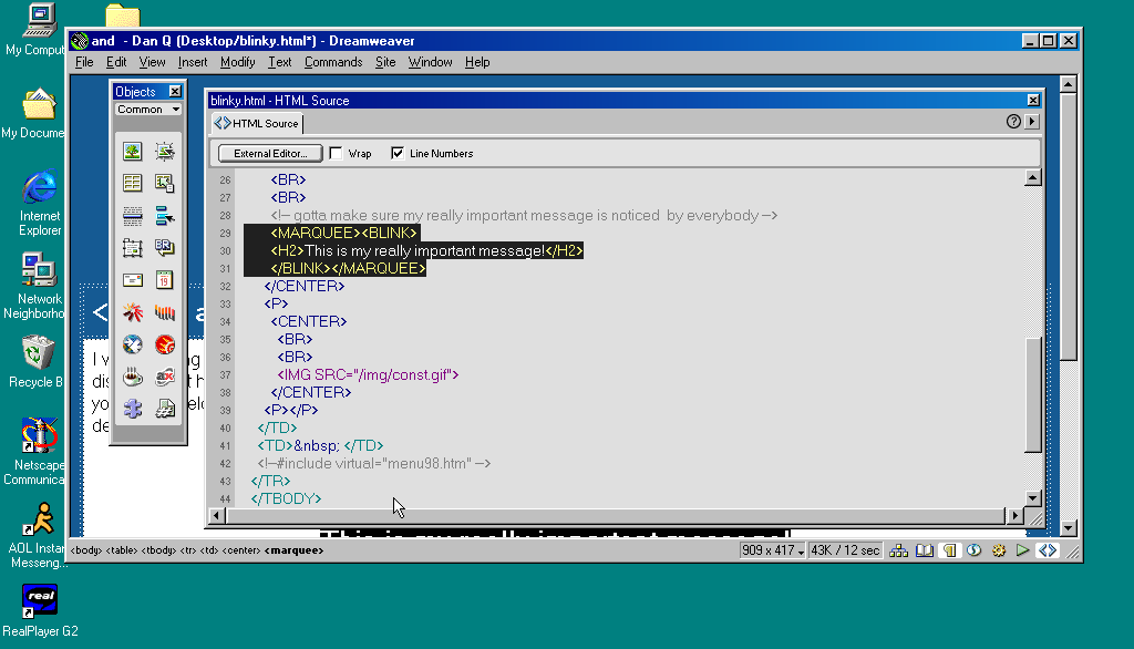
Even Macromedia Dreamweaver, which embodied the essence of 1990s web design, seemed to treat wrapping
<blink> in <marquee> as an antipattern.
Invention of the <blink> element is often credited to Lou Montulli, who wrote pioneering web browser Lynx before being joining Netscape in 1994. He insists that he didn’t write any
of the code that eventually became the first implementation of <blink>. Instead, he claims: while out at a bar (on the evening he’d first meet his wife!), he
pointed out that many of the fancy new stylistic elements the other Netscape engineers were proposing wouldn’t work in Lynx, which is a text-only browser. The fanciest conceivable
effect that would work across both browsers would be making the text flash on and off, he joked. Then another engineer – who he doesn’t identify – pulled a late night hack session and
added it.
And so it was that when Netscape Navigator 2.0 was released in 1995 it added support for
the <blink> tag. Also animated GIFs and the first inklings of JavaScript, which collectively
would go on to define the “personal website” experience for years to come. Here’s how you’d use it:
<BLINK>This is my blinking text!</BLINK>
With no attributes, it was clear from the outset that this tag was supposed to be a joke. By the time HTML4 was
published as a a recommendation two years later, it was documented as being a joke. But the Web of the late 1990s
saw it used a lot. If you wanted somebody to notice the “latest updates” section on your personal home page, you’d wrap a <blink> tag around the title (or,
if you were a sadist, the entire block).
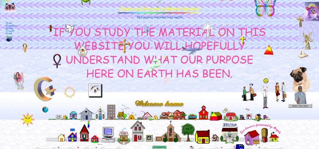
If you missed this particular chapter of the Web’s history, you can simulate it at Cameron’s World.
In the same year as Netscape Navigator 2.0 was released, Microsoft released Internet Explorer
2.0. At this point, Internet Explorer was still very-much playing catch-up with the features the Netscape team had implemented, but clearly some senior Microsoft engineer took a
look at the <blink> tag, refused to play along with the joke, but had an innovation of their own: the <marquee> tag! It had a whole suite of attributes to control the scroll direction, speed, and whether it looped or bounced backwards and forwards. While
<blink> encouraged disgusting and inaccessible design as a joke, <marquee> did it on purpose.
<MARQUEE>Oh my god this still works in most modern browsers!</MARQUEE>
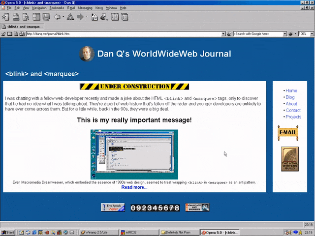
But here’s the interesting bit: for a while in the late 1990s, it became a somewhat common practice to wrap content that you wanted to emphasise with animation in both a
<blink> and a <marquee> tag. That way, the Netscape users would see it flash, the IE users
would see it scroll or bounce. Like this:
<MARQUEE><BLINK>This is my really important message!</BLINK></MARQUEE>
Wrap a <blink> inside a <marquee> and IE users will see the marquee. Delightful.
The web has always been built on Postel’s Law: a web browser should assume that it won’t understand everything it reads,
but it should provide a best-effort rendering for the benefit of its user anyway. Ever wondered why the modern <video> element is a block rather than a self-closing
tag? It’s so you can embed within it code that an earlier browser – one that doesn’t understand <video> – can read (a browser’s default state when seeing a
new element it doesn’t understand is to ignore it and carry on). So embedding a <blink> in a <marquee> gave you the best of both worlds, right?
(welll…)
Wrap a <blink> inside a <marquee> and Netscape users will see the blink. Joy.
Better yet, you were safe in the knowledge that anybody using a browser that didn’t understand either of these tags could still read your content. Used properly, the
web is about progressive enhancement. Implement for everybody, enhance for those who support the shiny features. JavaScript and CSS can be applied with the same rules, and doing so pays dividends in maintainability and accessibility (though, sadly, that doesn’t stop people writing
sites that needlessly require these technologies).
Personally, I was a (paying! – back when people used to pay for web browsers!) Opera user so I mostly saw neither <blink> nor <marquee> elements.
I don’t feel like I missed out.
I remember, though, the first time I tried Netscape 7, in 2002. Netscape 7 and its close descendent are, as far as I can tell, the only web browsers to support both<blink> and <marquee>. Even then, it was picky about the order in which they were presented and the elements wrapped-within them. But support was
good enough that some people’s personal web pages suddenly began to exhibit the most ugly effect imaginable: the combination of both scrolling and flashing text.
If Netscape 7’s UI didn’t already make your eyes bleed (I’ve toned it down here by installing the “classic skin”), its simultaneous
rendering of <blink> and <marquee> would.
The <blink> tag is very-definitely dead (hurrah!), but you can bring it back with pure CSS if you must.
<marquee>, amazingly, still survives, not only in polyfills but natively, as you might be able to see above. However, if you’re in any doubt as to whether or not
you should use it: you shouldn’t. If you’re looking for digital nostalgia, there’s a whole
rabbit hole to dive down, but you don’t need to inflict <marquee> on the rest of us.
What this now does is instead of saying “add margin to the left”, it says “regardless of direction, put margin on the starting side”. If the language of the document was
right to left, like Arabic, that margin would be on the right hand side.
…
This is clever. If you use e.g. margin-left on every list element after the first to put space “between” them, the spacing isn’t quite right when the order of the elements
is reversed, for example because your page has been automatically translated into a language that reads in the opposite direction (e.g. right-to-left, rather than left-to-right). When
you use margin-left in this way you’re imposing a language-direction-centric bias on your content, and there’s no need: margin-inline-start and its friends
are widely-supported and says what you mean: “place a margin before this element”. I’ll be trying to remember to
use this where it’s appropriate from now on.
You see what that’s doing? It’s loading the stylesheet for the print medium, but then when the document finishes loading it’s switching the media type from “print” to “all”.
Because it didn’t apply to begin with the stylesheet isn’t render-blocking. You can use this to delay secondary styles so the page essentials can load at full speed.
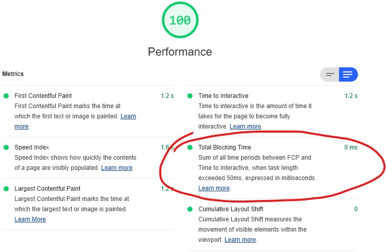
Reducing blocking times, like I have on this page, is one of many steps in optimising perceived page performance.
I don’t like this approach. I mean: I love the elegance… I just don’t like the implications.
Why I don’t like lazy-loading CSS using Javascript
Using Javascript to load CSS, in order to prevent that CSS
blocking rendering, feels to me like it conceptually breaks the Web. It certainly violates the expectations of progressive enhancement, because it introduces a level of
fault-intolerance that I consider (mostly) unacceptable.
CSS and Javascript are independent of one another. A well-designed progressively-enhanced page should function with
HTML only, HTML-and-CSS only, HTML-and-JS only, or all
three.CSS adds style, and JS adds behvaiour to a page; and when
you insist that the user agent uses Javascript in order to load stylistic elements, you violate the separation of these technologies (I’m looking at you, the majority of heavyweight
front-end frameworks!).
If you’re thinking that the only people affected are nerds like me who browse with Javascript wholly or partially disabled, you’re wrong: gov.uk research shows that around 1% of your visitors have Javascript fail for some reason or another: because it’s disabled
(whether for preference, privacy, compatibility with accessibility technologies, or whaterver), blocked, firewalled, or they’re using a browser that you didn’t expect.
Can we lazy-load CSS in a way that doesn’t depend on Javascript? (spoiler: yes)
Chris’s daily tip got me thinking: could there exist a way to load CSS in a non-render-blocking way but which degraded
gracefully in the event that Javascript was unavailable? I.e. if Javascript is working, lazy-load CSS, otherwise: load
conventionally as a fallback. It turns out, there is!
In principle, it’s this:
Link your stylesheet from within a <noscript> block, thereby only exposing it where Javascript is disabled. Give it a custom attribute to make it easy to find
later, e.g. <noscript lazyload> (if you’re a standards purist, you might prefer to use a data- attribute).
Have your Javascript extract the contents of these <noscript> blocks and reinject them. In modern browsers, this is as simple as e.g.
[...document.querySelectorAll('noscript[lazyload]')].forEach(ns=>ns.outerHTML=ns.innerHTML).
If you need support for Internet Explorer, you need a little more work, because Internet Explorer doesn’t expose<noscript> blocks to the DOM in a helpful way. There are a variety of possible workarounds; I’ve implemented one but not put too much thought into it because I rarely have to
think about Internet Explorer these days.
In any case, I’ve implemented a proof of concept/demonstration if you’d like to see it in action: just take a look and view source (or read the page)
for details. Or view the source alone via this gist.
Lazy-loading CSS using my approach provides most of the benefits of other approaches… but works properly in environments without
Javascript too.
Update: Chris Ferdinandi’s refined this into an even cleaner approach that takes the best of both worlds.