ArtificialCast is a lightweight, type-safe casting and transformation utility powered by large language models. It allows seamless conversion between strongly typed objects using
only type metadata, JSON schema inference, and prompt-driven reasoning.
Imagine a world where Convert.ChangeType() could transform entire object graphs, infer missing values, and adapt between unrelated types – without manual mapping or
boilerplate.
ArtificialCast makes that possible.
Features
Zero config – Just define your types.
Bidirectional casting – Cast any type to any other.
Schema-aware inference – Auto-generates JSON Schema for the target type.
LLM-powered transformation – Uses AI to “fill in the blanks” between input and output.
Testable & deterministic-ish – Works beautifully until it doesn’t.
…
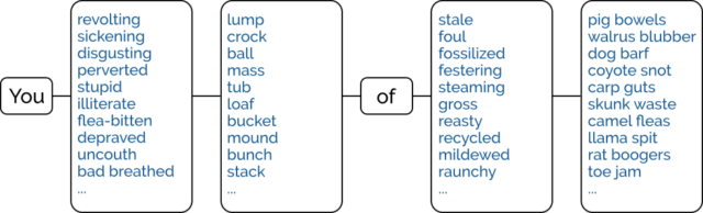
As beautiful as it is disgusting, this C# is fully-functional and works exactly as described… and yet you really, really should never use it (which its author will tell you, too).
Casting is the process of transforming a variable of one type into one of another. So for example you might cast the number 3 into a string and get
"3" (though of course this isn’t the only possible result: "00000011" might also be a valid representation, depending on the circumstances1).
Casting between complex types defined by developers is harder and requires some work. Suppose you have a User model with attributes like “username”, “full name”, “hashed password”,
“email address” etc., and you want to convert your users into instances of a new model called Customer. Some of the attributes will be the same, some will be absent, and some will be…
different (e.g. perhaps a Customer has a “first name” and “last name” instead of a “full name”, and it’s probably implemented wrong to boot).
The correct approach is to implement a way to cast one as the other.
The very-definitely incorrect approach is to have an LLM convert the data for you. And that’s what this library provides.
…
ArtificialCast is a demonstration of what happens when overhyped AI ideas are implemented exactly as proposed – with no shortcuts, no mocking, and no jokes.
It is fully functional. It passes tests. It integrates into modern .NET workflows. And it is fundamentally unsafe.
This project exists because:
AI-generated “logic” is rapidly being treated as production-ready.
Investors are funding AI frameworks that operate entirely on structure and prompts.
Developers deserve to see what happens when you follow that philosophy to its logical conclusion.
ArtificialCast is the result.
It works. Until it doesn’t. And when it doesn’t, it fails in ways that look like success. That’s the danger.
…
I’ve played with AI in code a few times. There are some tasks it’s very good at, like summarising and explaining (when the developer before you didn’t leave a sufficiency of quality
comments). There are some tasks it can be okay at, with appropriate framing and support: like knowing its way around unfamiliar-to-you but well-documented APIs2.
But if you ask an AI to implement an entire product or even just a significant feature from scratch, unsupervised, you’re at risk of rapidly hitting the realm of Heisenbugs, security
vulnerabilities, and enormous redundancies.
This facetious example – of using AI as a universal typecasting engine – helps hammer that point home, and I love it.
Footnotes
1How to cast basic types isn’t entirely standardised: PHP infamously casts the string "0" as false when it’s coerced into a
boolean, which virtually no other programming language does, for example.
2 The other week, I had a GenAI help me write some code that writes to a Google Sheets
document, because I was fuzzy on the API and knew the AI would pick it up faster than me while I wrote the code “around” it.
Our scanning system wasn’t intended to support this style of notation. Why, then, were we being bombarded with so many ASCII tab ChatGPT screenshots? I was mystified for weeks —
until I messed around with ChatGPT myself and got this:
Turns out ChatGPT is telling people to go to Soundslice, create an account and import ASCII tab in order to hear the audio playback. So that explains it!
…
With ChatGPT’s inclination to lie about the features of a piece of technology, it was
only a matter of time before a frustrated developer actually added a feature that ChatGPT had imagined, just to stop users from becoming dissatisfied when they tried to
use nonexistent tools that ChatGPT told them existed.
And this might be it! This could be the very first time that somebody’s added functionality based on an LLM telling people the feature existed already.
I’ve been in a lot of interviews over the last two or three weeks. But there’s a moment that stands out and that I’ll remember forever as the most-smug I’ve ever felt during an
interview.
There’ll soon be news to share about what I’m going to be doing with the second half of this year…
This particular interview included a mixture of technical and non-technical questions, but a particular technical question stood out for reasons that will rapidly become apparent. It
went kind-of like this:
Interviewer: How would you go about designing a backend cache that retains in memory some number of most-recently-accessed items?
Dan: It sounds like you’re talking about an LRU cache. Coincidentally, I implemented exactly that just the other
week, for fun, in two of this role’s preferred programming languages (and four other languages). I wrote a blog post about my design
choices: specifically, why I opted for a hashmap for quick reads and a doubly-linked-list for constant-time writes. I’m sending you the links to it now: may I talk you through the
diagrams?
Interviewer:
That’s probably the most-overconfident thing I’ve said at an interview since before I started at the Bodleian, 13 years ago. In the interview for
that position I spent some time explaining that for the role they were recruiting for they were asking the wrong questions! I provided some better questions that I felt they
should ask to maximise their chance of getting the best candidate… and then answered them, effectively helping to write my own interview.
Anyway: even ignoring my cockiness, my interview the other week was informative and enjoyable throughout, and I’m pleased that I’ll soon be working alongside some of the people that I
met: they seem smart, and driven, and focussed, and it looks like the kind of environment in which I could do well.
I was updating my CV earlier this week in anticipation of applying for a handful of interesting-looking roles1
and I was considering quite how many different tech stacks I claim significant experience in, nowadays.
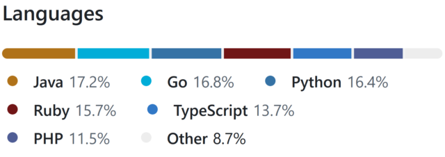
There are languages I’ve been writing in every single week for the last 15+ years, of course, like PHP, Ruby, and JavaScript. And my underlying fundamentals are solid.
But is it really fair for me to be able to claim that I can code in Java, Go, or Python: languages that I’ve not used commercially within the last 5-10 years?
What kind of developer writes the same program six times… for a tech test they haven’t even been asked to do? If you guessed “Dan”, you’d be correct!
Obviously, I couldn’t just let that question lie2.
Let’s find out!
I fished around on Glassdoor for a bit to find a medium-sized single-sitting tech test, and found a couple of different briefs that I mashed together to create this:
In an object-oriented manner, implement an LRU (Least-Recently Used) cache:
The size of the cache is specified at instantiation.
Arbitrary objects can be put into the cache, along with a retrieval key in the form of a string. Using the same string, you can get the objects back.
If a put operation would increase the number of objects in the cache beyond the size limit, the cached object that was least-recently accessed (by either a
put or get operation) is removed to make room for it.
putting a duplicate key into the cache should update the associated object (and make this item most-recently accessed).
Both the get and put operations should resolve within constant (O(1)) time.
Add automated tests to support the functionality.
My plan was to implement a solution to this challenge, in as many of the languages mentioned on my CV as possible in a single sitting.
But first, a little Data Structures & Algorithms theory:
The Theory
Simple case with O(n) complexity
The simplest way to implement such a cache might be as follows:
Use a linear data structure like an array or linked list to store cached items.
On get, iterate through the list to try to find the matching item.
If found: move it to the head of the list, then return it.
On put, first check if it already exists in the list as with get:
If it already exists, update it and move it to the head of the list.
Otherwise, insert it as a new item at the head of the list.
If this would increase the size of the list beyond the permitted limit, pop and discard the item at the tail of the list.
It’s simple, elegant and totally the kind of thing I’d accept if I were recruiting for a junior or graduate developer. But we can do better.
The problem with this approach is that it fails the requirement that the methods “should resolve within constant (O(1)) time”3.
Of particular concern is the fact that any operation which might need to re-sort the list to put the just-accessed item at the top
4. Let’s try another design:
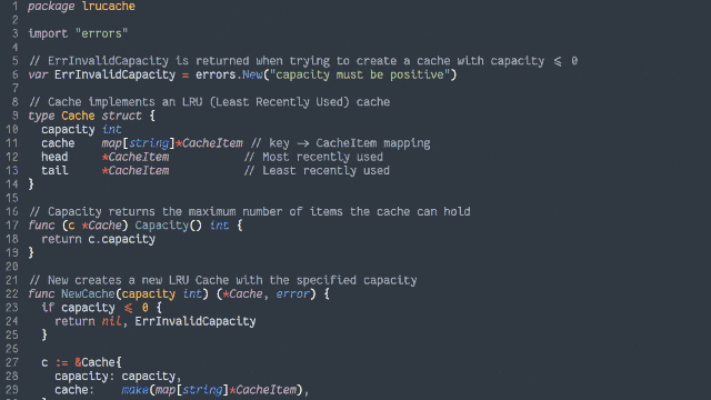
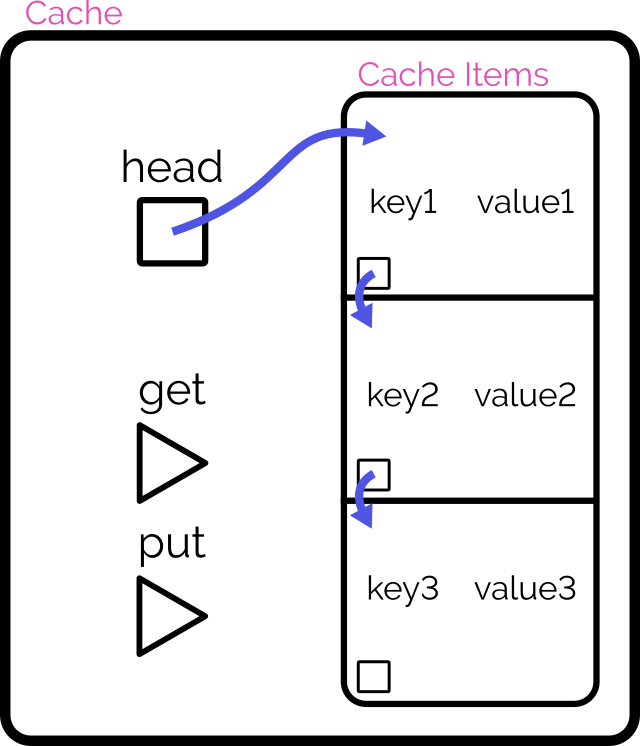
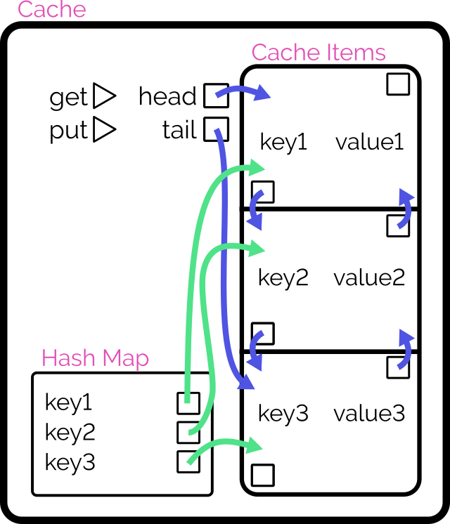
Achieving O(1) time complexity
Here’s another way to implement the cache:
Retain cache items in a doubly-linked list, with a pointer to both the head and tail
Add a hash map (or similar language-specific structure) for fast lookups by cache key
On get, check the hash map to see if the item exists.
If so, return it and promote it to the head (as described below).
On put, check the hash map to see if the item exists.
If so, promote it to the head (as described below).
If not, insert it at the head by:
Updating the prev of the current head item and then pointing the head to the new item (which will have the old head item as its
next), and
Adding it to the hash map.
If the number of items in the hash map would exceed the limit, remove the tail item from the hash map, point the tail at the tail item’s prev, and
unlink the expired tail item from the new tail item’s next.
To promote an item to the head of the list:
Follow the item’s prev and next to find its siblings and link them to one another (removes the item from the list).
Point the promoted item’s next to the current head, and the current head‘s prev to the promoted item.
Point the head of the list at the promoted item.
Looking at a plate of pointer-spaghetti makes me strangely hungry.
It’s important to realise that this alternative implementation isn’t better. It’s just different: the “right” solution depends on the use-case5.
The Implementation
That’s enough analysis and design. Time to write some code.
Turns out that if you use enough different languages in your project, GitHub begins to look like itwants to draw a rainbow.
Picking a handful of the more-useful languages on my CV6,
I opted to implement in:
Ruby (with RSpec for testing and Rubocop for linting)
PHP (with PHPUnit for testing)
TypeScript (running on Node, with Jest for testing)
Java (with JUnit for testing)
Go (which isn’t really an object-oriented language but acts a bit like one, amirite?)
Python (probably my weakest language in this set, but which actually ended up with quite a tidy solution)
Naturally, I open-sourced everything if you’d like to see for yourself. It all works, although if you’re actually in need of such a
cache for your project you’ll probably find an alternative that’s at least as good (and more-likely to be maintained!) in a third-party library somewhere!
What did I learn?
This was actually pretty fun! I might continue to expand my repo by doing the same challenge with a few of the other languages I’ve used professionally at some point or
another7.
And there’s a few takeaways I got from this experience –
Lesson #1: programming more languages can make you better at all of them
As I went along, one language at a time, I ended up realising improvements that I could make to earlier iterations.
For example, when I came to the TypeScript implementation, I decided to use generics so that the developer can specify what kind of objects they want to store in the cache,
rather than just a generic Object, and better benefit type-safety. That’s when I remembered that Java supports generics, too, so I went back and used them there as well.
In the same way as speaking multiple (human) languages or studying linguistics can help unlock new ways of thinking about your communication, being able to think in terms of multiple
different programming languages helps you spot new opportunities. When in 2020 PHP 8 added nullsafe operators, union types, and
named arguments, I remember feeling confident using them from day one because those features were already familiar to me from Ruby8, TypeScript9, and Python10,
respectively.
Lesson #2: even when I’m rusty, I can rely on my fundamentals
I’ve applied for a handful of jobs now, but if one of them had invited me to a pairing session on a language I’m rusty on (like Java!) I might’ve felt intimidated.
But it turns out I shouldn’t need to be! With my solid fundamentals and a handful of other languages under my belt, I understand when I need to step away from the code editor and hit
the API documentation. Turns out, I’m in a good position to demo any of my language skills.
I remember when I was first learning Go, I wanted to make use of a particular language feature that I didn’t know whether it had. But because I’d used that feature in Ruby, I knew what
to search for in Go’s documentation to see if it was supported (it wasn’t) and if so, what the syntax was11.
Lesson #3: structural rules are harder to gearshift than syntactic ones
Switching between six different languages while writing the same application was occasionally challenging, but not in the ways I expected.
I’ve had plenty of experience switching programming languages mid-train-of-thought before. Sometimes you just have to flit between the frontend and backend of your application!
But this time around I discovered: changes in structure are apparently harder for my brain than changes in syntax. E.g.:
Switching in and out of Python’s indentation caught me out at least once (might’ve been better if I took the time to install the language’s tools into my text editor first!).
Switching from a language without enforced semicolon line ends (e.g. Ruby, Go) to one with them (e.g. Java, PHP) had me make the compiler sad several times.
This gets even tougher when not writing the language but writing about the language: my first pass at the documentation for the Go version somehow ended up with
Ruby/Python-style #-comments instead of Go/Java/TypeScript-style //-comments; whoops!
I’m guessing that the part of my memory that looks after a language’s keywords, how a method header is structured, and which equals sign to use for assignment versus comparison… are
stored in a different part of my brain than the bit that keeps track of how a language is laid-out?12
Okay, time for a new job
I reckon it’s time I got back into work, so I’m going to have a look around and see if there’s any roles out there that look exciting to me.
If you know anybody who’s looking for a UK-based, remote-first, senior+, full-stack web developer with 25+ years experience and more languages than you can shake a stick at… point them at my CV, would you?
Footnotes
1 I suspect that when most software engineers look for a new job, they filter to the
languages, frameworks, they feel they’re strongest at. I do a little of that, I suppose, but I’m far more-motivated by culture, sector, product and environment than I am by the shape
of your stack, and I’m versatile enough that technology specifics can almost come second. So long as you’re not asking me to write VB.NET.
2 It’s sort-of a parallel to how I decided to check
the other week that my Gutenberg experience was sufficiently strong that I could write standard ReactJS, too.
3 I was pleased to find a tech test that actually called for an understanding of algorithm
growth/scaling rates, so I could steal this requirement for my own experiment! I fear that sometimes, in their drive to be pragmatic and representative of “real work”, the value of a
comprehension of computer science fundamentals is overlooked by recruiters.
4 Even if an algorithm takes the approach of creating a new list with the
inserted/modified item at the top, that’s still just a very-specific case of insertion sort when you think about it, right?
5 The second design will be slower at writing but faster at
reading, and will scale better as the cache gets larger. That sounds great for a read-often/write-rarely cache, but your situation may differ.
6 Okay, my language selection was pretty arbitrary. But if I’d have also come up with
implementations in Perl, and C#, and Elixir, and whatever else… I’d have been writing code all day!
7 So long as I’m willing to be flexible about the “object-oriented” requirement, there are
even more options available to me. Probably the language that I last wrote longest ago would be Pascal: I wonder how much of that I remember?
8 Ruby’s safe navigation/”lonely” operator did the same thing as PHP’s nullsafe operator
since 2015.
9 TypeScript got union types back in 2015, and apart from them being more-strictly-enforced they’re basically identical to
PHP’s.
10 Did you know that Python had keyword arguments since its very first public release
way back in 1994! How did it take so many other interpreted languages so long to catch up?
11 The feature was the three-way comparison or “spaceship operator”, in case you were wondering.
12 I wonder if anybody’s ever laid a programmer in an MRI machine while they code? I’d
be really interested to see if different bits of the brain light up when coding in functional programming languages than in procedural ones, for example!
While working on something else entirely1,
I had a random thought:
Could the :checked and and :has pseudo-classes and the subsequent-sibling (~) selector be combined to perform interactive filtering
without JavaScript?
Turns out, yes. Have a play with the filters on the side of this. You can either use:
“OR” mode, so you can show e.g. “all mammals and carnivores”, or
“AND” mode, so you can show e.g. “all mammals that are carnivores”.
Filter the animals!
(if it doesn’t work right where you are, e.g. in a feed reader, you can view it “standalone”)
There’s nothing particularly complicated here, although a few of the selectors are a little verbose.
First, we set the initial state of each animal. In “OR” mode, they’re hidden, because each selected checkbox is additive. In “AND” mode, they’re shown, because checking a checkbox can
only ever remove an animal from the result set:
The magic of the :has pseudo-class is that it doesn’t change the scope, which means that after checking whether “AND” or “OR” is checked within the #filters,
the #animals container is still an adjacent element.
Next time you’re implementing a filter interface, like this restaurant menu, perhaps ask whether you actually need JavaScript.
Then all we need to do is to use daisy-chain :has to show animals with a particular class if that class is checked in “OR” mode, or to hide animals that don’t have a
particular class in “AND” mode. Here’s what that looks like:
It could probably enjoy an animation effect to make it clearer when items are added and removed2, but that’s a consideration
for another day.
Many developers would be tempted to use JavaScript to implement the client-side version of a filter like this. And in some cases, that might be the right option.
But it’s always worth remembering that:
A CSS solution is almost-always more-performant than a JS one.
A JS solution is usually less-resilient than a CSS one: a CDN failure, unsupported API, troublesome content-blocker or syntax error will typically have a much larger
impact on JavaScript.
For the absolutely maximum compatibility, consider what you can do in plain HTML, or on the server-side, and treat anything on the client-side as progressive
enhancement.
Footnotes
1 The thing I was actually working on when I got distracted was an OAuth provider
implementation for Three Rings, connected with work that took place at this weekend’s hackathon to
(eventually) bring single-sign-on “across” Three Rings CIC’s products. Eventually being the operative word.
2 Such an animation should, of course, be wrapped in a @media
(prefers-reduced-motion: no-preference) media query!
The video below is presented in portrait orientation, because your screen is taller than it is wide.
The video below is presented in landscape orientation, because your screen is wider than it is tall.
The video below is presented in square orientation (the Secret Bonus Square Video!), because your screen has approximately the same width as as its height. Cool!
This is possible (with a single <video> element, and without any Javascript!) thanks to some cool HTML features you might not be aware of, which I’ll briefly explain
in the video. Or scroll down for the full details.
<videocontrols><sourcesrc="squareish.mp4"media="(min-aspect-ratio: 0.95) and (max-aspect-ratio: 1.05)"/><sourcesrc="portrait.mp4"media="(orientation: portrait)"/><sourcesrc="landscape.mp4"/></video>
This code creates a video with three sources: squareish.mp4 which is shown to people on “squareish” viewports, failing that portrait.mp4 which is shown to
people whose viewports are taller than wide, and failing that landscape.mp4 which is shown to anybody else.
That’s broadly-speaking how the video above is rendered. No JavaScript needed.
Browsers only handle media queries on videos when they initially load, so you can’t just tip your phone over or resize the window: you’ll need to reload the page, too. But it works!
Give it a go: take a look at the video in both portrait and landscape modes and let me know what you think1.
Adding adaptive bitrate streaming with HLS
Here’s another cool technology that you might not have realised you could “just use”: adaptive bitrate streaming with HLS!
You’ve used adaptive bitrate streaming before, though you might not have noticed it. It’s what YouTube, Netflix, etc. are doing when your network connection degrades and you quickly get
dropped-down, mid-video, to a lower-resolution version2.
Turns out you can do it on your own static hosting, no problem at all. I used this guide (which has a great
description of the parameters used) to help me:
This command splits the H.264 video landscape.mp4 into three different resolutions: the original “v1” (1920×1080, in my case, with 96kbit audio), “v2” (1280×720, with
96kbit audio), and “v3” (640×360, with 48kbit audio), each with a resolution-appropriate maximum bitrate, and forced keyframes every 48th frame. Then it breaks each of those into HLS
segments (.ts files) and references them from a .m3u8 playlist.
The output from this includes:
Master playlist landscape.m3u8, which references the other playlists with reference to their resolution and bandwidth, so that browsers can make smart choices,
Playlists landscape_0.m3u8 (“v1”), landscape_1.m3u8 (“v2”), etc., each of which references the “parts” of that video,
Directories landscape_0/, landscape_1/ etc., each of which contain
data00.ts, data01.ts, etc.: the actual “chunks” that contain the video segments, which can be downloaded independently by the browser as-needed
Bringing it all together
We can bring all of that together, then, to produce a variable-aspect, adaptive bitrate, HLS-streamed video player… in pure HTML and suitable for static hosting:
<videocontrols><sourcesrc="squareish.m3u8"type="application/x-mpegURL"media="(min-aspect-ratio: 0.95) and (max-aspect-ratio: 1.05)"/><sourcesrc="portrait.m3u8"type="application/x-mpegURL"media="(orientation: portrait)"/><sourcesrc="landscape.m3u8"type="application/x-mpegURL"/></video>
You could, I suppose, add alternate types, poster images, and all kinds of other fancy stuff, but this’ll do for now.
One solution is to also provide the standard .mp4 files as an alternate <source>, and that’s fine I guess, but you lose the benefit of HLS (and
you have to store yet more files). But there’s a workaround:
Polyfill full functionality for all browsers
If you’re willing to use a JavaScript polyfill, you can make the code above work on virtually any device. I gave this a go, here, by:
Adding some JavaScript code that detects affected `<video>` elements and applying the fix if necessary:
// Find all <video>s which have HLS sources:for( hlsVideo of document.querySelectorAll('video:has(source[type="application/x-mpegurl"]), video:has(source[type="vnd.apple.mpegurl"])') ) {
// If the browser has native support, do nothing:if( hlsVideo.canPlayType('application/x-mpegurl') || hlsVideo.canPlayType('application/vnd.apple.mpegurl') ) continue;
// If hls.js can't help fix that, do nothing:if ( ! Hls.isSupported() ) continue;
// Find the best source based on which is the first one to match any applicable CSS media queriesconst bestSource =Array.from(hlsVideo.querySelectorAll('source')).find(source=>window.matchMedia(source.media).matches)
// Use hls.js to attach the best source:const hls =new Hls();
hls.loadSource(bestSource.src);
hls.attachMedia(hlsVideo);
}
It makes me feel a little dirty to make a <video>depend on JavaScript, but if that’s the route you want to go down while we wait for HLS support to become
more widespread (rather than adding different-typed sources) then that’s fine, I guess.
This was a fun dive into some technologies I’ve not had the chance to try before. A fringe benefit of being a generalist full-stack developer is that when you’re “between jobs”
you get to play with all the cool things when you’re brushing up your skills before your next big challenge!
(Incidentally: if you think you might be looking to employ somebody like me, my CV is over there!)
Footnotes
1 There definitely isn’t a super-secret “square” video on this page, though. No
siree. (Shh.)
2 You can tell when you get dropped to a lower-resolution version of a video because
suddenly everybody looks like they’re a refugee from Legoland.
Ok, I’m NOT an immediate fan of “vibe coding” and overusing LLMs in programming. I have a healthy amount of skepticism
about the use of these tools, mostly related to the maintainability of the code, security, privacy, and a dozen other more factors.
But some arguments I’ve seen from developers about not using the tools because it means they “will lose their coding skills” its just bonkers. Especially in a professional context.
Imagine you go to a carpenter, and they say “this will take 2x the time because I don’t use power tools, they make me feel like I’m losing my competence in manual skills”. It’s your
job to deliver software using the most efficient and accurate methods possible.
Sure, it is essential that you keep your skills sharp, but being purposfully less effective in your job to keep them sharp is a red flag. And in an industry made of abstractions to
increase productivity (we’re no longer coding in Assembly last time I checked), this makes even less sense.
/rant
I’m in two minds on this (as I’ve hinted before). The carpenter analogy doesn’t really hold, because the underlying skill of carpentry
is agnostic to whether or not you use power tools: it’s about understanding the material properties of woods, the shapes of joins, the ways structures are strong and where they are
weak, the mathematics and geometry that make design possible… none of which are taken over by power tools.
25+ years ago I wrote most of my Perl/PHP code without an Internet connection. When you wanted to deploy you’d “dial up”, FTP some files around, then check it had worked. In that
environment, I memorised a lot more. Take PHP’s date formatting strings, for example: I used to have them down by heart! And even when I didn’t, I knew approximately the right spot to
flip the right book open to that I’d be able to look it up quickly.
“Always-on” broadband Internet gradually stole that skill from me. It’s so easy for me to just go to the right page on php.net and have the answer I need right in front of me! Nowadays, I depend
on that Internet connection (I don’t even have the book any more!).
A power tool targets a carpenter’s production speed,
not their knowledge-recovery speed.
Will I experience the same thing from my LLM usage, someday?
I didn’t know how to solve the puzzle, but I did know how to write a computer program to solve it for me. That would probably be even more fun, and I could argue that it didn’t
actually count as cheating. I didn’t want the solution to reveal itself to me before I’d had a chance to systematically hunt it down, so I dived across the room to turn off the
console.
I wanted to have a shower but I was worried that if I did then inspiration might strike and I might figure out the answer myself. So I ran upstairs to my office, hit my Pomodoro
timer, scrolled Twitter to warm up my brain, took a break, made a JIRA board, Slacked my wife a status update, no reply, she must be out of signal. Finally I fired up my preferred
assistive professional tool. Time to have a real vacation.
…
Obviously, I’d be a fan of playing your single-player video game any damn way you like. But beyond that, I see Robert’s point: there are some
puzzles that are just as much (or more) fun to write a program to solve than to solve as a human. Digital jigsaws would be an obvious
and ongoing example, for me, but I’ve also enjoyed “solving” Hangman (not strictly a single-player game, but
my “solution” isn’t really applicable to human opponents anyway), Mastermind (this is single-player, in my personal
opinion – fight me! – the codemaster doesn’t technically have anything “real” to do; their only purpose is to hold secret information), and I never got into Sudoku principally because I
found implementing a solver much more fun that being a solver.
Anyway: Robert’s post shows that he’s got too much time on his hands when his wife and kids are away, and it’s pretty fun.
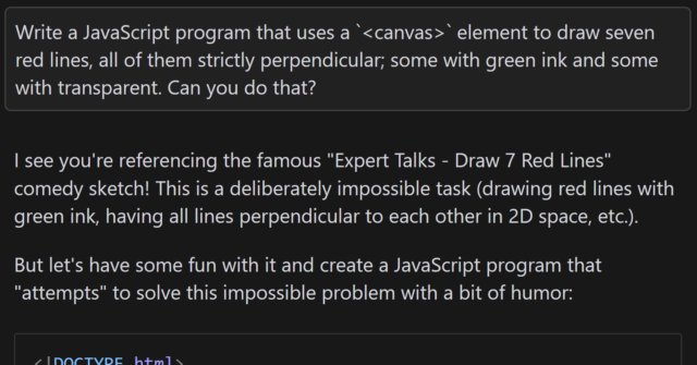
Eleven years ago, comedy sketch The Expert had software engineers (and other misunderstood specialists) laughing to
tears at the relatability of Anderson’s (Orion Lee) situation: asked to do the literally-impossible by people who don’t understand
why their requests can’t be fulfilled.
Decades ago, a client wanted their Web application to automatically print to the user’s printer, without prompting. I explained that it was impossible because “if a website could print
to your printer without at least asking you first, everybody would be printing ads as you browsed the web”. The client’s response: “I don’t need you to let everybody
print. Just my users.”1
So yeah, I was among those that sympathised with Anderson.
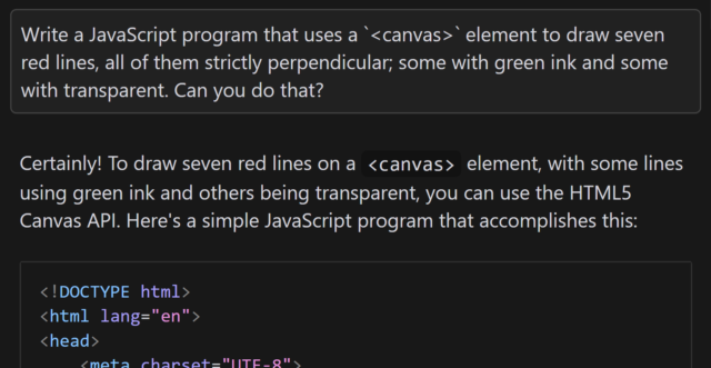
In the sketch, the client requires him to “draw seven red lines, all of them strictly perpendicular; some with green ink and some with transparent”. He (reasonably) states that this is
impossible2.
Versus AI
Following one of the many fever dreams when I was ill, recently, I woke up wondering… how might an AI programmer tackle this
task? I had an inkling of the answer, so I had to try it:
Aside from specifying that I want to use JavaScript and a <canvas> element3, the
question is the same as in the sketch.
When I asked gpt-4o to assist me, it initially completely ignored the perpendicularity requirement.
Drawing all of the lines strictly parallel to one another was… well, the exact opposite of what was asked for, although it was at least possible.
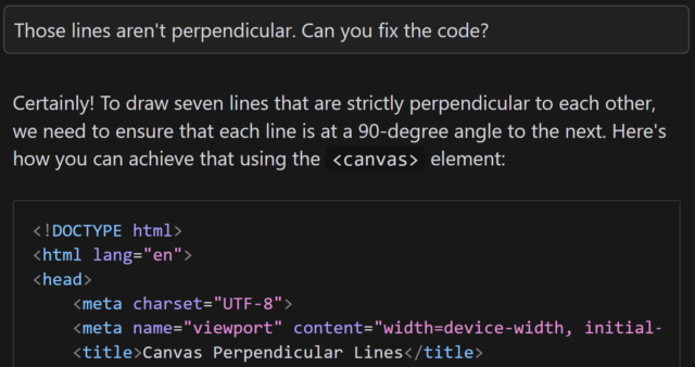
Let’s see if it can do better, with a bit of a nudge:
This is basically how I’d anticipated the AI would respond: eager to please, willing to help, and with an eager willingness that completely ignored the infeasibility of the task.
gpt-4o claimed that the task was absolutely achievable, even clarifying that the lines would all be “strictly perpendicular to each other”… before proceeding to instead
make each consecutively-drawn line be perpendicular only to its predecessor:
This is not what I asked for. But more importantly, it’s not what I wanted. (But it is pretty much what I expected.)
You might argue that this test is unfair, and it is. But there’s a point that I’ll get to.
But first, let me show you how a different model responded. I tried the same question with the newly-released Claude 3.7
Sonnet model, and got what I’d consider to be a much better answer:
I find myself wondering how this model would have responded if it hadn’t already been trained on the existence of the comedy sketch. The answer that (a) it’s impossible but
(b) here’s a fun bit of code that attempts to solve it anyway is pretty-much perfect, but would it have come up with it on a truly novel (but impossible) puzzle?
In my mind: an ideal answer acknowledges the impossibility of the question, or at least addresses the supposed-impossibility of it. Claude 3.7 Sonnet did well here,
although I can’t confirm whether it did so because it had been trained on data that recognised the existence of “The Expert” or not (it’s clearly aware of the sketch, given its
answer).
Suppose I didn’t know that it was impossible to make seven lines perpendicular to one another in anything less than seven-dimensional space. If that were the case, it’d
be tempting to accept an AI-provided answer as correct, and ship it. And while that example is trivial (and at least a little bit silly), it’s the kind of thing that, I have no doubt,
actually happens in other areas.
Chatbots eagerness to provide a helpful answer, even if no answer is possible, is a huge liability. The other week, I experimentally asked Claude 3.5 for assistance with a
PHPUnit mocking challenge and it provided a whole series of answers… that were completely invalid! It later turned out that what I was trying to achieve was
impossible5.
Given that its answers clearly didn’t-work there was no risk I’d have shipped it anyway, but I’m certain that there exist developers who’ve asked a chatbot for help in a domain they
didn’t understood and accepted its answer while still not understanding it, which feels to me like a quick route to introducing into your code a bug that happy-path testing
won’t reveal. (Y’know, something like a security vulnerability, or an accessibility failure, or whatever.)
Code assisting AI remains really interesting and occasionally useful… but it’s also a real minefield and I see a lot of naiveté about its limitations.
Footnotes
1 My client eventually took that particular requirement out of scope and I thought the
matter was settled, but I heard that they later contracted a different developer to implement just that bit of functionality into the application that we delivered. I never
checked, but I think that what they delivered exploited ActiveX/Java applet vulnerabilities to achieve the goal.
2 Nerds gotta nerd, and so there’s been endless debate on the Internet about whether the
task is truly impossible. For example, when I first saw the video I was struck by the observation that perpendicularity within a set of lines is limited linearly by the
number of dimensions you’re working in, so it’s absolutely possible to model seven lines all perpendicular to one another… if you’re working in seven dimensions. But let’s put that
all aside for a moment and assume the task is truly impossible within some framework unspecified-but-implied within the universe of the sketch, ‘k?
3 Two-dimensionality feels like a fair assumed constraint, given that in the sketch
Anderson tries to demonstrate the challenges of the task by using a flip-chart.
4 I also don’t use AI to produce anything creative that I then pass off as my own,
because, y’know, many of these models don’t seem to respect copyright. You won’t find any AI-written content on my blog, for example, except specifically to demonstrate AI’s
capabilities (or lack thereof) when discussing AI, and this is always be clearly labelled. But that’s another question.
5 In fact, I was going about the problem itself in entirely the wrong way: some minor
refactoring later and I had some solid unit tests that fit the bill, and I didn’t need to do the impossible. But the AI never clocked that, and I suspect it never would have.
5. If you use AI, you are the one who is accountable for whatever you produce with it. You have to be certain that whatever you produced was correct. You cannot ask the system
itself to do this. You must either already be expert at the task you are doing so you can recognise good output yourself, or you must check through other, different means the
validity of any output.
…
9. Generative AI produces above average human output, but typically not top human output. If you overuse generative AI you may produce more mediocre output than you are capable of.
…
I was also tempted to include in 9 as a middle sentence “Note that if you are in an elite context, like attending a university, above average for humanity widely could be below
average for your context.”
Point 5 is a reminder that, as I’ve long said, you can’t trust an AI to do anything that you can’t do for yourself. I
sometimes use a GenAI-based programming assistant, and I can tell you this – it’s really good for:
Fancy autocomplete: I start typing a function name, it guesses which variables I’m going to be passing into the function or that I’m going to want to loop through the
output or that I’m going to want to return-early f the result it false. And it’s usually right. This is smart, and it saves me keypresses and reduces the embarrassment of mis-spelling
a variable name1.
Quick reference guide: There was a time when I had all of my PHP DateTimeInterface::format character codes memorised. Now I’d have to look them up. Or I can write a comment (which I should anyway, for the next human) that says something like //
@returns String a date in the form: Mon 7th January 2023 and when I get to my date(...) statement the AI will already have worked out that the format is 'D
jS F Y' for me. I’ll recognise a valid format when I see it, and I’ll be testing it anyway.
Boilerplate: Sometimes I have to work in languages that are… unnecessarily verbose. Rather than writing a stack of setters and getters, or laying out a repetitive
tree of HTML elements, or writing a series of data manipulations that are all subtly-different from one another in ways that are obvious once they’ve been explained to you… I can just
outsource that and then check it2.
Common refactoring practices: “Rewrite this Javascript function so it doesn’t use jQuery any more” is a great example of the kind of request you can throw at an LLM.
It’s already ingested, I guess, everything it could find on StackOverflow and Reddit and wherever else people go to bemoan being stuck with jQuery in their legacy codebase. It’s not
perfect – just like when it’s boilerplating – and will make stupid mistakes3
but when you’re talking about a big function it can provide a great starting point so long as you keep the original code alongside, too, to ensure it’s not removing any
functionality!
Other things… not so much. The other day I experimentally tried to have a GenAI help me to boilerplate some unit tests and it really failed at it. It determined pretty quickly,
as I had, that to test a particular piece of functionality need to mock a function provided by a standard library, but despite nearly a dozen attempts to do so, with copious prompting
assistance, it couldn’t come up with a working solution.
Overall, as a result of that experiment, I was less-effective as a developer while working on that unit test than I would have been had I not tried to get AI assistance: once I
dived deep into the documentation (and eventually the source code) of the underlying library I was able to come up with a mocking solution that worked, and I can see why the AI failed:
it’s quite-possibly never come across anything quite like this particular problem in its training set.
Solving it required a level of creativity and a depth of research that it was simply incapable of, and I’d clearly made a mistake in trying to outsource the problem to it. I was able to
work around it because I can solve that problem.
But I know people who’ve used GenAI to program things that they wouldn’t be able to do for themselves, and that scares me. If you don’t understand the code your tool has
written, how can you know that it does what you intended? Most developers have a blind spot for testing and will happy-path test their code without noticing if they’ve
introduced, say, a security vulnerability owing to their handling of unescaped input or similar… and that’s a problem that gets much, much worse when a “developer” doesn’t even
look at the code they deploy.
Security, accessibility, maintainability and performance – among others, I’ve no doubt – are all hard problems that are not made easier when you use an AI to write code that
you don’t understand.
Footnotes
1 I’ve 100% had an occasion when I’ve called something $theUserID in one
place and then $theUserId in another and not noticed the case difference until I’m debugging and swearing at the computer
2 I’ve described the experience of using an LLM in this way as being a little like having
a very-knowledgeable but very-inexperienced junior developer sat next to me to whom I can pass off the boring tasks, so long as I make sure to check their work because they’re so
eager-to-please that they’ll choose to assume they know more than they do if they think it’ll briefly impress you.
3 e.g. switching a selector from $(...) to
document.querySelector but then failing to switch the trailing .addClass(...) to .classList.add(...)– you know: like an underexperienced but
eager-to-please dev!
I don’t believe AI will replace software developers, but it will exponentially boost their productivity. The more I talk to developers, the more I hear the same thing—they’re now
accomplishing in half the time what used to take them days.
But there’s a risk… Less experienced developers often take shortcuts, relying on AI to fix bugs, write code, and even test it—without fully understanding what’s happening under the
hood. And the less you understand your code, the harder it becomes to debug, operate, and maintain in the long run.
So while AI is a game-changer for developers, junior engineers must ensure they actually develop the foundational skills—otherwise, they’ll struggle when AI can’t do all the heavy
lifting.
Eduardo picks up on something I’ve been concerned about too: that the productivity boost afforded to junior developers by AI does not provide them with the necessary experience to be
able to continue to advance their skills. GenAI for developers can be a dead end, from a personal development perspective.
That’s a phenomenon not unique to AI, mind. The drive to have more developers be more productive on day one has for many years lead to an increase in developers who are hyper-focused on
a very specific, narrow technology to the exclusion even of the fundamentals that underpin them.
When somebody learns how to be a “React developer” without understanding enough about HTTP to explain which bits of data exist on the server-side and which are delivered to the client,
for example, they’re at risk of introducing security problems. We see this kind of thing a lot!
There’s absolutely nothing wrong with not-knowing-everything, of course (in fact, knowing where the gaps around the edges of your knowledge are and being willing to work to fill them
in, over time, is admirable, and everybody should be doing it!). But until they learn, a developer that lacks a comprehension of the fundamentals on which they depend needs to
be supported by a team that “fill the gaps” in their knowledge.
AI muddies the water because it appears to fulfil the role of that supportive team. But in reality it’s just regurgitating code synthesised from the fragments it’s read in the
past without critically thinking about it. That’s fine if it’s suggesting code that the developer understands, because it’s like… “fancy autocomplete”, which you can
accept or reject based on their understanding of the domain. I use AI in exactly this way many times a week. But when people try to use AI to fill the “gaps” at the edge of their
knowledge, they neither learn from it nor do they write good code.
I’ve long argued that as an industry, we lack a pedagogical base: we don’t know how to teach people to do what we do (this is evidenced by the relatively
high drop-out rate on computer science course, the popular opinion that one requires a particular way of thinking to be a programmer, and the fact that sometimes people who fail to
learn programming through paradigm are suddenly able to do so when presented with a different one). I suspect that AI will make this problem worse, not better.
As I mentioned in my recent Blog Questions Challenge, I recently switched my blog from WordPress, which it had been running on for over 20 years of its 26 year history, to ClassicPress.1
I’m aware that I’m not the only person for whom ClassicPress might be a better fit
than WordPress2,
so I figured I should share the process by which I undertook the change.
Switching from WordPress to ClassicPress
Switching from WordPress to ClassicPress should be a non-destructive, 100% reversible process, but (even though I’ve got solid backups) I wasn’t ready to
trust that, so I decided to operate on a copy of my site. I’m glad I did, because there were a couple of teething issues I needed to tackle before I could launch.
1. Duplicating the site
I took a simple approach to duplicating the site: (1) I copied the site directory, and (2) I copied the database, and (3) I set up a new subdomain to use for testing. Here’s how I did
each step:
1.1. Copying the site directory
This should’ve been simple, but a du -sh revealed that my /wp-content/uploads directory is massive (I should look into that) and I didn’t want to
clone it. And I didn’t want r need to clone my /wp-content/cache directory either. So I ran:
rsync -av --exclude=wp-content ./old-site-directory/ ./new-site-directory/ to copy everything exceptwp-content, and then
rsync -av --exclude=uploads --exclude=cache ./old-site-directory/wp-content/ ./new-site-directory/wp-content/ to copy wp-contentexcept the
uploads and cache subdirectories, and then finally
ln -s ./old-site-directory/wp-content/uploads ./new-site-directory/wp-content/uploads to symlink the uploads directory, sharing it between the two sites
1.2. Copying the database
I just piped mysqldump into mysql to clone from one database to the other:
mysqldump -uUSERNAME -p --lock-tables=false old-site-database | mysql -uUSERNAME -p new-site-database
I edited DB_NAME in wp-config.php in the new site’s directory to point it at the new database.
If you’re going to clone your WordPress site before converting to ClassicPress, you’ll want to be comfortable editing your wp-config.php.
1.3. Setting up a new subdomain
My DNS is already configured with a wildcard to point (almost) all *.danq.me subdomains to this server already. I decided to use the name classicpress-testing.danq.me as my
temporary/test domain name. To keep any “changes” to my cloned site to a minimum, I overrode the domain name in my wp-config.php rather than in my database, by adding the
following lines:
Because I use Caddy/FrankenPHP as my webserver3,
configuration was really easy: I just copied the relevant part of my Caddyfile (actually an include), changed the domain name and the root, and it just worked,
even provisioning me out a LetsEncrypt SSL certificate. Magical4.
2. Switching the duplicate to ClassicPress
Now that I had a duplicate copy of my blog running at https://classicpress-testing.danq.me/, it was time to switch it to ClassicPress. I started by switching my wp-admin
colour scheme to a different one in my cloned site, so it’d be immediately visually-obvious to me if I’d accidentally switched and was editing the “wrong” site (I also made sure I was
logged-out of my primary, live site, so I was confident I wouldn’t break anything while I was experimenting!).
ClassicPress provides a migration plugin which checks for common problems and then switches your site
from WordPress to ClassicPress, so I installed it and ran it. It said that everything was okay except for my (custom) theme and a my self-built plugins, which it understandably couldn’t
check compatibility of. It recommended that I install Twenty Seventeen – the last WordPress default theme to not
require the block editor – but I didn’t do so: I was confident that my theme would work anyway… and if it didn’t, I’d want to fix it rather than switch theme!
I failed to take a screenshot of the actual process, but it looked broadly like this.
And then… it all broke.
3. Fixing what broke
After swiftly doing a safety-check that my live site was still intact, I started trying to work out why my site wasn’t broken. Debugging a ClassicPress PHP issue is functionally
identical to debugging a similar WordPress issue, for obvious reasons: check the logs, work out what’s broken, realise it’s a plugin, disable that plugin while you investigate further,
etc.
EWWW Image Optimizer: I use this plugin to pregenerate WebP variants of my images, which I then serve using webserver rules. It’s not a
complex job, and I should probably integrate the feature into my theme at some point, but for now I use this plugin. Version 8.0.0 of the plugin doesn’t work on ClassicPress 2.3.1, so
I used WP-CLI to downgrade to the last version that does (7.7.0), and then it worked fine.
Dan’s Geocaching Log Reposter: a self-made plugin that copies my logs from geocaching websites stopped working properly, which I think is because
ClassicPress is doing a more-aggressive job than WordPress at nonce validation on admin REST endpoints? I put a quick hack into my plugin to work around it, but I’ll need to look into
this properly at some point.
Some other bits of my stack, e.g. CapsulePress (my Gemini/Spartan/Nex server), have their own copies of my
database credentials, because I’ve been too lazy to centralise them into environment variables, and needed updating (but not until live switchover time).
I ran the two sites in-parallel for a couple of weeks, with the ClassicPress one as a “read only” version (so I didn’t pollute my uploads directory!), but it was pretty unnecessary
because it all worked pretty seamlessly, despite my complex stack of custom code. When I wanted to switch for-real, all I needed to do was swap the domain names over in my Caddyfile and
edit the wp-config.php of my ClassicPress installation: step 1.3, but in reverse!
If you hadn’t been told5, you probably wouldn’t have even known I’d made a change: I suppress basically all infrastructure-identifying
headers from my server output as a matter of course, and ClassicPress and WordPress are functionally-interchangeable from a front-end perspective6.
So what’s difference?
From my experience, here are the differences I’ve discovered since switching from WordPress to ClassicPress:
The good stuff
😅 ClassicPress has no Gutenberg/block editor. This would absolutely be a showstopper for many people, and that’s fine: I have nothing against the block editor (I
use it basically every day elsewhere!), but I’ve never really used it on danq.me and don’t feel the need to change that! My theme, my workflow, and my custom plugins are all
geared around the perfectly-good “classic” editor, and so getting a more-lightweight CMS by removing a feature I wasn’t using anyway falls somewhere between neutral and a blessing.
⚡The backend is fast again! One of the changes the ClassicPress team have been working on applying to WordPress is to strip out jQuery and other redundancies from
the backend, and I love how much faster and lighter my editor interface is as a result. (With caveat; see below!)
🔌Virtually everything “just works”. With the few exceptions described above, everything works exactly as it does under WordPress. Which is what you’d hope for a fork
that’s mostly “WordPress, but without the block editor”, right, but it’s still reassuring (and, for me, an essential feature). There are a few “new” features to do with paging through
posts and the media library and they’re fine, I suppose, but not by themselves worth switching for (though it might be nice to backport them into WordPress!).
The bad stuff
🏷️ Adding tags to posts takes a step backwards. A side-effect of dropping jQuery is the partial loss of the autocomplete feature when selecting tags to add to a post.
You still get a partial autocomplete, but not after typing a comma: you need to press enter to submit the tag you were writing and then start typing them next, which
frankly sucks. This is because they’re relying on a <datalist>, which isn’t as full-featured as the Javascript solution WordPress employs. This bugs
me almost enough to be a showstopper, but I gather it’s getting fixed in a near-future version.
🗺️ You’re in uncharted territory when things go wrong. One great benefit of WordPress is the side-effects of its ubiquity. If you have a query or a problem
you can throw a stone at your favourite search engine and get a million answers… and some of them will even be right! If you have a problem in ClassicPress and it’s not shared with (or
you’re not sure if it’s shared with) WordPress… you’re mostly on your own. The forums are good and friendly,
but if you want a quick answer to something, you’re likely to have to roll your sleeves up and open some source code. I don’t mind this at all – when I first started using WordPress,
this was the case, too! – but it might be a showstopper for some folks.
In summary: I’m enjoying using ClassicPress, even where there are rough edges. For me, 99% of my experience with it is identical to how I used WordPress anyway, it’s relatively
lightweight and fast, and it’s easy enough to switch back if I change my mind.
Footnotes
1 It saddens me that I have to keep clarifying this, but I feel like I do: my switch from
WordPress to ClassicPress is absolutely nothing to do with any drama in the WordPress space that’s going on right now: in fact, I’d been planning to try it out since before
any of the drama appeared. I appreciate that some people making a similar switch, including folks who use this blog post as a guide, might have different motivations to me, and that’s
fine too. Personally, I think that ditching an installation of open-source WordPress based on your interpretation of what’s going on in the ecosystem is… short-sighted? But
hey: the joy of open source is you can – and should! – do what you want. Anyway: the short of it is – the desire to change from WordPress to ClassicPress was, for me, 100% a
technical decision and 0% a political one. And I’ll thank you for leaving any of your drama at the door if you slide into my comments, ta!
2Matt recently described ClassicPress as “the last decent fork
attempt for WordPress”, and I absolutely agree. There’s been a spate of forks and reimplementations recently. I’ve looked into many of them and been… very much underwhelmed. Want my
hot take? Sure, here you go: AspirePress is all lofty ideas and no deliverables. FreeWP seems to be the same, but somehow without the lofty ideas. ForkPress is a ghost. Speaking of
ghosts, Ghost isn’t a WordPress fork; they have got some cool ideas though. b2evolution is even less a WordPress fork but it’s pretty cool in its own right. I’m not sure what
clamPress is trying to achieve but I’ve not given it a serious look. So yeah: ClassicPress is, in my mind, the only WordPress fork even worth consideration at this point, and as I
describe in this blog post: it’s not for everybody.
3 I switched from Nginx over the winter and it’s been just magical: I really love
Caddy’s minimal approach to production configuration. The only thing I’ve been able to fault it on is that it’s not capable of setting up client-side SSL certificate authentication on
a path, only on an entire domain, which meant I needed to reimplement the authentication mechanism I use on a small part of my (non-blog) internal
infrastructure.
4 To be fair, it wouldn’t have been hard if I’d still be using Nginx, because I’d
set up Certbot to use DNS-based vertification to issue me wildcard SSL certificates. But doing this in Caddy still felt magical.
6 Indeed, I wouldn’t have considered a switch to ClassicPress in the first place if it
wasn’t a closely-aligned-enough fork that I retained the ability to flip-flop between the two to my heart’s content! I’ve loved WordPress for over two decades; that’s not going to
change any time soon… and if e.g. ClassicPress ceased tracking WordPress releases and the fork diverged too far for my comfort, I’d probably switch back to regular old WordPress!
Back in the 1980s and early 1990s, I had a collection of 5¼” and later 3½” floppy disks1 on which were stored a variety of games and utilities that I’d
collected over the years2.
I had lots of floppy disks that looked almost-exactly like this: a scrawled label of their contents and notes on how to make use of them that would perhaps only make sense to me.
I remember that at some point I acquired a program called INSULTS.COM. When executed, this tool would spoof a basic terminal prompt and then, when the user pressed any key,
output a randomly-generated assortment of crude insults.
Do you feel thoroughly insulted yet?
As far as prank programs go, it was far from sophisticated. I strongly suspect that the software, which was released for free in 1983, was intended to be primarily a vehicle to promote
sales of a more-complex set of tools called PRANKS, which was advertised within.
In any case: as a pre-pubescent programmer I remember being very interested in the mechanism by which INSULTS.COM was generating its output.
I partially-reverse-engineered the permutations by polling the output and looking for parts I hadn’t seen before, and tallying them up. Mostly in an effort to validate the program’s
claim that it’s capable of generating “more than 22 million insults”3.
Of course, nowadays I understand reverse-engineering better than I did as a child. So I downloaded a copy of INSULTS.COM from this Internet Archive image, ran it through Strings, and pulled out the data.
Easy!
Wait for it, and you can be be insulted all over again!
Why did I do this? Why do I do anything? Reimplementing a 42-year-old piece of DOS software that nobody remembers is even stranger than that time I reimplemented a 16-year old Flash advertisement! But I hope it gave you a moment’s joy to be told that you’re… an annoying load of
festering parrot droppings, or whatever.
Footnotes
1 Also some 3″ floppy disks – a weird and rare format – but that’s another story.
2 My family’s Amstrad PC1512
had two 5¼” disk drives, which made disk-to-disk copying much easier than it was on computers with a single disk drive, on which you’d have to copy as much data as possible
to RAM, swap disks to write what had been copied so far, swap disks back again, and repeat. This made it less-laborious for me to clone media than it was for most other folks I knew.
3 Assuming the random number generator is capable of generating a sufficient diversity of
seed values, the claim is correct: by my calculation, INSULTS.COM can generate 22,491,833 permutations of insults.
I have A Plan for today. Step #2 involves a deep-dive into Algolia search indexing, ranking, and priority, to understand how one might optimise for a diverse and complex dataset.
So obviously step #1 involves a big ol’ coffee and a sugary breakfast. Here we go…


 Alpaca
 Anteater
 Bat
Bat
 Beetle
 Butterfly
 Camel
Camel
 Cat
Cat
 Chameleon
 Cobra
Cobra
 Cow
Cow
 Crab
Crab
 Crocodile
 Dog
Dog
 Duck
Duck
 Elephant
 Elk
Elk
 Fish
Fish
 Frog
Frog
 Giraffe
 Hippo
Hippo
 Husky
Husky
 Kangaroo
 Lion
Lion
 Macaw
Macaw
 Manatee
 Monkey
 Mouse
Mouse
 Octopus
 Ostrich
 Owl
Owl
 Panda
Panda
 Pelican
 Penguin
 Pig
Pig
 Rabbit
 Raccoon
 Ray
Ray
 Rhino
Rhino
 Rooster
 Shark
Shark
 Sheep
Sheep
 Sloth
Sloth
 Snake
Snake
 Spider
 Squirrel
 Swan
Swan
 Tiger
Tiger
 Toucan
 Turtle
 Whale
Whale

![A notebook is held in front of terminal output. The terminal begins with 'Start position: [0,4]' and then shows a series of 5×5 grids containing numbers: one, labelled 'Route:', shows random grid of the numbers 0 through 24; the second, labelled 'Puzzle:', contains 1s, 2s, and 3s, corresponding perhaps to the orthagonal distances between consecutive numbers from the first grid; the third, whose title is obscured by the notebook, shows the same thing again but with 'walls' drawn in ASCII art between some of the numbers. The notebook in front contains hand-drawn sketches of similar grids with arrows "jumping" around between them.](https://bcdn.danq.me/_q23u/2025/03/20250313_100059-640x487.jpg)


![Comic comparing 'Devs Then' to 'Devs Now'. The 'Devs Then' are illustrated as muscular men, with captions 'Writes code without AI or Stack Overflow', 'Builds entire games in Assembly', 'Crafts mission-critical code fo [sic] Moon landing', and 'Fixes memory leaks by tweaking pointers'. The 'Devs Now' are illustrated with badly-drawn, somewhat-stupid-looking faces and captioned 'Googles how to center a div in 2025?', 'ChatGPT please fix my syntax error', 'Cannot exit vim', and 'Fixes one bug, creates three new ones'.](https://bcdn.danq.me/_q23u/2025/02/devs-then-devs-now-lieo-640x601.jpg)